Paint Colors to Sell your House

Popular  “wisdom” says paint colors to sell your house should be warm neutrals. This has been the direction many paint color experts and Realtors alike have purported for years. They say don’t choose personal, idiosyncratic, boisterous colors and don’t paint it white. “Builder’s beige” had been a go-to for landlords and builders forever with colors like Benjamin Moore’s Linen White being used for rentals or new construction for decades. As a color consultant as well as a Realtor I say, “not so fast.” The choices are not so limited or rigid.  Paint colors that sell says Zillow 
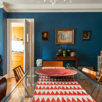
Zillow’s statistics regarding paint colors to sell your house which garnered more money for their homeowners in 2018 include a black or charcoal front door, navy or black kitchen islands with white cabinets, light blue bathrooms and light taupe living rooms.… Continue reading...

How to use blue in your home

How to use the world’s favorite color.  There are many shades and tones of this exquisite color. Ultramarine, Egyptian, Prussian, cerulean, periwinkle, indigo, turquoise; the list goes on. When mixing paint there are 3 primary colors: blue, red and yellow.  Indivisible by no other color, blue is a foundational hue. It is considered by most people to be calming though some unlucky souls find the color melancholy. Here’s how to use blue. Across nations and cultures blue remains the world’s favorite color. It wasn’t always so though. It was not until the twelfth century that it began to be associated with the divine and would start to be used in stained glass windows, depictions of the Virgin Mary and coats of arms.… Continue reading...

Paint Color for an Open Plan House

In 2001, a Bucks County, PA couple fell in love with Woodstock and began what was to become an annual ritual visiting the area. In 2008 they bought 3.5 acres. Drawn to area by the excellent hiking and the Woodstock Film Festival they decided to build their retirement home there. They started researching house styles and realized the perfect layout was one that they designed themselves. The couple chose to work with Atlantic Custom Homes, independent dealers for Lindal Cedar Homes. The Lindal Homes are semi-custom and the house they designed is loosely based on the Elements line. Using a software program called Chief Architect, they made drawings of what they wanted, then bounced ideas back and forth with the Atlantic rep, eventually submitting drawings to the Lindal architects for the final plans. … Continue reading...

The allure of pink and orange.

This color combination of pink and orange conjures up associations with the exoticism of the East. For some this may mean Morocco, for others India. Either way, it’s an unusual palette in the American home, but sensational, nevertheless. Admittedly, it’s not for everyone. Pink has gotten a bum rap, being tied to all things “little girl” since WW2 in the States. Previously and in some cultures still, it is considered gender neutral or even masculine due to its derivation from red, an aggressive, active, powerful color. Orange has virtually no negative cultural connotations. It’s considered joyful and happy. Together they create a vibrant, warm space. This… Continue reading...

Choosing Exterior House Colors

Shakkei ~ Borrowed Scenery As an exterior house paint color specialist a knowledge of landscape design and an understanding of the affect of landscaping on a home’s curb appeal is a bonus. When studying Landscape Design at the New York Botanical Garden, one very important concept taught was the Japanese idea of Shakkei or borrowed scenery. This meant that as you were designing the garden and considering its elements, you needed to take into account the existing landscape which was part of your immediate view shed. If, as you stood and looked at your plot, a distant mountain, a nearby pond or a stand of tall grasses in the your neighbors yard were visible then they, in effect, became part of the garden you were designing.… Continue reading...

A Caribbean palette

I escaped. One week away from the brutal cold temperatures and the winter wonderland I profess to love. (But I do!!) And the best part of it was immersing myself in the warm sea and the Caribbean color palette. The colors of the tropics are emblematic of the blue green seas of the Caribbean we all love. If you’re going for a Caribbean color palette in your interior it will look out of place if you don’t live in a tropical climate. Bold saturated colors indoors in the Northeast or Mid-West just don’t make sense if you want your interiors to fit into their environment well.… Continue reading...

Colorful Barn Exteriors

Living in the country it’s impossible to ignore the variety of colorful barn exteriors around. But I’m often zipping by at speeds way too fast to stop and take a photo. Who doesn’t love the iconic red barn with its endless variations of that red hue. The origin story for that comes from many angles. It’s hard to know which is the true cause. In the Great Plains and Mid West Scandinavian immigrants with a history of painting “Falun Red” buildings back in Sweden brought this tradition with them. In the earlier days of US history it was discovered that iron oxide mixed with Linseed oil created a sealant for the barn exterior that helped preserved it.… Continue reading...