You think the hard work is done because you finally chose magnificent tiles for your project. But now you have to choose the perfect grout color for your tiles to make them really sing.
There are a number of factors to consider when choosing grout color.
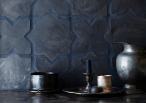
Cle Tile
Where are the tiles going, on a floor or a wall? Will there be heavy traffic?
In heavily trafficked areas the tiles will get dirty quickly so they’re best with a grout color that is mid-toned to dark.
Will the tiles get splattered with food or grease and need constant cleaning and upkeep?
Again, mid toned to dark grout will be best.
How large is the room?
Grout which contrasts with the tile in terms of color and value ( lightness/darkness) will
create a busier look which might make a small room appear smaller than if the grout
matched the tile color. ( If you’re tiling a large expanse)
Do you want serenity or complexity in the space?
This is a key question. Matching the grout color to the tile creates the most serene look as the grout lines almost disappear. Choosing a contrasting grout color will create the most dynamic, active look. Using a mid-toned neutral like gray (like below) with a tile that isn’t light colored will split the difference and recede somewhat.
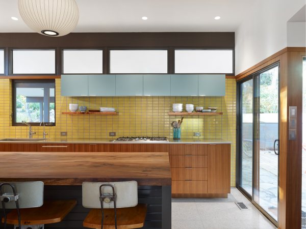
Fireclay Tiles
Do you like pattern?
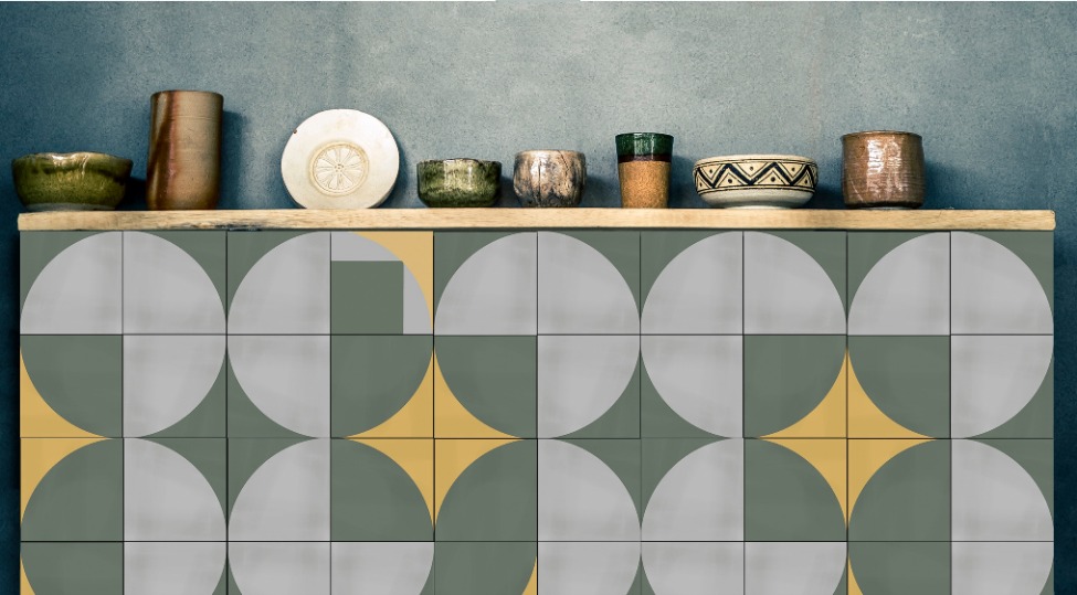
Marianne Smink Cle Tile
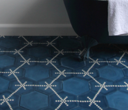
If your tile is heavily patterned and you want the focus to be its pattern then make the
grout lines disappear by using tight grout lines and a grout color that matches the field color of the tiles. If the tiles are solid and you want to create pattern then choose contrasting grout and the grout lines will accentuate and define the pattern.
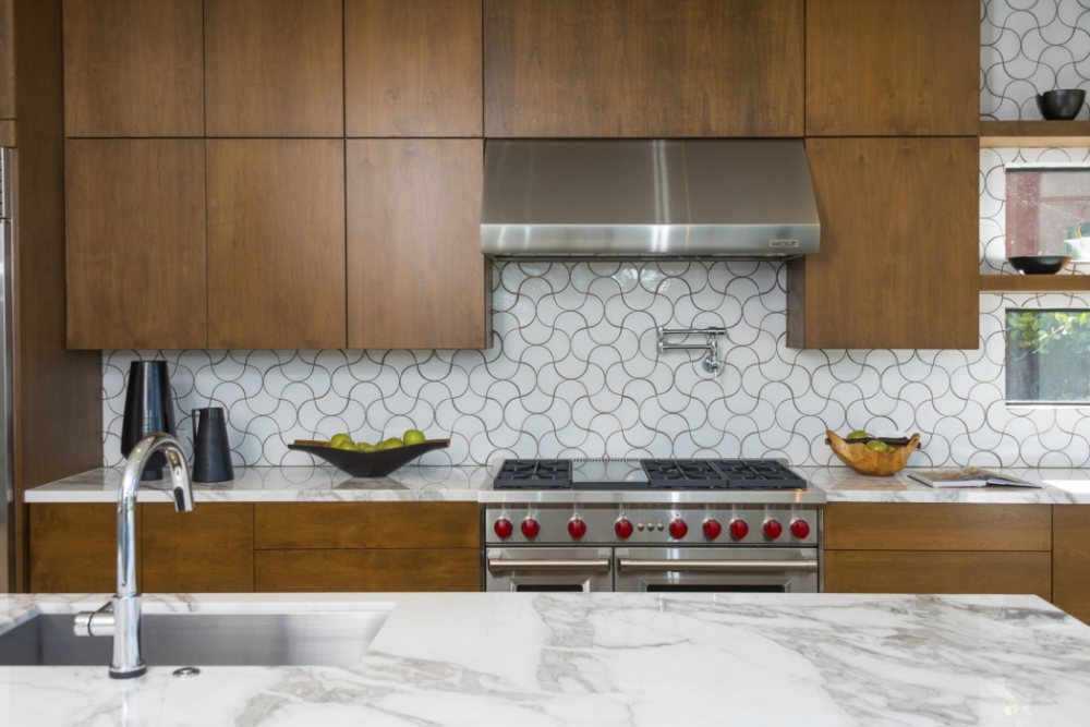
Kirsten Kaiser
Tiles whose pattern is completed once it’s placed next to the same tile will benefit from grout which disappears.
Popham Design

Bartlett House, Ghent NY. Photo: Matthew Novak, New York Times
White subway tiles are a classic, of course, and pairing white tiles with white grout is the classic treatment. In The Bartlett House Kitchen, Bakery and Cafe, the white mini subway tiles are in the retail area and create a timeless ambiance. In a kitchen backsplash you are creating the need for constant maintenance.
What about a grout color that’s not present in your tile nor is it white?
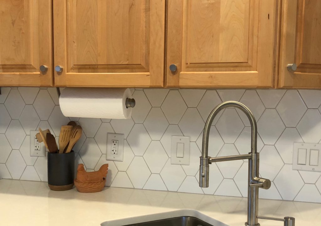
Sometimes you can use the grout color to tie the tile color closer to the countertop for a more seamless look. In the photo below the quartz countertop is a warm white with veins of bright white running through it. The black splash tile is bright white. Since the eye combines the whites in the countertop the takeaway is cream. To tie the backsplash tiles closer to the countertop the grout color chosen was a very warm, mid-toned gray. Mission accomplished!
Amy Krane Color
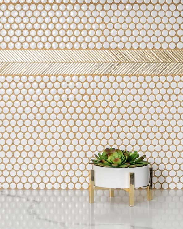
Gold feather tile on penny tile. Attribution unknown.
This photo above portrays a very playful, contemporary look with the grout a brand new tone brought into the environment. As such it is the least “timeless” choice. It’s very idiosyncratic and you may tire of it down the road.
Keeping all of these factors in mind will guide you towards the right grout color choice for your room.

