
Alma Homes
I’m going to make a confession right up front. I’m not a warm gray lover. But I am in the minority. In my opinion, the most popular class of neutrals for a home interior besides white is warm grays. Agreeable Gray is one of the best. This kind of neutral appeals broadly to people who want a hint of something to take them beyond the emptiness that white can sometimes engender. It’s a hint of color which makes a pretty low-key statement. It works so well with many other colors.
Agreeable Gray is one of Sherwin-Williams’ most popular paint colors.
While it’s popular to talk about undertones the correct terminology is really hue family. All colors exist as some version of a particular hue family. This means that grays that seem a bit reddish or blue or green don’t actually have those undertones. They literally live as part of those color families. So without further ado let’s talk about Agreeable Gray.
Take a look at the characteristics of Agreeable Gray. This Colorgraphic from Land of Color (a wonderful website all about specifying color) gives you all the solid numerical facts about Agreeable Gray, not someone’s subjective, often incorrect view of what the color is and appears as! (I’ve seen people say it has green undertones. No!)

From Land of Color
Agreeable Gray is clearly and squarely in the yellow color family. It’s a warm gray. There is visible evidence of the color family this gray comes from. Its Value (lightness/darkness) out of 10 is 8 which makes it bright. It’s LRV or Light Reflectance Value which measures the reflectivity of a color, is 60% out of 100 which makes it lighter than mid-tone. It’s Chroma is .74 so it’s lacking significant color which is why it’s a gray. Folks these days call this kind of color, greige. That’s OK. Names come and go. It’s understandable that people feel it straddles gray and beige. That’s because it’s warm – from the yellow hue family.
House of 7 Feathers
Colors are always experienced in combination with the other colors around it. So around darker, deeper colors it will be perceived lighter than it is and around whites it will appear more colorful and darker.
What trim color works with Agreeable Gray walls?
It is very common to see this kind of gray paired with white trim. SW whites which work well with it include Greek Villa and Snowbound. As a fan of going a less traditional trim route, I like the trim to match the walls in a higher sheen, like satin with the walls being matte. But though I like to eschew the white trim and gray walls duo I do think Agreeable Gray is lovely used with white. The gray wainscoting and white walls above are really handsome.
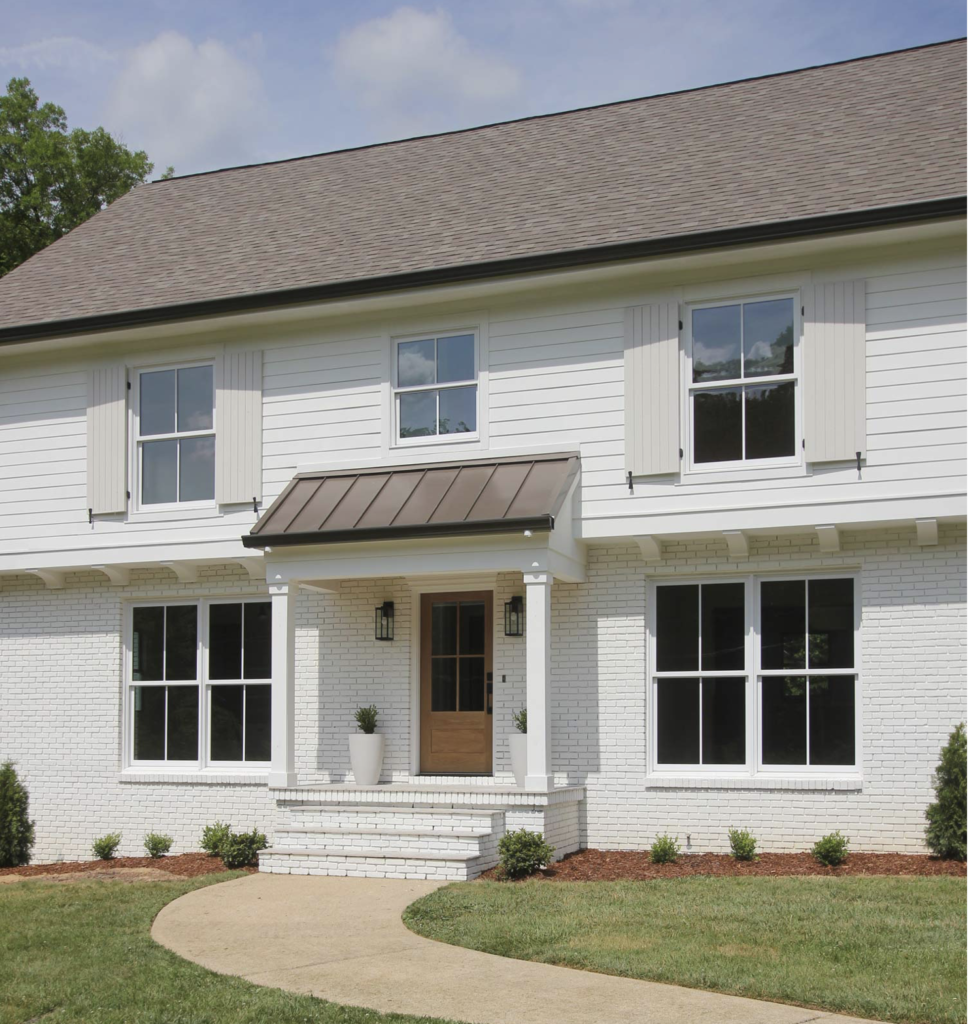
Agreeable Gray for Exteriors.
Agreeable Gray makes a beautiful color for an exterior. The exterior ambient light will make it look barely there though. With white you can create a really subtle soft look. Below Agreeable Gray is used just on the shutters for just a hint of color.
Plank and Pillow
Agreeable Gray mixes well with darker colors.
Truly a neutral as it lacks colorfulness, Agreeable Gray works with so many deeper colors very well. Think hunter or olive green, navy blue, or burnt orange for a few ideas.
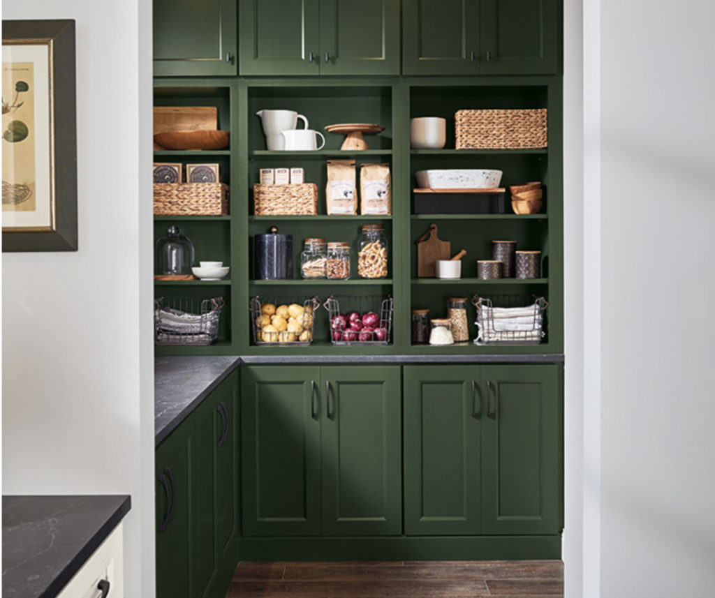
Remember colors which share their makeup work well together. With Agreeable Gray’s “home” being the yellow color family, it plays particularly well with greens, a mixture of blue and yellow. The commonality enhances their relationship.
Agreeable Gray with your floors.
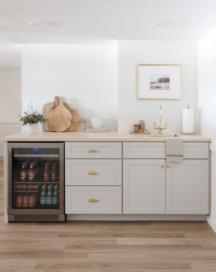
Julie Blanner
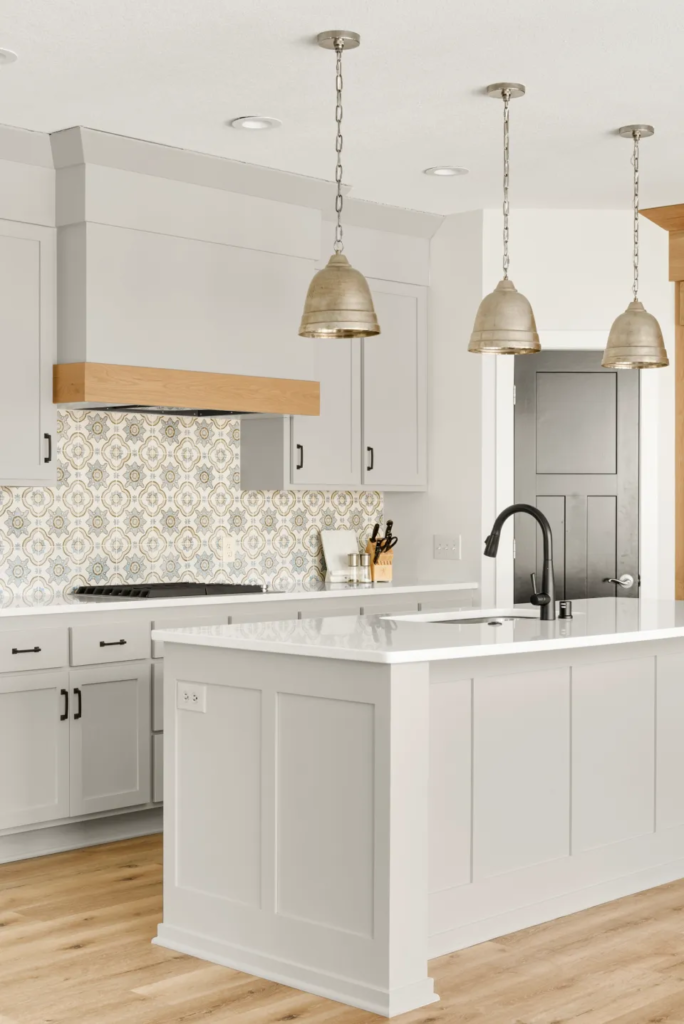
Let’s start this way, the more neutral your floor color the more they will work with other colors. The floor above doesn’t skew orange, red or yellow and it works terrifically with Agreeable Gray. This floor is a gray-ish brown and it really enhances the look of the Agreeable Gray kitchen cabinets.
What kind of rooms will Agreeable Gray work in?
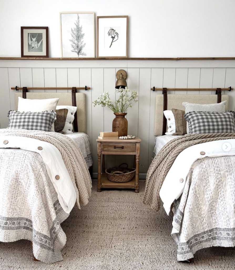
Depending on the hard finishes and other colors in the room, Agreeable Gray could work anywhere. As a neutral, it is a nice choice for hallways in particular. The color is extremely serene so it makes a nice bedroom color for those who don’t want lots of visual stimulation where they sleep. Agreeable gray is the kind of color which works so well for people who gravitate to low contrast, not too colorful settings. You could of course, mix it with lots of colors in your decor but more people tend to choose white for that kind of environment.

Jenna Kate
The Lily Pad Cottage
Some tips on Directional light and colors.
Northern Exposure
North-facing rooms are the darkest in the home with diffuse, shadow-less, and slightly grayish or neutral light most of the day and year. Most painters prefer to use this light because it is more constant than direct sunlight. Everything in the space will appear and feel, cooler on a color spectrum. Using a warm color here will help warm it up a bit depending on how saturated the color is. Of course Agreeable Gray is not saturated at all. It may feel dull in a room with this kind of light.
Southern Exposure
South-facing rooms are the brightest in the house, with the daylight being dominant from late morning to mid-afternoon. These spaces, like north-facing rooms, have consistent light all day, but with crisp strong shadows and beams of light. The warm bright light tends to render colors accurately, even to the point of intensifying any color placed within it. Agreeable gray will look great here though may wash out a bit.
Eastern Exposure
East-facing rooms are brightest in the morning, with a light of a lower altitude casting long soft shadows. The morning light can vary from a grey-yellow to bright and white, which tends to wash out color. It is important to determine what time of day east-facing rooms will be used and what importance natural light will play. If the function of the room lends itself to afternoon or evening use, a warm palette will help balance the lack of natural light. Agreeable gray in an eastern facing room used in the morning will be soft and appear very light. Later in the day it may feel duller.
Western Exposure
West-facing rooms have their strongest light in the late afternoon and early evening with a light of a rich gold-orange hue. The light can at times appear overwhelmingly orange. Morning use of a west-facing room means more warm tones can be used without the risk of skewing hot. Agreeable gray here will seem warmer and altered in color if you spend lots of time here in late afternoon.