Benjamin Moore’s Color of the Year 2025 appears as a purple.
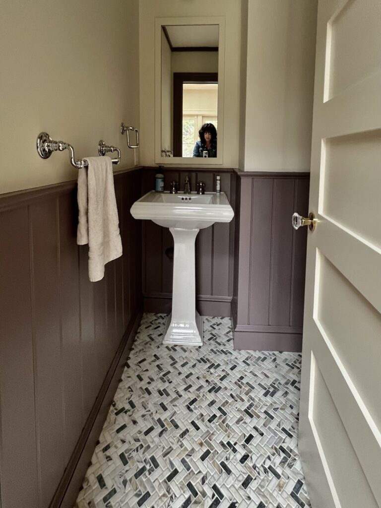
I’m happy to say I used it this year. My client’s were color courageous. We used it for the wainscoting of a powder room to pick up the hints of purple in the marble floor. The home is awash with color so our goal was a soft purple, one that was heavily muted so the effect would be eminently livable.

Amy Krane Color
The photo doesn’t do justice to the floor which has a fair amount of purple in it. Many people are “purple-shy”. It’s not often requested in a color consult. My unofficial anecdotal poll puts purple and pink neck and neck for little girl’s rooms. Purple is great in the garden too…. It’s a wonderful companion to greens and of course it’s complement on the color wheel is yellow which will enhance both of these colors when used together. The warm neutral in this bathroom, in fact, that covers the top of the walls is Benjamin Moore’s Niveous. It’s a very yellow based off white. I am very careful about using purple on house exteriors. I find it usually too fanciful for that use.. Perhaps as a tiny accent color in a polychrome Victorian. I like the idea of pairing colors this impactful with neutral rooms near it. Drama is created by going from the serenity of a neutral to the warm embrace of a color like Cinnamon Slate.

Benjamin Moore

Benjamin Moore Color Trends Palette for 2025
The palette this year is muted elegant color. Many colors can be considered earthy which of course is a subjective term. What’s muted? Desaturated and lacking chroma and colorfulness. Iv’e used every color in the collection except for Chowning’s Tan.
It’s a collection that would go lovely together.
- Cinnamon Slate (2113-40)
- Sea Salt (CSP-95)
- Leather Saddle Brown (2100-20)
- Chowning’s Tan (CW-195)
- Tissue Pink (1163)
- Stained Glass (CSP-685)
- Ashwood Moss (1484)
- Rosepine (461)
- Paris Rain (1501)
- Glacier White (OC-37)
Paris Rain is a really interesting toned neutral from the yellow hue family heading towards the green-yellow family. You can sense the green in it a bit as well as a tad of gray. It has loads of personality for an off-white. Tissue pink is one of my very favorites pinks from Benjamin Moore. It leans yellow, giving it a slightly peach appearance. Ashwood Moss and Rosepine are fantastic muted greens, perfect for interiors and exteriors.

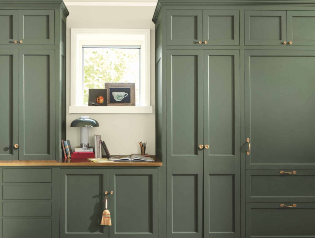
Benjamin Moore Ashwood Moss
Where is Cinnamon Slate best used in an interior?
I would use Cinnamon Slate in a living room, dining room, office, den and library to name a few. It is sophisticated and understated.

Color Drenching with Cinnamon Slate
If you’re going for a moody atmosphere it is perfect. I like it with trim ( molding) matching the walls in a higher sheen. White trim will be too contrasty and detract from the atmosphere created by this beautiful color.
Cinnamon Slate is a warm color.
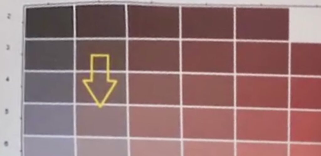
In person this color appears somewhat cooler for a warm color. In fact, it belongs to the end of the Red Hue family. That’s the side closer to purple red. Therefore it makes sense that it appears like a grayed-down grape in person. These color graphics from Land of Color show the color from its most desaturated up to its more chromatic version. It’s a mid toned color ( see its value of 5 out of 10 on the value bar graph and note how low on the chromatic scale it is at 2, hence its grayness.) Cinnamon Slate has an LRV, Light Reflectance Value of 19.71. Which means it absorbs 80% of the light that hits it. LRV runs from 0 to100 with 0 reflecting no light and 100 reflecting 100%.

From Land of Color

From Land of Color
What kind of floors would look best with Cinnamon Slate?

I think this moody purple would look great with almost every tone of wood floor. A red leaning stain, a pale beech, a yellowy pine, a dark brown walnut, a pinkish maple or a red or white oak would all shine with it. In terms of carpet color, a gray, an olive, a wheat or a beige would combine very well.
What Colors will Cinnamon Slate mix with well?
I like cinnamon slate with deep reds, cognacs, ochres, warm browns, and deep or muted greens.
Using Cinnamon slate in different room light.
Northern Exposure
North-facing rooms are the darkest in the home with diffuse, shadow-less, and slightly grayish or neutral light most of the day and year. Most fine art painters prefer to use this light because it is more constant than direct sunlight. Everything in the space will appear and feel, cooler on a color spectrum. Using a warm color here will help warm it up a bit depending on how saturated the color is. Of course Cinnamon Slate is not saturated at all. It may feel dull in a room with this kind of light.
Southern Exposure
South-facing rooms are the brightest in the house, with the daylight being dominant from late morning to mid-afternoon. These spaces, like north-facing rooms, have consistent light all day, but with crisp strong shadows and beams of light. The warm bright light tends to render colors accurately, even to the point of intensifying any color placed within it. Cinnamon Slate will look great here.
Eastern Exposure
East-facing rooms are brightest in the morning, with a light of a lower altitude casting long soft shadows. The morning light can vary from a grey-yellow to bright and white, which tends to wash out color. It is important to determine what time of day east-facing rooms will be used and what importance natural light will play. If the function of the room lends itself to afternoon or evening use, a warm palette will help balance the lack of natural light.
Western Exposure
West-facing rooms have their strongest light in the late afternoon and early evening with a light of a rich gold-orange hue. The light can at times appear overwhelmingly orange. Morning use of a west-facing room means more warm tones can be used without the risk of skewing hot.

