Our blog offers a fresh voice on the design scene, with ideas, inspiration and paint color advice focused on color for the built world. Updated regularly, discover current paint color trends and tried and true proven approaches to color design for your home, your business or your brand. It's all about the human response to color. Learn how to choose and apply color in a way that supports well-being and adds beauty and function to any environment. Whether interior or exterior, residential or commercial, smart color design makes the difference between a space that's hardly noticeable and one that makes you feel alive!
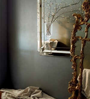
There’s been a growing trend towards the use of warm toned metallics in home decor. Brass and copper are everywhere from lighting to case goods, hardware to kitchen cabinets. This first post for 2016 is about color of course, but only tangentially about wall color.
Of course chrome and nickel finishes have been the standard for so long. Both have serviced many decorating styles ably. But the warmth of brass and copper is really coming to the fore. These warm toned metallics counter the more clinical influence of cool grays and white, adding richness, depth and color. Forget about their elemental composition and just consider their color ~ gold and pink.… Continue reading...
“Best of” lists are common this time of year. We see roundups of the best television shows, movies, Facebook posts and photos of 2015. With the recent announcement of the new Color of the Year by Pantone and the major paint companies, sights are set on the new year in design. But next year’s trends are formulated by this year’s choices. Who better than a paint color consultant to focus a keen eye on what was, to point us towards what will be. Here’s a list of the top color and home design trends of 2015 which promise to evolve in 2016.… Continue reading...
Domino magazine asked your resident Paint Color Consultant, Amy Krane, how to handle color in small rooms. There is so much contradictory advice out there about how to paint small rooms.
This article attempts to sort through the clutter and define some concrete rules. Spoiler alert, two of us were interviewed and even we disagreed sometimes! Nevertheless, find some helpful how-to’s when it comes to small room color.
Domino magazine: What you should know about painting a small room.
Things to consider? How much natural light is there, when do you use the room, how high are the ceilings, how much time do you spend in the room.… Continue reading...
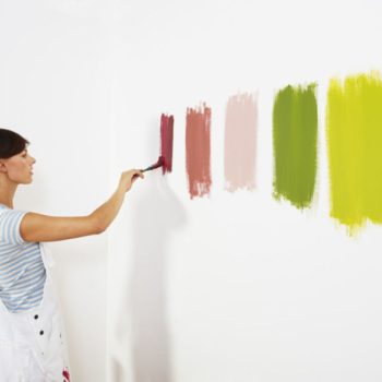
White is like any paint color. There is no one best. It’s all about context and your design goals. Best depends on best for what. There are thousands of white paint colors available.
White is considered the ultimate neutral. White paint colors have relatively little hue so some think that makes them easy to choose. They’re not. Neutral whites without pronounced undertones are few and not necessarily the best choice for every application.
What do you want your white to do, brighten and lighten? Its success is based on how much natural light is in the room. White walls in an area with no natural light can look dingy if not chosen well.… Continue reading...
If you have a hankering to do some permanent redecorating this time of year, consider some toastier autumn colors for your walls. As a color expert I suggest brown, plum, mustard, taupe and burnt orange to conjure up feelings of coziness, perfect for the colder months.
We all know switching out a summer wardrobe for a winter one is as easy as taking our sweaters out of storage and packing the sandals away. The white pants get a final cleaning then move to the rear of the closet and our deep dark tones come to the forefront. It’s a little more complicated with home decor but that doesn’t mean you can’t accessorize differently for the colder months.… Continue reading...
Well not all of us make color mistakes! Elle Decor reached out to interior paint color expert Amy Krane to find out what common color mistakes people make when choosing paint colors. Find out what they are and how to avoid them here at Elledecor.com.
It’s easier and easier to educate yourself about using color in the build world these days. There are so many online advice columns, online magazines and blogs to help you along the way not to mention the millions of photos you can study on Pinterest and Houzz.
Paint color mistakes don’t have to happen to you. Listening to my podcast Let’s Talk (paint) Color you’ll hear tons of color advice to help you on your way.… Continue reading...
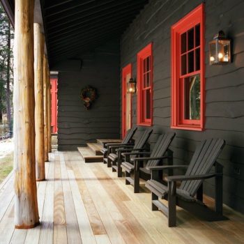
Dark houses are dramatic! The juxtaposition of a dark house color with the lighter sky makes for serious contrast. Of course dark houses blend in less with the environment than lighter or mid tone houses. But that’s a design choice. Dark blue, dark green, dark grey, brown and black are all great choices. A very modern approach is not to use any contrasting trim colors at all, but the success of that is very much based on the architectural style of the house. As an exterior paint color specialist I help my clients choose dark paint colors for exteriors when they want to go that direction.… Continue reading...
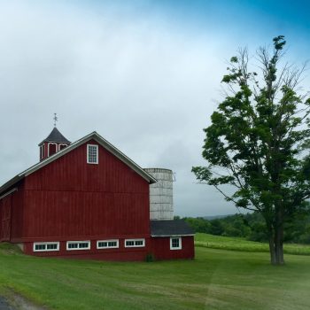
I spend a lot time driving around Columbia County NY where I live, admiring the red barns. There are so many beautiful ones, both vintage and new. Many people choose a classic barn red for their home as well. Like all colors, the light greatly affects the appearance of the red. The same red will look completely different on a sunny versus cloudy day, front, back or side lit, facing north or south.
There are numerous fables about the origin of the red used on barns in the U.S. One story relates that iron oxide or rust was added to linseed oil and painted on the wood siding to protect the structure from fungus and mold.… Continue reading...