Our blog offers a fresh voice on the design scene, with ideas, inspiration and paint color advice focused on color for the built world. Updated regularly, discover current paint color trends and tried and true proven approaches to color design for your home, your business or your brand. It's all about the human response to color. Learn how to choose and apply color in a way that supports well-being and adds beauty and function to any environment. Whether interior or exterior, residential or commercial, smart color design makes the difference between a space that's hardly noticeable and one that makes you feel alive!
Thanks for stopping by our blog........Amy
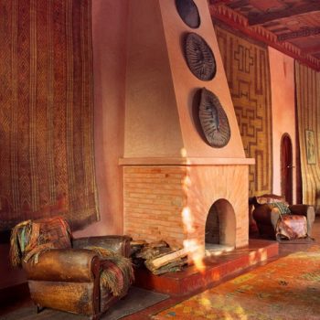
 Albert & Liz Watson's Dar Faracha
This color combination of pink and orange conjures up associations with the exoticism of the East. For some this may mean Morocco, for others India. Either way, it’s an unusual palette in the American home, but sensational, nevertheless. Admittedly, it’s not for everyone. Pink has gotten a bum rap, being tied to all things “little girl” since WW2 in the States. Previously and in some cultures still, it is considered gender neutral or even masculine due to its derivation from red, an aggressive, active, powerful color. Orange has virtually no negative cultural connotations. It’s considered joyful and happy. Together they create a vibrant, warm space. This…
Continue reading...
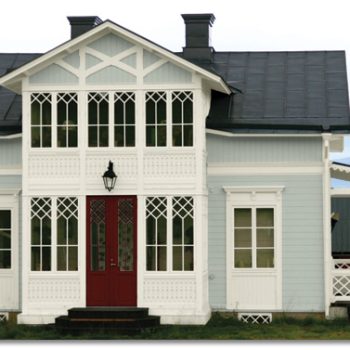
Interested in current exterior house color trends? Read about them in InPaint Magazine. They tapped exterior house paint consultant, Amy Krane Color, to hear what’s happening in the NorthEast and around the U.S. Click here.
In general, Northern locales choose cooler, more muted colors while the South chooses warmer, bolder tones. The home’s architectural style, local materials, the landscape and the cultural background of the inhabitants all influence exterior home color choices around the U.S.
In the Northeast, many colors are influenced by the proximity to the coast. Classic combinations for historical homes inform the choice for many homes from the Federal, Georgian, Colonial and Victorian styles, to name a few.…
Continue reading...  mixed patterns in interiors
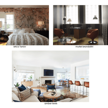
As an interior paint color consultant I think mixing patterns creates dynamic and fascinating spaces. It does not appeal to all. For some, it makes a space less harmonious and therefore less peaceful. If monochromatic minimalism is your aesthetic it just won’t work for you and that’s OK. For we who love interesting juxtapositions, if done right, 1 + 1 will equal 3 by combining diverse patterns in one space. Though there are some good general guidelines, many people who possess the skill of combining patterns effectively do so intuitively. A master of it is the Interior Designer Muriel Brandolini. She is fearless when combining color and pattern though her designs might be considered on the bolder end of the spectrum.…
Continue reading...  Alexander Vervoodt interior
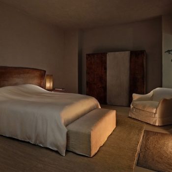
I LOVE the look of Lime wash. Not a fan of glossy surfaces, the super matte,chalky, mottled surface lime wash creates is right up my alley. It makes me think of white wash homes on Greek Islands, Ancient Italian walls and French Villas. Beautifully described on one of my fav go-to design websites, remodelista, “whitewash is environmentally friendly and used for centuries. It is one of the original house paints. An ancient house staple dating back to Roman times, limewash is made from limestone that’s been crushed, burned, and mixed with water to make a lime putty. The putty is aged and then thinned with water and colored with natural pigments.…
Continue reading...  Julie Holloway
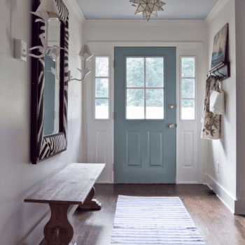
There isn’t an interior color expert worth their salt that doesn’t extoll the virtues of a colorful and arresting front door. Look around and you’ll find front door color which run the gamut from the classic (red, black) to the arcane or whimsical (turquoise, acid yellow, chartreuse). But rarely do we hear about adding color to the front door’s interior side. Most often you’ll find the inside of the front door in wood stain which matches its exterior or find it painted white. While I would never criticize the use of white in a home’s entranceway; it can never offend and is so crisp and clean, one is really missing out on a great opportunity by going that route.…
Continue reading...  Pink and Mint for toddler girls
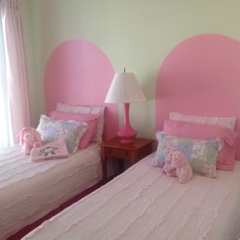
How to Choose Paint Colors for a Baby Nursery
Wondering what colors to paint the baby nursery? From 0 – 3 months, babys’ vision is not fully formed and they can only focus on objects 8″ – 12″ from their faces. Highly contrasting patterns are most recognizable to them. By 5/6 months old their color vision is well developed and this affect baby nursery colors you might choose.
What colors will help with their development and keep them stimulated? What colors and lighting encourage them to sleep? What types of paints are most healthy to use?
Until World War 2, the color pink was not gender specific.…
Continue reading...  Barn door in the home of Oughten bag co. founder
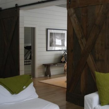
Aren’t interior barn doors fantastic? Like pocket doors, they are space savers as there is no need for floor space for them to swing out into the room. But they are so much more attractive with their rugged proportions. Pocket doors are all about saving space and disappearing but rarely do they move smoothly and tend to wobble along as they slide.
It’s difficult to imagine any other architectural structure which came in from the cold and gained popularity as an interior accoutrement. Historically, most barns had at least one pair of large hinged doors that opened onto the main drive.…
Continue reading...
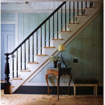
Not surprising that Benjamin Moore chose Breath of Fresh Air (806) as its color of the year in 2014. Close to a sky blue on a sunny day, the color is an up lifting light blue, pale but not quite pastel, calm and reassuring. It’s one of the best paint colors for bedrooms and bathrooms. One can’t help but feel a sense of relaxation settle in around it. Painting with blue and green works well because both are soothing and refreshing colors. Blue is associated with trust while green, with its tie to nature, relates to the essence of life.
Together they remind us of cool water and the elements.…
Continue reading... 
