Black & White Paint in and on Houses
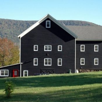 Black Modern Farmhouse
There is no combination more graphic than black and white. Using polar opposites creates maximum contrast which translates into drama. Whether dealing with an interior or exterior, the absence of another hue puts emphasis on pattern and that creates focus on form. The addition of another color changes the whole equation. Three colors bring a different kind of balance to a space and more possibilities for complex color relationships. Black house exteriors have come into vogue and for good reason. They make a very big, grand statement. Black and white interiors are tricky to pull off well.
Bathrooms and kitchens seem to lend themselves to this choice.… Continue reading...