Autumn Colors for your Home

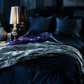
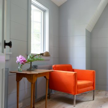
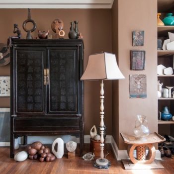
If you have a hankering to do some permanent redecorating this time of year, consider some toastier autumn colors for your walls. As a color expert I suggest brown, plum, mustard, taupe and burnt orange to conjure up feelings of coziness, perfect for the colder months. We all know switching out a summer wardrobe for a winter one is as easy as taking our sweaters out of storage and packing the sandals away. The white pants get a final cleaning then move to the rear of the closet and our deep dark tones come to the forefront. It’s a little more complicated with home decor but that doesn’t mean you can’t accessorize differently for the colder months.… Continue reading...

Barn Red : A Survey of Red Barns

I spend a lot time driving around Columbia County NY where I live, admiring the red barns. There are so many beautiful ones, both vintage and new. Many people choose a classic barn red for their home as well. Like all colors, the light greatly affects the appearance of the red. The same red will look completely different on a sunny versus cloudy day, front, back or side lit, facing north or south. There are numerous fables about the origin of the red used on barns in the U.S. One story relates that iron oxide or rust was added to linseed oil and painted on the wood siding to protect the structure from fungus and mold.… Continue reading...

Talking to Elle Decor about Color

Amy Krane Color in Elle Decor When one of my favorite shelter magazines, Elle Decor, called and asked me to weigh in about colors which are often maligned, I jumped at the opportunity. Read the article about 6 colors people love to hate, but shouldn’t. In the end it’s more about how colors combine with one another than your thoughts about any one color because they’re never used in isolation. A case can be made for any color if the setting is right for it. Think about your architecture, lighting, other colors in the room and the mood you want to set.… Continue reading...

Black & White Paint in and on Houses

There is no combination more graphic than black and white. Using polar opposites creates maximum contrast which translates into drama. Whether dealing with an interior or exterior, the absence of another hue puts emphasis on pattern and that creates focus on form. The addition of another color changes the whole equation. Three colors bring a different kind of balance to a space and more possibilities for complex color relationships. Black house exteriors have come into vogue and for good reason. They make a very big, grand statement. Black and white interiors are tricky to pull off well. Bathrooms and kitchens seem to lend themselves to this choice.… Continue reading...

Creating Punch… Mixing Warm and Cool Colors .

As an interior color specialist I recommend that if you are looking to create a soothing, peaceful space there are a number of ways to go about it. You can choose all muted tones, ones which are “knocked down” by the addition of black or grey. You can use pale pastels, which are desaturated by the addition of white. Or you can choose analogous colors from the cool side of the color wheel. See the photo above. These hues sit right next to one another on the cool side of color wheel. They include blue, green and violet and those colors in between.… Continue reading...

Jewel Tones on your Walls

It seems hardly a year goes by when we don’t see jewel tones in one incarnation or another when we consider women’s fashion. In particular they seem to make their way into evening wear. The colors are deep and rich and flatter most complexions. They speak of high-end luxury, wealth and nobility harkening back to the purple robes of the monarchs and the tones of their jewels. Likewise, each paint company includes jewel tones when they create their trend palettes and color inspiration for the year. Certainly there’s been lots of commentary on Pantone’s Color of the Year, Marsala, a muddy, brown maroon.… Continue reading...

Fifty Shades of Gray in your Home

Let’s begin with the spelling. Both gray and grey are correct. I find myself in the minority,  using the “e” all the time. After (easily) 5 years, it’s still the “new” hands down favorite for a neutral home. Gray has nudged beige, cream and off-white aside, only lagging behind white as the “go – to” neutral for residential interiors. Depending on who you are; your taste, your sensibility, the style of your decor, you either love it or hate it. Gray is deemed cold and blah by some, but it is considered a very sophisticated choice by others. It will create a calm and neutral palette for your home.… Continue reading...

Design Ascension: Color on the Staircase

It’s not JUST a way to transport you from story to story. You can create a perfectly lovely traditional staircase with a runner over bare wood. But, it’s an architectural feature that can be transformed into a major design element with the inventive application of paint, stain or wallpaper creating a new striking design feature which elevates it beyond its mere functionality. Think color, out of the box! Especially for the property owner who is timid about adding color to the home, the staircase is an excellent place to dip your color-phobic toe into the paint bucket and create a bold statement in a very contained place.… Continue reading...