How to Create Curb Appeal

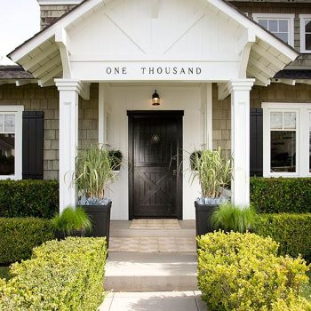
Well, summer is here and it’s a great time to take stock of your home’s curb appeal. By now your landscaping should be well out of the winter doldrums and producing its finest. Whether you are there for the long haul or thinking about selling, curb appeal is extremely important. People really do read a book by its cover and first impressions are hard to dispel. What are the elements which create maximum curb appeal? The home in this photo covers all of the bases. Exterior siding or cladding. Is it chipping, peeling or fading? If so, it’s time for a paint job but this time of year you’re going to find your painting contractors already booked through the end of summer, possibly even Fall.… Continue reading...

How to Choose Interior & Exterior Paint Colors For Your Home

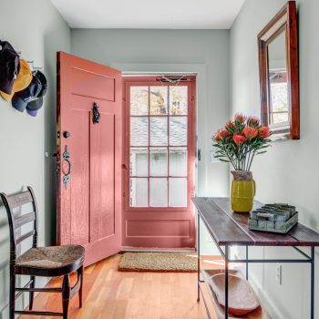
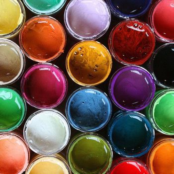
Are you about to redecorate, renovate or build? Learn how to choose paint colors. Many people want to make their own color decisions but end up stuck, staring at color chips pasted to their wall for months. Choosing colors is difficult but the right color makes the difference between a home that makes you feel great, reflecting who you are and one which leaves you cold and uninspired. Exterior house color is the number one factor affecting your home’s curb appeal and therefore its value. Learn how to choose paint colors which reflect your individual stye, the ambience you want to create and the decor you have.… Continue reading...

A Look to 2017: 10 Design Trends

While it’s been a tumultuous year politically, design trends spotted in 2016 and even before, continue to manifest. Warm metals like copper and brass abound, pinks of all types continue to appear as sophisticated wall color choices and dark tones are showing up everywhere. Live edge wood used in everything from tabletops and shelving to bed frames continues to be featured in shelter magazines and homes alike. Here’s my take as an interior color specialist on what’s coming in interior design. Purple A deep jewel purple, Shadow is Benjamin Moore’s 2017 Color of the Year. Mid-toned violets like PPG’s Violet Verbena and Olympic’s Cloudberry made the top list as well.… Continue reading...

Painting a Ceiling with Color

When you’re looking to add a design detail that’s a bit out of the ordinary, consider using color on a painted ceiling. It adds an element of fun and whimsy to a room. But designers really differ on the when and how-to. Parameters when deciding to paint a ceiling with color. If the ceilings are low, don’t do it. When the ceiling is painted differently than the rest of the room the eye will gravitate towards it. If the ceilings are low it will accentuate this problem. If the room is very colorful already either from wall color, decor or both, don’t do it.… Continue reading...

9 Sophisticated Color Palettes for your Home

Summer is here and many of us are thinking about painting and redecorating. With 3500 Benjamin Moore colors alone the possibilities are endless. Often people find it difficult to know where to start. While any color on its lonesome might be a beauty, it’s really about how colors combine which create the finished effect. Looking for a sophisticated color palette which brings elegance or whimsy to your home? Think outside of the box and be adventurous with your combinations.  The Living room above found in House Beautiful exemplifies this notion. Mixing a warm lavender (warm because the red in its makeup is palpable) with caramel and ecru creates a space which surprises.… Continue reading...

Two Toned Painted Walls

Two toned painted walls add color to a room without adding chaos. When the walls are divided horizontally, a graphic element is added to the design of the space. Painting walls with two colors creates a dynamism where the final affect is much more than the sum of the parts. When a client is open to it I’m happy to suggest this approach when I’m interior paint color consulting. We’re accustomed to seeing two colors with wainscoting, of course. Wainscoting is a traditional room treatment which adds millwork to the lower portion of the walls. Wainscoting is often painted white while the sheetrock above is painted another color.… Continue reading...

The Warm Tones of Metallics at Home

There’s been a growing trend towards the use of warm toned metallics in home decor. Brass and copper are everywhere from lighting to case goods, hardware to kitchen cabinets. This first post for 2016 is about color of course, but only tangentially about wall color. Of course chrome and nickel finishes have been the standard for so long. Both have serviced many decorating styles ably. But the warmth of brass and copper is really coming to the fore. These warm toned metallics counter the more clinical influence of cool grays and white, adding richness, depth and color. Forget about their elemental composition and just consider their color ~ gold and pink.… Continue reading...

9 Design Trends for 2016

“Best of” lists are common this time of year. We see roundups of the best television shows, movies, Facebook posts and photos of 2015.  With the recent announcement of the new Color of the Year by Pantone and the major paint companies, sights are set on the new year in design. But next year’s trends are formulated by this year’s choices. Who better than a paint color consultant to focus a keen eye on what was, to point us towards what will be. Here’s a list of the top color and home design trends of 2015 which promise to evolve in 2016.… Continue reading...