Country Kitchen Color: Beyond All White

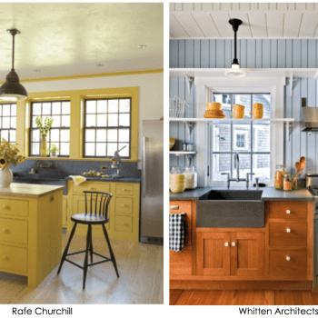
There is no doubt that the all white kitchen is the standard in home design today. Whether housed in a country home or part of a sleek urban apartment, the all white kitchen is endlessly versatile and seemingly universally appealing. It works with every color palette, is always bright and projects its clean persona. While the ultra modern, minimalist version sometimes runs the risk of chilliness with its surfeit of reflective surfaces, the all white country kitchen is more often very warm in temperament. Bright white walls and cabinets, Cararra marble or similar stone and the use of white subway tile is everywhere, albeit with variations.… Continue reading...

Paint Sheen & High Gloss Glamour.

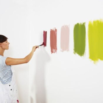
Paint sheen trips up lots of people. Click bait shots of glossy walls appeal to some but beware. A steadfast devotee of chalky, matte paint, my idea of a beautiful wall runs more towards plaster and lime wash rather than anything with a lick of shine. For practical reasons only, I advise my clients and readers to use an eggshell finish solely for its durability in high traffic areas like bathrooms, kitchens, kid’s rooms and occasionally stairwells. Trim of course, is a different story and eggshell, satin, semi gloss or high gloss are fine for that use. Higher paint sheen adds reflectivity to walls and in doing so sometimes adds the appearance of a milky white film to the surface, the amount of which wanes and waxes based on the amount and direction of light in the room and your angle of incidence viewing the walls.… Continue reading...

Jewel Tones on your Walls

It seems hardly a year goes by when we don’t see jewel tones in one incarnation or another when we consider women’s fashion. In particular they seem to make their way into evening wear. The colors are deep and rich and flatter most complexions. They speak of high-end luxury, wealth and nobility harkening back to the purple robes of the monarchs and the tones of their jewels. Likewise, each paint company includes jewel tones when they create their trend palettes and color inspiration for the year. Certainly there’s been lots of commentary on Pantone’s Color of the Year, Marsala, a muddy, brown maroon.… Continue reading...

Fifty Shades of Gray in your Home

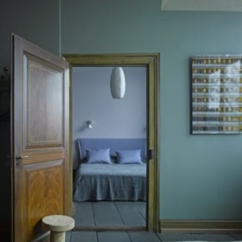
Let’s begin with the spelling. Both gray and grey are correct. I find myself in the minority,  using the “e” all the time. After (easily) 5 years, it’s still the “new” hands down favorite for a neutral home. Gray has nudged beige, cream and off-white aside, only lagging behind white as the “go – to” neutral for residential interiors. Depending on who you are; your taste, your sensibility, the style of your decor, you either love it or hate it. Gray is deemed cold and blah by some, but it is considered a very sophisticated choice by others. It will create a calm and neutral palette for your home.… Continue reading...

Design Ascension: Color on the Staircase

It’s not JUST a way to transport you from story to story. You can create a perfectly lovely traditional staircase with a runner over bare wood. But, it’s an architectural feature that can be transformed into a major design element with the inventive application of paint, stain or wallpaper creating a new striking design feature which elevates it beyond its mere functionality. Think color, out of the box! Especially for the property owner who is timid about adding color to the home, the staircase is an excellent place to dip your color-phobic toe into the paint bucket and create a bold statement in a very contained place.… Continue reading...

Exterior House Color Trends

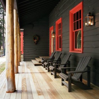
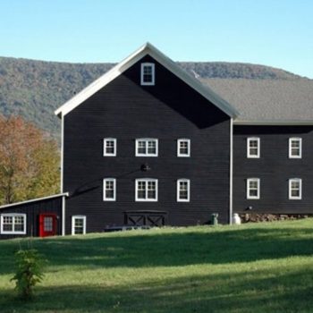
Interested in current exterior house color trends?  Read about them in InPaint Magazine. They tapped exterior house paint consultant, Amy Krane Color, to hear what’s happening in the NorthEast and around the U.S. Click here. In general, Northern locales choose cooler, more muted colors while the South chooses warmer, bolder tones. The home’s architectural style, local materials, the landscape and the cultural background of the inhabitants all influence exterior home color choices around the U.S. In the Northeast, many colors are influenced by the proximity to the coast. Classic combinations for historical homes inform the choice for many homes from the Federal, Georgian, Colonial and Victorian styles, to name a few.… Continue reading...

How to Mix Patterns in Home Decor

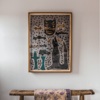
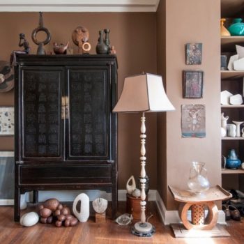
As an interior paint color consultant I think mixing patterns creates dynamic and fascinating spaces. It does not appeal to all. For some, it makes a space less harmonious and therefore less peaceful. If monochromatic minimalism is your aesthetic it just won’t work for you and that’s OK. For we who love interesting juxtapositions, if done right, 1 + 1 will equal 3 by combining diverse patterns in one space. Though there are some good general guidelines, many people who possess the skill of combining patterns effectively do so intuitively. A master of it is the Interior Designer Muriel Brandolini. She is fearless when combining color and pattern though her designs might be considered on the bolder end of the spectrum.… Continue reading...

Front Door Color Tips

There isn’t an interior color expert worth their salt that doesn’t extoll the virtues of a colorful and arresting front door. Look around and you’ll find front door color which run the gamut from the classic (red, black) to the arcane or whimsical (turquoise, acid yellow, chartreuse). But rarely do we hear about adding color to the front door’s interior side. Most often you’ll find the inside of the front door in wood stain which matches its exterior or find it painted white.  While I would never criticize the use of white in a home’s entranceway; it can never offend and is so crisp and clean, one is really missing out on a great opportunity by going that route.… Continue reading...