 Of all of the paint colors available, white paint seems to be the trickiest color for people to choose. Neutrals are the backbone of paint companies’ color lines so filling out the choices with whites, grays and beiges is smart business for them. There are buckets of them, making the choice difficult. It’s a great time to call in a paint color consultant if you’re stuck. You can also tune into my podcast on this topic using this link here.
Why choose white in the first place?
People choose white paint for many reasons. The poorest reasons are lack of a better idea or afraid to make a mistake. Specifically, afraid what you choose won’t “go” with your decor. Maybe it will be too bright, too dark or clash. Some better reasons are, you are looking for a bright, open, fresh feel to the space and/or you want a modern atmosphere which white is often associated with.
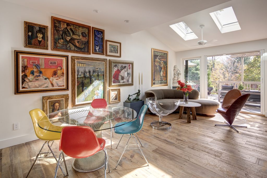
Amy Krane Color Donald Kaufman Color 67
The room above belongs to a renovated a Victorian village home my clients own. They stripped the floors, added large sliders onto the back deck and rearranged rooms. They created an open plan in this portion of the main floor, incorporating the living, dining, lounging and kitchen areas into one. Purchasing iconic modern furniture they incorporated a large collection of artwork they already owned, creating an eclectic space which reflects who they are. Tasked with finding the “right” white paint color I chose Donald Kaufman Color #67. Known as the father of full spectrum paints, DKC paint includes many more color pigments than the large paint companies use and always mixes warm and cool colors into the white. In this way, the white appears balanced and is a wonderful backdrop for the many colors in the furnishings and art.
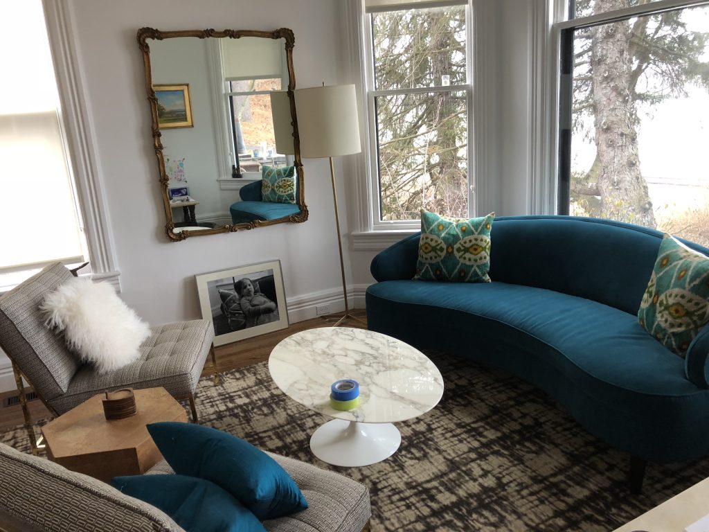
Amy Krane Color Benjamin Moore Distant Gray
Another renovation of a Victorian, this one sited on the Hudson River, involved a young family who wanted a cool white so the “modern” would be a quick read. I chose Benjamin Moore’s Distant Gray to create this atmosphere. The home is filled with boldly hued upholstered textiles so the overall feel is far from austere.
Cool or warm white?
This is a tricky question for many, beginning with the issue that many folks can’t tell one from the other. Warm colors include orange, red and yellow and tints and shades of each. Cool colors include blues, greens and purples. No white paint is pure white although a few may seem so. White paints will be associated with a particular color family, no matter how faintly. The question is what to do with this knowledge?
Repetition creates cohesion in a space. So if you’re worried about whether your home feels like a harmonious whole, employ repetition by choosing a white paint from the color family the other major colors in the room are from.
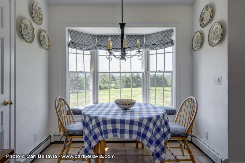 Though the accent color in the above dining area is blue, a cool color, the whole floor in the kitchen is a warm terra-cotta. Therefore I chose Benjamin Moore Atrium White for the walls. This white has distinct red undertones, or, comes from the red hue family. It’s not blatant, or else it would look like pink, but it’s there.
When you’re comfortable making bold color choices
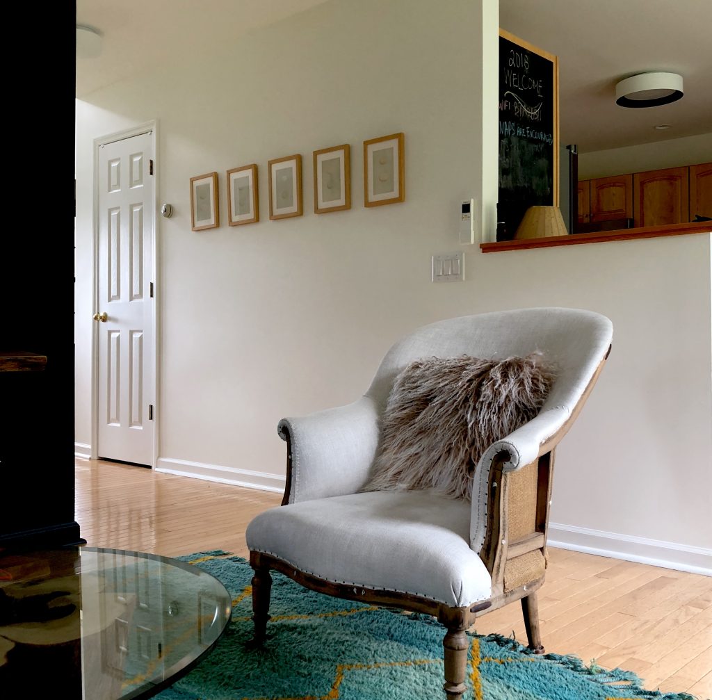
Amy Krane Color Benjamin Moore Simply White
Some people are OK mixing it up a little. In the space above, though the rug and accent wall are shades of blue ( teal and turquoise) a warm white was chosen for the walls, Benjamin Moore Simply White. The thought here is that although the accents are cool there is plenty of yellow in the decor ( in the turquoise and teal) therefore a white with visible green and yellow components would pull the space together. It’s a light filled home and the warm golden light accentuates the warmth in the white walls creating a home that’s uplifting and lovely.
If you just can’t decide what kind of white you need find one that appears neutral.
As mentioned, no white paints contain nothing but white but some appear so. The trick is finding one which seems neutral but doesn’t appear dead or flat. My go-to in these cases is Farrow & Ball’s All White.
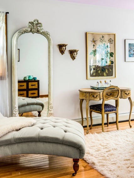
Amy Krane Color Farrow & Ball All White


White paint is so hard! These are great tips!
I’m so glad you think so.
Love love love white. Hey! I’m a minimalist, what can I say?
So many styles of home can benefit from a white space. Even one that is not minimalist!
I usually find yellow to be the most challenging, but totally agree that the plethora of whites has people’s heads spinning. Such good insight and info!
Thanks Jeri, Yellow is indeed difficult. Of all the colors I find it”grows” in power very quickly. It’s so easy to choose a yellow that’s too bright or saturated.
Absolutely! White should be an informed choice, not a default from indecision!
Im with you, Janet. The worst reason to choose any color is out of fear.
Interesting thoughts on selecting white. I recently painted the common areas white in my own home, but it was a very specific decision for me. I went with Alabaster from SW which is a gorgeous warmer chalky white. The color really completes the look I was going for. Anything other than white wouldn’t have worked!
That’s a lovely white!
Alabaster is lovely. White is a great choice as long as it isn’t a default. It’s in my public spaces also! Thanks for stopping by.