
How to use the world’s favorite color.
Amy Krane Color
There are many shades and tones of this exquisite color. Ultramarine, Egyptian, Prussian, cerulean, periwinkle, indigo, turquoise; the list goes on. When mixing paint there are 3 primary colors: blue, red and yellow. Indivisible by no other color, blue is a foundational hue. It is considered by most people to be calming though some unlucky souls find the color melancholy. Here’s how to use blue.
Across nations and cultures blue remains the world’s favorite color. It wasn’t always so though. It was not until the twelfth century that it began to be associated with the divine and would start to be used in stained glass windows, depictions of the Virgin Mary and coats of arms. From the middle ages, when lapis lazuli was discovered in the mountains of Afghanistan until synthetic blue was manufactured centuries later, the pigment, called ultramarine, was amongst the rarest and as such was extremely precious and expensive.
We can hypothesize about its allure. It’s likely due to its association with sky and water, two seemingly infinite, life supporting, soothing and inspiring elements of our physical world.
Even the Brooklyn Museum has a popular exhibit examining its own collection of art and artifacts through the lens of the world’s favorite color, blue, right now. It’s aptly called Infinite Blue.
Follow the guidelines we use to apply any color
Farrow & Ball
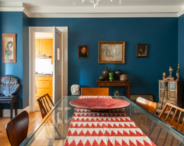
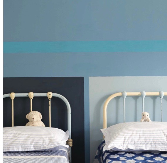
Like in the photo above, mixing different shades and tones of the same hue can be achieved with great success and creates a dynamic environment. Blue vary by its lightness/ darkness going from pastel to midnight. It can also skew towards red in which case it approaches purple and we get colors like periwinkle and indigo or towards green when we get turquoise and teal. Mixing these together takes boldness and an appetite for unconventional color combinations.
Variations of Blue
What rooms are commonly blue?
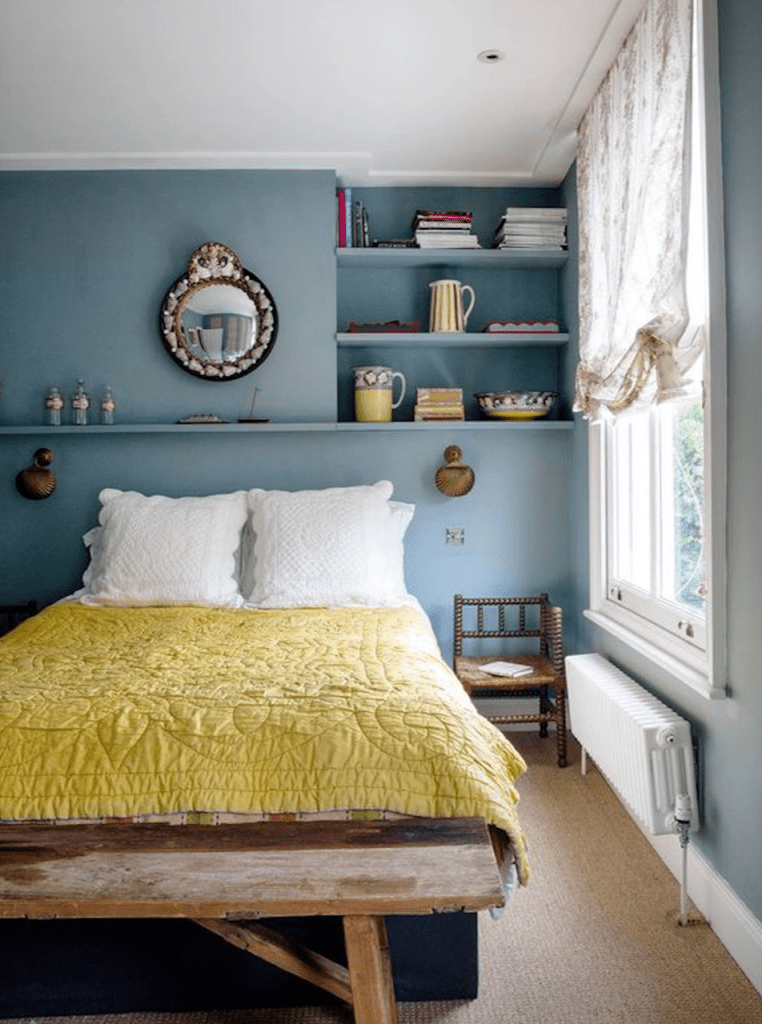
You may use blue in any room or space that makes you happy but as color can signal the function of a space or even aid in that function it is most commonly used in bedrooms and bathrooms.
Its ability to calm makes it the perfect hue for a bedroom. To choose the most soothing blue, reduce its brightness or saturation. Choose a more gray blue or even a pastel blue.
Matilda Goad
Blue has become a popular choice for kitchens as well. From navy to peacock blue we see cabinets and islands in all of these shades. It pairs well with wood tones and neutrals.
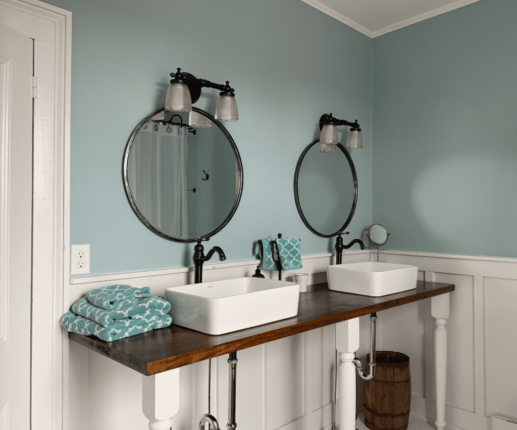
The association with water and its soothing effect on people points to its use in bathrooms and spas. Here you often see a green blue applied. Zillow reports homes with light blue bathrooms sell for more. Blues with a touch of green are more refreshing and work well in a bathroom. But if you love those aquas, teals and turquoises use them anywhere you like. Personal preferences trump all guidelines. Blues pair well with white, green, orange and red.
Green blue in a bathroom
The Orchard House. Sherwin Williams Oyster Bay.
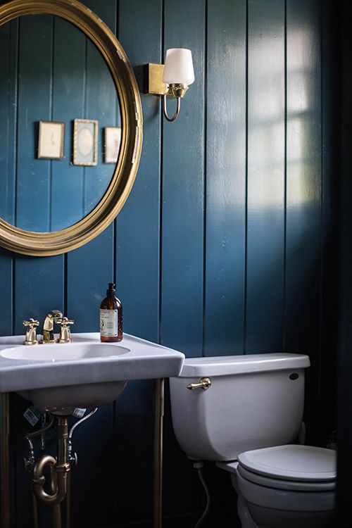
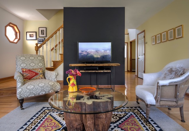
Dark blues, like other dark colors have been on trend for a number of years. Below we see a dark blue in the bathroom and as a living room accent wall.
Jersey Ice Cream Co
Blues pair well with warm colors like yellow, red and its complement, orange, very well.
Amy Krane Color
Exteriors
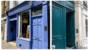
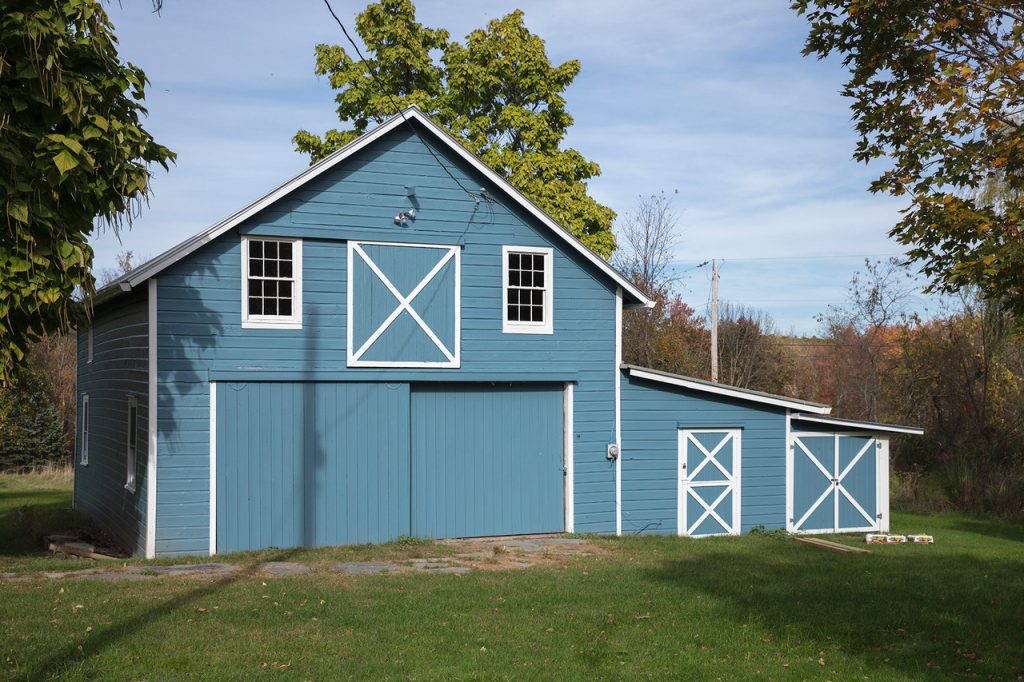
Statistics have changed on the use of blue on home exteriors. It used to be considered a handicap when selling one’s home. Now it can increase the resale value of a home. As colors appear much brighter when used on an exterior make sure to choose a toned down hue for your home. Desaturate or mute the color if it’s too bright. An exception is door color where people often throw rules away and just have fun!
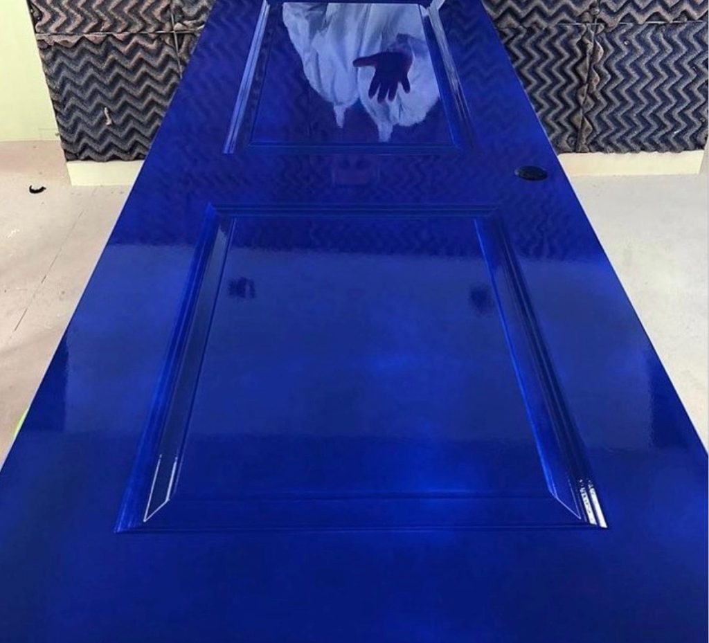
Hollandlac high gloss
Depending on what part of the country you live in a pastel or deep dark blue might be more or less appropriate.
Amy Krane Color
Since blue is so beloved it’s an easy pick if you’re looking for an unconventional color choice for a particular structure like the mid toned barn above.