
Amy Krane Color
Creating an exterior color scheme for multi-family buildings, especially in multi-building communities is a challenge all unto itself. The factors one considers, the process to choose and have the colors approved, the time line, all differ greatly from specifying color for single family residences. We’re going to review here what makes a successful exterior color palette for Coop, Condo and Apartment buildings.
What’s important when choosing exterior colors for large residential buildings?
Important factors to consider are where the buildings are located in the country. Are they in the South, North, East, West? What kind of weather and other environmental factors will the buildings have to stand up to and what will wear and tear be like? What style of architecture is it? Is it set in an urban, exurban, suburban or rural landscape? How high end is the community? What are the demographics of the owners or renters? Is the area a traditional one or one where younger residents may be living there and are more tuned into to current design trends? These all should give you helpful cues and guide you towards the right kind of colors.
Despite community variations certain concerns and practices should be universal.
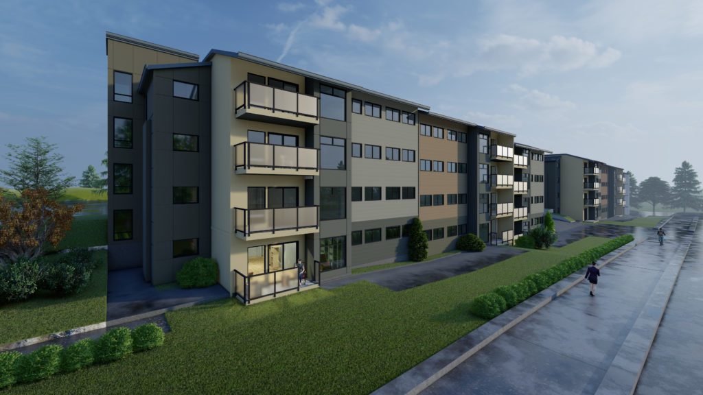
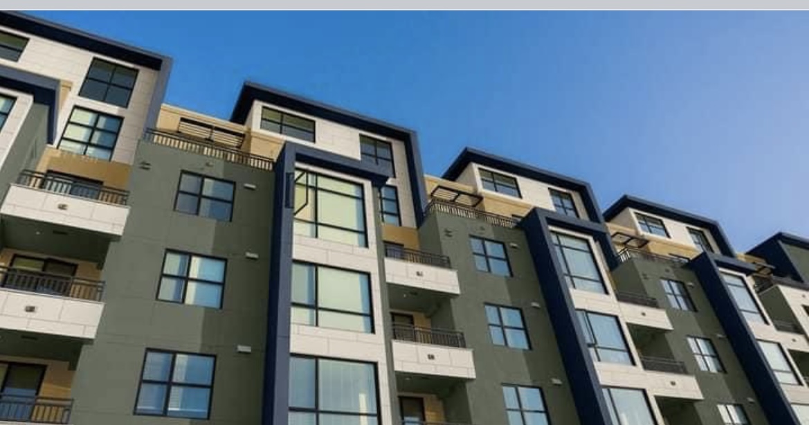
Using high contrast color combinations are very popular today for exterior multi-family color palettes. There’s nothing wrong with contrast to create pattern and beauty but just pairing a black with a stark white alone creates too much contrast. It’s best to add other colors of medium value to soften the overall look. The difference in outcome between adding neutrals like below versus bold vibrant hues is vast.
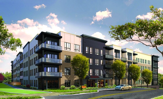
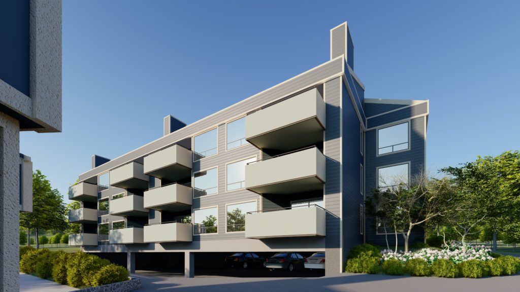
Grayson Flats
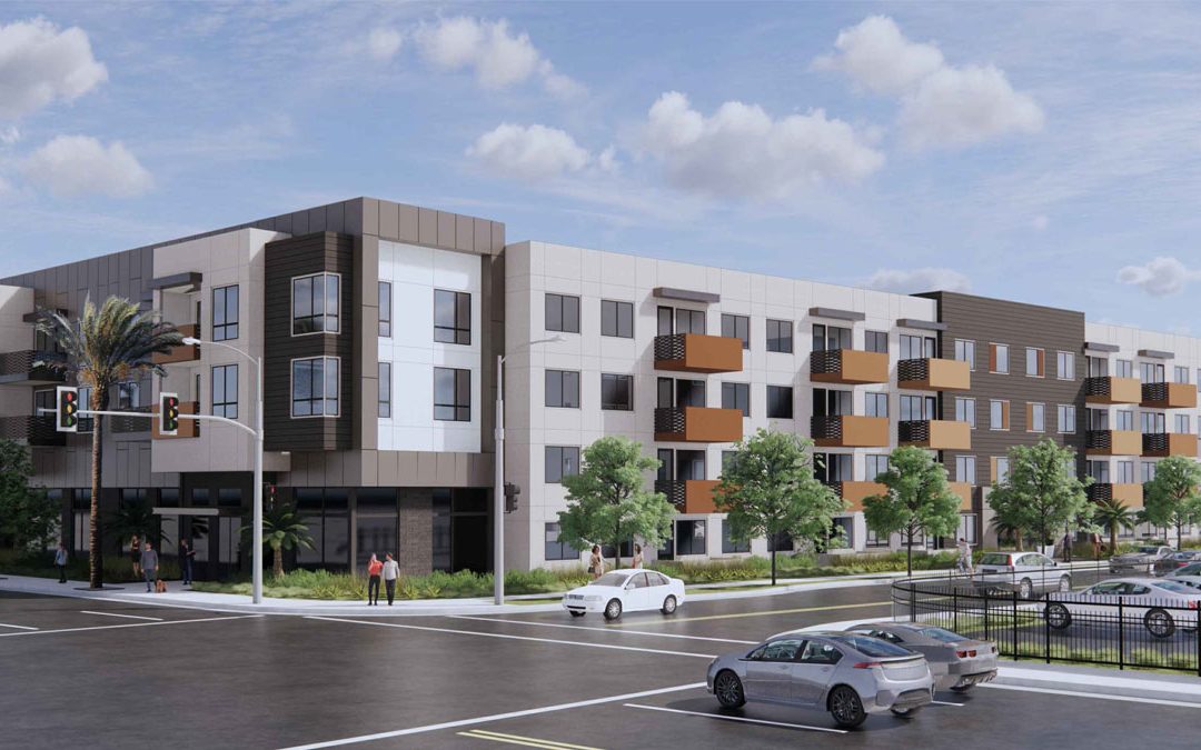
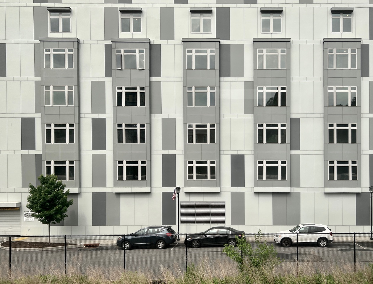
Miraflores
Be very careful that poppy bold colors don’t look circus-like and inappropriate for the environment.
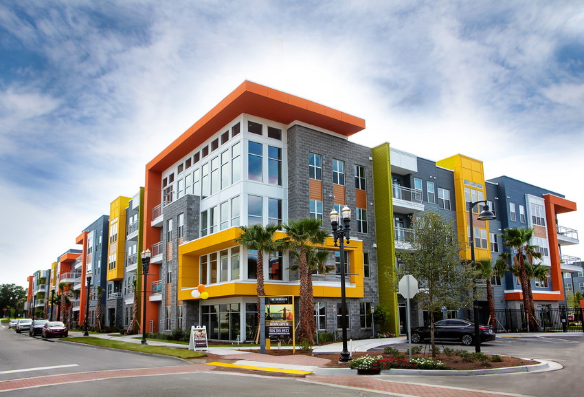
Brooklyn Riverside
Repetition creates the all important FLOW.
Some complexes contain many buildings and as you drive or walk past them you want the community to appear like a cohesive whole with a singular design sensibility. This is the case for picking a reasonable amount of colors and repeating them. Choose colors commensurate with its region. Turquoise won’t work in CT for instance.
Most buildings these days are designed with multiple surface planes. Color can reinforce the monumentality and physicality of a facade. As dark colors recede and light ones come forward choosing colors which reinforce this can help emphasize the form of the building in a very pleasing way. Color repetition can create an undulating experience as one views the buildings.
Sometimes the color palette is tight and small but the color values (lightness/darkness) are what creates the drama. This can work as well.
Local vernacular of building styles can drive the color palette.
These are dorms at Bowdoin College in Maine. Note the hat tip to barn architecture
hence the choice of deep red as one of the complex’s colors. It works!
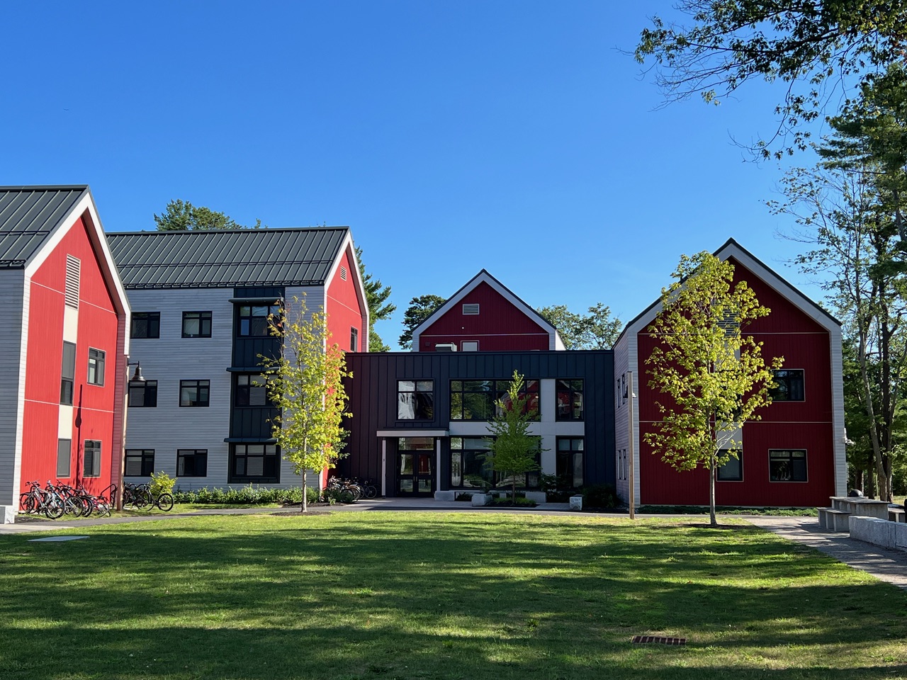
Lavallee Brensinger
You can choose a playful color to add whimsy but be sure to moderate its saturation so the color is not too bright and bold.
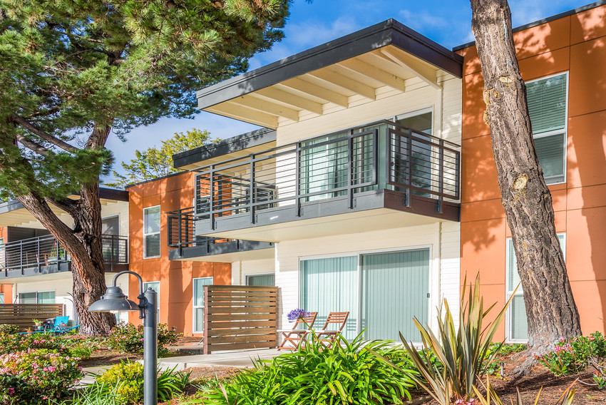
Waters Edge
Create Personality with Color
Amy Krane Color
A successful exterior color palette can create personality. It can speak to sophistication, monumentality, importance, tradition. Anything you want if chosen right! Want to hear more about choosing Exterior Colors for Multi-family Commercial buildings? Tune in to
Let’s Talk (paint) Color podcast.