
Color and Design by Maye Ruiz
Amy:
Color is the foundation of great design. It can settle a building into its landscape. It can make an unattractive structural detail just disappear. And it can change your mood in a room instantly. Welcome to Let’s Talk Color. I’m Amy Krane, architectural color consultant at Amy Krane Color. I’m a color expert and use color to transform spaces and products from the ordinary to the sublime. As a paint color specialist, realtor, and design writer, I’ve got my finger on the pulse of what’s happening in the world of color. In each episode, I’ll reveal best practices for choosing color by introducing you to masters of color for the built world. So throw out those paint chips, tape to your walls, and let’s get started.
Maye Ruiz is an interior designer, creative director of Maye Studio and one of the designers selected for the AD100 Mexico and Latin America list, which recognizes the most influential designers and architects in that region. Maye has built a career spanning residential, commercial and hospitality design, always embracing color as a powerful tool for spatial transformation. Through Maye Studio, she and her team strive to challenge conventions using color as a language of expression and design as an experience that transforms the way we inhabit spaces. Welcome, Maye.
Maye:
Hi, thank you for having me Amy.
Amy:
So happy to have you. Maye opened her interior design company in 2021. Was that in Mexico City?
Maye:
Yes, but that was pretty brief because when I started my own studio, I just moved to San Miguel de Allende. So I guess my studio really opened in San Miguel de Allende.
Amy:
For those who haven’t been there, I just came back. San Miguel de Allende is a small city of about 180,000 in the center of Mexico, about three and a half hours drive time from Mexico City. Its center is a World UNESCO site with its river stone paved streets, which was very difficult to walk on every day, and highly colorful buildings. It’s set in a landscape of semi-arid topography with cactus all around, and it’s the home of 40 % non-Mexicans, many of them retirees from the US, which makes it a very unusual place. Does practicing interior design in San Miguel differ than in Mexico City, do you think?
Maye:
Yes, yes. I think it’s different because the things that inspire you are really different. And I should say for me, the move to San Miguel de Allende, were really personal, really like part of my story because actually I am from Leon, it’s the same state that San Miguel de Allende is in. I moved to Mexico City for almost five years. And you know, when you move to one of the biggest cities in the world, your capital then back to a small town, it’s challenging and really moves your world, your entire world. San Miguel de Allende is a good opportunity for interior designers and artists. Guanajuato is a really conservative state, but San Miguel de Allende is rare. It’s totally different. It’s a pretty, small town with really deep traditions, but at the same time, it’s pretty international. I mean, a lot of people from Canada and the U S come here to retire, but at the same time, they are more open people. People are more related with the world of art and design and creative people, you know? So the community here is really artistic. And I think that influences my current work totally.
Amy:
Would you say more of your clients are foreign or Mexican right now?
Maye:
Yeah, actually half and half for commercial projects like restaurants, bars, and things like that. They are more Mexicans. But for residential, all of them are foreigners.
Amy:
And do you think they know about you from word of mouth or from all of the fabulous magazine exposure you’ve had recently? How do they know who you are?
Maye:
Well, actually, I just started to design homes.
Amy:
Because I should say for most of the people, it’s kind of scary that a designer is so colorful and color driven and that they would design their home because a lot of people are a little scared about color.
Maye:
Yes. Here too. Absolutely. So this rare small town helped me because the nice thing here with houses is they are not the, the principal home. It’s like their second house or third house and they don’t live full time here. So they are more open to experiment with color and style and try a Mexican design. We did Casa Coa, we’ll talk about that later. Right now we have a new client also here in San Miguel. They are also more open to color and they both are more open to Mexican culture, to experiment. But I mean, it isn’t their primary home. So they’re more open to that.
Amy:
Yeah, it sounds like the perfect opportunity to introduce people from a different culture, a northern culture that is not used to that much color and that kind of color, to dip their little toe in and see what it’s like. One of your most memorable quotes is, “Mexico is not beige.” I love that. Would you say that your use of color in interiors, the number of different colors, how saturated they are and their placement, reflects a popular approach amongst interior designers in Mexico or is it kind of more unique to you?
Maye:
Okay, I think I am part of a new movement because for a while the Mexican movement was more oriented to look like Japanese and also pretty neutral, like black and white or maybe earth tones. I think for years and years all around the world, people related to it. Mexico likes earth tones and at the same time people thought folk arts were more about bad taste. But I mean, I put bad taste in quotes because I don’t believe it, but right now, not just me other designers and other artists are changing this. And I mean, I think it’s a movement that started years ago since Barragan. Of course. Or Chucho Reyes, and all these people that brought colorfulness back, you know- the Mexican pink. This a super Mexican color and all of these colors came from the folk arts. I think I’m part of this movement and this movement makes sense to me. We’re not a minimalistic culture. We are a culture of color.
Amy:
Do you find that with, at least your residential clients, you are still needing to push them to be more colorful? Or do you feel that once they’ve hired you, they kind of know where your head is and where your design intention is, and they accept it will be very colorful?
Maye:
Yeah. I mean, this is a journey. And when I just started, I had to push more my clients because at that time I didn’t have a book of work. Didn’t have projects to say this is what I do and this is my vision and this is what I believe. For me color is a devotion, it’s like my faith, you know? So at the beginning it was hard. But I think every project gives me more and more of this color language. And actually, a few weeks ago, I had an interview with a potential client and they asked me “but what about color and what about neutrals”? And I told them “every color has their own projects. For example, people relate me with red and it’s one of my favorite colors and I love it. But I never say “I want all the houses red or all the houses are a certain color.” Totally not. But I told them I always look for (places to put) color because this is my vision and this is my mission. So if you’re thinking about a neutral project and working with me, honestly, it doesn’t make sense. Also for me, if someone is looking for me and thinking about neutral colors since the beginning, I think we’re not a good match.
Amy:
Understood. How do you think starting your company right after the lockdown. I don’t know exactly what months Mexico locked down during the pandemic, but if you started in 2021, we were really in the sort of beginning of the pandemic. How did that, did that influence you coming back to your home state of Guanajuato and why you wanted to be close to home? And how did that affect launching your company in the middle of a pandemic?
Maye:
Wow. Well, I mean, the pandemic was awful, but for me, it was like an awakening, like changed a lot of things for me because I used to live in Mexico City and I used to work for, for another firm. I used to work with Andres Gutierrez. He’s also pretty colorful and I think we have similar vision and similar values in design. I really admire his work. The COVID pandemic exploded in Mexico in March 2020. And that time I still worked with Andres that whole year, the whole 2020. At that time my apartment was red, everything, like the ceiling, like a full red apartment in the middle of the chaos. But I mean, it was a good experience being there. But also for me, it was like an awakening to… answer for myself what do I want for my career. Should I stay, like the song, or should I go? Yeah. And I decided that I wanted to go out of my comfort zone and look for, look for my own language in design because I work for Andrés for so many years that I was confused -who I am regarding design? What do I want to say? So in the middle of the chaos, I started. My very first projects were really interesting because I was working for Andrés’ firm, but at the same time, during COVID, I started to work with people from all around the world, people in New York, people in Austin, people in Amsterdam.
Amy:
How did that happen? Through Zoom and through people I met because all those people were inside their places. And they were like, Maye helped me to choose a color. Okay. So I had meetings through zoom, consultations, little projects, but it was really inspiring for me. For example, I remember a couple in Amsterdam, a couple of women and I recommended to them super warm colors because you know, Netherlands is gray almost all year long. That completely changed their experience with this lockdown. So it changed their lives in a positive way, just through paint. During that time, in these consultations, I asked them to let me know what is the paint brand they use because you know, n the different brands, it’s totally different languages. And I am familiar with Mexican brands, but not brands from the Netherlands and things like that. So I chose colors and also I asked them for links to stores they can afford it. So I helped them to choose furniture from different brands, even not inexpensive brands like IKEA . And it was teamwork and it was really amazing to me. It opened my eyes to say like, okay, maybe I’m ready to look for my own journey and my own language. So I decided in 2021 to start with my own office after that.
Amy:
Okay. Two questions about that. So if you were specifying paint colors in these other countries, did you try and get your hands on a fan deck of those paint brands? How did you pick the colors?
Maye:
I picked the colors through my laptop. Yeah, digitally.
Amy:
Oh wow, colors online are so inaccurate! They’re really different.
Maye:
Very. It was a challenge for both of us because these people had my help, but at the same time, they had to create proofs for me. Like I tried with this color and doesn’t work. I’d say “Okay try this or these samples.” But at the end, the results were amazing. For example, in a house in Austin, a residential house. It was a house with good taste and everything, but everything was beige. So it was amazing because the client didn’t change the furniture. I mean, two pieces, two lamps, little things. But the only thing she changed was the paint and the house was completely changed. And it was amazing because the people sent me videos like… eating during the dinner with our guests saying “thank you, Maye, our place changed totally.” And other things I found out during the COVID lockdown was it’s really important to have surprises in your place. At that time, we spent all day long in the same house. So it’s refreshing that when you get in your room, it’s another color, it’s another ambience, and also it helps you to disconnect from the living room or from the office, you know?
Amy:
Right, right. From your workspace. Absolutely.
Maye:
You need some change, even if you have a really small apartment, I think it’s important that the spaces help you to have different worlds. And change the mindset.
Amy:
So if these were the earliest projects you did during that first year, again, I ask you, how do these people find you from Amsterdam and Austin and wherever?
Maye:
Yeah. These people from the very beginning, they found me through friends. For example, this woman from Austin, her daughter is my friend and she recommended me. From people I knew. That’s how I started. Then I decided in 2021 to start with my own company. And it was really curious because my very first three projects where shoe stores. And it’s funny because I am from Leon and Leon is a shoemaker. In Leon, everything is about leather and shoes.
Amy:
Do you work on more commercial or residential projects right now?
Maye:
Most of my projects are commercial. Not, not that much are residential, but I should say I enjoy residential. But the people in charge of commercial projects are more open to color, to experimentation, to wild things.
Amy:
Right. I wanted to ask you about that. How much leeway, how much ability to really design the space the way you see it, are you usually given in a commercial project? Do the owners come to you and say, I want this vibe, or do they say, I hate orange? I mean, how much direction do they give you?
Maye:
Yeah, well, they come to me and the information they give us,, the idea of the business is very important because also in commercial design, you have to think about an experience more than, okay, I want an orange space or I want a yellow space, etc. To design for a brand, you have to design for an experience because it’s not the same if you are, if you design a breakfast place than a bar. So you start to design with the information that the clients give you. At the same time, I should say a lot of clients. don’t have the full idea. But the design process is really helpful because I give them a lot of questions and they are like, “oh my gosh, I don’t even think about it. “
Amy:
Right, right. Yep. Absolutely. It’s a good way to help people who don’t normally think about color refine what their thoughts are, what their desires are.
Maye:
Exactly. Yeah, it’s a good experience for them.
Amy:
I saw a photo of a bar /restaurant called Carmin. You designed in Mexico City where the room was blue, red, maroon, and green. Really bright, saturated colors all together. Do you think for spaces where we spend less time than we do in our homes, that it’s more of an opportunity to combine strong colors and create a really powerful look? Do you tend to be more adventurous in that respect because of the short time we spend in these places?
Maye:
Yes, yes. And I think for a commercial place, I like to be bold because I think you need to push more. I like trends and I follow trends and I like to investigate about trends. But for example, in the last years, this trend about Japandi or this gray and beige trend, to me, everything looks the same. You could have a spa or a restaurant or a hotel and everything looks like the same. So to me, these bold colors and this bold design and these bright colors is an opportunity I offer my clients.
Amy:
Right. Something really exciting and different and very bold. You know that here, North of you, neutrals still make up the backbone, we say, of design in most people’s homes here. And it takes some pushing to get people to be at least a little adventurous to include more color in their home. I feel that if a home is all neutrals, it’s pretty boring. But I… Personally, when I design, I use neutrals as a rest for the eyes, because otherwise having one bold, bright, saturated color right next to another can become overwhelming, at least for our sensibilities here. And I find it really fascinating, I’ve seen pictures of Casa Coa and it’s bold and I’m looking at you in, I guess it’s your office, but that’s a pretty fabulous and powerful color on your walls and your ceiling. It kind of looks like orange from here. How often do you use neutrals in a residence? And I feel you probably use it differently than I do or we do here. Explain to me why you would include a neutral in a more colorful home, where you would put it, how you would choose it, that kind of thing.
Maye:
No, I totally agree with you that design in homes and in general needs rhythm, needs pauses, need different notes, needs extras, needs characters, like a movie, like different roles and not everybody is a principal and not everybody makes a statement. And I think this is really important because yeah, we want places also for rest, not dancing all the time, you know, like a bar. Right. I think I start always with color and I add the neutrals later to balance. For example, in Casa Coa, the sofas are beige. To balance the different tones. Maybe (one can ) use just bright accents and then mix them with more… pale colors or not saturated colors. Yeah, balance. To me, it’s important to balance color between bright and more neutrals.
Amy:
What about wall color, though? Do you include more neutral wall colors in a house that has many powerful bright colors, or do you keep the walls all very intense and use your neutrals maybe in tile floors or in a sofa, that kind of thing? What about the walls?
Maye:
In my own experience, I think I have more neutral furniture and I like more of a “wow” effect changing the wall colors. So to me, I love bold colors, bold walls, and I think I like more neutrals in the more basic furniture. So yeah, I think I prefer bold walls.
Amy:
Got it. Okay. I read that you chose the color of the year for the paint brand, COMEX. And when I was in San Miguel, I went to the Comex store and I got a fan deck. Very interesting, of course, to see the colors offered in a country whose culture is so different. Whereas here, more colors would be muted, softer, muted, grayed down colors. In the Comex fan deck, of course, most of the colors were clear. Clear, not muted, more saturated color, even if they were lighter, they were clearer, bolder colors. So interesting to see that difference. So how did that come about and what color did you pick and why?
Maye:
Yeah. Well, I choose the color of the year for COMEX in 2020, in 2022 and the color of 2023. And in that time, we choose a color called Molly. The color was like a lilac. But not saturated. It was kind of lilac, but with a little of gray in it. And also, I think about trends, it’s the color of the year, which is a big responsibility to name a color for a whole year. I think you have to talk about something. You have to talk about a timeline, like something has happened in your world. In that time, we choose that color. Because it was a color not feminine, not masculine. It was a color more about flow. And it was actually like just when the world started again after lockdown, super crazy. And also, this color talked about identity. I mean, right now in the U.S all these issues about identity and trans and feminine and masculine are a thing. I mean, people are obsessed with it right now. We love this color because it was a color that was good company for other colors. Actually, this color didn’t try to be a principle. And it was a color not bold, but at the same time, not that boring, like a rare color because it was this kind of color that depends on how you combine it That would change it a lot. And yeah, it was really interesting for flow and choosing a “middle color”. Like a color more… not a binary color. It was a bridge, a bridge to other things.
Amy:
Very interesting. So was Casa Coa, which ended up in Architectural Digest, which is a residential house right in the center of San Miguel de Ande, was that the project that launched your company sort of more internationally? That’s how US magazines found out about you. Talk about Casa Coa. What the challenge was, how it was to work with those clients and how do they feel about all the press that you’ve gotten for it?
Maye:
Yeah, think Casa Coa is our most published project ever. And it was the first house we made as a firm. Actually, I didn’t expect all the press to be honest. And yeah, these clients found us through another project here in San Miguel called Casa Arca. A hotel.
Amy:
I almost stayed there.
Maye:
Okay. Well, we designed the lobby restaurant in the courtyard of the house. And we designed that restaurant which was inspired by a Mexican kitchen. And I think in this project, we achieved a traditional Mexican, but at the same time, updated design. So through that project, the clients from Casa Coa contacted us and said “we just bought this house.“ They live in Melbourne, Australia. Far, far away. And they came to San Miguel de Allende and they fell in love with San Miguel de Allende and they bought this house. It was a beautiful house but with no personality at all. Just a big San Miguel de Allende house, but pretty generic. And they contacted us and they said “we want something similar than Casa Arca. Like Mexican, traditional, but at the same time, young, bold, new and we want green color on it.” Oh, okay. They wanted green for it. So we started with this information and yeah, we started with greens, but then it felt we needed more warm colors. I truly believe in this Genius Loci idea. Like the protector spirit of the place tells you what it should be. Yeah, because a lot of people ask me, okay, what is your methodology to choose colors or how do you start and things like that? And I don’t know if the process is always the same, but I should say that a lot of the process to choose colors, is pretty like instinct. You see the space and you immediately know what it should be. I don’t know if immediately. Okay. Soon after. Sometimes it takes more time and takes more samples. I think that the place just talks to me. So we started for Casa Coa thinking about green, but during the process we added this kind of rare color, it’s like a mix between pink and brown. You see the color pretty differently depending on the lighting, but that helped us to bring to the house a super warm experience and also kind of moody.
Amy:
Maye, was it custom or a color that existed from the paint company?
Maye:
No, it was a color that existing from COMEX actually. And yeah, we made a lot of proofs and I should say to me it’s easier to choose warm colors. I think that the cold colors are more difficult actually. For example, for the living room and for other rooms, for other green rooms, it was harder. And we has to make so many samples to choose the right colors.
Amy:
It’s not your personal natural language, those cool colors. What about the color of the exterior? I thought that was fantastic. It was also sort of, it was pink, but it was so much more than pink. Is that a color that was custom or from Comex?
Maye:
No, from Comex. Yeah, actually Comex has super good colors and I like the brand because I mean, at least in Mexico, they talk more about color than just paint. And also for a country like Mexico, which is a color culture for a lot of people, it’s difficult to choose colors. So Comex really works with designers and artists and tries to push people to choose more color. And I think this is amazing. And also, for example, you know, people like graphic designers and people like that have Pantone and the RGB codes. But for example, here in Mexico, the color code, the Comex color code, it’s more friendly. I mean, I work with artisans from Oaxaca. And it’s like ”I want this blue” but what blue, right? I mean the color is not generic. So it’s pretty amazing that I can talk with these people from Oaxaca or from other small towns or cities around Mexico. And we both can have the same Comex colors. It’s a standard language that you can all speak. So for me, the carpenter or the artisan that make rocks and things like that don’t have a Pantone catalogue. They go to the paint store and we talk the same language.
Amy:
Oh, that’s interesting. So actually the Comex catalog here in Mexico, I think is really… More important than just a paint company because it’s the standard that you can all, the constant that you can all look at and talk about and design from.
Maye:
Yeah, and not just for paint, also for textiles, for carpentry.
Amy:
That’s so interesting. I’ve heard you say that color is about democracy. It made me think about something I tell clients all the time, which is if you’re wanting to change your space and maybe your budget is limited or you’re afraid to do too much, a color change is the most economical way to make the biggest impact in a space. What did you mean by color is about democracy?
Maye:
Yeah, it’s the same as you talk about. And for example, I love and I get a lot of inspiration from neighbors who are not super luxury neighbors. And I love the freedom of these people that just choose colors because they like them. And also, as you’re saying, they don’t have so much budget. For them, it’s everything. The change of color is everything. Because also it’s not, for example, it’s not the same white drywall or white marble. Also, if you choose neutrals, you have to put expensive materials, more texture, more statement pieces.
Amy:
Good point. Yeah, absolutely. Absolutely.
Maye:
And with color, you don’t feel in a white box, you already have a layer. It’s not a super expensive layer.
Amy:
Yeah, yeah. That really makes sense. The world is such a crazy place right now. I’m sure you follow the news and what’s going on here. We’re not going to get into politics, but it’s crazy on every front. But also, it feels like a very dangerous time for so many reasons in so many countries. And at a minimum, you know, our economy is probably about to tank, as we say here. Do you, are you feeling any change right now in the number of people reaching out to you, residentially to work on their houses? Are you feeling any reaction to world events in terms of more business right now or less business right now? I know it’s difficult to identify what exactly the thing is causing that, but I sometimes feel that when the world gets really scary and unreliable. People like to change the color in their home or change something. It’s a little bit of escapism. It’s a way to get away from the world’s problems and concentrate on making your home more fulfilling in every way. Make it exciting or tranquil. It’s a refuge. And I just wondered if you were seeing a different amount of business right now.
Maye:
Well, right now in Mexico City and all around Mexico, Mexico is getting pretty popular and pretty trendy. So right now we’re having more commercial projects. But talking about homes, I think this happened to me since lockdown. As we’re saying, I think since lockdown (and now still happening with the Gaza war) there are a lot of sad things in the news. But I think for people since lockdown, they’ve gotten more aware of finding their inner peace and your home helps you. Because it’s like your happy place or your hidden place.
Amy:
Right, your refuge.
Maye:
Yeah, exactly. So I think since lockdown, this idea of a refuge changed a lot. And also, San Miguel, it’s a refuge to a lot of people because it’s an international place. The things that happen in the US impacts this little town so much. So for example, a lot of people that do not agree with the administration move to San Miguel. Or say like, I will spend more time in my San Miguel place or things like that. And also, I love the freedom with color that people experiment with here. Because, for example, in other rich neighborhoods from all around the country, people have this idea that good taste has to be beige or has to be gray. There’s a stigma to the very colorful still. But not in San Miguel de Allende. It’s like, no, the trend is San Miguel de Allende is being colorful. And actually, for example, in downtown. They have a certain color palette. You couldn’t paint other colors.
Amy:
I saw that. So that’s amazing.
Maye:
And yeah, that pushes people to respect color. To embrace colorful interiors as well as exteriors.
Amy:
Absolutely. That’s so interesting. Just a couple of more questions just about how you use color. We’re looking at our two rooms. This is my home office, that’s your office. I am about to paint my ceiling, not green, but another color, sort of a rose color. But generally I have to fight to not have clients choose a white ceiling. I’m looking at your room. Orange walls, orange ceilings. So, there’s my question to you. How often do you, again in residences, paint the ceiling the same color as the walls or another bold color as opposed to white or off white? I bet there’s no white in any of your places.
Maye:
Yeah, actually, Never say never, but I never make the ceiling whites or neutral.
Amy:
Well, you know, it’s not just about the fact it’s white. It’s about with color on your walls and white on your ceiling, you’re adding immediate contrast and you’re adding contrast in a place that you may not want. Like why draw attention to your ceiling? You know, but there’s the contrast. Do you often paint your ceilings a different color than the walls or do you pretty much keep them the same most of all?
Maye:
Yeah, I’m looking for an immersive experience. I like when the ceiling and the walls are the same or similar colors or harmonious colors because to me it’s more immersive. I think when the ceiling is white, for example, it’s like a disconnection.
Amy:
Okay. Yeah. Yeah. I see what you mean for sure. I agree with you. What about a dark room? Now, in San Miguel, you’re in Mexico, there’s sunshine all the time. Buildings have high ceilings, which is fantastic. You have rooms with high ceilings, but you must have encountered rooms that are dark, lacking natural light? So no windows or few windows or something like that. Do you have a specific approach for handling wall color for dark rooms?
Maye:
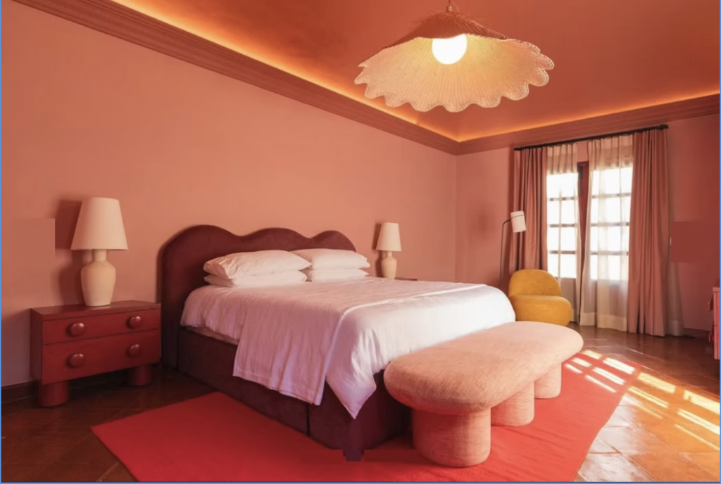
Yeah, I think it’s more difficult because actually right now I just changed my bedroom color. It used to be an orange, like a dark orange color, but doesn’t make sense to me and we need more lights. And now we changed the color to pastel green.
Amy:
Ah, I love green. Okay.
Maye:
It’s like similar to your studio, but your studio, it’s a little more yellowish. My new room, it’s more, a little more blue, but a balance. And this color brings us more light, but at the same time, still has personality. And also I think the match is super important.
Amy:
What do you mean by that? What kind of match?
Maye:
The way you combine colors, for example, in my room right now, the color could be a little childish. Okay. So we mix with sexy colors. The bed is burgundy. All the blankets and the sheets are brown. Well, right now the brown is the big color story in the world, you know, it’s the trendy colors. But also we have red night tables, red lampshades. So these super sexy colors help us to not have a childish room. This is super important because for me, for example, right now my home, my living room is orange, but it’s super important how you balance these colors. It’s all about combining. You need other cool colors to make the balance. Usually I love contrast. Also in my life, I think I am an extreme person and I like the contrast and I like how the colors, the combination of colors change the color itself, the shape of it itself. It’s like Joseph Albers, his work. I mean, there are squares of colors but… the color changes, when another color is next to it. And I truly believe in this. So I think in interior design you have to analyze or be aware of the, the big picture. Because it’s like, maybe this wall doesn’t make sense to you, but with the furniture, with the stone, with the curtains. I mean, with a big picture it will make sense.
Amy:
Absolutely. No color can be evaluated in isolation. It’s always about what it’s next to, for sure. Maye, this has been so much fun. Thank you.
Maye:
No, I’m super thankful and I really enjoyed talking. I love to talk with people that love color as much as I do and see color with special eyes this passion. So it was amazing to talk to you about color.