
Colorful Brooklyn
Amy: Color is the foundation of great design. It can settle a building into its landscape. It can make an unattractive structural detail just disappear. And it can change your mood in a room instantly. Welcome to Let’s Talk Color. I’m Amy Krane, Architectural Color Consultant at Amy Krane Color. I’m a color expert and use color to transform spaces and products from the ordinary to the sublime. As a paint color specialist, realtor, and design writer, I’ve got my finger on the pulse of what’s happening in the world of color. In each episode, I’ll reveal best practices for choosing color by introducing you to masters of color for the built world. So throw out those paint chips, tape to your walls, and let’s get started.
Since I’ve hosted this podcast, I’ve had the privilege of interviewing designers, educators, museum directors, thought leaders, and other people whose life’s work touch on color for the built world. But none were people I knew. This episode is different, as I have the pleasure of speaking with a friend of 40 years. Regina Myer is a leading urban planner in New York City, where she’s had an extensive career revitalizing neighborhoods and creating new open spaces. She currently serves as the president of the Downtown Partnership, where she’s leading initiatives and securing funding to improve downtown Brooklyn’s public realm: upgrading the infrastructure, creating open spaces, and cohesively connecting the district to adjacent neighborhoods. Until 2016, Regina served as the president of Brooklyn Bridge Park. During her nine years overseeing the park project and historic public investment into one of the largest public works in the city, Myer oversaw the dramatic transformation of 1.3 miles of industrial waterfront into one of New York City’s most popular destinations and one of the most lauded urban parks in the nation. Regina was also the Brooklyn Borough Director for the New York City Planning Department. She received her BA and Master’s in Urban Planning from the University of Michigan and resides in Park Slope, Brooklyn. Welcome, Regina.
Regina: Welcome, Amy.
Amy: So let’s start with U of M, a place which we are both alumnus of. In your master’s education, how were you taught to think about color of architecture for a city? Was it taught at all in your curriculum?
Regina: I am not remembering color being a part of the curriculum. Urban design certainly was. And given that we were both in school a while ago, I remember definitely the emphasis on urban design was the form of cities. And this was the eighties. So it was a very interesting time to consider form because we were really in that period sort of post post-war, say, where modernists had really, really imbued design of cities, right? So in a place like New York City, course, buildings like the Seagram Building or Mies van der Rohe’s other projects here or Sixth Avenue were really sort of what we were still sort of digesting as form. Same in Detroit, same in Boston, same in Philadelphia, obviously different projects where the conversation was about form plazas, towers, public spaces. But the other thing to think back at at that time was there wasn’t an emphasis on on nature and public space that was more organic. And so when I think back at that time, am thinking of all these amazing water features, polished granite, very, very, very, very formal spaces. And it’s funny to think of that, of course, how much that has impacted the form of so many cities, but not color per se. I’d say that in those cases, It was about materiality.
Amy: Do you think cities should be more deliberate about color as a planning tool or is it better left to architects and building owners?
Regina: You’re asking a good and I think huge question. There are certain cities that have used color very, very impactively, especially smaller cities where they’ve sought to bring back a commercial corridor and they’ve been specific about color and form in order to evoke a period. I can think of a lot of places, historic towns where they want to say evoke Mediterranean feel and they’ll choose those nice yellows or nice blues. But in a city like New York or even a typical Northeastern city or a industrial city, Color really hasn’t been specified, right? We have building classes that definitely fall into different colors, right? When you think of the great art deco buildings of many of our cities, right? Many of them are different forms of brick. They’re very warm looking. Other pre-war forms also very warm, a lot of brick. But then of course, a lot of civic architectures, a lot of stone, so it’s a lot of gray. But whether or not you really think those should be specified, my instinct is for the most part, leave that to architects and owners to distinguish design. I think even when we look past at the brutalist era, which had an impact upon a number of our cities. You know, was the use of concrete and sometimes brick in certain sort of creative ways that have added flavor. But should that have been deliberate? I don’t know.
Amy: Right. It’s eclectic and buildings built in different eras with different emphasis by different people. So I think in a way you’ve answered this question. Are there any specific guidelines or regulations around building color? Is it at all part of the formal planning and approval process? Do you regulate that at all?
Regina: Well, in New York City, I’d say the closest place that’s done is through the landmarks process. Because when a building is built in a landmark historic district or a landmark is being changed or renovated, the landmark commissioners definitely consider color as part of their deliberation. And that obviously New York City landmarks are a big deal um for our city and the consistency or their transformation um is considered very carefully by the Landmark Commission. And you could imagine, know, tons of examples of that where people focused in on exact colors. But the rest of New York City has a zoning code that is really about function and density. And that has given architects, owners, other urban designers great leeway in color. And of course, now that we can say there is so much new development, especially in New York City and other cities, really been a shift in materiality, right? We’ve gone from a lot of stone, a lot of brick. to a lot of steel and a lot of glass. then of course, building construction has changed so much. oh a lot of this comes in panels, right? It’s very prefab, it’s being trucked in overnight. And sometimes developers use color in those buildings. Sometimes they’re successful. But should that be regulated? My instinct says no.
Amy: Okay. So if a developer wants to build something that, in fact, is a shocking color, nowhere in the process would your department, well, when you were in city planning, would a department step in. And I’m not saying it’s ever happened, but, you know, a hot pink and a chrome yellow building, whether it was made of glass or… stucco that’s painted or anything at any point in the process does the city say wait a minute!
Regina: You know it could if that project was going through a review process of any sort I just don’t really remember a specific example. You know at different times, projects where the buildings were a new form has gotten people excited and you know been provocative. I’m remembering a project in Astor Place that is the first sort of really curvy building near Cooper Union that was heralded. But then I can remember once it was built, I think somebody said to me, should we do Amoeba again? So I’m only saying that because really, you know, at the end of the day though, when buildings are like that, that are a little bit different or creative or do something out of a norm, they do distinguish themselves. Whether people say they’re great. may or may not matter because in a city as dense as New York City, it’s also very exciting to see a break in the form because we have so many blocks of consistent form that when you have a break in the form, that can be a huge relief, right? You know, the funny thing about a dense city like ours, there’s two ways to observe the city. One is the way most people do on the street, where they’re walking to, where they’re walking from. when they’re going to the train. That’s really the way we observe. Another place we observe, of course, is Skyline. And so everybody has their image of Skyline and of course that’s changing or long views. So those are the two places. And when you think about it in terms of the street, so many things in addition to buildings have color in them. And so designers, owners, stores, advertisers are all adding to what the color is in our city, whether it be signs in stores, or advertising, street signs, signs to get to transit, all of those things are really the part of what’s palette of New York City is from my perspective.
Amy: So really was an organic growth over time? Each element, each entity, there was no whole, even if you went down to a microcosm of a small neighborhood, there isn’t an overriding design aesthetic placed on top of it that would involve color? Each element. grows over time and different people are responsible for it.
Regina: Totally. I mean, I’d say like when I think about my neighborhood in Park Slope, it’s highly regulated as a historic district. And when you file plans to change things, the color is a part of the review. For instance, on my block, window [sashes] have to be black. And if I painted mine white, they come back to me and say, that’s no good. That’s an offending item. So there you have it. In that case, color is important for that landmarks review.
Amy: Got it.
Regina: It’s also, you know, when you think about choices, when developers or owners have large sites, their team is making color choices. And, you know, so that’s sort of interesting too when you’re the one on that side.
Amy: It also makes me think about buildings which go up, which for whatever reason are built, let’s say residential, are built for a certain demographic, let’s say a younger demographic. This is sort of a blanket statement, not particularly in New York City, but oftentimes in other cities, more attention is paid to color and arresting color and standout color when a building is geared towards a younger demographic.
Regina: That’s interesting. I would buy that.
Amy: So do you think we should distinguish between residential, commercial and municipal buildings when considering color for exteriors? Is that something that you think, I mean, again, you’re sort of saying the city’s not really involved, but do you think from a designer’s, builder’s, architect’s standpoint?
Regina: Well, I think that there’s certain norms that the design community adheres to, which is sort of interesting, right? Especially when it comes to municipal or civic architecture. You know, most of our courthouses and civic buildings are stone or use that palette. I’d be shocked to see a totally brick courthouse, though I’m sure there are some, but there’s just certain norms about that. Residential, I think has changed, right? They used to be just sort of the browns of bricks. But as we’ve gotten more modern, that’s changed. And I think there’s been an evolution there of developers using variety of colors and um especially with panels too, right? That’s given them the ability to bring in and click in frames of new color. And sometimes that’s been really effective. mean, there’s a building right behind um Barclays Center on Dean Street.
Amy: Barclays is colorful, isn’t it? I haven’t seen it in ages.
Regina: Yeah, well, Barclays is Corten steel. So it’s rust.
Amy: Right. um very cool, right?
Regina: It’s really, really had a huge impact on downtown Brooklyn. But then there’s actually an apartment house behind it, the sort of an L-shaped building that sort of hugs one corner of the Barclays Center. And it’s red and they used red panels on that. And that was Shop architects. They’re located here in in lower Manhattan. And, you know, I respect those decisions. They found a red. It’s not a glaring fire engine red, it’s a little muted, but it’s still a bright red that distinguishes that apartment house on a site that is balancing itself with a huge arena use. That was a cool decision. And I think Shop Architects has done that in a number of their other projects. And honestly, it’s been copied as well.
Amy: You know, I think about traveling to and from the city, which I do much more than traveling in the city these days. My ride along Amtrak as I’m approaching the city, coming in through Yonker and parts of Westchester also. And as the train’s passing, there really are very large multifamily apartment buildings now, whether they’re condos, co-ops, or rentals. And they are absolutely using panels and using panels colorful panels often and creating patterns with the colorful patterns which really affect how you experience the building more so moving quickly from a train or a car than walking past because you get that undulation of color as you’re moving past it you get a pattern being created and repeating as you move past it so I think that in terms of using color and building I’m in agreement with you that panels have really been revolutionary and just open up open up the choices that there are. Do you remember any time when you were the director of city planning in Brooklyn where color became an issue between your department and the builder?
Regina: There was one time, it wasn’t at a staff level, it was at a commissioner level. And what had happened was, but it was very much in the mode of what we were talking about earlier. The Brooklyn Law School sought to expand with a new dormitory. And they hired Robert A.M. Stern to build it, who of course is phenomenal. He has passed this year, but he was phenomenally qualified. But one commissioner questioned his use of the combination of stone and brick because of the other civic buildings on the street. And I have to say, Robert A.M. Stern did not take that lightly. You’re talking about really one of the great architects of our era. um And he did build a very handsome building. But I do remember one commissioner saying, well, maybe that oughtn’t have brick. Now he felt that should have brick because it was a residential use. He had a perfectly great answer. But he said, I’m not, this building is the dormitory for the Brooklyn Law School. It’s not a courthouse or a legal building. And so he felt very comfortable in that decision. And I do remember that clearly. I really don’t remember any other conflicts like that. There is one thing on the zoning code, I think it’s been since updated, but it was a product of community revitalization here in Brooklyn. And that is the Atlantic Avenue corridor near Brownstone, Brooklyn. That neighborhood in the eighties and seventies wanted to be denoted as a historic district like Brooklyn Heights and Cobble Hill. The commissioners then felt that there wasn’t enough great buildings on the corridor to denote that. So they deferred to the zoning code and actually had zoning code written specifically for that corridor that specified a paint palette.
Amy: Really?
Regina: Yes. The thing is that was such a silly thing to do. There’s no way our buildings department could really get down to correctly enforcing this. There’s so much pressure on our buildings department here in New York City. Could you imagine a building enforcer getting the correct chips from Benjamin Moore? So anyway, we laugh about it because when you think about neighborhoods, a small residential scale, one of the things that people do if they’re not in a highly regulated area is differentiate their homes with things like door colors. And we’re not surprised as New Yorkers to see that. It can be done beautifully.
Amy: Oh, absolutely.
Regina: So it is funny that one district sought to regulate that. But, you know, I’m always happy. Like, I can’t paint my door a muted dark green. Or I could get it reviewed and maybe they would approve it. Honestly, I’d rather just renovate my door and have the beautiful woodwork shine through and call it a day.
Amy: Absolutely. What happened in that neighborhood when they tried to zone the colors in? It was just ignored?
Regina: I’m sure some people cared about it, did keep to it. And honestly, the street does really look cohesive. That’s the thing. But it’s the form. In a place like New York City, if they had the wrong Benjamin Moore chip, would any of us really know? I mean, the brown reads brown. Let’s be honest. Right? I mean, yes, if it was lime green… But honestly, I think there have been some storefronts who have gone and done things like that since. And they differentiate themselves and they have every right to. They want to be a retail corridor that folks pay attention to.
Amy: Yeah, absolutely. So when we’re talking about public spaces, who decides the color of the public spaces, all the element in the spaces? Again, is it treated just like any building that wants to be built? I mean, the builder presents their plans and gets approval and…
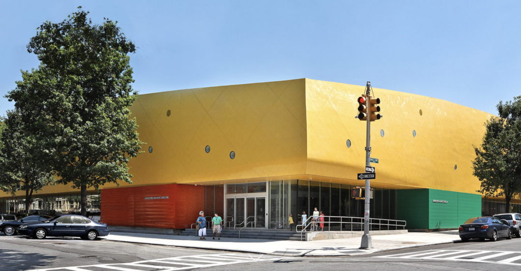
Regina: Well, if you’re talking about public spaces like parks, the Parks Department staff chooses everything. And they have to go through a review process with what’s known as the Public Design Commission, which reviews every major New York City capital project. And so that’s really important. And, you know, when you think about public architecture, I’m now remembering some really cool examples. Rafael Vinoly, when he built the Brooklyn Children’s Museum in Crown Heights, he developed a beautiful, crazy form, very organic and modern, and it’s bright yellow in the Crown Heights Historic District. And the Public Design Commission approved that. They bought into Rafael Vinoly’s vision. And that children’s museum, when you go there, you’re like, I know how to find it. It’s so yellow!
Amy: How did the neighborhood react to it?
Regina: You know, I think that that institution really is beloved in that neighborhood. And they accepted it. Now, I’m not speaking for them, right? I don’t know exactly the answer. I’m also thinking that the new library in Long Island City, is that also a Vinoly building? I’m not remembering. Also has a color. I’m going to have to look that up Amy. Okay. We’ll have to go check that out. you know, certain projects the city has proudly taken on color. But those are buildings. I think in parks, for the most part, New York City parks uses a very consistent palette in their signage because they’re operating so many and they don’t really want to diverge because they have a centralized maintenance crew and they have centralized admin and having variation in the city parks is really problematic. I had a very special experience building Brooklyn Bridge Park because we were allowed to deviate and we were very specific about color.
Amy: Tell us about that.
Regina: I have some good examples. Obviously when you’re building a park, it’s nature first. And it’s nature first and color in nature first, right? We got to think about what trees would flower when and how we’d signify spring and what the fall palette looked like. And that’s all of course in organic material. But the color choices that we had at Brooklyn Bridge Park were very specific. And I really respect Michael Van Vallkenburg’s team on introducing very carefully a few colors. So the biggest move they used in color was salvaging the former Port Authority piers. And those piers were famously painted light blue. And so when we salvaged the frames of many of them, we were not able to salvage all of them. We did maintain that color light blue. And I always loved that because I felt it gave that site a consistency. And the blue looked perfect with the concrete bases of the piers that we left as retaining walls on those piers. So I was really proud that they came upon that as a design element and stuck with it. And that light blue did a few different things that influenced other signs and color selections in the park. We hired a great graphic designer for our signage at Brooklyn Bridge Park. Scott Stowell, he runs a firm called Open. And the whole graphic package he developed, used that light blue and then another darker blue, but not a navy. It’s sort of like a combination Royal /Navy color. And that was our entire graphic package. It was those two colors and a very, very simple font. And I feel like that totally tied in… the light blue that the landscape architect chose for the frames, and that gave us a level of consistency. In the playgrounds, a lot of material that is available is quite colorful to attract children, of course. And in that instance, we chose a wide range of color. Why not? It didn’t have to be one. And then with our moveable furniture, know, Fermob furniture has influenced so much public space in the past 30 years, right?
Amy: Oh my God. Stop there. The furniture is Fermob in the park? You know, I have been to botanical gardens all over the country. Fermob is everywhere. They’re so colorful, but Regina, they’re so expensive. Did they give you like a huge break on the price? I can’t believe it.
Regina: I’m sure we got a decent price, but when you think about the cost of the park, the cost of the furniture is just a blip. We were building infrastructure, had no sewer lines. We had no electric lines. So in terms of budget, Fermob wasn’t a major hit. I was really proud that we used a really cool all-color palette. and mixed it up because the scale of Brooklyn Bridge Park is the East River and the lower Manhattan skyline. There was no need to say all the movable furniture needed to be that one color blue. It was like, come on, make people feel like there’s some diversity of color. And so I was really proud about that. The other color decision that was made was when Jane Williams donated the carousel to the park. We commissioned Jean Nouvel to build the carousel building. And that was an incredible experience for all of us. Jean Nouvel, of course, has incredible expertise. But the one color choice that he made was, he had some columns in the building that he built, which was mostly plexiglass. It was all plexiglass. And he did not choose the light blue. He chose a green, a very pale green that for him, he expressed that it was a corollary to the blue. And I enjoyed listening to that. He said, you know, we’re not building another pier. This is not a pier. I’m not faking it. But I want those columns to be comfortable within the existing color palette of the park. So was really intrigued to learn that and hear that he himself articulated that comment. And I felt like I learned something. I liked that.
Amy: Yeah, interesting. Tell me, go back to um the furniture again for a second. So it’s multi-toned, meaning not within one piece of furniture, but overall with the whole collection of furniture. Did you group the same color or a small subset of colors for different regions and areas in the park? Like the seating here is all, just for argument’s sake. red and pink, but over here it’s blue and green or is it a total mishmash mix it up?
Regina: If memory serves me, and I haven’t been there in a while, and this of course is something you can make a decision in the drop of a hat to change, we bought a set of colors, like we picked five or six and we just put them out. They weren’t all primary colors either. We went to some that were so muted too. Now there is one or two places I could look up that I think they’ve stuck to a smaller subset of colors. I think the best example of that, though in a public space in New York City, is Governor’s Island. And they’ve used red in most of their furniture. And a few other places do that. Here in downtown Brooklyn, when I got here, we were using mostly a really bright light blue, a really good light blue for most of our furniture. As we’ve evolved and frankly had to buy more furniture, we’ve leaned into mixing it up too. Basically because people are just comfortable in it and it feels cheery, right? What you want to do is enliven the space. You don’t always need to be a severe design statement when you’re talking about bistro chairs. Though I think in a place like Bryant Park, they use all green. It’s very Parisian in that way. All the Paris parks are deep green. Bryant Park is deep green. I think that in Central Park, most of their movable furniture is deep green, so you’ll see that around. Yeah.
Amy: So in your role as the head of the Downtown Brooklyn Partnership, you’re talking a little bit about the furniture now in a broader context. How has color been used, if at all, to clarify the area’s identity, to augment wayfinding and maybe assist with safety in some way?
Regina: Yeah, I mean, we do a bunch of things with color here. Downtown Brooklyn has evolved so much in the past 20 years. It’s literally been remade. It used to be mainly dominated by Fulton Street as a shopping street, and then, of course, the civic and the court area. Over 25,000 housing units have been built and it’s really been remade as an apartment house district, office district with Metro Tech and bigger uses. So we have really taken the tact that the public realm and the public space are so important to this district. And right before COVID, we retained WXY and Big Architects, two firms. to advise us on streetscape and public realm. And we worked really hard to think about places where we could improve downtown Brooklyn, make it more walkable, make it more friendly. And we came up with focusing on a few different things. We were able to convince the city to build a new park on Willoughby Street called Abolitionist Place. And that park was built. It’s a one acre park with a small play area and water play and a really nice lawn, very cheerful. And that’s been really exciting. Another thing we did was we worked really hard with the Department of Transportation to get approvals for improvements to some of our plazas and our sidewalks and our seating. And so we devised a system that did go through this public design commission to re-landscape major streets. And we’ve convinced developers to do that. And we actually also convinced the city parks department to help us on that. So we haven’t, those are mostly re-landscaping. So it’s a lot of plantings and a new bench prototype that’s actually made of natural wood. What I really like about it is it feels comfortable. You know, people like sitting down on wood. It’s soft. It’s not like a metal bench. And so I’m really proud of that. And it has a really cool curvilinear state. And so it just feels different and welcoming.
Amy: Well, also adding the “organic-ness” of a material like wood really just changes so much of the vibe of a space with all the concrete.
Regina: Exactly. Exactly. And then the other thing that’s so been so great is that we’ve also gotten permission to do something called shared streets, which in New York City parlance means a tactical project where it’s not a permanent improvement, but you make improvements that could be removed. And in many cases on our streets, what that means is that we take over the parking strip that is available, that used to be available for parking and turn that over to pedestrian use. And we have improved those with color a great deal in two different ways. We chose two different kinds of planters I think they’re available from Vestra. One of them is a bright yellow and it’s a oval shape. We put them in these areas where we formerly used to have parking to create new seating areas.
Amy: So this is for outdoor seating, outside of restaurants, things like that?
Regina: Yeah, and we have two areas of this right off of Fulton Street, which is our busy shopping street. And it’s been a huge success for us. Another place that we use color is we do this thing called art murals in the street. And so for the fifth year, we’ve chosen an artist to paint these murals throughout the neighborhood. And that’s also been really fun, also very, very colorful.
Amy: On the ground or on a building?
Regina: On the ground, on the ground, in areas of the street that are no longer for parking or driving. And it’s really been great. It really denotes an extension of the neighborhood. It makes the neighborhood sort of have another verb or vibe, like you said, uh that feels friendly and cheerful. So those are ways that we’ve gotten permission to use color. And I’m really proud of that. I think that that’s really a way for us to supplement our public space in a way that differentiates us. And really gives us this ability to brand our neighborhood as doing something different. And look, a lot of other places in New York are doing similar projects like this. So it’s great to be a part of that when you think about the area around Union Square. They’ve done a lot of great art on the streets. Madison Square outside Eataly, again, the same really, really cheerful colors. Spaces that have more seating really differentiate the neighborhood. So I’m really proud that we’re sort of working within that paradigm with my colleagues throughout the city. It’s a lot of fun. And honestly, the other great story here is that the city really supports this work.
Amy: That’s wonderful, really. Regina, I mean, it’s not directly related to color, but I mean, in talking about public art… When I come in and especially driving, if I am, from one neighborhood to another and you just pass these areas where, you know, maybe where it’s on the plaza, the center green area, you know, on Park Avenue between Uptown and Dow. You see these sculptures, you see art all over. Is there an eye towards having public art in downtown Brooklyn? Is there a space for it and do you have it? Besides the murals you just mentioned.
Regina: Yeah, we were really lucky a few years ago we got a significant grant from the city and the state to do public art in downtown Brooklyn. And we had the ability to bring a few beautiful sculptures to the neighborhood. One was by Fred Wilson, the unbelievable thoughtful artist and a couple of others. In fact, we did one that was in bright yellow. Now that I’m thinking about it, on Fulton Street, I’ll have to send you a photo of that. So we have promoted public art projects. We’ve also done some temporary lighting installations, especially in the winter months. I think lighting is a fun thing to do in the winter. You don’t get a lot of people, but you can differentiate your neighborhood when it’s dark. So for a few years, we were doing projects on one of the plazas off of Flatbush Avenue with light. And we had a lot of fun selecting artists to do temporary projects in a pretty small budget. And then this year, we got a grant to do a lighting project in the now vacant Macy’s building on Fulton Street, which was the original Abraham and Strauss. And we did a beautiful lighting project with a firm from Boston called Masary, which was all about color. So those things are all things that we’ve done. I’m always looking for new possibilities, talking to people, trying to get people excited about them. I feel these are things that make our neighborhoods fun.
Amy: Energized.
Regina: Energized. I mean, I would say I do laugh sometimes that, it’s sort of like an arms race. All of my colleagues are doing the same thing. We all want art. I mean, and you’re absolutely right. Some neighborhoods have great budgets and they are doing beautiful, beautiful work. Madison Square, think, is one of them. Absolutely. Meat Market has been able to get some great projects. We haven’t been able to attract that level, but, you know, we always have our ears and eyes out for projects. We did do a great project with Sherwin Banfield, which was a sculpture to honor Biggie. And that was really fabulous. Yeah. Because that felt so Brooklyn, right? I mean, Biggie obviously lived in Brooklyn and it was just great. We had a great time with that project.
Amy: Have you ever seen color used intentionally to signal revitalization, gentrification, or the beginning of investment in a neighborhood or the desire to bring more investment in a neighborhood? Or is that not really a New York thing?
Regina: I think New Yorkers sort of understand when places are getting redeveloped, they look shiny and new. I don’t know if color is a part of that intentionally or not, but New Yorkers are certainly used to the fact that there’s been a lot of change. There’s a lot, you know, the subtle things that get done in buildings like the new lettering on the graphic numbers or the house numbers or new roofs that happen. But I don’t know if it’s color that signals that or if it’s just the amount of construction.
Amy: Can you think of an example of a color decision on a building or public space that really changed how people felt about the place?
Regina: I mean, I think that certain places, certain public spaces have been incredibly impactful as new spaces. And I think like a nice example could be Governor’s Island where the use of red was definitely a part of their theme. But, you know, when I think about like the renovation of the plaza outside the Metropolitan Museum of Art, which was mostly their big fountains. They chose, I’m pretty sure they chose red umbrellas in a really, really great line of them. And I think those are the kind of things, I don’t know if that changes the whole city, but they use those kind of colors to make a statement. You have so few, moments to differentiate so you just use it.
Amy: Do you know why red was chosen for Governor’s Island? Is there some like materiality already happening there that it tied into or it was just like let’s excite people with this?
Regina: Yeah, my instinct is, I don’t know the answer, but my instinct would be that they wanted to make a statement. Right? I mean, consistency says something to people too, right? We talked earlier about mixing it up and what that says, but consistency says something too. It communicates that it’s really organized and cared for.
Amy: It’s designed.
Regina: Yeah. It’s designed. Yeah. And that’s a great thing.
Amy: Let’s switch gears a minute and talk about our consistently degrading world we’re living in. Not going to talk about politics, but just in reference to global warming. Obviously, you’re in a big concrete city. It’s warmer anyway because of everything, all the energy being used and generated, the people, the buildings, all of it. The concrete jungle. Are there conversations happening about cooler roofs and lighter color facades as a climate adaption strategy? This might not be necessarily apropos to your current position, maybe it is, but in the past, are people thinking about energy usage and how that affects the building and the buildings look, therefore?
Regina: Yeah, in a few ways. Certainly most roofs in New York City are painted white now. That is the norm. And you don’t know that until you start to look at Google Maps and you look at roofs. Most are painted white in order to lessen the heat load in the summertime. Also, there’s been changes to the zoning code to accommodate green roofs.
Amy: Are there green roofs?
Regina: I mean, in certain projects, not often, but they are promoted and they’re not given any kind of demerit, so to speak, in the zoning. So there are some green roofs. There’s also been recognition about regulation of light coming into windows. so different scrims or screens that have been used are permitted. You know, the biggest moves that dense buildings can do is be all electric. And that has happened. We’ve had a lot of new buildings in the city now that are all electric. You’re not seeing that many new buildings with gas.
Amy: You know, I I applaud the intention, but the electric grid, it can’t be ready to handle that. So I don’t really get it. I mean, here, living in upstate New York, when people are building newer homes, they are often putting in mini splits just to do both the heat and the AC. And I have to tell you, Regina, I’ve been in those homes and it is fricking cold, right? And the electric bills are enormous, more in the winter than in the summer. So I feel like the intention is right but maybe we’re not ready for it, but I don’t know. I mean, until you start building [electric homes], maybe it won’t happen… But I worry about our electric capacity, you know?
Regina: Yeah, Interesting. There’s also been big movements for small buildings to do solar on their roofs.
Amy: Mine went in a few months ago.
Regina: Yeah. Yeah. Very exciting. I have not done it in my house, but I have a number of neighbors who have. And this morning on the radio, I heard that some people are able in apartments to put something out their window. And I’m not sure if that’s legal yet. To generate a small amount of electricity.
Amy: I wonder how small that panel would be. I mean, sometimes you drive in an area and there will be public lights, either stoplights or just street lights, and they have little panels that are powering them. I can’t imagine a whole bunch of even small ones, one foot square panels sticking out of people’s windows.
Regina: Yeah, I have to learn more about that.
Amy: Can you think of any cities outside of New York City that you admire specifically for how color is applied and is used in the city? Anywhere you’ve been where one of the first things that come to mind is how colorful or the kind of colors that are in that city.
Regina: How could you answer that question without saying New Orleans? Right? I mean, there’s certain places that their historic areas are about color. And certainly, in the Americas, many of the colonial cities, all are really differentiated by color and have fabulous color.
Amy: You mean like Charleston?
Regina: Yeah. Charleston, New Orleans, the Deco of Miami. I mean, those places have always historically used color. And then of course, there’s places like Cartagena, right? I mean, we’ve all been to these great places on vacation that have used color beautifully in their historic areas. And that has been historic. And color is an integral part of that urban
Amy: So many places in Mexico also.
Regina: Totally, totally. So that’s a lot of fun, but that’s not a Northeastern thing or a cold weather thing for the most part.
Amy: No, it’s really not. Tell me a little bit more about that design commission. Are they appointed? And are they design and architect professionals? Who’s in that?
Regina: Yes. Yeah, there’s a staff and there’s a commission. And the commissioners are a mix of architects, landscape architects, artists, and community members. And it’s historically been part of New York City for hundreds of years. And there’s an incredible archive going back, way back when, that you could visit. They actually do tours at City Hall. Yeah, so it’s really in the category of civic pride, it’s really wonderful. And they have really heralded great modern architecture. Obviously not everything that’s built that’s modern that they approve are all successes. That’s just the way the world is, as we all know. But nonetheless, it’s a pretty serious consideration.
Amy: And is it like the Supreme Court, you’re in for life unless you retire?
Regina: No, there’s terms and they’re not paid. I think they meet once or twice a month depending on the month. Yeah, I’ll send you a link.
Amy: Yeah, that’s so interesting to me. My goodness. How wonderful. Regina, what a resume you have.
Regina: No, I think this has been a great conversation. Really, I don’t think we, you and I have known each other so many years and we’ve never had this kind of work conversation.
Amy: Although I do remember when you built the park we did talk about the landscape architects and that whole process, which must have been incredible. Okay, I’m going to let you go. Thanks again, Regina. This has been great.