
Amy Krane Color
The Allure of Paint Colors on Social Media
Paint Colors seen on Pinterest and Instagram often fail when used in your home. Whether you’re hunting for the right color to paint a room or just scrolling through the vast array of interior design eye candy on Instagram or Pinterest it’s easy to fall under the spell of colors seen online. The rooms in the photos seem perfect. The furnishings and decor are gorgeous and aspirational, every detail has been chosen to create an enviable environment. It’s the home you wish you lived in but don’t.
But choosing paint colors from any online source is problematic. Colors online are created only using the RGB system. RGB is an additive color system used for screens, where combining light creates brighter colors and eventually white. Paint pigments are a subtractive system where combining physical paints absorbs or subtracts light, resulting in darker, less clear colors. They don’t bear a relationship to one another. So a color you see on a screen just won’t look like that on your wall. But there is more….
Interior design photos are often edited
Amy Krane Color
A messy bed, a crooked painting, a lampshade askew, photos are retouched and edited all the time. And with AI it’s even easier now. The less proficient the photographer, the more likely the colors in the room in a PInterest photo will be adjusted after the photo is created. Often times the colors are adjusted beyond what real life offered to create a room even more beautiful and harmonious than in reality. Photographers might use filters which affect the light and therefore the appearance of the colors.
Color is Light
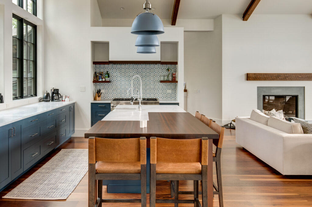
Color is reflected light. No light – no color, but beyond that, light varies. Artificial light from a light source or natural light look different. Light temperature is measured in kelvin and light can be warm or cool based on the color temperature of the light. A warm light will make warm colors seem more intense and cool muddier. A cool light will make cool colors more pronounced but warm colors muddier. This is important when you’re choosing colors for your room. Does it get a lot of natural light and what time of day does it get that light? Afternoon light in a west facing room is intensely yellow-orange. You can look at a white wall during this time of day and the wall literally looks yellow. Paint colors on Pinterest and Instagram don’t relate to the light in your home.
Where you live matters when choosing colors
Amy Krane Color
Tropical light is intense and white. It washes out some colors and renders muted colors less desirable. Take into account where you live when you choose your paint colors. Light in the northwest is low and cool. Light in the southwest is intense. Paint colors used here commemorate the materials commonly found there like plaster and stucco.
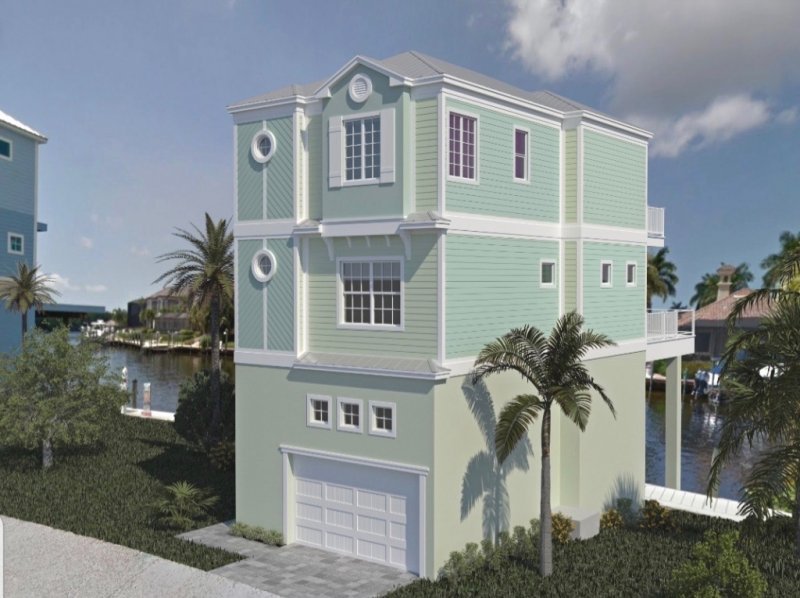
Architecture should inform your color choices
Though it doesn’t mean you have to follow commonly used colors for certain styles it helps to know what colors are typical for certain arch styles. Then you’re making an informed choice whether to adhere or reject what colors are the norm. Paint colors on Pinterest and Instagram might be shown in a home with very dissimilar architecture to your own.
Cam Slemp Modern Design
How to Use Pinterest and Instagram to help you find a Paint Color
Feel free to troll the photos to find the colors which you’re attracted to but then you MUST test them on your walls. Your light, your region, your architecture, your adjacent colors will all affect how a new paint color will look. Either paint on the wall or use a middle gray poster board and paint 2 coats on it. Make your paint color choices personalized for YOU or hire a color consultant to help you wrangle the right ones.