
![]()
The Let’s Talk Paint Color Podcast allows listeners into the minds of renowned color experts to benefit from their years of experience consulting on color decisions. The January 2023 podcast update brings new guests each episode to join an insightful conversation with Amy Krane about all aspects of the use of color for the built world. You’ll find it enlightening and informative. Homeowners and design professionals alike struggle choosing paint colors.
In Episodes 1- 20 of Let’s Talk Paint Color experts Amy Krane and Amy Woolf unravel the mysteries of how to choose color for your home or business, interior and exterior. It’s a rousing conversation between colleagues which spans all aspects of architectural color and design decisions involving color for our modern life.
Scroll through the player to play individual episodes. Transcripts of each episode are below.
Episode Thirty Three:
The Colors of the Shakers
 Amy:
Amy:
Color is the foundation of great design. It can settle a building into its landscape. It can make an unattractive structural detail just disappear. And it can change your mood in a room instantly. Welcome to Let’s Talk Paint Color. I’m Amy Krane, architectural color consultant at Amy Krane Color. I’m a color expert and use color to transform spaces and products from the ordinary to the sublime. As a paint color specialist, realtor, and design writer, I’ve got my finger on the pulse of what’s happening in the world of color. In each episode, I’ll reveal best practices for choosing color by introducing you to masters of color for the built world. So throw out those paint chips taped to your walls and let’s get started.
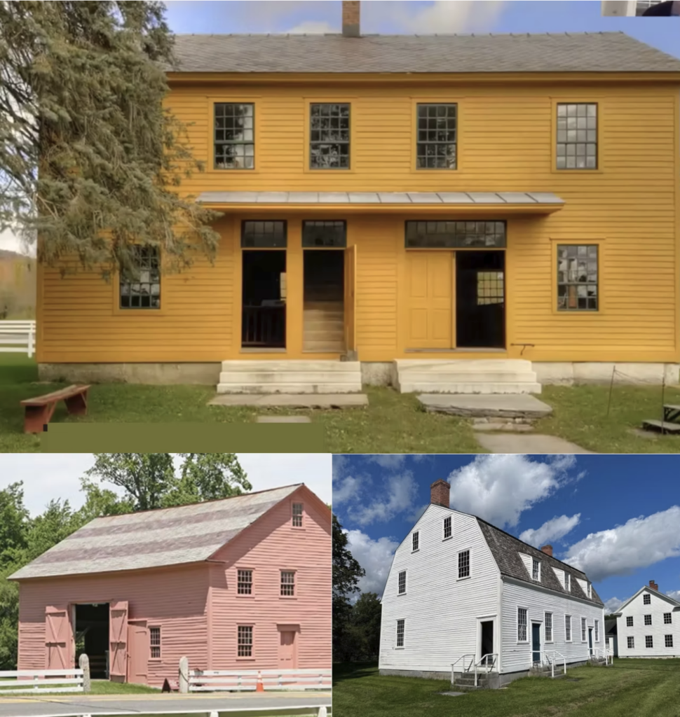
I consider myself lucky to be living in the northern Hudson Valley of New York. And one reason for that is my proximity to preserved Shaker villages. There’s one in Colonie which is next to Albany, and it’s the site of the original Shaker settlement in the US, although it wasn’t called that then. There’s also one in New Lebanon, New York, but my favorite is the Hancock Shaker Village in Hancock, Mass. In the Berkshires. They call that community the city of heavenly peace. I can’t tell you how many photos of that salmon pink building I have taken while driving past. Today’s conversation, so timely because of the release of the new film, The Testament of Anne Lee, is going to center on Shaker design, more specifically Shaker colors. And for that, I have the pleasure of speaking with Cindy Dickinson, the Director of Education at the Hancock Shaker Village, a consummate public educator Dickinson holds undergrad degrees from Princeton University and the University of North Carolina at Chapel Hill, as well as a master’s in early American culture from the prestigious Winterthur program at the University of Delaware. I love Winterthur. Welcome, Cindy.
Cindy:
Thank you. It’s nice to be here.
Amy:
It’s about 14 degrees here. It’s a good day to be talking about color. Are there any shakers left in the United States?
Cindy:
There are, there is one active community in Maine, in Sabbathday Lake, Maine, just north of Portland. And they welcomed a new member, a prospective member, this year. So they are still happy to have people join them and they are happy to have people learn about the Shakers, their history and their current practice.
Amy:
Oh, how fantastic. Give us the basics. Who were they, where did they come from, when did they come and why did they come?
Cindy:
The Shakers are a Protestant Christian religion. They started out in England in the mid 18th century at a time when there were a number of people dissatisfied with the religion of the state and with the religious experience that it offered. So they’re one of a number of dissenting groups that ultimately found the opportunity to come to America to practice their religion. They came in 1774 after a couple of members having visions that freedom in America would be the right pursuit. So they arrived in New York City in August, and then after a couple of years made their way up to the Watervliet community area that you mentioned. And from there, their leader, Anne Lee, made a pilgrimage throughout New England and met up with many potential followers and followers and ultimately there were, depending on who you talk to, 19 to 25 communities throughout the Northeast and even a couple in the South, shorter lived, and one in Philadelphia. So at its height, there are five or 6,000 Shakers, practicing Shakers, in the mid-19th century.
Amy:
That’s amazing. So when they first joined in the beginning, of course, they would have joined as families, but we’re not going to go too deeply into their rules and regulations, although I’d like to hear a little. One of the rules or tenets was celibacy. So after a generation or so, unless there were new families joining, there would have been fewer and fewer kids, right?
Cindy:
Yes. So one of the principal tenets of the Shaker religion is the practice of celibacy. They believed in leading a sinless life, and for them, that includes the practicing sex. It also relates to intimate relationships of any sort because the greatest good is the good of the union of the community. So it does to people on the outside feel like that’s a model for decline. But when I think of it, knowing the number of different groups that were forming at this time that may or may not have practiced celibacy, they are actually a survival group. In spite of celibacy, they are still here with us today. So they always hoped that adult converts would join. In the 19th century, they did begin having children, taking in children to live with them, sort of like a foster care situation, sometimes not full adoption but really living in the community until they reach the age to make the decision whether or not they would become Shakers themselves. Only about 10 % of the children raised by Shakers did become adult full members of the community. So those 10 % of course did help to continue the numbers for a while. But I think the Shakers have had to reckon at different points in their history with the whether or not celibacy was the way to continue and they have always come down on the side of that is a central part of our beliefs.
Amy:
Did you think that the film, The Testament of Anne Lee was accurate in many areas? Did it diverge from reality greatly? Creative license and all that?
Cindy:
I was deeply impressed by the movie. From my understanding of the Shakers, I feel that it captures a lot about their passion and beliefs that can be difficult to convey to a visitor when you’re walking through buildings and objects that certainly have a lot to share. But the sort of vitality of the film, certainly the writers took some liberties with how the story was told, understandably. And I thought even in those alterations, for example, of the timeline, Mother Anne would not have seen the communities come together in the way that she’s depicted seeing them. I thought that what they were really portraying was what she spawned, you know, that she, this is what her general goal was. And so I liked the way that they combined them. I certainly would not want to… I’m not speaking for the Shakers because as a non-Shaker, I understand their theology from a certain distance. So the accuracies of the interpretation of the theology, I won’t comment on. I thought that especially the use of the music was very well done and well-handled and very true to the essence of the melodies that were used. Almost all the songs are Shaker songs that are in that film. And the way they combined the experience of being a Shaker with some of the real historical issues they dealt with, persecution and taking a ship over to a new country. I thought that was all very well done and compelling for me as someone who really admires the Shakers and is interested in their origin story.
Amy:
In the very beginning, I think she was only here for 10 years, in the early years of the Shakers, let’s call that 50 years, for argument’s sake, do you think there was great difference in how each community practiced, how they looked, how they practiced, how they treated one another, how they treated outsiders? How much variety do you think there was?
Cindy:
That’s a really good question. And frankly, I think addressing what you just asked about is one key thing that has led to the Shakers thriving in the 19th century and still being here today. Because from the very beginning, after the initial Mother Anne pilgrimage, they insisted on the need for uniformity among the different communities. And you can imagine it was difficult to necessarily achieve, but they knew that if the experience wasn’t similar, you just start to have a more chaotic experience at each one. And particularly after Mother Anne died, those early second generation leaders really pulled together what it meant to be a Shaker almost institutionally. So not just spiritually. That was when they kind of started thinking about, what should the worship experience be like? Because up until then, it was a fairly spontaneous, a truly spirit-driven experience. And they began to realize that if we took our music and our movements and formalized them in a way that people could learn so that it becomes something you can teach, then the worship experience might resemble something that a potential convert. And likewise, living in community together, realizing that that, so that was not a Mother Anne idea, the communal living. That’s a second generation idea because it’s easier to live in this different way. You’re living in celibate life, you’re supposed to be nice to everybody, your worship looks different, and if you come together, there’s more protection in that. And then there also, of course, is the opportunity that you’ve got working hands who can labor together to recreate heaven together. So I think the experience once Mother Anne had died and those who were left knew they wanted to continue her legacy was fairly uniform, as uniform as you can have when you’re geographically distant, experience.
Amy:
So early on was there was communication among the villages?
Cindy:
Early on, there was travel by certain leaders so that there could be some consistency and understanding of what it meant to be a Shaker.
Amy:
Can you tell us why they were called Shakers?
Cindy:
Yes. That’s a very good question. They did not call themselves Shakers. They called themselves the United Society of Believers in Christ’s Second Appearing. They’re considered a millennialist group that are living into the Second Coming. The way they worshiped was divine revelation of the Spirit directly through the body. So if God spoke to one of them and they were filled with the Spirit, they would move. And although they have some similarities with the Quakers, they apparently moved a lot more than the Quakers. So they were not quaking, they were shaking. So they were called the shaking Quakers. Like the Quakers, the Shakers also believed that you don’t need a trained spiritual guide to tell you what God intends for you. So God can speak directly to you. It doesn’t matter if you’re a male or female. There’s direct connection to the divine. So they were the shaking Quakers. And then that got shortened to Shakers. And the believers, the people who were being called this, at some point realized that the word itself was a shorter word than United Society of Believers in Christ’s Second Appearing and when they began marketing products that they made, they used that word on their, as kind of almost like their brand. Within the community, they would have referred to each other as believers. But so that’s where the name comes from. And then now they actually are incorporated as the United Society of Shakers.
Amy:
You sort of hit on this, but give us just the basic beliefs, or as they came to be.
So, communal living and spirituality through work? What other kinds of things?
Cindy:
So, usually it was described as the three C’s. Celibacy we’ve discussed, communal living and then confession. They do believe in periodic cleansing. Which includes bringing to light the things that you are not doing well or doing wrong, almost like a cognitive therapy session where if you have an issue and you need to discuss it with someone so that you can overcome it. The sins are not dismissed. You work on what you can do to achieve a more pure life. The Shakers also are pacifists. They share that with some of their Quaker comrades. They believe in equality and equality for all regardless of gender, race, ability, anyone who accepts the beliefs of the Shakers is welcome. Because laboring was very important. All work was a form of worship. So there wasn’t just the Sunday morning service, there were actual meetings, gatherings each day, but throughout the day, you were also worshiping God in the way that you did the work that was assigned to you. So that kind of leads to another belief, which is perfection, the purpose of the Shakers is to reflect the perfection of heaven so that when they get there, they’re already working towards that ultimate end. And that also does play into their design and what I think a lot of us admire about it is everything is so well done. Well, it’s well done because heaven doesn’t have dirt, heaven doesn’t have mistakes. Heaven has the best of what we can offer. And so that motivation is there in everything that they do.
Amy:
Okay. Well, this is a great segue into talk about their design. If I was to ask where their aesthetic was from, I guess you’ve kind of answered a little bit, not in terms of its exact look, but their striving for perfection. Was there one or a few Shakers who created the design aesthetic or did it evolve over time from contributions from different people in different communities?
Cindy:
I love that question. I’ve been thinking about that. There are certainly a couple of individuals you can point to for certain aspects of Shaker design, but generally speaking, I think that what we call Shaker design is not something that the Shakers set out to create. Because the last thing they would want to do is create an aesthetic. Because they’re all about what something actually means and stands for. And so I think that early on, even as their communities were forming, the communities were formed from land and structures donated when groups joined the group. So our Hancock, for example, there were five key families that joined the Shakers that were landholders. And so the community is based on that acreage, that combined acreage and the buildings that were part of it. So over time, as those buildings proved inadequate or they grew, they had to then build new structures. And that’s when you begin to see an architecture, more of a uniformity of the buildings. And I think the same is true for things like furniture and household goods. You’re coming into the community with what you already own. And then as those need to be adapted or perfected, you start to have some changes in design. And then you also want to create a uniform experience. So when you’ve decided on a chair type that seems to work best, you’re going to continue to create that because you need to have this universal experience. So in terms of individuals, there is someone to mention on the architecture front. Moses Johnson is a Shaker brother from Enfield, New Hampshire, who is responsible for the design of the early Shaker meeting house.
Amy:
With the Gambrel roof, right?
Cindy:
Yes, the Gambrel roof. Exactly. So early on when I was mentioning about the need for the villages to be similar, the meeting house was a central building for each community. So each community was to have the gambrel roof, rectangular white clapboard building with doors on either end for sisters and brothers to come in and then doors for the world’s people to observe the worship. I should say that Worship for the Shakers was both a central spiritual practice, but also a key way to attract converts. So their Sunday morning worship was, for most of the period of their history, open to the public to attend, not to participate in, but to attend, so that they could get a sense of the real essence of what it was to be a Shaker. So that meeting house, even though I have said that they were worshiping all the time, the meeting house experience was very critical for them. And a meeting house is what they would not have had already on their sites as they were accumulating their land and so forth. So having that same design of a meeting house throughout the communities was important. And this is in the late 18th century. Moses Johnson is one of the few Shakers you’ll hear named, whereas a design is attributed to him.
Amy:
Over time, we’ve attributed the lack of ornamentation to be equivalent with the Shakers. In the 21st and 20th century, it has been so collectible and so kind of revered by design enthusiasts. It really seems to connect with people. The design itself having nothing to do with who the Shakers were or anyone’s knowledge of what their practices were or anything. It’s interesting to me how popular it’s become. You know, I’m a color consultant and I often end up working with people on kitchen design. And especially living in the country, but even other places, the most popular kitchen cabinet door is the Shaker style, which does have four rails around it. It has simple ornamentation. Let’s talk about the colors. So covering architecture colors, interior and exterior, and then of course, I’m sure that the objects didn’t diverge that much from that. What are the basic Shaker colors?
Cindy:
Okay. So basic Shaker colors include a couple of types of yellow. One is often called chrome yellow, and then the other is just yellow. Yellow ochre, sometimes called the ochre. There is also a green, a chrome green that appears more in the interior, on the furniture, the beds. That’s kind of a famous edict we can discuss. One of the examples of a effort at uniformity across the communities was that beds needed to be painted green. Red ochre is often seen architecturally on some of the buildings. Some of the buildings are white, meeting houses were to be white. There is some evidence that only meeting houses were to be white, but there is a lot of evidence even here at the village where we have other white buildings. So over time, some of this changed. Prussian blue, very important in the meeting house interior as a color that was seen there and used sparingly, but in important ways. And then you’ve already referred to the salmon or the pink color that here at the village is used on our horse barn. But that color also can be seen on some objects and in some other applications. Those are the key colors that you’ll see in Shaker community. And you see them in a very pure way. They’re rarely mixed or blended or broken up with ornamentation or decoration. So I have a feeling that’s another reason why they’re so striking is that you see a palette, it’s the full color and not broken up by much. The Shaker communities were almost always on a major road. They’re rarely set away. They needed to be found because they were not proselytizing. They didn’t go out seeking members. So they kind of needed you to take notice. And I wonder, too, if one element of that was the color on the architecture, let’s make sure our buildings are noticed.
Amy:
I read that color and divinity were very linked together from early on. They were separate from the way other people lived in the world, and maybe color was used to. to exemplify that separateness from how other people lived. When you were saying before, not breaking up the colors, it’s so interesting because, again, talking about exterior colors, during different periods of time, people would highlight the trim on their house with another color. But… for many years through different periods, they did not. And there is a resurgence now in the past 20 years or so, again, for country houses, for the trim to match the body of the house. And certainly, that was the case back then, that they did not create more ornamentation by calling out the trim boards with a different color. Maybe they did with the doors. I think I saw a picture of a yellow building with green doors. Do you know whether doors were often painted a different color or not, exterior?
Cindy:
Based on my observation, I believe you are correct because I’m just thinking about the village. Yes, the meeting house has doors that are not white. The dwelling certainly has doors that are different color. Let me check the millennial laws.
Amy:
Okay, well, that’s a great segue into the millennial laws. What were they in general, very briefly, and then specifically how were they related to what we’re talking about -colors in buildings, on buildings, on objects?
Cindy:
The millennial laws, are a group of basically a code of conduct that the Shakers first issued in 1821. So about 30 years after they had really come together as communities and then revised and reissued in 1845 and finally in 1860. The 1845 edition is the most specific. It’s the longest and it comes at a time in the Shaker world when things were sort of falling apart. They were losing members, there was a tremendous period of spiritual revival, but this was also kind of an effort to gain more followers. So as is often the case when rules are promulgated, it suggests that something is not going right. So usually you need a rule to do something or not do something because everyone is doing the opposite. And I think that could be the case even with building design and color that maybe people were getting a little bit too into a different kind of yellow or maybe the blue was being misapplied. But certainly, in terms of behavior between the sexes, there’s a lot of that in the 1845 laws as well. By 1860, there aren’t too many laws so I guess people were perhaps following them a little better, but you can’t imagine that when you have all of these people living so far apart and you’re essentially communicating through letter and occasional visits that you’ve got to have something to refer to, to say, well, look, a true Shaker community is going to have this color paint on your beds. So let’s get our act together. So in the millennial laws from 1845 they do have a section that is called concerning building painting varnishing and the manufacture of articles for sale so I’m just I thought I would share just a few of these things. The meeting house should be painted white without and of a bluish shade within houses and shops, and in this case shops are referring to workshops where people would make things not retail establishments, should be as near uniform in color and consistent. But it is advisable to have shops of a little darker shade than dwelling houses. Floors in dwelling houses, if stained at all, should be of a reddish yellow and shop floors should be of a yellowish red. It is unadvisable for wooden buildings fronting the street to be painted red, brown, or black, but they should be of a lightish hue. No buildings may be painted white save meeting houses. And then it kind of goes on to talk about whether you could paint your carts or varnish these things. So something about that suggests that there was perhaps less conformity with color in 1844 than the Shakers thought there ought to be. But it is interesting that they’re discussing a hierarchy of building to be shown through color.
Amy:
Yes, it really is. Back then Prussian blue was one of the only synthetic pigments made.. And I’ve read that it was $12 a pound. Back then, that is fabulously expensive. White would have been super cheap, like a dollar or something. And of course, a lot of the colors, which I’ve read that they foraged and rounded up as many pigments as they could for making dyes and maybe paints. And those things like ochres, red ochres, yellow ochres, umbers and siennas, I mean, these came from minerals and were very plentiful and inexpensive. And once you got into your chromes, I think you were into more expensive things. So I also was reading a little bit that the, there were these gift paintings, right?
Cindy:
Of course, these are gift paintings.
Amy:
But I mean, apparently they did feel that there were associations between colors and concepts. Green is a sign of increase or growth. Red, suffering. White, purity. Blue, heavenly. Peach- blue. I do not know what that is, Love. Gold, purity. Silver, union. So that’s all very, very interesting that they really felt the need and desire to connect colors with concepts, all tied into their practice, their religious practice, their beliefs. I think we could describe their aesthetic as being sort of streamlined and simple, almost austere. So don’t you think it’s interesting that a lot of these colors are so bold and saturated? I mean, you could almost interpret them, at least today, as decorative just because they’re so highly chromatic. You know, it’s a bold yellow, it’s a bold salmon, it’s a bold blue. It’s so interesting to me because the colors becomes decorative. And yet they were, I think of them as a somewhat austere group. But maybe I shouldn’t think of them as austere. Maybe the way that they, their spirituality maybe wasn’t austere at all. Maybe the colors were a representation of their joy.
Cindy:
I think you’re doing a wonderful job of understanding the Shakers by using color as an example. Because I think that what happens a lot of times, those of us who aren’t part of a group like this or when we’re looking particularly at something in the past where I know not just with the Shakers, but even I think with the Greeks and Roman, you know, this idea that, they didn’t have any color. Well, maybe it’s because it faded or, you know, it got covered up. And the idea that people have lived without color is not, it’s obviously not true. And I think you’re articulating what is often misunderstood about the Shakers, which is although they are leading a life that is regulated and has intention and feels to many of us outside it like it must be a struggle, they were ecstatically joyful about this experience. And so the singing and the movement is all about feeling at one with each other and one with God. And it’s not a religion of punishment. I think a lot of times when we feel like, people aren’t doing a certain thing, especially if they’re celibate, you know, they must be punishing themselves. And there is some degree of that, but for the most part, it’s all about finding the joy in life. And so what you’re helping me see by describing the color in this way is that that’s yet another example of how they present the world. The gift drawings that you mentioned are a really good. way to tie in the color that you see in the buildings and the objects because the gift drawings also come from around the same time as the millennial laws when there was a lot of spiritual revival and effort to kind of reinvigorate the religion. And one thing that happened during this period, which is between 1830 and 1860, is that individual people who are called instruments, just to be confusing, were receiving messages from the spirit world that they then interpreted for the people on Earth. So these instruments weren’t necessarily telling people what to do, but they were hearing from Mother Anne, who was deceased, or random person X, that persevered, So you can live on, and there were very specific messages, but they often were accompanied with an image. So that’s where you get the image of the tree of life or an image of a basket of apples. These had very specific purposes, but they’re watercolors. And so they have a lot of color in them, but the color is, as you described, it tends to be a certain pure color as opposed to a lot of mixing of the colors and gradations. So when you were talking, it’s reminding me of when you got the Jumbo crayon set from Crayola and you’ve kind of got the same palette in some ways, and you can still do a lot with that, and it’s the joy that children have of kind of starting out with color that expresses, and so each color seems to have a purpose. And I think that that’s what you’re helping to articulate, is that’s how color works for the Shakers.
Amy:
Can we talk a little bit about the paints back then? I mean, I think the paints were just Pigments with linseed oil, at least in the beginning. Any idea about them? Well, I mean you mentioned the Prussian blue. So that was something they had to buy
Cindy:
So there was an interesting development in Shaker color history. It’s the examination of the paints. Starting in the 1990s with Susan Buck did some analysis of about a hundred objects and they were doing some very interesting work with that. Then since that time, I know here at Hancock, we’ve had all of our building’s paint analysis done, and we’ve returned the colors of all the buildings to their “original colors.” So, you know, the colors that the Shakers were using at their height. So that effort to kind of restore the color palette is something that over the last 30 years has been worked on. What I’ve come to understand and I am not a paint expert or a scientist is the Shakers, as with other people, kind of followed trends. So if everyone was making paint like out in the world, they would have been making their own paints. But as soon as paint was available to purchase or pigments, they would also be doing that because, it’s not a… theological tenant, but the Shakers were very practical people. So using technology, purchasing something that might make their lives more efficient is something that they were willing to do. So it seems to be a mix of sources of their paints, in terms of purchasing the oil to make the paints, the pigments to make the paints, and then ultimately purchasing the paints themselves. So by the second half of the 19th century, they were certainly buying paint. I think there’s a little bit of debate about how much they were gathering, or mining ore to get ochre, which does not seem to be so much the case. But with dye and clothing dye, they were growing, certainly growing plants for that purpose, gathering those. So different sources for their colors. But we even have some pigments in our collection. They’re not dated, and then there are recipe books in the Shaker archives. The Shakers were actively making paints and varnishes. Another thing that seems to distinguish the Shakers from perhaps other municipal groups is the constant effort of upkeep. So the shakers are regularly repainting their architectural elements. They’re cleaning them because again, this need for perfection. So that seems to be something that sets them apart a bit – the attention to maintenance that then shows up in the materials if you’re looking at different paint layers.
Amy:
Tell me, overall, and I don’t know if there was variety or not, would you say during their heyday for 100, 150 years, whatever, did they make enough money to live as well as they wanted to? Were they impoverished or were they perfectly self-sufficient in terms of what they needed and what they got by their own hands or by their ability to buy?
Cindy:
By the early-ish 19th century, they were doing well. And I think, again, that’s something that’s important to understand about the Shakers. In the early days, so… the Mother Anne era, this is graphically depicted in the movie, it was a struggle. Even food was difficult to come by, but as they gathered in community and as they had labor to work, they were able not only to provide for their basic needs, but to live well. One of my favorite examples of this is a clothing inventory that was kept. You might think, they’re each wearing one outfit and that’s all they have. No, the Shakers individually had several dresses, lots of undergarments. They were well cared for because again, they weren’t about living a life with nothing. They were about living as they should. To take care of themselves, they wanted to be healthy. And in some ways, being able to change your clothes does make you a healthier person. Being able to do laundry helps with health. So they did live comfortably, yes. And because they were, again, not about suffering for their faith. They didn’t want anything that they didn’t need. But that didn’t mean that they had to be uncomfortable.
Amy:
Got it. Any idea if they sold their paint formulas or paint itself? to non-Shakers?
Cindy:
I’m not an expert in that area. It doesn’t seem to have been a key, one of their hot sellers. It doesn’t mean that they never did that, but it doesn’t seem to have been one of their main items for market. However, I was reading something that suggested some of the same ingredients go into the medicinal herbs or dye manufacturing that might also go into a paint or a varnish. I’m not suggesting that they were selling paint to cure an illness. But if they’re buying stuff in large quantity, it could have been used for that purpose as well. But principally, their principal businesses had to do with seeds, medicinal herbs, and then for some communities, the manufacture of goods like the chairs or oval boxes and then fancy goods later on. But paint does not seem to have been a major part of that economy.
Amy:
So you mentioned some of the communities sold objects while others didn’t. I wonder if we know why and also was it considered sort of a necessary evil? to fraternize with the outside world by selling your stuff? Did they sell reluctantly because they had to or no? Was it like, hey, this is great. We’re happy to share our objects. It tells people more about who we are and maybe brings them here and things like that.
Cindy:
I think the latter is the principal motivation that once they began to do well and were making or growing in excess, they did not want to be wasteful. Sharing or selling the goods was a way to, again, this goes to practicality, it was a way to generate some income for the community, but to not waste the item and to spread the name of the Shakers because, contrary to a model that works for other religions, going out and proselytizing is not what they chose to do. But their products kind of took on that role. So there were people designated to go out into the world to sell, especially the seeds, the seeds of the earliest business starting in the late 18th century. And those people had to interact with the world. So they had to be trustworthy to maintain their Shaker identity out in the world. So I think they dealt with some issues of back and forth into the world, but not to the point that it wasn’t worth it to have these product lines. And I think that as people, because they were made so well, even the seeds were, they grew into the plants that the package said, that quality, that association of Shaker with quality became very important. Anything they made really was met by the market favorably. And I think the Shakers, they needed money in some ways so that they could purchase things that they might need that they couldn’t make. They tried to make as much of their own as they could. For example, once it was just cheaper to purchase fabric after the Civil War they would buy cloth to make clothing. But up until then, they were making their own. So it depended. I think that their interaction with the world is really interesting and that kind of choice to engage on the market level, but then not in other ways. It just, again, sets them up as something really interesting to study and wonder about.
Amy:
There’s no way of knowing how the general public reacted to their colors specifically. Is there?
Cindy:
There is some evidence that people could visit the villages. I think there is some evidence that they found the communities striking, you know, the way the buildings were arranged. I don’t have a specific info about the public’s reaction to the colors. But I think the whole package was interesting to visitors for sure.
Amy:
Got it. Who makes your paint now when you had to repaint?
Cindy:
We do have a list of our paint colors that we use and when our paint analysis was first done, we were then given a set of Benjamin Moore equivalents to those colors. My understanding now is there are different apps that you can use to simply take a picture of an existing paint color and they get a color matched. So that is what sometimes happens here. We hire different painting crews. So they will work with our existing buildings to match the paint color.
Amy:
So that’s really interesting. I mean, Benjamin Moore has 3,500 colors, but that does not mean they have exactly that salmon pink. So once Susan Bock discovered what that’s… salmon pink looked like. I mean, do you think going back, anyone went to Benjamin Moore and said, replicate exactly this original color? Or people just kind of eyeballed it and said, well, that salmon pink looks like Benjamin Moore’s blah, blah, blah. Let’s use it.
Cindy:
I was not at the village at the time but I’m not sure that Susan did all of our paint analysis for the village. But we also had a relationship with the University of Massachusetts and some students also got involved with some color analysis with some of the buildings. But we do have this list that we’ve generally worked with. So that salmon color is in the Benjamin War world is called Antique Rose. So it must have had a similar enough composition that it seemed good to use. And you had asked if we have visitors ask about our colors now, and yes, all the time. And that’s one of the colors that people do like, because it’s unexpected. And then the yellows.
Amy:
As I mentioned, I did see the film. You know, I saw that tree of life on the walls inside the meeting room? I’m going to assume that they did not request to change anything, and nor would you have let them.
Cindy:
So that building where you see the tree of life, that is one set piece that they built when they were filming in Hungary. The shots shot at the village, no, as far as I know, there were no changes to the interiors of that nature. So all the colors that you see in the buildings, the shots done at Hancock are as the buildings are. But the meeting house, they did recreate over there. And that interior is, because the Shakers would not have put an image on the wall like that. So I am interested in finding out the choice of doing that, because that is a Shaker gift drawing done by Hannah Cahoon, who was a member of the Hancock community. And I love that gift drawing, but it would not have been on the wall. The walls were never decorated. No. And they would not have hung paintings on the wall. Not until the late 19th century. So the Shakers, having said they didn’t put anything on their walls, in the late 19th century and early 20th century, the Shakers did use wallpaper. The Shakers changed their own aesthetic to attract new people. They were trying to liven up in a way that might be more attractive to someone from the outside. So there is evidence of wallpaper and some hanging images on the walls for decoration in that later period. The museums now, at least here, tend to go back to an earlier 19th century aesthetic so that you don’t see decoration on the walls. So there is a little bit of that, but certainly at that time, that the film’s depicting, would not have it. And the gift drawings were not intended as artwork, so they would never have hung on the walls. In fact, they were in a drawer when some of the early collectors came through Hancock and just kind of discovered them. And one of the Shakers said, oh yes, well, we have those too, but they were not framed. They had never been displayed. So we as an outside society have come to honor them as works of art. But again, the Shakers, these were spiritual messages.
Amy:
Interesting. This has been so fascinating, Cindy. I can’t thank you enough.
Cindy:
Oh, thank you. Well, I’ve enjoyed it very much. You’re very knowledgeable and I appreciate so much your thoughts about the Shakers.
Episode Thirty Two:
Color for Production Housing
Amy:
Color is the foundation of great design. It can settle a building into its landscape. It can make an unattractive structural detail just disappear and it can change your mood in a room instantly. Welcome to Let’s Talk Paint Color. I’m Amy Krane, architectural color consultant at Amy Krane Color. I’m a color expert and use color to transform spaces and products from the ordinary to the sublime. As a paint color specialist, realtor and design writer, I’ve got my finger on the pulse of what’s happening in the world of color. In each episode, I’ll reveal best practices for choosing color by introducing you to Masters of Color for the Built world. So throw out those paint chips taped to your walls, and let’s get started.
I rarely interview other US based color consultants because of the obvious overlap, but in this instance, my guest’s predominant work experience differs from mine somewhat. So I thought this would be interesting. I find conversations about adding color to our shared public environments really thought provoking and important.
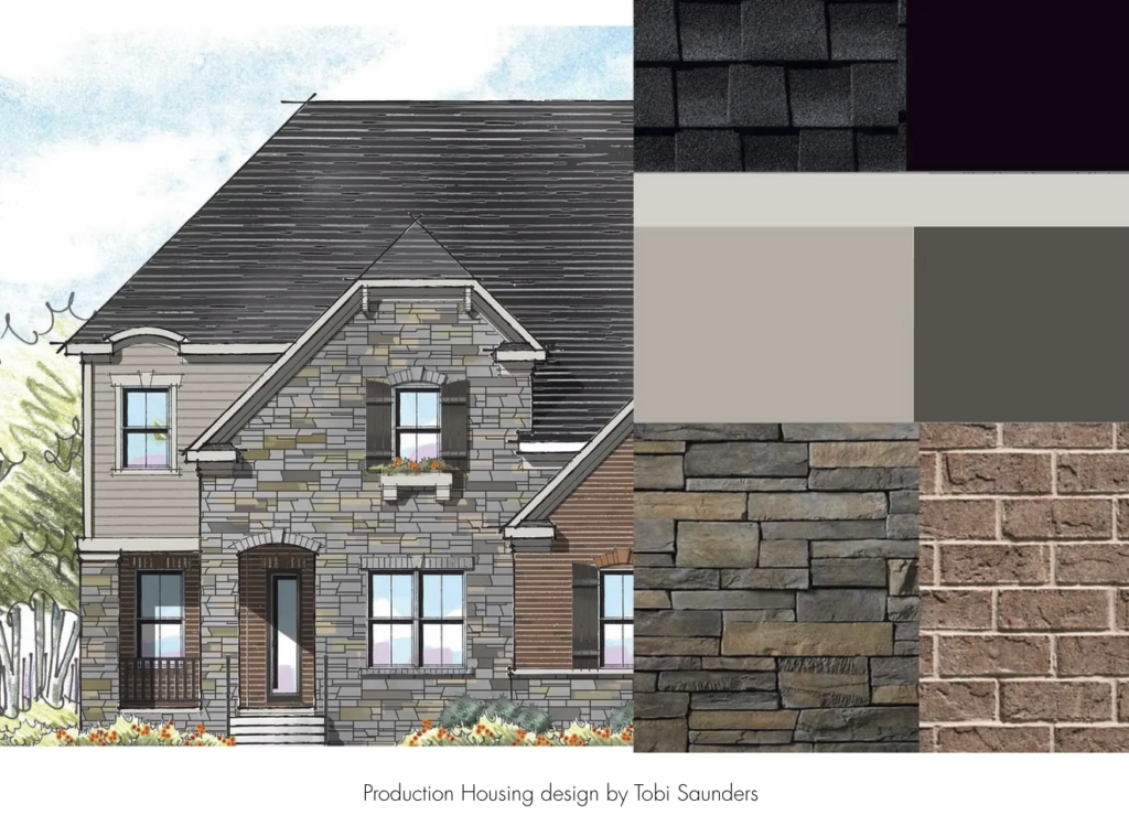
Toby Saunders is an architectural design professional and color strategist. She holds a master of architecture from the University of Florida and has worked in the architecture industry for over 20 years. She studied the psychology of color at the International Association of Color Consultants, as I did, and was greatly influenced by the color studies of influential artists, Joseph Albers. She’s combined her knowledge of architectural style and color theory to work with single and multifamily builders across the country, developing color palettes for new communities. She’s the owner of 1837 Color and Design. Welcome, Toby.
Toby:
Hi, thanks.
Amy:
Sure. So your earliest jobs were on staff at individual builders?
Toby:
No, I’ve actually only ever worked for architectural firms who work for builders. So I’ve worked in both commercial and residential firms, and probably the last 10 years or so I’ve worked for firms that specialize in production building.
Amy:
Got it. And so when you worked for those firms previously, were you working in the capacity of an architect or as a color consultant?
Toby:
Both.
Amy:
Okay. Yeah. And do you do architecture work now? Do you actually design buildings?
Toby:
I don’t right now I focus mainly on color at the moment. It’s fluid. I could go back at any time, but this is what I enjoy right now. Yeah.
Amy:
Great. In case our listeners don’t actually know what production builders are, can you explain what they are and how they work?
Toby:
So in simple terms, production builders develop residential communities, whether that’s built for sale or what’s becoming popular now is built for rent. Sometimes there’s only one builder in the community. Other times there’s these large developments that have multiple builders. There’s a lot of those. In Florida particularly and in Texas where building has been booming the past several years, the builder will typically develop multiple floor plans and develop a few elevation styles for each plan, maybe anywhere from three to five elevation styles, just depending on the size of the community and the budget. So they build the same plan basically over and over again, which makes it economical. And then changing the front facade creates diversity, and we add more diversity to that by providing multiple color palettes for each style.
Amy:
Got it. Would you say that developing color plans and facade styles for communities that are predominantly for rent is different in terms of what they ask you for and what they want you to accomplish than for sale?
Toby:
Not really. I mean, they’re still trying to make it look like a neighborhood. They don’t, for the most part, they don’t want it to be a cookie cutter community that you drive in and see the exact same house and color over and over again. So I haven’t found a lot of difference in that sense now architecturally and as far as finishes go, there are differences, but for color, I don’t think there’s a lot of difference either way.
Amy:
Got it. Is most of your work actually in Florida and Texas because of the building, boom there?
Toby:
It is. And the Carolinas now as well. They’re doing well. Yeah. So I’m actually trying to expand West. I’m from Florida, but I’ve lived out here for a couple years now in southern California. So I’m trying to expand my business west.
Amy:
Gotcha. What’s the biggest challenge in being a company that’s only two years old? I mean, I would think, tell me if I’m wrong, it’s actually getting accounts and getting work. How have you approached that coming from the background you had?
Toby:
Well, I already had relationships with builders, just working with them through my architecture firms, and I was the only colorist on staff. So conveniently for me I still offer this service. I just offer it on my own. So there is the challenge of getting new work from new clients that I haven’t worked with before, but I do have working relationships with previous clients and I’m not stepping on any toes either. So I have a good relationship with my former employers and colleagues and they refer work to me.
Amy:
Fantastic. And over the years that you were in fact on staff at these architectural companies, have you seen the existence of color consultants growing? I mean, personally, I do some commercial and mostly residences and individual homeowners. And from when I started, which isn’t a tremendously long time ago, I started in 2012, there are so many people out there calling themselves color consultants, trying to make a living as a color consultant, whether they really have the training or don’t. As we both probably know the training is not standard and it really ranges from some classes you took when you were studying architecture, like for you, but I think the majority of people who are out there selling themselves as a color consultant are not architects. And they come from very different walks of life, which is terrific, but there is not standard education for this. So are you finding there is more competition now and more companies do have someone on staff to do color?
Toby:
Well, I find that companies don’t necessarily keep a colorist on staff because it is such a niche, sort of a niche task, and paying someone full-time to be on staff and that’s their only job is not economical for them. Also, because I have a background in architecture and design, and I think it gives me more credibility than somebody who just says, oh, I’m a color designer. A lot of people call themselves interior decorators because they can’t technically call themselves interior designers, but have no formal
Amy:
Training.
Toby:
Right. So I haven’t found a lot of competition in that regard. Now there are other architecture firms who do have colorists on staff that may be working with a builder, but as far as outside colorists, I haven’t really run into that.
Amy:
Gotcha. When you’re working with production builders walk us through the process from the beginning of your involvement to the end. So you just mentioned before there might be a few different elevations, a few different layouts. They’re going to come to you and ask you what ? They’re going to tell you what about the materials that you can use, and then you give them what?
Toby:
Obviously the first place to start is what region are you in? So I can start thinking about what that mood is going to be. I need to know what their elevation styles are. I’d love to see the elevations if those are developed already because that’s very helpful. I want to know the materials that they’re using, the manufacturers they’re using, do they have a vision? Sometimes they do, sometimes they don’t really, so when I start the process, I gather all of their manufacturer materials. Typically it’s paint, but it’s also brick and stone and window colors, pre colored garage doors, shutters.
Amy:
And you’re talking about actual samples that you get?
Toby:
Some Yes. Essentially, yes. Brick and stone comes on a color board that’s usually 18 by 18 inches, pretty mobile, but I can take those. I take it outside. I take my paint samples outside and lay it all out.
So I start with ordering all of the samples that I may or may not have. Hopefully I have a lot of ’em. Then I ask them how many homes they’re actually building in that community because I need to know how many color palettes are you going to need, how many craftsman styles are you building? How many French country styles are you building? Typically, I will develop between three and five color palettes per style, just depending on the size of the development and the budget. Sometimes there’s much more than that. It just depends if it’s a really large community. So I start there and I start laying out collections of color palettes. So I have to think of it in terms of collections and how those collections work together and really envision how the streetscape will work as I’m developing those colors.
Amy:
Got it. How much feedback or influence ,interference, guidance, anything, do you get from the stakeholders that you are working with? The people who hire you?
Toby:
It depends on the client. Some clients are, these look great, let’s move forward. Others, when you start getting into it, sometimes there’s a panel of people who want to see and want to give their input, and sometimes I agree with their input and sometimes I try to steer them in a different direction.
Amy:
Always some politics involved. Right. You have to be able to work with people. What are the deliverables you give them? What are you actually showing them when you are saying this is what the facade looks like?
Toby:
So I provide a color board. It’s typically a digital color board that has the paint samples, bricks, stone, their window colors, roof colors, all of the exterior elements put together on a display board to show them how those colors are going to work together. Like I said, usually that’s digital. Sometimes they want actual physical color boards.
Amy:
Which means you put it together and ship it to them because you’re not in the same place.
Toby:
Correct.
Amy:
Okay.
Amy:
So you would create a board. You would take Masonite or something structural, and if there was brick or stone or cultured stone or Hardie board or anything, you’d put it together?
Toby:
So not the brick and stone, because that is very heavy. I will use manufacturer’s photography for that, which is usually pretty accurate. And oftentimes they have samples where they are too. But I will use paint samples, Hardie Board, vinyl, whatever it is they’re using so they can really see the color.
Amy:
Got it.
Toby:
But that’s not typical, not in the development process anyway. Sometimes they want color boards at the end for their design studio so that buyers can come in and see, touch and feel. But typically we are using digital color boards now. So I do that and then I also provide them with a matrix, a spreadsheet that has each material and what color, what manufacturer, so that it makes their ordering easier. And then I do a color diagram on their elevation, sort of a paint by numbers with highlighter colors. So it’s really easy to look at it and see, okay, yellow needs trim, and that’s the trim color we’re going to use, which is really great for painters in the field. So it makes their job easier.
Amy:
And the tools that you use, are you doing a lot of Photoshop or not needed for what you’re doing?
Toby:
I do use Photoshop and InDesign quite a bit.
Amy:
Got it.
Toby:
Especially for Photoshop. For color elevations, I also do renderings for them in Photoshop that have sort of a watercolor look if that’s something they want for their marketing materials or their website. So I use that. And then InDesign, I can create color boards on it pretty easily.
Amy:
Got it. Do these production builders ever offer an added level of customization for certain clients who are buying these houses? And if so, are you ever back in the process after you’ve done the layout for the whole community or once it’s done.
Toby:
So it’s not typical for a production builder to offer customization because it’s not economical for them. Sometimes the separate HOA that’s formed at that community will allow changes away from the builder on their own. And I have served as a consultant for HOAs and reviewing color choices that their home buyers or homeowners at that point want to make. But it’s not typical. Normally if I’m just working with a builder, we’re done. They’re done. We both move on and onto the next project.
Amy:
So what would you say your typical length of interaction is with one of these production builders? From the point they say, “Hey, Toby, we’d like you involved. Here’s where it’s going to be. Here are the five house layouts. We want three designs each from start to here you go, we’re done. What’s that time span?”
Toby:
I mean, in an ideal world with no bumps, maybe two to four weeks. It’s pretty fast.
Amy:
It sounds fast.
Toby:
Yeah. There are builders that take months also. So sometimes they come back and say, you know what? We need to add brick to this elevation. The HOA is requiring us to add more brick, or they want stone instead of brick now. So we’ll make those changes along the way as well. But in a typical easy peasy project, in and out, they tell me what they want. I develop the palettes, I send them on their way with all of their color elevations and everything, and we’re done. Yeah.
Amy:
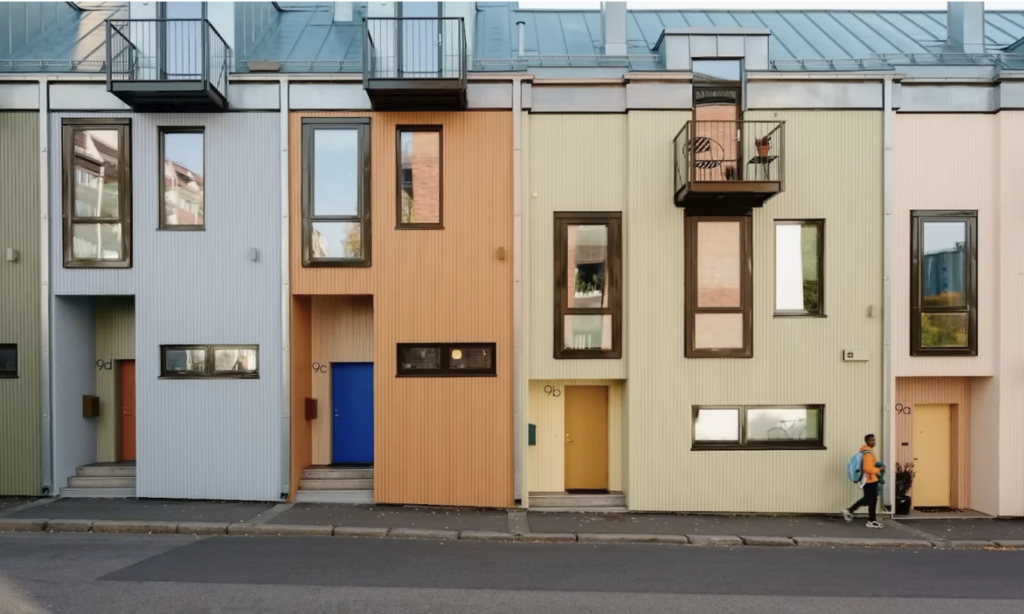
Given a lot of this work has been with production builders, talk to me a little bit about multi-family buildings. So have you worked on multifamily projects, apartment buildings, condos, whole complexes of single buildings, new builds, renovation when the buildings get taller and become that kind of community? Have you experienced doing that?
Toby:
Most of my multi-family housing is townhouse style housing. So anywhere from a duplex to maybe a six or eight plex building. And it’s a community of buildings. So when I do that, we have to discuss what are you looking for, what’s your vision for the community? Do you want all each building to be the same one color palette for each building, or do we want to do a row house type color scheme? And then once we develop all the color palettes, then I’ll actually map them out on the site to make sure that we’re not using the same color palette either next door or right across from each other that we make sure that there’s not a lot of monotony going on.
Amy:
Got it. And so you do that by looking at a site plan, an overhead site plan, and saying, okay, the green house is here, the blue house is here, it’s looking at the yellow house.
Toby:
I actually open it up in Photoshop, and I start placing small thumbnails of my color palettes on each building to see visually I can see what’s happening.
Amy:
You’re creating colors for whole communities, be it multi-family or single family homes, but in community, do you think that you rely more on value, saturation or hue to create the difference between the looks of the façade? Do you tend towards a certain kind of design that you’re more likely to rely on using these three different attributes of color?
Toby:
First of all, I have to separate my personal taste from what I do. But I like to make sure if you look a little cross-eyed at the palettes as they’re laid out, that you see variety. So you see greens, blues, reds, whether, I mean, obviously not
Amy:
Cherry red,
Toby:
Right? Maybe it’s a door or it’s a shutter color. There’s a wide range of color that is there. So I would say it’s all of those things, hue in particular, because I think that we have got to incorporate more than just gray and beige. So yeah. When you squint your eyes, do you see variety? You want to see variety, but you don’t want to see one particular, one really popping out at you because can you imagine driving down the street and suddenly there’s a bright red house amongst the moody, earthy towns of the other houses?
Amy:
Right. What about, I find just looking at building across the country, be it single family homes or multifamily, that it’s a whole bunch of years now that there’s been such a prevalence of buildings being black and white or being almost black and white, charcoal gray and white. There’s such an reliance it seems, on these high contrast color combinations regardless of where in the nation they are. And it just seems for me, it’s too much of a reliance. What’s your feeling about that?
Toby:
I mean, I don’t hate high contrast. I think I agree that it’s overused. You’re going to know that house was built in the early 2020s, just like in the nineties when you drove through a neighborhood and everything was beige, and you know we called it Builder Beige, and now we have builder white. I think that you can still use high contrast colors, but maybe it’s not the modern farmhouse White House black trim that is so popular. Maybe it’s a second body color that accentuates a gable or an entryway or trying to think of more creative ways to use contrast than just paint color and trim. I do think it’s dated though. I think there’s an expiration date on it.
Amy:
Right. Are you finding that even for your clients who are predominantly in the South, that they are still embracing some use of black, even if it’s not a whole black façade? I am.
Toby:
Yes. Because, well, obviously you cannot paint the entire house black because of heat gain in the South. But you can paint a boxed out window, you can paint that siding black, and it’s small and it’s impactful, but it’s not really contributing to heat gain.
Amy:
And what about the idea of color blocking? The effect of creating patterns on facades where maybe the materials are being switched up? Maybe you’re going from a Board and Batten area to a lap siding area, and there’s a little bit of an architectural reason, or maybe there’s not, and color blocks are created just for visual interest where there’s no architectural justification for it. Have you seen that and what do you think about that?
Toby:
I think it’s a great way to add animation to the facade. While keeping a tighter budget, they may not be able to change materials and architecturally change the facade, but you can create a lot of change with color. So again, maybe it’s the gable or it’s just right around the entryway. We use something, even if it’s a darker tone of the same color, something to draw the eye to it. You create depth. And even on a flat surface, you can create the illusion of a change of plane without having to box it out and add to the expense of the building.
Amy:
Absolutely. I had a client last year, she was a university professor, and was pretty close to retirement and she was building a house that was going to be her last house. She had it priced out pre COVID, and then they were breaking ground post COVID. And the change in the building costs, both labor and materials were so impactful that she had to make so many compromises that she never planned on. So when we started, we were using LP siding and I was trying to get her to to pick some small section of it and have panels there. So we could do a little, if not board and batten just panels and a different look and switch up the color and all. It was modern, it was kind of tiny, but modern kind of boxy. And as it turned out, it was so much more money to do the panels than the lap siding. It flabbergasted me that all we could do was use color. Exactly like you said, we created depth, an area looking like it recessed when it wasn’t or comes forward when it didn’t. And adding shades and all of that stuff just to give it more architectural interest using color. So I mean, costs are incredible now. I’m working with a client right now in Rhinebeck, which is a Hudson Valley town here, a beautiful home in the village of Rhinebeck. And it’s a 1920s brick house that they’re doing extensive renovation, expanding, upgrading, and all of that. And I can’t tell you the square footage of the kitchen. I don’t know it, but it’s kind of a normal size kitchen with let’s say two long rows of cabinets and therefore counters and backsplashes are also stone. So stone on the counters, real stone, not quartz, stone on the backsplash. And then in the primary bathroom, they wanted two shower walls to be stone slabs also. That was marble. And I just saw them yesterday. We were doing paint color for various things, and he said that the cost of the stone in the two areas was flabbergasting. And I said, I have to ask, will you tell me? And he said, yeah, $70,000.
Toby:
Oh, wow.
Amy:
Yeah.
Toby:
Wow.
Amy:
So are there any kind of projects that you haven’t worked on yet?
Toby:
Yeah, I’ve worked on mainly smaller scale residential and commercial projects. I’ve done some commercial and retail and medical buildings. I would really like to work on a high rise, particularly a condo type high rise that combines both residential and commercial. It’s a different scale and you don’t have to think about unit to unit. We can think large color blocking on a large building.
Amy:
Do you want to talk about any of your projects that you’ve done so far that have really stood out for you in terms of anything it’s problem solving, complexity, level of satisfaction, uniqueness, anything that stands out in your mind?
Toby:
Well, I did have a project in South Florida. My client was one of several builders in the development. They had, gosh, I think they had 10 floor plans and seven elevations each. And we did five or six color palettes for each elevation style. And we also had to render all of the elevations. So in addition to picking the color palettes, I was also maintaining the matrix so that we knew what color palettes we were using, and we made sure to use each one at least once. And then I also joined the team that was rendering those elevations. So really cool project. Yeah, a lot of work. Very complicated, but great. Yeah.
Amy:
Had you done color renderings before?
Toby:
I had a little
Amy:
Gotcha.
Toby:
But it really fast forwarded that skill for me.
Amy:
Right, right. And that’s something, I mean, Photoshop isn’t 3D, so you would’ve done that on InDesign?
Toby:
No, I did it in Photoshop. It’s not three dimensional, but elevations, it’s just the two dimensional elevations. So you add shadow and light and create the illusion that it is more of a three-dimensional watercolor sort of rendering.
Amy:
Gotcha. What made you decide to create your elevations with this watercolor look? You just find it painterly. Yeah.
Toby:
It’s what the client was looking for and it’s a great look.
Amy:
Do you also do work in California or is that kind of building not happening?
Toby:
It’s happening a little less. So in the area that I’m in currently, I’m actually planning to move a little further south, so there’s a bit more building going on down there. But I’m in the Los Angeles area, so there is not really production building that happens in Los Angeles.
Amy:
Gotcha. What kind of regional differences do you see in the requests from the builders, even given comparing a southern location to a southern location, for instance, a Florida to a Texas, things that you think you can attribute to region as opposed to just individual companies and people who are hiring you?
Toby:
Florida and Texas are a great example because Texas loves their Texas stone and it’s mined there. It’s very economical for them, it’s plentiful and that’s why they use it. And a lot of it has a lot of yellows and oranges in it. And they use a lot of, they like cedar, they like cedarwood and their Texas stone and the colors really, it’s can be a challenge to work with so much orange and yellow. Whereas, there’s really nothing that’s native to Florida anymore. So it’s cultured stone, it’s brick. The world is your oyster, but Texas is a little more limited in what you can do.
Amy:
Do you find that when it does come down to using paint, if it isn’t Hardie or vinyl or something like that, do you find that most of the builders are using one paint company as opposed to the others?
Toby:
A lot of them do, but there are instances where they’ll use a different company and I need to know that upfront because as you know, the base they use, the mineral base they use for their colors is different from company to company. And so even though you can come close to matching it, it’s really not a color match. So I had a builder in Florida who after we chose all the color palettes, their paint contractor went with a cheaper paint and they color matched each individual color, but they did not look at it as a pair as two or three colors that work together. Undertones were off. They painted a couple of houses. And when I tell you I was horrified, horrified, well, I was like, okay, this is the color. If this is what you’re doing, let me redo your colors because I don’t want this to get built like this. So we did, we just went back and redid the colors based on the new brand they were using and got them to at least to repaint some of the elements on the already painted houses that worked better than, I mean it turned out well in the end, but it was a scary moment. At first. I was like, did I do this? No.
Amy:
Yeah, yeah. It’s just incredible. The painters, the painters are so quick to say, yeah, use any company you want. And then they go and use who they want. Here where I am, I mean more of my work is virtual than on-site at this point, but still, I’m in the Hudson Valley, I’m right next to New England. And I would say slightly more homeowners choose Benjamin Moore and way more painters want Sherman Williams. So I had a situation where I had this lovely couple who were renovating a country house in the Berkshires in Great Barrington. And we did colors for interior, a whole interior. And I said to them, what are you using? Make sure and not just the name of the company, you want to hear the line of paint, because I’ll tell you, there are contractor grade paints and their goal is cheap and fast and there’s retail paint and their goal is coverage and durability, and that costs more. And you can’t just say, Benjamin Moore, your quote needs to say, what line of paint? Okay, fine. So we spent a lot of time on picking these colors, which we settled on. And one day I get a call from a woman and she says, hi, my name is so-and-so, one of the local reps for Sherwin Williams. I know you’re working on a project with us and I just want to know if I could help you. Do you need any designer tools? And I have every single fan book and fan deck and loose leaf and everything I need from Sherwin, thanks so much, but I’m not doing a job in the Berkshires. What are you talking about? And she was like, oh, oh, I must have made a mistake – all this backpedaling. And I got off the phone and I emailed my clients and I said, “listen, I think your painter might be doing a swap out Benjamin Moore to Sherwin- Williams. And there’s no problem with Sherman’s paint. It’s excellent paint, but I do not condone color matching one company’s to another. Look I took so much time. We went and looked at the paint in the rainy days and then we came back on the sunny days and all of this, and now it’s being matched. And so they were really upset. They got in touch with the builder. The builder subbed out to a painter. So he got in touch with the painter and they said, oh yeah, yeah, Sherwin Williams all the time. I don’t even need to mention the Sherwin-Williams because we match Benjamin Moore all the time. And I said, have them paint the tests, paint the tests, and let’s go see it. And we walked into, when we came into the house, the Benjamin Moore swatches were up on the wall next to a painted patch of the Sherwin match and not one color matched. Not one. And they said, sorry, you bid Benjamin Moore, you’re going to have to use Benjamin Moore. But the painters are very flippant about matching because they don’t care. They don’t have the eye, the nuance. It is not apparent to them or important to them.
Toby:
Right. It’s the mechanics of painting for them. It’s not the artistry of painting for them. So they don’t get, I don’t think they’re trying to cause any harm. I think they just don’t get it. So you definitely have to educate your client and make sure your client is, understands what their painter’s going to do for them.
Amy:
Well, listen, this has been really fun talking about your work and your projects. I wish you a lot of luck. I mean, it’s always exciting to go out and start your own thing and be your own boss. And I’m glad that you’re enjoying it, and I wish you lots of luck and I’ll see you out in the field.
Toby:
Yeah, thank you so much for having me. I appreciate it.
Episode Thirty One:
Dagny Thurmann-Moe : Maximalist Scandi Design
 Amy:
Amy:
Color is the foundation of great design. It can settle a building into its landscape. It can make an unattractive structural detail just disappear. And it can change your mood in a room instantly. Welcome to Let’s Talk Color. I’m Amy Krane, architectural color consultant at Amy Krane Color. I’m a color expert and use color to transform spaces and products from the ordinary to the sublime. As a paint color specialist, realtor, and design writer, I’ve got my finger on the pulse of what’s happening in the world of color. In each episode, I’ll reveal best practices for choosing color by introducing you to masters of color for the built world. So throw out those paint chips, tape to your walls, and let’s get started.
I think I’m probably not alone confessing that sometimes I end up down a rabbit hole surfing on Instagram. We all know that the algorithms have changed over the past few years, and it’s a lot less fun than it was. But I used to be sent some really inspiring profiles I wouldn’t have known about otherwise. One of them was called Dagny Farga. I have to admit, not speaking Norwegian, I had no idea what those words meant. But I saw all of these colorful interiors, and I thought it was a paint brand. But no, it’s the profile of Dagny Thurman Moe. Farga means color. I’m really excited to introduce you to Dagny, whom you can also hear speak on YouTube at a TEDx talk she gave. Dagny Thurman Moe is a leading Norwegian color designer and the founder of Koi Color and Design Studio. She and her team designs exteriors, interiors, products, and develop CMF strategies for brand syncing a stronger identity through color materials and finishes. Dagny is known for challenging the idea of timeless design, instead creating time-bound and aesthetically sustainable environments that reflect culture, history, and human needs. Welcome, Dagny
Dagny:
Thank you so much.
Amy:
You have a lovely website. And besides what I mentioned, it looks like you’ve also done a collaboration with a company for wallpaper. And you made a downloadable manual for applying color to schools, which is really interesting to me and we’ll talk about. And I think you’ve contributed color for a paint brand called Pure and Original Paint. Well, your interests are wide. What was your training?
Dagny:
It was very far from what I do. So I went to university and studied pedagogy, sociology and informatics. I am basically self-trained.
Amy:
So how did the original projects come in, what taught you? How did it all get started then?
Dagny:
This has actually been a lifelong kind of love story with colors. And so from a very early age, as long as I can remember, you know, being like three, four, five years old, I was very much into the colors on my clothes. They were a very important form of communication for me. I used to change clothes, you know, due to where I was going. And that evolved into an interest for interiors and colors and interiors. So when I was like seven, my mom let me decorate my own room. Colors were super important. And around 15, 16, I started devouring. everything I could get my hands on when it came to research and books on interiors and colors. And I was just insatiable in a way. I could not get enough, but I never saw it as, you know, a possible career because who worked with colors, you know, no one. And there was no type of education that I could pick that up with, you know, to cater to exactly what I felt I needed. And from, I would say my early twenties, I started reading the research and books on architecture and historical use of colors in architecture and arts. So I’ve read many, many, many books.
Amy:
What were the first projects that came in for you? Interior design, people liked how you design and they asked you to do their apartments or their houses?
Dagny:
Well, kind of. I was pregnant with my first daughter, I started a blog that was about Scandinavian style from a maximalistic perspective. This was around 2007 where, know, the gray-if-ication of Scandinavia in particular was, in full bloom and I hated it. And everyone was saying, this is so Norwegian and so Scandinavian. And I was like, “it’s really not. Look at the history.” So that blog had readers from over hundred different countries and that I got a job as creative director for a paint brand in Norway with paint shops. So they sold paint and wallpapers and textiles. And my job was creating colors and color charts for interiors and facades and also doing these creative collaborations and helping the stores and picking out wallpaper designs and textiles.
Amy:
That must have been heaven.
Dagny:
Yes, it was. It was amazing. And I had a wonderful budget.
Amy:
Incredible. You know, you’re talking about something that I plan to talk about later today, but why not jump into it? All of our understanding of Scandi design is white, pale gray, pale blue, Gustavian, all of that. You know, okay, I know that’s Swedish. Yes, I’ve seen the photos of the waterfront in Copenhagen and you see those colorful buildings and yet the power of that idea of Scandi design is so strong that I also really believed that throughout time Scandinavian design, let’s say interior and exterior, was all about those really pale colors. So when you’re saying your blog was about maximalist Scandi design to me. It’s like “what is that? “ Were you the only person (espousing that)?
Dagny:
It probably wasn’t just me, but I was I would say the loudest voice, you know, the whiteness and the gray has nothing to do with Scandinavia at all. So we have no cultural historical references to gray being a popular color in any of the Scandinavian countries That is just the trend and that trend came from Belgian industrialism that we felt had a kind of a connection to Scandinavian minimalism that started in Denmark and Finland in the fifties. Denmark has been the whitest Scandinavian country, if we can call it that. Norway has very little history of using white in their interiors. There have been some shorter phases, but nothing that has lasted for more than a decade. And if we look at Sweden, they have a really strong history with floral wallpapers, for example. They’re the wallpaper nation of Scandinavia. Norway has been the most colorful country of the Scandinavian countries. We’ve been, I would say, the country that had the least contact with the continent. So we were all farmers and fisherman until we found the oil, basically. That’s a simplification, of course. We have a really strong history with textiles and weaving and using bright and complex paint colors. We have the Rose paintings that were like incredibly bright and then the Stave churches, which are, I think, our most important cultural icon. And of course we have Edvard Munch, the famous painter who was a master in using colors.
Amy:
Yeah, incredible talented. You’re in my office. I have these yellow-green walls. It’s a color I really gravitate to. And I just changed my ceiling color from white to sort of a rose-peach color. This is the boldest mix of wall and ceiling that I’ve ever done. You know, you might do it too, but I use my own home to experiment. But in looking at photos, older photos on your Instagram I think I never saw a white ceiling in an interior. So is that you or is that Scandinavian or Norwegian tradition? Do you always put color on the ceiling?
Dagny:
I would say that that is very much me. I have worked with creating interiors since 2007, 2008. I would say from 2010, we’ve worked with colors on the ceiling. It’s the past 15 years of most of my career, I would say. The reason for that is that I feel that white is really harsh. It’s not a part of the color wheel. It’s either the center or the end of the wheel. And if you want the room to feel harmonious and not like you have a white big like iceberg on top of your colored walls. You need to put some color pigments in there. And of course, this isn’t something I invented. Yeah, the inspiration I took was from historical interiors and looking at how they decorated their ceilings and what kind of color they used on the ceilings. So I just wanted to do my 2010 kind of version of it and it’s turned out to be like a trademark for us.
Amy:
Got it.
Dagny:
I’m sitting in an apartment from the 50s right now and it has the same color on the ceiling. This is the fireplace living room and it has 250 centimeter high ceilings. My take on using colors on ceilings is first of all, we need to decide what kind of feeling and atmosphere we want in this room. I think that always focusing on light is not necessarily right for any space. Some spaces need to feel cozier and like a little safe cave. A bedroom, for example. A room with a low ceiling height or the feeling of a low ceiling height with a colored ceiling can give you a cave feeling and give you much better sleep. So if you live in an apartment with a low ceiling height, you have a small bedroom and you have trouble sleeping, paint it all dark. Don’t paint it black, but maybe a dark shade of green, for example, or blue or brown or brownish red or whatever, whatever kind of nuance or warmth or coolness you want in the room. But if you are working on a room where it is important to have it light and airy, for example, we do use pigments on the ceiling, but we don’t necessarily use very saturated colors if the ceiling height is low. So it can be more of a dusty kind of airy, light and airy tone, but never white.
Amy:
Got it. Okay. Could you talk about time-bound design? How does it differ than trendy? And if a design is tied to a particular point in time, then how does it not become dated later on?
Dagny:
That’s a good and important question because I really want to change how we think about decor and interiors and what it means to be a representative of an era. Because if we look at historical interiors that we celebrate today, they’re in no way timeless. They’re very much time bound. We want to preserve and celebrate interiors that are the best representatives of the times they were made. So I think that you shouldn’t be afraid to represent the 2020s or the 30s or the 10s. Just do it in a really high-quality way. Do the best you think you can to represent that era with the patterns and textiles, we have. I think that the way our society is moving, we can’t change our decor every 10 years. We need to, you know, live with our homes for, hopefully, my dream is that we create a home for someone and they keep it that way for the rest of their lives or for the period they live in that home. If they need to add anything that’s OK, like art, or change the cover on a pillow if it’s worn out, you know, maybe you need a new light fixture or wall scones or whatever, you know, but just don’t change the whole room.
Amy:
Well, I mean, we do have such disposable societies. It comes out of materialism and capitalism and the fact that manufacturers want to keep selling, but it’s so antithetical to environmentalism and it’s antithetical to just the concept of quality. It’s really not a great change in society.
Dagny:
I completely agree, and it’s really unsustainable.
Amy:
What’s the makeup of your company? Are there other designers besides you, or are you the main designer and then you have support people?
Dagny:
I am the creative director. I always pretty much have the vision for what we want to achieve in a project. And then I have a really talented interior architect and architects that contribute with their ideas and their competence. And we work together in creating the projects that we do. I always collaborate with one of them on a project. It’s very rarely that I do it all by myself.
Amy:
Got you. And they’re actually trained architects and so someone might come to your company to build a new building from scratch?
Dagny:
Yes.
Amy:
Ah, I didn’t realize that. That’s exciting. What countries have you had projects in? I mean, any kind, from architecture to even interior design, someone’s country house. I don’t care. Where have you worked?
Dagny:
I’ve worked in England, Belgium, the Netherlands, Sweden, Denmark, and Norway, of course. For the paint brand, they have suppliers in many different countries across the world.
Amy:
They’re not here in the States, are they?
Dagny:
Yes, they uh have an agent for the US and Canada. It’s Pure and Original paint. I think the Instagram handle is Pure and Original US Canada. They’re definitely available in the States and it’s kind of lime paint. So the reason for why we wanted to work with them, I’ve worked with them since I started my company, which was in 2014, is that they only use natural color pigments and it’s just not plastic paint. Paint basically, as you know, has plastic color pigments and plastic binder. So it’s really been a joy working with them and they’re a Belgian or a Dutch brand. They’re really known for their shades of gray and white and beige. And then they let us, or me at the time, dig through their archival colors, they had so many amazing colors. So we’ve been working on making their unknown colors famous.
Amy:
Got it. That’s great. Neutrals for exteriors and interiors are considered culturally as a sign of sophistication and good taste. Is it the same way where you live? Do you feel you’re constantly battling a public perception, but also specific requests of your clients to go neutral and you have to kind of push them to use more color? Or do you think because you’re known as this person who emphasizes colorfulness the people who come to you already know what they’re going to get.
Dagny:
I think they already know what they’re going to get. And if someone comes to us and says that we want something conservative, that’s white or gray. I’m like, first of all, that’s not conservative. That’s just not knowing history. And secondly, we don’t do white or gray. So then you’ll have to work with someone else who does.
Amy:
Okay. So yeah. So that means even for projects where you’ve been involved in the color for exteriors, even on exteriors, ah there isn’t a beige, tan, earth tone. If you were to consider neutrals, whites and grays and beige and off-white and black, but also some earth tones, know, tan and mushroom and colors like that, never.
Dagny:
We’ve worked with some beige, tones of beige, and we can work on finding a good white, but then that white will have color pigments in it. It will not be like a harsh white. Yeah. And when we work with facade colors, we’re not really into what’s been popular for the past 20 years. And I talked to this with our clients. I say we’re into what will last the next 400 years, you know, and what others that have been relevant and returning again and and again for the past 400 years. So if you tell me that white is a classic, you don’t know our history, you know, and it’s not a classic. It’s, it’s, it’s not timeless. And it irritates me when someone thinks that it’s timeless or when they think that it’s sophisticated. And I’ve had this discussion so many times about, you know, eh but why is more elegant and so many have been inspired by ancient Greece, for example, with the columns and the marble architecture. And the fact is that those palaces, they weren’t white. No, they looked like they came straight out of a Disney movie. oh The colors are all gone. It’s so amazing. Yeah. And you know what happened during the late, like the end of the 1800s, like around 1890, 95, archaeologists started finding these structures. And when they found traces of paint, they actually removed those traces because they didn’t want history to be the way it actually was. Yeah, they removed the traces of colors that they found because they wanted to keep this idea and ideal of Greek classicism. Of classicism being white.
Amy:
Yeah, interesting. Wow. I had no idea. That’s fascinating. I’ve heard you, I’ve heard some interviews and I of course listen to your TED talk. One thing that really stood out is that using slightly different terminology, you talked about something that I talk about all the time that came out of my training with the International Association of Color Consultants and Designers, which is that for an interior to be comfortable and relatable to a human, what we should be aiming to do, is to create a color palette that is like nature with a mixture of different hues, saturation and value. That in one eyeful, you get a mix of all of it. Not to the point that it’s crazy, overstimulating, confusing, because that will cause anxiety, a sort of moderate amount of all of that. And I’ve heard you talk about similar ideas, although when I think about that, I think about it and utilize that for interiors, but I have a sense that you utilize that concept for everything that you work on. Could you talk about biophilia, nature, and humans’ need for color from your perspective?
Dagny:
Yes, biophilia is a really important color cornerstone, I would say, in how we work and what we work with. And it is actually exactly what you work with as well in the way you describe it. So when using colors, it needs to be uh layered in a sense. If you look out on a forest with trees, for example, you will see thousands of nuances of green. It’s not just one shade. And when we work with green inside, we also need it to be layered, for example. We need to add more nuances of either green or any other color that works in a harmonious way. But we also work with, we know that for example, green plants or plants in general are important for our wellbeing. We know that it reduces our sick leave from work, for example. We know that it calms us and it increases our ability to focus and concentrate. We also know that and natural materials, especially wood that hasn’t been lacquered to death, touch it, your pulse sinks. So you become calmer. And when it comes to lighting, for example, there’s something called human-centric lighting where the lighting follows the natural rhythm of the day, which is also something that increases our wellbeing inside. When we work on a facade, we also want to have this variation in how or the color of the facades look. So if we think of a little village with lots of cute houses in different colors, if you start analyzing that little village, you’ll see that most of the architecture is really monotonous in a sense. It looks very similar. There are not many different types of architecture or style directions, but you have difference in details like detailing and colors on the facades and the doors and the plants. And that creates a space that feels really warm and welcoming to us. We work with on a modern area or street or a large housing projects with many, many buildings. Our goal is always to combine colors that vary in nuance and saturation and hue, like you mentioned. We know that that increases the human level of curiosity. If an environment is very monotonous where all the façades are glass or steel, for example, they’re all white or gray, we become more indifferent to our surroundings. We become less interested in investigating and getting to know that environment. And that is because there’s not much to rest your eyes on and there’s not much to find or So, yeah, we work with exactly the same outdoors as we do indoors, but the nuances and the actual colors that we use, not the colors, but the nuances are very different from the ones we use inside because, for example, we have very blue daylight, which highly affects colors when you bring them outside. A color that can look amazing inside can look crazy when you put it on a large facade.
Amy:
Do you tend to use more warm colors or cool colors or always a mix of both on exteriors in Norway?
Dagny:
I would say 80 % is warm colors. So nuances of red and yellow and that includes like pink and terracotta and red and Very little orange actually, which I think is a bit sad because Copenhagen has like the best orange facades in the world. And it’s difficult to get Norwegian homeowners to go there. But yeah, we do that. So the red and yellow groups of facade color are the ones that have lived in Norway for the longest. period of time. And people have been explaining that with the fact that it’s the cheapest pigments. Historically, not after plastic paint because the cheapest is white, which was the most expensive free plastic paint. Those two colors are the two colors that are missing from our surroundings during winter. when the light becomes even bluer than it is during summer and all of the colors are removed from our nature. It just becomes gray and dead. And we know that color is energy and the warmest colors like reds, oranges and yellows have the longest light waves which again gives us the most energy that we are missing because of our blue daylight and green during winter daylight. So I believe that the reason for the two color groups popularity has much more to do about health and our previous intuitive understanding of what we need with our surroundings. You can also see that with how architecture was designed before the fifties. And we do use greens, a lot of greens actually. It’s the third most popular color in Norway throughout times for facades. And blue is a very tricky color here because we have blue dyes. So it can become fluorescent.
Amy:
That’s so interesting. Also forgive my ignorance, because it kills me, I haven’t been there yet. just thinking back to the photos I’ve seen over time, and I’m hoping this isn’t just Sweden, and it’s Norway and Sweden and even Finland. I’m thinking about the older wooden homes that I see out in the countryside, up on the islands. What stands out for me, old wooden houses, black bright yellow and red, that Falun red. So are black, yellow and red popular colors in all of the Scandinavian countries or am I just thinking Sweden?
Dagny:
Black is not really common, but you have a very, very dark brown. Is it called tar in English? Kind of like a treatment of wood panels with tar, which makes them a brownish black. It can look black, but it’s brown. So yes, I would say that those are the most popular facade colors in pretty much every country that is placed in the same section of planet Earth. North, If you look at Greenland, you will see the same colors. Where do you start when you’re working on color for a large exterior?
Amy:
Let’s say, I don’t know if you do more new builds or they come to you because it’s an older community or building or set of buildings and they need a facelift, they need a renovation. So where do you start when designing? Obviously you have to start with the architecture, have to start with the purpose of the buildings and the surrounding and all of that stuff. But thinking about color, where do you start? What’s your process?
Dagny:
We work with both historical buildings, like from the 1650s to future architecture that hasn’t been built yet. And we always start with the surroundings. Often we map the surroundings and we do an aesthetic analysis of the colors and materials we see in the surrounding areas and streets and the actual street that building or the project is. And it depends on the size of the building. You know, we have different strategies and using colors. If it’s a small wooden house, you know, we very often complexify the palettes for the past 20, 30 years. You know, a lot of them have been painted white or gray or whatever with white windows. And that’s just wrong when you look at history. So we try to reintroduce the historical principles on how to create a color palette for this type of architecture. When it comes to larger buildings, like, above two stories and up to 14, 15. We try to figure out how to make this volume look smaller. We very often split up volumes into maybe two or three sections and we often split them up both horizontally and vertically depending on the size. Because we try to create like a human scale even if it’s not there. You know, color can be a really powerful tool in making a structure seem smaller than it is. So I often say that contemporary architects are experts at making large structures seem bigger than they are and we want to make them smaller. And we think that’s really important for a good surroundings for humans.
Amy:
One project of yours I really love were those, that set of row houses in Oslo. They started off a sort of tan color, tan beige, covered in graffiti, and they weren’t old. And you really, it was an incredible transformation. The colors you chose, I would not call them pastel, but were not very saturated. They were sort of light mid-tone. At least that’s how they appeared in photos. A couple of the houses seemed larger, slightly bigger architecture than the others. The terraces were in different places. And it seemed like those larger houses got slightly lighter colors, which was very interesting. They all had inset doorways. So the volume pushed back for the doorway. And you added color to the walls of the inset as well as the front doors. But how you treated each inset entranceway was different. So it was not uniform. For instance, from what I recall, one of them had a super striking, intense cobalt blue front door where others had more mid-tone, less saturated front doors. So I thought that was a really interesting approach to how you added color to these houses. And I wondered if you could talk about why you gave up on this idea of symmetry for each interior entranceway. They are equally saturated, even though different colors, and why you varied it up like that? What was the idea?
Dagny:
That’s actually a biophilia. So it’s all about creating something where you as a walker by feel like there’s something to discover here. It’s really important that it doesn’t feel like there is a system is not systematic in any sense. I wanted it to feel randomized, but still kind of like related. So it feels good to look at, but it doesn’t really, you can’t really make sense of it, but it still makes sense. And I think that…We work like that with very many of the projects we do, because I feel that that is what we need from our cities. We need them to be interesting and we need them to be, make us think. When you walk on the sidewalk, you walk by these houses, there is something new to see from every single entrance when these houses were painted, we got, and people understood that it was us that were doing it, we got so many messages and thank you notes and people saying that they’d changed their route to work, for example, because they just wanted to pass this. It felt so good to look at.
Amy:
It’s almost like candy colors.
Dagny:
It’s actually historical paint colors. The base colors are historical, inspired from the wooden houses in Grinne Ljokka, which is an area in Oslo with a lot of older buildings and we’ve combined those with more contemporary colors or colors that are more available with modern paint. This is something we often do. We take historical colors and nuances and we mix them with contemporary because we want that little touch of the time we’re in but we still wanted to be connected to the surroundings so that 10 years or 15 years from now, it will still make sense that those houses have those colors on them.
Amy:
Got it. I really like how you handle saturation and intensity of colors on exteriors. I think it’s one of the hardest things to work out. I mean, we all run to hue, you know, that it’s gonna be pink, it’s gonna be terracotta, it’s gonna be green. But these nuances really make or break the design and also affect the combination of the colors hugely. It’s not just about green next to pink, it’s about what green next to what pink. And I feel that that’s something you’ve really, really learned well and excel at. I don’t know if it’s something you can articulate or not. Can you talk about how you choose the chromaticity or saturation of a color for an exterior?
Dagny:
For an exterior, we always use less saturation and chromaticity than you think you want. The color becomes more up on a facade. But we know that we can take more color, for example, on the first floor or the ground floor. We know that we can handle more colors on details, for example. We have a lot of experience with what nuances work on a building and what doesn’t. And what works on a large building and what doesn’t. We want when we work with a city, example, and an apartment complex with commercial spaces on the ground floor, for example, we want that ground floor to be really beautiful and stunning and maybe just calm it down a bit when we move up. And I would say it’s all about using very dusty colors mainly, but not too dusty. It’s a combination because when we work with yellows, for example, we can use a lot of chromaticity and saturation, but when we work with the green, we can barely have anything.
Amy:
Interesting. Are you always using this for exteriors? Are you always using the same paint brand because you like that paint?
Dagny:
No, no. The project dictates what paint to use and what type of material. So sometimes we can work with… oils for example or bricks and then we combine that with maybe lime paint. We have very many different products that we work with and very many different fan decks and then we also have our own samples which we have a lot of and sometimes we try to use a new color for n exterior, lavender, for example, which is incredibly uncommon. We’re like, want to put lavender on a big apartment complex. And then we try to, and then our goal is to make it work and feel completely natural together, more historical reds or yellows or brick colors, for example. Yeah.
Amy:
Fabulous. When you think about these historical buildings in Scandinavia being these colorful buildings, these reds and terracottas and yellows, and I see a lot of pink, you use a lot of pink, I love pink. Do you get a lot of pushback from people, we don’t want pink? Because I’ve seen some just beautiful pink buildings that you’ve done. Is it rare or no?
Dagny:
The reason for why we do a lot of pink is that it has been a historically significant color that has been completely removed from our cities and streets and buildings. We often call what we do kind of like city repair or street repair. We can see that we have a really beautiful yellow facade here, for example, and next to that would be perfect with red. Or we have a brick building here and it would really work well with a pink. When we have people saying that we don’t want a pink facade, I just say it’s a light terracotta.
Amy:
That is so great. It reminds me when I send my colors. This is for a residence. When I send the color chart with the colors to my client for remote jobs when I’m not in the same place and then order color samples and have them sent to them, I always tell them these two things. Do not look the colors up online. They are not accurate. They’ll just bias you unnecessarily. And please ignore the names because every other name in a Benjamin Moore fan deck is such and such gray, such and such gray, and they’re not. They’re just muted versions of a real hue. And if you see gray, you go running away, but I told you I don’t want gray. Ignore the names. So it’s very funny. There you are saying, call that pink a terracotta and you’ll get away with it, right? Yes. Let’s switch gears for a minute. That manual for color for schools. Were you employed to come up with a manual or were you asked to create color for schools and from that came a manual?
Dagny:
Now I actually worked with colors for schools and then we have kind of a set of rules and guides called Universal Design, which is about creating public spaces that are welcoming and easy to interpret for most people or everyone. So if you have issues with your eyes or if you can’t hear or whatever, you can still read the room. And a company that worked with that contacted me and they’re like, we want to get funds to create a guide for the use of color in schools and we want to do it with you. And I was like, yes, I have been talking about this for so long. You know, we used to do courses together with four architects and interior architects and how to use something called luminance contrast, which is an important part of this universal design set of rules. Yeah, it was a really wonderful project. I wanted it to be easier for architects and interior architects to use or choose colors for the different types of rooms so that they would be completely sure would work. Because there’s a gap in competence for these roles. There hasn’t been a lot of focus on colors in the education of interior architects and architects for decades. They just didn’t know what to choose and what colors would actually work. We wanted to make it really simple and picked out the best color codes to use for the different types of rooms in a school. And that guide has been so popular. It’s widely used today. We still get feedback.
Amy:
Incredible. That’s incredible. Did you use studies because studies have been made about color for schools and how different colors work for different age children? So did you factor that in?
Dagny:
It’s actually it’s difficult to use all of that research to perfect it because you can only work on the large surfaces and the furniture. But we do as well as we can to make it easy to make choices that fit the age groups. Research has been used both for schools and hospitals and other kinds of institutions because they often point in the same direction. So it gives extra safety and making the right choice.
Amy:
Got it. Okay. Do you want to just give us some just very basic principles that you applied, the guidelines that you came up with regarding color?
Dagny:
When we work with elementary schools, it’s really important to make a space that feels safe. So, maybe it doesn’t feel that much like a warehouse like most of Norwegian schools do today. They feel very, very sterile. So, we often have to use vinyl flooring, for example. What we often do in the classrooms is to use vinyl that looks like wood flooring. It creates like a soft straw atmosphere and it’s fake flooring. I know that most architects hate fake surfaces that pretend it’s something else than what it actually is. But it has a really important effect. It’s the feeling of something more natural. Then on the walls in classrooms, we know what colors to use for focus and concentration, the colors that are the best. So like dusty light shades of blue or green or bluish-green. It’s really important that they’re not too bright. So they have to not be very saturated. With chairs, for example, they can have brighter colors on them. And for the desks, the absolute best choice is wooden. Which is calming. For the public spaces where they’re moving from classroom to classroom or from different types of rooms, we want it to be really warm. When you make fitted furniture for those classrooms with the muted colors on the walls, use bright but calmer colors on the fitted furniture. Try to get green plants in there which is something we’ve worked a lot on achieving because we know that for kids it really reduces outbursts in the classroom to have of a lot of green plants in there. So that’s also an important factor. We try to implement something that gives you a feeling of wonder. like curiosity, something that you can experience that is, you know, I think that that feeling of wonder is something that we don’t work with a lot or enough in today’s society. And it’s really important for kids to have that curiosity both when it comes to learning and just life itself.
Amy:
Well, I was going to ask you what have you not worked on yet that you hope to? You kind of mentioned a lavender building, is there anything else, you know, not necessarily a color, but a kind of project, anything like that?
Dagny:
This is something that is going to happen, but that I’m really excited for. It’s the government that builds, or the local government in Oslo that is responsible for building and running retirement homes or nursing homes. We are going into a big research project with them, where we work on seeing how the environments affect life quality. And that is so exciting and we’re going to work with both color on the walls, type of furniture, art, plants, lighting. So that’s a project I’m really excited about. Other than that, I would say that we would love to do a hotel which is more like a luxury thing. It’s like the opposite of a nursing home. So I really like working, like you said, extremely different things. And the most meaningful projects are often when we work with institutions.
Amy:
Yeah. What a fantastic career. Thank you so much for speaking with me. I really enjoyed it.
Dagny:
Thank you. was such a good conversation. I feel like we could talk for hours and hours.
Amy:
And I have to say, orange and pink is probably my favorite combination. And just being able to look at you in that hot pink shirt with that terracotta wall behind you, it’s really been fantastic.
Episode Thirty:
Maye Ruiz: The Mexican Queen of Color
Color and Design by Maye Ruiz
Amy:
Color is the foundation of great design. It can settle a building into its landscape. It can make an unattractive structural detail just disappear. And it can change your mood in a room instantly. Welcome to Let’s Talk Color. I’m Amy Krane, architectural color consultant at Amy Krane Color. I’m a color expert and use color to transform spaces and products from the ordinary to the sublime. As a paint color specialist, realtor, and design writer, I’ve got my finger on the pulse of what’s happening in the world of color. In each episode, I’ll reveal best practices for choosing color by introducing you to masters of color for the built world. So throw out those paint chips, tape to your walls, and let’s get started.
Maye Ruiz is an interior designer, creative director of Maye Studio and one of the designers selected for the AD100 Mexico and Latin America list, which recognizes the most influential designers and architects in that region. Maye has built a career spanning residential, commercial and hospitality design, always embracing color as a powerful tool for spatial transformation. Through Maye Studio, she and her team strive to challenge conventions using color as a language of expression and design as an experience that transforms the way we inhabit spaces. Welcome, Maye.
Maye:
Hi, thank you for having me Amy.
Amy:
So happy to have you. Maye opened her interior design company in 2021. Was that in Mexico City?
Maye:
Yes, but that was pretty brief because when I started my own studio, I just moved to San Miguel de Allende. So I guess my studio really opened in San Miguel de Allende.
Amy:
For those who haven’t been there, I just came back. San Miguel de Allende is a small city of about 180,000 in the center of Mexico, about three and a half hours drive time from Mexico City. Its center is a World UNESCO site with its river stone paved streets, which was very difficult to walk on every day, and highly colorful buildings. It’s set in a landscape of semi-arid topography with cactus all around, and it’s the home of 40 % non-Mexicans, many of them retirees from the US, which makes it a very unusual place. Does practicing interior design in San Miguel differ than in Mexico City, do you think?
Maye:
Yes, yes. I think it’s different because the things that inspire you are really different. And I should say for me, the move to San Miguel de Allende, were really personal, really like part of my story because actually I am from Leon, it’s the same state that San Miguel de Allende is in. I moved to Mexico City for almost five years. And you know, when you move to one of the biggest cities in the world, your capital then back to a small town, it’s challenging and really moves your world, your entire world. San Miguel de Allende is a good opportunity for interior designers and artists. Guanajuato is a really conservative state, but San Miguel de Allende is rare. It’s totally different. It’s a pretty, small town with really deep traditions, but at the same time, it’s pretty international. I mean, a lot of people from Canada and the U S come here to retire, but at the same time, they are more open people. People are more related with the world of art and design and creative people, you know? So the community here is really artistic. And I think that influences my current work totally.
Amy:
Would you say more of your clients are foreign or Mexican right now?
Maye:
Yeah, actually half and half for commercial projects like restaurants, bars, and things like that. They are more Mexicans. But for residential, all of them are foreigners.
Amy:
And do you think they know about you from word of mouth or from all of the fabulous magazine exposure you’ve had recently? How do they know who you are?
Maye:
Well, actually, I just started to design homes.
Amy:
Because I should say for most of the people, it’s kind of scary that a designer is so colorful and color driven and that they would design their home because a lot of people are a little scared about color.
Maye:
Yes. Here too. Absolutely. So this rare small town helped me because the nice thing here with houses is they are not the, the principal home. It’s like their second house or third house and they don’t live full time here. So they are more open to experiment with color and style and try a Mexican design. We did Casa Coa, we’ll talk about that later. Right now we have a new client also here in San Miguel. They are also more open to color and they both are more open to Mexican culture, to experiment. But I mean, it isn’t their primary home. So they’re more open to that.
Amy:
Yeah, it sounds like the perfect opportunity to introduce people from a different culture, a northern culture that is not used to that much color and that kind of color, to dip their little toe in and see what it’s like. One of your most memorable quotes is, “Mexico is not beige.” I love that. Would you say that your use of color in interiors, the number of different colors, how saturated they are and their placement, reflects a popular approach amongst interior designers in Mexico or is it kind of more unique to you?
Maye:
Okay, I think I am part of a new movement because for a while the Mexican movement was more oriented to look like Japanese and also pretty neutral, like black and white or maybe earth tones. I think for years and years all around the world, people related to it. Mexico likes earth tones and at the same time people thought folk arts were more about bad taste. But I mean, I put bad taste in quotes because I don’t believe it, but right now, not just me other designers and other artists are changing this. And I mean, I think it’s a movement that started years ago since Barragan. Of course. Or Chucho Reyes, and all these people that brought colorfulness back, you know- the Mexican pink. This a super Mexican color and all of these colors came from the folk arts. I think I’m part of this movement and this movement makes sense to me. We’re not a minimalistic culture. We are a culture of color.
Amy:
Do you find that with, at least your residential clients, you are still needing to push them to be more colorful? Or do you feel that once they’ve hired you, they kind of know where your head is and where your design intention is, and they accept it will be very colorful?
Maye:
Yeah. I mean, this is a journey. And when I just started, I had to push more my clients because at that time I didn’t have a book of work. Didn’t have projects to say this is what I do and this is my vision and this is what I believe. For me color is a devotion, it’s like my faith, you know? So at the beginning it was hard. But I think every project gives me more and more of this color language. And actually, a few weeks ago, I had an interview with a potential client and they asked me “but what about color and what about neutrals”? And I told them “every color has their own projects. For example, people relate me with red and it’s one of my favorite colors and I love it. But I never say “I want all the houses red or all the houses are a certain color.” Totally not. But I told them I always look for (places to put) color because this is my vision and this is my mission. So if you’re thinking about a neutral project and working with me, honestly, it doesn’t make sense. Also for me, if someone is looking for me and thinking about neutral colors since the beginning, I think we’re not a good match.
Amy:
Understood. How do you think starting your company right after the lockdown. I don’t know exactly what months Mexico locked down during the pandemic, but if you started in 2021, we were really in the sort of beginning of the pandemic. How did that, did that influence you coming back to your home state of Guanajuato and why you wanted to be close to home? And how did that affect launching your company in the middle of a pandemic?
Maye:
Wow. Well, I mean, the pandemic was awful, but for me, it was like an awakening, like changed a lot of things for me because I used to live in Mexico City and I used to work for, for another firm. I used to work with Andres Gutierrez. He’s also pretty colorful and I think we have similar vision and similar values in design. I really admire his work. The COVID pandemic exploded in Mexico in March 2020. And that time I still worked with Andres that whole year, the whole 2020. At that time my apartment was red, everything, like the ceiling, like a full red apartment in the middle of the chaos. But I mean, it was a good experience being there. But also for me, it was like an awakening to… answer for myself what do I want for my career. Should I stay, like the song, or should I go? Yeah. And I decided that I wanted to go out of my comfort zone and look for, look for my own language in design because I work for Andrés for so many years that I was confused -who I am regarding design? What do I want to say? So in the middle of the chaos, I started. My very first projects were really interesting because I was working for Andrés’ firm, but at the same time, during COVID, I started to work with people from all around the world, people in New York, people in Austin, people in Amsterdam.
Amy:
How did that happen? Through Zoom and through people I met because all those people were inside their places. And they were like, Maye helped me to choose a color. Okay. So I had meetings through zoom, consultations, little projects, but it was really inspiring for me. For example, I remember a couple in Amsterdam, a couple of women and I recommended to them super warm colors because you know, Netherlands is gray almost all year long. That completely changed their experience with this lockdown. So it changed their lives in a positive way, just through paint. During that time, in these consultations, I asked them to let me know what is the paint brand they use because you know, n the different brands, it’s totally different languages. And I am familiar with Mexican brands, but not brands from the Netherlands and things like that. So I chose colors and also I asked them for links to stores they can afford it. So I helped them to choose furniture from different brands, even not inexpensive brands like IKEA . And it was teamwork and it was really amazing to me. It opened my eyes to say like, okay, maybe I’m ready to look for my own journey and my own language. So I decided in 2021 to start with my own office after that.
Amy:
Okay. Two questions about that. So if you were specifying paint colors in these other countries, did you try and get your hands on a fan deck of those paint brands? How did you pick the colors?
Maye:
I picked the colors through my laptop. Yeah, digitally.
Amy:
Oh wow, colors online are so inaccurate! They’re really different.
Maye:
Very. It was a challenge for both of us because these people had my help, but at the same time, they had to create proofs for me. Like I tried with this color and doesn’t work. I’d say “Okay try this or these samples.” But at the end, the results were amazing. For example, in a house in Austin, a residential house. It was a house with good taste and everything, but everything was beige. So it was amazing because the client didn’t change the furniture. I mean, two pieces, two lamps, little things. But the only thing she changed was the paint and the house was completely changed. And it was amazing because the people sent me videos like… eating during the dinner with our guests saying “thank you, Maye, our place changed totally.” And other things I found out during the COVID lockdown was it’s really important to have surprises in your place. At that time, we spent all day long in the same house. So it’s refreshing that when you get in your room, it’s another color, it’s another ambience, and also it helps you to disconnect from the living room or from the office, you know?
Amy:
Right, right. From your workspace. Absolutely.
Maye:
You need some change, even if you have a really small apartment, I think it’s important that the spaces help you to have different worlds. And change the mindset.
Amy:
So if these were the earliest projects you did during that first year, again, I ask you, how do these people find you from Amsterdam and Austin and wherever?
Maye:
Yeah. These people from the very beginning, they found me through friends. For example, this woman from Austin, her daughter is my friend and she recommended me. From people I knew. That’s how I started. Then I decided in 2021 to start with my own company. And it was really curious because my very first three projects where shoe stores. And it’s funny because I am from Leon and Leon is a shoemaker. In Leon, everything is about leather and shoes.
Amy:
Do you work on more commercial or residential projects right now?
Maye:
Most of my projects are commercial. Not, not that much are residential, but I should say I enjoy residential. But the people in charge of commercial projects are more open to color, to experimentation, to wild things.
Amy:
Right. I wanted to ask you about that. How much leeway, how much ability to really design the space the way you see it, are you usually given in a commercial project? Do the owners come to you and say, I want this vibe, or do they say, I hate orange? I mean, how much direction do they give you?
Maye:
Yeah, well, they come to me and the information they give us,, the idea of the business is very important because also in commercial design, you have to think about an experience more than, okay, I want an orange space or I want a yellow space, etc. To design for a brand, you have to design for an experience because it’s not the same if you are, if you design a breakfast place than a bar. So you start to design with the information that the clients give you. At the same time, I should say a lot of clients. don’t have the full idea. But the design process is really helpful because I give them a lot of questions and they are like, “oh my gosh, I don’t even think about it. “
Amy:
Right, right. Yep. Absolutely. It’s a good way to help people who don’t normally think about color refine what their thoughts are, what their desires are.
Maye:
Exactly. Yeah, it’s a good experience for them.
Amy:
I saw a photo of a bar /restaurant called Carmin. You designed in Mexico City where the room was blue, red, maroon, and green. Really bright, saturated colors all together. Do you think for spaces where we spend less time than we do in our homes, that it’s more of an opportunity to combine strong colors and create a really powerful look? Do you tend to be more adventurous in that respect because of the short time we spend in these places?
Maye:
Yes, yes. And I think for a commercial place, I like to be bold because I think you need to push more. I like trends and I follow trends and I like to investigate about trends. But for example, in the last years, this trend about Japandi or this gray and beige trend, to me, everything looks the same. You could have a spa or a restaurant or a hotel and everything looks like the same. So to me, these bold colors and this bold design and these bright colors is an opportunity I offer my clients.
Amy:
Right. Something really exciting and different and very bold. You know that here, North of you, neutrals still make up the backbone, we say, of design in most people’s homes here. And it takes some pushing to get people to be at least a little adventurous to include more color in their home. I feel that if a home is all neutrals, it’s pretty boring. But I… Personally, when I design, I use neutrals as a rest for the eyes, because otherwise having one bold, bright, saturated color right next to another can become overwhelming, at least for our sensibilities here. And I find it really fascinating, I’ve seen pictures of Casa Coa and it’s bold and I’m looking at you in, I guess it’s your office, but that’s a pretty fabulous and powerful color on your walls and your ceiling. It kind of looks like orange from here. How often do you use neutrals in a residence? And I feel you probably use it differently than I do or we do here. Explain to me why you would include a neutral in a more colorful home, where you would put it, how you would choose it, that kind of thing.
Maye:
No, I totally agree with you that design in homes and in general needs rhythm, needs pauses, need different notes, needs extras, needs characters, like a movie, like different roles and not everybody is a principal and not everybody makes a statement. And I think this is really important because yeah, we want places also for rest, not dancing all the time, you know, like a bar. Right. I think I start always with color and I add the neutrals later to balance. For example, in Casa Coa, the sofas are beige. To balance the different tones. Maybe (one can ) use just bright accents and then mix them with more… pale colors or not saturated colors. Yeah, balance. To me, it’s important to balance color between bright and more neutrals.
Amy:
What about wall color, though? Do you include more neutral wall colors in a house that has many powerful bright colors, or do you keep the walls all very intense and use your neutrals maybe in tile floors or in a sofa, that kind of thing? What about the walls?
Maye:
In my own experience, I think I have more neutral furniture and I like more of a “wow” effect changing the wall colors. So to me, I love bold colors, bold walls, and I think I like more neutrals in the more basic furniture. So yeah, I think I prefer bold walls.
Amy:
Got it. Okay. I read that you chose the color of the year for the paint brand, COMEX. And when I was in San Miguel, I went to the Comex store and I got a fan deck. Very interesting, of course, to see the colors offered in a country whose culture is so different. Whereas here, more colors would be muted, softer, muted, grayed down colors. In the Comex fan deck, of course, most of the colors were clear. Clear, not muted, more saturated color, even if they were lighter, they were clearer, bolder colors. So interesting to see that difference. So how did that come about and what color did you pick and why?
Maye:
Yeah. Well, I choose the color of the year for COMEX in 2020, in 2022 and the color of 2023. And in that time, we choose a color called Molly. The color was like a lilac. But not saturated. It was kind of lilac, but with a little of gray in it. And also, I think about trends, it’s the color of the year, which is a big responsibility to name a color for a whole year. I think you have to talk about something. You have to talk about a timeline, like something has happened in your world. In that time, we choose that color. Because it was a color not feminine, not masculine. It was a color more about flow. And it was actually like just when the world started again after lockdown, super crazy. And also, this color talked about identity. I mean, right now in the U.S all these issues about identity and trans and feminine and masculine are a thing. I mean, people are obsessed with it right now. We love this color because it was a color that was good company for other colors. Actually, this color didn’t try to be a principle. And it was a color not bold, but at the same time, not that boring, like a rare color because it was this kind of color that depends on how you combine it That would change it a lot. And yeah, it was really interesting for flow and choosing a “middle color”. Like a color more… not a binary color. It was a bridge, a bridge to other things.
Amy:
Very interesting. So was Casa Coa, which ended up in Architectural Digest, which is a residential house right in the center of San Miguel de Ande, was that the project that launched your company sort of more internationally? That’s how US magazines found out about you. Talk about Casa Coa. What the challenge was, how it was to work with those clients and how do they feel about all the press that you’ve gotten for it?
Maye:
Yeah, think Casa Coa is our most published project ever. And it was the first house we made as a firm. Actually, I didn’t expect all the press to be honest. And yeah, these clients found us through another project here in San Miguel called Casa Arca. A hotel.
Amy:
I almost stayed there.
Maye:
Okay. Well, we designed the lobby restaurant in the courtyard of the house. And we designed that restaurant which was inspired by a Mexican kitchen. And I think in this project, we achieved a traditional Mexican, but at the same time, updated design. So through that project, the clients from Casa Coa contacted us and said “we just bought this house.“ They live in Melbourne, Australia. Far, far away. And they came to San Miguel de Allende and they fell in love with San Miguel de Allende and they bought this house. It was a beautiful house but with no personality at all. Just a big San Miguel de Allende house, but pretty generic. And they contacted us and they said “we want something similar than Casa Arca. Like Mexican, traditional, but at the same time, young, bold, new and we want green color on it.” Oh, okay. They wanted green for it. So we started with this information and yeah, we started with greens, but then it felt we needed more warm colors. I truly believe in this Genius Loci idea. Like the protector spirit of the place tells you what it should be. Yeah, because a lot of people ask me, okay, what is your methodology to choose colors or how do you start and things like that? And I don’t know if the process is always the same, but I should say that a lot of the process to choose colors, is pretty like instinct. You see the space and you immediately know what it should be. I don’t know if immediately. Okay. Soon after. Sometimes it takes more time and takes more samples. I think that the place just talks to me. So we started for Casa Coa thinking about green, but during the process we added this kind of rare color, it’s like a mix between pink and brown. You see the color pretty differently depending on the lighting, but that helped us to bring to the house a super warm experience and also kind of moody.
Amy:
Maye, was it custom or a color that existed from the paint company?
Maye:
No, it was a color that existing from COMEX actually. And yeah, we made a lot of proofs and I should say to me it’s easier to choose warm colors. I think that the cold colors are more difficult actually. For example, for the living room and for other rooms, for other green rooms, it was harder. And we has to make so many samples to choose the right colors.
Amy:
It’s not your personal natural language, those cool colors. What about the color of the exterior? I thought that was fantastic. It was also sort of, it was pink, but it was so much more than pink. Is that a color that was custom or from Comex?
Maye:
No, from Comex. Yeah, actually Comex has super good colors and I like the brand because I mean, at least in Mexico, they talk more about color than just paint. And also for a country like Mexico, which is a color culture for a lot of people, it’s difficult to choose colors. So Comex really works with designers and artists and tries to push people to choose more color. And I think this is amazing. And also, for example, you know, people like graphic designers and people like that have Pantone and the RGB codes. But for example, here in Mexico, the color code, the Comex color code, it’s more friendly. I mean, I work with artisans from Oaxaca. And it’s like ”I want this blue” but what blue, right? I mean the color is not generic. So it’s pretty amazing that I can talk with these people from Oaxaca or from other small towns or cities around Mexico. And we both can have the same Comex colors. It’s a standard language that you can all speak. So for me, the carpenter or the artisan that make rocks and things like that don’t have a Pantone catalogue. They go to the paint store and we talk the same language.
Amy:
Oh, that’s interesting. So actually the Comex catalog here in Mexico, I think is really… More important than just a paint company because it’s the standard that you can all, the constant that you can all look at and talk about and design from.
Maye:
Yeah, and not just for paint, also for textiles, for carpentry.
Amy:
That’s so interesting. I’ve heard you say that color is about democracy. It made me think about something I tell clients all the time, which is if you’re wanting to change your space and maybe your budget is limited or you’re afraid to do too much, a color change is the most economical way to make the biggest impact in a space. What did you mean by color is about democracy?
Maye:
Yeah, it’s the same as you talk about. And for example, I love and I get a lot of inspiration from neighbors who are not super luxury neighbors. And I love the freedom of these people that just choose colors because they like them. And also, as you’re saying, they don’t have so much budget. For them, it’s everything. The change of color is everything. Because also it’s not, for example, it’s not the same white drywall or white marble. Also, if you choose neutrals, you have to put expensive materials, more texture, more statement pieces.
Amy:
Good point. Yeah, absolutely. Absolutely.
Maye:
And with color, you don’t feel in a white box, you already have a layer. It’s not a super expensive layer.
Amy:
Yeah, yeah. That really makes sense. The world is such a crazy place right now. I’m sure you follow the news and what’s going on here. We’re not going to get into politics, but it’s crazy on every front. But also, it feels like a very dangerous time for so many reasons in so many countries. And at a minimum, you know, our economy is probably about to tank, as we say here. Do you, are you feeling any change right now in the number of people reaching out to you, residentially to work on their houses? Are you feeling any reaction to world events in terms of more business right now or less business right now? I know it’s difficult to identify what exactly the thing is causing that, but I sometimes feel that when the world gets really scary and unreliable. People like to change the color in their home or change something. It’s a little bit of escapism. It’s a way to get away from the world’s problems and concentrate on making your home more fulfilling in every way. Make it exciting or tranquil. It’s a refuge. And I just wondered if you were seeing a different amount of business right now.
Maye:
Well, right now in Mexico City and all around Mexico, Mexico is getting pretty popular and pretty trendy. So right now we’re having more commercial projects. But talking about homes, I think this happened to me since lockdown. As we’re saying, I think since lockdown (and now still happening with the Gaza war) there are a lot of sad things in the news. But I think for people since lockdown, they’ve gotten more aware of finding their inner peace and your home helps you. Because it’s like your happy place or your hidden place.
Amy:
Right, your refuge.
Maye:
Yeah, exactly. So I think since lockdown, this idea of a refuge changed a lot. And also, San Miguel, it’s a refuge to a lot of people because it’s an international place. The things that happen in the US impacts this little town so much. So for example, a lot of people that do not agree with the administration move to San Miguel. Or say like, I will spend more time in my San Miguel place or things like that. And also, I love the freedom with color that people experiment with here. Because, for example, in other rich neighborhoods from all around the country, people have this idea that good taste has to be beige or has to be gray. There’s a stigma to the very colorful still. But not in San Miguel de Allende. It’s like, no, the trend is San Miguel de Allende is being colorful. And actually, for example, in downtown. They have a certain color palette. You couldn’t paint other colors.
Amy:
I saw that. So that’s amazing.
Maye:
And yeah, that pushes people to respect color. To embrace colorful interiors as well as exteriors.
Amy:
Absolutely. That’s so interesting. Just a couple of more questions just about how you use color. We’re looking at our two rooms. This is my home office, that’s your office. I am about to paint my ceiling, not green, but another color, sort of a rose color. But generally I have to fight to not have clients choose a white ceiling. I’m looking at your room. Orange walls, orange ceilings. So, there’s my question to you. How often do you, again in residences, paint the ceiling the same color as the walls or another bold color as opposed to white or off white? I bet there’s no white in any of your places.
Maye:
Yeah, actually, Never say never, but I never make the ceiling whites or neutral.
Amy:
Well, you know, it’s not just about the fact it’s white. It’s about with color on your walls and white on your ceiling, you’re adding immediate contrast and you’re adding contrast in a place that you may not want. Like why draw attention to your ceiling? You know, but there’s the contrast. Do you often paint your ceilings a different color than the walls or do you pretty much keep them the same most of all?
Maye:
Yeah, I’m looking for an immersive experience. I like when the ceiling and the walls are the same or similar colors or harmonious colors because to me it’s more immersive. I think when the ceiling is white, for example, it’s like a disconnection.
Amy:
Okay. Yeah. Yeah. I see what you mean for sure. I agree with you. What about a dark room? Now, in San Miguel, you’re in Mexico, there’s sunshine all the time. Buildings have high ceilings, which is fantastic. You have rooms with high ceilings, but you must have encountered rooms that are dark, lacking natural light? So no windows or few windows or something like that. Do you have a specific approach for handling wall color for dark rooms?
Maye:
Yeah, I think it’s more difficult because actually right now I just changed my bedroom color. It used to be an orange, like a dark orange color, but doesn’t make sense to me and we need more lights. And now we changed the color to pastel green.
Amy:
Ah, I love green. Okay.
Maye:
It’s like similar to your studio, but your studio, it’s a little more yellowish. My new room, it’s more, a little more blue, but a balance. And this color brings us more light, but at the same time, still has personality. And also I think the match is super important.
Amy:
What do you mean by that? What kind of match?
Maye:
The way you combine colors, for example, in my room right now, the color could be a little childish. Okay. So we mix with sexy colors. The bed is burgundy. All the blankets and the sheets are brown. Well, right now the brown is the big color story in the world, you know, it’s the trendy colors. But also we have red night tables, red lampshades. So these super sexy colors help us to not have a childish room. This is super important because for me, for example, right now my home, my living room is orange, but it’s super important how you balance these colors. It’s all about combining. You need other cool colors to make the balance. Usually I love contrast. Also in my life, I think I am an extreme person and I like the contrast and I like how the colors, the combination of colors change the color itself, the shape of it itself. It’s like Joseph Albers, his work. I mean, there are squares of colors but… the color changes, when another color is next to it. And I truly believe in this. So I think in interior design you have to analyze or be aware of the, the big picture. Because it’s like, maybe this wall doesn’t make sense to you, but with the furniture, with the stone, with the curtains. I mean, with a big picture it will make sense.
Amy:
Absolutely. No color can be evaluated in isolation. It’s always about what it’s next to, for sure. Maye, this has been so much fun. Thank you.
Maye:
No, I’m super thankful and I really enjoyed talking. I love to talk with people that love color as much as I do and see color with special eyes this passion. So it was amazing to talk to you about color.
Episode Twenty Nine:
The Colors of Olana
Olana
Amy:
Color is the foundation of great design. It can settle a building into its landscape. It can make an unattractive structural detail just disappear, and it can change your mood in a room instantly. Welcome to Let’s Talk Color. I’m Amy Krane, architectural color consultant at Amy Krane Color. I’m a color expert and use color to transform spaces and products from the ordinary to the sublime. As a paint color specialist, realtor and design writer, I’ve got my finger on the pulse of what’s happening in the world of color. In each episode, I’ll reveal best practices for choosing color by introducing you to masters of color for the built world. So throw out those paint chips taped to your walls and let’s get started.
|
Today we’ll be discussing a truly amazing place. It’s called Olana, and it’s a New York State historic site, as well as a National Historic Landmark. In fact, it’s the most intact historic artist’s environment in the United States, and it’s the home of the acclaimed Hudson River School painter Frederic Church. In the 1860s, Church bought land located in Columbia County, New York, above the Hudson River with his wife, Isabel. Work began on the property soon after and continued until almost 1900.
|
|
Olana encompasses 250 acres of bucolic landscapes shaped by Church and includes a lake, native woodlands and meadows, the historic house and its collections, the farm, an extensive carriage road system, and of course, far-reaching views. The view shed, virtually unchanged from when the house was built, except for a bridge, has been protected by those charged as stewards of Olana, successfully fighting off unsightly commercialization along the Hudson River nearby.
|
|
In the 19th century, Church became the most famous artist in the United States, best known for his adventurous travels and bold paintings of the natural world. He spent time in the Andes of South America and the Levant, or the Eastern Mediterranean, what we know as the Middle East now, amongst other places.
|
|
You can go to Olana’s own website, Olana.org. to see photos if youn haven’t visited. And now I’d like to introduce the president of the Olana Partnership, Dr. Sean Sawyer. Sean has served as the Washburn and Susan Oberwager President of the Olana Partnership since May 2015. He received a BA summa cum laude in History and Archaeology from Princeton in 1988, and his PhD in Architectural History from Columbia University in 1999.
|
|
Prior to joining Olana, Sean was the executive director of the Royal Oak Foundation, the American Partner of the National Trust of England, Wales, and Northern Ireland. Sean is a member of the Columbia County Economic Development Corporation and of the Village of Kinderhook Historic Preservation Commission. Welcome, Sean.
Sean: Amy: |
|
Can you talk about your own connection to Church and how you became involved with Olana leading to becoming its president?
Sean: |
|
And we’ve just opened a new visitor center, the Frederic Church Center for Art and Landscape. So I hope that’s another incentive for some of your listeners to come and visit us if they haven’t been here before. And so I was hired specifically for my background in working in historic site administration and I would say fundraising, nonprofit fundraising. So I was recruited to take the job. I was really excited to move up here from New York City.
|
|
And I beat the pandemic by a few years and take on this amazing project of working here at Olana with a great team, both in New York State Parks and in our own organization, the Olana Partnership.
Amy: Sean: |
|
So you know, basically modern-day Turkey over towards Syria. And that was described in an ancient Greek geography text by the author Strabo that was translated in 1855, and there’s an English edition in Church’s Library. The passage has a little pencil mark next to it that describes a place spelled O-L-A-N-E.
|
|
So instead of an A at the end, it has an E. The thought is that when the Churches embraced this name, they made it a little easier to pronounce in English. And that passage describes a treasure house set above a fertile river valley.
Amy: Sean: Amy: |
|
Sean:
Always. He and the entire family traveled extensively their whole life. His artistic career was really based, he was really was a traveling artist and in many senses sort of an explorer artist. Certainly it relates to the style that he chose for the main house.
|
|
But like artists today who live in these hills around here in Hudson and the environment, it was tied directly to New York City being the main market for artists to create a career and develop a reputation to exhibit, to sell their work. And so he was back and forth all of the time. But Olana was the only home that he and his family ever had. They owned a small camp, a very modest camp up on Lake Millinocket in far northern Maine.
|
|
But this was the only property that he owned. And this is where they created, out of their own imagination and their travels and their memories of it, their home to raise their family. In the city, they rented, or they would, as the habit was back then, stay for months on time, or certainly at least, you know, six to eight weeks, let’s say, with friends. And he had, they had many, many friends. They’re incredibly social people.
|
|
But this was the base. This was home.
Amy: Sean: |
|
And his wife as well was from a Connecticut family. Her father owned an import-export business that was connected through Paris to European markets. So, you know, they were, they were living a life of privilege and he added to that.
Amy:
I mean, he was the most successful American artist, the first American artist to exhibit and sell paintings in Europe without being an expatriate over there, right? |
|
Sean:
So he was really was what I would like to say, the first American international art star. And he knew how to promote himself. You know, that’s a whole other topic. We did an exhibition, gosh, last winter, called Spectacle, Frederic Church in the Business of Art. And it was a real business enterprise for him. And so he was able to add significantly to his personal wealth. He inherited in the 1880s additional monies as his father and mother passed away.
|
|
So you know he had great disposable income to invest at Olana.
Amy: Sean: |
|
I imagine even with your work, you hear multiple opinions from the same client based on which member of the family you speak to. But yes, seriously, we do know from writings and an oral history that was done with her daughter in particular later in her life. And the daughter whose name was also Isabel, so therefore she went by a nickname her whole life. She was known as Downey Church.
|
|
She said in that interview that particularly the interiors of the house at Olana were as much her mother’s as her father’s. And there is one letter where Church writes to a friend who says, Isabel and I were up all night sorting through colors and stencils, right? So I think it was quite a collaborative process.
|
|
And you know as we get into talking more about the main house and its interiors, which are certainly the most stylistically distinct kind of aspect of Olana, you know they were very much inspired by the long journey they took about 18 months in total from 1867 to 1869 that was really centered on what was then called Ottoman Syria, or now a number of different countries, make that up.
|
|
But it was really the Near East, shall we say, the Levant, you used that term, which is a good phrase, but not very widely known these days. So that was the inspiration, really. Frederic was an artist, a visual artist, and a painter and a person of images. Isabel did most of the writing that we have left. And so she did a diary of their travels in the Near East.
|
|
And you can see her responding to these amazing places that they are going. And so when they return, although we do not have a lot of tangible evidence, you know we don’t have a drawing that she signed or a letter that she said, I just designed the stencil for the arch over the stairway. We don’t have that. We do assume that his hand was the one that ultimately was putting together the whole thing, but she was deeply consulted and involved with it.
|
|
Amy:
I love that. I love that. Are any of those diaries or memoirs of hers available?
Sean: Amy: |
|
I know he studied with him when he was as young as 18. So much is written about the landscapes that they loved and they painted across the river in what is now Greene County, where the Catskill Mountains are. But I haven’t heard so much about whether they spent time here, East of the Hudson River around Olana? Do you think that they studied this landscape and painted it at all?
Sean: |
|
I don’t know if you know of the views from Burlington, Vermont, across Lake Champlain to the Adirondacks. The best views of the Adirondacks are from the other side. And so therefore, similarly, to get those great views of the Catskill escarpment, which was the great attraction for the early painters, the early 19th century- Cole and others, were over here from this bank of the river. And so that is, of course, the great sweeping views that so many thousands of people come every year to see from Olana.
|
|
And it is one of the most distinct, I think, views, certainly in the Eastern United States. It’s a very, very important national landscape in that way, which is what our National Landmark designation really also is speaking to. So yes, and we do have specific drawings dated from his time with Cole. He was 18, 19 years old, 1844 to ’46. Cole died two years later in 1848. He was quite young. He was a much mourned person.
|
|
And so we have a drawing dated May of 1845 when Church would have been 19 years old from the hill that is just by our new visitor center. And it shows that view. So we know he hiked these hills. They were privately held, a number of small land holdings, farms. And you know they were hiking hundreds of miles a week. It’s insane. No wonder the poor man suffered greatly from arthritis at the end of his life.
|
|
You know, he was one of the first people to really explore all of Maine as an artist. Mount Desert Island, all of that was really not what it is today. You know, it was not a tourist destination. And the Green Mountains, the White Mountains, they were painting everywhere across New England. And then Church made his fame principally by becoming identified with South America. He hiked the Andes twice. You know So yeah, there wasn’t a problem getting on a ferry and coming across and hiking up a 400-foot high hill.
|
|
Amy:
Just amazing. It really is. You just mentioned that a lot of small parcels were owned by different landowners. Was it a trial and a tribulation to amass the parcels and put together the 250 acres?
Sean: |
|
So, you know, I think this has not changed much. Here was this fairly successful artist from New York City who wanted a particular piece of land and particularly because it had a view. And so the local farmer knew he had somebody on the hook there.
Amy: Sean: |
|
I think the key thing was he had an artistic vision for the landscape here. He was buying pieces of land that had been clear-cut, had no trees on them, that were scrubby, you know, sort of full of briars and wet marshy land that wasn’t good for much agriculturally, but still nevertheless had been subdivided and purchased and made into small farm plots and wood lots for farms and things like that.
|
|
And so, just like what was happening in New York City, the greatest enterprise of his lifetime was Central Park. And he was deeply involved in Central Park. And he was close friends with Olmsted and Vaux in Central Park. And so he was doing a little microcosm of that up here. So instead of thousands of acres on Manhattan Island being kind of knitted together through landscape design, he was putting 250 acres together in what he called “landscape architecturing.”
|
|
Amy:
Okay. So was Olmsted or any of those really well-known landscape designers involved at all in the layout of the land here, or did he do it all himself?
Sean: |
|
Absolutely. They must have, right? Was there something passed on the back of a menu or something between them? Who knows? We don’t have it if it does survive. And I think that’s been a struggle for the 20th and 21st century history of Olana, is that because it’s known that Church was so close with Olmsted and Vaux, there’s been an assumption that therefore they must have done this work. But no, he was an artist. And the landscape direction was an artistic one.
|
|
It was kind of bringing art into the manipulation of rock and dirt and trees and plantings and water. And you know it took 18 seasons of hand excavation to create the 12 acre lake at Olana. So that was begun before Church even finished the first house that he and his wife moved into here, the house I’m speaking to you from Cozy Cottage, that wasn’t finished until 1861.
|
|
hat first summer, he has laborers set about starting to excavate a swampy area to create the lake. So you know this is a vision. He’s got an idea. And he isn’t able to acquire the big view at the top of the hill until seven years later. So the big house goes up with the big view. And that is the second phase. The first thing that happens is he creates a farmhouse and he buys a farm, this 126 acre farm, has a little two-room, very humble farmhouse on it.
|
|
He’s not going to move his newlywed into that and live their life of fame and celebrity there. So he builds a lovely little picturesque farmhouse, very intentionally sort of artistically designed with clipped gables and diamond paned windows and all of the latest style of that period. And so it’s an incredible, consistent vision over 40 years to create Olana.
|
|
Amy:
Would you give us some background into how he did come to design the house in the style he did? And what was happening with architecture in the United States then? Did it inform at all what he built and how he decorated it, or did he just depart completely?
Sean: |
|
It is a gentleman’s country seat, but of a modest type, a little farmhouse that sits in the landscape. And that’s the emphasis. This is a reaction against Greek revival architecture with the white columns out in the middle of farmland in New York State. They hated that. So this is the next phase where you get these cottages sort of nestled into the landscape. Now, when it gets to be the big house, though, it’s quite a dilemma because he wants it on top of the hill. He’s not going to nestle it necessarily into the landscape.
|
|
It’s going to be quite prominent. And in some sense, it is a realization of Cole’s writing about the Hudson River where he said, “It will one day be like the Rhine and the castles of the great and famous will dot its shores.” Right? So in some sense, Olana, you know, Church realizes his mentor’s vision of building a castle of his own. And he does refer to it as a castle, a little bit tongue in cheek when he’s doing it. So he starts out with an architect.
|
|
Before he makes his journeys, he buys the top of the land in 1867. His good friend, Richard Morris Hunt, one of the most prominent architects of his generation, the first American to be trained at the Ecole des Beaux-Arts in Paris. He does some designs for Church that survive. They are what Hunt wants, which is Hunt has just come back from the French Alps. He wants an alpine chateau out of stone.
|
|
And so then Church and his wife and his mother-in-law and their little baby go off on this great journey. And they just fall in love with the architecture of the Middle East, of the Near East, of particularly Damascus and Beirut. Those two cities, they spend a lot of time in. This is not uncommon for wealthy Americans at the time to make this a destination because it is also the Holy Lands.
|
|
You know, it has that sort of pilgrimage aspect to it. But for Church, it’s very much an artistic journey. And he is fascinated by architecture at this point in his life. He really makes a big shift in his own paintings to move from pure landscape subjects to ones in which architecture is integrated into it as essential elements. So for instance, the painting of Petra that’s at Olana, that view, right?
|
|
So he has taken a crash course down in New York on the classical orders and architectural drafting before he goes away so that he is able to capture better the ruins that he knows he will see. But they’re also celebrity travelers. So in Damascus, the British Consul invites them to dinner and throws a big dinner party for them. The British consulate happens to be in this amazing historic palace in the center of Damascus with a great interior courtyard.
|
|
All of these features that they fall in love with – Middle Eastern domestic architecture. So you’re in an urban setting, but you have an open-air courtyard in the middle with fountains and gardens and plants with tiles and color, you know. Mostly there in the stone and in hard surfaces, inherent color, not so much paint. There’s a lot of tile and ceramic work. So this is what Isabel writes about in her diary.
|
|
And, you know, who wouldn’t have a magical memory of being fetted as the great American artist and his wife by the diplomats of Europe in the Middle East, right? It’s a very international experience. So when he comes back, he spends a little time working with Hunt again. Doesn’t go anywhere. I’ve done a talk that’s on our website all about this where he decides, well, I do need an architect who knows how to build things to help me here.
|
|
But I know what I want for design. I worked for an architect for a while. And you know there’s a sort of modern-day distinction where you have a design architect and an architect of record. Somebody has to stamp the drawings and hire the engineers and make sure that it all stands up and doesn’t fall down. That was Calvert Vaux, ultimately, here at Olana for the main house. The Englishman who was brought over in the 1850s and made his name as the designer of literally dozens of Hudson Valley homes.
|
|
Unfortunately, most of them now gone. And Church is the design architect. He’s his own architect in that way. And there’s several famous quotes about him that really back this up. But one of them is that later in his life, he does an interview for a Boston newspaper. And there’s a lot about the architecture of the house in it. And he responds to, were you your own architect, Mr. Church? He says, “I certainly was.
|
|
And as the lady said of her turtle soup, I made it up in my head. It’s entirely my own fiction.” And I do think it is. Ultimately, it does have a lot of stylistic influences. The Middle East is a major one. There’s a lot of East Asian as well. There’s even kind of enamel terra-cottas from China that are incorporated into the bell tower here and things like that. But ultimately, one of the best terms that I’ve seen used is an Artist’s Handmade House. There’s a book by that name.
|
|
And the author’s name is escaping me at the moment. But Olana’s in it. And it’s a great term because as an artist, he’s using it as a laboratory for what fascinates him most about architecture. And I think color is a big part of that story.
Amy: Sean: |
|
And that was what Calvert Vaux was known for, was sensitive sighting of buildings and homes to capture views. So Olana is, although it’s one of the great Hudson Valley houses, it’s not like the Vanderbilt Mansion or the Mills Mansion or even Oak Hill, the Livingston home that’s right down the hill from us on the river facing the Hudson with a boat launch and the railway running down along the shoreline. This is up, removed from the river to capture great panoramic views.
|
|
And it is angled specifically to capture the motif that Church painted in his studio pretty much every day of his life, which is where the Hudson Valley and the Catskill Mountains meet as the Overlook Mountain comes down to meet the plateau. And then the Hudson opens up and turns down towards New York City through the mountain ranges, right? So that was what Olana was about. If there’s an image that is Olana, it is that, I think, in Church’s mind. So, the site was determined, I think, that way.
|
|
And then he does write in letters that when he’s traveling, he said, I have 1,000 ideas for home building when I return. And he launches into it immediately on his return. He launches into The Great Project. And one of them, he said is that I will have a stone-built house, or I will have a house that is a masonry structure. No wood for me. You know, he wants a permanent home. He’s a great man. He would say he’s humble, but you know it wasn’t so much. And you know he wants a monument.
|
|
He’s creating something to last, right? And then I think the design principles are very much about a sense of space and the interior. So it’s a house that’s designed from the interior out. And from the outside, it can appear a little ungainly. There’s a lot of plain, unrelieved wall expanses. They were in Church’s lifetime planted. Now we don’t plant the exterior of stone houses because it’s so damaging to the mortar and creates another maintenance headache.
|
|
So but it would have been planted in church’s lifetime. And so it would soften the edges of it a little bit. But the interior court hall, the heart of the house, was explicitly inspired by these experiences of these great urban palaces in the Middle East on their travels. But how do you do that without a Sultan’s budget, but on a painter’s, albeit a successful one’s? And how do you do it in a climate where you cannot have it open to the air?
|
|
So color comes in in a big way. So instead of marble, precious stones, even much mirror, there are a few key places where mirrors are used, he turns to paint, his medium. He’s a painter. First of all he’s a painter. He does become an architect. He does become a landscape architect, most certainly. And one can argue he becomes an interior designer.
|
|
But paint and color are his chief seat of inspiration.
Amy:
So he used color and pattern as his version of creating, this Middle Eastern aesthetic.
Sean: |
|
But it’s also well ahead of Frank Lloyd Wright by almost a generation in creating an open interior space with views outside from pretty much every principal space rather than these little boxes that are joined by double sliding doors.
|
|
And you know when you come into Olana, you immediately see right through the heart of the house.
Amy: Sean: Amy: |
|
From the Arabic pointed arches to the number of colors used and which colors, as well as all of the patterns adorning the architecture. Cliches is like jaw-dropping and awe-inspiring don’t really cut it. It’s just so different. Describing colors is often a losing proposition because we all see color a little differently, and we also use different words to describe the same color. But I wanted to give the listeners an idea of what the house interior looks like.
|
|
So I’m going to give it my best shot, and you can chime in. So no room is one color, and there are often more than three colors per room. So in other words, not just wall, trim, and ceiling. There’s no white in the house. Most doors are highly decorated with stencil designs on them, which have very Middle Eastern looking motifs like we’ve been talking about. The casements or openings between rooms, as well as trim, are often multiple colors and patterns also.
|
|
When you walk into the house, there’s a small vestibule that is painted a saturated orange with a salmon pink trim around the door. And the bottom half of the walls are covered in Islamic-looking tiles that are white, gold, and blue. And then you enter through here into an entry that is painted the most vibrant violet color. I love it. And it’s not a color you see in houses now.
|
|
And just the juxtaposition of these bold colors together, the orange and the violet, really let you know you’re in for something different. The colors are mostly dark and employ both warm and cool hues with a predominance of warm ones. The colors are often very muted, not always, but many of them are muted. And here’s just an abridged list of everything I saw.
|
|
There are many types of greens, celery, moss, mint, chartreuse, all kinds of browns, tan, taupe, ochre, and other earth tones. Gold, light blue, maroon, burgundy, peach, brick red, deep purple, yellow, turquoise, and more. And if you could believe it, it works. It’s incredible that it works. To me, a lot of the colors are tied into landscapes, you know maybe not the bright orange or the purple, but all of these earth tones just make me think of his paintings of land.
|
|
Do you think that that’s what it comes right out of?
Sean:
You know I do. And you know I’ve been here 10 years, and I think it was only year seven that I sort of had this epiphany one day, this feeling I had when I was in the main house, in the interior. So it’s like if I look around here, everything, the color, the motifs, the symbols are about nature. It’s a home in nature. And of course, he’s a landscape architect. |
|
He’s a lover of Humboldt and of science and of George Perkins Marsh, who was writing the first book about man’s impact on the climate and on the environment as leading to what was known as desertification. We would say drought and deforestation. I mean, so these are issues. And so, yes, that makes sense. You know, this is a monument, as famous art historian David Huntington said about Olana, a monument of Emerson, of Whitman and Thoreau’s America.
|
|
Of an America before the Gilded Age that had discovered its landscape, had discovered that industrialization was laying waste to it. And then the Gilded Age happened, right? Then Reconstruction happened. But it was, to my mind, a great bright moment in our history that Olana stands testament to.
|
|
We know that he sent sort of whiny letters to friends saying he can’t attend some social event because he’s tied down, dictating to the contractors every little detail, including mixing the colors on his palette and showing them how to mix it appropriately for larger surfaces. You know, he is intimately involved in it and Isabel, as I’ve said, probably was not recognized for her contributions as she should have been.
|
|
But Church as the artist was absolutely intimately involved in creating this palette. Now, if you look at two of the important source books for the patterns, the stencil work, they are these wonderful, lush, beautifully illustrated, including some color illustrations, French books on Persian architecture or on Arab architecture. And the Churches owned these books, most likely acquired perhaps in Paris, perhaps through Isabel’s father.
|
|
We don’t know for sure. Certainly, New York then was like New York City is today. You can find anything you want there. So we have these two books in our library. If you look through them, you can see that there’s a seed of the patterns that come out of them. In fact fairly explicitly taken, like the principal door stencil right out of Modern Arab Art.
|
|
And also for the door stencils and a lot of the stencil work, the idea of building in metallic powders into the paints to give them reflective quality. Now, all of those surfaces have oxidized. So unfortunately, we don’t have the reflective surface effect from Church’s lifetime.
|
|
So if you think about the darkness of the colors you so wonderfully described, think then about the contrast with these reflective shimmery silver and gold surfaces, right? I would love one day to do a set of the doors, a reproduction set, and have them painted in that historic way with those metallic pigments. Now, this is something I never studied in architectural history, but apparently it was quite a common practice in the 19th century to use metallic pigments.
|
|
In the case at Olana, it was bronze to create a gold effect and aluminum to create the silver effect, right?
Amy: Sean: |
|
I mean, why do you think brasses are on bureaus, right? I mean, that’s how you found out where to pull the handles and get your night shirt out. So it’s a house before electricity. It’s a house even before gaslight. And so I think that’s a whole other subject, a fascinating subject to me that I’ve been learning a lot about just here at Olana, working with exhibition designers who know all about optics and the way in which the eye works and the way in which it compensates. And one of the big issues we have at Olana is lighting.
|
|
Next year is the 200th anniversary of Church’s birth. We have 100 projects that are going to be open and done. One of them will be our first enhancements to the lighting and the interiors to try to give them more even tone so that your eye can see the paintings and the artwork better. And that’s what it would have been more like in Church’s Day, because there would have been many more window treatments than we have now. But of course, light is a key part of perceiving color.
|
|
Amy:
Oh, absolutely. You hit on a number of things I was going to ask you, which was because there wasn’t gas light and it would have been candles and kerosene, do you think that affected the colors that were used in a way? If you think the lighting was dimmer and more spotty, you would think you’d go with lighter colors because there was less light. And yet he went for these really dark ones.
Sean: |
|
You know, and this is also the look of Tiffany interiors. They’re very dark. The Park Avenue Armory, those interiors…. They’re lugubrious. But that was something that was felt to be very appealing at this moment in time. And we’re talking about the 1870s to about 1890 in that 20-year period is when and there are two main phases of the interiors of Olana. There’s the first phase, 1870 to ’75, and then there’s later 1880s renovations that happen.
|
|
And that’s under a designer who’s a distant relative of Isabel Church’s named Lockwood de Forest, who worked with Tiffany, went out on his own, was the first American designer to design and source Indian-style fittings, mostly carved wood and have them made in India. He set up his own manufacturing in India. And so that’s another interesting layer at Olana in the 1880s. And I find it fascinating what we do know about who did this work under Church’s direction, the painters.
|
|
First of all, it’s a very local story in the sense the Mason was from Catskill, a man by the name of William Smith and Son. And the painters in the first phases of the house were the Tobey family from Warren Street in Hudson. Their shop was located at the sign of the whale’s jawbone. Oh. Believe it or not, it’s a whaling town. And the whale jawbone is still preserved in the Robert Jenkins house down on Lower Warren Street, the Daughters of the American Revolution Museum.
|
|
If it’s ever open, go in, look for the whale’s jawbone. It used to be out on the street as a sort of emblem of the city. And so I love that that’s how they advertised where their shop was, the Tobey family. And then Church, very interestingly, didn’t take students in a very explicit way. But he was very respected, very revered, obviously, as an artist, and he was very sociable and friendly with other artists.
|
|
And so he connected through the Albany artist, Erastus Dow Palmer, a sculptor who set up the Albany Institute, with Palmer’s son, Walter Launt Palmer, who wanted to be a painter. And so he came to Church. And through Wally, as he was known, he met a young man from Albany by the name of Herbert Myron Lawrence, who would go on to become an interior designer. He was born in 1851. He died in 1937.
|
|
He worked on the 1880s redecoration of the White House under Chester Arthur, one of our few gay presidents, who refused to move into the White House until it could be repainted. Now, if we’re guessing about his sexuality, now I think we know it for sure, right? And in any case, Herbert Myron Lawrence worked at Olana off and on for Church for 10 years or so, and there’s a lot of evidence of payments and talk about him coming and doing this and that.
|
|
So he’s training and breaking in as a young man under the tutelage, of the great painter, Frederic Church. So fascinating to think about that. And the Chester Arthur White House was done by Tiffany. So Herbert Myron went on to work for Tiffany.
Amy: |
|
Sean:
Oh, I think they were doing all that yes. You know, they were doing all that work. I think it’s typical, both in paintings and in the design of the house. And there are over 700 drawings surviving in his hand for the house, for the interiors, for every detail of the woodwork, for the stencils. We have the original stencils themselves, not just the preparatory drawings for them, right? And they’re splattered with paint. And well, the state, when they repaint, which they’re about to do in 2027, the exterior, all that decorative work is going to be redone.
|
|
They obviously use the original stencils and color match to create the custom colors. But Church’s typical working method was to sketch something in pencil and then to refine it and refine it. And so we have sketches for the stencils. And then he obviously would have had, whether it was Lawrence or Walter Laun Palmer ,if he was visiting, or others help, or some of the workmen, the painters from Tobey, or others would help.
|
|
There was an Albany firm too, I think, called Gladding, who was advertised for doing gilding, graining, and glazing. And anyway, so you know again, local people.
Amy: Sean: |
|
I mean, it was notably visible from across the river. And as you cross the river, today on the Rip Van Winkle Bridge, back in the day on ferries, it was a house that was meant to be seen. And you know we don’t have a lot of evidence of writing about it, which is interesting. There are a few articles. There’s that one from 1890 in the Boston paper.
|
|
And in that Church sort of admits that he did design the house. What did he say? Something like it helps to see it in the right light. And I think I’ve experienced that in terms of the exterior of the house. If you’re here in the summer at sunset, there is a strange phenomenon. And maybe you as a color person have seen this, or can it help explain it, where there’s almost a rose hue that comes across the sky at sunset.
|
|
And it helps to unify the house in the landscape. And you just feel like, wow, this must be the moment Church designed it for, right? You know because otherwise, in certain lights, like in winter light, it can be quite hard and sort of harsh. But the stone is right from the site here. You know, it’s blasted out of the mountaintop, out of the hilltop, and reused to build the house. The core structure is brick. And that’s what the Hudson Valley brickyards that were up and down in this area were known for, was creating structural brick, not facing brick.
|
|
That usually required a finer grain of clay. So Philadelphia was famous for its facing brick. But New York brick, Hudson Valley brick, was used for structure. And that’s the bulk of the brick. And then you put a sheathing on. So Church, instead of using brick in most places, although the bell tower has exterior brick, he used this bedrock that was blasted out of the hilltop.
|
|
So W.S. Smith was in charge with basically taking this shrapnel of rock and sticking it onto the brick structure of the house.
Amy: Sean: It’s shale. You know my geology is many, many decades ago now. But I asked the geologist once, and he told me it was shirt and shale. Not very good building stone. It cracks. Under pressure, it turns back to clay, essentially, right? |
|
Amy:
It’s got that kind of orangey terracotta kind of color.
Sean: |
|
One of the great color quotes I have to share from churches is there’s a quote where he’s speaking kind of poetically, waxing poetically. And he says, “there goes Isabel, astride a milk white donkey riding the red veined hills of Olana, right?
Amy: Sean: |
|
Amy:
On the interior, they used Benjamin Moore?
Sean: |
|
It has been cleaned very painstakingly by conservation painters and others working to clean it with dry erasers and other techniques like that. But it is faded. So you do get this faded effect. But the saturation of color is the original color on the flat surfaces without stencil work.
|
|
Amy:
I went up to the wall in a few places and it almost had this sort of filmy milkiness to it. And I think old paints were often linseed oil mixed with pigment. |
|
It didn’t give that impression to me at all. But again, it could have a lot of layers. It could be how they restored it.
Sean: Amy: Sean: |
|
So plein air painting existed way back into time. You know, Impressionists made that into the whole focus of their art. So Church was trained by Cole to paint outside, but it was in Church’s lifetime that portable tubes of paint, ready-mixed, became available. And it made that process transformed. And it basically created Impressionism as we know it.
Amy: |
|
Sean:
It is. That is an important point. Yeah, it is Robin’s Egg Blue. My understanding is that it is literally just the transposition of a typical 19th-century porch ceiling, that glossy Robin’s egg blue that was intended to hint at the sky and make it feel more spacious and open as you’re sitting on the porch because they had originally framed it out so that the skylight that is on the second floor landing would have been visible and brought light right down into the center of the house. |
|
But for whatever reasons, we don’t know for sure, he decided not to keep that opening. And so he had to use this sort of technique, again, that glossy paint.
Amy: Sean: |
|
Amy:
Do you think since it was X amount of years later, that the colors he used or the way he applied the paint, or the number of different colors used, does it feel different in your mind to the rest of the house built earlier? Do you think it’s different?
Sean: |
|
In fact, we love it so much, we replicated it on the entry wall of our new visitor center. So that color is there. And oh, by the way, to encourage everyone who loves color to come to see the visitor center, the architect built into each of the gender-neutral restrooms, they’re full enclosed stalls, each stall on the back wall has a tile that’s a color from the house palette.
Amy:
Oh, I love that. Sean: |
|
And then in May, we open six days a week. You can get tickets at the New Visitor Center. It’s intended to be a place where you stop. You know, most of our visitors are first-time visitors, amazingly. And so we want them to sort of stop there and have a chance to get oriented. There will be more exhibits than there are currently. And to go see one of the original views in nature that Church composed, it’s at the bottom of the lake, right above the new visitor center. So just up the stairs from the end of the visitor center is this original artwork by Church in three dimensions.
|
|
And we want that to be the introduction to Olana, because the house is in it. The house is the summit. The house is your destination. But it is far from the only thing. So at Olana, we don’t use the word grounds because really the landscape is primary, and the architecture is subsidiary. So for the average visitor experience for the last 54 years, that has not been the case because really the access was provided to the house primarily and less to the landscape.
|
|
But we’re doing much more now to provide access to our visitors and interpretive access tours. We have electric vehicle tours that take you on all five miles of the Carriage Road network that Church personally designed. And it takes you to a sequence of views, just like if you go to one of the picturesque gardens in England like Stowe or Stourhead or something like that. We have our own version here at Olana.
Amy: Sean: |
|
Amy:
This has been so much fun. I thank you so much for your time. |
Episode Twenty Eight:
2025 Color & Design Trends
2025 Colors of the Year
|
Amy K:
Color is the foundation of great design. It can settle a building into its landscape. It can make an unattractive structural detail just disappear, and it can change your mood in a room instantly. Welcome to Let’s Talk Color. I’m Amy Krane, architectural color consultant at Amy Krane Color. |
|
I’m a color expert and use color to transform spaces and products from the ordinary to the sublime. As a paint color specialist, realtor, and design writer. I’ve got my finger on the pulse of what’s happening in the world of color. In each episode, I’ll reveal best practices for choosing color by introducing you to masters of color for the built world. So throw out those paint chips taped to your walls, and let’s get started.
|
|
Today, I welcome back my friend, colleague, and former co-host, Amy Woolf, to talk about the color and design trends right now, including the 2025 Colors of the Year now that they’re all announced. Amy, why don’t you just rattle off all of the major color names for us to get started?
|
|
Amy W:
We’ve got from Dutch Boy, a color called Mapped Blue, which is a grayed down turquoise, you know blue-green, Valspar Encore, which looks to me like a bright, I don’t know, kind of a cadet blue maybe. C2 Raku, which is a dark reddened brown. Dunn Edwards Caramelized, which is exactly what it sounds like. PPG Glidden called Purple Basil for the color of the year for them. |
|
Again, exactly what it sounds like. Benjamin Moore coming in with another purple. They chose Cinnamon Slate, which is a desaturated grayed-down purple that almost feels neutral. Behr, again, with the purplish, you know the purple vibe, we’ve got Rumors. Sherwin-Williams for HGTV picked Quietude, which is a great color, but hmm, yawn.
|
|
Feels kind of like dated, but we’ll get to that in a bit. Pantone, as we well know, the last one to roll out. Selected Mocha Mousse and Little Greene, which is a UK brand, which we like to love around here, picked a color called Mochi, which feels a little bit like a light version of the mocha mousse, mocha and mochi.
Amy K: |
|
And I’m fascinated by how, with a couple of exceptions, they go beautifully together as a color scheme. I really thought, wow, they feel so cohesive maybe because it’s a limited number of hues. You know, there aren’t really outliers, like a bright green or any kind of yellow or a clear red. But they really harmonize beautifully together, which means nothing.
Amy W: |
|
If you pull out the bright blue from Valspar, I think you’re totally right. I think you could just do a whole house, a whole room. I think the Benjamin Moore Cinnamon Slate paired with the Quietude from Sherwin-Williams for HGTV. Throw a Little Greene mochi in there. That’s wild. I don’t think I would have ever thought about purple and teal together in quite this way, but I think they work.
|
|
You know I think they both share they have a shared desaturation. Those two work together.
Amy K: |
|
I think one thing that’s so interesting is that different companies, I’m sure, start the process of deciding what their color of the year is going to be at different points. I know you’ve talked about being in the Color Marketing Group and how many years ahead you work on palettes for the future. But I think it just feels like these were done really recently. And I did hear some interview of I don’t even remember which company it is.
|
|
It might have been Benjamin Moore who said they start working on it in January. So that’s the same calendar year, which I think definitely helps make colors relevant to now because you know there’s only so much anticipating you could do for what the world’s going to be about in two years from now. So closer to the launch point seems to be quite valuable. I mean, I’m thinking back about the you know I do on my blog at the end of the year, my color and design trend forecast.
|
|
It’s a matter of what’s happening right now and clearly going into the future. And this is the second or third year, that brown’s been talked about really a lot. So it’s interesting to think about how these colors creep up on you. They’re in the design sites and then boom, everyone’s doing it. Don’t you think there’s tons of talk about brown?
|
|
Amy W:
I think Brown for sure. And I know that this year, without giving away any specifics with Color Marketing Group this year in our forecasting process, we certainly saw more brown and a movement toward red and darker reds, you know darker, deeper, more desaturated reds. |
|
Amy K:
Yeah, that’s interesting because you know thinking about browns being able to lean in the yellow or the red direction, I definitely see them leaning towards red. And also, I’m in agreement with you. I mean, when I did my trend forecast for colors this coming year, besides mentioning greens, which are still so much with us, I just clumped all of these colors together and said you know burgundy, brown, brown- purple, deep plum. |
|
I put them all together and said, “That’s what’s happening right now.” And then as I think back to it, they all have this sort of deep, deep redness in them. It’s like what’s tying them together for me, a deep, deep red. Also, I looked back at the past bunch of years of Pantones. And since 2020, there were two colors chosen in the purple family.
|
|
I know they didn’t go purple this year, but they were very, very punchy, like a periwinkle, very peri. And there was another one back in ’20 that was also a mid-tone, very clear purple. And so it’s just interesting, again, to think about purple just percolating out there. I mean, for so many people, it’s not a go-to. It’s not very usable or functional. I think it could be gorgeous.
|
|
I mean, not necessarily as a whole room, but you know as aspects of your decor, or maybe even if you’re doing a sort of deep I always glom on den library or dining room. It’s those rooms you think about really being very comfortable to have a deep color in there. And I can see certain purples going in that direct being used in that way. What do you think? Yeah.
Amy W: |
|
And I haven’t really looked at Powell Smokehouse up against Cinnamon Slate. I have a feeling it’s a little more neutral, but I’ve put it in powder rooms, put it in a music room, and it’s definitely one of these kind of smoky mid-tone, not too dark colors. It’s interesting. It’s a color that feels dark but technically isn’t as dark as some of these other colors of the year. So I think it’s really useful.
|
|
Amy K:
Sherwin-Williams this year, you know almost all of them release a whole palette that goes hand-in-hand with their single color of the year. But instead, Sherwin-Williams released these four capsules, which are color collections called Kindred, Wellspring, Paradox, and Chrysalis. And they’re very different from one another. One of them is really heavily in the neutral and brownish neutral world. |
|
That’s chrysalis. The others are different. I don’t see a lot of cohesion in the colors picked in each of the collections. But why do you think they did this? Was it purely just a marketing thing, “Let’s be different this year? Let’s see if we get more buzz out of the fact we’re releasing a lot of colors or what?”
Amy W: |
|
So perhaps they were a little bit ahead of the curve. I personally found that color repulsive.
Amy K: Amy W: |
|
Snarky me says they didn’t pick one color because last year’s pick was so bad. But that’s me being snarky. It is funny, though, as I look around at their collection, that weird outlier from Valspar shows up in the Paradox collection for Sherwin-Williams, that blue that just feels odd.
|
|
You know they’ve included Carnelian and Mexican sand. And you know it is funny how you could almost plug and play all the rest of the colors of the year into this Sherwin palette.
Amy K: |
|
I mean, it’s so unspecific to me. To me, it just dilutes the impact. It dilutes the impact of saying you know this color’s great, and it’s a new direction. And think about using it next year because it’s so fresh and modern and right now. But instead, if you’ve got 48 colors…. meh. Yeah.
Amy W: |
|
Amy K:
I’ve been through a kind of a mountain of design trend articles and you know in the blogosphere and all of that. And I thought we’d kick around what’s being reported you know in the wider world of design, not just paint color, going forward into 2025. So why don’t we start with you went to some design show in London in the fall, right? |
|
Amy W:
I was at Decorex in the fall with my partner, Sarah, who is also my daughter, and had not been to Decorex before. It was a great show in the west side of London. And what kind of blew my mind was how much pink and green there was. It was like a kind of pink and green pastel fever dream. |
|
And I was kind of shocked by that. And I still haven’t really processed and tried to figure out why and what was going on there. It may have been the nature of the manufacturers. You know I’m mostly going and looking at fabric, a little bit of tile.
|
|
But you know my sense is that the way trends work is they go from runway to the fabric design houses, from the fabric design houses to the furniture makers, and then from the furniture makers into our homes and into the magazines a year after that. And so I often find that looking at the fabric houses is really where you see emerging color schemes.
|
|
Many, many of the smaller manufacturers who were showing at DecorX were block printers, you know screen printers that kind of very sweet English country look. And so there’s a part of me that wonders if it’s that context that created that plethora of pink and green or whether that’s really something coming.
|
|
But in any case, after a while, I grew weary of it, all quite charming, but didn’t feel applicable or useful to me, really, in many ways.
Amy K: |
|
Amy W:
There was what I would call like a clay pink and a sage green. So I would say it ranged from that into sort of peachy terracotta pinks, like stone pink and green marble, things like that. And it was largely shown with browns, beiges, creams – warm neutrals, a little bit of olive green, things like that.
|
|
But yeah, there were no bold, shocking. Yeah, I guess that’s it. I guess everything was lovely. It was all lovely. And to me, when everything is lovely, it’s like forget about. Forgettable. It’s sort of sort of a yawn.
|
|
You know I guess I like to go to a show and see something that kind of freaks me out a little bit and maybe makes me think it’s ugly. And then I start to think about that color in new ways.
Amy K: Yeah, that’s interesting you’re saying that because I think back to the interview I did with the design writer, Sophie Donaldson. And she had just come back from K-Biz, the Kitchen and Bath show right before we spoke. And when I said, “Well, what was there, what was new?” She said there were all of these shocking colors for appliances. |
|
And you know in her opinion, the purpose of coming out with colors like that is to sort of shock, excite you, and have you think about colors and kitchen appliances in a different way. It really wasn’t about coming out with, “Gee, that’s so pretty. I’ll take two and another one for my client.” So that’s interesting you saying that and thinking that you also want a little bit of shock and surprise when you see them come out with what’s supposedly new and happening right then.
|
|
Amy W:
Yeah, I was not shocked by anything I saw in London, not in the showrooms, not in the Design Center, not at Decorex, and not on Pimlico Road, where we spent a day popping in and out of design studios. No shocking combinations and no shocking singular colors. |
|
Amy K:
We might have talked about this offline or I remember like one or two years ago on the podcast, I asked you if you had been reading a lot about color drenching being the “it” idea, and you hadn’t come across it yet. So that continues to be a thing. But what’s really fascinating to me is that Ruth Mottershead, if I’m pronouncing her name right, the creative director over at Little Greene, I think it was she who decided to come up with a newer concept called Double Drenching. |
|
And she started writing about this in this fall. I mean, she just made it up, dammit. And within one or two weeks, I’m not kidding. I was being contacted by Real Simple, Living Etc., whomever, all the online design folks who come to me for comments. And it’s like, “Gee whiz, folks.
|
|
Just because she said it, it doesn’t mean it’s real, it’s one person’s idea.” You know it just made me think about, it’s so unrelated, but it made me think about going to a graduation at a university when the speaker comes up and says, “One person can change the future, can make a difference in the life of everyone.” And of course, you know, again, you know that’s about world peace and climate change.
|
|
But in the world of interior design, here’s just one person who came up with this term, double drenching. And now it’s so out there, they don’t stop writing about it. And I’ve got to tell you, she has written what it is. Others have written what it is, and I still don’t even get it. Here’s what I think it is. You pick a hue, like blue, and instead of varying up the chromaticity or the value of all the blues you use in the room, you pick blues of different undertones.
|
|
And they’re of equal strengths. They’re equal chroma. And you use them all over a space. And still, the whole room is blue, but it’s all these different blues and you’re hearing this from a person who often loves to dip a toe into clashing. They are often really clashing. I have seen the pictures that they have put forward, and I don’t like it.
|
|
And I say, “Why?” Again, you know it’s a marketing person’s idea. It was almost like an experiment, a thought experiment to see if someone could make up a new term and would it take off? And the speed at which it did take off just speaks to how many online venues there are for design-oriented content and how they’re so desperate to write about something new because it took off in a second.
|
|
Amy W:
Wow. That’s interesting. You know it’s interesting because I saw in our show notes prior to coming on today with you this notion of double drenching, this term, which I had not heard of. And what I was thinking about was, OK, so what’s next? What might this mean? And what could I see coming next? |
|
And it seems to me that the drenching trend has allowed people to shift away from this notion that trim has to be white or off-white.
Amy K: Amy W: |
|
Staying with a similar value and chroma, but pivoting around the color wheel and possibly putting you know one of these smoky purples on the wall and then putting a smoky teal on the trim.
Amy K: |
|
But in fact, to have a color that’s different. I mean, they’ve got to work together somehow. You’ve got to know enough about colors to put together two disparate colors well. I think it could be good. You know I just had this client in California. I think I sent you some of her materials. She’s the one who she has this Emma Shipley fabric of elephants for her sofa.
|
|
The background is a plum. Highly saturated. This fabric is purple with deep reds, orange, burnt orange, muddy pinks, greens. It is just absolutely wild and where one might hope that that sofa would be the diva in the room. In fact, she wanted the room to be a kaleidoscope.
|
|
And in her inspiration pictures she sent me were rooms that were deep red with green trim, all clear, chromatic, clear colors, not muted colors. Rooms with different ceiling, different trim color. I mean, personally speaking, way too much for me. And I actually did try to impress upon her that the more you had multiple colors all over the room, not just on the walls the less the sofa would be the diva.
|
|
She wanted different walls to be different colors and the trim to yet a different color and the ceiling to be a different color again. It went on and on and on. And I am absolutely shocked that I was able to get her to back off from that because if she hadn’t ended her questionnaire by saying, “I’m a maximalist at heart.
|
|
but I don’t want it to look like a circus.” And I was like, “Phew, okay. Now I know the word to use.” “Circus”. Let’s expand out a little bit to interior design and talk a little bit about what you’re seeing, what you’re liking, what you think is here to stay.
|
|
I kind of want to start with Zellige tiles. When I was thinking about redoing my primary bathroom about 10 years ago, which I didn’t end up doing, the tile du jour were cement tiles. Also from Morocco, amongst other places.
Amy W: Amy K: |
|
I ended up not doing that bathroom then. And I was so happy that I didn’t do it and use them because I would have been stuck with cement tiles which are out of style now. And you know it’s that perennial question of you love something not just because it’s new, but because maybe you’ve never seen that before, or that hasn’t been available before, and you’re so in love with it.
|
|
And we all know it dates. These hard finishes can point to a specific time in the lifeline of your life, your home, your bathroom, and say exactly within a year or two of when you did it. And so I think about that in terms of the zellige because they are still going strong. It’s definitely five years now, and they don’t seem to be going away. The colors they come in are so extraordinary.
|
|
Every time I see, be it a bathroom or a backsplash that are these browny deep reds or these incredible yellows. I just go crazy. I think they’re so incredibly beautiful. And I just close my eyes and I think, “Okay. What if you put it in today? What would you think about it seven years from now?” And it’s a tough one because it’s like an entrenched trend, but you still know it won’t be here forever.
|
|
I think they’re beautiful, but I would be afraid to use them. What do you think?
Amy W: |
|
Will it be trend-proof for resale? Probably not. But if you’re planning on staying… You know in 2004, I put in hand-cut mixed-colored mosaic glass from oceanside glass tile into my kitchen in Florida. And it was a mix of blues and creams and ambers.
|
|
And yeah, you know I’d still put that up in my laundry room. I wouldn’t put it in my kitchen necessarily, but I loved those colors. I love that material. To me, it might feel dated to some people, but to me, it’s just unequivocally gorgeous. So I think if you find something truly beautiful and it excites you and it maybe reminds you of a place you visited, you know like the Tadelakt.
|
|
Tadelakt, those finishes that we saw in our hotel rooms in Morocco. I mean, you know wow. How could anybody ever get tired? And to some extent, those things are classic. I mean, real zellige (zelij) tiles and real encaustic tiles, even though we hadn’t seen them in the marketplace here in the US, that stuff had been around in other countries you know for eons, eons.
|
|
So I think in that regard, some of these things are timeless.
Amy K: Amy W: |
|
Amy K:
Yeah. Yeah. I remember probably two years ago, , there’s a Great Barrington in the Berkshires-based interior designer. Lovely lady does nice work, Jess Cooney. And she posted a bathroom she had done. I think it was for a client in the Berkshires. And it was mosaic tile, those tiny three-quarter of an inch squares, mosaic. |
|
And it was the most intense teal blue. It was an enormous, enormous shower. Three walls of it. And I gasped because I loved the color. And I’ve always loved tiny mosaic tiles. And they really weren’t in style then. And they’re not even really in style or trending, I should say, now. And I commented. I said, “Oh, I’m so blown away by this, Jess.
|
|
I mean, you did something gorgeous that you know isn’t on Instagram, but it’s something that hopefully you and certainly your client love. And this bathroom just blows me away. And you know she wrote back and said, “Oh, I know I love them too.” And I would do that. I would almost do something like that before I would do a zellige. I’m going to have to think about why. I don’t know. You know sometimes the color just carries it.
Amy W: |
|
It’s not the whole bathroom, folks. It’s just the shower. I think if somebody is really in love with a color that it will carry and hold its belovedness throughout time, regardless of what the format of the material is.
Amy K: |
|
Staying on the topic of tiles, I think it’s really interesting how the past maybe four years or so, we started seeing really a lot of checkerboard floors, tiled floors, or painted stenciled checkerboard wood floors. Usually in cream and another color, cream and black. Or the classic black and white. It could be marble. They were big squares, a foot squares, right?
|
|
And this past year, I’m seeing a lot of checkerboard tiles patterns on bathroom walls.. So I’m talking like black and cream, black and putty, other colors, also even on kitchen backsaplshes. And boy, that is like pop art. I mean, because, of course, the smaller the scale, the busier the impact is.
|
|
And from what I could tell from these photos, these were four, five, or six-inch squares in a checkerboard in a shower, or on a backsplash. And they’re dizzying.
Amy W: Amy K: Amy W: |
|
For me, the way I love to see a checkerboard done, the way I would do it, the way I have done it is a very tonal, close, low contrast 2 colors. The one I did here in Northampton was sort of a creamy off-white and a golden amber color to kind of create this warm, glowy, you know traditional Victorian house kitchen.
|
|
Amy K:
I’m also seeing more tile-covered fireplace surrounds. And I think that’s really, really fun. |
|
So having gone through a whole bunch of different articles about what others think are trending…. Well, actually, Amy, let me start by asking you. Instead of just running through these, which I will anyway, is there anything that you’ve noticed in your just being out there in the world, dealing with your clients, dealing with what you read online, see in magazines, any things that you think are big, hot, new things for next year.
|
|
Amy W:
Wallpaper, wallpaper, wallpaper? Absolutely wallpaper. Amy K: |
|
Now, to me, if something’s earthy, it’s got browns in it. So are they talking about browny greens? No, they’re not. Oh, also, deep. All right. Deep I’ll take for dark. Sure. Rich. Come on now. Rich means nothing. You go back, take a look at what you read online, and see how many people use the word rich to describe colors. Are they talking about highly chromatic saturated colors?
|
|
Maybe, maybe not. It’s just they’re blah, blah, blah words. And so I’m picking up on this newest blah, blah, blah word or term, which is earthy greens because folks, greens are usually not earthy. Period The end. Okay. So for the folks who can afford such things and have the space for it, second kitchens, also known as sculleries and butler pantries, they do seem to be all the rage.
|
|
I have one client who is putting one into a renovated and updated 1820s house. But otherwise, I don’t think I’ve had any clients who are putting those in. How about you?
Amy W: |
|
Kind of back of the house, front of the house, if you will. I had a client.
Amy K: Amy W: Amy K: |
|
Amy W:
There’s an extra dishwasher, laundry machines, not one sink, but two sinks, you know a big laundry sink and a scrubbing up potting sink. These rooms are often accessible to the outdoors. So it’s where you come into the house and leave your muddy boots and maybe wash your hands from the garden, maybe cut flowers and arrange them. Amy K: Amy W: |
|
Definitely mudroom laundry room combos. Definitely. This is more about a second kitchen. Yeah. So the one I’m referring to has the laundry mudroom and the scullery next door. So it all kind of flows into the same space. All the cabinetry has done the same in these two spaces. They are different than the kitchen and put together. I think these two rooms are actually larger than the kitchen.
|
|
And there was a house that I worked on. I mostly did the exterior finishes for this particular house in New Hampshire, but they were putting in a full-on 2nd kitchen. They were having the so-called dirty kitchen and the clean kitchen so that this woman could make the mess and do the cooking and still entertain in the kitchen. Because let’s face it, that’s where everybody hangs out is in the kitchen.
|
|
Amy K:
Also, something that’s been around for a bunch of years and it is not going away. And this, again, is for a certain echelon of folks. Kitchen counters that are not quartz. They are not man-made. They are natural stone with wild, colorful veining. We’ve seen those marbles now that have purple veining, violet veining, turquoise veining, charcoal, black and white veining. |
|
I mean, I think they’re exquisite. It’s a good three, four years easy that these have been kind of on the rise, getting bigger and bigger. I mean, it’s a whole different maintenance situation when you’re dealing with natural stone than with quartz. And And please make sure that they’re the only diva in your kitchen. Because if you’ve got a lot of other stuff going on, I think your head could explode.
|
|
I mean, that’s a very overstimulating space. But they are very colorful stones. I believe these marbles are extremely expensive, so they’re not for everyone’s pocketbooks. But I mean, I’m really still seeing a lot of that, really a lot of that.
Amy W: I first saw that purple veined marble in a waterworks showroom at the Boston Design Center a couple of years ago. |
|
I would think that despite how easily marble etches, and then if you go for a version that’s not polished, it’s honed, which is even more porous, it will lead to even more staining and etching. If you’ve got a wild pattern in your marble, maybe the upside is it really camouflages all of the wear and tear and patina that your marble will get after years you know unless you’ve got a little servant cleaning up after you.
|
|
Somebody running after you to mop up the lemon juice. I think it’s for people who only make reservations. They don’t actually make food.
Amy K: |
|
Amy W:
It seems very impractical. I can’t, for the life of me, imagine it. I mean, I’m a person who tries to dissuade my clients from using clear glass in a kitchen you know for light fixtures. I’m always looking for a little bit of antiquing, a little bubble, a little crackle, a little cloudy, a little milky. Yeah. Something. Amy K: Amy W: |
|
But yeah, fabric. I don’t know. That’s just for the rich and famous, I’m afraid. You know, actually, you can do that if you’ve got a clean kitchen and a dirty kitchen. If your tomato sauce was in the dirty kitchen, you could have all the fabric you want.
Amy K: |
|
I find that really quite disturbing. No. Let’s see what else. In Elle Decor, they polled 15 interior designers, and many said living rooms are being used differently now. They’re referring to more formal living rooms now, but also ones that prioritize entertaining and not technology.
|
|
And again, this is for people who have the space to have perhaps a media room where they’re not watching TV in there. It’s more about bar carts and multiple seating vignettes, fireplaces, well, that you either have or you don’t. And not having a living room centered on a TV
Amy W: |
|
You know when the TV is in the room, the TV is the diva, you know in terms of function. TV is a functional diva and an aesthetic nightmare for me, personally. You know TVs over the fireplace, just shoot me now. You know TVs propped up in the corners so that you can see them from everywhere. Oh, my God.
|
|
It makes me think about possible social backlash. You know I think a couple of things have happened. One is I think people socialize a little more at home, possibly as a result of COVID. Everybody got stuck at home. And yeah, we all wanted to be back out again, but I think that there is a certain amount of comfort many of us derived from being home during the pandemic. I think an awful lot of people spent an awful lot of money on their homes during the pandemic.
|
|
I think a lot of disposable income went from travel and restaurants and got plowed into home design, for sure. We were all swamped and busy as all get out. And so people are having people in more. You know and I think it may also be a backlash of an over-screened existence. You know So many screens. We’ve got our phones with us constantly. We’re watching the news on the subway.
|
|
You know I mean, good Lord, people have internet on their refrigerators, right? I mean, is that still even a thing? That was a thing a while ago. You know I love that this is a trend. And so I think as you know the boomers age and you know even the millennials are getting older, and you know maybe we’ve got more room to play around with the spaces in our house and start to use them for different things.
Amy K: |
|
And that’s interesting because think about all of the curvy sofas, curving sofas, round side tables and coffee tables. But I’m really thinking about so much upholstered seating being curved. You know Sometimes they allude to a deco sensibility or sometimes something else. But they seem to really still be out there and really hot.
|
|
It’s funny. I like circles, but I’m not a curved sofa person. I don’t personally gravitate towards it at all. I’m into squares, Amy. I like square rooms. I like angles and things like that. So these curved sofas don’t really turn me on, but they are really popular. And it’s been a bunch of years now that I’m still seeing it in the magazines.
|
|
Amy W:
Well, I think what’s interesting is that we started with the curved sofas inwhat I call teddy bear upholstery coming out of the pandemic. Amy K: Amy W: |
|
We have maintained that. I do think that a curved sofa can be a problem solver in a tricky space. I think it is a way to get a little bit of the function of a sectional without the size and clunky commitment of a sectional. I mean, when you think about a sectional, you know it’s a nice angular array of seating.
|
|
And I think you can almost replicate that with something with a little bit of a curve to it. But you’re kind of squeezing out a similar function, conversationally speaking. Have I specified a curved sofa? No, not. I have not done that. Do I like the look? Yeah, it’s okay. Do I think it solves some problems? Yes. Absolutely. Would I have one in my own house?
|
|
Probably not.
Amy K: |
|
There’s the third annual national survey conducted by the Harris Poll people on behalf of one-siding company. And homeowners reaffirmed off-white and cream are the most popular siding colors. After that, white, then light brown, light gray, medium blue. That’s what came out of that particular poll. From fixer.com who has has come onto the scene in the last few years.
|
|
Another website about DIY and home building and renovating. Okay. They polled designers who said the most popular color for homebuyers is going to be off-white. Again, off-white. After that, natural wood. Then they say dark gray, natural stone. Obviously, some of these are fixed materials. Then taupe, light gray, black, navy blue.
|
|
Look at that navy blue only at 13%. It’s been so hot. 10%, say sage green, and then it finishes with 2% red brick. So in light of your work with a major player in the siding world, in terms of what you have pointed them towards, what you’ve heard from them is selling, what you see yourself out there.
|
|
What’s your two cents on siding colors, no matter what the siding’s made out of? Paint, Hardie board, vinyl, whatever.
Amy W: |
|
So this is one of the big three companies in the country. And so I have access to a lot of sales data, which is interesting. And I would say that none of this is surprising to me. One thing I would like to say is that the all-side survey seems to have asked homeowners for preferred colors. The Fixer Survey asked designers about home buyers.
|
|
And I see those as two very different sets of data. I make a distinction. Because when you ask homeowners how they feel about their own house, it’s very different than asking designers how they feel about resale. You and I know as designers that when we’re talking to clients about resale, we’re obviously going to take a more conservative path.
|
|
So I actually think that the all-side data is probably more reliable than the fixer data. I think the fixer data is skewed by asking designers about home buyers. So all that said, if you’re residing your house for yourself because it’s your forever house and you’re going to stay there, it’s very different than talking to a designer about if you’re residing your house because you’re about to put it on the market.
|
|
So I would tend to agree. If you’re about to reside your house so that you can sell it, then absolutely off-white /cream makes total sense. And I’d say that top amount of data, you know those top spots in both surveys are analogous, and that makes complete sense to me.
|
|
I think what’s really interesting is that the All Side Survey really sticks with light brown and light gray as kind of in third and fourth place. Whereas you know the designers are going for the dark gray and they’re going for the black and they’re going for the navy blue. So here’s what we’ve done, just to let you know what we’ve done.
|
|
Because white is such a great seller and because I’m so not crazy about bright white anything, as you well know, what I’ve done is I’ve developed more toned whites. So what we’ve done is we’ve broadened the range of whites that are available that live between the bright white and the light gray or the bright white and the beige.
|
|
We’ve left the cream kind of where it is, but I’ve brought in more toned whites into the collection.
|
|
What I have done for this company is introduce some more nuanced beiges, some more nuanced grays, things that don’t necessarily read like beige, maybe a grayish-green, maybe you know a complex beige, some more complex neutrals. You and I talk about complex neutrals a lot. And those are the kinds of colors that we use when we have 3,000 colors to choose from.
|
|
And so I’ve tried to bring more of the kinds of colors I use in the universe of paint into the vinyl siding selection. Yeah. And blue is totally huge. Blue is totally huge. Yeah. And not just this medium blue, but dark blue. I mean Dark Blue has been one of the top sellers for the company I work for. And I’m talking dark.
|
|
They’ve been extremely popular, extremely popular. And where do I see things going? And I think that’s what’s really interesting. And also in my work with paint, I’m seeing more greens. More people are I kind of feel like yeah all the blue houses have run their course.
|
|
And I’m seeing people move into green. And it’s interesting because you know as we see this you know we were talking about this cycle of how trends start on the runway and then go to the fabric mills and then go to the furniture manufacturers. I also see a similar trend flow, if you will, from residential interiors to residential exteriors.
|
|
So colors that were trending three or four years ago, you know greens really became a big thing a few years ago inside, and now they have shifted to outside. You know Prior to that, you know every darn color of the year was blue, what, five years ago. And then the blue house thing took off like crazy. You got to wonder, are we going to have red houses come back?
|
|
I mean, yeah it’ll be really interesting to see if the burgundies and deep, toned, reds come onto the scene.
Amy K: |
|
I do tons of work across the country. Probably more virtual work now than I do even locally where I live, but I live in the country in upstate New York. And so we’ve got older houses here, historical houses here. Kind of there’s this dividing line where you’ve got this portion of people who are picking a green because they want to, using my words, settle it into the landscape, have it really meld with its landscape and disappear into the landscape.
|
|
And then there are people who right away will say not green. The whole exterior is green. I don’t want it to just disappear out in the woods and the greenery around my house. So it’s interesting how people ‘s houses are in different settings, but they have a different point of view about why green will or won’t work for them. A couple of months ago, I was in Sag Harbor, which is a beautiful historic town on the east end of Long Island in the Hamptons.
|
|
The houses are often from the 1600s in the village itself. And you would be surprised how many houses are white. Way more than I have seen in the past, way more than I’ve seen anywhere, so many whites. And then they are sprinkled with your black, off-black, and charcoal dark houses. So there’s almost no contrasting trim in anyone’s house there, which is interesting because that is also a historical look as well as a modern look.
|
|
It’s amazing. So you know this is regional also and very much tied into the really old architecture or old for America architecture that’s there. I mean I agree a stark cold white is not the way to paint any house. But tons of people still do want very bright white houses. I find it very off-putting, but there are tons of them and there are tons of them in Sag Harbor.
|
|
So it just depends who you are, what the light is, where you live, what your architecture is, and all. But I think if you have a little bit of tone, a little bit of something, something in your white paint, it makes for a softer look.
Amy W: |
|
You know It was only really the wealthy who could afford to put colored pigments in their paints. That’s why everything was painted white. That’s why wainscoting was painted white because that was the cheap paint and they could put something above the chair rail or above the wainscoting. And that was what was decorative. And maybe they’d put wallpaper or a color, but the white wainscoting was easy to repaint and cheap.
|
|
So that was really, I think, an aesthetic trend based in economics and materiality at the time, so.
Amy K: |
|
I really feel like it’s a mix of both because there’s so many black, dark, gray, and off-black houses that I feel like it’s all so trendy. Hard to know.
Amy W: |
|
You know people say, “I want a White House,” and the painter goes to Ben Moore and buys white, whatever.
Amy K: |
|
Amy W:
Thank you. It’s great to be back. And yeah, next time I’m out in the world, hopefully I will discover something that shocks me, upsets me, and makes for good listening. Amy K: |
Episode Twenty Seven
Alkemis Paint
 Amy:
Amy:
Color is the foundation of great design. It can settle a building into its landscape. It can make an unattractive structural detail just disappear, and it can change your mood in a room instantly. Welcome to Let’s Talk Color. I’m Amy Krane, Architectural Color Consultant at Amy Krane Color. I’m a color expert and use color to transform spaces and products from the ordinary to the sublime. As a paint color specialist, realtor, and design writer, I’ve got my finger on the pulse of what’s happening in the world of color. In each episode, I’ll reveal best practices for choosing color by introducing you to Masters of Color for the Built World. So throw out those paint chips, taped to your walls, and let’s get started. Today, we’re going to do something a little bit different. We’re going to talk about a new product and the people who brought it to the market. When a company has a tagline, paint your walls with rock instead of plastic. It’s got to pique your interest. It did mine.
Alkemis is a new premium all-natural interior paint from artist-quality crystalline pigments that promote both human wellness and environmental consciousness. Their 119 shades are mineral-based, making them non-toxic and zero VOC. The brand guarantees 20-plus years of fade-free light fast coverage, which is amazing. So let me introduce the two co-founders, Maya Crowne and Price Latimer.
Maya is the CEO. She has a professional background in finance. She considers herself a junior art collector and has also studied art.
Price is the CCO with a BFA from RISD. She recently went to Parsons for Interior Design. With a background as an artist and a curator, Price is also a designer. So welcome to both of you.
Price: Thanks for having us.
Amy: My pleasure. I hear the origin of the paint came out of a home painting project for you, Maya, during COVID. Can you tell us a little bit about that?
Maya: Yeah, sure. So as you mentioned, Amy, just some quick background. My mom, when I was growing up, was a decorative painter and multidisciplinary artist. So like any teenager, I felt compelled to rebel and go into finance. But I found my way back into the art world about five years ago. I started collecting a little bit of art and spending a lot more time with materials. And I started taking classes at the New York Academy of Art.
And during the pandemic, the school closed down. So I really found my artistic practice as an active meditation. And so I was looking for a creative project to do inside of my home. And I thought maybe I’ll try to repaint my apartment. So I went to a local hardware store. I was wearing my N95 mask, and I quickly started to smell that familiar paint smell fume. Obviously, I knew from art school when we were washing our brushes and handling certain types of products, we had to be really careful. And so I started to think, “Why is it that interior paint smells so bad?” And I went on Google when I got home. You know I realized that it would not be possible for me to purchase this paint and actually paint inside of my apartment because I live in 450 square feet. So I couldn’t go anywhere. My neighbor certainly couldn’t go anywhere. Everyone was concerned about being able to breathe at the time. And I just was like, “Why does paint smell so bad? Are we actually covering our walls with the same things that we’re painting pictures with that I have to be really careful about disposing of?” And I realized 95% of paint that we use globally is acrylic latex-based, which by definition is plastic. And that was sort of shocking to me. You know I figured we’ve obviously been painting spaces long before the advent of plastic, and there had to be a different way. So that was really how the idea of Alkemis started. I coincidentally met Price as well a couple months afterwards in 2020. And we really bonded over our shared love of art and aesthetics and environmentalism and spiritualism and wellness and all of it. I had no idea what Price did professionally other than just being extremely cool and interesting. And so I mentioned to her this project that I was considering undertaking, and she was really surprised and thought it was a really great idea. And you know I had gone to her for advice just because I loved her taste. I knew it was really important for me as somebody that also considers myself a self-proclaimed aesthete, that any type of product that I would create would be not just healthy and good for the environment, but aesthetically beautiful, especially in the world of design. And I thought that maybe Price could help point me in the right direction. And I was incredibly flattered when I found out what she did professionally and that you know the timing had really been ideal for her to join me you know as my co-founder. And so I’ll pause there and let her share her experience. But that’s really how Alkemis started and came to be.
Amy: Amazing.
Price: So to Maya’s point, Alkemis really brings together all of the things that I care about and that I’m passionate about. And it’s really interesting to have had all these kind of diverse experiences in the art world and in the design world and to be able to bring all of that to the table to really shift the industry away from these deleterious practices that are harmful both to the environment as well as to human health and to hopefully really make a difference in this industry and also to really educate people about what’s really going on.
Amy: I mean, you really just bit off a most enormous endeavor. It is remarkable, really, to think about two people from disparate walks of life who became friends, who were friends, new friends, let’s say, who said, “Hey, there’s something wrong with this. Do you want to fix it? Do you want to change it?” It’s very courageous. It really is. I want to talk about the name for a sec. Alkemis. So you can correct me if I’m wrong. I read that it is the Swedish word for alchemy. Alchemy being the transformation of matter. This is the precursor. The science, as it were, that came before science, before modern chemistry. Why give it a Swedish name? I get alchemy. I get what you’re saying there, but why give it a Swedish name?
Maya: Well, I mean, to be totally transparent, it had a bit to do with trademark law and a bit to do with also just the spelling of alchemy in the Swedish Scandinavian way is slightly more abridged and a little bit more unique, but it still has the same sound. So we thought it was really beautiful and modern and cool, and we’re big fans of Scandinavian design in general, so….
Amy: So what was the learning curve like to launch it? I mean, there was a hell of a lot to learn, I would imagine. Manufacturing, paint science and sourcing materials, storage… I mean, even before you get to how do we distribute it and who’s going to market it with us? What was the learning curve like to make it?
Maya: It was steep, you know of course. Although you know when you start to get into the true nature of paints, there are baselines where things are kind of broken out. And so really, the first step was we spoke to a ton of experts. We were not clear on what direction we really wanted to go in early on. We did about three and a half, four years of R&D, but it started with a lot of exploration, particularly around natural pigments, sort of what we’re doing within the fashion industry and seeing if there was opportunity to leverage organic natural pigments like turmeric or sweet pea flower or things of that nature that the textile industry is leveraging. And we spoke to experts in that space, and they kind of introduced us to more people and more people. Eventually, we hired a group of chemists to do a feasibility study for us. And that really gave us sort of a roadmap. And what was interesting, chemists are an interesting breed in the way that they view things. But what was clear was they were concerned about the lightfastness of organic pigments in being able to withstand various forms of daylight over time. And so that became a concern. You know even if a paint is absolutely healthy, if it fades over time, that could be problematic. And so that’s really when we started to get interested in mineral technology. And if you look at really a lot of ancient paint-making practices, it’s not hard to see some of these old traditional ancient formulas that were eventually overlayed with modern technology. Mineral paints and different types of stone-based paints are not very commonly used in the United States, but there are other parts of the world in which they use these sort of technologies. We have an incredible silent advisor that was the head of research and development for one of the largest paint companies here in the United States who really helped us figure out who to talk to. And from there, that’s really how we were able to start developing a formula and manufacturing capacity. You know once you have the raw steps, it’s much easier to figure out how you are you going to make it.
Amy: Right. Right. What about sourcing your mineral ingredients? I did not research this, but I would imagine that they come from all over the world. Do you think geopolitics will affect your ability down the road in terms of always being able to get your minerals?
Maya: Right now, actually, all of our raw materials are sourced within a 350 mile radius in order to keep our carbon footprint low. So.
Amy: Wow.
Maya: That is a very interesting question, though, that does keep me up at night. I mean, right now, you know where they are sourced from is not an area that is in conflict. In conflict from a geopolitical perspective, but it is certainly something that we are keeping a close eye on. I mean, we saw with the pandemic that shipping materials in general became problematic. And we know that we’re in a very chaotic time right now. So fingers crossed that nothing happens.
Amy: Yeah. Well said.
Price: And we are vertically integrated as well. So yeah. Under our cradle to cradle certification, you know everything from our manufacturing and production standards and perspectives are all assessed to make sure that we are up to speed with the most environmentally stringent standards in the world.
Amy: Great. So modern latex paint, which is really acrylic paint, is water-based using acrylic polymers, polyvinyl acetate, and pigments. And what I didn’t know is that these paints, which you know even the low VOC ones, you certainly smell it when you paint. A couple of days later, it’s lightened up. And then soon-ish after that, you don’t smell your paint anymore, which is why I was very surprised to hear that conventional paint can off-gas for up to 10 years. That was really disappointing. I also read that the biggest contributor of microplastics in the ocean is paint. And that is just devastating that somehow paint is allowed to be dumped in our waterways. Paint uses over 90 million metric tons of petroleum a year, which obviously complicates our goal to get off of fossil fuels. So can you talk a little bit more, not getting into proprietary info, about what’s in it, and how is it different? What are the attributes of it being like that?
Maya: Yeah. Well, I think you hit on the first aspect of that, which is the majority of conventional paints, 95% of them, are essentially plastic-based and derived from acrylic and latex. Our paint is fundamentally different in that it is mineral-based. The majority of the formula is actually derived from the minerals that make up the crust of the earth. And so they’re constantly replenishing. And as a function of that, you know we also use 10 natural pigments, which are not rare and have been used since the dawn of time. Examples of that are hematite, which is a beautiful red iron oxide and geothite, which makes a variety of colors. And so often conventional paints are using synthetic pigments in addition to these milky plastic bases and binders. And so we always like to level set with people. You know I think you referenced this tagline, but would you rather paint with plastic or rock? Of course, it was important that you know from a performance perspective, if we’re going out there and saying, you know we have this product that is better for you and better for the environment, that it not only meets conventional paint standards, but ideally exceeds them. And so there are a lot of nuances about Alkemis as a mineral-based formula that are very intuitive if you just think about it. One is rock doesn’t burn. You know you could light a rock on fire and it’s never going to burn.
Price: As a function of that, our paint is Class A certified fire resistant. So for commercial buildings or commercial designers, architects, is that something that’s generally very important and certainly something that they care about.
Maya: You know another thing you had alluded to is smell. I mean, one of the things that I think that customers inherently notice and you know we just did an installation for a beautiful design gallery here in New York. We work with a couple of them. It is the New York home of Jean Royer, the furniture designer from Paris. And it’s called Maison Royer. And literally, the team painted the gallery like two weeks ago. And the creative director was telling me that everyone was stressed out and didn’t want to be in the studio while they were painting because they were going to get a headache and they were going to get sick and they weren’t going to be able to work and blah, blah, blah. Blah blah And the team’s painting and nobody even noticed. And they were like, “What’s going on?” you know and literally, they had their opening cocktail yesterday, and nobody would have ever guessed in a million years that the place had been painted just two days prior. Yeah. So you know these materials, you know they don’t smell. They don’t off gas because they’re made of rock. Another really huge factor is the fact that they are inherently porous and vapor permeable.
So they naturally are high in alkaline and it makes mold and fungus and algae virtually impossible to grow because water doesn’t condense on top like it would a plastic. You know we’re essentially wrapping our walls with saran wrap. It actually absorbs into the porous layer of paint and then it dries out just as a rock would. And so you know those are just some of the high-level benefits. I mean, certainly another one is that these pigments never fade because they’re made out of rock. And so we can guarantee double the lifetime performance of conventional paints if not longer. But you know just from a guarantee perspective, we say 20 years. And you know that has to do. Again, when I say all this stuff out loud to people, you know it is not terribly surprising because when you think about a rock, you’re like, “Oh, yeah.”
Amy: You know my favorite finish for almost every room in the house in other paint brands is matte. I don’t really like shine. I mean, you know use a bit on trim and things like that, but I’m really into that very flat, suede-like texture. But a benefit of the technology, let’s say, that went into making modern acrylic paints, matte paints, is that they are sold as washable or wipeable. So you get a smudge, you know you moved your furniture, you scuffed it, your kid put a hand on it, whatever. So yours is not plastic, and it is not like a film over the sheetrock, right? I would think it embeds to the wall in a different way. What can you say then about its wipe-ability and washability?
Price: So we’re actually best-in-class as far as abrasion and scrub resistance goes. So class one across the board. So it’s comparable to any of those, you know, the wipeability of any of these conventional paint brands, but without all of the toxins. And so, again, inherently, if you think about, it dries hard as a rock, it actually chemically bonds and fuses to the underlying substrate. So that bond is incredibly strong, incredibly durable. I’m living with the paint here in this office. And, you know, inevitably, somebody, you know, like you said, runs a suitcase along it, or any number of things. And it’s so easy to clean. The main thing is to just be really mindful about what you clean it with. It’s just like really gentle soap and water, sometimes just water, and a gentle sponge. Or try my art gallery hack that I learned many years ago, which is cheap vodka, which takes almost everything off.
Amy: No kidding?
Price: Yeah, it works, it works amazingly. You’ll try it once, you’ll try it next time and text me back and be like, “Oh my God, this is amazing.” But yeah, as far as being comparable to those other brands where washability is a real selling factor, we’re giving you that without all of these environmental toxins and chemicals that are deleterious to human health. Yes. Yeah. That’s just some of the high-level benefits of how we’re different, what we’re made of, and why it’s better for you and for the environment. We get this question all the time, well, do you offer semi gloss? Do you offer satin? Do you offer eggshell? So we really like to just reset and reframe people’s perspective because once you start thinking about it, well, the reason why there are multiple sheens in conventional paints is the higher the sheen, the more plastic, the more resin. All of these particular ingredients that we are trying to avoid. So we offer the one matte velvet sheen, which is simultaneously matte and velvet, but it also has this really high luminosity due to the clear crystal quartz binder and the natural pigments. So Maya mentioned a little bit earlier, conventional paint is made with like a milky plastic binder injected with chemical colorants. So our binder is clear crystal quartz. So these all-natural pigments are actually embedded in a clear glass-like binder. So they’re able to shine through with this unparalleled luminosity. And we get this comment all the time. Like, just in High Point, over the past weekend, everybody was like, I just can’t get over how the paint changes and shifts with the light throughout the day. So this is really great, just beautiful and peoples are surprised about the way that it plays off the light.
Amy: That’s really interesting. I really have to wrap my head around this because it almost sounds contradictory, but I get that it isn’t. On one hand, matte, you know matte means not reflective, right? And yet you’re talking about luminosity and reflectivity. So somehow, it’s both. And I can’t wait to see that. You know in terms of someone pulling a suitcase, inadvertently kicking the baseboard in their house the trim does get more scuffs. And so we’ve learned to accept and expect the higher shine in the trim because functionally, they put it there to help with that. But aesthetically, that’s what we’ve grown to accept as the way to paint. So it’s interesting. It will be very interesting to and I hope that any consumers out there who want to try your paint, who buy your paint and fall in love with the paint and the color, also accept this new way of thinking about what to do with your trim. Because it seems from what you’ve said, you’ve solved the durability question because it’s washable and it’s hard as rock. But people have to accept the fact that there is no glossiness in their trim. So that should be very interesting.
Price: Yeah. And just to clarify, so we don’t recommend it for large swaths of wood, wood paneling, doors, cabinetry. I mean, people do it all the time. But it’s really the way that it adheres to wood, because of the way that wood fluctuates with humidity, expands and contracts, is just a little bit different than the way that our paint adheres to drywall, concrete, plaster, stucco, and brick. So anyway, well, we have a bunch of ideas about additional products to roll out down the road. So we do hope to release a trim/ cabinetry/ door-specific paint down the road. But for now, it’s fine for low traffic trim.
Amy: Right. Got it.
Maya: Just to clarify, which is really part of the unique benefit of Alkemis paint, you know if you look at research about mineral paints historically, that’s always been one of their biggest setbacks is that they’re not intended for pre-existing acrylic latex. They’ve been more intended for stone bases. And so that is something that is unique and proprietary to Alkemis, that it can go over pre-existing acrylic latex paint flawlessly, and you still get a lot of the same benefits that you would get from going over new construction.
Amy: Got it.
Price: The self-priming aspect is incredibly advantageous just from a time and money saving perspective. So for instance, we had a client in Brooklyn who had a bachelor pad that was painted, you know, floor to ceiling, black. And he wanted to sell it. And of course, the realtor was like, “Look, you need to paint this all white.” He had a number of painting contractors come in, give him quotes, and they said, “Look, you’re going to have to paint at least two coats of primer and a couple and likely a couple coats of white after that.” We came in, we did two coats of Alkemis paint, no primer, and it went seamlessly from black to white, and looks fantastic. So the amount of time and money that you’re saving, not only on materials, but on labor as well, is really significant.
Amy: Got it. Okay. Yeah. That’s fantastic. So how is it sold? It’s just online, right? You’re not in any retail spaces and perhaps don’t ever plan to be? You can tell me, but also answering that….. Sampling paint is so important when you are picking your colors. Many companies, not all of them, have the ability for me to send clients large paper samples. And I tell them to use that to narrow down. And then even after you’ve done that, if you want to be positive you love the color, get yourself a quart and put on two coats and check it out. So how are you selling it? And how are you helping consumers know that they like the color?
Maya: So, Amy, you’re preaching our language over here because we offer a fan deck. We offer the 8 by 11 sample swatches for all of our colors, and we offer quarts. So we just recommend, as opposed to having to go to the store and get all overwhelmed. The best purchasing experience really is we also offer and we haven’t put it on the website yet, but we will be. You know for a cost, we offer custom color consultation. You can speak with Price or one of our color experts. But generally speaking, you know purchase a fan deck, pick out the colors you like, buy the 8 by 11 swatches, and then we always recommend, particularly with rooms that get a lot of light, purchasing the court and testing it in situ to ensure that you like the way that it looks. We’ve had some funny conversations with people in Los Angeles. As an example, we just did this whole house where they were looking for this white, and you know their client had insisted on using Alkemis because they didn’t want any plastic paint inside of their home. The designer had not heard of us before because we are a new company. And so she was like, “you know these whites, like they’re really dynamic. You know LA has June gloom and lots of sunlight sometimes and blah, blah, blah. Blah blah. So I’m trying to figure out the right tone of the white.”
And she must have tested every single one. Because as you know, a large part about how we experience color is really light refraction, right? And so the clear crystal quartz binder, as Price mentioned, allows for this dynamic component to the paint that’s very, very subtle.
Amy: Great. I mean, I spend a lot of time explaining to people that color is reflected light. It literally is reflected light. So the light changes during the day, your color will change. That’s it. And you know people love the color on the side of the house, but not the front of the house. It’s like, “Listen, cloudy days, sunny day, rainy day, summer, fall, winter. You’re in the north, you’re in the south.” This is the nature of light, and we have to accept it, but also embrace it. I mean, it is dynamic. It’s mutable. And that’s what makes it alive, right? How are you marketing it? I mean, what are the different ways that you are getting your name out there? You’ve mentioned a couple of times different jobs people have used it on, different designers who have used it. How are people hearing about you?
Price: Yeah. So our marketing strategy is really twofold and I think, you know, kind of bifurcated into two separate segments, which are to the trades, so B2B, and then direct to consumer. So, you know, for the first year, we really spent a lot of time developing relationships. I mean, Maya and I really hitting the pavement, going door-to-door, taking meetings with architects, designers, contractors, developers, and getting the message out there because there is so much of an educational component. And it’s incredible how many esteemed designers, esteemed architects, you name it across the board, when we go in and we say, you know, all the paint we’ve been using is plastic. And they’re like, hmm, I never thought about that. So to witness these aha moments in person is really incredible. And, you know, as soon as we can talk to people and they can hear what we’re about, the, the response and the enthusiasm is, is, you know, has been overwhelmingly positive. So, you know, we have that, that part of the business that we’re focusing on. And, and so part of that business, we like to say we sit within the Venn diagram of modern, clean, and aspirational, because we believe these are the things that we want in our homes, and we believe this is what other consumers want too. So it’s a bit of a trickle-down marketing effect. So when somebody sees one of their favorite designers, or, you know, one of their favorite design galleries, or, you know, so on and so forth, using our paint or hearing about it in the press, then that gets the message out to consumers. And then separately, we’re also doing direct marketing to DIYers, to moms, to all of our other demographics, just in a pretty straightforward digital marketing and traditional marketing way. And I mean, we also have a really incredible PR team.
Amy: Great. That’s great. Let’s talk color, finally. So you have 119 colors. They’re organized into four elemental collections, Fire, Water, Air, and Earth. I know when you create a curated collection of colors, you have to be pretty ruthless when you make your final selection to keep the overall number down. Start by talking about what the vision was for the palette. Was there an overarching idea for the whole palette? And then perhaps you can talk a little bit more on a granular level. But you know what was your vision for the colors?
Price: Yeah. I think originally, we had about the number in our head of about 75 to 100. But then when we went to actually develop the palette, so of course, I started with a much broader palette and developed all of these colors and went through different iterations and different versions of what qualifies as the entire palette and sent that to trusted people, designers, artists, architects, and got their feedback. I said, “Hey, do you think we need some more whites? Do we need more neutrals? Do we have enough blues? Do we have enough dark colors?” And so ultimately, just over time, and just really just old-school, like graphic design, taking the paint samples, laying everything out on an enormous table, and arranging them. Arranging them, like that one, that one works next to this one. That one doesn’t quite work.” And really figuring out that order and that flow and that relationship between all of the different colors. But I would say we started probably with about 200, maybe 250 colors. And then, you know, like anything, like we’re going to do with this podcast and edit out our flubs and errors, and you being a color expert, the magic is in the editing, right? I think that’s what creates this finished product that’s really special. Having that critical eye to go in and say, you know what, this works, this doesn’t work. So we just whittled it down, whittled it down. And you know after internal feedback and external feedback with trusted sources, we really felt that we nailed this. And of course, we plan to release additional color collections over time. And a lot of what we’re doing is custom curated palettes with different entities, whether that’s interior designers, whether that’s design galleries, whether that’s Design Miami, where we’re really proud to be the official paint sponsor. So that’s another option that we offer, and it’s really fun for us to do custom color development as well.
Amy: Price you were the main person developing the color line. Did you go to your chemists or your manufacturers or your people making the paint and did say, “you know here’s a favorite sweater. Make this?” Or did you send them Swipe? You know, remember swipe? We used to tear magazines out back in the day, or digital swipe or whatever. I mean, how did you advise them where you wanted each color to be?
Price: Yeah. I mean, I think it’s a combination of all of these things and you know starting off with color references, whether that was Pantone colors, or existing colors in nature…. I mean, I went to RISD for graphic design. I mean, I did very old-school color studies where you’re taking an original, an initial shade, and you’re adding….. Let’s see what happens when we add one drop of white, two drops of white, three drops of white, four drops of white. Let’s do the same when we add one drop of black, two drops of black. And really just formulating and pushing all of those colors in the different directions. And so it was really a combination of all of those different things to get kind of the initial base colors and then tweak them and push them in whatever direction and then edit them down. In addition to that, you know similarly, like when we work with artists, we’re able to leverage color standards. Whether. We used a sweater. in fact, or something to that degree, or if we’re actually mixing color using a different medium and sending that to our manufacturers who are then able to shoot that and determine whether or not that can fit into our mineral-based formulas is part of how we went about creating colors. And of course, there are parameters, too, because we’re using 10 natural pigments. And you know there are certain colors that I wanted to create but you just can’t get. And I mean, don’t get me wrong, there are plenty, there are a plethora of countless colors that we’re able to achieve. But, you know, fluorescent, anything that’s really synthetic, that’s very chemically composed are difficult to achieve. And then it’s interesting with mineral pigments, they don’t behave the same way as a lot of other pigments. So you can look at, say, like a really bright red that we have, like our Cocolico. And then you can look at a really bright blue that we have, say our Lazarite. And you’re like, OK, well, intuitively, I would think if I mix those two together, I’m going to get like a really bright royal purple.
Amy: Mud. Yeah, you get mud.
Maya: Amy knows. That’s not what happens.
Price: Mud. Exactly. You know, you get mud. So you know, just playing around, there are limitations, but that’s the beauty of any creative project, right, is parameters? And you work within those parameters. And so, yeah, again, there’s no real concessions there, but just being mindful of what the capabilities are of these actual natural pigment. There are limitations. Yeah. There are limitations.
Amy: Got it. Okay. I went through the through the palette, and I’m going to tell you how I would describe it. So I would say it’s very fashion-forward in terms of interiors. You’ve got some really modern, like what’s happening right now colors in terms of ochre yellow, olive greens, and some browns, which is like really 2023, 2024 kind of colors. There’s a beautiful selection of off-whites, which is really important because, let’s face it, a lot of people buy it. You’ve got a lot of warm gray colors like taupes, mushrooms, things like that. A fair number of deep colors, a tiny handful of highly chromatic, saturated colors, which have limited use, but someone will need them for something. Here’s what I don’t think you have. You don’t have any near neutrals or complex neutrals like blue grays, green grays, and blue-green grays. Is that a conscious decision or a limitation of your pigments?
Price: I would say a little bit of both. And I would say that there are some of those colors waiting in the wings to ultimately be released at a later date. But I’d say a lot of times these mineral pigments tend to veer on the side of being a little warmer if that makes sense, just naturally. So, to your point, I think that’s why things tilt a little bit towards one direction towards the warmer side of things. And so, you know, for the cool pigments, those are more limited using 10 natural pigments. Like, there are a smaller number of cool pigments, if that makes sense.
Amy: Sure. Yep. Yeah. Absolutely. Absolutely. What kind of colors up to now are selling the most? And is it different in different parts of the country?
Price: Oh, great question. You want to take that one?
Maya: I noticed that when we first launched these deep reds, like we have a color called Hair of the Dog. It’s more of like a brownish red that’s really beautiful, really elegant, very sexy, was very popular. I was sort of surprised by that. I mean, we did a really beautiful installation with it. It has kind of like a masculine sort of undertone as well. And so that, I think, that was really popular last year, whereas I’m sort of noticing and I don’t know why, but we have a really beautiful mauve-y pink. We have some of the most beautiful pink colors that I’ve ever seen. And we have one color called Baroque Floor Show that a lot of people love. It’s not too girly or too feminine. It’s really an elegant pink, but it would work well inside of a child’s room, and it would work really well inside of any room, you know quite frankly. And so I think that it has a lot of utility. And again, because of the natural tone of the natural pigments, it really has an elegance. Like I would say that about all of our colors. We have a really beautiful bright blue. We have two really beautiful bright blues, but Lazarite is like this royal blue that is made out of ultramarine that is just like the most gorgeous blue you’ve ever seen. We actually have an ad on Instagram right now with it. And I tend to find that that is one of the colors that men and women mutually just love and are very drawn to. And then, of course, you know I mean, to your point, you know the colors that we sell a lot of are whites and our neutrals. Especially with the finish of Alkemis paint, even though they are white and neutral, they add that beautiful warmth and light reflective quality of being like inside of a stone building or like a plaster. And so it really adds this elegance, even if it is a very common color like a white. It really adds an elegance to a space that’s unique. I mean, to the point that I was making yesterday when I was at this toast for Maison Royer, the majority of the space was painted in a white, and they just loved it. They just thought it was so incredibly elegant the way that it reflected light. So Price, I don’t know if there’s anything that you’ve noticed as well, but that’s sort of my high-level feedback on what’s popular.
Price:Yeah. I mean, I think and it’s interesting to kind of find out which whites people are gravitating towards. I would definitely say the trend right now is towards warmer whites as opposed to cooler whites, which, you know, there have been periods of time where everybody was going for either very neutral white or a much starker white. So you know we like this move towards something a little warmer. Our color Blanche Niege is one of our bestsellers, hands down. And yeah, I think as far as different places across the country, that’s a great question. I don’t think that we’re really able to see any particular regional trends.
Amy: Did you want to evoke the look of a color, the emotion you might get from being in a room in that color? What was your approach to naming names?
Price: Yeah. I think all of the above. Some of them are literary references, geographical references, musical references, art references, you know, alchemical references. And I think, yeah, we really wanted to find a name that embodied the vibe of each color. And certainly, like Baroque floor show is a type of rose, for instance. It’s a variety of rose. So it’s a dusty rose color. So there is a correlation there. And yeah, I think a lot of the other ones, we tried to have fun with it first and foremost. And you know it’s one of those things where you’re like, I’ve got a perfect name for color. And then you go and you Google, and you’re like, well, shit, somebody else already took that four times over. So it is a very interesting exercise in creativity, because you do have to push the boundaries, because a lot of color names have already been used. So it forced us to put on our thinking caps and really explore outside of, outside of the English language. I mean, there are a lot of, there are a lot of color names that are words in different languages. I mean, across the board from Japanese to Norwegian to Spanish to French and Welsh, Irish, all sorts of things.
Amy: Wow. That is fun. Any interest in joining the hullabaloo this time of year to do a Color of the Year? Or are you going to not be part of that shenanigans?
Maya: We’re not intending to be part of the shenanigans, not because we consider ourselves above it or anything like that, but simply because we just have a lot of work to do. Yeah. But we are doing a really fun activation with Design Miami. I’m not sure when this will air, but Design Miami is obviously the first week of December, along with Art Basel, the design fair that travels with it around the world. We did a custom palette for Design Miami in line with our curatorial theme. And for one of the colors we’re going to open up to the World Wide Web and the massive audience to actually name the color. So that will be a really fun activation that we’re looking forward to seeing how people respond to that. Because to your point, naming colors is really, really fun. And it was certainly a pleasure to be able to do. And then describing them is a whole other thing, which is really fun to do, so. Yeah. A different way of engagement this year instead of doing a color of the year. But we understand you know the color of the year can be a really exciting marketing initiative and, again, engagement technique to get people excited about these new color releases, which again, everyone’s excited. Everyone’s excited about new colors.
Amy: Absolutely. It touches something in all of us.
Price: Anyway, we like to say that we’re a functional wellness brand that brings nature and design together to create healthier, more intentional interior spaces. And our mission statement is that together we can raise the vibration of our home planet by starting with our most intimate space, our four walls. So really being the change that we want to see in the world.
Amy: That’s beautiful. Thank you. Thank you both. This has been really fun. Enlightening. And I’m going to pick some special room in my house. I don’t know which one, and I’m going to try the paint.
Maya: Oh, we’d be so honored.
Price: Thanks, Amy. It’s been such a pleasure and honor.
Episode Twenty Six
Talking Shop with Eve Ashcraft
Color Design by Eve Ashcraft
Amy:
Color is the foundation of great design. It can settle a building into its landscape. It can make an unattractive structural detail just disappear, and it can change your mood in a room instantly.
Welcome to Let’s Talk Color. I’m Amy Krane, Architectural Color Consultant at Amy Krane Color. I’m a color expert and use color to transform spaces and products from the ordinary to the sublime.
As a paint color specialist, realtor and design writer, I’ve got my finger on the pulse of what’s happening in the world of color. In each episode, I’ll reveal best practices for choosing color by introducing you to masters of color for the built world. So throw out those paint chips taped to your walls and let’s get started.
When I first learned about the profession of architectural color consulting decades ago, there were two names I knew in the field. One of them was Eve Ashcraft. My knowledge of Eve was rekindled by an article in New York Magazine back around 2012 during my own color training when I was still producing TV commercials.
“The article highlighted the interior color Eve chose for a TV commercial director who had worked at the same company as I. I told Eve there wasn’t another color consultant I wanted as a guest on this podcast. She’s been working in the world of color for over 30 years with esteemed clients like Martha Stewart, Ralph lauren, the Art Institute of Chicago, as well as architects, interior designers, and countless private residential clients.
Eve says her favorite color is the one that works. Here, here. Welcome Eve.
Eve: Hi. Thanks for asking me to be a part of your podcast.
Amy: I’m excited. Let’s start by talking about your career. Your work for Martha and Ralph was pretty early in your career, right? . How did those projects come about?
Eve: Yeah. Actually, people ask me a lot about how I ended up doing something as esoteric as what we do. I didn’t really make it happen as so much as it happened to me, and that is because everybody from art school in my era came right to New York and started doing a lot of freelance work to keep my studio going. “And one of the people that I ended up doing a lot of work for was Martha Stewart, and it was sort of early days for her. And I did all kinds of things, like stenciling on chairs and painting backdrops for photo shoots. And Martha pretty quickly said, you know, you’re really good with color. Why don’t you help design a paint line for me?” “And so we ended up doing this thing called the Arcauna Colors that was made by Fine Paints of Europe. And we did a big photo shoot and it was pretty revolutionary because it was only 22 colors. And it took the world by storm. Nobody knew that was going to happen. Everybody loved that it was, you know, got this Martha stamp of approval and that it was this limited palette. And, you know, that was sort of a light bulb, one of the early light bulb moments for me, because I thought, yeah, people are overwhelmed by having to choose things.” “So what happened from that was all of a sudden, you know, people found out that I was behind that, working with Martha and people just started saying, hey, you’re good with this. Can you come help me? And so it was pretty organic beginning.And, you know, it was a little overwhelming because it just started, you know, and then I found, oh, you know, this is really an issue. People really, really want help with this. And it was also something that was relatively easy for me because I just sort of see color, you know, it’s in my family.”“And so that was sort of the origin story. And then later I ended up reworking the Ralph Lauren paint line. But that was a few years after I was sort of more established.
Amy: Martha’s colors, were they in the 80s or the 90s?
Eve: They were in the 90s. The first batch was in the afternoon of the 90s. And then right on the heels of that late 90s, she did a line for Kmart. And that was fascinating because she said, well, the Araucana colors did really well. Let’s make a bigger palette, which was 256 colors. And then she said she was going to do a deal with Sherwin-Williams and Kmart.” “We were all sort of flabbergasted, like, oh, Kmart, what’s that going to be like? But it was actually really great. I mean, she was so revolutionary about bringing, you know, really high design to this mass marketplace. And, you know, now that’s so normal for us. You know, everybody’s doing design deals with Target and whatever. But then it was just so radical. And, you know, it was an amazing opportunity. I mean, I just feel like I was in the right place at the right time.
Amy: Absolutely. That’s what I was going to say. You know how many times I’ve gone on to eBay to try and find, do you know what I’m going to say? … Those Martha Stewart colors. No one, if they have them, they’re not getting rid of them. I want them so badly.”
Eve: “I know I have a cherished, well-worn set, and they’re really just for posterity sake, because you really can’t get those paints anymore, but who cares, because it’s really, they’re inspiring. I mean, one of my favorite things was also really hard. Two things I’ll say about that. One thing that was really hard was having all the swatches in my studio and then organizing them for the color sheet, which was kind of radical also. It was this sort of like 24 by 24 folded brochure that had every little swatch tagged on it, but they had to all sort of run in this rhythmic order. And so I actually love doing that. It was hard because the colors weren’t, they had no real typical, you know, rhyme or reason. They were really based on things Martha liked and, you know, all kinds of crazy things. So it wasn’t like a paint company going, oh, 10% lighter, 10% bluer. So they were all over the map and we kind of had to make our own color map.”
Amy: “That’s interesting. What stands out in my mind, whether true or not, is that it was kind of heavy in that color family I love so much. The blue green and green blues.
Eve: Totally Martha. You know, I mean, it was a very personal color palette, I thought, and she would come to the studio and I’d have all these hand painted swatches, you know, on all these boards all over the studio. And she’d come in and take some down and then she’d laugh. And she said, I know what you’re going to do. And I said, you do know what I’m going to do. As soon as you leave, I’m going to put them back up. And so we had this very funny back and forth thing. because she could be a little formidable, but once you sort of give her a little pushback. So we got along really well and it was a really fascinating process because she’d say things like, I have this drabware, you know, China that I absolutely love. “Can you make it into a paint color? Or I have the sweater or literally I have a cat that I think is a beautiful color. I mean, just not so, you know, the Aracana colors generated from a basket of eggs from our kind of chicken.
Amy: Right, right, right.
Eve: That was very personal. It was before her company was corporate, you know, the whole thing had a great kind of creative backbone.
Amy: Funnily enough, my first job out of college was at Crown Publishers. And I was in the production department and a book that was published right when I was there was Entertaining – her first book. So I kind of watched her become something. It was fascinating. It really was. And I worked with her years later when I was a TV commercial producer. We did a commercial with her. And I’ll just say formidable yes.
Eve: Yes. Yeah. You don’t want to get on the wrong side of that. People have asked me so much about Martha. I think she’s a genius, but she’s not the easiest person. So you really have to, the bar was high, let’s put it that way.
Amy: Right. Right. Right.” “Right. Something I was going to ask you later, but since you brought it up, there you are in your studio, mixing colors to present to her. So when you come up with custom colors, are you mixing in tempera paint or something else that is not common household paint that later gets transcribed into household paint? How does that work?
Eve: A great question. Because I was so concerned about being able to replicate the colors. You know, I mean, you know this because it’s trade talk. But, you know, the way pigments sit in different kinds of bases, they’re, you know, they might feel more reflective, whatever. House paint is a fairly dumb creature. You know, it’s not filled with nuance. And I knew that, you know, OK, so we’re going to be using this water borne paint. It’s not like fabulous oil paint. So what I did, well, for the Martha project, for sure, is I started with regular house paint. “And I used universal tinting colors and other kinds of water borne, you know, pigmented things like acrylic paints, things that were not too exotic, so that I was able to make colors that the lab wouldn’t have a big problem with. So, and you know, once we had all the sort of swatches that went into our kind of color Bible and Martha approved them, then the next interesting thing was having all that go to Sherwin-Williams or Fine Paints of Europe. Fine Paints of Europe wasn’t so hard because it was 22 colors but with Sherwin-Williams it was much more laborious. And so they would, we would just go back and forth with all these shipments. And then eventually I ended up in the lab with them, you know, with their color people, you know, making sure that we all saw the same thing.”
Amy: “I love it.
Eve: At the end of the day, it all boils down to the human eye. You can have all kinds of gadgets and computers and things, but you know, it’s really, everybody has to look at it and hopefully see the same thing, you know, does it match or is your version even better than the original, whatever, and so that we could get to the point where we had static formulas.
Amy: Got it. Speaking about your career, how do clients find you now? Obviously, 30 years later, you know, there’s a whole echelon of people who know who you are.
From a big project that’s commercial to someone who owns a great house in Kennebunkport, how do they find you?
Eve: That’s a great question. I had an assistant years ago when she left and she was going off to do something interesting. I said, so do you have anything to say to me? Like, are there anythings you think I could improve at? And she said, yeah, you’re really terrible at self-promotion. So I’ve been really lucky because I have to agree. “I’m not great at slinging it. But fortunately for me, I’ve had, you know, part of it is just being in the game for a long time and getting good recommendations. So most of my work comes from referral, which is lovely, you know. And, you know, it’s just me and I can only do so much work. So that’s also a thing. And in fact, I had to, I had to actually create project minimum fees so that I could weed out people because it’s hard to, you can’t, you can’t take everything. You know, what a glamorous problem to have. And having clients, you know, that’s the other thing. It’s just having people, because I’ve been doing this for a while, you know, I’m on their third house or their son’s house, or, or I’ve been working with the Art Institute in Chicago and another project comes up. So it’s just also the repetitive thing.
Amy: Got it. Tell me how as a young person straight from Michigan, how did you get a studio in New York as a young person? Who can afford a studio in New York as a young person?”
Eve: “Well, you know, it’s interesting. I when I got out, I went to RISD. So I studied painting and I did what everybody did, you know, get out of art school.
And then my dream was always to go right to New York. I didn’t really want to go back to the Midwest. There wasn’t anything going on there. At that time. And I just wanted to go to New York. So, you know, I did. I you know, I had basically zero money. I lived in, you know, the Lower East Side in a little walk up. And I just thought, well, this is great and I’ll, I’ll do whatever. I was really lucky because in 1989, I won a National Endowment for the Arts grant for painting. And it was a whopping $5,000. And that was just enough for me to get a studio space downtown in a little, at that point, which is a little loft space on the edge of Soho between Soho and Little Italy. “And I thought, well, I’ll do it, you know, I’ll get this space. And then after a year, if I can’t figure out how to keep it going, I guess I’ll have to get rid of it. But, you know, so I earmarked that money and I meted it out over the year. And it was just enough to do the studio. And that was also around the time that I started doing more freelance stuff with Martha. So I had more steady income and I was able to keep the space and I kept it for 30 years.
Amy: So it’s the same space you have now?
Eve: No, actually COVID, you know, like all real estate in New York, my rent went from, you know, like $500 to $9,000 over the course of 30 years. So it was a lot to carry. And I knew for the couple of years before COVID, I thought, oh, the jig is up. I’m so tired of having to work so hard just to pay the rent. It’s a lot, you know. And my studio got bigger.” “I took over space next door. I had this marvelous skylight. And I knew the way the light worked in that space, like the back of my hand. But then COVID hit and, you know, my partner Heather is a real estate nut. We have this house up in Rhinebeck. We went up to Rhinebeck because, like everybody, we thought it will be gone for two weeks. Well, you know, cut to…….. And she said, we got to do something. We have to keep working. And she said, I’m going to look for space up here, like just a temporary office. And she found the space that I’m in right now. And it is just incredible, you know, and it is one tenth of the price of the former studio. So I talked to the landlords in the city and we moved out of that space in June, 2020, in the heat of the lockdown and everything, and got this space here, which has been a total godsend.
Amy: So your’re in studio up in Rhinebeck right now.”
Eve: “Yeah. So I kind of moved home base, except for we still have our apartment in the city, which is great because we have a lot of work there, and that’s where we travel from. And so, but I moved all the studio operations up here, and it’s been great. And of course, you know, like anybody, creative people, or anybody trying to run a business, it’s great when your overhead drops drastically. I had a little more freedom about what I took on as work. And yeah, so that was a big move.
Amy: I know that you worked on product color for a lighting company. How does that work, how does working on products differ? I mean, I know working on the paint was a product, but do you collaborate with sales and marketing people? How’s the process different?
Eve: Yeah, that’s a great question. Yes, yes.” “And I was doing this with a company called Urban Electric Company, and they’re based in Charleston, South Carolina, and they’re privately owned company, like a family. They have a great ethos in terms of how they develop their products. And it’s just a great fit. I absolutely love them. And their creative director actually is based in London, Michael Lomato. And so Michael would travel here. We would meet either in Charleston or Rhinebeck or New York City and talk about things from a creative angle. And then yes, marketing and sales were a part of it. But we tried not to let the tail wag the dog. They’re a very creative forward company. And that’s a wonderful place for somebody like me, because it’s great to not have to be a slave to marketing research about color, which I find really boring. But, and Michael’s a great teammate in all this. “And it’s a fascinating process, because it’s so different than paint color on walls because of scale and the way that the materials are used. And when you’re using sort of shiny paint around a curved small object, it’s very different than somebody’s living room. But I like it, I like switching up like that.
Amy: Did they give you actually whatever coatings you needed? I don’t know if this stuff is powder coated colors or what? What kind of materials are you working with when you’re developing the colors?
Eve: Yeah, that’s also interesting because I thought a lot about that because it is that shift, you know, like thinking if we’re gonna replicate this in house paint, let’s try to work in house paint. Well, it’s not like I’m gonna set up a powder coating spray shop. So what I did was I actually worked with really saturated flash paint, like saturated waterborne paint.” “And then I put a sealer over it to see what it would do when it had sheen, you know, because that always affects the color. I mean, I was trying to approximate finishes and that was sort of half successful, half not. And then I started talking to the lab there and saying how are you guys replicating this? Can you, can I send you some painted swatches that are maybe kind of a satiny finish? And can you send back some samples on metal in the paint that you’re working with? And they said, oh yeah, sure.
Amy: Tell us a story about working on a Moynihan Train Hall. For those who don’t know, this was the repurposing and redesign of a portion of the main Post Office of Manhattan to become an expansion of Penn Station, the main Commuter Rail Hub in New York. How did you get involved?
Who did you collaborate with? I think I read or heard that the scope of the job expanded once you got started. Tell us about it.
Eve: Completely fascinating.” “I feel so lucky when I get a project like that, because it just opens up. For me, it’s like, oh wow, that’s a thing. You know, like all of these considerations that go into something that massive. I remember the first time I went to the site, it was almost like a medieval cave with, it had 2,000 people working inside with full scale, earth moving machines and things. I mean, it was extraordinary, because what they did was they took out the inside of a massive post office. And then it was Skidmore, who was the lead architect and then all kinds of other firms under the umbrella doing different aspects. David Rockwell was doing the train lounge. I mean, there were just so many people involved. So I was one of legion of people. And I actually, to tell you the truth, I don’t even completely remember how I got involved in that project, because it was like the telephone game. People called, oh, so-and-so recommended you this, that and the other things. The next thing I know, I’m sitting in there with a hard hat on.” “And I worked on it for about a year and a half. And it went from everything, you know, sort of the initial thing was, what color should the trusses be that held up the whole inside of the building? These big beams of riveted iron, steel columns and trusses were kind of the only vestiges of the old building that had been excavated out. And they wanted to maintain them. And so this was all about like what color gray, you know, color that you don’t even notice, but it was a big thing and we did all kinds of tests and, you know, in this wild construction site. So that was one thing, but then it led into a lot of wayfinding colors because the architect said, oh, well, you know, we’re doing this whole wayfinding palette. Can you put your eyes on it? And I said, sure. And they showed me a couple of versions of what they wanted to do.” “And this is before they handed it over to this Dutch team. And then we worked with the Dutch team. But the first thing I said is those that all looks like sports teams colors. It can’t look like that. It has to be something that stands out from the built fabric. And it, you know, people have to be able to see it. And so it was great because the Dutch team, they did the Schiphol Airport signage and all kinds of other things all over the world. And so I loved working with them because, you know they said let’s talk about the vibrancy of the color and the color that surrounds it and the typeface and what’s the distance that you can read it and does it stand out from all the other background noise. So absolutely fascinating color problems to try to solve. So I loved that.”
Amy: I’m surprised Skidmore didn’t say, hey, color is part of what we do. It’s going to be us. And then the Dutch company, they didn’t say, well, that’s exactly what we do. It should be us. So how did you, how did you stay in that project?
Eve: Oh, yes. Yeah, it’s really interesting. Some people are so much more proprietary about that thing. And others sort of welcome collaboration. I’m a big collaborator. I I’d get bored if I’m listening to my own head too much. I really like working with other people. And I have found that, you know, it really is kind of two heads are better than one. Some people will come in and they’re all blustery. And it’s like, this is my zone. And I’m like, OK, you have your lane. That’s fine.” “But I found by and large, I think it’s just a kind of an attitude, sort of a mutual respect, like, let’s figure out ways to make this better. And, you know, especially with architects, they love working with color consultants. And I also think like an architect, which I think helps. But it’s sort of like, well, look, that’s what you do. That’s your lane. So you’re going to spend more time thinking about it than we are. And, you know, in a project like this, where it was okay to have a lot of outside consultants, that also helps. It was really making everybody’s job a little bit easier, if that makes sense. So I think I was a pretty welcome addition. “And of course, for me, I absolutely loved it because I got to work with really interesting people and we did get a chance to work as a team. I think it made everything stronger. And, you know, even though, you know, my issue is color, I often kind of step out of bounds and comment on other things because I see it as all related. You know, it’s a pretty holistic world where you can’t just only look at color. So just in terms of a design team, you know, that it’s the projects are sort of only as good as the team assembled to make them happen.
Amy: Gotcha. Well, actually, that segues into something I was going to ask you later on, but I’ll ask it now. You’ve worked with some or one or a few interior designers. I have to say that I’ve been hired by retired interior designers for their own home. I’ve been hired by clients who are working with an interior designer and they say, “would you work in secret without your name ever being on this? ” I say “Absolutely.” “Who cares? I’m here to help you. But I have never been hired on a project to work with an interior designer. And I would think that obviously color is what you do, but color is so intrinsic to what they do. How in the world do you split up the responsibility to both work on color or them working on the whole palette? Well, how does it work with an interior designer?
Eve: I didn’t work with interior designers for a long time, not because I didn’t want to, but because of that exact thing. It’s sort of like, well they’ve got that, you know? But over time, you know, in this world of continual specificity and the idea that things just keep getting cut into smaller pieces, you do this and it could be a little tiny thing. And I have found, especially with younger designers, like one of them is this wonderful woman, Hadley Wiggins, who we did a project together. “We, she came to this client one way and I already had the client. And so it was sort of natural when Alan said, oh, well, Hadley’s coming in to do the interiors. Why don’t you guys talk? And we really got along well. And, you know, I’ve worked with her on all kinds of projects.” “And the nice thing about it is that, you know, she’ll show me a scheme, you know, what she’s thinking about in terms of fabrics and window treatments, etc. And then we’ll just kind of have a little brainstorming session and say, do you think you want to make the room dark? We could do that. And, you know, we just have this sort of back and forth. So in a way, I kind of function as like someone to bounce ideas off, but also somebody to bring ideas that they maybe haven’t been thinking about. And then some fine tuning. I find sometimes interiors people can get, you know, they get formulaic because they’re busy. And a lot of times I’ll say, well, let’s shake it up. I know you usually do it this way but I was looking at your work and I saw X, Y, and Z.” “And so maybe what would you think if we tried this? So it is a collaboration and and one that, you know, tends to be it’s like those things. It’s really personality. Like if you get along and you really respect each other and like the ideas that come to the table, who cares, you know, or if it’s bristly and somebody has territorial things, it’s not going to work. But yeah, I love working with designers and I love working with architects. With Gil Schafer, he has an interiors department in his firm and I’ve worked with them for 20 years.
Amy: Fantastic. So he’s not, he’s not from the school of it has to be white.
Eve: No, not at all. But you know, he’s a classicist. So he’s a little more open to color than somebody who’s going to be, you know, completely like a pure modernist who is maybe horrified by color. I did laugh when you said getting hired by the client behind the designer’s back. I absolutely have had that happen. And usually it’s because like architects are being all bossy and dictatorial.” “And I had a very funny client who had been a client before and she hired a very fancy architect to do her apartment terrace expansion next to the Guggenheim. It was a very fabulous apartment. And she said, I cannot, I can’t have it all white, but I can’t tell him. So can you come in at eight o’clock at night and we’ll brainstorm and we’ll make secret things and I can have it all painted when he’s gone.
Amy: Well, is that what happened?
Eve: And I said, well, I won’t tell if you don’t. Well, we also have a super duper belief that none of us are going to live in those places. The client lives there. Let’s make the client happy.
Amy: Right. Right. Yeah, absolutely.” “I recently did a country house in the Berkshires for these clients who bought a house. Then soon after they wanted to slightly expand and renovate the house. And at the same time, they had hired an interior designer, local, who had done sort of mood boards to get them started.
Now, when I came on to the project, they were saying things like, we’re not getting new furniture. I think expense-wise, it had gone too far. But he had done mood boards for tiles, for wall color, general and specific things. And I got contacted by him saying, it’s not working with the architect and us. We’d like to recommend you. We’re going to step back. I was like, okay. I mean, on one hand I thought – great. On the other hand, warning signal! So they brought me on and we did the colors. It’s not finished yet. It’s painted, but I mean, they’re doing finishing touches. And the architect was very respectful of me. But when it was time to, I think we had chosen the colors already, but there was some kind of walkthrough that was happening. It wasn’t painted yet.” “She was there, I was there. And she said, I’m not going to get in your way because you’re doing the colors. But I have a point of view about the colors in more general sense. And then she went on and described how she wanted three colors, (not which colors, that was me) but three colors in the kitchen, for different walls and the soffits. And the client was whispering, “don’t worry, don’t worry,” to me. And then she left. And they said to me right away, “We’re not into that.” And I said, okay. You know, there was one thing she talked about I thought was interesting. Let’s go into that space and see if we want to do it, you know, a little bit of what she said. And we did, we embraced one small thing she said. And that was it. And I thought, this is so strange. So that was only the second time I worked with an architect. And boy, it goes really differently each time.
Eve: Yeah.” Every job is like a brand new snowflake. You know, there is no template really for how it will go.
But, you know, I have the same experience. I also have that same experience where I get hired sometimes because I’m a bridge or a translator. You know, I get hired because the architects can’t work with the client at the color level, or, you know, they’re trying to figure out how to make the client happy, but the client has developed some kind of distrust or, you know, something’s going on. And a couple of my friends who are interior designers, they nicknamed me the Client Whisperer, which I always… It’s probably just my Midwestern sense of diplomacy, but, and also just kind of an awareness. Color is like a third rail for people. It makes them go crazy. They can be completely fine with all kinds of other aspects of the project. Then it gets to color and everybody goes nuts.” “So I already know that can happen. People develop what I call the color emergency. They’ll have a meltdown about a ceiling color at two o’clock in the morning. It’s like, whoa, you’re spending excellent tens of thousands of dollars, and now all of a sudden you’re worried about the powder room color? Just calm down. But color is some kind of trigger. It’s personal. It gets to people in some kind of interior way. It can really derail a project. It’s strange. Sometimes I get brought in at really uncomfortable, weird moments, which people have tried to warn me about before I get there. Like you said, and you’re like, okay, that seems normal, but that’s like a crazy set of red flags. I think I’ve been pretty lucky trying to decode these things. But there are plenty of days in my work life where color is the least of it.
Amy: Yeah, politics, diplomacy. Yeah, it’s psychological somehow. How about husband, wife?”
Eve: “Whoa, I worked on a townhouse once where I was like, okay, you two, I’m working with you for the top two floors and you for the bottom two floors. And you can figure it out after that. I mean, they couldn’t all be in the same room.
Amy: I’m sad, but it’s hysterical. Definitely. Yeah, I interviewed the director of exhibitions at the Clark Institute of Art. And it was so fascinating because we talked about, there was an exhibit last summer about Edvard Munch. I don’t know if you saw, it was just incredible.
Eve: I didn’t.”
Amy: “And the art was great, but the wall color was really impressive. So she agreed to be interviewed. And it was really fascinating to talk about her process, their process, what’s important, what’s not, what’s your goal with picking those colors and all that. And I know that you did that really interesting project at the Art Institute of Chicago. You created a little sort of installation, as it were, to hold George Seurat’s Pointillist masterpiece, Sunday afternoon at the Grand Jette. What was your approach to picking the paint color? And did they have one? Did they give you marching orders? Or was it broad?
Eve: Well, it’s interesting. Fortunately for me, I was brought in by the top guy, James Rondo, who is the director of the museum. And it’s because I met him at a client’s lunch on Long Island, it’s one of those things. And so James said, oh, what you do is really fascinating, I’m going to call you. And he did. And he said, well, you come to Chicago and talk to us.” “The reason I’m saying it was so great to be brought in by James is because a museum – it’s like little fiefdoms. There are all these curators and they’re really smarty pants people. And a lot of them have been doing it for a long time and they have real ideas of what’s going to happen with their special exhibitions or their departments. And so I really was very aware that I could potentially be stepping on toes. But because James was new at the helm and he had some ideas about kind of refreshing the museum, he didn’t tell me what we were going to do. We just kind of walked into a gallery space and he said, this is a jewel in the crown for us. And of course, who doesn’t know that painting? And he said, but it’s dying in here and we can’t move it from this gallery for all kinds of reasons. So what can we do? “And this is where I jump out of my lane. The first thing I said to him is, why I think you have to change the frame. I said, I think you have to change the profile of that frame and Barbara, who is another client who referred me to James, she was cracking up later. She said, you really have some stones telling him to do that. But I said, “I couldn’t help it because there was no way. We had to be able to bridge from the painting to the color around it and kind of exert a little more control over those things so the painting could be a little more liberated so that you could see it.” So the frame was the first thing and then the actual physical way the space was being handled.”“The next thing I said, I think we have to make an architectural move here where we build out kind of a plinth wall that separates that painting’s display space from the rest of the gallery and creates kind of visual hierarchy. It also would allow us to make that plinth wall a slightly different color from the rest of the room, because I felt like depending on what we did, the color that would maybe best support the Seurat might not be so great for the rest of the room. And so my approach was through some of these physical conditions so that I could have a set up that would kind of be a set up that would provide for a more sort of successful outcome for the color that ended up going around that painting. And one of the interesting things in terms of diplomacy, as I think all along, I knew it was gonna have to be sort of a mid tone neutral because the painting is nothing but a billion specs of color. “And so I did an exercise because James just really kind of hell bent on this idea initially that the painting would really sing on a bigger, bolder color, like a more chromatic statement. And I was like, oh, well, let’s let’s do a little exercise where we, you know, make a scale model and we look at, you know, this replica of the painting on different colors. And of course, what’s so cool is every time you put on another color, it triggers some aspect of that painting. Like if you put it on a green, then you see all the greens come to life, or you’re very aware of all the reds because of the contrast. And so we went through that, and I did that as an exercise to get past just the verbiage of saying, oh, James, here are the reasons why that’s not gonna work. I thought, well, let’s just look at it. You know, I don’t wanna just explain away these options. I think we should look at them. “And, you know, we ended up back at this kind of coolish mid-tone gray that just gets out of the way of the painting.
Amy: But what’s the rest of the room? How does that color tie in with the room?
Eve: It’s also a gray. There’s a tonal shift. I think it’s darker behind Seurat and a little bit lighter in the rest of the room, which is just kind of a way to push the space. And I guess I wanted to create a sense of the plinth being just that much more kind of individual. So it doesn’t look like a big move in terms of what happened behind that painting, but it really was a process and it was fascinating.”
Amy: “And you’ve gone back to do more things there?
Eve: I have. Early this year, I was there working with their graphic design department because they were doing a brand refresh and we got together to discuss the branding color palette and what moves to make there as they refresh their identity. It was fun. I mean, even just talking about the colors of the walls in the gift shop, just all these things that were always a part of it. So yeah. And nothing on the docket for what’s next there, but I imagine they’ll call me back because we have a nice relationship.
Amy: Do you use your own homes to experiment with color? Do you change your homes’ colors a lot?
Eve: Yeah, actually. My wife Heather is also in the creative world. We do some interior design projects together actually, but I secretly hate interior design as work because it’s too many details.” “But we do some work together, which is great. And we actually met because of paint color, because she’s done tons of design writing. She was the architecture editor years ago at House and Garden. She did all the travel design writing for Travel and Leisure. So we got together when I was working on my book. And it just so happened that her house in Rhinebeck, I walked into it, I thought, oh, wow, all these colors, they look like the colors in my little paint line. And we just have a very similar aesthetic. So consequently, and we also love working on our house, which is the house here in Rhinebeck. So it was built in 1850 and it’s kind of constantly being repainted in some way, inside and out. I always feel like the house is like, oh no, here they come again with the brushes.”
Amy: “So I wondered what your company together was and how you split up the work, working together.
Eve: Yeah, we really work as design consultants overall. Like our current project, which is very exciting, is we are working with a couple in Denmark to sort of develop, brand, launch, the whole nine yards, a family art foundation. They own a castle two hours outside of Copenhagen. It is their family seat. They are really down to earth, fantastic people. And we met them from a project that Heather was working on doing design writing, and it all just led to this crazy kismet. And so we’re committed to this, you know, this sort of creating and launching this foundation. And so we’ve been going to Denmark for about 10 days every two months.”
Amy: “Wow. Very cool. It sounds amazing.
Eve: Yeah. The next time we go, I’m going to make the color palette for the entire property. It’s a campus of about 10 buildings.
And so that’ll be really fun, like dealing with the history of the colors on the buildings, sort of figuring out what sort of brand colors for the foundation will be based on. I’ll be doing some research in their archives. And yeah, I couldn’t be happier. It’s really fun. And it’s really fun to be doing that with Heather. We’re a great team for something like this.
Amy: The foundation is going to give classes? What will it, what will it do?
Eve: Well, it will be, it’s called the Valdemar Foundation for Art and Culture, and it will, it will host exhibitions, primarily visual art in the beginning. It will also host concerts. And our goal is within the next two years also to launch an artist residency program.” “So we’re going to, we’re working on that to be able to host artists, you know, maybe 10 to 12 artists every summer who can come and be in the residency. And the foundation will host them and we’ll have a primary artist in residence who’s more established. So we’re working on designing that program. It kind of can be anything we want it to be. We have a wonderful, long established gallerist in Copenhagen, Suzanne Otteson, who we’re working with. And we’re forming a kind of a Danish-American friendship program because the couple that we’re working with both went to university in the United States and they really have a foot in both places. They’re very international people. They love America. They love the American mindset.” “And so we are, you know, we’re working on to set up a sort of Friends of Valdemar Foundation stateside. So we have our work cut out for us.”
Amy: Yeah. Oh, it sounds so exciting.
Eve: It’s really exciting. It’s very fun. It’s a real passion project. You know, we sort of can’t believe that we get to do this. It’s wonderful.
Amy: Fantastic. Ok, Color Consulting. Let’s talk about it. Maybe you have your own guidelines and then we break them all the time. You know, so based on the space and the client and all that, do you have a point of view about what you do with interior ceilings when the walls are painted dark? Is there, I mean, obviously, you know, the light in the room, what they’re doing in the room, the other colors in the room, blah, blah, blah. We know all that. Do you start at a certain point or with a certain point of view about it?”
Eve: “Yeah, I would say one thing that I definitely think about ceilings. They’re really open for discussion. I mean, I think a lot of people, you know, it’s like, oh, it has to be white or some friend of white. And for me, that’s not the case at all. But I’m always looking for some kind of harmonious balance. I mean, I feel like some of the biggest moves I make in a room are things that are undetectable. And in fact, I often think that a successful project is often looks like I was never there. You know, because it’s an envelope, it’s the backdrop of a lot of other things that people tend to care more about than the color of the wall. So, you know, I see it as a hierarchy. In terms of ceiling in a dark room, I think, you know, the guideposts for me about that sometimes you just want to go hard and make the whole thing a deep, dark nest that you can hardly see.” “We have this room in our own house, that’s where our television is, and it’s like a snug, you know? The walls are this really, they’re kind of a cocoa brown color, and the ceiling is like a weird, mauve-y, lavender, gray, Victorian-ish color. And it’s a very saturated room, you know. It’s like a dark cave. Your eyes have to adjust in there, and there are all these little lights, you know, dull light sources. And if you go in there, you’re probably going to take a nap. I mean, it’s not the kind of room where you go in there to get energized, you know? But it’s intentional. It was all about, like, let’s make this little thing that’s great to watch a movie in, or maybe take a nap. And everybody loves that room, but it’s not a room you’d want to be in 24 hours a day by any stretch of the imagination. So I think, you know, here we go again. “It’s like, is there a rule? No, because it’s like, how do you use the room? What do you want from it? And, you know, in a dark room, you know, sometimes you have to balance it by opening it up at the ceiling and making it lighter just so that it doesn’t become that kind of cave. I think it’s what the end point, the goal is, right?
Amy: Right! And accent walls, a lot of people feel very strongly about them which is so funny. And you’re always reading- they’re in, they’re out, they’re in. Oh my God, you want to give me one there? Aren’t they out? I think for me, in the right space, for the right reason, they are just wonderful. Whether it’s mid-mod and you just want to or there’s a freestanding wall. It’s such a great place to blast some color.” “But, you know, to that degree, I don’t really care about what’s in vogue or not trending or whatever.
Eve: You can’t. I don’t think you can be us and be following that stuff, you know, because it’s too limited.
Amy: Yeah. Yeah. Oh, I think it’s funny. People get furious about accent walls. Everybody has an opinion.
Eve: I feel exactly the way you do. I feel like if it’s right, great, do it. I don’t really, I don’t rule out kind of anythingThat’s why I always say, you know, people say, what’s your favorite color? And I always like, it’s the one that works because you can’t really say, you know, it’s sort of like if you were writing music, you wouldn’t say, well, I hate a G flat. I’m never going to use it.You can’t rule anything out because it’s just hamstrings, your ability to do a good job. So, you know, yeah, it’s accent wall. It’s like, yeah, if it’s right.” “I mean, I was somebody invited us over for drinks last night. And of course, it gets to the like, let me show you my house. And of course, we get into one room, which I was just wondering what you thought about. I was thinking of doing an accent color on this wall. And Heather and I both looked at each other because we know like, oh, here come the design questions. And we were like, well, not that wall, that wall. You know, both of us said it at the same time. because so much of it is about the architecture. I mean, sometimes people plop a color on a wall and it’s like, oh, yes, don’t do that. It just highlights the irregularity of the wall or, yeah, it’s so random looking. It’s got to be intentional. I think the architecture has to be pretty regular in order to hold it correctly.I mean, so there are a lot of places where I would just think, no, you know, don’t do it. Make the whole room a color or whatever, but don’t just, you know, randomly do that because you like the color or whatever. “So I let the architecture be the boss.
Amy: Is there any kind of space that you would like to work on, interior or exterior, that you haven’t yet?
Eve: I just thought of something so crazy. I can’t tell you how many times I will drive through a, this is going to sound nuts, drive through a small town like Rhinebeck or something, that little main street. In my mind, I repaint all the buildings. I think it would be really interesting without being like a dictator to be able to work with a little village about creating a harmonious look, without being slavish. I don’t mean like every sign has to be in gold. But I often think about that context. Sometimes you go through a little town, you’re like, God, I wish that building wasn’t that color, because that whole block would be so pretty if it did this, that or the other thing. So I can’t help it. I’m always kind of contextualizing like that. So I think that could be really a sort of cool project.
Amy: Well, that’s a great idea. All right. Last question. What color white are your walls there in your studio?”
Eve: “Benjamin Moore’s super white.
Amy: That’s what my kitchen was in the city. That is a clean white.
Eve: It is clean, but it’s interesting. It was my old studio color too. It’s just so neutral. It doesn’t really go blue. It doesn’t go warm, you know.
Amy: I hear you. Yeah.
Eve: And I’m always trying to figure out one thing I miss here. I only have northern light and then the back window, which is the south. And in my old studio, I had Eastern light and then I had this great eight by six foot skylight. And my work table was on wheels, so I could kind of move it around in this sort of sundial way. So here I’ve got really these fixed cardinal points, and I’m always working on how to illuminate the space in a way that supports work. But I’m, I just, I really prefer working in natural light above anything. I don’t like artificial light at all. So sometimes I’ll actually take a project back to the house so I can see it in different, you know, in different light angles, you know. But yeah, yeah. “So you know, that’s all white intentionally because I need to be able to reflect, you know, to bounce light around in here. Yeah. And not have another color reflecting on what you’re working on. Yeah. It’s the way I learned how not to wear a bright shirt when I was working on site, because you’d hold things, it was like, oh, holy shit, you know, that’s the shirt reflecting on my work, you know.
Amy: That’s so funny. Years ago, I did an interior in Rhinebeck, actually, and I have a great photographer who is a dear friend from my previous life. He was a location scout. And so he takes beautiful pictures. And I mean, he moved up here to Hudson in January. But I mean, I used to get him to come up once a year and shoot projects for me. And we were shooting this Rhinebeck house. And I was wearing a rust colored, really saturated rust colored linen tunic. And he was like, “Amy, stand over there!” “Are you kidding?”
Eve: That is so funny. What were you thinking?
Amy: And I was like, oh gosh, what was I thinking? I mean, it didn’t even cross my mind, but it’s a thing.
Eve: Yeah, it is a thing. Heather always laughs, if you open my closet, it’s white, gray, blue. You know, it’s pretty neutral. It’s changed a little bit and then hers is just like screaming color, you know? She doesn’t have to stand next to a color deck all day so it makes a difference.
Amy: Yeah, yeah, that’s so funny. Eve, thanks so much. This has been really fun.
Eve: Oh yeah, it’s been wonderful. You asked great questions. I really appreciate that. It’s fun not to have to repeat myself. Yeah, it’s been a joy. Thank you.
Episode Twenty Five
Benjamin Moore’s Director of Color Marketing Andrea Magno
Director of Color Marketing Andrea Magno
| Amy: Color is the foundation of great design. It can settle a building into its landscape. It can make an unattractive structural detail just disappear, and it can change your mood in a room instantly. Welcome to Let’s Talk Color. |
| I’m Amy Krane, Architectural Color Consultant at Amy Krane Color. I’m a color expert and use color to transform spaces and products from the ordinary to the sublime. As a paint color specialist, realtor, and design writer, I have my pulse on what’s happening in the world of color. In each episode I’ll reveal best practices for choosing color by introducing you to masters of color for the built world. So throw out those paint chips taped to your walls and let’s get started. |
| Okay, what do Barbra Streisand, the LA Dodgers, and Larry David have in common with one of America’s most revered companies? Did you guess? They were all born in Brooklyn. In 1883, the Moore brothers opened in Brooklyn with one product called Moore’s Prepared Calsom Finish and a commitment to sell its paints through independent retailers. |
| 141 years later, their stature has grown enormously in the paint, coatings, and color worlds. Today, my guest is Andrea Magno, Director of Color Marketing and Design at Benjamin Moore. As part of the Benjamin Moore Color Studio, Andrea plays an integral role in the development of color tools and color research that further positions Benjamin Moore as a color and product leader. |
| She’s played an important role in the development of designer and architect-focused events, educational programs, and trend research. Andrea began her career at Christie’s Auction House. She graduated from Lafayette College with a BA in Art History and English, earned a degree in Interior Design from the New York School of Interior Design, and earned her MBA at the University of Scranton.
Welcome, Andrea. Andrea: Thank you. Thank you for having me. |
| Amy: It’s my pleasure. You’re the first paint company representative I’ve had on the podcast and I’m just thrilled to have you here. As I’ve said before, you are the person with most enviable job! I love my job. I’m very lucky. yes. I intended the conversation to really focus on historical colors because those color lines in particular I use so much and really adore. But there’s a bunch of other topics I’d also like to cover. |
| So Benjamin Moore does not actually sell the most paints in the US, but almost every color consulting client of mine …When I say, “What color tools should I use? What color paints do you want to use? Almost everyone asks for Benjamin Moore.” So for clients and people chasing quality, color, and a high-end reputation, to me, Benjamin Moore is absolutely number one in the United States. |
| So how does Benjamin Moore combat the allure of newer, maybe smaller, direct-to-consumer paint companies, what would the advantage be to consumers to go with a company like Benjamin Moore?
Andrea: Well, I think there are a number of things that are a real advantage for us. I mean, for one, you mentioned before about how we have been around for 141 years, right? |
| So we have this really unbelievable legacy of research and technology and just this relentless focus on making our products better and better, being able to address whatever the needs of the designers, the contractors, homeowners, any of our customer segments are, which is really, really huge. You know one of the things that I think really sets us apart is the fact that we are only sold through the independent channel, right? |
| So it’s really a nice you know connection to the local community and it’s small business. And the difference that you get when you go to those stores is that you have people who are experts in paint. You have people who specialize in color on staff. So you know you’re getting another level of expertise. You know So I think that’s one component. And I think it’s just year after year being able to deliver on beautiful color. It’s reliable. |
| It’s time-tested. You know? Sure, there’s always going to be you know others jumping into the mix and so on and so forth. But you know they don’t have the background and kind of the history that we have. And there’s something to be said for that.
Amy: Oh, I agree with you. Even myself, being an architectural color consultant, I call up my local retailers often if I feel a client asks me a product question. |
| I mean, I specialize in color, but it’s so intrinsically tied to the product. So if someone is painting aluminum siding or you know all the issues with vinyl paint and you know what colors can you put on vinyl or shouldn’t you, whatever, they are incredibly important to me as a professional to ask. And I totally believe, certainly to the consumer as well. |
| You know, we always used to say in the color world, it’s one of the least expensive changes and upgrades you can do to change the aura and the ambiance of a room. And while it’s still true, everything in our world costs more. And so I think relying on a company that’s got a reputation for over 100 years is a big deal.
Andrea: Oh, absolutely. And the thing is that whether you know you hire someone, whether you’re doing it yourself, you know you want to know that you’re putting that work into a project and it’s going to stand the test of time. |
| It’s going to last. It’s going to hold up to the everyday. So you know it’s having that confidence and that trust built in. And you know because we have so many colors that you look at others who will have a small collection of 50 or 100. You know we have so many colors, which it’s funny because I think on one side, people get a little bit intimidated by it at first glance. |
| But then when you’re really trying to narrow down and find exactly that perfect color, it’s kind of nice to have so many options so that you don’t have to settle. You’re able to really pinpoint exactly the color that you’re looking for.
Amy: I agree with you. I mean, I think that you know there may be 34, 3,500 colors, but pretty soon people narrow down to at least the color family that they want. And then you’re really looking for depth in that color family. |
| And you’re not going to get that in 132 colors or 50 colors or even 1,400 colors. You know it’s completely different. Let’s talk about trends for a minute. The first company that I remembered starting a color of the year thing, they may not be the first, but I recall it being Pantone around 1999. And of course, they create colors for manufacturing and so many different things, you know standardizing colors to use for industry. |
| What was the impetus at Benjamin Moore to start doing a color of the year? I don’t know when you started. Did it seem like the perfect marketing tool? Where did that come from?
Andrea: Well, you know it’s funny you say that because it’s something that has been done for decades and decades at Benjamin Moore, actually. So you know I was actually just recently, I was you know digging through our archives. |
| We have this amazing digital archive of lots and lots of fabulous stuff from you know 50 years ago, 100 years ago. It’s great. And so I found a color trends report that was from 1961. It was so fascinating. So you know it’s not something that we just started doing. It’s something we’ve actually been doing for decades. It’s just that now it’s become something that people are interested in, right? So everything is so different with social media and so forth. |
| It becomes just a nice way for us to be able to share color research, get people excited about color. So you know I think you know going back, you know we would have different brochures. There’s actually one also from the archives from the ’70s, and it’s hysterical because they did some different things with names and whatnot. And it’s very indicative of that period, kind of has like a disco vibe.
Amy: Oh, wow. Yeah. Andrea: No, it’s really neat. |
| So you know when you dig through, you do find some interesting things. But yeah. So I mean, it’s not something that we started doing recently, but it’s just a great way to get people excited about color and really even to consider colors that maybe they had never thought of ever you know or highlight colors that have been in the Fan decks for years and years, but they just passed by it and went to their favorites.
Amy: That happens. That absolutely happens. |
| I mean, I’m sure social media definitely had something to do with its explosion. And I know just in the last few years, again, you might have been doing it forever. The release becomes a really big deal. The announcement is big. You know I set my timer to see what it is when it comes out. You released little short films which were so beautiful and inspirational. And it’s really very exciting. It is. |
| And then the other guys glommed on also. So, it’s that season. It’s that end of the year. I’m thinking what are they coming out with this year? It’s so much fun to think about what it might be. Talking about trends… I live in the Hudson Valley. Most people own a single-family residence. I started my blog in 2014 and that’s when I started noticing the very beginning of the dark house exterior. |
| And of course, now, 10 years later, it’s exploded. And in more places around the country than I ever imagined. I have clients in Texas ask me if they should do black. So what do you think? Is the dark house trend a trend, or do you think it’s a little bit more permanent than that?
Andrea: I think there’s definitely much more staying power to it. You know I think there will be shifts in whether or not people stick with black or charcoal. |
| I feel like I’m seeing a lot more in the green family, you know really like deep mossy greens that are really complementing the landscape. Navy blue is a big one that we see a lot of. So I think the fear that people used to have, call it, I don’t know, 15 years ago of using a darker color on an exterior, I think that’s really gone away. And I think people have seen enough examples where it’s becomes definitely a contender for more people than would have previously. |
| So I think it’ll be more a matter of which colors are really kind of standing out at a given time.
Amy: Gotcha. Do you think that there are some important factors that turn a trend into something with more staying power? Andrea: Well, I think a lot has to do with people getting comfortable with what they’re seeing. I think a lot of times it’ll be something initially, maybe is a little bit they’re not so sure about it. |
| But then as these different things, whether it’s a color, whether it’s anything, you see it enough, it becomes more mainstream, people become more comfortable with it. And that’s where it’ll catch on. And then eventually it’ll kind of fade away and then it’ll be replaced with something else. But I think that you talk about social media. You know we didn’t used to have so much access to so much visual inspiration. |
| We used to go to a shelter magazine, to look for something like that. But now you could be standing online waiting for coffee and you’re scrolling through and you’re like, “I’ve got to have that room,” right?
Amy: Right. The rabbit hole. You go down that rabbit hole. It’s endless. Yeah. I mean, that’s one thing that I run up against often is that people will go to one’s Pinterest page or something and see the image of a house and love it. |
| And you can get many hundreds of people saying what color, what color, what color. It’s very hard to keep up with it. But one thing people are ignoring is that, of course, how an image appears on your computer and even in a shelter magazine is completely different than how it will be in real life on your substrate. And so you know sometimes you’d get a comment from someone, “Oh, I looked up that color. |
| It looks nothing like that.” Like this is some big lie. It’s not a lie. It’s physics. You know It’s RBG color versus CMYK color. You have to see colors in the light of the place you’re going to use it, right?
Andrea: 100%. Before it was all the social media stuff people had the magazine tear and they’d say, “But I want this color.” And then you know they’re looking at the chip and it looks totally different. |
| And it’s the light in the room and so many different factors. And even looking whether it’s on Instagram or in a magazine or wherever, you don’t know what work has been done on it, even retouching that image, right? You know so it’s more of kind of a target, right? It’s not necessarily what color is called out in the caption of the image. It’s a matter of I love that look. Let me find a few colors that are going to deliver that and then test them. |
| That is the most important thing, you know particularly with the neutrals. I’m sure you probably run into the same thing where you know people think, “Oh, well, I’m just going to use this safe gray or beige or even a white,” right? But the way that the undertones kind of come through with the natural light, time of day, and so forth, you know taking that small amount of extra time to test the color and really understand it, it’s just huge. |
| Amy: It absolutely is. I mean, I tell everyone to do that. And you know I say, “Look, you have taken the time and spent the money to hire a color consultant, but you should know, especially if it’s virtual I’m not there with you. I have my tools and my way to understand the light in your home. It’s not the same as being there. So you’ve got to test it. You know, it’s funny what you said before. Even being a professional, I was redoing my guest bathroom, and I had figured out what the walls were going to be, and I was going to repaint a vanity. |
| And I was on Instagram, and I saw another designer’s client’s bathroom she did. And I was like, “That’s what my vanity’s going to be because I’m a real lover of greens, spring greens, yellowy greens. I absolutely love it.” And so I asked her what it was, and she told me, and I looked it up, and it was like, it was a completely different color. It was a gray. It was absolutely stunning how different the color was. |
| And it was like, “I don’t care, actually, what she really used. The picture is so different. Now I know I want a springy green, and I’ll go find one.” So you have to go by, as you said, the look of what you see, not the name in the caption, because that’s a road to mistakes, for sure. Benjamin Moore does have so many color lines. Was this by accident or design?
Andrea: Well, I wouldn’t say it was by accident, nor was it maybe by design. |
| I think it was really just kind of evolving over time. Yeah. It’s just evolved. And you know I mean, it goes all the way back to, I believe it was in the ’50s where they first came out with the platform to be able to custom tint colors. And so what they had then, it was Moromatic one. Well, actually, I guess it was just Moromatic because it was before there was anything after that. But that was really the beginning of establishing the different color collections. |
| And so it’s really been a matter of- what are the gaps? Is there a new product that’s coming out, and we want to be able to marry up a color palette with it or a color collection, I should say. So I think it’s really just been a matter of evolving over time. And you know here we are.
Amy: Wow. Do you think it’s complete, or is it one of those never say never? Andrea: You never know. I don’t think it’ll ever necessarily be complete. |
| You know I mean, if we look at all of the colors that we have in color space, there’s definitely room to add. You know I don’t know that we have any plans to add anything soon, but I wouldn’t say that you know 5, 10, 15 years down the road, we wouldn’t come up with another collection.
Amy: And on the other hand, would you guys ever take a look at sales, which I know is not your purview, and say, “Wow, these 350 colors, they’re just not hitting anymore. |
| Should we cull the line and reduce?” Have they ever done that?
Amy: No. So you know we never get rid of a color. Even if there’s a color that you know hasn’t sold particularly well, we’ll always have it available in our tinting software. We’ve had instances where there are colors that maybe we don’t merchandise anymore. |
| There’s even designers who have come to us with colors that maybe they used in the ’80s, let’s say, and they just have to have this particular color. And we don’t necessarily have a chip available to show them, but they would be able to pull up that prescription. So just because you never know what somebody’s going to need for a given project, we give them the options.
Amy: Right. Right. It’s like throwing one of your babies out. You cant do it. |
| You can’t do it. Focusing on the historical collections, historical-oriented collections, there’s the HC Historical Colors, and there’s the CW Colonial Williamsburg. I love them both. I think that people might be surprised to even realize how many highly chromatic and saturated colors, in fact, were used in times of yore. |
| Of course, the pigments were natural and the paint was made differently and all of that but CW especially has parrot green and mayo teal and some really saturated beauties.
Andrea: Oh, absolutely. Yeah. And they’re great for front doors. We love them for front doors. Amy: Absolutely. We love them for front doors. I did do a little research, and you can tell me if this is not correct. It seems in 1976, the historic collection was created in collaboration with the National Park Service. |
| I didn’t know that it was an interpretation of colors from the archives of historic houses. Can you talk a little bit about that? Maybe which houses or are they exact replicas or versions of? Tell us about that collection.
Andrea: So what we can gather from digging through the archives and looking for some different clues to see how that collection came together. It appears the people who were focused on color at the time went on a bit of a road trip. |
| And you know we found some documentation based on them going to areas of New England to see houses. And I can’t say for sure the exactness of the colors in terms of being replicas. I think it’s more of taking the inspiration from some of these different colors. And that was really a point of inspiration for how they pulled together that collection. |
| And like you said, that they launched that for the bicentennial.
Amy: That’s amazing. So do you think that they were colors that were originally seen on exteriors, and that was more of the intention to use them on exteriors or not necessarily? Andrea: Not necessarily. I think you know it’s a little bit of a guess, to be completely honest, but I think it’s probably a combination of colors that they were seeing, on historic properties, interior or exterior. |
| I was recently driving through Connecticut and I was driving my son crazy because I was like, “Oh, the Hale Homestead. It’s Hale Navy or Coventry.” And it was just really funny. So you know it’s taking these little bits of inspiration from these different places that have great historical stories behind them. But then on the colonial Williamsburg side, that one is very precise. |
| So that one, you know we worked with the Colonial Williamsburg Foundation, and they have an unbelievable research team that has fragments from the actual houses. They’re putting it under microscopes. It’s just unbelievable to see the work that they’re doing and using that to be able to put the palette or the collection, rather, together is really amazing.
Amy: Am I correct? Was the collection originally associated with another paint company? |
| And then they switched to Benjamin Moore, and you guys tinkered with the colors to make them more accurate?
Andrea: Yeah. So there was somebody else who had it, and then we were able to get the licensing agreement back in 2012, 2013. And so at that time, you know it was just a nice thing to be able to refresh the collection. |
| And you know there was some duplication and we gave it a fresh eye and added some of those deeper and more bold colors and looked to see where there were opportunities to have a nice well-rounded collection where you have those brights, but then you also have a nice number of neutrals and deeps. So it becomes just a great collection. I look at it personally as a great complement to the historical collection. |
| So if you take the two together, it’s kind of like the best of both worlds.
Amy: Yeah. I agree. I think they’re beautiful. I think especially the HC has a great range of neutrals, oh yeah specifically warm neutrals, but even cooler ones. And just a lot of those earth tones, those ochres and browns and mossy greens and those colors, you know those indescribable colors that each of us would give a different name because you may see more of the green and I’ll see more of the brown? |
| You know talking colors is very difficult, isn’t it? Between seeing them differently and describing them with different words, it’s really hard to get on the same page sometimes. Wow. I’d love to have been on that trip to drive around and pick those houses that they were based on. That would be just amazing. I wonder if any of the WPA buildings served as a basis for some colors. |
| Beautiful lodges and places like that. And I wonder if any of the colors came from those buildings. That would have been amazing. Did you guys ever think about getting into the nitty-gritty of what eras the colors are from and marketing them in a way that you have brochures that say, “These are colonial colors and these are mid-century modern colors and things like that.” You don’t have that kind of marketing tool, do you? |
| Amy: We don’t have an official card that calls that out. That’s the kind of thing where you know well, on one hand, I think a lot of the beauty of that collection is that it really transcends styles, time periods. So there’s so many colors in there that would be fabulous in a very traditional kind of home, but then it could also be great in a more modern home, right? So it’s kind of being able to give people the flexibility and not kind of pigeonhole it within a certain time period. |
| But that said, you know we’ve also played around, particularly in social media, with coming up with smaller palettes that are focused on mid-century modern. And it’s just another one of those opportunities where we’re able to curate different smaller palettes to answer those questions. You know Craftsman comes up a lot. But you know again, when you have so many colors, you can really cater to any style, any time period. Right?
Amy: Right. That makes perfect sense. |
| Andrea: Well, you know one of the things that we did that you can find on our website is going through each of the collections to describe the essence of them. You know -what are some of the characteristics of the different collections, which can be kind of nice for people. You know the ways that people shop is not always the same. Like for me, I’m always going to go to the historical collection probably first, right? That or maybe the off-whites. |
| But you know in that process of narrowing, sometimes people will identify with a particular collection for one reason or another. So as an example, the Affinity Collection, those colors are all selected and curated and designed so that they all work together. That’s really one of the hallmarks of that collection. So one of the things that we really want to do is to share those stories so that people can understand a little bit more of the rationale for why those colors are together. |
| And it can help people make different selections, right?
Amy: Right. Right. That makes sense. How would you describe Preview then, the preview collection? Andrea: Well, those colors are very clean, bright, saturated. So for some people, that is exactly where they’re going to go. They love that really true color. For me personally, I’m going to go to the more muted colors. And it’s just personal preference, right? |
| There isn’t a right answer or a wrong answer. It’s just kind of like what you gravitate towards. But you know when you think of those colors or if you compare that to the Classic collection, that’s really what I mentioned before about the Moromatic piece. The Classic Collection really evolved over time. And then we made that collection into the Classics. So that’s the one that I would say is kind of like our legacy colors, really the cornerstone of our color offering. |
| So you have those more muted, a little bit richer kind of Classic colors versus the ones that are crisp and clean. You’ve got it all.
Amy: You know. It’s so funny. Again, coming back to semantics. In terms of personal taste, I find muted colors soft and sophisticated, but other people will look at them and the word that comes to their mouth is dirty. |
| My Dad used to sell upholstery fabrics. And my dad would look at colors and say dirty colors. And I was like, what? Dirty colors, not dirty. Muted and sophisticated. And I’ll say to some clients, do you like more muted or do you like more clean and clear colors? But not everyone is used to looking at and thinking about describing colors in those terms. |
| So they don’t even really understand or recognize that this one is muted and that one is clear. And then, of course, I have to tell you, this might not make you happy. But when I send my color suggestions to my clients, here’s the two warnings I give them. Do not look them up online until you get my samples. They will be so inaccurate. And ignore the names. |
| Yes. Ignore the names because you know especially in the HC collection, right? It seems like almost half of them are called gray. But the hue family that they’re from, those undertones are so clear that you know that’s a green. That’s a blue. But they’ve been named gray. And you know people are biased by words. They’re biased by names. So ignore the names. Just look at the samples, right?
Andrea: 100%. |
| You know, it’s funny because it can either work in your favor or it can work against you, right? So you say, “Here’s healing aloe or beach glass.” People are like, “Oh, that sounds wonderful.” Yep. Then you know there’s other colors that you know they’ll say, “But it’s not a gray.” Actually, it was funny. At one time in our corporate headquarters, we had Gentlemen’s Gray painted on one of the main walls. And you know one of the facilities people came to me, and he was very, very concerned. |
| He’s like, “I don’t know. I don’t know if it was the right color.” And I’m like, “Well, why is that?” He’s like, “But it’s Gentleman’s Gray. The color on the wall is navy! It’s not gray.” So it’s just funny you know how people really will take the name so literally or either really they’ll love it or they’ll be kind of turned off by it, so. Yes, yes. They’ll be biased one way or another.
Amy: Right. |
| For the companies of which there are so few who’ve decided to give their colors just numbers instead of names. I get why they did that. But on the other hand, as a company selling a product, why not allure people with healing aloe? Right? I mean, it creates a thought and a mood in your mind. And tell me, is it one person’s job to give them names? |
| Andrea: No. There’s a number of people, I would say, involved in that. You know usually, it starts with our color team, and so we’ll all just submit different names, you know throw some different ideas out there, but then we have to put it through actually a pretty extensive vetting process to make sure that we don’t have anything that’s too similar or it hasn’t been used elsewhere. We’ll have to look and make sure that you know there’s nothing conflicting with it. So it’s not maybe as fun as people might initially think. |
| But you know for a little bit there, when you can be creative and just kind of throw some different ideas into them. That’s fun.
Amy: Yeah. Have you been there at the company since new colors have been developed? Andrea: So January will be 20 years that I’ve been with the company. And so when I first started, that’s when the Affinity Collection came out. That’s when we launched Aura. So they were launched at the same time. And then Color Stories came after that, and then Williamsburg. |
| So I’ve seen a couple of launches.
Amy: Is it a long process from the initial impetus? How much time until it’s released? It’s out there? Is it a year or something? Andrea: At least, I would say, just because you know it’s a matter of pulling together what are the points of inspiration, what are the things that are going to be sort of the starting point for what that color is. |
| And then it’s a matter of working with our labs to figure out what is the prescription, looking at different drawdowns. And you know that’s actually a fascinating process because it’s looking at where they start and then tweaking the color. We’ll say, “I want it to be a little brighter, a little more red, a little more green,” whatever the case may be. And then they’re continually doing these drawdowns until we’re at the right color. |
| And then the process of having the materials made and merchandised and produced and all of that takes a while. Takes a long time. Yeah, it’s pretty extensive.
Amy: So when Color Stories was released, and I like it very much, I think it’s a beautiful palette, what was the impetus for the idea? I mean, I know it’s sold as full spectrum. So maybe that was the idea. |
| But where do you start when you’re doing a whole new collection? Where do you start color-wise?
Andrea: So that one was I would say that really began with a lot of travel and a lot of people on the team taking different things, different points of inspiration that they collected, whether it was a shopping bag color that they picked up in Paris when they were at Maison y Objet, and they held onto it and said, you know this is just an unbelievable color. |
| And I remember at the time, there were swatches. Maybe it was a piece of fabric. It was whatever that thing that was in that color was, that’s then submitted to the lab. So that in itself takes a pretty long time. And then it’s a matter too of saying, “Okay, well, here’s where we’re starting, but are we necessarily going to have all of these colors, or are we going to narrow down from here and really have the colors that are the best of the best from that research?”
Amy: So do you think that there’s a unifying theme or not really to that collection? |
| Andrea: I mean, I think the theme is really the full spectrum, you know not having the black or the gray pigments in them. Really having just these gorgeous colors that can stand alone and really react to the natural light become they’re so much richer and so much more than any other color.
Amy: Yeah. They’re so much more mutable. They’re really affected by the light. It’s a beautiful collection. I use it a lot also. I have a lot of favorites. Andrea: That’s great. Love it. |
| Amy: Well, this has been great. What a rare opportunity to speak to someone at the source. Thank you so much for your time.
Andrea: No thank you. It’s been fun. |
Episode Twenty Four:
Uncommon Kitchens with Sophie Donelson
Uncommon Kitchens by Sophie Donelson
Amy:
Color is the foundation of great design. It can settle a building into its landscape. It can make an unattractive structural detail just disappear, and it can change your mood in a room instantly. Welcome to Let’s Talk Color. I’m Amy Krane, Architectural Color Consultant at Amy Krane Color.I’m a color expert and use color to transform spaces and products from the ordinary to the sublime. As a paint color specialist, realtor, and design writer, I’ve got my finger on the pulse of what’s happening in the world of color. In each episode, I’ll reveal best practices for choosing color by introducing you to Masters of Color for the Built World. So throw out those paint chips, taped to your walls, and let’s get started.
|
||||||||||||||||||||||||||||||||||||||||||||||||||||||||
| Sophie: Absolutely. Yeah. It is a kitchen that has to function, but also, you do so much more than cooking in that kitchen, I bet you. And so also think about addressing those needs. A chair doesn’t need to be an upholstered chair that’s British style, but I brought in two of my dining chairs, which are kind of comfy to this tiny cafe table. It’s wedged in there. It’s not perfect, but boy, now my kids eat breakfast while I make their lunch and cook. And previously, they’d been in another room. | ||||||||||||||||||||||||||||||||||||||||||||||||||||||||
| And that has changed my life. They’re by a window. I have to move the chair to get in the lower cabinet to the recycling. There is some awkwardness there, but hanging out with my kids for an extra 20 minutes is great. Yes, please.
Amy: More important. Right. Design with flexibility in mind and work around existing imperfections, right? Sophie: Yeah. And the flexibility is… if you are renovating…..I’m anti banquette. I don’t love built-ins. |
||||||||||||||||||||||||||||||||||||||||||||||||||||||||
| I learned this from a designer, Lee Schwartz, a while back when I was working in an apartment in Queens. And she said, “once we build this in, there’s no out.” You won’t get to move something around anymore. You don’t get to change anything. You know, some houses call for it, and they need the intimacy, and maybe you can drop the ceiling there or make it feel cozy. Houses come in all shapes and forms? But I would say that the trend that I see in renovation is so often about making it bigger, raising the ceiling. | ||||||||||||||||||||||||||||||||||||||||||||||||||||||||
| “It’s a room that I love, so I want more of it.” But the truth is that a lot of the reason that we love the room is because of the intimacy of it. People gather in the kitchen, not because that’s where food is, because that’s where people are. And typically, people want to be close to people. And when you add an island the size of an Escalade, you don’t even get to touch hands across the table. You can’t even pass a dish. I see islands like that all the time. That’s crazy. You’re cooking something in the kitchen and you can literally not be able to slide it across this huge “dance floor.” | ||||||||||||||||||||||||||||||||||||||||||||||||||||||||
| It’s so strange to me.
Amy: It’s funny. I grew up in a 1965 New York suburban house. Shortly after we moved in, my parents, room by room ,when they could afford it, did their decorating. And the kitchen that stands out to me over all the incarnations, from somewhere in the ’70s, was wallpapered walls. |
||||||||||||||||||||||||||||||||||||||||||||||||||||||||
| A combination of matte and shiny, white glossy background with yellow and black flowers and a plaid over it. Yeah. And then we sat around a formica table with a black banquette with white piping. There were six people in my family, so you know we’d slide all the kids in the banquet. It was what people were doing then, and it worked for a relatively big family. But I was surprised to see it come back so strongly, the banquet. | ||||||||||||||||||||||||||||||||||||||||||||||||||||||||
| Sophie: At my time at House Beautiful, the banquette was like our Playboy centerfold. We just absolutely dined off of that and people couldn’t get enough of them. We did them on covers along with breakfast rooms. I will say I understand the impulse for it because there’s intimacy in there and there’s memories. It’s like a diner, you know like a little booth in a diner or a bench back seat of a car or a love seat. These really were intimate spaces. | ||||||||||||||||||||||||||||||||||||||||||||||||||||||||
| Yeah, and like I said, for some houses, they’re totally right because they can add intimacy where there is none if you’re already in kind of a petite space. I honestly think a club chair does better. You may end up just spending more time there by yourself or reading or enjoying a room that has a lot of work to do in it.
Amy: Yeah, yeah. There were a lot of memorable quotes and ideas from different people in the book. When I reread the book, I wrote down so many that I know I can’t mention them all here. |
||||||||||||||||||||||||||||||||||||||||||||||||||||||||
| So I’m just going to I’m going to start with the biggest hits. I mean, the ones that really, really got me. Okay, maybe because I read it first in the book, it ends up first on my list, and I laughed out loud. If your kitchen makes your heart sing, you don’t need to hang a sign that says, “Live, love, laugh.” I laughed out loud when I saw that. Immediately in my mind’s eye were those stupid signs, “I’m sorry if you have them, listeners.” People hang in their kitchen or over their fireplaces that say exactly that. | ||||||||||||||||||||||||||||||||||||||||||||||||||||||||
| Because if you’re living and you’re loving and you’re laughing, you don’t need a sign to tell you that, right? I hate them.
Sophie: Yeah. I think it’s also filed under the impulse to buy a thing to have an experience. And I think that 9 times out of 10, it doesn’t work. It has to be experience-led. Design can help make experiences, but you can’t reshape culture from scratch by buying stuff. |
||||||||||||||||||||||||||||||||||||||||||||||||||||||||
| You just can’t tell your family to laugh more. It’s just like try harder and do it in the ways that are human-based. You know, spend more time. Yeah.
Amy: Well said. Well said. Meta Coleman’s client said they want their kitchen to be a workhorse and a show pony. I mean, that’s so clever, isn’t it? Sophie: It’s brilliant. It’s so brilliant. It’s one of the best things I’ve heard. It’s incredible. Yeah, that’s our hope. That’s your hope. Beautiful. |
||||||||||||||||||||||||||||||||||||||||||||||||||||||||
| Amy: Liz McPhail said, “Some people read, some travel, some work out. I do house. It’s never finished.” That’s me, baby. I don’t know about you, but I tinker forever.
Sophie: It does represent me too. And I often think about Charlotte Moss, who was the ultimate tinkerer. And I remember this conversation with her, I’d love to revisit it here, where she kind of explained maybe like a Saturday, Sunday morning at her house and what she does. And it’s just so beautiful. |
||||||||||||||||||||||||||||||||||||||||||||||||||||||||
| And I do it too, which is you kind of walk around the space and you take one thing from a mantle, and you move it, and you bring it to another table, or you know it wasn’t cleaning so much as like tinkering, or you’re getting fresh flowers, and you’re putting a bunch in a vase, and maybe you have like a tulipiere or a little bud vase, and you’re adding a couple of those, and you’re adding them to a different part of the house, or you’re readjusting a chair maybe to face somewhere else. | ||||||||||||||||||||||||||||||||||||||||||||||||||||||||
| But Charlotte’s style is legendary, and we sort of see it as static, right? It’s like it gets photographed and you’re like, “Oh, it’s perfect, exactly the way it is.” But no, she moves things all the time. You know I think it’s so important to say out loud. Really, people that love and live well change things. They’re not like there’s one right answer. There’s a lot of right ways, or there’s a lot of good ways to do it. And so anyway, I love that idea of doing house. | ||||||||||||||||||||||||||||||||||||||||||||||||||||||||
| Yeah. And it’s totally that. Sometimes it’s mending broken things. I move the furniture constantly. I take up rugs when I’m like, “Ugh, just too much stuff.” And I want to roll the rugs up and heave them in the closet where they’re jammed in. There’s no good place for storing a rug, but it opens up the space for a little bit or, yeah, just have an active relationship with your house. I wrote about this a lot during the pandemic because people were forced to live in their houses and work from home where they never had. | ||||||||||||||||||||||||||||||||||||||||||||||||||||||||
| And we were really, really actively touching our house for the first time. I remember talking to people who said, “I have never known where the sun crosses my living room because I have gone to an office five days a week.”
Amy: That’s beautiful. Sophie: And on weekends, I’ve been out with friends. They were getting to know their houses for the first time in ways that they were like, “Whoa. You know I didn’t know my apartment was like this at a certain time.” And I would say everyone’s desk in the basement or desk tucked away in a bedroom needs to come out to the light. |
||||||||||||||||||||||||||||||||||||||||||||||||||||||||
| Maybe you needed the privacy when your kids were home, but maybe you’re still working from home and it’s time to bring that desk to the light. It’s just everyone works better near the light. And that’s ultimately also what color tries to do is manipulate light to feel a certain way. And that doesn’t have to be bright, airy. It can feel cosseted and cozy and warm. Yellow can feel more like the lamp glow than the color yellow. | ||||||||||||||||||||||||||||||||||||||||||||||||||||||||
| You’re not like, “Ooh, wow, what a great yellow.” It’s like, “Oh my gosh, this room just makes me feel so good,” or, “It feels so cozy.”
Amy: Right. What’s the effect of it? What’s the effect of the color more than what’s the hue itself? I love that. I love that concept of coming downstairs and walking from room to room and tinkering because it’s really about seeing your environment. I mean, there; so much we take for granted in our lives, because there are other things to think about, worry about, experience, plan, blah, blah, blah. |
||||||||||||||||||||||||||||||||||||||||||||||||||||||||
| But start the day just walking around, looking, seeing, and seeing how you want to iterate it for that moment. That’s fantastic. I love that. It’s so great.
Sophie: Honestly, Amy, there’s some people that see things and they’re very intimately in tune with that. And there are other people that are pretty happy in their environment or unhappy in their environment. And they are not going to want environmental changes. They’re just not as sensitive to that. |
||||||||||||||||||||||||||||||||||||||||||||||||||||||||
| You know, there are people that smell things very acutely and others for whom that will never be a function of how they experience life. And I believe that house is the same way. And for those of us who care about our home, it matters a lot. | ||||||||||||||||||||||||||||||||||||||||||||||||||||||||
| Amy: I would say a minimum of two. Like never say I love blue. Say I love dusty blue. If you could just give it one adjective with the noun, that really, really helps. But I love that she said that. I love it.
Sophie: Yeah. That’s a great one. And she also talked about colors fighting. |
||||||||||||||||||||||||||||||||||||||||||||||||||||||||
| This idea where this is a little advanced, but obviously you know how to do this, where maybe you’re taking the same tone of two colors, and one of them becomes dusty, but the other one is more pure and anodyne. And so it’s this like push and pull. There’s energy that’s created from, let’s say, let’s take that egg yolk yellow and a blue that has more of a gray blue, like a historic blue quality to it. | ||||||||||||||||||||||||||||||||||||||||||||||||||||||||
| Maybe in the day, we would call this clashing. Let’s say the room is saturated in that blue and there’s beautiful furnishings that are kind of like on the neutral side, adding a yellow lampshade is like an exclamation point in the room. You know black does the same thing, like having this punch of something unexpected, and it doesn’t have to be an equal. You’re not doing a 50/50 room of these two colors. | ||||||||||||||||||||||||||||||||||||||||||||||||||||||||
| But it’s just like eyeliner we can use as an example of just highlighting something. You almost don’t see it, but you feel it. Right?
Amy: Right. Well, listen, you’re talking my talk here. I mean, I spent way too much time on one episode of the podcast, which was about interior color talking about power clashing. And my co-host had to reel me in. It’s a topic I love.. |
||||||||||||||||||||||||||||||||||||||||||||||||||||||||
| You know the first person who I noticed did it a lot and by no means is she the first person who did it. The first person I noticed who did it was Heidi Caillier. Yes, she’s a clashing maven and she talks about the tension created by clashing colors. I agree. Again, this is so personal. For some people, you know they would say one of two things. “They don’t go or they don’t match.” | ||||||||||||||||||||||||||||||||||||||||||||||||||||||||
| I mean, my big thing is we don’t talk match in my world. There’s no matchy-matchy. You’re never trying to match.
Sophie: Yeah. And people have different thresholds. I mean, honestly, I really respect some people just don’t have it in them to be brave with color in their home. It doesn’t make them feel good. It makes them feel ungood. And you know what? Totally valid. The best power clash I did, my friend Karl Lohnes, who’s an editor here in Montreal and Toronto at Style At Home, and a longtime designer and a just smart guy. |
||||||||||||||||||||||||||||||||||||||||||||||||||||||||
| We were sitting at the breakfast table in the breakfast room of my old home. And I had lovingly shelled out for this incredible Venetian plaster treatment in a color very similar to Monticello Rose by Benjamin Moore, a dusty pink, let’s say. And it was very beautiful. And everything was coming together really nicely. And it was very pretty. But to me, kind of soft. | ||||||||||||||||||||||||||||||||||||||||||||||||||||||||
| I was like, this is nice. But it didn’t really carry an energy for me. In that room, you know the kitchen, it’s like I had kids underfoot. And I asked, what? What should I do? He said paint the inside of the window wells. Like the inside of the window. Not the molding on the outside, but the inside where you could sit. In older houses they often deep, which is really lucky. But even the shallow ones work. | ||||||||||||||||||||||||||||||||||||||||||||||||||||||||
| And we had the Benjamin Moore deck in front of us as often we do. And he fanned it out and he said he found this color. I think it is actually called split pea. And he was like, “this is like the lemon zest for the room. It’s like the hit of acid. It’s like the squeeze of lemon on a fishy pasta or like lime shaved on a baked good.” | ||||||||||||||||||||||||||||||||||||||||||||||||||||||||
| Amy: Yeah. You need the acid.
Sophie: Acid. I was like, “We got the fat. We got the salt. Where’s the acid?” And I tested it because it was a bold move. And it was beautiful. And also, the light comes in there and the way light plays on color, it often just washes it out, right? When you have a gloss color, it’s kind of washing over it. It doesn’t heat it up. |
||||||||||||||||||||||||||||||||||||||||||||||||||||||||
| So you can be pretty bold in that. But the inside of the window well is something. And now that I’m saying it, I’m like, “Ooh, where’s the paintbrush?” What can I do today? Because that’s a pretty quick project with some painter’s tape and yeah.
Amy: Was it semi-gloss or was it matte? Sophie: It was gloss. Yeah. And the walls are quite, you know, actually they’re like velvet. They’re a matte Venetian plaster, so they’re super. |
||||||||||||||||||||||||||||||||||||||||||||||||||||||||
| And that hit of gloss and matte is so classic. You can take the same color in gloss and matte and talk about chic. I mean, my God. Yeah. So chic.
Amy: And this is in the room, adjacent part of the kitchen that had the oxblood cabinets? Katie Rosenfeld. She said white cabinets need contrast or else it’s a snooze fest. I totally agree. But I just want to mention also, Katie’s kitchen, which was very beautiful, she went for aesthetics over function. |
||||||||||||||||||||||||||||||||||||||||||||||||||||||||
| She gave up storage for the look of her kitchen. As a person with a kitchen that’s pretty small, all of my baking pans and things are in a giant Tupperware in the garage. When I saw she gave up storage, I was aghast, but she did, right?
Sophie: She did a bunch of things that you know are right for her because that is how she’s going to enjoy her kitchen. But she wanted the uppers gone. |
||||||||||||||||||||||||||||||||||||||||||||||||||||||||
| The kitchen is petite and those uppers feel like you know they can feel like rain clouds, storm clouds over your head. It’s just when you remove them and you have new space at eye level, you gain so much extra it really is like headspace, headroom. It opens up so much more than almost any other decision. And so that’s why designers do it. That’s why you see the uppers coming down. And that’s why in a lot of older kitchens, you never saw uppers. | ||||||||||||||||||||||||||||||||||||||||||||||||||||||||
| Amy: James Coviello said unfitted kitchens are the most flexible. I just love them because I have such a love of that DeVol British kitchen. I can’t help myself. I love those country kitchens. And I love when the parts don’t all look like they were built together. They weren’t fit together.
Sophie: Yeah. So what that means, and I write that you know in mid-century, we created a bodysuit of a kitchen. |
||||||||||||||||||||||||||||||||||||||||||||||||||||||||
| But why does the blouse have to connect to the underwear? When was that a good idea? When has that ever been, “Oh, I’m so glad that this blouse is connected to my underwear.” Kitchens became where if you’re going to touch one thing, you had touch another thing, you had to touch all the things, right? Because the cabinets are fit to the counters are fit to the this, to the fit to the that. And unfitted kitchens is how kitchens used to be, which is that there was a Hoosier cabinet that was a cupboard before the cupboards were mounted and there was a table instead of an island and there were chairs, not banquettes. | ||||||||||||||||||||||||||||||||||||||||||||||||||||||||
| And yeah, there would be just a small table next to your range. These are parts. You know it is unconventional now. There are ways to “halfway it” that are quite clever. And you know this is an elevated thought for people that are building and want to think about it. In Europe, they’re common because people move with their appliances. When you rent and own, you bring your stove with you. That is how that goes. And so that is why those British kitchens look all kind of quirky and like haphazard. | ||||||||||||||||||||||||||||||||||||||||||||||||||||||||
| It’s like, well, yeah, this table was here and the previous owners left it. We brought the range because we spent on the range. And you know it’s all kind of a jumble.
Amy: Nate McBride said older kitchens are episodic and evolve over time. That’s so sweet. Sophie: True. I love that. Nate McBride was an incredible interview, and his contributions to the book are unbelievable. And his point was, as we age, so should our kitchens, as we evolve, so should they. |
||||||||||||||||||||||||||||||||||||||||||||||||||||||||
| And that doesn’t mean that things just get old and chipped. It means that our needs are different. You know there’s some talk about bar stools in there. And I stand by the fact that bar stools are great for people aged 14 to 44, and they’re really bad for everybody on either side of it. Older people can’t get up and they feel uneasy getting up onto a bar stool. And kids can’t. They fall off. They twist around. It’s not fun and it’s not cool. | ||||||||||||||||||||||||||||||||||||||||||||||||||||||||
| It’s not an inclusive seating. It just isn’t. If you’re going to have over an older neighbor, you’re not sitting at a bar stool. Just a hard stop. And so anyway, I think about that as somebody that likes to host and somebody that likes to make people feel at home. And kitchens should evolve with age in the way that you look at your needs and say, “Oh my gosh, we finally only have 14 to 44-year-olds. Great. Let’s do it. You know, for the next 20 years, the people that are going to be sitting around are that. Yeah, and I want to do it that way, or I like the way it looks and I want it. | ||||||||||||||||||||||||||||||||||||||||||||||||||||||||
| But the point is that there’s just so many factors to take in. It’s not just what resells, what have you seen in pictures, but there can be a lot of reasons to make the decision for function or for, “I just like it. I just want it.” I’m like, “You know what? Then do it. Totally do it.” If you’ve been thinking about this forever and fantasizing, I’m not going to stop you. It sounds great. You know?
Amy: The book ends with a list of small additions to your kitchen to make it your own. They were all great. They were common sense. |
||||||||||||||||||||||||||||||||||||||||||||||||||||||||
| They weren’t revolutionary. They were just ……think about it. Yeah, of course. I wrote down just a few of them because they were probably the ones that I employ. The small table lamp, a piece of art, a collection of vases on a ledge or a shelf, cookbooks, and dish towels. Well, I collect them. But there’s so many more. Sophie, Thank you.
Sophie: First of all, Amy, I’m such a fan! I love the post…… It’s so funny because I talk about this all the time. |
||||||||||||||||||||||||||||||||||||||||||||||||||||||||
| You did a post on Instagram about an exterior color, and it was this beautiful, I think it was like a blue-gray, or a deeper color for a house. And the client wanted to keep the contrast of white trim. But he wanted the gutters and the downspouts white too. And the number one thing I tell people all the time is like, no, paint it all the same. If you have trim or a weird ceiling or whatever, just know that if something is color and then something is white, you’re going to go look at the contrast between the two. | ||||||||||||||||||||||||||||||||||||||||||||||||||||||||
| It’s the number one thing that is both kind of obvious but essential to say out loud. I say it all the time to friends. I just think that you’ve handled it so beautifully in so many of your projects. And there’s so many of these tiny little nudges that can make a project better. You’re already doing this thing. You can just make this tiny little iteration. And those are my favorite kind of design moves, which are basically just think with an open mind for a second, look at the images, read a book like mine or other ones that are addressing it from kind of an unconventional standpoint and understand that minor adjustments can make big life changes. | ||||||||||||||||||||||||||||||||||||||||||||||||||||||||
| You know I really am like before you gut and before you just spend the next six months of your life fighting with your spouse and spending all of your money and agonizing over decisions. What could just be a minor adjustment that could bring joy and levity into that realm? And that’s the kind of lens which I want. And you know ideally, the book is just filled with that for people, where they look and go, “God, what a relief. I didn’t realize that just doing this would be an option.”
Amy: Absolutely, Sophie. |
||||||||||||||||||||||||||||||||||||||||||||||||||||||||
| I mean, just your description of what happened with your friend and painting the jambs of your windows, right? That big color in that small space changed the whole space. It changed the kitchen. It was that eyeliner. It was that accent. I mean, I always tell my clients, “Yes, you like this blue. No, you don’t like this blue.” We’ll talk about putting that blue on your walls. But remember, colors are perceived in combination only, just how they work together. | ||||||||||||||||||||||||||||||||||||||||||||||||||||||||
| It’s the whole shebang.
Sophie: Yeah, and in symphony with life. That’s the other thing. It’s like you make all these decisions. And like I said, then people walk through and things are cooked and they smell a certain way and life goes on and you’re not staring at a chip. You know you’re not staring at a color sample. You’re not staring at the tile. It’s all part of this big, beautiful working organism. So just relax a little. Amy: Absolutely. Thank you, Sophie. This was so much fun. |
||||||||||||||||||||||||||||||||||||||||||||||||||||||||
| Sophie: Thank you, Amy, so much. Everybody go buy the book or check out Instagram, where I share different tips on kitchens and more, kitchen and living, right? |
Episode Twenty Three:
Mind the Gap
Amy:
Color is the foundation of great design. It can settle a building into its landscape. It can make an unattractive structural detail just disappear, and it can change your mood in a room instantly. Welcome to Let’s Talk Color. I’m Amy Krane, Architectural Color Consultant at Amy Krane Color.I’m a color expert and use color to transform spaces and products from the ordinary to the sublime. As a paint color specialist, realtor, and design writer, I’ve got my finger on the pulse of what’s happening in the world of color. In each episode, I’ll reveal best practices for choosing color by introducing you to Masters of Color for the Built World. So throw out those paint chips, taped to your walls, and let’s get started.
When you think about companies that create wallpaper, textiles, and home decor, how many of them really stand out and offer a uniquely singular vision so different from others? I think not so many. But my guest today is the founder of one of those companies.Please help me welcome Stefan Ormensian. Stefan is the founder and creative director of Mind the Gap. Mind the Gap is a lifestyle brand that is known for its highly original, colorful patterns for wallpaper and textiles. But it now produces much more than that with lighting, rugs, furnishings, and accessories. They’re based in Transylvania, a region of Romania, the name of which is so exotic to Americans.The patterns that Mind the Gap create rely heavily on the folklore of the region and the importance of artisan, crafted, handmade objects. Their creations pay homage to the region’s heritage, artifacts, culture, and history. And if you’re a color and pattern lover like I am, they will absolutely delight you. Welcome, Stefan.
Stefan: Thank you.
Amy: I know you’re a jazz musician. So how did you get into this line of work? Did you study design? I mean, where did Mind the Gap come from in your life?
Stefan: It’s a bit more complicated. So I studied music in school. I studied piano, but then I abandoned music for over 20 years. I became a licensed journalist and I was a journalist for seven years practicing with big newspapers in our country, in Romania. And then I started to have a small printing company, a small printing company that was producing printed canvases and frame prints.You know I could not continue the journalism because I was working in a very corrupt country where fair journalism was totally impossible. So I created this production company. I’ve always dreamed to make something for the people, for the people to use. And so this is how we started at the very beginning.And we were the first company in Eastern Europe producing this kind of framed prints. We were selling very easily and in a very short time we got into the big stores around Eastern Europe. And then I think in 2009 or 2010, we started to export our goods to the whole Western Europe, which was not that easy for a Eastern European post-communist country.And we were producing at that time private label framed prints and canvases for big names in the market. Everything was working well except the fact that we were providing the designs, both the designs and the finished product to these big companies. And our margin was very low because we were considered like a private label company.And in 2016, our business and our lives changed because of the Brexit, because England was our main market. Brexit was voted in 2016. And just after this announcement was made that the Brexit will pass, we were forced to reduce our margin, so we could not continue.So that moment, me and my business partner and co-founder, Victor, we decided to create our own brand and to go into the market and see if we are lucky enough to succeed. We knew that it was very hard with the framed prints, but we had in mind the wallpaper. So this is how Mind the Gap history begins.
Amy: Wow. So you were never a designer, and your background actually isn’t in visual arts in any way.
Stefan: Not at all. Unfortunately, not at all, but also fortunately, because it seems that today, most of the English press and the journalists are telling me that this is one of the key reasons that Mind the Gap is so fresh, that we weren’t influenced or we didn’t come from a design background. And this made us, how should I say, more maverick and brave enough to get into the market with something new, which probably coming from design school you wouldn’t do.
Amy: Right. Why do you make the emphasis about your brand being from Transylvania as opposed to Romania? I mean, I know it’s a region there, but it seems so tied into your identity. So why do we talk about Transylvania?
Stefan: Yes, it is. It’s a good question. Romania is a country of probably 105 years old only.
So before this, Transylvania was one of the most important historical regions in that area of the world, in the Balkans. And beside of this, the multiculturality and the mix of the ethnicities that we have in Transylvania and that was forever there influenced us a lot. For example, I am a very good example because my father is Romanian and my mother, she’s half German, half Hungarian.And this is happening with probably over 50% of the Transylvanian people. Transylvania includes and included since hundreds of years Armenians, Jews, Gypsies, Hungarians, Germans, and other Slavic nations around Romania. So I think all the Transylvanian people are very proud to belong to this historical region.
Amy: So you explained the origin of yourself and your business, but what actually gave you the idea to base the designs, at least at first, on the folklore of Transylvania? I mean, what was it about this approach that led you to believe that it would have a fairly wide appeal? You talked about being brave, and I think you’re right. But what gave you the idea?
Stefan: We knew that it would be catchy to say, “Okay, Mind the Gap made in Transylvania.” Because Transylvania is so famous, first of all, because of Dracula probably, thanks to Bram Stoker and the American cinema. I remember that in the early beginning of Mind the Gap, we weren’t so confident to use this, but we figured it out later on.We’ve seen that we have so much culture and so much heritage it would be a pity not to show it to the whole world. Today, I can tell you our Transylvania Roots Collection, which was launched probably in 2021. Is it still the best collection for Mind the Gap.And once we got into the market, we discovered that a lot of people, especially from England and the United States, were in love with the patterns because a lot of people have roots in Eastern Europe. So they recognize symbols or motifs or patterns that they’ve seen when they were a child or when they were talking about it at home.So this is how we started to believe more in Transylvania and in this special connection and special place.
Amy: Interesting. So when you started with those patterns, did your designers use an older pattern, a historical pattern that they found, just as inspiration for what they created, or are some of them actual replicas, more or less, of old patterns you found just in your own colorways?
Stefan: Both, I would say. Usually we work on one collection a year. So we start one year previously to do the research to understand what it’s all about in that story. No matter it’s connected to Transylvania or, I don’t know, Mediterranean or now, the Italian collection. So this was the same for Transylvania.Even though we live here, we can’t see these old folkloric patterns everywhere these days. So we started to study in the museums and I was traveling around Transylvania to old churches: Saxon churches, old Gothic churches, old museums and old houses so I could understand more about what I would love to see on our products that you couldn’t see in locally made throw pillows or on other products that are made by the traditional craftsman.So basically, Transylvania Roots collection shows a mix of patterns inspired by old ones. Some of them are really replicas. For example, I remember one of the most successful patterns.I found it in a church, a very old church, a Saxon Church that is located in a village where Prince Charles or King Charles today is going every year because King Charles is very connected and actually the royal family has roots in Transylvania.So I found it’s a very beautiful church and I went there and I saw on the back of the bench some very old florals that were hand painted. I took pictures. I took it to the studio and we redesigned them, rebuilt them. And this is how we have one of the best wallpapers
Amy: Wow. That’s incredible. There are no copyright issues? It’s not that kind of thing, right?
Stefan: No. No, for sure, no.
They are old folkloric. Nobody knows who made then. I mean, they are probably over 150 years old. So yeah, I think local people and Romanian are very happy that we are trying to show to the world this. We never encountered copyright issues or something like that.
Amy: Got it. Got it. In fact, do you have any kind of clientele in Romania itself? Do they sell there if they can afford it?
Stefan: Yes, we have, but in a very small size, I would say, because we export over 95% of our products. So I think Romania is not yet, being a post-communist country, and there are only 34 years since the communist was taken down, I think we are still not prepared (to buy these kind of products) because, you know, first of all, because of the education, so people still need to understand the relation between our patterns and different stories behind them, like music. We have a collection called Woodstock, very famous. We launched it like three years ago. So not everyone here knows about Woodstock or Jimi Hendrix.
Amy: Was your education different than your average person’s? I know that’s a very difficult word to define, but was your education different or do you think because you were a journalist, you were more open to what’s in the world in terms of culture and design?
Stefan: You know I keep questioning myself about why I have this cultural background and where does it comes from. And this began at a very early stage in my life. So probably 12 years or 13 years old up to 20, 22. I don’t know, because of the environment, because of my family (maybe I’m this way), but I was not raised in a different cultural background because we had no access.I mean, it was communist, I was 12 years old when communism came down. When I grew up we couldn’t travel. We couldn’t travel – just in the communist countries at that time. And almost nobody could afford to travel abroad. So I grew up traveling by books, by movies, you know by music.So definitely travel’s inspired a lot. And also, as I told you previously, traveling by books when I was young, I dreamed about visiting, I don’t know, Papua or Hawaii. So later when I’m thinking for a tropical collection, it’s easy to see it my mind, even if I wasn’t in Hawaii. But it’s easy. I’ve made already in my mind a vision. So I’m trying to transmit that to our designers and to make them understand what I’m envisioning. And this fed my imagination and created my cultural background that later allowed me to create transporting design stories and home decor.
Amy: It must have been amazing to be able to get out of the country for the first time. Do you travel a lot now? I don’t mean for business because I’m sure you must, but I know that when we first contacted one another, I think you were in Vietnam.
Stefan: I try to travel. Yes, I don’t have too much time for anything besides the business and the music because I’m doing also some jazz. I do travel, yes. I try to go with the kids and my wife. I try to go at least two times a year.
Amy: Thus far, have you been influenced to head in any particular design direction because of your travels or not necessarily?
Stefan: Yes, I was and I’m still influenced. I know that one of the future wallpaper collections will be called Saigon, for example, because I fell in love with Vietnam. So of course, I think this is one of the best resources you can get as a designer to travel because once you are there, and usually I try to stay like at least two weeks in a place, I discover as much as I can from food to cultural to music to fashion, local fashion.
Amy: Wonderful. Your designers are all in Romania and are all Romanian or no?
Stefan: Yes. They’re all in Romanian. We have five designers today.
Amy: So where do you sell the most now? Is it England?
Stefan: No, it is the United States? Yes, yes. Over 60% of our business comes from the United States. Since the beginning of last year, it grew amazingly. And before it was England, but you know the economical situation today in Europe is quite difficult because we had COVID, then we had Brexit, and then the war, which affects a lot. So all these are influencing a lot, the buyers. And we can see the last one in Europe, very big decrease in the whole European countries and mostly in England because of the Brexit.
Amy: So how do you think the American market learned about your products?
Stefan: So this is very interesting because somehow people learned about Mind the Gap and I believe it’s social media. End users learned about Mind the Gap, they liked it, and then they go to the interior designer saying, “I want that in my house”. Which is not the common way of things working. You know it’s not the designer coming and saying, I have this and it’s very beautiful you should use it. So I think social media, internet…
Amy: Isn’t that amazing? It’s so amazing.
Stefan: Yeah, it’s a different way of building a business these days, and it was very helpful for us. I mean, I can’t imagine the business without internet, definitely. Even if I’m an old fashioned guy, who I likes to touch the fabric and to see the sofa. And also with the professionals, the internet is growing very fast. So ten years ago or five years ago it was still working the traditional way where the interior designer would go into the showroom and place the order upon seeing a book.Today, everything has changed a lot, and we see the professionals going more and more online, which forced us to develop more and more of the online business and the social media.
Amy: Yeah. Right. And of course, as I always tell my clients, you can’t choose anything from online only. You can get interested, but you must see a sample.
Stefan: Yeah, sure. That’s so important for your line of business.
Amy: Talk to me about color. I mean, all of your collections now are different, but I think as an observer, color still seems to play an important part. What’s your take on color for your brand?
Stefan: I think from the beginning, I’ve seen that it’s a way to create a new brand. I mean there is a path to create a new brand by bringing in more color into the home decor.It wasn’t easy, but now I can see that people love that. And to be honest, we are called by the English press and the competitors a maximalist brand, yeah which I’m not very pleased about because I don’t consider it.
Amy: It is very maximalist compared to Scandinavian.
Stefan: Yeah, exactly. Compared to the Scandinavians and the gray and the beige and the plain velvets. But then I don’t want necessarily to have this nickname – maximalist. But we became called this. And seeing the success, of course, we want to explore this. And yeah, color is part of our life.
I think I’m dressed now in black just because I’m in a hotel, but usually you would see me in denim or with some color scarf or something. I mean, because I always embrace color. And this is something that you can see also in our collections. I mean, we believe that color brings happiness, brings joy. When you come back home, it helps you relax more than a gray or beige space that you have it in your office too. You know like in a white hospital or whatever. You know I think people need color. You know we need color in our life.
Stefan: Yes, it is financial, but it is also a matter of being different because I know that most of the brands are releasing many different colorways, mostly for stripes or plains. But then if you have a very heavy pattern on the printed linen or velvet, I think it doesn’t need a different colorway. With wallpaper it’s different. So on the wallpaper, we can play a bit more. We are also producing our own wallpaper in our factory. So we control totally the production for the wallpaper.
But for the fabrics, it’s also harder to get the best colors in some colorways. So sometimes for printed ones, we do two colorways, but otherwise we try to keep just one way. I know there is always a need for, you know, I want a black background and we only have an ochre. But you know if you really like it, you can use it because you’ll find so many hues in our designs in just one pattern.
Amy: I was trying to remember how I first heard of your company, and I thought it must have been on social media, but it wasn’t. I was on vacation in Maine, and I was in a store in Portland, Maine. And in one little section, in the back, a little accent wall had one of your designs and I really fell for it. It’s called Green Sanctuary and it has very large ferns. And I was like, “I love that.” It’s fabulous. It comes with a white background or a black background and I got a sample for my dining room. I don’t know how I ended up with elephants on my wall, but that’s what I got! That’s what I got.
|
And I was like, “I love that.” It’s fabulous. It comes with a white background or a black background and I got a sample for my dining room. I don’t know how I ended up with elephants on my wall, but that’s what I got! That’s what I got.
And I was like, “I love that.” It’s fabulous. It comes with a white background or a black background and I got a sample for my dining room. I don’t know how I ended up with elephants on my wall, but that’s what I got! That’s what I got. Stefan: You know it’s funny because in the first two years we had two tropical collections that became very strong for Mind the Gap. And we knew that we would make a good success with these designs in most of Europe and Nordic countries where people don’t have tropical plants outside, or you can look out the window and you see snow or a foggy day. But then this became massive also in Singapore, Australia, Malaysia and Thailand.tefan: You know it’s funny because in the first two years we had two tropical collections that became very strong for Mind the Gap. And we knew that we would make a good success with these designs in most of Europe and Nordic countries where people don’t have tropical plants outside, or you can look out the window and you see snow or a foggy day. But then this became massive also in Singapore, Australia, Malaysia and Thailand. |
|
And we were so surprised to see that people are in love with greens and bringing in the greens and the ferns and the tropical foliage.
Amy: Yeah. It’s interesting. I mean green over the years in decorating goes in and out of style, but I find here since the pandemic, green’s been really big. So people are looking for just the refreshment of it. |
|
The connection with nature, the peacefulness of it. It’s one of my favorites, so I’m really thrilled with that. It’s a great color. Tell us about Le Dolce Vita. I watched you on Instagram Live a little bit. You had an incredibly bold wallpaper behind you. Primary colors, red, yellow, and blue. It was like, wow.
Stefan: Yeah, it’s beautiful. |
|
It’s called Bossa, like the musical style, the South American musical style. After Transylvania Roots, we had a very successful collection, Woodstock, inspired by the famous Rock Festival. And that collection won the best wallpaper and fabric collection in the UK in that year.
|
|
And after that, we had another one called Tyrol, which is inspired by the Austrian mountainside. It’s a bit more niche and more targeted, you know. It’s not very easy to use, you know? So I was aiming to create, let’s say, a second successful Woodstock.
|
|
But I had in my mind something Italian and more summer-ish, fresh, like an Italian summer, very beautiful with everything inspired by Italian escapism, by the Italian lifestyle, you know. With no heavy thoughts and just have a good martini. And this is how it came out, Dolce Vita, of course, inspired by the famous movie back in the ’60s.
|
|
But with a totally different touch, the main aim for me was to create something more contemporary with a modern touch because the other collections were more into the folkloric pattern with florals and stencils even if they were colorful, but a different approach to designing the patterns. And with Dolce Vita, I asked the whole team and it took longer actually than normal.
|
|
Usually it takes one year because everyone gets used to creating these timeless patterns, floral patterns. So with Dolce Vita, we introduced more bold geometrics, very strong colors, and combined with architectural and historical elements, like the carriage with the horses or other Italian elements. It was a hard work, but I’m very pleased with what came out.
|
|
And I think it will be more successful than Woodstock.
Amy: Wow, great. Stefan: And this is very important because I mean, we feel that we grew and we are better than three years ago. So for me personally, this is very important that we still can came out with such strong collections. Amy: As you increase your collections every year, will you start to retire some? Stefan: Yeah, we just started to retire the first and the second wallpaper collections because it’s harder and harder to manage with the books especially. |
|
So we will keep these designs online, but then we will retire from the stores, from the showrooms because it’s very hard to keep this up. I mean, when we sign with a new showroom and they see so many books, they get scared, you know? So we have to stop some of them. But online there is no issue to sell all of them because we still have some older ones in the top 10 designs.
|
|
Amy: Amazing. Everything is created or manufactured in Europe? Nothing’s from Asia, for instance?
Stefan: Yes, we do have. So most of our products are created and manufactured in Europe. What we are bringing from Asia is embroidered some of the embroidered fabrics that comes from India. But otherwise, yes, some of the cottons, the stripes and the plain cottons that we launched last year, they’re coming from Turkey, but Turkey is at the edge of Europe. |
|
But otherwise, everything is made in Europe. Yeah, the velvets and cottons are made in England. The woven fabrics are made in Belgium. We try to search and to work with the best mills. Probably 85% of our fabrics are natural fibers. So I’m trying to avoid anything related to plastic and to in some cases with the woven ones, we need to accept like 15%.
|
|
Amy: Yeah, just for durability.
Stefan: Exactly. But then we try to work as much as we can in Europe. And also we produce the wallpapers and the lampshades in our own factory. Amy: My wallpaper hanger said it was beautiful quality, by the way. Stefan: Yeah, we work with different suppliers for the base of the wallpaper, for the substrate. We buy from France, from Germany, from Finland. |
|
We have very good quality. We had to learn a lot. And to invest a lot I remember the first three years we were cutting by hand the wallpaper because we could not find the proper machine to buy that would cut. So we had to order a machine in England.
Amy: You know, I find here, especially with the prevalence of social media, people are so guided and focused on what they see in Pinterest and Instagram and things like that. |
|
And I feel like people have homes that you could say wear a uniform. Kitchens look this way and living rooms look that way. And even if you’re not going mid-century modern or Japanese or minimalism, it’s amazing how uniform and same, same people’s homes look. And I wondered, you’ve kind of answered this question already because you’ve said the American market is really great for you.
|
|
And I’m thrilled to hear that because I think your products, your patterns tell stories, and people will always love stories. I can see the connection. And yet, it’s not really what you see on Instagram and Pinterest. You know that is more minimal. It is white walls and you know maybe a pattern in a rug, or they’ll venture into having a green sofa.
|
|
Do you feel that you’ll always be fighting that desire to have one’s home look like everyone else’s home? Or have you just broken out beyond that and it’s no problem?
Stefan: I don’t believe we necessarily will have an issue with this. I agree with you that people want to match what they see on social media. Yeah. |
|
And that’s a pity because that doesn’t necessarily get connected with their souls, you know? I’m always asked how do you get people to buy your products? So what is your advice when decorating a house? And I’m always saying, try to think what’s in your head, what you like, what you love, what you would love to see on the walls, what inspires you and start working from there because it’s very important.
|
|
And I think we managed to be successful because of the variety and the wide range of styles and stories we approach. Because definitely some of us like Transylvania roots. For example, me, I’m very connected with Woodstock because I’m a musician and I’ve loved rock since my early life. So everyone should find in a Mind the Gap collection something to like.
|
|
Either it’s equestrian or tropical or so some other way, we manage to maybe get into those minds that are looking for a more uniform thing and maybe to make a click in their head and see that there are other options too. You know?
Amy: Yeah. I mean, I think it’s all about self-expression. Stefan: For sure. Amy: I mean, to have the choice between white walls and color and pattern that expresses who you are……. |
|
I think a lot of people aren’t in touch with that, unfortunately. They don’t have that connection to themselves and the visual world. But I hope seeing the kind of variety that a company like yours offers might, like you said, help people get in touch with who they are and then express it around them.
Stefan: I think that’s very pleasant for me to see that people can find that in our goods. |
|
We have a showroom in our city and I can see very well-educated people like doctors and lawyers coming in to order for their houses. And they always, you know, they look at all the books there. And I see the designer beside them getting bored and they say “oh my God, I love this one or should it be this one?” I would love to go up to them….. I don’t know them. I would love to say, “what do you love? You love cars, you love horses, you love countryside?
|
|
Then get connected with that. “ Because this is what I would like to see when they are going home. So I like travel and I have in my house African masks and masks from Papua, but I also have a beautiful Oriental wallpaper. And then I have upstairs, I have a Japanese indigo pattern because I love indigo color. And it’s moody in the bedroom.
|
|
This also a bit easier for us because we are in the business. We are already educated with this. So make the connection. I’m trying to promote this every time. I’m trying to make my friends and family learn about this. It’s not just about color or what other people would love to see in your home because they’ve seen it in the magazine or whatever.
Amy: Yeah, absolutely. |
|
I mean, I think one thing you’ll always be fighting for homeowners is their idea, and this is more about wallpaper than anything else, that they think about the resale value. Right? And what will the next person think if I needed to sell my house? But I think that’s really lame.
Stefan: Oh, yeah. I would never think about that at all. |
|
I mean, you know for one collection, I’m asking our designers, to design something like 30 patterns, 20 patterns each. And then I’m doing the selection of what’s going into the collection. And some of them are disappointed, of course, because it’s their design and theirs didn’t make it. And when I’m having the meeting, I’m always asking them, would you take this home?
|
|
Would you put it in your bedroom? Yes or no? Because if you like that, then for sure it will sell. And for sure, I would love it too. So it has to be strong enough, but it has to represent your soul. If not don’t do it. Don’t design it just because Stefan will like it and he will put it in the collection. So I think it’s the same way with the customer. Don’t take it just because you saw it in your neighbor’s house or on Instagram.
|
|
Amy: Well, listeners, I suggest the minute you finish listening to this, you hop onto your computer. Don’t do it on your phone. The screen is too small. And take a look at all the patterns at Mind the Gap because I think you’ll be as wowed as I am. Thank you, Stefan.
Stefan: Thank you, Amy. |
Episode Twenty Two:
Color for Museum Walls
The Clark Art Institute
The Clark Art Institute
Amy: Color is the foundation of great design. It can settle a building into its landscape. It can make an unattractive structural detail just disappear, and it can change your mood in a room instantly. Welcome to Let’s Talk Color.
I’m Amy Krane, Architectural Color Consultant at Amy Krane Color. I’m a color expert and use color to transform spaces and products from the ordinary to the sublime. As a paint color specialist, realtor, and design writer, I’ve got my finger on the pulse of what’s happening in the world of color. In each episode, I’ll reveal best practices for choosing color by introducing you to Masters of Color for the Built World. So throw out those paint chips, taped to your walls, and let’s get started.
Today, it’s my extreme pleasure to have as my guest, Kathleen Morris. Kathy is the Sylvia and Leonard Marks Director of Collections and Exhibitions and Curator of Decorative Arts at the Sterling and Francine Clark Art Institute in Williamstown, Mass, affectionately known as the Clark to all of us.
Kathy has held this position at the Clark since 2005. Before joining the Clark, she worked at the Virginia Museum of Fine Arts in Richmond for 21 years in similar roles. Kathy holds a PhD in art history from the University of Virginia. At the Clark, Kathy oversees the exhibition program and a team of staff who work in exhibitions management, registration, art handling, and publications, in addition to her work as a curator.
Sounds like two full-time jobs to me. As such, Kathy oversees a collection of several thousand objects, including European silver, porcelain, and furniture, and American silver glass, furniture, and ceramics. If you haven’t been, you must go. It’s a genuine destination, a truly beautiful place. And the Silver Collection alone is mind-blowing.
I want to mention that this year, 2024, the Clark is going to celebrate its 10-year anniversary of the grand opening of its redesign and expansion by the esteemed team, including the Pritzker Prize-winning architect to Tadao Ando, Seldorf Architects, and the dramatic revamping of its landscape by Reed Hilderbrand. I was put in touch with Kathy after I reached out to the museum this past summer after visiting the Edvard Munch painting exhibit a few times.
I was familiar with his work, but I had never seen so many of his paintings in one place. And I was blown away not only by Munch’s use of color, but by how the museum used color on the exhibit walls. So I thought I’d go to the source and find out how they do it. So we’re welcoming Kathy here. Welcome, Kathy.
Kathy: Thank you. It’s a pleasure to be here.
Amy: Great.
Kathy told me that while we’re all used to viewing modern art against white wall, something I asked about, color’s always been a factor in exhibitions of historic art. So let’s dive in. Kathy, what’s the overarching goal when choosing colors for exhibit walls?
Kathy: It depends on the exhibition. And at The Clark, we do exhibitions on a range of topics, including contemporary art, but also a lot of historic art.
And when we’re thinking about exhibition design, color is a really critical aspect of that. Obviously, the layout of the galleries is also really critical to how visitors encounter art and how you create the narrative that you want people to experience as they go through the exhibition. But color, I think, is one of the most powerful tools that we have to create an atmosphere and to create a backdrop for the things that people will be seeing.
Sometimes you want the colors to basically recede and not be noticeable in some ways. And sometimes you want the colors themselves to have a personality that somehow strengthens the experience of viewing the art. So it really depends from exhibition to exhibition.
Amy: Got it. Would you say then that if the paintings were quite colorful themselves, that would lead you towards using more colorful walls?
Kathy: Not necessarily, because if you think about it a lot of contemporary art can be very boldly colored and look very striking on white walls, or off-white walls, perhaps. But to my mind, we think a lot about how these works of art would have been seen when they were originally made, perhaps. And this is one reason why color is used so much for exhibitions of historic art.
Because the sort of idea that art should be shown on white or neutral background is really a 20th century idea. This is not something that you find either in the ways that art was displayed in exhibitions prior to the 20th century or in homes or in churches or wherever they might have originally been encountered.
Although we’re not trying to recreate necessarily any kind of historical accuracy in the colors that we choose. So we’re not like going to a Williamsburg blue to show early American art, that sort of period room look. That’s not what we want to do. We want to actually mine the works of art themselves to find colors that we think are going to be complementary to them.
Sometimes that means even a very colorful work of art can look striking against a similarly colored background. Sometimes you’ll find that that will compete with the art. So it really depends from one artist to another, from one work of art to another. It’s a process that takes time and it takes thought and it takes experimentation.
Amy: I’m sure this differs greatly from exhibit to exhibit, but generalizing, talking ballpark, from the point that you have collected or know what the pieces are, maybe they’re not in-house yet, to the point that you are ready to hang it. How long does it take to come up with that exhibition design, including the choice of colors?
Kathy: Great question. And that also depends a little bit from project to project.
It depends on how complicated the exhibition is, how complicated the space needs to be. But let’s use the Munch exhibition as an example, since you mentioned that one. So that exhibition was in our largest space. That’s a space that we always program in the summer with a big show. And we start on the design of that exhibition about a year before it opens.
So right now, we’re coming up on the summer of 2024. Pretty much as soon as our 2024 exhibition opens, we’ll start on the design of the 2025 exhibition. So for Munch, that means by the time we have a pretty good idea of what’s going to be in the checklist, we may not have every single loan verified a year in advance, but we have definitely asked for all the loans we know what we think we’re going to get.
So we start working first on the layout, the walls, you know the sections, how the art is going to be organized through the exhibition, what is the story that we’re telling. And we work with designers to then take our space and create a new layout, new floor plan specifically for that exhibition. It’s a long process.
Once the walls and the layout and the sections are pretty much set and we’re all in agreement on how that looks and how it’s going to work, then we start talking about color. So we start talking about color probably six months before the show opens. The designer that we work with will suggest colors. The curator or curators of the exhibition are always asked early on questions like, “what should the mood of the exhibition be?”
“You know, what is the feeling? What is the atmosphere that you’re trying to evoke? And then are there any colors that come to the curator’s mind right off the bat?” So the designer will then take all of that information, think about it and propose a palette of colors. And then from there, we have several months of conversation and trial and error with colors.
We do a lot of color sampling in order to get to the final palette, which could be sometimes very different from what the designer originally proposed.
Amy: Do you create a sort of a small mock-up or model of the whole exhibit? Or is it more like testing the paint right on the walls or both?
Kathy: So we do both. It starts with an electronic floor plan.
So we have electronic floor plans where you can turn them around and see the walls from above or straight on. You know, they’re axiomatic in that way. And the designers will lay colors in and suggest either pantone colors or Benjamin Moore colors usually.
Amy: Why did you choose and then stick with Benjamin Moore almost always?
Kathy: So we have used paints other than Benjamin Moore.
We use Benjamin Moore most frequently because it is really easy for us to get. It’s one of the most available paints.
Amy: Is it important to you to repeat colors within the exhibit? I believe I remember colors were repeated within the Munch. I think there was a teal somewhere and then I saw the teal again. I think I remember that. Is repetition important or not necessarily?
Kathy: That’s a really good question too.
It really depends on the exhibition. Typically, we think of the color as a way to help mark the sections. So the sections of the exhibitions, which will have different themes within the sort of overall theme of the exhibition, are easy to demarcate by changing the color. So we have a group of works. They may be in one room or two rooms that create one section.
And then you go into the next section, and not only do you have an introductory text that tells you what that section is about, but it’s signaled because there’s a new color. So oftentimes, we will have a different color for each section of the show. But if the show has too many, has a lot of sections, like our summer show this coming summer will have eight different thematic sections in it, having eight different colors can just be, you know, too much.
It’s just too distracting. And so in that case, we might repeat colors, as you’re saying. Sometimes I think we have used the same color for two contiguous sections. What we decided to do for the Munch show, if you remember, was that each of the galleries had a diagonal wall, freestanding wall in it. And that wall was painted a contrasting color. That wall color for the contrasting wall in the center of each section was the same in each section.
It was a kind of an aubergine. And so for that reason, because we were also introducing this accent color in each of the sections, we wanted to make sure that there were not too many color changes. It can feel very distracting. So we used the accent color and then three other colors, which is why you saw that one color come back in.
Amy: So the exhibit has different sections. Often, they are marking different stages in the career of the artist, different phases, which represent different chronological years of his life, and I would imagine a corresponding change in the style or evolution of the style, perhaps. How do you decide on the colors, despite the fact that that section might have some kind of cohesive theme to it, still, they’re individual paintings making up one show.
How difficult is it to find a single color to do its job behind disparate paintings in one section, even though, again, the section might have a cohesive theme? How do you marry the needs of all the different paintings and come up with one paint color that works with it all? Is it sort of a majority rules thing? Like, it’s great for five out of ten. t’s pretty good for another three. It’s okay for one, and it’s meh for one. How do you do it?
Kathy: You know almost always, actually, pretty much always, we’re making these decisions without having the actual art available to test against the colors. Because again, we’re making those decisions months and months and months before the exhibition opens. And the art doesn’t arrive until you know a month or three weeks before it opens.
However, by that time, you know we’ve all really been living with the digital images of the art that’s going to be in the exhibition. We know how the works in each section work with each other because that in itself is a really important part of laying out a show. Making sure that the juxtapositions of one painting, let’s just say they’re all paintings, painting next to the other, that they work well together.
It’s really an important part of planning exhibitions. We have a floor plan going into an installation that shows exactly where every painting is going to go, how far apart it is from where it is on the wall, and so forth. And then the paintings come out of the crates, and sometimes they look completely different.
And one of the things that makes them look completely different is that when we almost never have pictures of paintings in their frames.
Amy: I was going to ask you about the frames.
Kathy: So we don’t know what the frames look like, usually. The curators often will know how they’re framed because they’re going around when they’re planning the exhibition, they’re visiting museums, they’re looking at things.
You know and a lot of the works of art by most artists are framed in similar ways. Nevertheless, we can have a real surprise. We open a crate and a painting by Munch comes out with a bright white frame or something you’re just not expecting. And that actually, usually, that doesn’t mean that it changes sections because then that’s really complicated in terms of the theme of the show.
But it may mean that the entire room has to be rearranged to find a place where this painting with a crazy frame is not going to look out of place. So then to go back to your question about how do we choose colors where every painting is going to look good against it. I mean, we really think about the palette of the artist, you know the colors that are in the art. And this is true regardless of the media of what the art is.
And we try to find colors that we think everything is going to look good against. And you know I think it’s not always perfect, but you know I’m very critical of the colors once they’re on the wall and everything is hung. Because I think part of the trick to doing this well is to learn from your mistakes.
So we can look at things and think, we thought this was going to look great. And as you say, it’s like meh. You know, it’s okay, but it’s not like really great.
Amy: So I was going to ask you, do you feel overall the colors chosen for Munch were successful? Were you happy with it?
Kathy: Yes. I was very happy with how that show looked. We got a lot of comments on the color.
And a lot of times, and this is interesting, people who like colors that they see on the walls of galleries will ask what the color is, and they’ll say something like, I want to paint my bedroom that color, or I want to paint my dining room that color, which I think is really wonderful because it’s not just about having this encounter with the art and just thinking about it in that terms, but thinking that this is a color you want to live with.
And I think that that makes it really successful.
Amy: I agree with you. And you know I also think doing what I do, because most of my clients are residential, even though I do commercial work as well, people will look at inspiration be it online, Pinterest, Instagram, or even remember magazines, and they’ll see something and say, “Oh, I want that.” And I have to tell them that you’re looking at a two-dimensional page, and when we scale it up to four walls in a room all around them, some colors are too much.
And we all have different proclivities towards living with color and a desire to be surrounded by color on a whole continuum between desaturated and saturated color. But what’s great about what you just said is they may not have been in a house, but they were in a physical, architectural space, and they were surrounded by the color. So they do get a pretty good idea if they would like to live with it or not. So that’s really interesting to me.
And I also was going to ask you, was I the only person who reached out and said, “Great colors?” And I guess not.
Kathy: Well, you know, this is true for most of our exhibitions and our permanent collection galleries. People frequently ask about wall colors. And so we actually, for every exhibition that we do, we have a cheat sheet that’s available to everyone on the staff that tells you all kinds of things about the exhibition.
But one of the things it tells you is the actual brand and numbers and names of the wall colors. So let’s say somebody’s sitting at the information desk and someone comes and says, “Oh, I really want to know what that color is.” They don’t have to make a phone call. They can just open up the document on their computer and find it right away. We also have information on that document about the type fonts that are used on the labels, because people will say, you know what is that font?
I mean, and people are very curious. Some people, of course, go through the exhibitions and they’re not thinking about those things. But we do get frequently questions about design elements. And the biggest one that people are interested in is color.
Amy: I’m not surprised. Go back to the designers. Are these on staff people? Are you guys hiring freelance museum exhibition designers to work with you?
Kathy: We have an exhibition design manager on staff, and he designs some of our exhibitions. But most of our exhibitions are designed by freelance independent exhibition designers. We work with a number. There are a number that we’ve worked with many times. Sometimes we will find a designer or learn about a designer that we’re interested in, who feels like they’re going to be a good fit for a project and start a new relationship.
When we first are talking about an exhibition project and thinking about you what its needs are in terms of design, and this is true of the catalog as well, we think about the character of the project and what kind of design sensibility we need to bring to it.
And so not every exhibition is the same and has the same needs. And also, we don’t want all of our exhibitions to feel like they’re all from the same family, in a sense. So every exhibition designer has their own approach, as I’m sure you’re well aware, and they can be very different. They all bring a perspective and a set of ideas to the table that are unique. And I think that’s really exciting.
For us, we find that to be a really compelling part of the creative process of putting together an exhibition. And making the match between the content of the exhibition, what the curator and what the institution wants to accomplish with it, and then finding a designer who we think is going to bring out the best.
Amy: Oh, that sounds fascinating.
You know I’m thinking about other parts of the museum, and I think I remember that when you did reopen after the expansion, I remember walking into the original part of the museum. God, when you first walk in, I think is it Winslow Homer that’s in that room? Amazing paintings. I gasp every time I walk into that room. It’s just a perfect selection of paintings and wall colors.
But then you walk back one or a few rooms and you walk into that room that’s sort of like an atrium. The light is different. And it’s like a gray-lavender- mauve. That color, the first time I saw it, it just blew me away. And I think I asked the museum at the time, did they say that Seldorf picked that color?
Kathy: Well, this was actually a real collaboration between Annabelle Seldorf and the curatorial team at The Clark. And I was a part of that process. And it was so much fun. But yes, we had lots of conversations with Annabelle. You know once the gallery footprint was in place and we were thinking about the installation, and Annabelle would come to the clerk pretty frequently, we would do the same thing.
We would paint sample colors and go through the galleries together and think about the colors. Some of the colors were kind of easy to land on. The color that you’re talking about, which is called Beguiling Mauve, was one of the most difficult. It’s unique. Its choice was unique.
Amy: I mean, it just felt like, “Whoa, this is a really different kind of color to have in a museum.” Personally, and my own personal likes and dislikes are unimportant in the scheme of thing for any of my clients and my work, I do not like mauve at all. I walked into that room and said, “This is fantastic.” I mean, maybe because it had a slightly more lavender bluish feel than your typical mauve, which tends a little bit more towards the red.
I thought it was fabulous, and I was really surprised that I liked it so much.
Kathy: That was, of all of the choices we made for colors in that building, and I think are 10 wall colors in that building, the most controversial, actually. And people either love it or they hate it.
But we thought that it was really important in that particular gallery to find a color that reacts to the changing of the light because there’s a natural skylight in that gallery. It’s the only gallery at The Clark with a natural skylight where it actually changes based on how sunny it is outside and the sun passing behind clouds and all that. So the light is always changing. And we wanted a wall color that was alive, if you know what I mean?
Amy: Beautiful, yeah.
Kathy: That really reacted to the changing in the color. And that also was a great backdrop for Impressionist paintings because that’s what we’re showing there.
Amy: Right. Right.
Kathy: So we were very happy with the color that we selected. And it was interesting to see how strong the reactions were. And I think the reactions were strongest with that color in part because The Clark is really known for its Impressionist collection.
And for some portion of our longtime visitors, that’s the core of the collection. That’s what they think of as the heart of The Clark, these Impressionist paintings. And this is actually a wonderful thing. People have a real sense of ownership. And if you change something, and that color is very different than the color that the gallery had been before we renovated. So it was a big change and people were just like, like you moved my cheese, kind of attitude.
I love that because I love the fact that people feel such investment in the objects themselves and in the experience of looking at them.
Amy: Yeah, that is wonderful. It seems to me from what you’ve said so far that your goal and your process to pick exhibition wall color as a whole will be the same whether it’s a decorative object or a sculpture or a painting.
I mean, you’re looking to enhance, to reinforce the mood that you want to set and tell the story of the art and all of that, that it’s the same process, but the results may change based on what the art is. But in general, it’s the same, right? Decorative art, sculpture, painting. What about styles of painting?
I mean, are there any generalizations that hold, you know if it’s an Impressionist story, will tend to go more like this? If it’s modern, we’ll do this, or is it just completely particular to the artist and this work?
Kathy: Yeah. I would say, this is not an ironclad rule by any stretch of the imagination.
But I would say the older the art, thinking of sort of post-Renaissance, the stronger the color. So that, for example, if you’re showing Baroque art, so big paintings by the Italian you know Guaccino or Guido Reni or Spanish artists like Velazquez, those paintings, which are really powerful and tend to have a lot of dark, we go dark.
Yeah. Yeah. They actually, they pop against like a really rich dark color, a rich red, a rich blue. And you need to be careful, or we always try to be careful. Again, even with those colors it can get really tricky because they can be cheesy. I don’t know exactly how to say this, but I mean, it can feel kind of overblown. It can feel too dramatic or too theatrical.
So you have to strike the balance between, again, the wall color can’t be the most important thing that you’re seeing when you walk into a room, but those paintings tend to really glow against rich dark colors. And then as you go on in history, by the time you get to the Impressionists, the Impressionist paintings don’t look good against those dark colors. They just don’t feel right.
And they weren’t shown with darks at the time. You know in the 19th century, those paintings would not have been shown against really dark-colored walls. They would have been shown against lighter walls. I mean, the style of that taste also or just traditions changed over time. There are times maybe when you want to create a contrast, kind of an unexpected contrast for the purposes of, I don’t know, being a little provocative, in which case you might choose a color that’s very counterintuitive for the kind of art that you’re showing.
Amy: What would make you want to be provocative? I mean, what kind of kind of art? Because the artist himself or herself was a provocative character within the milieu that he lived or she lived? Or what would be wanting you to go that way?
Kathy: Let’s say maybe you’re showing an artist who everyone is very familiar with and has a particular idea of what that art is about or what that artist thought about or what that artist meant.
And you want to disrupt that traditional narrative. Let’s say you want people to think about this artist in a completely different way than they’re used to thinking about him or her. Then I think color can be a really powerful thing because it can sort of destabilize your point of view in a subtle way. I mean, you can be really bold about this, but I think you can also do it in a subtle way that just signals, you know we’re looking at this artist in a different way, and we want you to look at this artist in a different way.
Amy: Ok.
Kathy: When we’re choosing wall colors, the people who are in the room in the discussion include the designer, the curator, me, the exhibition manager, other curators, curatorial colleagues, the registrar is there, the art handlers are there, the publication staff is there, and everyone is looking at it and bringing a different kind of point of view into the discussion so that you know the preparators might say, you know if you choose that color and you want eggshell, you know it’s not going to look right because they actually know what paint does on the wall.
Whereas the publications person would say, well, if you choose that color, we’re not going to be able to get to 70% contrast. People are not going to be able to read the labels. So there’s all of these different things you have to think about.
Amy: Wow. I didn’t even think about finish. I didn’t even think about paint finish. So it’s not always the same eggshell, or for instance? The finish, it’s not always the same.
Kathy: It also depends….you know we often use large graphics, like graphic images and different things that are sometimes they’re painted on the wall, sometimes they’re vinyl applied to the wall. And if you’re doing something on top of a paint color, you have to make sure that you’re using a finish that will work with whatever you’re applying. Because if you put vinyl on certain kinds of finishes, it will peel right off.
So, I mean, there’s all kinds of things that you wouldn’t necessarily even think about. And as you know, using an eggshell finish has a very different look than using any other kind of finish. We typically use eggshell, but there are times when something else… you just want a different look or a different feel.
Amy: We probably covered this already in a way, but do you have a point of view about using light colors versus dark or clear saturated colors versus muted?
Kathy: It’s very specific to the exhibit, the art, and what enhances the art and all of that. I think that each kind of color has their place, right? It depends on the art. It depends on the space. It depends on the mood that you’re seeking. I think that different people might gravitate towards certain kinds of colors.
I mean, I personally love saturated colors. But I also think that you have to kind of step back from your personal taste when you’re thinking about the kind of work that we’re doing with exhibitions.
Amy: Sure.
Kathy: It’s a real privilege to be able to do this kind of work. I feel really fortunate. I’ve had the opportunity to learn so much about every exhibition. I learn about art I didn’t know anything about or an artist I’d never really known anything about.
Every project is different. Every project has its own challenges too. And that can be frustrating, of course, but it also means that we are never bored.
Amy: Ok, I’m going to finish with this. How often do you have to polish that silver? Oh my God.
Kathy: Well, you know we polished it before it went on view in the renovated building.
So the last time that silver was polished was, what it’s now 2024? Probably 11 years ago. Because every aspect of the interior of those cases is archival, and the cases are airtight. The cases are also equipped with carbon cloth, which absorbs the sulfur in the air, and silica gel, which maintains a dry humidity.
So what we try to do is inside the cases to create an environment where the tarnish, first of all, gets attracted to something that’s there to attract it and not attack the silver.
Amy: Kathy, thank you so much! This was so much fun. I learned so much.
Kathy: Well, Amy, I want to thank you for the opportunity to come here and talk with you. It’s really been a lot of fun. I think we both have a love of color and what color can do to brighten our world. It’s really wonderful to be able to talk about how color is part of my job as well.
Episode Twenty One:
The Hidden Dimensions of Color
Amy: Color is the foundation of great design. It can settle a building into its landscape. It can make an unattractive structural detail just disappear, and it can change your mood in a room instantly. Welcome to Let’s Talk Color. I’m Amy Krane, architectural color consultant at Amy Krane Color.
I’m a color expert and use color to transform spaces and products from the ordinary to the sublime. As a paint color specialist, realtor, and design writer, I have my pulse on what’s happening in the world of color. In each episode, I’ll reveal best practices for choosing color by introducing you to masters of color for the built world. So throw out those paint chips taped to your walls and let’s get started.
My guest today is Ellen Divers. Ellen and I met during color training at the International Association of Color Consultants and Designers years ago. And since then, she’s been knee-deep in color research. And today we’re going to hear about how her findings can enhance or inform your process when choosing colors. So for all of you budding color consultants out there, this may be a game changer.
So Ellen, give it to us in a nutshell. What was your research attempting to prove or to change?
Ellen: Well, I mean, my work is about the thought process that designers use to make color decisions. I’m just trying to answer the question, how do I know that the colors I’ve chosen for this project are good for the people who will use it? I’ve studied the research of others, I’ve conducted my own study, and now I’m developing a rational process for choosing color palettes that can give designers just more confidence that their choices are a good fit for the project.
Amy: That sounds incredibly useful. So what was your journey up to this point?
Ellen: Well, I wondered about the psychology of color as far back as college where I majored in psychology. I used color in many different ways up until about 14 years ago when I became interested more specifically in how we apply color in the environment. Then I studied color application for architecture, but it did not point me to the research that actually could help a designer with day-to-day decisions about color palettes.
Especially the ones that really matter, such as for spaces that house people who are in fragile mental or physical conditions. So I started reading research on my own, and eventually I came upon what I call the study that changed everything for me. I thought this study really had the potential to change the way we conceive and execute color design. So I decided to go back to school for interior design. And while I was there, I conducted my own color study.
And since that time, I’ve been presenting at conferences, publishing papers, and I’m now working on what has been the goal all along, a course to teach this novel way of approaching color design.
Amy: That’s fantastic. I can’t wait to tell people about it when it’s out there and ready for the public. You know our listeners have often heard us talk about the three dimensions of color. Hue, which is what people know as color, basically. Is it green? Is it red? Is it orange?
Chroma, which talks about the purity of a color, and value, which is a fancy way of talking about lightness and darkness. How is this new approach different from the old approach when talking about color?
Ellen: Well, there has been way too much focus on hue, that is, whether a color is red or green or purple in the last 400 years. And that was when Newton discovered the color spectrum. And really since then, Roy G. Biv became the only way that we have been talking about researching color.
People have been trying to force fit the very complex human response to color into six shoe boxes, which are the red, orange, yellow, green, blue, and purple. And the reality is, it just doesn’t work. We’re taught that color psychology says red is considered aggressive or passionate, for instance. Yellow is cheerful. Orange is exciting. Blue is calming. Green is refreshing. And purple mysterious.
Although we know personal associations and predilections can eclipse these generalizations. Yes, we definitely claim that red is exciting, that it’s passionate, and even that it’s alarming. But I wonder, would you use those same words to describe pink or dark red or rosy neutral? Of course not. If anything, they are the opposite of exciting, passionate, and alarming. But these are all colors in the red family, right?
These internal contradictions and meaning within a hue is a huge limitation because it doesn’t allow for useful generalizations. My research and that of others suggests that we should be focusing less on hue and looking instead at the dimensions of value and chroma because people’s response to them are more consistent and reliable.
Amy: Are they really? That’s surprising. So how does focusing on value and chroma change how we consider and then choose colors?
Ellen: Well, we’re actually talking about an intuitive color language, okay, to start off with, and I’m certain that your audience already knows and uses this language, even if they haven’t had the opportunity to understand how it works or how to leverage it. But let’s talk about the keywords in this way of thinking about color. First, we have pale, you know light colors, dark, vivid, and muted. Those are four key categories that we’re looking at.
Everyone knows that the terms light and dark have really deep visceral connotations, right? We use these terms in everyday language to convey emotions. If we say he is in a dark mood, we all know what this means. Stay away. You know He might lash out at you. I think most people understand that darkness is associated with power and sometimes in a negative way. On the other hand, if we describe Maria’s mood as being light, the meaning is quite opposite. She’s happy.
We don’t need to stay out of her way. Vivid and muted are two more words that have meaning beyond the color context. If we say he had a vivid memory of that day, we understand that those events were clear and very apparent, much like the vivid hues. On the other hand, if I say the response to her proposal was muted, it’s quite the opposite because muted means quiet, low energy. So it really isn’t a stretch to say that all of these meanings are connected to the meanings of color.
Amy: Yeah. Yeah. I see that now. So can you explain how they’re connected to colors?
Ellen: Okay, so I’m going to ask you to visualize color. I have to say it’s the first time I’ve talked about color without the benefit of a slide. So you’ll have to use your mind’s eye to do this.
Amy: You go, girl.
Ellen: I want you to picture a dark red, which we might call a deep burgundy, a dark midnight blue, and a deep forest green. Put them close together in your mind.
Now, I’m going to give you a pair of words and ask you to choose the one that you think fits best with this collection of colors. Here goes. Would you describe these dark colors as more serious or more cheerful?
Amy: Serious.
Ellen: My subjects agree with you. They said they were serious. Are they heavy or light?
Amy: Heavy? Yeah.
Ellen: My subject said the same thing. What about mature or young?
Amy: Mature. I say mature. Yes.
Ellen: Well, that’s exactly what my subject said as well. So you can see what’s happening here. Despite being different hues, these colors actually have a lot in common when it comes to other types of meaning.
Amy: So how we interpret pale colors is the opposite of the way we do dark colors?
Ellen: Yep, that’s right. And pale was described by subjects as cheerful, light, and young, also calm and soft, by the way.
The vivid and muted categories have some opposite connotations as well. In general, vivid colors are more energetic, cheerful, friendly, while the muted colors are relaxed, not all that cheerful, nor that friendly. What’s exciting about this approach is that it allows us to make these much-needed generalizations. But Ellen, we already had generalizations about colors. Remember, red is passionate, blue is calming.
Amy: I guess what you’re saying now is we have more generalizations, and this affords us a more nuanced and accurate approach to choosing colors. Okay. Show us how to use this method.
Ellen: Okay. So if I know that I want a space to read as friendly and I know that grey and neutral colors I’ve selected do not really convey that, then I can make sure I consciously add colors to the palette that people do interpret as friendly. And that would be mainly colors that have more chroma in them than your greyish colors, right?
Amy: Mm-hmm.
Ellen: So designing with color is very similar to the process of cooking. Sometimes I call it cooking with color. Because if you understand the flavor profiles, in this case, these core color profiles, if you understand the flavor profiles of your ingredients, then you can make combinations of flavors that balance each other and that are pleasing to the palate.
Amy: That makes sense. So will it affect a viewer more that what I’m looking at is red, for instance, or that it’s dark or that it’s muted? I mean, are you saying the effects of chroma and value eclipse the effects of the hue we’ve chosen?
Ellen: I would say that if it’s a vivid red, then hue will likely have the strongest effect, in part because, well, we noticed at first his vivid colors stand out. But if it’s not a vivid color, then the emotional qualities of dark or pale or muted will take precedence.
Amy: So hue value and chroma contribute different information. Okay.
Ellen: I suspect that the brain may prioritize value, lightness and darkness first because it’s the one dimension of color that most helps us read our environment. Think about this. If you turn a color photo of a landscape or an urban scape into grayscale, you don’t lose information about depth or height or width or relative placement of objects, nor the sun’s position based on the shadows. And this is obviously really useful information for humans trying to get around in the environment.
Now, on the other hand, chroma tells us what we need to notice in that environment. We said earlier that perceptually vivid red stands out more than a muted red. A muted red, in fact, is closer to grey. So it blends into the background and also takes on some of the meaning of grey. Right.
Amy: Got it. Well, that was a great analogy you gave before about the photograph. So how do we think about Hue in this new paradigm, this new way of thinking?
Ellen: Well, this may come as a surprise, but you can execute the same design in a different hue and still retain the core message and emotional signature as long as you keep value in chroma constant. Hue simply modulates the message somewhat. What do I mean by that?
Amy: Yes. What do you mean by that, Ellen?
Ellen: Remember when I asked you to visualize the dark red, the dark blue, and the dark green?
Well, if you’re designing a space that you want to project maturity and power, you could successfully convey those qualities using dark red, dark blue, or dark green, or any other dark color. Each version would convey maturity and power, but the red version would be warmer, and it would probably feel more advancing. And it may include associations that we have with dark objects like you know red wine. The blue version would be cooler and a little more receding, right, along with all the other associations that blue brings with it.
The green one would not be quite as cool as blue, but perhaps it has associations related to nature. The effective hue is a bit like applying a color filter to a photo. The content of the scene doesn’t change, but it gains additional meaning through the symbolic and associative meanings related to hue.
Amy: Got it. Well, I love that analogy also about a filter to a photo. It really helps one translate this new way of thinking in the world of visuals as we know them.
You know for my part, I send an in-depth questionnaire to my clients, whether it’s a virtual or an on-site color consultation. I ask them a lot of questions about every aspect of what kind of colors they want to surround themselves with. And in that questionnaire, I also ask if they like clear or muted colors. And I have to admit, a lot of people are stumped by this question.
They’ve either never heard those terms in conjunction with colors or never thought about it. And that’s why I asked them to also submit inspirational photos to help explain what they say they think they like. Sometimes people can’t articulate a concept, especially one related to a visual, but they can show it.
Do you think this will make your system valuable for designers but difficult for the laymen to grasp because they don’t necessarily know what a clear color is or a muted color is or vivid for that matter?
Ellen: Well, my system is really for anyone because laypeople and designers answer the survey the same way. So I suspect there’s an internal language that is developed alongside evolution. But it is something that people you know once you understand it, it’s something that you can show them and explain to them, to your clients.
It might help them.
Amy: Got it. So how do we consider hue with chroma and value together practically in the field when we’re choosing colors for our clients or ourselves? Give us an example of how to use these three dimensions of colors together to specify any particular color palette.
Ellen: What I’m recommending is that you begin the design by selecting the primary color category.
And again, we’re talking about the dark, pale, vivid, muted categories first. You know based on looking at the terms associated with it, and by the way, if you go to my website, ellendiversdesign. com, I have a tab on research and my articles and different things are there like if you want to go read about this. So I have organized the responses to the survey on what I call the color compass.
So if you look up the article called the compass and the map, you can get this compass. And the reason I put it in a compass form is because what’s the first thing you do when you’re going to go on a trip? You have to know, are you going north, south, east, or west? All right? So I think you need to make that decision early on. So is the space going to be basically done with pale colors? Or is it going to be a dark space? Is it going to be kind of a vivid space or a muted one? You know At this point, you really don’t even need to think about hue. It doesn’t matter, okay?
Then you decide what other attributes you want to convey, look back at your color compass, at other attributes that you’d like to include in the design, and you choose another color category.
Amy: Again, you’re still not talking about hue? You’re just saying, for example, if you’re creating a space with mostly light colors, do you want to pair the light colors with vivid or dark colors or muted colors? And your choice of each will create a completely different emotional response based on which you pair.
Ellen: Right. Exactly. Exactly. And once you’ve established the levels of value and chroma, then you start testing the hues.
Amy: Got it. It’s like the way to finesse it.
Ellen: Exactly. That’s what it is.
Amy: Yeah. Okay. Got it. So I’d imagine using this system would be definitely helpful in residential settings, really all settings, but even more essential in some kind of institution, perhaps a school, or healthcare, right?
Ellen: Yep, yep. You know in residential design, your instincts and your trend awareness are likely enough because your clients are going to be telling you whether the colors you’re choosing for them work for them or not.
Amy: Right, right. And of course, as an experienced color consultant, we use more than our knowledge of trends and instincts. You know I keep factors like flow, cohesion, and balance at the forefront of my mind when I’m designing a residential palette.
And I layer that holistic approach on top of my own aesthetics, my design experience, color psychology, and last but not least, my clients’ desires to be surrounded by particular colors that I have learned, they respond to and they love. But public settings like healthcare needs to be approached differently, right?
Ellen: That’s right. In public spaces, especially healthcare, designers are making these decisions for people they will never meet.
There is no one to tell them if they are on track. And also, they have to often justify to somebody, why are you choosing these colors? You know people who go to clinics, hospitals, and nursing homes are often in frail physical or emotional states. So the color choices a designer makes really do have real-life consequences. We owe it to anyone whose health confines them to a particular place to make sure that world is as comfortable as possible. And designers need an objective way to feel confident that they’re making reasonable choices.
Amy: Yeah, that makes sense, Ellen. I mean, obviously, everyone knows any space that we design should look good. It should be pleasing and enjoyable to be in. But it can convey so much more. It can work so much harder. It can function at a completely different level if you pay attention to this design principle and create a space that emotionally helps the patients there, right?
Ellen: That’s exactly right. Because you know they feel bad enough. You don’t want to make them feel worse by making them feel edgier because colors are too wild or bored out of their minds because they’re too restrained. And I also go online and I do research to see you know what’s the hottest thing people are now doing. And you know I just have to shake my head because I think designers who don’t truly understand the value in chroma dimension of meaning.
Follow along with the idea, for instance, that blue is calming you know and the green is relaxing. And they limit themselves to blue and green, which is becoming now an institutional color. Like Green used to be, you know now it’s turning into, “Oh, my God, don’t give me another blue and green space.” Because you can create a relaxing space using a soft beach.
You know I mean, you can use other colors and not just that, but as you and I learned in our courses with the IACC-NA, that Frank Manke would talk so much about the need to balance warm and cool. You know and when people latch onto the cool colors because they’re relaxing, they’re depriving people of the comfort of warmth. You know and so once you understand how value in chroma shapes meaning, it just gives you a huge amount of freedom to get really creative and to follow your instincts.
I think designers who are getting started or just aren’t as confident with color don’t want to take big chances, and I totally understand that. And I think this approach that I’m taking will give them the confidence to you know take a leap and take a chance because I’m organizing it in such a way that they can’t screw it up. You know
Amy: Yes. Right. So don’t be wild and don’t make willy-nilly decisions that have no rationality.
I like how you used the word rational in the very beginning when you described what you’re creating here. So make rational decisions with all of the information you have and all of the tools and therefore pick the perfect palette. I love alliteration. Pick the perfect palette. Ellen, I can’t tell you how important I think balance is in a space. And I really, really think if Frank Manke taught us anything, it’s how important it is to mix cool and warm colors in an environment.
Ellen, this was fascinating. Thank you so much. And I hope our listeners learned a lot. I think they will if they pay attention. And I can’t wait to see when your class comes out because I do get calls from budding color consultants quite often saying, “Where should I study?” And I would love to add your course to my recommendations.
Ellen: Thank you for having me, Amy.
Episode Twenty:
Choosing Color for Commercial Interiors: Retail, Office & Healthcare
Color by Amy Woolf
Krane: Welcome to let’s Talk Color
Woolf: I’m Amy Woolf, principal designer at Amy Woolf Color & Design
Krane: And I’m Amy Krane, founding designer at Amy Krane Color. We’re both professional color experts who specialize in architectural color. We met while training, and years later, the conversation is still going strong.
Woolf: We both live our lives immersed in color and design. We often agree, but sometimes we don’t because color is personal. Color truths, however, are universal.
Krane: In each episode, we’ll unravel the mystery of choosing color for your home or business, both inside and out.
Krane: Welcome back. Today’s topic is color for commercial spaces and though we’ve talked about that before, vis-a-vis multi-family housing, today we’re going to talk about color for other kinds of commercial spaces, spaces where commercial and other kinds of businesses and activities take place. Places like retail establishments, office, healthcare spaces, things like that. One thing that’s interesting, of course, is that you’re not catering to the whims, views and tastes of an individual who owns the property here. We’re trying to develop a color palette that serves a purpose, a function, right Amy?
Woolf: I mean, not just a function, but also a multitude of people. You know, what you said is true, not catering to the whims of the owner of said business, but really trying to get into the minds of the multitudes of people who will be using the space as a client or a customer. I find it’s often helpful to develop a persona. So sometimes it’s me. I think one of the very first commercial projects I did was a doctor’s office and I was a patient. And I actually spoke to one of the practitioners and said “you know that waiting room could really use an update.”
And so in some ways it was my response to the surroundings. Obviously, I wasn’t going to design that waiting room to satisfy me, but I certainly did respond to what I felt needed an update, as an individual, as as a patient.
Krane: It’s interesting because updating, staying current, new, possibly modern, is an important aspect of how you want to color public spaces. But certainly for a healthcare facility, a doctor’s office, a hospital, a clinic, whatever, there’s so much important work, as it were, that has to happen in that waiting room. And what I mean by that is you basically have nervous or anxious — or if they’re waiting too long, bored too — patients sitting there. And so it’s important for waiting room color to function in a certain way. I think it’s to calm, but also to interest in a way. It’s one of the places where I’m loathe to even call it an accent wall, Amy, because that’s just a term and an idea we think of for a residential space. But what I mean is really color blocking in a space like that and having different portions of the room be different colors, even if it’s just an accent wall behind reception. Because just the variety that’s created by having more than one color in a space, in the most subtle way, I think, keeps a brain sort of occupied as they’re viewing it. And then of course, you know, I would think we don’t want to have really vibrant, warm, hot, exciting colors there — nothing that’s going to stress someone’s nervous system, you know?
Woolf: Yeah, I definitely hear what you’re saying. And I think artwork plays a huge role in this, you know selecting art that has enough complexity in it that somebody can kind of get lost in it if they want to. I think that’s a huge piece of the waiting room puzzle. The message that I got from that first medical practice job that I sort of bullied my way into was that the furniture and the colors in the waiting room were dated. They felt like they were a holdover from the eighties. I did this job maybe 13-14 years ago, so the colors were sort of that colonial blue and rose, you know? And what I said to the practitioner, which just absolutely hit home was “your colors look like they’re from the eighties. And the message that you need to convey is that you all are up to date technologically and medically speaking.” And when somebody walks into a space, I don’t think they’re necessarily aware of it, but on some deep level, they’re seeing dated colors. And somehow that registers an impression on what’s going on. It’s kind of like front of the house, back of the house in a restaurant, you know? And you want the back of the house at your medical office to not be stuck in the eighties.
Krane: It also shows a level of care or lack of care – no acknowledgement of the fact that your patient experience is starting in the waiting room.
Woolf: Absolutely. That’s such a great point. That care element, that’s huge.
Krane: But outside of medical or dental, certainly one’s interior or exterior decor can tie into one’s branding if you choose to, and it’s often a really good idea. But there are many different ways of doing that. There can be a very literal, direct line from what colors are in a logo to what colors one wants to be surrounded by in the interior of this business. But beyond that, you can branch out and not replicate the logo colors, per se, if it’s not relevant or a good idea. And just think about the kind of image and vibe you want to portray about your company, and choose the kind of colors that will create that because they’re so good at doing that. Many mistakes can be made by just choosing logo colors, because again, just like when a client says to me, “look at this great room I saw on Instagram or in a magazine, let’s put it in my living room.” What you see on a screen or a piece of paper is not always relevant to what you wanna surround yourself with on four walls. So if your logo, for instance, is black and white, maybe there’s a lot of reasons why your space should not be black and white. So it goes beyond logo color and onto the overall image you want to portray and the vibe you want to create in your space.
Woolf: There’s a local bank here in my town, I will not name names of course. If anybody’s listening, they’ll know. But their logo colors are a fairly vibrant blue and a very vibrant yellow. I mean, we know yellow is just inherently more vibrant than the other colors on the color wheel, and they painted… So my town, you know, dates back to probably late 1800’s, when that architecture first started getting built. And it’s been built through the decades. But I would say the architecture’s definitely vintage. And what they did for this bank — it’s on a very prominent corner in the middle of town — they painted their exact yellow logo color on the exterior trim of the building.
Krane: Wow.
Woolf: Just an accent, you know? But every time I’m stuck at a light there, I have to face down this yellow. And it just makes me want to weep. I mean, I just, I cannot stand it. There is a way to speak to branding colors by sticking with the hue but dialing it down. You can still create your brand statement, but have it be relevant to an exterior surface or an interior wall. Another one of my commercial clients, somebody I did an art gallery for, called me one day and she said, “I just had to leave my gym. My gym just repainted.” Their logo colors are bright red, and now the walls inside the gym are bright red. She said, “I can’t even be in there.”
Krane: Sure.
Woolf: This is a national chain of gyms. And they painted the walls this vibrant, warm red. And I mean, I can’t imagine…maybe black would be worse, but I don’t know. Can you imagine anything worse for a workout space than red?
Krane: No, that’s awful. But, I think about Planet Fitness whose color is purple with tiny bits of white, black, and yellow accents. And if you go in a Planet Fitness, some of the walls are purple. It’s very livable. And they were able to take their logo color and bring it in. But not red. No way.
Woolf: I mean maybe like a stripe around the wall. Mm-hmm. Or like shapes or I don’t know… But large swaths of red, when you’re sweating, you’re sweating to death. No thanks!
Krane: Yeah, I mean paint the base of your reception desk. Right?
Woolf: Right!
Krane: I just remembered, I did a local gym here. It was a small space in a country town here. It was in the bottom of an 1800’s building with a window in the front and just one long rectangular space with bathrooms in the back. And I did a whole geometric color blocking thing with them, and used a combination of mostly cool colors — aquas and greens and some blues. But the shapes were energetic. They were sort of permutations of arrows and bars. And some of them were muted and a few of them were more saturated or chromatic, which also speaks to a conversation you and I, Amy, have had before. I mean, there’s many different views about what kind of colors to put in a gym. Do you put energizing warm colors in, or do you put soothing, cooler colors in? But that simplistic question disregards other aspects of color, which we’ve been talking about recently. Value—lightness, darkness, and chroma or saturation, also influence how the color affects you. So blues might be calming and sedate, but when you’ve got a bold aqua or cobalt blue, you can no longer call it soothing and sedate. So every aspect of a color influences its effect on you biologically and psychologically.
Woolf: For me, a soft turquoise or an aqua is always my starting point with a gym…for a home gym. I don’t know whether I would do that for a commercial gym, but certainly for a home gym. There’s something about aqua or soft turquoise – everybody sees turquoise differently, it’s one of those weird things. I think a lot of people think of turquoise as being greener. When I hear the word turquoise, I think bluer. So anyway, there’s a lot of personal variation, but I think that turquoise or aqua somehow straddles the energetic continuum, but is still cooling.
Krane: In my mind, while aqua and turquoise are both in the blue-green, green-blue family, for me, turquoise leans blue like the ocean and aqua leans green. But this is very personal. It’s kind of what you come up with yourself. You know, there’s no standard. An important part of assigning color for every kind of business and even other kinds of spaces, is for way-finding. Right? Funny word — it’s a term that I first learned in our training. Way-finding…it really just means how to find your way. Color helps you understand: walk this way, don’t walk this way, enter through here, don’t enter through there. It’s incredibly important.
Woolf: Well, we know physiologically what the human eye is drawn to. The human eye is drawn to brighter colors.
Krane: Warmer colors.…
Woolf: The human eye is drawn to lighter colors and so we can use that to our advantage to direct traffic. I did a restaurant at one point and the bathrooms were down a long corridor with doors off of either side. We did not want people going through those doors, because they were back of the house doors.
Krane: Paint them the wall colors!
Woolf: We painted them really dark. And at the end of this corridor where the bathrooms were located, we painted it a bright orange. So there was no doubt about it. So it was, it served two purposes. One purpose is the way-finding of the individual, such that when they start to wander around their eye is going to be immediately drawn to this orange wall. Also, it was lit so it has this sort of glow-y nature. But also when giving directions, color helps. This is where way-finding in public institutions really matters. If you’ve been to a hospital where every corridor, every department, every floor is the same color, good luck! You know, how are you going to find your way? But I’ve been in, I think the hospital that I first noticed this in was in Sarasota, where certain chunks of the hospital were painted out in different colors. So the people giving the directions in the restaurant could say, go down the hall and look for the orange wall. Simple, simple, simple.
Krane: Mm-hmm.
Woolf: It was easy to give directions by saying, you know, “turn left when you get down there and then look for the green corridor, or the yellow or the blue.” You know? So it functions both ways. People are able to remember where they are and position themselves in space and find their way better. But it’s also easier for those giving directions to have things color coded. I’ve also seen, I think either hospitals or classrooms where there’s a long corridor of doors.You know, imagine a long corridor of patient rooms and you’re going to the cafeteria, and then you’ve got to find your way back to your family members’ hospital room. And if those doors are painted different colors, you’re going to remember the blue door versus the green door versus the apricot door (because I don’t think I’d paint an orange door). You’re going to remember that probably sooner than you’re gonna remember what room number they’re in.
Krane: That’s true, although I don’t think I can think of any hospital corridor where the doors were different colors. I don’t remember ever seeing that.
Woolf: I haven’t been in them, but I’ve seen it and I’m not positive it’s a hospital or whether it’s a school.
Krane: Got it.
Woolf: But I’ve seen it, I believe probably in Europe. I do really think that European institutional design is more progressive than what we’re doing here. And you know I follow a couple of architectural colorists, and of course Frank. I mean, Frank Manke, our teacher with IACC was, you know, that was his specialty, nursing homes and hospitals and institutional environments.
Krane: Yeah. I mean, that’s when architectural — really informed, educated architectural color —can shine, can really make a difference. I mean, it’s so much less about decoration and so much more about function.
Woolf: But it can be both and it should be both.
Krane: Yes. Yeah.
Woolf: I mean, that to me is the most important piece, is that we need to be thinking about function and aesthetics at the same time.
Krane: Yeah. Absolutely. Certainly when you’re in office settings — and we’ve talked about this a little bit previously — you want your employees to be comfortable, to be supported is the best word. Because in some places creative thinking is going on, in other places, physical things are being made. In other places it’s heavy duty, mental contemplation. There’s so many different kinds of work and you really want to have the aesthetic component there, but to develop a color plan that supports the work that people are doing is best. And with lots of people in one space, you’re never going to make everyone happy. I just had a meeting with three women on the director board of a local theater. I’m doing a pro bono redesign of the exterior color of a theater here. Three women, three retirees, who lived three previous lives. You sit down and start talking about color, and as soon as an idea comes out of your mouth there are 3 different opinions. It’s hard, it’s hard when decisions need to be made. Either when decisions are made by a group or the effects of your work are being felt by, endured by and lived with, by a large group of people who are all so different.
Woolf: I call it color by committee. It’s not a good thing!
Krane: Oh, yeah. Ugh.
But, you know, things like reducing eye strain, workflow, wayfinding… think about that. All of that comes into play with the color(s) you put into an interior commercial space.,…if it’s an office kind of setting anyway. Right? And then there’s retail. You’ve done retail….
Woolf: Yes. I’ve done retail.
Krane: So what was that about?
Woolf: The place that comes to mind first that I did… this was a small, almost like a kiosk kind of a situation.
Krane: Mm-hmm.
Woolf: I had done a lot of work for this client, for his other retail establishments, and they were creating a little tiny — like a pocket store, you know — and it was going to focus on cosmetics. He had a health food store, and they were going to pull out all the cosmetics and put them into this separate little space. It was like walking into a large walk-in closet. It was very cute.
Krane: Or a mini, mini mini Sephora.
Woolf: Yeah, exactly. And the person who was in charge of that department in the store wanted everything to be bright white, kind of like that Clinique look, you know?
Krane: Okay, I understand.
Woolf: And so what I said was, “yeah, okay, but who looks good in bright white?” You know, I guess there’s two ways to think about this. If somebody’s walking into a little cosmetic store, but this was also, this wasn’t makeup so much as skincare.
Krane: Okay.
Woolf: And they’re looking at themselves in the mirror. I mean, ugh, how many times have we sat at the makeup counter at Nordstrom or something, under those bright lights and looked in the mirror and thought, oh holy hell, this is not good. I want an environment that’s going to make people look good so that they’re happy with the experience on a deep level.
Krane: Mm-hmm.
Woolf: What I was going to say was maybe the opposite is true. Maybe you want an environment in which people go in and it’s unflattering and they look like yuck, and then they buy all the skincare. I don’t know. But at that time, again this is probably at least a decade ago, my approach was that I wanted colors in that space that would be flattering to people where they would go in and be happy to be looking at themselves in the mirror. They would be happy to go in.
Krane: Was it a pink peach moment?
Woolf: It was!
Krane: It really does look great on skin tone. It does.
Woolf: So what we did was we combined the natural birch slat walls, which have that warm golden glow. And we did throw in a little bit of peach… coral. I don’t remember the exact color, but flattering, really flattering, because I want people to sit in the chair longer. That’s my goal. And I think that’s every retailer’s goal. The longer somebody is in the retail space, the more likely it is that they’re going to buy something.
And so when the retail space is beautiful, appealing, and certainly when it comes to skincare, you know, that’s flattering — you’re not looking in the mirror wanting to run away. You are looking in the mirror and feeling okay, and so you’re willing to stay put. Yeah. And to me, the longer somebody’s in the retail space, the more you build your sales and that’s the bottom line.
Krane: Makes sense, totally. When you think about, for instance, a clothing store and all, that has racks and racks of clothing everywhere — in and of itself, that’s not such an appealing setup. How clothing and goods are displayed, there’s such a wide range in how artfully they can be displayed. And, I really think that a clothing store needs to have a really, really uplifting and /or fun, elegant…aspirational vibe. It’s really about the experience. You know, it’s not just you need the dress, it’s that you want to enjoy the experience of being in that store. And that, as you said, good color will keep people in there longer and hopefully lead to sales. So super important.
Woolf: My very, very favorite store in Northampton — sadly the owner decided to retire during the pandemic, and I can’t say that I blame her. You know, she’d been in business for a long time. She was really a fixture, but I think one of the most remarkable things, she had great color in the store, really great color. But one of the most remarkable things about the experience of shopping at Artisan Gallery was the dressing rooms. They were just tiny little cabins, you know, nothing special. Solid closing doors, pretty colors. Really pretty colors. But the mirrors were lit from the sides. So you had full length mirrors with full length strips of very soft, very flattering lighting on either side of the mirror. And so you were well lit. Your face wasn’t shadowy. You know, when you have lighting from overhead,
Krane: top light!
Woolf: light shining down on you in a dressing room, or light shining down in a bathroom, and you get this kind of ghoulish look because the shadows come out and all that stuff? So this light was just beautiful. Maybe the clothes fit, maybe they didn’t, but you always looked good in Patty’s dressing rooms. So Artisan Gallery, what they did there was they color blocked. And so you’d walk in and the front of the store was housewares: decorative, beautiful things for the home. The middle of the store was jewelry, accessories, and then you’d go around the corner and the back was the clothing. And Patty had worked with another local colorist, a brilliant guy, really an artist — long before I ever came to town — and had color blocked chunks of the store, which I think actually gave the store a feeling of being larger. It’s sort of counterintuitive because I think often we think about color blocking as sort of chopping up a space. But it was interesting the way you would sort of move through this space and move through these different color zones. And in a way, it made the space…you felt like you were moving from one area to another, which kind of created this kinetic experience.
Krane: That’s really interesting. It makes great sense too, because maybe in that scenario where the color was tied so tightly to the different items being sold, to the different items, the color created a bunch of mini-stores. So it felt like multitudes, that you were going from this store to that store, to that store. And though they might be just small sections of one space, it created variety. It reinforced the variety that she was selling. Very interesting. Smart. Very smart.
Woolf: I think Patty was a brilliant, is a brilliant, retailer.
Krane: Oh, cool. Do you find, working in the world of color now, that you just can’t drive around looking at buildings or go into stores or any kind of interior without thinking about its color? It’s so predominant in my mind. I changed dentists a bunch of years ago, and I remember going into their office for the first time, and it was all neutrals. But they were really soft, well done. It’ rare. A lot of times when you go into a dentist or a doctor’s office everything clashes. The cabinetry in your patient care room is never beautiful wood. It can’t be, that makes no sense, they’re laminates. And often, they try to mix these fake wood tones with a wall color and floor color that clashes with it. One might be a warm neutral, but the laminate cabinetry is a cool neutral, and it’s just clashing beiges everywhere. Or those pink beiges put with the yellow beiges. It drives me crazy.
Woolf: I have a photograph of that exact situation. I did an office for an audiologist, a hearing aid specialist. And I did exactly in that office what you suggested that your dentist did, which was soft neutrals. We used a very soft, but warm pale — I don’t even want to say it — but like a grayish color. I don’t want to say gray, but it was. It was one of the Benjamin Moore, I think it was Tyler Gray. But all the furniture was sort of apple green and turquoise. And the artwork was beautiful, and the reception area was painted sort of a zingy green color, not too energetic, but lively enough to be welcoming and to keep the staff awake, zipped up and happy, you know?
Krane: Yeah.
Woolf: This has been a fun conversation. I’ve really enjoyed it. There’s a chance to have a big impact out there. So when you’re thinking about commercial color, consider it carefully. We can change the world with color. Right?
Krane: Thanks for spending some time with us. We hope you’ve learned a little bit more about color for the built world. Come on back next time and hear more of us speaking about how to apply color in our modern life.
Woolf: See you next time. Bye everybody.
Episode Nineteen
Choosing Color for the Modern Farmhouse
Color by Amy Woolf
Color by Amy Woolf
Krane: Welcome to Let’s Talk Color.
Woolf: I’m Amy Woolf, principal designer at Amy Woolf Color and Design.
Krane: And I’m Amy Krane, founding designer at Amy Krane Color. We’re both professional color experts who specialize in architectural color. We met while training and years later the conversation is still going strong.
Woolf: We both live our lives immersed in color and design. We often agree, but sometimes we don’t because color is personal. Color truths, however, are universal.
Krane: In each episode we’ll unravel the mystery of choosing color for your home or business, both inside and out.
Woolf: Okay. And we are back. We took a little bit of a break for the summer and we are back today to talk about the modern farmhouse, a very popular subject. You love it, you hate it or somewhere in between. How about you, Amy? Love it? Hate it?
Krane: Ooh, toughy. I hate those. I hate those black and white questions. I like some of them. And I think their location and context, that’s what it’s really all about. So where is it and why is it there? And all of that. I certainly like elements of it. It really comes down to how it’s put together. You know, what are the details of it? What are each of the parts and how does it contribute to the overall look? I do want to say that I go to visit family on Long Island and I’m from a really typical 1960’s neighborhood where the houses were built in the mid-sixties. There are a few ranches, but mostly they’re high or raised ranches. And, another kind of very local vernacular kind of house called a Splanch, which is a split-level ranch on sort of two levels plus a mezzanine in between. And each street has about three, with the occasional exception, about three styles of houses. They’re very close, they’re on roughly a third to a quarter of an acre. Recently I went to visit my old family house and there were two identical modern farm houses next to each other around the corner from my from my mom. And, boy did they stand out like a sore thumb. They were much taller. The houses around them were smaller and older. Of course, the darkness of the black and stark white was it. They just stood out. They looked so inappropriate and awful. And I thought wow, even here in a 1960’s neighborhood people are choosing to do a tear down or buy a parcel of land or something, and they feel that it’s okay to do this, like they want this kind of a house. “This is my dream home, my idea of a home, regardless of what’s around me.” And I think that’s a mistake, you know?
Woolf: So were they both white?
Krane: Yes. Identical houses. White.
Woolf: Two identical white houses right next to each other. Mm-hmm. I mean, that to me breaks the first cardinal rule when choosing exterior color. And that is to look and see what’s around you and try to create some variety and pick something different and be a little bit individualistic. And maybe that’s my deep issue with modern farmhouse, is that it’s lacking individualism. That black and white isn’t leaving a whole lot of room for personal expression. It’s kind of like, dare I say it, you’re having a Magnolia expression and not a you expression.I think those two identical houses plopped down like alien life forms in the middle of a 1960’s ranch community, which I have to confess, I had never heard the term splanch until you and I were prepping yesterday.
Krane: I know. Hysterical. I think it’s very local. I I think that builder might have even made it up, you know,
Woolf: So what I’m wondering is, did this arrival of two modern farmhouses identical to each other also get made up by a builder? I mean, it doesn’t seem like any two individuals would choose to build identical houses right next to each other. I mean, unless they were sisters or cousins, I don’t know.
Krane: They were spec houses, Amy. Because they sold at a different time.
Woolf: Okay. So it was definitely some builder’s idea, to put in two identical houses. That is a bad idea. I just think I would feel weird buying them. But I guess if you’re really, really in love with modern farmhouse, which lord knows everybody is, or lots of people are, at least, maybe you do that at any cost, which includes sacrificing individuality, uniqueness in the area and appropriate context.
Krane: Self-expression.
Woolf: Yes, and appropriate context. I kind of feel like every modern farmhouse should probably be sited on a minimum of five acres. How about that for a new rule?
Krane: Well, I certainly buy that, but I’m fine with it on two acres. It’s really about where the two acres are. I just don’t see it in the suburbs. I’m from the New York City area, so we of the outer boroughs of course do have houses, but they’ve been there for a really long time and have their different styles and different history and all of that. But there are other cities that do have inner city housing and I don’t see it there either. I really want you to at least be in the country, even if your property wasn’t a farm. It should feel rural for me. It’s appropriate in a rural place, you know?
Woolf: Yeah. There’s a community I’ve done a couple of houses in, near here. It’s a newer community, probably those houses started getting built maybe 6-10 years ago. And it’s interesting, it’s been built slowly over time. They’ve expanded the streets and added lots. And there are a couple of modern farmhouse leaning houses. They’re not stark black and white, but they’ve definitely got that modern farmhouse vibe. But, they’re interspersed between some craftsman style houses, some foursquares, some very traditional New England style farmhouses. There’s enough variety on the street that I think there’s room for that modern farmhouse look without it having feel out of place. And it’s certainly suburbia. I mean it’s a lovely community, but I think that that works. That’s okay. But I agree with you, in downtown Northampton where I live, I would not want to see somebody do a tear down and put up a modern farmhouse. I mean, the longevity of it is really interesting.
Krane: It’s the question of whether it’s a trend or not. It’s certainly a trend, but is it a trend that’s here to stay for a long time? Maybe. So does that make it a trend anymore? Like black houses and dark houses started off as a trend and have really been here 10 years now. And I don’t see the dark houses going away. And by that I don’t mean just black, but dark blue, dark brown, dark charcoal. I just don’t see it going away.
Woolf: There was a time, I don’t know how many years ago when somebody mentioned Chip and Joanna, and I had to look them up because I did not know who they were. And clearly they had already become a household name.
Krane: I did too.
Woolf: And I, when did it all start? Do we have a date on Magnolia?
Krane: I don’t know. Because, you know they had their HGTV show way before they created the Magnolia Network. I have to go back in my records and see who the first client was who said that one of her design heroes was Joanna Gaines. And I had to look it up too, because I was not an HGTV person at all.
Woolf: Me neither. It’s too painful. It’s way too painful.
Krane: There’s so many reasons why. It’s just not elucidating, not interesting, whatever. However, I will say that since Magnolia network has come, there are a number of Magnolia shows which I tune into occasionally. And they’re fun. You know, beach houses and cabins and old houses. I guess they choose houses and designers and people designing the houses that are very interesting to me, very current and very interesting.
But that show on HGTV all those years ago, I wasn’t tuned into at all. Then when I heard of them, I checked them out and I thought, wow, they’ve got a charming thing going on in terms of their repartee and all of that. They probably spawned all of those shows about fixer uppers and flipping houses and stuff.
Woolf: Right. What was their show called?
Krane: I forget. Oh boy. Was it Fixer Upper? It could have been Fixer Upper.
Woolf: I don’t know.
Krane: It could have been. We’re showing our ignorance here.
Woolf: Sorry, dear audience, this is one example of where you guys probably know way more than we do about Chip and Joanna.
Krane: So why don’t we talk about what its elements are? It totally starts with board and batten siding and….
Woolf: Vertical white. White, white, white…
Krane: And white. Right. And the house has a lot of gables usually in the front, at least one gable but often more, in the front. It almost always has a porch, and the front porch often uses wood stain elements. Maybe on the porch posts, maybe their garage door. Just a little bit of wood stain. Not always, but sometimes a full or partial metal roof. Not always, but often. Anything else you can think of? I mean, I guess we should talk about the big thing, the elephant in the room, which is the use of black. And that ranges.
Woolf: And the black windows. I think that’s probably one of the biggest market impacts that this look has had. You know, 10 years ago, black windows were special order, a big upcharge. And now it’s become one of the standard colors. Black, white, gray, bronze, putty. That seems to be the basic handful of colors. And certainly we see black being used all over the place in all kinds of contexts. I actually think black windows on a modern farmhouse are lovely. I think they’re great. I think just enough black and not too much is what makes it work for me. If I had my way with everything in the world including house colors, I would always be going for a soft black. You know we just saw the Behr color of the year get announced yesterday. It’s this Peppercorn color. I love that kind of color. I love Geddy Gray from Ben Moore. I like these kind of knocked back softer blacks. And so for me, I feel like you could get that modern farmhouse look with a softer black. But you know, that strong black is where it’s at. It’s certainly the standard stock color. And again, if I had my way and we all used a softer charcoal, we’d all be paying upcharges for custom window colors. For me, this also goes back to our training with IACC where we were taught that high contrast really isn’t great for the eye. And I think that’s much more of an issue on an interior and less so for an exterior. But I think it’s just so deeply ingrained in me that less contrast is always going to be better. So a softer black and a toned white to me would still achieve that farmhouse look.
Krane: I agree. I just don’t go for a black roof on a modern farmhouse. So black windows, white siding, but I don’t like the dark black roof. I think it might be indicative to some people of what a modern farmhouse is, but I think it is too contrasty. This is funny, you and me doing a switch because I usually have no problem with contrast. I don’t like the black roof. I much prefer to have a silver metal roof — natural metal or silver metal if you’re going to have any metal roof and otherwise have a darkish gray, not the black and white. And as to the windows, I thought a lot about it since we started talking yesterday, because funnily enough, I kind of glommed onto and started specifying black windows for the interior, which is such a different decision than for the exterior. So I can think of very few homes I’ve worked on where I did specify a black exterior window. And the thing about it for me is I don’t want thick black sashes. If the style of the window, the model and brand of the window has pretty thick, pronounced sashes, I do not want those thick black lines set into a white house. I don’t like it. So if you’re going to go black on the outside, for me it’s very thin sashes. It’s also very popular for the modern farmhouse to do two-over-one or four-over-one. So to have a different number of panes top and bottom of your double-hung windows, and to have just one big piece of glass on the bottom, not everyone does it. Some people do it. I think it’s very nice. And I think, without the mullions, muntins, grills, whatever you want to call them, creating the panes, less of that means less black. I think that is something that I think makes for a nicer, modern farmhouse look to me. And I also like, and the architecture has to allow for this, when the board and batten gets changed up on the house. So maybe it’s narrower in the gable, and then there’s a band, and then it becomes wider board and batten. You know, a little bit of variety in the siding, even though it’s all board and batten. Not every house can handle that, but I think it’s really pretty. And I think it’s a nice design element to add to a house’s exterior, which is otherwise all white.
Woolf: Getting back to the windows, thinking about window size — the format of the window I perceive that as a ratio. If the windows are small, then you’re going to have more black, it’s going to be more busy. The windows are on the larger size and the ratio decreases and it’s a little more tolerable. What I’m noticing is black is the current default, no matter the style of architecture. I’ve driven into the Boston suburbs a couple times this summer and there’s just black windows everywhere. It is like a default regardless of the style of the house. And a modern farmhouse smack in the middle of Boston in those mid-level suburbs, they’re not really suburbs, they’re really kind of city. I’m not loving it. But, I do see those black windows on houses with really bright colors, and I think that looks okay. I guess what bothers me, and what’s been a trickle down effect of the modern farmhouse look is that everybody seems to want black windows. So they sort of become a default. People select them without really thinking about it. And then you’re kind of stuck with something that, in my opinion, doesn’t have a great deal of flexibility. I think it looks good with bold colors. I think it looks good with the modern farmhouse — looks good with white. But, you know it’s a funny thing. You can’t cherry pick. The modern farmhouse has become incredibly popular, but I feel like you have to go all in and do it or not. Don’t cherry pick the ideas and try to put them somewhere else.
Krane: I prefer it on mid-tone and darker houses, and I think there’s a lot of flexibility there to use it. I just don’t want to see it on pale houses. I accept it on a modern farmhouse because it is, like you said, it’s the whole thing. You buy the whole package. So black windows, white house. I’m accepting it because it’s part of that design, but I have to say I wouldn’t put it on beige houses and tan houses. I wouldn’t put it on light houses. I wouldn’t put it on light gray houses. I don’t really like it on a light house. I want the darker window on a darker house, a mid-tone to dark house. And I’ve got no problem with it with color. I don’t think it locks you in with color at all. I think you could have a green house, a green-gray house, a blue house, a slate, blue-gray house. I mean, anything for me that’s nice and tasteful and appropriate for the architecture as long as the value is there. I have a problem with the black fascia and soffits, which some people do, which just adds to the heavy outline of the exterior of the house. So maybe you’ve got a black roof and then you’ve got black soffits and fascia. And for folks who don’t know what that is, it’s the trim boards that come right below the eve of the house. They come below the roof. So the fasciais that board that faces you. And the soffit is the board that is 90 degrees to it, underneath sort of creating a box as it were. And I just think that that’s just way too much black. Absolutely.
Woolf: So I read something lately about the modern farmhouse and why it has staying power. So I think we should talk about that a little bit. It is interesting to think about why people make this choice over and over and over again, and whether it’s really because of the influence of Joanna Gaines or whether it is because it’s easy.
How many clients, Amy, do you get who call you or contact you to get interior color help? And they say, “I just want white.” I always laugh at that. “I just want white.” Because I think white is one of the trickiest color neighborhoods to navigate. There are so many different whites, there are so many undertones, there’s so much going on that white can go wrong pretty quickly. But I wonder about this bright white, dark black, no variation one choice, one’s and zeros. It’s a black and white decision, you know, and people take confidence and feel like they can just make the decision and have it be easy and it’ll work.
Krane: Although, there still is the decision of the white, so it doesn’t take that complexity out of the decision. But I think in people’s minds, it takes the “does it go together?” anxiety away. Because someone already decided that it was okay, it goes together and they don’t have to hire a designer to do it for them.
Woolf: Right.
Krane: I think it does mean home now for a certain demographic. I think that millennials really ate up this modern farmhouse thing. I think for many people it means home. I mean it’s romantic. It’s storybook. You could be living your life miles and miles away in every respect from a rural country farm kind of existence. And yet, you know, we’re all so influenced by media and social media and what we see. And I think there’s a little bit of a fantasy in there.There’s a little bit of a fantasy that you want to fulfill when you create a home — your idea of home, your first home,
Woolf: It’s the first nesting experience.
Krane: Yeah. Either your first nesting experience or maybe you had a starter home and then you were able to trade up. That’s what I’m trying to say. When you had a little bit more money to spend and it could be closer to your ideal of the perfect home. I think it does resonate for a certain demographic. I don’t know, I could be wrong if 56 year olds are buying a new home, are they going for this? I don’t think so. But, I think the 42 year old is. I’m making sweeping assumptions here.
Woolf: You know what it is, it’s idealism. It’s an idealism that sort of glorifies this rural simple life, but somehow elevated.
Krane: I mean, romantic in terms of the romance of home, the romantic idea of what a home is nurturing.
Woolf: I’m thinking of Kinfolk as you say all this. Kinfolk certainly ties into all of that. It’s also really interesting to me to think about the legs that this so-called trend has, or movement or era. I guess that’s what it is. If it lasts longer than a trend, then it becomes an era. We are in the era of the modern farmhouse. It’s really interesting to me to think about what would’ve happened if we hadn’t had the pandemic. What would’ve happened if people did not leave the cities to escape to the country to be safe from everything that was going on at the time. Because all that gardening and organics and beekeeping and this ideal vision of the rural existence. It’s wholesome, it’s safe, healthy. It really got legs during the pandemic. So it’s funny, I wonder about whether it was a perfect storm or not.
Krane: Although the modern farmhouse has been here for 10 years. So way, way before that, I think. I think you’re right Amy, and I think you also have to take it in the larger context of something we’ve talked a lot about, which is, what you get from the idea of homesteading. People raise bees and they have flowers, they have gardens. They’re doing organic. They’re beyond organic. It’s a wish for, you said it perfectly, it’s a wish for a bygone era before social media, before processed foods, when things were handmade. t kind of all ties together for me. It’s just hearkens back to an idealized or romantic vision. A romantic vision of what the past was.
Woolf: I’m just saying, might it have fizzled out a little bit had it not been for the pandemic?
Krane: Yeah. And you know, one of the most saved pictures on my Pinterest page is a house by a company called Wright Builders, w r i g h t builders. I don’t know where they are. It has been saved and I have gotten hundreds and hundreds of questions about the colors, and it’s not my work. I know the colors, they’re Sherwin-Williams colors. The house is board and batten, or partially board and batten. It has gables. It is Acacia Haze from Sherwin, which is kind of a sage-y green online. When you look at the color, it’s less sage-y, but it has green, it has board and batten, it has a full or partial metal roof and it has wood accents. So it’s very much the modern farmhouse. I do think the modern farmhouse goes beyond the white and black house. This is sort of the the apex of it or the icon of it. But the elements of that design are finding their ways into houses being built now, or renovated now, that still feel kind of modern farmhouse to me, but aren’t white and black. Folks, you can go to my 2021 design trends on my website if you want to see that house, or my Pinterest page.
Woolf: So, following on what you’ve just said, Amy, it would be interesting to think about what we would do if we could wave a magic wand and direct the modern farmhouse for the future. You know…where do we want to see this trend go? Is it going to go anywhere? Is it going to stay black and white? Is it going to pivot? You know, can I get my soft charcoal? Can I get my toned white? Can we reduce that contrast a little bit? No, we’re not going to get a stock color in soft charcoal, right? That’s not going to happen. If you want soft charcoal windows, we’re going to have to custom order them, which is an upcharge and extra time and who’s got time for that, right?
Krane: Well, as long as they’re not vinyl people also paint their windows.
Woolf: Right. You make a really good point because I’m thinking about new construction. And new construction is generally vinyl or aluminum clad. So you’re making a decision that lasts a long time. If you are repainting, then obviously you can do whatever you want. But, I’m having a cognitive disconnect around repainting. Any house that has wooden windows that are being painted is an older style of architecture. And I want to see that lean into its origin and its original architectural and design intent and not see an older home get reinvented as a modern farmhouse. You follow me?
Krane: I do. I’ve seen people do it, and I often don’t think it’s a good idea. They do it, or they handpick the elements that work on the house. Like, let’s re reside in board and batten and paint it white and let’s paint our windows black, for instance. And, you know, maybe their architecture will support it. Maybe not. I don’t want to see it on a craftsman, but I’ve seen that treatment on ranches. That’s kind of kind of a big thing.
Woolf: And especially on a ranch where the roof tends to be more prominent. You don’t have gables facing your front exposure so you’ve really got a big swath of roof there. So that’s where I think of upgrading to a non-black roof — silvery gray or gunmetal at the very worst.
Krane: For sure. So thanks, thanks for tuning in and joining this conversation with us. We hope you’ve learned a little bit more about color for the built world.
Episode Eighteen:
Decorating with Color
Color Design by Amy Krane Color
Color Design by Amy Krane Color
Krane: Welcome to Let’s Talk Color.
Woolf: I’m Amy Woolf, principal designer at Amy Woolf Color and Design.
Krane: And I’m Amy Krane, founding designer at Amy Krane Color. We’re both professional color experts who specialize in architectural color. We met while training and years later the conversation is still going strong.
Woolf: We both live our lives immersed in color and design. We often agree, but sometimes we don’t because color is personal. Color truths, however, are universal.
Krane: In each episode we’ll unravel the mystery of choosing color for your home or business, both inside and out.
Krane: I wanna start by saying, Yay, us, Amy, because we’ve just rounded the corner of year two, starting year three of Let’s Talk Paint Color.
Woolf: Wow.
Krane: So today we’re going to expand on our original mission, or should I say it was always our mission, but we never hit on this topic before. Today we’re going to talk about color and decorating. Color is so intrinsic to the success of your interior, it’s a huge contributing factor to what it feels like and looks like to be inside of your home. And color is not just about paint for our walls, of course, it’s about every finished hard surface and soft surface in our home. Let’s start with a big question, and maybe it’s not a question for some people, but… What comes first? Paint or furniture? Amy, what are your thoughts on that?
Woolf: We’re never looking at a room or any single color in isolation. It’s never just about one color. It’s always about how all the colors work together. I often liken it to an economic equation with multiple variables. One thing shifts and it shifts everything around it. So that whole question that you asked me about what comes first, decorating or the paint color, takes me back to one of my very first big decorating jobs, which was my own house that I bought in Sarasota. We moved into that house with a folding table, and some books and a couple of rugs. We had been living on a sail boat. We basically had nothing…
We were starting from just about zero, and one of my friends who really thought of himself as quite the decorator, very imperiously told me I should absolutely pick a paint color first and do everything from there. You must build the foundation of the room with the paint color. I don’t know about you, Amy, but that is basically 100% backwards in my opinion. I think that’s like, it’s crazy. It’s just crazy. Did I listen to him? Probably, because I just didn’t have a lot of furniture. So what else was I gonna do? I was gonna roll the walls but ultimately the final paint color that I ended up choosing stayed in that room even after I sold the house for 15 years.
Krane: Yeah, I totally agree. A lot of times people get in touch and they say, “I’ve just bought this house. We’re gonna move in a month. It only makes sense to paint the walls before I get in. We’re not bringing too much furniture or we’re bringing some… Or we’re starting from scratch.” They say they absolutely must pick the walls first. And when you must… You do it. But I’d like to think we’re talking about optimal here, best practice, and I agree with you.
Woolf: It’s so tempting. It’s so tempting to paint when the house is empty…
Krane: Sure.
Woolf: But you have to have context…. There’s no context then. You know? You have no context. I think if clients are willing, if anybody is willing to repaint once the room has evolved, which might take a year or more. If you’re decorating slowly, it could take three, four, five years for that room to fully evolve. If you’re using a designer all of your furniture will eventually come in, given lead times, it’s gonna be at least a year before everything lands is my experience. You can pursue a mood, a vibe and a feeling with color on the walls, and then build the furniture into that….. I think that can work, but it’s certainly suboptimal.
Krane: Yeah, I agree. The bottom line is, and we always say, fabrics, rugs, curtains, everything comes in a limited palette, a limited number of colors, and there are so many thousands of paint colors. So why would you ever pick paint first… unless you had to pick the paint color and then you try to jerry rig the design and jam those other colors in from behind , as it were. Trying to make your furnishings fit with the paint color…
Woolf: I mean, I get it.
Krane: If you’re going super duper neutral, like a white… Yeah, just about anything will go with it. It might not go perfectly with it. And then it comes down to what kind of white it is and what color family does that white came from? But it’s just much better to take a look at what your rug is, your accent chairs, your sofa etc., and then pick the one paint color that’s gonna pull it all together and relate well to them all.
Woolf: My rule of thumb can sort of be visualized as concentric circles. So imagine a little circle in the middle and then a slightly bigger circle around it than a big circle around that. In the middle circle, those are those items for which you have the fewest choices, and I’m always recommending the clients start with the item of which they’re the fewest choices. So a great example of that would be my local furniture store, you walk in, they sell rugs, but they maybe have 30 rugs to choose them. So that’s a pretty narrow selection. Maybe there’s gonna be two or three rugs that you actually like… That’s not a lot. So we moved from 30 rugs to the fabric wall, and there are hundreds of fabrics on the wall, so you go to that layer next, and then you move out to paint where there’s 3000. So we go from a couple dozen to a couple hundred to a couple thousand. Start with the thing of which they’re the fewest options.
Krane: I agree. When I’m called into a house to do color for all of the rooms, both floors, (or as many floors there are) or all the public spaces, I often start with the kitchen for the same reason because there are the most constraints there. Especially if the kitchen is sort of open to the other rooms. So you’re constrained by your cabinet color if you’re not changing it, your floor, your back splash, if you have one, your countertops, there’s a lot of constraints there. So pick a wall color that works with all of that and then come out of the kitchen and go to the hallway, the space that’s gonna bridge between all of the rooms. Although I digress, because we’re talking about a paint color here, and that wasn’t our intention today. You know, I was a guest on a podcast a few months ago called “Cidiot”. It’s a very popular podcast here in the Hudson Valley. The host and his husband had bought a quite old home from the late 1700s or early 1800’s. The house wasn’t historically important, but it was historical because it was old. I don’t remember what style it was. I actually never saw whether it was colonial or Greek revival or what. But he said to me, “what kind of colors do I pick for an interior in a house like that?” And I said, “You know, there isn’t a set answer because number one, your decision is whether you want the colors on the inside (in terms of walls and decor) to tie into the architectural style of the house or not. You can… It’s really nice, but you don’t have to because if you go another route, if your furnishings, for instance, aren’t period and aren’t even traditional, if they’re eclectic, let’s say they’re mixing some modern or Mid-Modern with antiques and some contemporary, that’s totally fine to put in a house from the 17 or 1800s.” So then you have to decide what’s the coloration of all of these items, and what do you want the walls to be.
One route to go is to go for a juxtaposition of a modern color palette in an older home, and I think that’s really exciting. It’s not for everyone, but if you’re gonna have a mix of furnishings like that and then go for…white walls for instance, I think that’s fantastic. Again, in a really old house like that, I personally would not go with cold, stark blue white walls no matter the decor. I wouldn’t choose an empty, soulless white. I think the tension created by the juxtaposition of the modernity of the white with all of the colors and styles of furniture is accomplished with a more accessible white than a cold, starkly modern one. So I would go with a white with a little bit of tone in there, but again, this goes back to the question of what’s the style architectural of your home, do you want your furnishings to tie right in with it or be in contrast with it… And then what kind of colors do you want for your walls and your furnishings? They are going to further that goal. So I think….. You have to start with a vision. What’s your vision?
Woolf: I would agree. I think in Europe, they do it so well. The architecture in Europe is vastly more ancient than what we have here. Obviously there’s modern houses being built in Europe, but when you think about the cities and the historic architecture, and thinking about whether you want to do that mash-up of modern and traditional, which I think can be done really well, or whether you want kind of what I call a congruence between interior and exterior. I think it’s probably easier to aim for congruence. It’s probably easier to get it right that way, to have your exterior architecture, color scheme, vibe, the whole thing, sort of feel more in alignment with what’s indoors. But I agree with you, it’s certainly more interesting, more challenging, to see that kind of… It’s like Power clashing. Only in style, you know?
Krane: Yeah, yeah, yeah, but it doesn’t have to be a clash because it isn’t like, they don’t go together. It’s more like they’re not of the same ilk… I don’t know if this happens to you, but quite a number of people who are either hiring me to do an exterior and an interior, or perhaps just an interior, will ask, “is it important and correct to literally bring some inside color out or some outside color in? And my point of view is, you don’t have to… I personally don’t ever want to be constrained that much. I feel like if it happens… It’s nice. This week, I did an on-site consultation for a 1790s eyebrow colonial in Germantown, NY, and the interior of the house had a lot of white, though it wasn’t all white. Their staircase was a Benjamin Moore very lovely color, a deep, deep green, sort of a green black, called Deep River. Just the staircase. As we were talking about colors for the exterior, one of the directions we were going was a dark-ish and though I didn’t direct us towards that color for the whole house I thought “what a great color for the door.” And I wasn’t even thinking about the fact that Deep River was in her house. I don’t even think I knew. And I said, “How about this for door color? It goes so great with this exterior siding color?” And she got all excited. She said, ” Oh my God, it’s in my house. That would be great inside and outside!” And I thought, it’s so interesting that really turns some people on. I get it, but I just don’t think it’s important… How about you?
Woolf: Yeah, I don’t think it’s important. Certainly not specific colors. Right now, I’m working on a new construction of a carriage house that’s being built behind an Italianate Victorian, and we’ve decided that the carriage house will not look like a barn and it will not be red. It will not match the house. It will be a complementary color with the house. They will each stand on their own. It’s a little bit of his and hers. He’s getting his color on the house and she’s getting her color on the carriage house. Which is kind of cute. But we’re doing a very muted gray blue on the carriage house with sort of a beige grey, very knocked back trim color. Fairly low contrast. Then on the interior, which will be an art studio and a guest space, we’re doing a variation on that theme up there. Which is gonna be a more vibrant blue and a very toned white for the trim.
It wasn’t really intentional, but in some ways, there’s a sense of comfort in that, and I think with any of these… any of these decisions, whether we’re buying sofas or painting walls or picking your exterior colors, we always go back to that stimulus continuum that you and I both learned at IACC. That is how much stimulation does any given person living in a space want or need what makes them feel good? You know what makes one person feel energized, makes another person feel jangled and over-stimulated. So for people who are looking for a calming experience, I do think that indoor outdoor congruence- I think carrying colors into the house, lowers the amount of visual data, and more visual data means more stimulation. So in a way, I think it can really serve the individual. I don’t think it’s a design rule so much as really figuring out what that individual person needs in terms of variety and change and how much contrast do they want… The contrast can mean anything…
Krane: Yeah, you know, because you go from the outside to the inside and you never see one from the other, I kind of feel like this is more of a conceptual alignment more than it’s an actual physical experiential alignment. I mean, you know the outside is blue and then you walk in and, Oh, your inside is blue too… Well, I know the outside is blue. They’re both blue. Yay! That must be calming. I don’t really think that’s how we work. I think… you see the exterior from the street and as you approach the house but when you close that door behind you, you’re in the inside world. And so I don’t know. It feels more… As I said, it feels more conceptual than experiential to me. That tying together of the colors….
Woolf: Yeah, I think… and this is a theory that I do feel strongly about, inside a house, I do think we carry the experience of a particular room with us as we move through the house, even if we can’t see that other room.
Krane: Agreed
Woolf: We still feel that color. If your kitchen and living room don’t have a visual connection, and that living room is a particular color, I still think the kitchen wants to somehow still be in conversation with that color… I think we could maybe consider carrying that one step further to the exterior… You know that house I was talking about in Sarasota? It was L-shaped, and so I could see the exterior from my bedroom window, so the house was an L and it was wrapping around a patio with the swimming pool. Classic Florida ranch house. It was a great house though, I loved it. But I could see from my bedroom slider diagonally across the patio to the exterior walls, and I hated the color of the house, it was sort of pinky beige. So at one point, I painted the inside of the L A mushroom color that basically… You could not tell the difference from the outside. I wasn’t ready to paint the entire exterior, but I needed to get the beige off the interior around the pool and I made it mushroom. So what I saw from inside was mushroom, and what you saw from the street was kind of band-aid
Krane: That’s a great solution. It’s so funny, you telling that story, because at this house from the 1790s, besides the house there was a separate shed with an attached sort of conservatory. And then the garage was on the other side of the house. Not attached. And she had a really, really lush garden, and right now, all of the property was white. So the front, three sides of that garage were white like the house but the back side, which faced the garden was painted sort of a taupe color, like the color of earth. She did not want bits of glaring white coming through all the plants growing in front of it and she thought it would be really jarring from inside the garden. So she basically made it go away, and while I don’t normally like the idea of one wall being different it made perfect sense. And you couldn’t see it from the road. So it’s a similar story in a way to your story about your ranch in Sarasota. So we’re pretty clear, we don’t start with paint color on the inside. Within a room, you’ve got maybe curtains, you’ve got one or two chairs, you’ve got a sofa, a rug. Let’s say it’s the living space. What do you think some guiding principles are for choosing colors for the decor? And then what do you think as we go from room to room?
Woolf: I mean, I think you gotta fall in love with something. That’s always my advice in the kitchen as well. Fall in love with something. You know, for me, it’s always tile or a tile is where I start to fall in love. First, I guess I would say fall in love with something, a lot of people say, start with the rug, and I think the rug can be a focal point. And I think a rug can be a supporting player. So I think you can easily fall in love with a rug. My current living room was driven by a fabric I found in London. It was made by a Scandinavian designer who’s name I really can’t pronounce. He has a little shop in London, and I obsessed over this fabric for at least a year and then finally bought some… And I built the entire living room around this one piece of fabric. It’s just two pillows. But it drove… the whole room. I started with the pillows, went to the sofa, found the rug. Honestly, the rug is just… It’s nothing major. I came from Overstock. It’s not a big deal. Good supporting player. I had some Hans Wegner chairs already, and a lucid coffee table, which is super neutral. They kinda go with anything. And then the last thing was the pale pink walls, you know. My adventure with the pale pink walls which took me two tries to get right. So, yeah, fall in love. That’s my advice. Yeah, and maybe it’s a painting, you know. It could be a piece of art, it could be a fabric, it could be… I don’t know.
Krane: It can even be a sofa that you fall in love with. I kind of see it as the major player in the living room. So short of having a piece of art that you love or a rug that you inherited that has to be the focal point of the room, it’s sort of the major investment piece. I often do start with the sofa, and the thing about that is that they generally come in neutral colors. Usually here’s very limited landscape of colors available. So unless you’re able to invest in com -picking your own fabric and having it upholstered in a fabric that you choose, starting with the sofa in a neutral color it comes in means that you have to keep an eye towards adding visual interest in the rest of the soft furnishings in that room. Maybe you start with beige or grey or taupe or blue gray, or mossy green.
Woolf: Can it be red?
Krane: If you start neutral if you want some shots of color in there to balance the room. That’s gonna come from the rug or an accent chair or a curtain with a pattern and lots of color. So it really depends, as you said, on what the thing is… What the thing is that you love, that you’re choosing to start with… BTW, I’ve got no problem with starting with a red sofa! I’m not a red person, so for me, red is just a little accent color. But yeah, I’ve seen tons of Pinterest porn of rooms with teal sofas, violet sofas, gold sofas and hot pink sofas. I think that’s all gorgeous. I’ve got no problem whatsoever having a bold color on the major piece of furniture in your room, but then you have to think about how many colors like that you want there. If you do have that red sofa, are you going to coordinate it with a more neutral rug or you’re gonna find a rug that’s got bits of the red in it? Are you gonna go a little bit out there and have the rug be something totally different, like blue and green. And then pick up the blue in greens and your curtains… There’s so many ways to go, and your tolerance for combining colors that blend beautifully or clash a little, or contrast… That’s so personal. There isn’t a right or wrong.
Woolf: There isn’t… Yeah. That goes back to that stimulation continuum. How vibrant, how much contrast, how bold, how saturated you want to go? You might love bold colors, but not so much that you want a whole bunch of different bold colors. You could do bold colors from one side of the color wheel. The colors are bold, but there’s a certain calmness because there’s not a ton of contrast because you’re hanging on one tight side of the color wheel.
Krane: Hey one side note here – side bar. I’ve been reading occasionally, all of these online magazines that there are now, Hunker home, LivingEtc, Apartment Therapy, Remodelista, on and on….. There’s a new term “they’ve” come up with for a sort of old concept. Have you been reading about color drenching?
Woolf: No, nor have I heard of Hunker home.
Krane: Oh, how funny! I’m Hunker Home’s new color expert, by the way.
Woolf: Wow. No, that’s exciting.
Krane: They’re sending me all of their previously published and future to-be published color-related articles for me to double check the color talk is right. Well, in some instances, they mean it to say your wall matches your trim, which has been my color mantra ever since you’ve known me. But now I’m starting to see it being used for not only that, but also furnishings, upholstery, rugs all are the same hue. Which is what I always thought of as tone on tone.
Woolf: The whole room?
Krane: Yeah, yeah, horrible. Horrible in terms of how we learned to apply color in the built world. Absolutely not enough variety whatsoever. You’ve got tone on tone, meaning maybe all the same hue and value or maybe darker blue and medium blue mixed. I personally… It’s against everything I believe in.
Woolf: Okay, here’s what I have to say about that. I think it makes a great Instagram grid, right? But it’s certainly not the way anybody should have to live. Yeah, but listen, I’m gonna say the same thing about an all white room, I’m opposed to white drenching.I’m opposed to beige drenching…..
Krane: Yeah, it’s not about blue per se. Its about total immersion in any one color. Daft! So colors from room to room….. We’ve talked about this in terms of wall color, but let’s broaden it out and talk about all the colors in a public room.
Woolf: Room to room… There’s the F word, the F-word flow.
Krane: I think there’s a real range there. Personal proclivities vary whether to tie them closely together or not and how much. (Some is good!) I generally tell people… “Don’t be afraid. Step a teeny bit outside of your comfort zone.” Some people just really, really gravitate towards a tightly, tightly controlled palette, and they really might want to repeat a lot of colors from room to room. Make the house one thing. And that’s okay if that’s you. But I encourage people to stretch their thinking. . It’s just not exciting. Maybe that person doesn’t need excitement, other people might like more variety in which case, it’s nice sometimes when rooms are really quite open to each other to maybe do some bit of repetition ’cause that helps so much with cohesiveness and flow. So if a room is predominantly let’s say neutrals and greens, and you happen to have a couple of pillows that are green and blue, put that blue in the next room and create your flow that way by just picking up bits and pieces from one room, even if they’re tiny accent colors, and use them in an adjoining room. But there are people who just … It’s like a new diorama from room to room. Each room is just a stand-up, stand-alone color palette.
Woolf: I have a name for that.
Krane: What’s your name?
Woolf: Is not very nice. I call it Disney World decorating. Okay, we’re in future world right, and then we’re in Western world, then we’re in….
Krane: it’s a small world !! … It’s like a hotel.
Woolf: I think we can leave that to the hotels… Yeah, yeah.
Krane: I think it’s quite discordant. I’m not gonna name names. There are some well-known designers who’s taste, I generally really like, but this one aspect of how they design a home, I don’t care for… It’s almost like a kid in the candy shop. Oh, I have to have a Sour Patch Kid. Oh, I need a Swedish fish. Oh, I have to have black licorice too… You love them all. You want one of these, one of these, one of these, and you might get a stomach ache when you eat it all… Right?
Woolf: Yeah, I don’t know, I really think homes should be a refuge and comforting, and somehow moving room to room and from one universe to another like that, from one theme to another, just feels like over-stimulation to me. It feels like too big of a gear shift. I’m not keen on it, I’m really not. You know, here’s what I’d rather see. I’d rather see all those different periods and styles mixed all up into one room, eclectic. So instead of mixing it up from room to room, I say put it all in the same room, mix it up and let the color do the work.
Krane: I agree with you but I actually wasn’t talking about different styles of furniture from room to room, I was talking about colors. Like here’s a teal kitchen, and then here’s a green and white living room, and then here’s a mud-room that has a red and tan checkerboard floor, and then here’s a bathroom that’s black and white wall paper. I’m talking about the color of the furnishings and the walls, not style, because in terms of style, for me, eclectic all the way, I personally love to mix it up… I really do. Yeah. Yeah, eclectic overall, eclectic furnishing in your house so that each room is a mixture of antique, maybe an Asian piece, a modern sofa, a mid-century modern chair, a plexiglass coffee table…. Yeah, but you have to do it with skill… It’s the hardest thing to teach another person how to do. I almost don’t know how to teach another person how to do it, that the eclectic thing… It’s a skill.
Woolf: Well, I think color is the answer.
Krane: It helps, it helps.
Woolf: It definitely helps. Yeah, yeah. No, I agree, you gotta have pretty good design chops. Yeah, but honestly, what you were describing with the teal and the red and the black and white….I had a sort of wave of nausea when you were saying that. I’m gonna be honest, It just didn’t feel good to me, but that’s me. That’s me. And for other people, that much color and that variation is what makes them feel alive. It’s what makes them feel happy. Yeah. And they would be maybe bored to tears in my soft celadon green bedroom, right?
Krane: They want to live in the the candy store, right? Yeah, right. So, until next time when perhaps we’ll be speaking more about bringing color into your furnishings and your a decor…. Thank you so much for listening. We hope you’ve learned a little bit more about using color in the built world.
Woolf: See you next time.
Krane: Yeah, and stick with us for year three.
Episode Seventeen:
Color Down Under: Paint Color for your Basement
Color Design by Amy Krane Color
Color Design by Amy Krane Color
Krane: Welcome to Let’s Talk Color.
Woolf: I’m Amy Woolf, principal designer at Amy Woolf Color and Design.
Krane: And I’m Amy Krane, founding designer at Amy Krane Color. We’re both professional color experts who specialize in architectural color. We met while training and years later the conversation is still going strong.
Woolf: We both live our lives immersed in color and design. We often agree, but sometimes we don’t because color is personal. Color truths, however, are universal.
Krane: In each episode we’ll unravel the mystery of choosing color for your home or business, both inside and out.
Woolf: Welcome back to Let’s talk paint color. Today we’re going to be talking about a topic that was requested by one of our listeners and that topic is the basement. My first question is, what are you doing? Is it a TV room? Are you doing laundry? Is there an office down there? So really, when I think about doing basements, the first thing I think about is function. What’s going on and how can we support whatever functional thing is happening in that basement with the use of good color choices. The next thing to consider, of course, is lighting. Lighting is huge. Recently, we did a basement project where the clients were using the basement as a TV room and a playroom and a little bit of an office area. When the client called and said they were looking for paint colors, she also told us that they’d be getting new lighting. And so of course, what I said was, “get the lighting first and then we’ll come out and pick the colors for you because color is reflected light.” And if the light’s going to change, there’s no point in selecting paint colors with bad lighting, because then you’d get the new lighting put in and everything’s gonna be different. Yeah, lighting, lighting is big. I think a every room needs more lighting, but… Especially basements, right?
Krane: Absolutely, I mean, a very fundamental place to start is what kind of basement do you have… Some of us have houses where the basement is a finished basement and others, their basement is unfinished or partially unfinished. They’re generally two different kinds of basement. Your basic below grade basement, which may or may not have little tiny windows up high to give you a little bit of natural light, or none. And then there’s the other kind of basement called a walk-out basement. A walk-out basement is where the house is built into the side of the earth, either naturally where there’s a berm there or you build it up so that three sides of the basement have no window because they’re below grade or ground level. And the other side, you can walk in and out, hence the name walk-out basement. Usually people have sliding doors there, and that’s going to give you a different option for natural light.
Either way though, it’s a space that does not have a lot of windows and so I agree with you, Amy, lighting is so important. You can’t figure out what kind of lighting you want or need until you figure out the layout and the layout comes, as you said, from the function. So is it a workout space? Is it that plus laundry? Is it an office? Is it a watching TV kind of place? We can choose color to support and enhance whatever function you come up with. But the fundamental questions is, what am I doing down there? How am I lighting it? And often you’ve got an unfinished floor. For newer houses or those built in the past 100 years or so people have poured concrete basements. And that means you have a concrete floor which is cold amongst other things. So after you decide on your function and your lighting a good thing to decide is what kind of floor makes sense. There are lots of different considerations… Everything from the look, obviously, to furthering your function. Are you doing something that you really don’t want to be slipping while you’re doing it? Do you want it all warm and cozy? And all of these questions and answers will dictate what the best route is for your floor. Amy, what are some kinds of floors that you think make sense or are nice options for basements?
Woolf: To me, I think one has to consider moisture. And I know, I have a lot of clients who say, “Oh, you know, the guys at the flooring store really think I should put in tile or something that’s more moisture-resistant than carpet.” I have a poured concrete floor in my basement. Part of the basement is unfinished and the rest has carpet in it. And it’s doing okay. It’s holding up fine but if we had any water issues at all it would be kind of a nightmare. There are definitely other houses in this neighborhood where they have had water issues so if that’s any even remote risk, I think it makes a lot of sense to do something waterproof on the floor. At least water resistant and then throw an area rug down for that warm cozy-ness. Maybe it’s an area rug for a TV space. Maybe it’s rubber matting for a workout space. Maybe it’s just plain tile floor, if it becomes an arts and crafts or a laundry space, and you can have some fun with that. I’m a fan of that vinyl composition tile. It’s very commercial, super functional, but it also comes in great colors and you can have some fun with it.
Krane: Right. Those are often up on a raised platform of sorts and the tiles click into it raised off the floor.
Woolf: Well, there’s a floating floor.
Krane: Yes! A floating floor. Thank you. Yeah. I’m thinking of a floating floor where you can put the luxury vinyl tiles onto. Another thing I really like is when you put an epoxy paint down on a basement floor. They can be such wonderful fun colors and kind of glossy without being slippery, which is a really great combination. But obviously ventilation is a really big deal when it comes to putting down any kind of oil-based paint or anything that isn’t latex. So you do have to deal with the fact that it’s kind of a messy process to put epoxy down on your floor.
Woolf: You know my floor paint story from when I built this house, right? So when I built this house… First of all, I’ll say this is a LEED certified house. I live in a LEED-certified house in the first LEED-certified neighborhood in the state of Massachusetts. So it’s kind of like buying an organic box of strawberries. Everything costs a little more and it’s very green and good for the environment. For my office and my husband’s art studio though we left plain unfinished floors in place and I decided to come in one weekend before we moved in and paint the floors with floor and porch paint. And the smell was… I have no words. It was so bad, and I thought, “Here I have this LEED certified clean and green house and I’ve just basically ruined it.”
Krane: You voided your warranty!
Woolf: Totally, and you know, it was October already and it was really too cold to leave all the windows open but I had to crack the windows for, I don’t know, like a month. So Amy’s right about ventilation. If you’re going to be doing epoxy or floor paint… But that was 15 years ago and I do know that there are floor paints now that are supposedly lower odor, less obnoxious, less toxic. So I think they are probably options out there that one could use, either floor paint or epoxy to create a durable surface in a basement. Does that epoxy you mentioned have speckles in it?
Krane: No. No, I’m thinking about a solid, solid colored epoxy floor. When I wore a different hat earlier in life I was a producer and we used to shoot in shooting lofts. They were spaces that started life off as industrial spaces then were revamped to be spaces to shoot in because they had a beautiful natural light, big open unobstructed square footage and some of them had concrete floors. Occasionally they were painted in a white epoxy. So just a solid white. I think because a basement is almost always lacking any architectural adornment or interest that many other parts of your house will have, it’s kind of a bigger challenge to make it great looking and fun and interesting. The job is really to create a whole new environment down there. Create a new world from almost nothing, from possibly concrete walls and a concrete floor. And it makes it a challenge, but it’s definitely very doable. As we said before, starting by delineating what areas are going to function as what, and then using furnishings and paint color big time to create the vibe you want and create the atmosphere that you want.
Woolf: I think because it’s away from the main part of the house and there’s visual separation, you could kind of have a little fun in a basement. Especially if you’re doing something like laundry. Something that feels a like drudgery. Why not put a happy color down there? I had a laundry room, two houses ago, that was blue and orange… My favorite combo.
Krane: Go Mets!
Woolf: . Yeah, no. Not quite that blue and orange. I think it was Farrow & Ball Orangerie and Parma Gray. So… That’s happy. Whatever makes you happy, you can do that in a basement.
Krane: Why don’t we talk a little bit about colors that might be good for certain functions and areas. We have touched on this when we’ve talked about bedrooms and home offices. You know, color is so proficient at creating an ambiance. Let’s talk a little bit about the kinds of colors you might want to use based on the function of the space. Like if it’s all about being a cozy den or an area where you’re going do viewing media, that kind of thing. Certainly dark colors could be great without being dour. You can choose some dark colors that really create a nice, warm moody area for watching TV. Embracing the fact that there isn’t natural light there, like some beautiful browns or navy blue or charcoal gray if you want.
Woolf: Right, well. The inside of a movie theater is always going to be black and the reason for that is that the light coming off the screen won’t reflect off dark walls as they would light ones. So in the same way a home theater or just a cozy TV corner in your basement can have dark colored walls to absorb that reflective light. Not having it bounce around the room can be really helpful. It certainly creates that home theater vibe in a nice way. I don’t know that I’d do black. I’m not a black wall fan, but really dark navy, like you said. A brown… I think of really dark purple, like an aubergine would be pretty wild and fun. And it’s a basement, so why not? I think a gym is another really important room to talk about. I really think a home gym, or any gym, I’m always leaning into cool colors.
Krane: Well, I was going to ask you… Are you from the “energize the space” school of thought for colors in a gym or the “cool me down and make time go faster” school? Because one could be for warm or cool colors in there.
Woolf: So I’m going to say both. Yes, I’m going to say energize and cool. And that would be with turquoise, aqua, colors like that. Colors that are uplifting and energizing, and yet at the same time, cooling… I had a client a couple of years ago, called me on the way home from the gym, she was not in a home gym, but a gym in town, and they had repainted all the walls deep red because that was their brand color.
Krane: Oh, no!
Woolf: And she said, “Amy, I can’t even be in the building. I had to leave.”
Krane: That’s so stupid. It’s crazy, right?
Woolf: I could see like a cool yellow being a good energizing color. But that’s fresh. I would never call yellow cooling, but if it was an icy, maybe.
Krane: Maybe you’d have different colors in there and you know, do some real combinations… Yeah, do some great color blocking and maybe you could put an orange, even a bright orange there if it’s just one section. It would be kind of energizing. And then have your turquoise or your yellowy-green in another area. Kind of mix it up, right?
Woolf: Or maybe art work on the wall is the way to do it. Put the warmer, energizing type colors on the wall and then have really cool fresh art work that kind of balances it out and gives your eye a resting space… I would imagine that resting space concept could apply to color temperatures as well, to warm and cool colors. But yeah, dark red. No, please, under no circumstances would I ever approve that. Even if it’s on brand… Oh man.
Krane: Yeah, that’s crazy. It’s so polarizing and the associations with aggression… Even if it’s energizing, I agree. It’s just absolutely the wrong color. I can’t imagine any scenario where red walls would work in a gym. I basically don’t think I’d put red in a basement. I mean, I don’t know, maybe some deep garnet kind of deep red for just one little section. Maybe. But it’s a very powerful color, red. I really think it should be used in moderation.
Woolf: I also feel like the colors in a basement, to me, I want them to evoke the outdoors, the natural world: sun, light, blue skies, fresh air. I’m almost always looking for something that brings a sense of lightness and brightness into a basement. There was that office that I did during the pandemic in the basement. No windows, completely land locked, and we did sky blue colors on the walls and the ceiling and beach art work. There was wallpaper that looked kind of like the ocean in a very gentle, soft way. It was kind of a Shibori…
Krane: It sounds transporting.
Woolf: Exactly, exactly. I want to bring… Oh, I hate that term. “Bring the outdoors in.” I mean the term has value and meaning, but it’s become sort of watered down.
Krane: Overused!
Woolf: I mean can I hear that one more time? So I guess it goes without saying that we always want to bring the outdoors in.
Krane: I had these clients… We did their interior and the their exterior, and then their basement, separately. It was a virtual project a few years ago. It was completely unfinished and the husband was really handy. He was doing the work himself and I did something that I absolutely would not do in any other part of the house. We made the walls a bright white and he put glossy epoxy white on the floor. Then I designed this whole layout for color blocking on the walls. And we had these giant swaths of semi-gloss colors in all different shapes all over the walls. There were blues, greens, blue greens and gold. Then, I don’t know if he painted them or if he bought these decals, but he put these giant images of soccer players on the walls. He had these teen age boys and they all hung out down there. It was a game room. The dad did some kind of hobby type stuff down there and the kids had pin-ball, a pool table and table tennis down there. So it was a rec room.
Woolf: That sounds wonderful.
Krane: It was very bright. The white shiny floor. I hope they’re not going blind right now!
Woolf: It sounds like a wonderful, wonderful space for teenagers and as a parent of a former teenager, I think the thing you want most… What I wanted as a mom was all the kids at my house. Because that way I could kinda keep an eye on them. And also I just thought they were fun. But I would love to have a basement like that if I had teenage boys. I can just imagine a basement full of boys… Can you imagine the snacks you’d go through? !
Let’s talk about full spectrum paints. Full spectrum paints are one of the things I also like to use in basements in addition to thinking about color. For those of you who are not familiar with full-spectrum paints, they are colors that are mixed without using black. And as we remember from middle school science, black absorbs light. And so, most paint recipes are made with a couple of colors and then some black thrown in to tone it. So full spectrum paints are made by using colors from the opposite side of the color wheel in order to get that toning… Theoretically, if you’re absorbing light by using paint with black in it, then you’re kind of stealing some of the light from the room. So I often like to use full spectrum paints in a basement. It could be Ellen Kennon full spectrum paints. Benjamin Moore has a line of full spectrum paints. So does C2, one of my faves and then there’s Donald Kaufman of course, who pioneered that full spectrum thing in the modern era. So that’s just another little trick. Every little thing helps.
So again, going back to where we started in this episode to talk about lighting and making sure you have a good lighting plan. My ceiling is a dropped ceiling and all I can have are those troffer lights that fill in the spaces between the ceiling panels. They take the place of the ceiling panel. There’s probably no worse light source than that. So I think it’s helpful to think seriously about a lighting plan in the basement. You can have some table lamps if you can figure that out and just lots of different sources hitting lots of different latitudes.
Krane: That’s a great point. I’m sure we’ve talked about this before, but when you are considering buying your bulbs, no matter what the fixture is, keep in mind that bulbs have color temperatures. They’re measured in Kelvin and the lower color temperature bulbs with numbers like 2700 or 3000 are considered warm bulbs. You’re gonna get light that’s anywhere from orangey-yellow to yellow. Very warm, that harkens back to the color bulbs that we remember when we all used incandescent bulbs. And then as you go up through the higher and higher Kelvin you go all the way up to 5000 and 6000 and you get what’s called daylight bulbs. They’re very blue cold light and they can be very good for task lighting in very specific places in a house.
But generally for most of your living spaces in a house, you really don’t want daylight bulbs because it’s got a real institutional feel to it. In a large space, you might want to mix your color temperatures based on what you’re doing there. Maybe you’re doing some kind of craft downstairs and seeing the actual color of what you’re doing is extremely important. Whether it’s painting or needle work or whatever it is, so maybe you want a slightly higher color temperature there so that the colors aren’t skewing yellow. So it’s not just about where your fixtures are and the kind of fixtures they are, but also the warmth or coolness of the bulbs that you’re putting in those fixtures.
Woolf: For me, my sweet spot is always 3000 for living because it feels natural.
Krane: Me too!
Woolf: Not too golden glow, but also not harsh. Sometimes I might go to 3500. They’re harder to find. Actually, 3000K is easy to find. But yeah, I know when LED bulbs first came out, I kinda got sucked into that daylight label because you look at something and it says daylight and you think, “Well, what could be wrong with that?” But you know the truth is we don’t want to be living in what feels like an operating room. But I agree with you for specific tasks, task lighting, a higher Kelvin can be right. And it’s weird, it’s backwards, the higher the number, the cooler the light…
Krane: So again, going back to where we started, as color is reflected light, if your bulbs are more yellow or more blue, it’s going to really affect how those paint colors look on your wall. So like Amy said, start off by nailing down your lights, even putting the bulbs you’re gonna use in those fixtures, and then going on to choosing your colors, not just for the paint, but for everything. I mean the color light affects everything. Function first, lighting next, then colors.
Woolf: Right, exactly. We hope you’ve enjoyed this episode and that you’ll join us again for Ley’s Talk [paint] Color. You can find us at… Let’s talk Paint color dot com. If you have any questions or any requests for a topic that you’d like us to cover, please let us know.
Krane: Thanks a lot. See you next time
Episode Sixteen:
Follow that Pattern: Wallpaper and Textiles
Design by Amy Krane Color
Krane: Welcome to Let’s Talk Color.
Woolf: I’m Amy Woolf, principal designer at Amy Woolf Color and Design.
Krane: And I’m Amy Krane founding designer at Amy Krane Color. We’re both professional color experts who specialize in architectural color. We met while training and years later the conversation is still going strong.
Woolf: We both live our lives immersed in color and design. We often agree, but sometimes we don’t because color is personal. Color truths, however, are universal.
Krane: In each episode we’ll unravel the mystery of choosing color for your home or business, both inside and out.
Woolf: Hi there, this is Amy Woolf. Welcome back to… Let’s Talk [paint] Color. Today we’re gonna be talking color, but not paint. Well, we’ll talk a little bit about paint, but our subject today is wallpaper. Why it’s so popular, what we’re seeing right now… Wallpaper is back and it’s big and it’s fun. We’ll also cover how can you navigate your way through all the choices, what to look for and what to avoid… So what are you seeing Amy? You doing as much wallpaper as I am?
Krane: I really am, and I feel it’s like potato chips, you cannot have just one… You really can’t. You can’t… from the standpoint of what we talk about this all the time, balance in your house. Don’t have one bright color. Don’t have one dark color. Don’t have wallpaper in one place. I guess, unless it’s a really private room, like a bedroom, then you can do it. But if you’ve got it in one public space, you shouldn’t have it in just one. Philosophically, you shouldn’t. Color is so satisfying to have around you. But ramp it up exponentially and have a pattern all around you! It’s like wearing a beautiful patterned dress. It’s like watching TV, but you’re not… It’s like looking at a painting. It’s pattern all around you. I think it’s great, and it’s been popular for some years, but it’s getting more and more popular, isn’t it?
Woolf: It really is. I love your potato chip analogy. That’s great. I have been working on a house in Maine and we’ve done five rooms of wallpaper, so I know my client will totally understand that potato chip analogy. And one of the things we also did, which was interesting was… she really wanted to have two rooms abutting each other with wallpaper that were contrasting. We gave each its own individual look. So we have a very large scale botanical stripe type of a situation in her entry foyer and then a smaller, more delicate floral pattern on a black ground that comes off of that entry foyer. It moves you back into the more private areas of the house. But… Yeah, five. Five. We had a lot of fun. Yeah, I love it.
Krane: And if you’re really bold, and this just ramps it up another level, you can put one on your walls and another maybe on your ceiling. I’m not so big personally, with putting a pattern on the ceiling. I think it can get kind of claustrophobic. But I have seen photos of rooms that have sort of angled ceilings, maybe a dormer bedroom or a room that was an attic, and the ceiling and the angled walls have one pattern while there’s another kind of corresponding different scale pattern on the walls. If you keep the colors kind of soft and in the same families then just trade up in scale for the other paper I think it could really work. It’s fantastic.
Woolf: Yeah, I love that idea.
Krane: I can’t wait to see pictures of that house …
Woolf: They’re coming, they’re coming. I have a few. I’m gonna post soon. Stay tuned. Look, for me on Instagram. It’s interesting what you talked about with ceilings because I’m about to paper my powder room. I’m not actually gonna paper it. I’m gonna hire somebody. And we’ve been talking about whether or not to put the paper on the ceilings. I’m gonna have extra… It’s one of those deals where I need two rolls and a tiny bit more. So I’m gonna be investing in three rolls of this all over floral from House of Hackney, and I kind of was debating whether to put it on the ceiling. But then I realized I have this really nasty, ugly vent that I don’t think I can trade out. Maybe I could, maybe I could look into switching that ugly beast out, but I decided probably I should just leave the ceiling white.
I totally get what you’re saying about two different wallpapers. I think it’s a great idea. Again, it all just depends on what it is. The context. Just like picking softer colors for a room where you’re going to combine two different wallpaper patterns, I think that similarly, one can pick a wallpaper with a very easy to live with ground color, that is the background and yet the pattern itself can be vibrant and saturated. So in other words, if you have a white or cream or a very soft colored background, yet the pattern itself has bright colors, it’s much easier to incorporate bright colors into your decor, then it would be if you picked one of those bright colors in the wall paper and put it all over your walls in the form of paint. Find a white wall paper with fuchsia, a little bits of fuchsia in it if you want fun your life. But you wouldn’t put fuchsia on your walls necessarily. But a polite, not too bossy wallpaper with a little bit of fuchsia is a way to bring those kinds of colors in. So… Yeah.
Krane: Because it’s already proportioned out in the pattern, so if it’s just this little bit here and a little bit there, it’s almost like an accent color in the pattern. Then you can pull it out of the pattern and use it in your room for anything as big as your sofa or as small as a throw pillow.
Woolf: Right, exactly. That’s a really good way of expressing it. So… What do you think about artwork on wallpaper?
Krane: Oh, that’s a great question. I have not done that in my house. Every time I see a photo of a room with framed art on wallpaper I scratch my head and ask myself the question again. Do I like it? Would I ever do it? I gravitate towards not… I think that the pattern is the star of the room and I want to spend my mental energy absorbing the pattern on the paper. The pattern might have a focal point in it, or it might not. It might be an all over, evenly distributed pattern. But either way, it adds so much visually to a room that I think the painting may confuse the visual or vice versa. So I don’t gravitate towards it.
Woolf: I’m putting some wallpaper up in my bedroom and I’m just doing an accent wall behind my bed… Yes, I said it. “Amy Woolf is doing an accent wall!” I will be painting the other three walls the same color as the ground color in the wallpaper. This is more to fix an architectural detail I’ve got a little problem with that I need to amend. So I need to have those two things match but I have so much artwork. Six paintings in my bedroom. I’m a little bit of an art collector and I can’t imagine not having those paintings there. They feel kind of beloved to me and I also can’t imagine putting them on top of wallpaper. At least not the pattern I’ve chosen.
Krane: But you have three other walls of solid paint, so you can put it on those walls… Right?
Woolf: Yeah. Perfect, right? That’s what I’m saying. But there was a part of me that thought, “Oh, should I just paper the whole room? You know? Go bigger or go home!
Krane: You got me thinking about the wallpaper in my bedroom. It’s a Chinoiserie mural and it’s only on my headboard wall. I chose white for the other three walls. The background color is sort of a slightly muted turquoise. It is turquoise, and the other colors in the pattern are just white with a bit of green and a teeny bit of maroon. The maroon is like a fine line drawing of the inside of the flowers. I’m not a maroon fan at all but it’s so tiny that it just adds contrast to the pattern. I did not choose to paint my other walls the ground color because I have a huge bedroom and I didn’t want to be surrounded by this saturated turquoise. It was too much for me so I’ve kept the other walls white, which I really enjoy.
But suddenly I started thinking about painting the other walls a color and the color I want is sort of a super pale lavender which is not in the paper. But is a more red lavender, which you could say is a riff on the maroon. And normally, I would not combine two distinct colors on walls in a room. It’s too colorful for me personally. So… with the lavender not even in the paper I’m a bit stuck. I want it but I don’t know I’ll like it. Could be too much color. I haven’t done it. And these are the kinds of questions you have when you put up wallpaper, especially on one wall as an accent wall. What do you do with the other walls? Do you just pull a color from it for the other walls? Like you did Amy. You plan to use your field color on the other walls and that is the cleanest, most seamless way of approaching this. No problem there. Once you go with a different color on the walls, it gets more complicated and you really have to put a lot of thought into what’s gonna look right for you.
I think that I have put wallpaper on the three most classic places, in my mind. The dining room above the chair rail, a powder room and in my bedroom on the headboard wall. What do you think about great places to use wall paper? Would you put it anywhere? Have you put it anywhere?
Woolf: Well, I’ll be doing a powder room and a bedroom just like you. This is me dipping my toe back into wallpaper. I stripped enough wallpaper as a young home owner that I thought I’d never do wall paper again. But here we go. So really what I think about mostly is clients. What kind of wallpaper have I done for clients? During the pandemic, the first or second year, I have clients who created a home office and it was in the basement with no windows. We put in a wallpaper that was very evocative of nature to try to give them some kind of a supportive, ergonomic kind of an experience. It’s very watery looking and has lots of blues and greens in it and feels fresh. It counter-balances being in a windowless basement room.
This house in Maine that I’ve been working on, we did two bathrooms, a powder room, the front foyer and a hallway. I think an entry foyer is a great place to do wallpaper, mostly because in most average size houses the foyer doesn’t have a ton of furniture. So you don’t have a lot of competing finishes and colors and materials. It’s sort of stand-alone. A wallpaper can really carry that space in a beautiful way. This foyer has this outstanding wallpaper and an absolutely gorgeous light fixture. And so the two of them hold that space. Then we also did the wallpaper going down the hallway. I think these sort of spaces where there isn’t a lot of furniture and there’s not a ton going on, are a great opportunity for wallpaper. Really great.
I also think if you want to play with wallpaper in a room that you don’t spend a lot of time in, but maybe you can see as you’re coming and going throughout your house, a guest room occurs to me. Maybe the guest room is in your site line as you come and go from your own bedroom and you know you want to do something fun and exciting in there. I think laundries are always a great place to have a little bit of fun too. I’m always talking about the best places to really splash out with color so foyers, powder rooms, entries, guest rooms and laundry rooms. Have you ever done any of the peel and stick? I know that’s a DIY that a lot of people think about trying.
Krane: When it first came on the scene, I thought, “wow, how cool?” And then the more I read about it, apparently it’s very difficult to apply, I never pursued it. I’m also not very DIY for much of anything. Certainly not wallpaper. I have talked to a few wallpaper hangers about it and they’re like, “Oh, it’s a nightmare, so… ” Imagine hiring out the job and having the expense of a professional wallpaper hanger. You thought you made it easier by doing this self-adhesive paper and in the end the hangers tell you it’s worse? So… no, I have no experience with it and I’m a little bit more turned off than I was when I first read about it. How about you?
Woolf: My only experience is watching other people do it and having it look great, but maybe that’s just Instagram. You don’t see the struggle of what went on behind to get it up. But I did have a job where my client had a paper printed and designed and put up by a professional hanger and he almost walked off the job. He really kinda had a meltdown and he’s actually on my contractor list with a do-not-hire by his name because he behaved so poorly. But anyway, my paper guy was here this past week and we were talking about peel’n’stick. What he said to me, which I thought was interesting, was that they’re getting better. The stick is not so sticky but the body of the wallpaper is getting a little bit heavier. Obviously, this is gonna vary from brand to brand, but he seemed to indicate that it’s not necessarily a recipe for disaster. The products are getting better and maybe somewhat easier to apply, so… That’s good news anyway.
Krane: Good to hear from a seasoned professional. Let’s talk a little bit about the kind of patterns that you see out there. What’s popular, what do you like, that kind of thing. I think one style that’s been around for quite a long time now and it’s still pretty strong are botanicals. So whether you’re talking about an all-over floral or a combination of a graphic with a botanical or even something more free form feeling, they’re great. I happen to love patterns where you can tell that the original artwork was water color. I like that soft, watery, imprecise vibe as one direction to go. I think botanicals are really beautiful and have been really big in the past few years. Also huge are those historical brands that have come back in a big way, like Voysey and William Morris. They certainly came out of the arts and crafts period in England and used very saturated, deep color, and all over patterns. So your eye doesn’t really have a focal point. They’re, dense, dense patterns with all kinds of things going on… Birds, leaves, flowers and just anything. They’re not all botanical, but they really create an incredible mood, and they’re also very much arts and crafts. Often they’re in Victorian colors which are deeper colors like browns, golds, mauves, for instance. Of course they come in many colorways. I think about those autumn-like colors being so common for those kind of brands. I just love them in traditionally decorated homes as well as a more modern approach, to contrast with modern furnishings. They’re historical, modern too and maybe old fashioned, but not in a stodgy, farty way. (Can we say that?) I love them. How about you? What else do you see out there?
Woolf: Yeah, I think what’s really interesting about Morris is that Sanderson, who basically is the house that has licenses for so many of the Morris designs, the wallpaper and the fabrics, had a couple of younger newer designers take the patterns and re-color them and tweak the designs. So, I don’t know, a handful of years ago, this Ben Pentreath guy did a gorgeous, amazing job re-coloring the traditional Morris prints with fresh, modern, vibrant colors. Vibrant, but in a more contemporary way. So the colors were a little more clean… Right, almost electric. When I was in Paris for Deco Off looking at fabric, I was at the Sanderson showroom and got to see in person another iteration of the Morris pattern. It was the classic William Morris Willow pattern. But instead of a solid ground it had a little bubble design on it. So it was like leaves over bubbles in a pond. It’s smashing. And to me, that kind of a look can almost go with anything. It could go with the traditional arts and crafts. It would work in a Victorian home. And it absolutely would go with contemporary or even farmhouse folkloric. I just love it. And I think those botanicals really have so much to do with this whole trend of outdoors-in and outdoor living and forest bathing and the healing power of nature and all of that. I really think that a botanical print is always gonna make us feel better than a brick wall, right? Or something architectural looking or graphic. There’s a place for graphic wallpaper, I guess, but I think in terms of how we feel in a space. I think nature is always going to just feel better.
Krane: Yeah, that’s great. I’m just about done with color and interior design for a new build condominium in another part of New York. And it is very sort of tailored looking. It’s tailored with a lot of neutrals and small shots of deep color as accents in the soft decor. They were just double-checking what paint color they should put in the foyer, and I said, “Oh, let’s just continue the main room color there.” But then I got back to them a couple of weeks later and said, “You know, when you open your front door, you’re looking straight at a wall. The entrance to the apartment is to your right. We were looking for a console table to throw your keys on for that wall. In the end, we’re having one custom made because we found a design we like, but the size was wrong. But then I asked, “have you thought about wallpaper?” Just on that one wall. And they went crazy. I guess these weren’t really wallpaper kind of people at first thought. So I sent them so many different ideas and I had a separate file called In Case you Want to go Wild, knowing they would not pick them. And they didn’t, they didn’t. But I got to put in things that I love, like this wild totem wallpaper from a British company called Timorous Beasties and a lot of other really wild things. But what they picked… I bring this up because you talked about graphics, they picked a wallpaper that is two colors. There’s a field color, which is a complex gray and the design is white. So the colors are restrained. It is completely graphic, but it’s very hand-drawn looking, so it has that sort of hand-made feel to at the same time. Here look.
Woolf: Wow.
Krane: I looked on the back of the sample and the wallpaper is made by Heath, Heath Ceramics! I didn’t even know they made paper. I sourced this wallpaper from the company called… And I’m gonna say this wrong, Hygge and West. You know, that Scandinavian word, H-Y-G-G-E? You wanna say “higgy”. But it’s Hyoooo-ga! Their condo will have some gorgeous Heath tiles too.
Woolf: Yeah, and as you’re talking about this, obviously, it doesn’t sound to me like that kind of a condo that would be suitable for a botanical. So I get it. But what I think makes that paper beautiful is that hand-drawn quality to it. That human touch. And I think that’s very appealing. Very lovely. And beautiful. Gorgeous color. Yeah, yeah. Great.
Krane: Thank you. In terms of where you buy them, you can go to a company that designs and makes them. You can go to companies that re-release older patterns, like you said, Sanderson does Morris as well as their own designs. There are some big companies that sell so many different designs that they have really great selections. There’s Decorators Best, Style library and even believe it or not, Anthropologie, Pottery Barn and Burke Decor if you want to look retail.
Woolf: They’re resellers.
Krane: They’re resellers. Exactly. A lot of big, big folks who sell fabric also sell paper like Thibaut, Schumacher, Kravet and Cole & Sons. My favorite paper company right now is Mind the Gap. Mind the Gap is made in Transylvania. They are just wildest patterns. Wild, wild mural-like scenes as well as more normal repeating patterns. That’s what I have in my dining room above the chair rail. I have Maharaja’s and elephants. But they have a huge selection of really interesting stuff. You saw them in Paris, didn’t you?
Woolf: They had a pop up in my neighborhood where I was staying. I think companies like Mind the Gap are riding the maximalist wave, as far as I can tell. Mind the Gap is just super maximalist. And as you can imagine, the showroom was super maximalist… It was quite wild. I should send you pictures. But anyway, I think that’s another big part of the trend. This “too much is just enough.” The thing that I saw the most in Paris were Scenics. I think Scenics are really having a moment… The thing about a Scenic is you really need a full wall, you need an empty wall.
Krane: Again, talking about feeling the handmade… I’m such a fan of block prints, Indian Block prints. And those are usually a repeating pattern. People like Molly Mahon, who’s British, does beautiful Indian-inspired block prints. I like a lot of British companies, like Scion and Sanderson and Harlequin. Really great.
Woolf: There’s so many places to go to.
Krane: It’s really incredible. Earlier you mentioned something. It’s what got me back interested in wallpaper a bunch of years ago now. It’s the whole folkloric trend, especially being here in the countryside. It is such a fun kind of pattern. They’re almost primitive. They can be very two-dimensional looking instead of three-dimensional. Flat color, without dimension rendered within the design. So it’s got a childlike-ness to it. A primitive-ness, and also an olde worldiness to it. I just I love those folkloric patterns. How about you?
Woolf: I’m a huge fan of Borastapeter and Eijffinger and I think one of the interesting things about those looks is that they’re Scandi. They come from Sweden and I think they have a great affinity for a lot of different decorating styles. It can either go Mid-Mod, it can go more country like you’re talking about. More of a modern country look which is probably what you’re talking about where you are. I’ve used a couple of these very Scandinavian, soft colored folkloric patterns in the last couple of years. I just find them just really pleasing. And then of course, at the opposite end of that is Josef Frank, which is a great stuff. He just basically took little sweet Scandinavian pattern and exploded them. I also wanted to mention one of the sources that I use. Obviously I have business relationships with a lot of the manufacturers and can go directly to them. P{laces like you mentioned, Thibaut and Sanderson and Schumacher. But for those of you listening who may not have trade accounts or for my clients who want to do the deep dive into wallpaper, I find Wallpaper Direct, which is a UK company that ships great. They ship into the US.
Krane: They’re fabulous!
Woolf: You can get two free samples. If you want an additional sample they’re a buck a piece, which is not bad. Because some of the other companies will charge you $4. So a dollar to indulge yourself in another sample is not a big deal. Wallpaper Direct has tons of European brands so settle in with a big mug of tea or a good half bottle of wine, because the site is vast but they have a pretty good search function and reasonable room scenes where you can see what the wallpaper looks like. So you can start to understand scale.
Woolf: Such a good point, Amy. Because you look at just the square or rectangle of a pattern and without some reference to scale you can’t tell what’s going on. It’s so important that they then put it in this room for you to show the scale. You can look up the repeat in the pattern, the horizontal and the vertical repeat of the pattern, and that should tell you how big the pattern is. Yet until you see the scale of it next to a chair or a credenza, a table, a human, anything, you don’t really understand what the impact of that design is going to be in a room and on you.
So thanks for listening. We hope you’ve learned a little bit more about color for the built world.
Woolf: We hope you’ll tune in again next time. And in the meantime, you can like us follow us, leave us a review, and certainly let us know if there’s anything else you’d like to hear us talk about when it comes to color for the built environment. You can find us at let’s talk paint color dot com. See you next time.
Episode Fifteen:
Exterior Color for Multi-Family Dwellings
Color by Amy Woolf Color & Design
Krane: Welcome to Let’s Talk Color.
Woolf: I’m Amy Woolf, principal designer at Amy Woolf Color and Design.
Krane: And I’m Amy Krane founding designer at Amy Krane Color. We’re both professional color experts who specialize in architectural color. We met while training and years later the conversation is still going strong.
Woolf: We both live our lives immersed in color and design. We often agree, but sometimes we don’t because color is personal. Color truths, however, are universal.
Krane: In each episode we’ll unravel the mystery of choosing color for your home or business, both inside and out.
Krane: Hi there. This is episode 15 and today Amy and I will be talking about specifying color for multi-family residences. This is a very different animal than a single family home in every respect, from the size of the buildings to the ownership, to what the process is and what your goals are. For instance, the building itself can be an apartment building or a condo or co-op building, or it could be a community of many of them. It can be a small four unit building or a six unit or eight unit building where the owner lives there or doesn’t.
It can be a resort with hundreds of buildings with many, many community buildings that serve many different functions. It can be an over 55 community. It could be a co-housing community. And in every instance, how you do what you do will be very different than if you were specifying exterior color for a single family. So Amy, why don’t you start? Tell us a little bit about the different kinds of buildings and communities you’ve worked with, how the ownership or the people you communicated with were different and how the process was different.
Woolf: So the very first multifamily project I ever did was for a co-housing community here in my area in Western Massachusetts. And for those of you who don’t know what co-housing is, it’s basically where each home, each, shall we say family group or homeowner group owns their own house within a cluster of buildings, but all decisions need to be made by consensus. And when I say consensus, that means every single person in the group. So in a community of, let’s say, 25 homes, everyone either needs to say yes or to abstain. If there is one no, then the whole thing gets scrapped. So yeah, that’s how I got started. And so what’s really interesting about that is to date, it’s been probably the most challenging multifamily specification I’ve done because of the process of getting to consensus with 25 owner groups.
And then at the other end of the extreme, I’ve done a number of apartment complexes. One of them is here in Western Mass. One of them was in Texas. And when that is the case, we have the opposite end where you’re working with a management company which is like working with a single owner. And in some ways it’s more analogous to doing color for an individual because you really have one small group.
And then in between, which has been most of my projects, are condo communities where everybody owns their own property. You don’t need full consensus. You don’t need 100% yeses. You just need a majority. And that’s usually 51%. But in some communities, it’s 70%. So there’s still a pitching to a great number of people. So I did 200 plus condos in Florida on the West Coast at one point, and we needed to have I think a 70% agreement rate. And there was a whole big legal process. And they have, you know, it’s all written up in their bylaws, how they go about seeking approval from the entire community, which even boils down to knocking door to door with paint schematics.
And what’s interesting is that all of these jobs, except obviously the ones here that were local to me in Western Massachusetts, have been done virtually. I’ve done a bunch of projects in Florida: A high rise building, a set of townhouses midsize and then a very large complex on Harbor Island in Tampa, which were, you know, multi level but low rise apartments. So yeah, the technical process of getting through the approval is very different, as you mentioned in the opening, based on ownership. I’ve always felt that the co-housing challenge was deep, you know. Getting 25 homeowner groups to agree really taught me a lot and has informed all these other projects that I’ve done in terms of, how you present when making a case for the color schemes I was proposing. The concept of best practices really comes into play in a new and very powerful way.
You know, I’m thinking about resale. I’m thinking about the architectural appropriateness, sort of going back to what we talked about in the last episode. What is the style of the architecture? What makes sense for that? And that’s what I’m talking about with best practices. We were doing a five color plan or maybe I think the painter said five and then we had to drop to four. I can’t remember. But for me, the important piece was keeping all the trim the same. And that was sort of the best practices issue. People wanted to be able to use some of the field colors as trim. So we were doing a green, a soft red, a yellow, a blue, and some of the folks wanted to use green for trim or get creative. And I was like, no, no, no, no, no, no, no.
Krane: I think that’s a good idea. Well in a situation like that, I mean, I think if people choose to live in co-housing or something like that, they’re choosing a way of life and they’re choosing a tighter connection to one another. And so I do think, I mean, we were going to talk about considerations a little bit later in the podcast but I think tying the houses together in some way is incredibly important. And certainly using the same trim is a great way to do that, especially if you have multiple colors in the whole community. I’ve worked on a large resort community with four or 500 residential units that were both freestanding and attached that also had multiple community buildings- places you eat, places where they taught, utility buildings, a stable, a giant rec area and community center with a pool, gate houses, fencing… I mean, there were many structures to take into consideration besides the living units themselves.
And I’ve done a number of condo communities in Seattle, also virtually, where they were getting major renovations. So they had been in existence for maybe 20 or 30 years and it was time for a total facelift. I was contacted by a project management company, one single individual who was my contact point. Like you said, sometimes there’s a single person who’s like a homeowner, except he had to then go on and talk to the boards. So what the process was in that scenario was very different. I came up with the color palette choices. They told me how many colors they wanted, how many palette choices they wanted. And then they came back to me and if there were adjustments that they wanted. And he dealt with the board who was then selling it to the condo owners. And I was just dealing with him and that was super streamlined. But with the resort community in Connecticut, it was an architectural board that was put together by the Board of Directors. And so I was presenting to them and they were presenting to the directors and then the directors. So the interaction was being filtered through two layers and eventually went on to all of the owners. We tested the options on a building and the color schemes were also disseminated to all 400-500 unit owners and then they voted. I don’t know what their approval percentages needed to be, how many people had to approve of it. I was really pushing for the community buildings to be a different coordinating color with all the residences from the standpoint of variety and interest sake, as well as the fact that color can signal function so readily. So it became easy to tell that those kinds of buildings were not for living in. I don’t know when it was painted previously, but it was all tan with brown trim. You know, really dated. So you know, it looks so refreshed and so modern now that I definitely think it was a success. Yeah, of course the timeline is different also. I mean, you know, you have to come up with a timeline. When do you want to go to your community and ask for approval? Then what’s the process on your side? How much time until the painters will come and questions like that. You sort of back out of some end date and come up with a timeline that works for everyone.
That’s one thing that I’m really on top of, maybe from my producing days. It’s like, here’s when you’re going to get your first round. This is when I expect comments or any changes. This is when you’ll get revisions. This is when you plan on approvals. And so, you can plot out the whole thing from the beginning, which is really helpful to not be flailing in the wind, wondering when you’re going to hear back about this, that, or the other thing.
Woolf: When I’m doing color for condo communities and apartment buildings in Florida, we are driven by the rainy season, you know, so we need to get started well in advance of the rain because once the rain comes in Florida, it’s much harder to do the painting.
Krane: Sure. Same in Seattle.
Woolf: Oh, come on. It’s always raining in Seattle. It only doesn’t rain in June, right?
Krane: Yeah. So let’s talk about what the considerations are. You know, obviously a resort community is going to be different than a condo, but you know, generalizing. I was contacted by a co-op building community on the East coast of Florida. And they wanted a refresh because they were older than the brand new, high end, beautiful buildings in their area. Right there near them on the water. They were they were competing for new co-op owners basically. They wanted the same target demographic as those buildings, but they were the older building. So they wanted to really give themself a facelift so that people would be just as attracted to them as their neighbors. So, there are many different things that you must take into consideration for buildings and communities like this that are completely irrelevant for single family homeowners who of course think about resale, but it’s very different, right?
Woolf: It is. And I would agree with you. I’d say the majority of the Florida projects I’ve done have been older buildings in areas that have been built up. There’s a lot of new construction all around them. And it’s funny because what we’ve been doing is getting rid of a lot of that sort of peachy pink, you know, terracotta type colors that were popular in the eighties, maybe the nineties. I mean, they stayed popular in Florida for a long time. And it’s kind of sad because that color sort of has that Florida look and that vibe, but of course everything around it is all going gray and oyster white. Gray in order to send the signal that these buildings and these communities are up to date and current, because I do think that color sends that kind of a signal. You know, the instant you look at a dated color, you think, “Oh, that building’s old.” Whereas if you see a color that fits in more with the new construction, I think it sends a subconscious signal that, you know, things aren’t quite so old.
Krane: It’s so amazing. It’s so amazing how the gray thing just traveled throughout the country, even to places where the the light is so bright and the sun is out all the time. Which is actually not the best scenario for painting a building gray. I mean, the association is with elegance of course. And so, you know, people in warmer locales like Florida kind of glommed onto that universal belief that gray meant current and sophisticated. And I get wanting that, but it’s too bad because it’s a missed opportunity to add great appropriate color. You know, geographic location is so important when you pick color and you want it to be appropriate for the architectural style as well as where it is. And to just go gray is sad. I get it, but it’s sad, you know?
Woolf: I was really determined with these two particular projects I’m thinking of… One was a very, it was a colorful gray. It was a darker value. It wasn’t like whitish gray. And that was really about the surroundings. This was up in Tampa on Harbor Island. And that set of buildings was really nestled into lush, lush, beautiful plantings, gorgeous landscape, really just yummy. So I think, you know, by using a darker gray that helped those buildings, settle into the landscape and not stand out like stark white would have. But, but for that project and for another project I’m thinking of in Fort Lauderdale, I definitely used color as accents. You know, color on doors… I did not use color on railings in Tampa. In the Fort Lauderdale project every unit had a balcony and all the balcony ceilings got pale blue so that from a distance, the building looked like it was an oyster color. But then when you got up close to it and you look straight up, you could see this accent of blue going up the sides of the buildings where the balconies were located. So you know, we did a little something fun.
Krane: Well, certainly it’s true that when you’re talking about skyscrapers, you know, great, great vertical expanses or horizontal expanses, it gives you the opportunity to use rhythm, more so than in a house because you’ve got the space, you’ve got the real estate to repeat and alternate. And that certainly creates a rhythm. I mean, I think in terms of just how you specify it… Really an outstanding difference in my mind between residences and multifamily like this, the big one is that you’re able to use multiple colors on it because if you take this big monolith of a single building or many buildings next to each other, often whose shape and form is exactly the same, you could do two things. You can paint whole buildings one color, but alternate between the buildings. But much more common to do, and I think rightly so, is to paint each building a multitude of colors. And you know, you have to do it with skill. Obviously it can’t be garish, can’t be silly. They have to coordinate with one another. They have to enhance one another and create a pattern, creating a rhythm as you look at the buildings, as you go past the buildings it’s really fun and exciting to look at and create.
You know, one of the most interesting parts of my two hour ride on Amtrak from Hudson, New York to New York City is passing big communities as you get closer and closer to the city. They’re in Yonkers, they’re in Westchester, they’re kind of all over and there’s some really big ones. And I’m always snapping pictures of them because I think it’s just so interesting how differently people assign color to large buildings. But especially if you’re in a moving vehicle, as you’re going past it, you really get to experience the rhythm and the change of the colors and the pattern in a different way, kind of more enhanced way than if you’re just standing in front of the building and moving your head and looking at building versus building.
You know, many, many buildings have undulating facades, bump outs and recesses, which is really a great way to think about alternating colors. And then you get to have that discussion with yourself about, light colors coming forward and dark colors receding. So do you want to enhance that or do you want to buck that and do the reverse? And I actually think that it looks better if you don’t buck it. So to put the lighter colors on the advancing part of the architecture and the darker ones on the receding ones just kind of enhances the undulation of the facade and it benefits it. And you know, of course I’m not talking about black versus white or gray versus white. It’s all done with colors, but as we’ve talked about so many times, colors have different values. So yeah, you’re dealing with the usual three things that we deal with -chroma, which is saturation, value, which is lightness/ darkness, and hue, which is color. And you use all three of those tools to come up with a pattern that in the end is really pleasing. So what kind of, what kind of problems have you seen when you’ve, when you’ve passed buildings?
Woolf: Oh, when I’ve passed buildings? Probably the things that makes me cringe the most are two things. One is when the whole building is just dark and dreary and sad, you know, like really dark gray, charcoal, black with, with no respite. To me feels like a trend gone really wrong. I have a hard time with that. And then, big shock, I have a really hard time with a high contrast where an exterior combines black and white. I feel like I have seen this out in California and I know it’s like a thing and trendy. But I also feel like those buildings are going to be dated. You know, you gotta wonder what’s it’s going to look like in 2030. Like at what point are all these gray and white buildings or black and white buildings going to start to look like harvest gold and avocado green to people, you know?
But in the meantime, I think just ergonomically the harsh black and white, it’s just not humane. It just doesn’t feel good. You know, I think what we want to do in our urban landscape is create a more humane experience. I mean, yes, we have to live in cities, but do we have to live in cities that are black and white and gray? You know, can’t we live in cities that are, you know, gray green? You know, can’t, can’t we live in cities that, that provide a little humane color? I think the answer could be yes.
Krane: Yeah, no, I agree. I mean too many colors, too few colors… I mean one whole monolith of singular color is incredibly boring. I mean, that harkens back more to the days when those buildings were all brick and the brick was all one color. I certainly see bad color combinations and not good interplay of dark versus light. Those are all the kinds of problems that I’ve seen. What else?
Woolf: And things, things that just don’t make sense. You know, there’s a little community of cottages, down the hill from me here in New England that are painted what looks to me it looks Bahamian. You know, like Caribbean colors. And it’s a housing community for single moms, I think. It just feels out of place and weird. I also think that’s a great way to use interior color instead. And I’d put money down that the exteriors are Caribbean colors and the interiors are all linen white. And so my contention would be, let’s keep the colors outside New England and let’s give these people a little bit of color inside, you know, which obviously is harder to maintain.
Krane: I mean, like you started off saying, color can be so supportive to how people live their lives, their well-being, their health, their mental state and all of that. It’s definitely a missed opportunity if you don’t use color to enhance both the appeal of a building from the outside, but even more importantly, how you feel when you live inside. Absolutely. Right, right.
Woolf: And I mean, I think that’s an important thing to think about, you know, what’s the demographic, you know, who are we coloring these buildings for? You know? I did a big rental community in Texas and it was kind of an entry level price point. Kind of what I would say, starter homes, you know, young families, lots of kids. It wasn’t for an upscale retirement rental or condo. And I think that’s a different demographic. And, and for that group of people, we did something a little more lighthearted, a little less serious, a little less austere, you know, a little more color. Again, trying to honor the landscape and you know, the surroundings. But also thinking about, okay, who’s our target market? Who’s going to be living here? What’s their age? What, going to please them?
So thanks for joining us. We love having you here and we hope you enjoyed this episode about paint color for multifamily residential dwellings. We invite you to leave a review for us if you’ve enjoyed this episode. So like it, share it, subscribe. You can find us anywhere podcasts are disseminated and you can always write to us at www.letstalkpaintcolor.com.
Krane: We’ll see you next time. Hope you’ve learned a little bit more about color for the built world.
Episode Fourteen:
Honor the Architecture
Color Design by Amy Krane Color
Krane: Welcome to Let’s Talk Color.
Woolf: I’m Amy Woolf, principal designer at Amy Woolf Color and Design.
Krane: And I’m Amy Krane founding designer at Amy Krane Color. We’re both professional color experts who specialize in architectural color. We met while training and years later the conversation is still going strong.
Woolf: We both live our lives immersed in color and design. We often agree, but sometimes we don’t because color is personal. Color truths, however, are universal.
Krane: In each episode we’ll unravel the mystery of choosing color for your home or business, both inside and out.
Woolf: Hello and welcome back to Let’s Talk Paint Color. The holiday is right around the corner and before you know it, exterior painting season will be upon us. It feels like it just ended a couple weeks ago with the long, warm season here in New England. So, for those of you who are thinking about painting next year, next summer, you probably should be thinking about lining up your painter now and also thinking about exterior colors. So we’ve talked about exterior colors in a previous episode but this time we’re going to get a little more granular and talk about particular architectural styles. And we’re going to break it down and talk about historic color, classic color, trendy color and what it means to you in terms of your exterior. So tell us, tell us what you brought today, Amy.
Krane: So originally paints were all made from natural pigments found in the earth. And that’s one important reason why color was, to some degree, regional. Even if people were using the same mineral pigments to create the paint, it was different from region to region. So you’d get variations on the same colors. Originally there were just a few different minerals that were ground down into a powdered pigment then mixed with some substance to put on the house. Usually it was linseed oil, but it also could be lime or even milk to make a milk paint. The earliest colonial people actually didn’t paint their houses back in the earliest 1600s and early 1700s. The materials to make paint wasn’t available or affordable. It was all very expensive. And so the wood was left exposed and it turned gray or brown. And of course, you know, if you don’t seal the wood, it lasts less long.
Then when that rudimentary paint came onto the scene, people would only paint the trim on their house, leaving the siding as the natural wood. In 1866, a company we’ve all heard of, Sherwin Williams, was the first company to manufacture paint in the US which then could be disseminated to people. Of course, chemically it wasn’t made from the same materials that it is now. Synthetics came onto the scene later than that.
So the tints became about eight core colors sourced from iron oxide or copper. The copper would give you the blues and the greens, like verdigris green. I know I have a guest bedroom that’s a Farrow and Ball color called arsenic, which is a verdigris green. It’s quite a bright color. But you’ve got colors like brown and burnt orange, red, tan, and a chrome yellow. Then in 1724, a color called Prussian blue came onto the scene. In fact, George Washington painted a room in his house that blue and it is very bright light blue.
And speaking of very bright colors, we should get it out of our heads that colors of yore were muted. You know, what we consider tasteful now because they weren’t. Many were very, very bright. So a few years ago I took my dog to a vet near you. I had to wait for the dog and I said, “What can I do around here?” And you said, “go to Historic Deerfield and take a look at those houses.” I was so pleasantly surprised. It was an amazing experience. Why don’t you tell everybody what the houses look like in historic Deerfield?
Woolf: Yeah, they’re beautiful. You know, most of them fall into that kind of historic muted, what we’ve come to think of as historic colors. But there is one house on the main street called the Wells- Thorn House, that sort of dispels the myth that all historic colors were muted. And the Well’s Thorn House was painted a robin’s egg blue.
Krane: I think that’s Prussian Blue.
Woolf: Okay, that would make sense. But that paint was put up in 1803. I remember the first time I saw it and I felt like, Oh my god, somebody came into historic Deerfield and did something radical. And how did that get approved? But it turns out that that color was original to 1803. That’s over 200 years ago. I mean, it’s wild. It was put on the house by an attorney, a young attorney who’d moved to Deerfield. And he wanted to bring attention to his practice, and to his offices. And so it was, I don’t know, I like to think of it as an early form of branding story. Brand color and great, great marketing.
Krane: They used some bright colors. I mean, the house in Maine that I helped decorate, the new owner didn’t want to repaint the outside when she bought it. But she didn’t love it. I mean, she calls it the Maine Marigold House. And she said to me when we started, how could they have done this? I mean, here we are in Maine with all these historic houses around here. This is a big colonial and it’s painted this crazy orange color. And I said, “client, it’s actually historic. They had orange paint there. They had deep reds, they had orange, they had chrome yellow, they had this Prussian blue paint colors.” Not all of them, but many of them were bright from these different mineral pigments that were used then.
Woolf: Years ago, when Benjamin Moore introduced their Williamsburg collection, I sat with my architectural rep from Ben Moore. And I said, “what is, tell me about the connection between the Williamsburg colors and the historic color collection, the HCs.” You know, the HCs have been around forever. And I think that’s kind of the palette that we’ve internalized as being historic. They’re very muted, they’re restrained, lots of grayed down earthy colors. And what what my rep said to me, which I thought was interesting, was that those are the colors after they’ve faded. Those are the colors years after the paints have been put on the house. Whereas the Williamsburg collection, which is full of much brighter colors, colors that were, you know, researched in Williamsburg, with a kind of color archeologist chipping through layers of paint to discover what was originally on these houses. The Williamsburg collection has all those brights, which is my very favorite palette, my ride or die palette. And so what they were doing with that collection is taking a step back further in time to colors like Gamboge, and…
Krane: Parrot Green! And Mayo Teal.
Woolf: These are bright colors. I love Mayo Teal. Oh, my God. I love Mayo Teal.
Krane: Good door color.
Woolf: Just I was gonna say I just put it on doors. I haven’t been bold enough to put it onto a whole house yet. But, you know, if you’re out there and you want a Mayo Teal house, come at me. I’m ready.
Krane: Well, yeah, I think Amy you made a really great distinction in the beginning, which I want more listeners to understand. In our minds, there are the historically correct colors, what really was. There are the classic colors, which is what we’ve grown to believe was, and then there are what’s new and trendy. And I guess a really good question is whether some architectural styles lend themselves to more creative expression than others. Would you choose to put an unusual color more so on a mid century modern than you would on a colonial? Or would you not? Is there something about the architecture and something about the history of that architecture that makes people embrace something different more readily than they would? Yeah, I’m not really sure of the answer of that. Maybe it’s the answer is very particular to the style. So why don’t we start with colonial, which, you know, happened when folks first got here and led up until the Georgian period.
Woolf: You know, when I’m doing a consult, one of my rules is first honor the architecture.
Krane: Sure.
Woolf: Always, honor the architecture. We can’t be doing weird stuff. That’s my opinion. And of course, that’s a rule and rules are made to be broken. But it’s a place to start. It’s a baseline for me. And so when we go into historic Deerfield and we’re driving along and we see all these houses that are on a very deep level what we consider appropriate, it’s what we’ve internalized… Yes, you know, they are traditionally accepted color palettes. And then we come across the Wells-Thorn house, which is Robin’s egg blue and intellectually we understand it’s historically correct but it’s still jolts us. It still feels weird and makes us go and kind of grinds the gears. So I think when I’m doing color, yes, we can break rules or bend rules. But I think we have to start with color that on a deep level feels right. So that we don’t do that. Jolt thing. I don’t want to create color palettes on houses that jolt people. Agreed.
Krane: Agreed. You know, I don’t think we should neglect mentioning the Shakers also. And I bring them up because they’re near me in Pittsfield, Mass. Hancock Shaker Village. And it’s so fabulous. You have to go there because the simplicity of the shaker architecture is so, so wonderful. And you can walk around this complex, the round barn, the communal living buildings and the individual buildings where they worked. You know, the Cooper’s shop and the blacksmith’s shop, and all of that. And again, the lines are so simple and clean and unadorned. And everything from the furniture to their implements to the buildings themselves are so beautiful. But what’s really shocking, and I take a picture every time I drive by are the exterior Shaker colors. And this is researched and historically correct. They include a deep red, like a barn red, a slate gray blue, a bright, chrome yellow and my favorite, what they called salmon. It’s a yellowy pink and it is really yellowy pink on this big, big house.
It’s fantastic. The whole Shaker movement started in the 1740s, I think in England. I’m not sure when they got here. Whether it was the 1700s or the early 1800s, again, we’re going back to colonial times and a little bit later and they were painting buildings, some really bright colors. So again, just reinforcing what you said, Amy, just because it’s old doesn’t mean it’s muted. Doesn’t mean it’s grayed down. Doesn’t mean it’s brown. Doesn’t mean it’s taupe or earth colors. There was a wide range of colors used then.
Woolf: And I would say conversely, just because it’s historically correct, doesn’t mean it’s necessarily something we have to adhere to or something that’s necessarily going to fit into a neighborhood in a comfortable way. Right. I mean, can you imagine any HOA today approving that Hancock Shaker Village color palette for a planned community? I don’t think so. Anyway, no. What’s important to think about is how do we walk that line between those two extremes? You know, stuff that’s like super, super muted and stuff that’s robin’s egg blue or chrome yellow or verdigris and, you know, find a palette that feels right, feels appropriate, is just enough, but not too much.
I always talk about, getting to the edge and then taking a micro step back. So the question is, you know, where’s that edge? I mean, I think, you know, another really amazing example of that kind of stuff, I think of Litchfield, Connecticut, where when you drive the green or walk the green in Litchfield, every single house is white. It’s just white. And somehow to think of robin’s egg blue or any of the colors that you see in Deerfield, I guess those houses are from a slightly later era.
Krane: There were some styles that white was part of the accepted color palette. Greek Revival, Carpenter Gothic, American Gothic and more. I just want to mention one thing before we go into styles. A conversation I have often with clients, depending on their style of house, you know. I wouldn’t say this to a raised ranch owner or necessarily some other style houses, but I do ask for interior clients as well, do you want to call out the trim and give it a contrasting color or do you want the trim to match the house? Which is both historical and modern. Because if we go back to Georgian houses, 1700 to 1780 ish, they were using white, off white and sandy colors as a trim, a contrasting trim.
But in the next period, the Federal period of 1780 to 1840, only the doors and shutters contrasted with the body. The trim matched the siding. So we’re going all the way back to 1780 to 1840. And there’s your historical reference for what is trending now, which is matching the the trim color to the body color. I personally love it on some styles of houses. I love it on colonials. It’s great on some other styles as well. It’s very serene and you get your… Amy, what what’s the word we’re using that’s not pop? Punch! You get your little punch.
Woolf: Or lift! I like to say lift. It gives you a lift.
Krane: You get a little punch of color from the door if your want. One thing I think we mentioned in our first episode on exteriors is you know Zillow does their review every year or two of interior and exterior house colors and what would garner you if you sold. And last time they did it was just a couple of years ago. And you got six grand more for your house if your front door was black, which is really kind of surprising. I mean, I think it’s really stately and elegant. But you know, I would only use it on some houses depending on the body color of the house. So that was very interesting.
Woolf: I do think that, you know, when you think about packaging and branding color, black and white and certainly gold have a certain caché as being luxury. So I can imagine a white house with a glossy black door and a gorgeous real brass door knocker. They kind of embody that luxury look. Luxury class. I don’t know. I think that Zillow stuff is a little bit of hooey but it’ good clickbait.
Krane: Yeah, yeah. I mean, I think it is clickbait, but I think it’s based on actual research. So it’s kind of fascinating. So why don’t we why don’t we dive in?
Woolf: Well, let’s dive in and actually start to pull it apart. I mean, I think we’ve talked about colonial.
Krane: Yeah, yeah. You know, you had your brighter colors in the Georgian period – yellow, brown, white, red, orange, Prussian blue. Federal got creamier, like creamy soft yellow, peach, grays and whites. And Greek revival… This is interesting. Think white with dark green shutters. And their windows… The sashes and the grills were dark green or black. And look how that’s come back with our modern farmhouse vernacular. The whole idea of the window disappearing, because all the components of the window were dark. It’s not brand new folks. It happened in the early 1800s with Greek revivals.
Here’s a style to talk about. Because I want to get your take on it. Dutch Revival or Dutch Gambrel, by the way, that Gambrel shape that we have here is not exactly what’s in Holland. But we call it Dutch Gambrel. I’ve done quite a number of them. I don’t know if there’s a classic color palette for them. I had clients who wanted white with very dark gray shutters. So that’s what we did. And I can envision historic Gambrels being white but I also think about tans, any toned colors. Not dark like black, but mid to dark like darker grays and gray blues and those kind of colors. I don’t really think of a standard color for a Dutch gambrel, a Dutch revival. What do you think about that?
Woolf: You know, it’s funny, when I was looking for houses in Florida back in 2002, one of the houses we seriously considered was a Dutch Gambrel and it was yellow. It was a pale yellow. And I think that house always stuck with me. It felt so right to me. This was before I got myself into the color business. But it sort of remained a baseline. There was just something about that house and that yellow that felt appropriate.
Krane: I agree with the idea of white but I also kind of feel that it’s sort of a missed opportunity. There’s something charming about a Gambrel roof. It’s kind of cottage-y and charming. To me, it wants a color. It doesn’t just want to be white. I mean, not that the house I did white with gray wasn’t really handsome. It was very handsome. But I agree with you. It’s a missed opportunity. So for me, I think not white.
Woolf: I did have some clients come to me with a Dutch Gambrel and they wanted to do dark. They were really after the dark gray kind of modern look. And we went through a whole series of possibilities and they happily landed on a soft gray, which I thought was really pretty. So I kind of feel like in the vein of pale yellow, pale gray. I think to me, a Dutch Gambrel wants to be a paler color. I think one of the tricks with these houses is that you have to deal with the roof because there’s usually so much roof that’s visible.
And I think that is probably the biggest reason for me why I wouldn’t do white, because you’re dealing with so much roof. I want to create a little more balance and a little more interest in the house itself. And I also think that the lines, the roof lines are what make the house special and attractive. And so we want to call them out. And so for me, a color with a little bit of a white trim to call out the lines of the house are really what bring out its special style. And I just got pictures of it recently and it’s really beautiful. I’m really happy about it. So anyway, they did good.
Krane: I think light is nice, but I would go to mid tone as well. I think mid tone can hold up nicely to a medium gray or light gray roof. Amy, I agree with you. You know, we will and have already started talking about this trend of dark, dark houses. I don’t see it on a Dutch Gambrel. Totally agree.
Woolf: I think the dark with with the prominent roof… It just feels overbearing to me. Yeah, yeah.
Krane: So, craftsmen… It’s so lovely. These houses are really about earth tones to me. So tan greens, rust, brown, taupe. It’s synonymous to me. I mean, they have very lovely shapes. Their trim is very important. That is definitely a style of house I would put a different trim color on and might even add an accent color besides the body color. But I think of them all being mid-toned, not super dark, not white, not off white. I love them. I love craftsmen and arts and crafts style.
Woolf: I mean, I think that era both for interiors and exteriors for the decorative arts, whether it’s fabric or wallpaper, stained glass, any of that, was so connected to nature. There’s so many flora and fauna patterns that were inherent to that design era. I think it just carries through to the color palette. It’s a very nature driven color palette. So I think that’s where that comes from. For sure.
Krane: I would put bungalow and cottage styles in that category too. Of mid-toned earth colors. They’re not the same style houses as craftsmen, but I would include that also with your organic colors. Colors from nature, that kind of thing. And also for the Prairie style, we think of Frank Lloyd Wright. 1900 to 1915 or 1920. They’re very horizontal houses, often lots of brick. But again, they’re in those earth tones.
Woolf: I think brick, slate, natural wood walls on the interiors. Not a lot of embellishment color- wise.
Krane: Right. Right. And then there’s Tudor. We were just talking about Tudor offline before we started. In my mind, this is not a place to be adventurous. I mean, there’s a range of classic colors. Not stark white for the stucco. But off white, tan, bone, cream. And then there’s the wooden beams and trim. That would be dark. Classic is dark brown, maybe a brown black. For me, I would not put navy blue on that trim. I would not put forest green on that trim, maybe a green black. So dark that you can’t tell what it is. It’s such a definitive style of house. I would stay classic which is historical with that one. How about you?
Woolf: So I think that the whole thing starts with the stucco itself, which originally would not have been painted. It might have been tinted in the stucco. Pigment actually added to the stucco. But for the most part, I think those look best in their most original state derived from the natural material. Just as a stucco Mediterranean or a stucco.
Krane: Pueblo.
Woolf: Yeah, Spanish Pueblo. So to me, that color palette begins and probably should end with the natural tones that are derived from the stucco itself. So I agree. I think getting creative with these kinds of houses, whether it’s Tudor or Spanish Med, I just wouldn’t. I wouldn’t go there. You can push the envelope a tiny bit, but not too much. It starts to feel wrong if it doesn’t work well with the natural material of the stucco. So I agree with you. I think I would stay all warm. I don’t think I would ever go cool. I wouldn’t go a cool black. I’d stick with a warm brown black, you know, for a Tudor’s trim and beams. You know, like maybe, yeah, let’s go with something brighter on the door. And same with the Spanish Mediterranean house.
Krane: You know, Amy, I can picture myself being on some kind of boat going down the Intracoastal in Florida, east side. And with all of these Mediterranean, Spanish Revivals, and though the majority of them are in the warmer colors like beige, cream, clay, pinky roses, every now and then I’d see a light blue and I’d think, no.
Woolf: Oh, right. No, no. I agree with you. With a terracotta barrel tile roof and light blue? No, I agree with you.
Krane: But, sometimes when you say maybe you can veer a little bit, I agree with you because I’ve seen golds, which look fine. Yes. And even roses, you know.
Woolf: Some kind of dusty pink that looks fine too. It’s all in that family. And it’s all about restraint. It’s about, you know, finding the edge. But again, rose and gold are both still derived from the natural material. They’re just pushing the envelope a little bit. You know, blue is from another planet, in my opinion.
Krane: Let’s talk about mid-century modern, you know, and whether that’s one area that trendy has taken over. And so we now see different colorations of it because I think when they started they were somewhat monochromatic. They were neutral. Maybe it would have a little bit of vertical wood siding with mixed materials on the outside that might have included wood or even some stone. And I think when they were new there were tans and grays and earthy greens and colors like that.
I think people do all different things with mid-century modern now, including black. I’ve seen a lot of people go for the black and the dark gray on them. And some have contrasting colored materials like, a mid-tone wood stain siding around the vestibule. I’ve seen a lot of mixed materials on their facades. But this is a style of house where people have embraced dark. And for the most part, I like it. I think they look really cool. On colonials as well. That’s one of my favorite styles of houses to go dark. I would go black or navy, dark or olive green and charcoal gray. But I like it on the mid-mods also.
Woolf: And I think the mid-century modern exterior was something that came as a response to previous iterations of previous architectural styles. And it was a minimalist response. And so in terms of exterior color palettes, it follows that they began as minimalist. But what’s interesting is that if you think about the color palettes of interiors of the 50s and the 60s, those were anything but minimalist.
Krane: In the 60’s and 70’s avocado, ochre, yellow, burnt orange.
Woolf: Yeah, those came later. But in the 50s, we had pink kitchens and turquoise kitchens. And so there’s this sort of dichotomy between the minimalism of the exteriors as a response to previous architectural styles, and the interiors, which were really very bright, very playful. But I think maybe as we have kind of rediscovered and embraced mid-mod, I think maybe those have been conflated. It’s almost like the interior and the exterior palettes have been conflated as we deal with mid-mod today. So now, instead of these sort of minimalist nature-based exteriors for mid-century modern houses, we do see people using brighter colors that may have more to do with the interior palettes of the 50s, the 60s, the 70s. I don’t know, because sometimes we see these mid-century modern houses that are kind of wild and crazy colors, which isn’t where they started, but it’s where they are now.
Krane: I mean, I think that there are all different kinds of mid-century modern homes. Of course, for style-mongers who really want to get their hands on a high end famous architect type, I think it’s very common to find not necessarily bright and colorful, but darker colors on the outside. Then you go inside, and what are you going to find? White. It’s white. It’s that whole sort of modern, elevated, ____ style of white interiors with colorful furniture. Maybe an accent wall here and there to give you that punch of color, but it’s black outside, black with wood outside, and white interiors with color in your decor. So that certainly has evolved over the years, because I think the handful of the mid-century modern homes in California and other places that were created by architects that became famous and well-known.
Woolf: Like Eichler.
Krane: Yeah. They’re very sought after. The houses are super expensive. The white interiors go hand in hand with this whole look. And contemporary and modern houses too have really embraced the dark outside. I think that’s a big thing. You know, black and gray.
Woolf: Yeah, gray. Gray will not go away. You know, it’s interesting. I was just at a conference in October in Boston dealing with neuroscience and design, and one of the most striking things I learned was this perspective of one of the architects speaking about the modernist Le Corbusier and Mies van der Rohe, and how that style of architecture was really born out of their PTSD from the war.
Krane: Wow.
Woolf: And yeah, it was really an eye-opener for me that when you look at some of the Le Corbusier architecture, you don’t know where the front door is, it looks like a bunker. And that that really was coming out of a need for safety and protection. And that very minimalist, unembellished kind of exterior presentation, which has really flowed right through to today’s modern architecture, comes out of trauma. I thought that was a really interesting perspective. These houses certainly aren’t happy and joyful. You know, they’re elegant and restrained. I have no conclusions, but I found it fascinating and eye-opening, and I will never really look at Le Corbusier or Mies van der Rohe or Breuer the same way again.
But we’re going to dial it back a little bit and go back to the Victorians because we skipped over them. We’re probably saving the best for last, and that would be Victorian style. You know, we’re all familiar with the painted ladies and polychrome, and I think, I don’t know, would you say you can do anything on a Victorian? I mean, what do you think about an all-white Victorian? That feels wrong to me. Yeah, it feels wrong. All-black Victorian?
Krane: I don’t like it. Creepy? Yeah.
Woolf: Adam’s Family?
Krane: I did a dark one because the clients really wanted it. I think it is more likely to be viewed as creepy. I hate to use that word. I mean, my client was thrilled. She wanted it. We did an almost black with no contrasting trim and it’s somber. It’s very somber, and I think it does take us back to, I don’t know, old movies or TV shows. If it was haunted it was always a fricking Victorian, and so black, we just associate with that right away. You know?
Woolf: Yeah, and that’s that jolt I was talking about earlier, that jolt of driving down the street and seeing something and feeling like, no.
Krane: Yeah. No. I mean, one thing to remember also is that there were subsets of Victorian. There was Folk, Gothic revival, Italianate, Second Empire, Queen Anne, Carpenter Gothic, which sometimes was white. I love that style. But I mean, yeah, they were richer hues, deeper hues, you know, roses, greens, blues, golds. There were clear colors and muted colors. I think it was a lot of different colors and it can be a lot of different colors. But I’m in agreement with you I would not do white, would not do black, would not do all gray. Just would not do one color. I wouldn’t.
Woolf: I’m actually doing a Victorian that is a couple shades of dark blue and black foundation and a little bit of black accent and bright colored door. And it’ as dark and black and monochrome as I would ever go. It’s what the client really wants. The house is really dark now. So we’re lightening it up. But yeah, I think it’s going to be pretty and elegant. I think the blue will make a difference.
Krane: Okay. Well, I hope you’ve learned a little bit more about using color for the built world.
Woolf: If you have anything you’d like us to talk about, anything you want to discuss, you can find us at letstalkpaintcolor.com. And we’d like to also ask you to like us, follow us, leave us a review. If you’re listening on Apple podcasts, I know you can scroll down the page and find a place to give us give us some props. Happy painting, happy colors, everybody. We’ll see you next time.
Krane: All right. Bye bye.
Episode Thirteen:
2023 Paint Colors of the Year

Krane: Welcome to Let’s Talk Color.
Woolf: I’m Amy Woolf, principal designer at Amy Woolf Color and Design.
Krane: And I’m Amy Krane founding designer at Amy Krane Color. We’re both professional color experts who specialize in architectural color. We met while training and years later the conversation is still going strong.
Woolf: We both live our lives immersed in color and design. We often agree, but sometimes we don’t because color is personal. Color truths, however, are universal.
Krane: In each episode we’ll unravel the mystery of choosing color for your home or business, both inside and out.
Woolf: Hello, and welcome back. It’s October, and we know what that means. Basically, by the end of summer into the Fall, the paint companies start to launch their Colors of the Year. This is a big marketing opportunity for them. It’s something that some of us wait for with anticipation and excitement. Some of us more than others. I’m certainly always curious about it. I think it’s always interesting to see where the paint companies think they’re headed and where we’re headed. How do you feel about it Amy excited? Apathetic? Somewhere in between?
Krane: I guess I’d say somewhere in between. I’m certainly not excited, but I am always curious, and I’d love to have something good to bash!
Woolf: Hey, that’s a good point.
Krane: Yeah.
Woolf: We’re gonna do a little gentle light-handed bashing today. I think possibly so! Anyway, I get excited, but I’m easily excitable about anything having to do with paint colors, so… I’m gonna admit that Benjamin Moore did a count down on their website, and I just happened to be texting with another color consultant friend who’s Canada-based, and she was like, Hey, “they’re about to do the color thing”, and I was like, “Okay, I’m gonna get online.” And so I watched the countdown. Benjamin Moore did a really beautiful video… Did you see it Amy?
Krane: I didn’t…
Woolf: It was a beautiful presentation. Really high production value. Well, look, I’m saying high production value but you’re a former producer. You’ll have to look at it and tell me what you think. But I found it really lovely and it was just a beautiful… It involved dance and movement and a beautiful woman, beautiful clothing, and I thought it was just an incredible way to announce the color.
Krane: Did it… Try to describe or explain why they chose it?
Woolf: It was more about a mood, it was not an explanation. So anyway, I do have a little intel on the way they chose it from my friend in Toronto who was at the big launch party for the color of the year at the design center. The word she got from the Ben Moore folks was that they really felt we needed liveliness, exuberance and brightness this year. And I thought that really made a lot of sense to me. These are still dark times. There’s still a lot of suffering out in the world, and certainly to see their tight palette of a handful of colors that are all really vibrant… There’s one neutral, there’s a soft violet color, they’re feel good colors. Now, whether I would put them on an entire room… Well, no, I’m just gonna say it right now. I was gonna say that remains to be seen, but I think the reality is I probably wouldn’t put most of those really strong colors in their palette into a whole room, maybe…
Krane: Isn’t it interesting, sometimes they kind of follow the zeitgeist of what’s happening now. The color goes hand-in-hand with how we’re all feeling. And other times I think it’s almost like an antidote to what we’re all feeling which I think might be the case this year with Benjamin Moore. We haven’t mentioned yet, it’s a color called Raspberry Blush 2008-30, and it is kind of a combo of a coral and a pink. A reddish pinkish orange. It’s extremely bright, in between orange, pink and red. (see postscript)
Woolf: Right, yeah, I ordered a big sample of it and it read more orange than I expected it to… From the name, I was expecting something definitely more coral-y pinky, but it feels squarely orange to me. But yeah, I think it’s interesting, I’m part of the color marketing group, and I participate in their forecasting process, and we look at colors two years out. So the forecasting that we did this June that will be announced in November at the international conference, will be for 2024 and beyond. So it’s interesting what you said about this sort of capturing the moment versus helping us to project into the future. That was the real feeling, it wasn’t temporal so much as this year they are sort of a broader look at trends and feelings. They feel more like a color marketing group kind of a forecast, where you could do your pillows in raspberry blush. You could do a rug that includes some of that vibrant green and maybe that soft violet. But I don’t know that you would do a whole room. It feels like more of a general trend forecast to me, rather than a specific… Hey, paint your room, your whole room, these wild colors, so…
Krane: Well, maybe you’re extrapolating though. Maybe as a color consultant, you… And I believe that these are not colors that you could live with wrapped around four walls in a room. So the only way to explain them, the only way to successfully market them, is to use it as accessories or on an accent wall or something like that. For me, this color is even too bright and saturated for an accent wall, but I have a saturation phobia in terms of wall color. You can get too bright for me pretty quickly.
But it begs the question, when they pick colors which are not considered easily usable and practical why did they do it? And also, you’re doing it two years ahead of time for the color marketing group, so with Raspberry blush as it chosen in the middle of the first year of covid? I don’t know how far out they do it. My guess is not… My guess is that they create the palette closer to the release date to get a more accurate response to the world at that moment.
Woolf: I don’t really know, but… Yeah, I think their trend cycle is a one-year trance basically… Yeah.
Krane: When you think about something like Pantone’s color of the year, which is called Digital Lavender that came out earlier, it’s a very lovely blue lavender. It’s fairly light. Pantone colors are used for so many more things other than paint colors that it becomes significant in a different way. For all kinds of home design, fashion and product design. Things like that. You have to also realize that Sherwin- Williams, Backdrop, PPG, etcetera, etcetera, they’re doing wall paint, so we’re back to that fundamental question of how you’re going to use these colors on the wall. So let’s list what some of the other ones are. I didn’t Google how to pronounce this so I’m giving it my best shot. Sherwin’s color of the year is called Redend Point.
Woolf: I think you got that right. That’s what I’m calling it. Yeah, yeah.
Krane: Yeah, it’s gotta be… Yeah, it’s gotta be Redend Point, and it is sort of a… Oh, it’s in between a mauve and a clay.
Woolf: We can call it rich bandaid.
Krane: Amy, I love your reference to bandaid color. It’s so good.
Woolf: That’s my original and oldest color wound.
Krane: No, I know. I know. I remember that story you told when we did our episode about how we got started. So one of the two newer companies that have come out with paint colors, Clare, doesn’t have a color of the year. But Backdrop has got one called Rubber band. And if there ever was a color that was super duper bright, way too loud, that’s it. That’s another unusable color.
Woolf: But did you see what they did with that? They declared a… Okay, so they made a whole big prank out of it. And they called it the color of the year. And they referenced a non-existent official color committee of the United States.
Krane: I know, I was like, “Who are these people?”
Woolf: It’s a joke, and there’s a little… There’s fine print at the bottom of the page where they cop to the fact that it’s prank. But they’re basically saying, This is the color of the year forever. We have declared this the pinnacle and the final color of the year. And after this, there will be no more colors of the year from anybody, ever again. It’s pretty hilarious, so I think we know what the people behind Backdrop think about this whole color of the year thin.
Krane: They basically took the piss out of it.
Woolf: It’s so… So I just thought that was hysterical. I wanna meet those people. They’re funny. I think they’d be fun to have dinner with.
Krane: Anyway, C2’s color of the year is called Tiramsu, which is more of a bronzy, caramel, clay color. Dunne Edwards is Terra Rosa, which is this sort of rose. Rose describes it well. PPG’s is Vining Ivy, a teal. Behr’s is Blank Canvas. It’s an off white and Dutch boy is Rustic Beige. Paint companies, if I’ve forgotten you or left you out… Please forgive me, I did some hunting online and I just couldn’t find any other ones. So the majority of these colors by far are warm colors. And in my end of year design forecast that I reveal on my blog, it’s been a good three years now that I’ve been talking about really warm colors. It’s interesting that PPG chose Vining Ivy because last year was such a green green group of colors from almost all of the paint companies. I don’t remember what PPG was last year? Do you remember, Amy?
Woolf: No. I know that Ben Moore had a teal and Sherwin picked Evergreen fog, a dreamy color for me.
Krane: So yeah, Vining Ivy and PPG stand alone sticking with the whole green thing from last year. When we talk about colors, it’s kind of hard to not interject a little bit of color psychology, and I always feel a little funny talking about color psychology because it’s such a “soft” science. I think it’s really considered by so many people to be BS.
Woolf: Psychology, color?
Krane: Color psychology! It’s a tough one because I think if we just kind of run through how people generally react to different colors and the emotions and feelings that we have from different colors, the generalizations kind of ring true. So it’s interesting to think about… They’re generalizations aligned with psychology. How true are they? How universal are they? I’m bringing this all up because talking about the psychology of warm colors and how they make us feel seems relevant. How they are inviting. [Unless they’re too bright and then they’re off-putting] But they’re generally approachable colors that generally appeal to people… We’ve talked about this before. I ask people in my questionnaire when we start working together to describe the kind of colors that they like. But stop and think for a moment, don’t just say warm colors. I’m not talking about how the colors make you feel ____ I’m asking you to describe the nature of the colors you like. The Look! I mean the kind of colors they really are… Are they warm colors meaning Rred, yellow, orange, pink, brown, and everything in between. But people, no matter how many times I say that, people come back to, “I want my home to feel warm.” Warm colors really appeal to humans, and we certainly got a big round of them this year.
Woolf: It’s funny, when I work with clients, sometimes they’re not actually aware of the difference between warm and cool colors.
Krane: Yes!
Woolf: So I try to find a better word. In other words, if somebody’s favorite colors are blue and green, but they want their space to feel warm, I try to re-label it and say… “How about cozy?” Do you mean cozy instead of warm because they don’t want brown, they don’t want orange, red, yellow. They actually just want cozy. So anyway, I did look up that PPG color of the year last year, it was a soft aqua called Porcelain Blue or something. So yeah, last year the three major paint co’s were all in the blue, green and blue green zone. We’ve certainly broken out of that in a major way this year. So let’s talk about those warm colors. Let’s talk about that Redend Point from Sherwin Williams. Totally on trend. I agree 100%. It’s on trend. I love you, Sherwin Williams, but I’m not a big fan of Redend Point.
Krane: Me too!
Woolf: It’s interesting too. It makes me think, Amy, when you said, “What’s the point of that color of the year… ” I have a client I’m working with, and we’ve been talking about this concept, I’m calling it an attention loss leader. Which means basically, you’re not gonna make a pile of money on this particular color, but it’s gonna get you a lot of attention. And when you take it out to market, it’s gonna generate some buzz, and it may be positive and it may be negative. I know Pantone’s color of the year last year, which was that pairing of a bright yellow and a gray got a lot of buzz and some of it was negative. But what’s that saying? Any publicity is good publicity? Even if it’s bad publicity…
Krane: Right. So the thing is I’m pretty sure that the paint companies say that sales of the Color of the Year always go up. So how are they expecting that this year? Redend Point and Raspberry Blush are going to bump their sales?
Woolf: Well, who do you think is buying that paint?
Krane: What do you mean?
Woolf: I mean, okay. So their sales go up. But who’s gonna be buying Raspberry Blush? Is that people who feel like, “Oh, it’s a color of the year, it must be good and I’m stuck and I can’t think of a color to get?” I’d put that color on a front door, Raspberry Blush. I just painted my front door bright pink. It’s Mardi Gras. Which is not as orange. It’s more pinky. It’s very similar, but pink. And I painted that on my front door this year, and I’m thrilled. I don’t know, maybe sales go up. But what’s the reasoning behind those sales? Is it just because people say, “Oh, it’s a color of the year. It must be Okay. I’ll try it. I’m not gonna hire a color consultant ’cause nobody’s working in my area. ” This has the seal of approval so it’s gotta be good?
Krane: Let me answer your question with a question. Think back. How many clients during a year or over the years, ask what the color of the year is or know it and say, “lets use it”? I can answer that really quickly. Zero.
Woolf: Yeah, I think you’re probably right. I don’t think I’ve ever had that insight… I never even really thought about that. That’s so funny. So I think where it gets the most buzz is in the online chat rooms…
Krane: Yeah, yeah.
Woolf: They’ll be all about it. We should go look and see what they’re saying. See what the responses on social media are. I mean, certainly, you can look at the announcements on social media and get some really quick feedback on how people are feeling about stuff. But anyway, that’s what I think about those Benjamin Moore colors. It’s like they’re exciting. They’re fun. They’re great to look at. It’s a gorgeous palette. I love it. But man, I’m not gonna be putting them on my walls. But they make me happy. I like looking at them. They are attention getters. They’re really attention getters and they’re buzz makers.
Krane: I didn’t feel any cohesion to that palette. They were such distinct colors to me. They didn’t feel part of a whole at all to me. I didn’t like them, although I have to say, I rarely feel much cohesion amongst the ones chosen. But I thought these really didn’t work together so well and I didn’t care for them. I mean they’re put out as one palette, not a collection of disparate colors.
Woolf: You know, it’s funny. My relationship to palettes has evolved over the time I’ve been forecasting with color Marketing Group, which I started in 2018. I remember the first palette I created. Everything went together perfectly. Like you could put it in a house and it would be beautiful. But what I realized was that’s not what… That’s architectural color consulting. That is not color forecasting. And I have learned over time watching other people with more expertise than my own and also growing my own skill set, that those palettes, it’s not necessarily about stuff that goes together. It’s about things that hold meaning in a particular point in time, in a similar way with some balance. I don’t know quite how to articulate it, but… Does that make sense?
Krane: Hmmmmm.
Woolf: What I do think is, it’s interesting when you look back over the Benjamin Moore colors, and I focus on Ben Moore because that’s the bulk of my work, the colors over the past handful of years, other than Caliente, which was a bright red that came out… I don’t know, five years ago or so. They have all been usable. They’ve all been great colors. Colors that have a lot of applicability, they’re easy to use in our world, so… Yeah, so yeah.
Krane: Yes, they usually pick usable colors and so it goes hand in hand with an increase in sales. So it makes you stop and think, again they wanted to say something. They like the buzz from it. But they know all about architectural color but people can’t put this on 4 walls of a room, so why you do it?
Woolf: How about for a powder room?
Krane: It might even be too bright and saturated for that!
Woolf: Somebody in my social media, when I posted about the Raspberry Blush, said it would make a great ceiling color in a small room… And I think that would be kind of wild and fun, so…
Krane: I have a personal aversion to hot colors over my head, so I would not use it. Yeah, I think because in the natural world, it’s a blue… No, I don’t want a warm color of my head, but that’s really personal.
Woolf: Wow, interesting, interesting. I did a gold ceiling in a dining room. The dining room had smoky purple walls and a gold ceiling that went with the curtains that the clients had invested a lot of money in and did not wanna replace. So we needed to kinda pull that room together and give those curtains some meaning. But I get it. Almost every single ceiling in my house is pale blue gray. You can barely notice it.
But how about Behr whose Color of the Year Blank Canvas is… I don’t specify Behr, except every now and then. But it’s so interesting to me to see this year of fairly strong colors, fairly bold choices, even though Redend Point & Raspberry Blush aren’t bold, they’re strong. They’re definitive, and then Behr comes out with a white… I’m surprised by that. It feels, I don’t know, what do you think?
Krane: For me, it’s not just about the color, but it’s about something that I always tell clients to ignore, which is the color name. They picked a color called Blank Canvas, and although I really feel strongly that the color name has nothing to do with to choose that color for your space or not, I am responding to that white color with its name, Blank Canvas. And so to me, it’s a COP OUT!
Woolf: [laughter] It’s like painting some kind of crazy abstract and putting it in a museum and saying It’s untitled 10, untitled 11. Yeah, yeah.
Krane: Or it’s like, “Gee, I just don’t know.” So I just think, “Wow”, they missed it there. This is just not a year for white. We need a strong point of view. Yeah, a strong point of view. A strong, positive point of view.
Woolf: I totally agree with you. We need something-ness. Not nothingness. Yeah, yup. Yeah, definitely, definitely. And what do you think of Dunne Edwards’ color? I think that’s pretty darn gorgeous.
Krane: Yeah, yeah, the color doesn’t appeal me. But again, that’s really… I just, I don’t like rose colors and I don’t like mauve.
Woolf: Maybe not a whole room.
Krane: That’s just me. I mean, my personal likes and dislikes. But I do see it as a very pleasant color for people who like that kind of color.
Woolf: Interesting, so one of the things that we’ve touched on before that I think may also be picking up some steam is not so much accent walls, but color blocking. We talked about this when we talked about kids rooms, where you had that client who painted a chunk of color in an arch shape behind the headboard of her granddaughters beds. Super, super cute idea. When I was on the Backdrop website and I looked at their gallery, there were a ton of these interesting shapes and free form shapes that were painted in bright colors on the walls. Of course, they were painted on white walls because after all, I guess they have a big following in LA.
Krane: They’re from LA.
Woolf: Yeah, okay. LA where white is king or queen or whatever. I don’t know. Lots of white walls in LA. But I thought that was really interesting, and that makes me think about the applicability of these bright, bright colors… To use them in color blocking. And I don’t mean accent walls, but I think maybe accent walls are gonna come back… What do you think? I know everybody, they never went away for a lot of people just… Just me, right?
Krane: [laughter] No, they didn’t go away. Another interesting thing about that is that I find it a kind of youthful thing to paint geometric shapes or organic shapes or any kind of graphics like that on a wall. I don’t know how many people in their 50s or later would do that. Ao I associate it with sort of a youthful-ness and so… Yeah, it does make the ability to use a bright color very feasible. It kinda ties in with the whole coloring book thing. You create shapes and fill it in.
Woolf: Yeah, I will say that once the shapes are painted on the wall, you’re never not gonna see them. They telegraphic through layers of paint if you decide to paint over them. Unless you really sand the daylights out of them, which I guess you can do, but anyway…
Krane: You don’t think priming and a couple of coats of paint…
Woolf: Back in my early days, I remember painting swathes on walls. would do these nice tidy squares and yeah, they telegraphed through… Another thing I think we talked about was this notion of defining spaces. We talked about that on a previous episode… Working from home and how spaces had to become multi-use. It does seem to me that one can use color blocking in order to define a little work zone over in the corner of your living room or whatever, and I could see using one of these… Well, not for work for sure, but maybe a cozy reading nook or a play space or something like that, where one of these brighter, bolder colors could be used as a way to define a space. Yeah.
Krane: Yeah, I think that makes great sense. I think it could be really fun, useful thing to do.
Woolf: Absolutely, right? Or even in a kitchen where you’re painting your backsplash because you don’t have tiles and there’s not a lot of wall space and you’re just doing little strips of color here and there. I could see using one of these really bold colors…
Krane: Except for a rubber band… Sorry, I’m glad it was a joke because that color is a JOKE.
Woolf: Except for Rubberband. Well, I don’t know. There’s a couple of colors like F&B Orangerie. It’s quite wonderful.
Krane: Or Charlotte’s Locks.
Woolf: Yeah, that is true. I love the Benjamin Moore color called Gamboge, which is that kind of mac and cheese color. I think they’re kind of beautiful. I did do an accent wall probably 10 years ago, in a color… It was Gamboge. So maybe it was… Maybe it wasn’t 10 years ago. I can’t remember. So I did the macaroni and cheese in the entry way. Just one small wall in the entry way, and these are people who had a real love for color, loved it. And it was gorgeous, so… It can be done.
Krane: Okay, Amy, you’re reminding me, this is so funny. The last on-site color consultation I did was last week, the end of last week, and it was a farmhouse. A rambling farmhouse north of me in another county. The house had been added onto a few times. The rooms were kind of small. You walked into an entry way that was longer than it was wide… Straight ahead, you walked into the living room, and to your left was the kitchen. Beyond that was an added-on sun room. And this entry way, which was completely cut apart by entrances to rooms was on two sides, an amazingly bright orange-yellow. This sounds confusing, but it isn’t… There was very little wall space in this entry, and the homeowner loved bright colors. That entry way was exactly the same color as Backdrop’s Rubberband. If it was on any more real estate than this tiny little entrance way, it would have been too much. I could tell just by getting to know her, that she wouldn’t have thought it would have been too much though. But I felt any more than those tiny strips of bright yellow would have been. So she was having work done in the house and a lot of the rooms were being redone. A lot of the house was white. There were a few rooms that were red and plum and other deep colors but most were white. Her stairwell going upstairs was a pink – pretty kind of shell pink and there was a mural of the Adirondacks painted on the wall she faced laying in bed. Not her headboard wall, but across the room. Otherwise her room was white. There were a lot of other white white rooms, but she wanted to bring more color into the house. There was artwork and rugs everywhere. This was a very, very full house, but she really wanted more color in that living room. So you walked into the house, saw this little strip of Velveta cheese yellow and straight ahead of you was the very busy, cluttered, all white living room. And she wanted more color, I’m not gonna stop a person from living the life they wanna live, and she… She wasn’t a muted color person. I had to walk that tightrope between giving her enough color, not having it be muted, but not having it be screaming-ly bright. I gave her a few green choices for one accent wall that you saw beyond the yellow entry way. So you’d walk into the house and you’d have a white kitchen to your left, a white wall to your right, a little bit of Velveta, like a picture frame around a very refreshing mid-toned green, so…
Woolf: Wow, I mean…
Krane: Hell, that was fun. So it may not be your own taste living with so much bright color and stuff on top of the bright color, but I think it was heaven for her. It really fulfilled her. Filled her up, as it were. When you started talking about color blocking and how do you use these kind of colors, that entry way where there was only a little slip of brightness could be the kind of place to put a color as bright as Raspberry Blush.
Woolf: Yeah, I actually will talk to clients about the view to another room being like an accent wall. That if you have a view from your kitchen onto, let’s say a mud room, and the mud room is a really bright color, that’s almost like color blocking… You’ve got this little… This little rectangle showing up. So there are ways of adding bright color that brings that punch… Notice I did not say Pop!
Krane: I noticed! !
Woolf: That bring you that punch of color without committing to bringing it fully all the way into the room, so… Anyway, but as you say, “to each their own”… I think it’s fun to have Colors of the Year, as I said, I do get excited about them. I think they’re fun to talk about. I think they’re fun to look at and let us know, listeners, if you’re planning any Redend Point or Raspberry Blush rooms in the near future, we wanna hear all about it.
Krane: Send us pictures! !
Woolf: Right, right. We wanna know. We wanna know more so. Thank you so much for listening.
Krane: Yeah, we hope you learned a little more about applying color to the built world…
Woolf: We had fun. See you next time. Take care.
Krane: Absolutely, bye
Post Script From Amy Krane:
Just got my Benjamin Moore large paper sample of Raspberry Blush. It’s orange!
Episode Twelve:
Over to the Dark Side: Paint Colors for Dark Rooms
Color Design by Amy Krane Color
Krane: Welcome to Let’s Talk Color.
Woolf: I’m Amy Woolf, principal designer at Amy Woolf Color and Design.
Krane: And I’m Amy Krane founding designer at Amy Krane Color. We’re both professional color experts who specialize in architectural color. We met while training and years later the conversation is still going strong.
Woolf: We both live our lives immersed in color and design. We often agree, but sometimes we don’t because color is personal. Color truths, however, are universal.
Krane: In each episode we’ll unravel the mystery of choosing color for your home or business, both inside and out.
Welcome back to another episode of Let’s talk Paint Color. This is Amy Krane, owner of Amy Krane Color, and I’m here with my friend and colleague, Amy Woolf.
Woolf: Yes, hello.
Krane: Owner of Amy Woolf Color and Design.
Today we’re going to tackle a subject which really bothers many home owners, and I think we’ll begin with what people really get wrong about rooms that are dark. How they approach it incorrectly. I think we’re in agreement about one really major thing here, and so Amy… Why don’t you dive in and tell everybody what they always get wrong.
Woolf: I think one of the things that we certainly have heard year after year, consult after consult, is that the client will show us a room that is inherently dark, and they will ask to make it lighter with white paint or another light color. They ask “Can we make this inherently dark room brighter and lighter with a light color paint?” The analogy I often use which I think drives the message home, is that if you take an inherently dark room, whether it just doesn’t have a lot of exposure, maybe a Northern Exposure, and you paint it white, what you’re basically going to have is something that looks like the color of dish water. You know it’s gonna die. And so what I generally suggest is, let’s just embrace what is. Let’s take that inherently dark room, fill it with some kind of a rich, deep, dark, moody, interesting color and make a little jewel box out of it. Just get with the reality and run with it so…
Krane: Yeah, I agree completely. I think that it’s sort of a natural inclination for people to say “It’s dark, let’s put white in it, or a super light color.” I think what they’re not understanding, understandably, is that color is reflected light. So when you see a green wall it’s green because it’s absorbing almost all of the other colors in the visible spectrum, but it is reflecting green. So for this reflection to happen there needs to be light in the room. Without light to reflect color and lightness, you’re not going to have a light room. Lightness and brightness are actually subjective perceptions, and the counter-point to them is luminance, which is the intensity of life reflected off of a surface into the observer’s eye. That’s measured in something called L-R-V or Light Reflectance Value. And that is a number that you can find out about the paint color that you’re using. So the higher the number, the closer to full reflectance or white and the lower the number, the closer to black. So getting back to where we started, if you want a room to feel brighter and it’s inherently dark, you might have more success going with a color that has a similar LRV but isn’t white, so it won’t look like dish water. Like yellow! And okay, if you don’t like yellow, that’s fine. Don’t go yellow. But you can use LRV, that number, to get a sense of how much light that color is going to reflect. But I agree, Amy. Embrace is the big word here. It’s reality. That room is dark. It’s dark. So I always say my big word is distract, or three words, distract with drama. Distract with drama, so people aren’t noticing or dwelling on the fact it’s a really dark room. So how do we create drama? We get drama from color. And we create drama from pattern. So I’m with you. Let’s put some color in the room, even dark colors.
So what kind of rooms do you like putting a darker color into when it’s a naturally dark room? What types of room ? What do you take into consideration?
Woolf: So I have what I consider my big four, and this is what I share with clients when we’re looking for places to either go dark, or bold and splash out a little bit, get a little more adventurous. And those are foyers, powder rooms, laundry rooms, and guest rooms. That’s partially driven by function because we don’t spend a lot of time in any of those four spaces. So particularly when a client is a little timid about going bold I tell them these are the rooms where we come and go. It creates a dramatic… There we go, drama! You can load an entryway with a dark, bold or dramatic color, but it’s a low commitment in terms of time, because you’re just coming and going. We often see the foyer from all around the house, but it serves as an accent and not really like a living space. It’s really a traffic space. A powder room is great because mostly that’s a five-minute relationship, you’re not in there too long. So let’s go with it. Let’s do something a little crazy in there. Guest rooms, of course, are fun because you don’t have to live in them. It’s just a fun place to play, to experiment. And then laundry rooms, of course, because I think laundry should be made as fun as possible, however possible. Sometimes that means color. A vivid turquoise or coral or something. Maybe not a dark color, but certainly a bold color for a laundry room.
Krane: Oh, I agree. I totally agree with you. I was gonna say,” laundry room, I just wouldn’t go dark because you really want to see the stains and the dirt on the clothing.”
Woolf: Yeah, I will say there was one project I did in Florida a number of years ago, and the laundry room was quite visible. This was in a single-story condo and the laundry room was quite visible from a lot of the passageways – the hallways. That door stayed open a lot, and my client had those really cool dark metallic laundry machines. Kind of like that gun metal color. So what I really wanted to do is settle the laundry machines down so that you wouldn’t see them from the hallway so much. So in that space, yes, I agree with you. Functionally, we want to be able to see stains, but the more important function of the wall color in that space was to camouflage those laundry machines. So we loaded that.. Oh, pardon the pun, room with a dark smoky gun metal color on the walls so the washing machines just kind of disappeared.
Krane: That’s great.
Woolf: So there’s an exception to every rule.
Krane: Right. And you know what, by mentioning more of a bold color rather than a dark color, you did remind me that there is another kind of approach. It isn’t going with a light color and isn’t going with a dark color because that’s scary to some people. But it’s going with a higher Chroma color, a bolder color, more saturated, intense, colorful version of a color than you would put in a room with lots of natural light. The lack of natural light is going to really temper that color. You’re not going to see it at its full velocity so it’s really a great kind of room to put more color into- both from the standpoint of distraction and drama and also from the standpoint of it won’t make it too loud. In a dark room it won’t become overpowering because there isn’t enough light for it to be overpowering. I would add to your list, dining room, because I think it’s important to also be thinking about not only the function of the room, but what time of day that you use it. So, powder rooms share an attribute with dining rooms, believe it or not, and that’s that the powder room often doesn’t have a window and therefore, it is illuminated by artificial light. And dining rooms generally, are used in the evening, so that it doesn’t matter how much natural it gets because it’s dark outside. So both are rooms that are being used when you’re lighting with your light fixtures, and that should inform the kind of color that you use, you can go dark, you can go dramatic. It’s different.
Woolf: So that’s important too. I’ve also put interesting accent colors on dining room ceilings for a similar reason. I think that we can do a little more drama in a dining room. So strong color on the wall, or maybe a little interesting creative color on the ceiling as well, because you’re right. And functionally, too. We need to see what we’re eating, but it’s not like we’re doing hand work or checking laundry stains or cooking.
Krane: Right, right. That also speaks to how adequate your chandelier is, and if it’s on dimmers… Everyone loves dimming. I’m really not a dimmer person. I just really like a lot of bright light but… the dining room is a room where I really think it’s important to have your light fixture on a dimmer so you get that lighting just right for who’s there, how many people are eating, the temperature, the mood, how you’re decorating your table…. You know, the whole thing. So lighting is important. You know, I’m thinking about a recent client who is in Miami and she has an open plan home. It’s a one floor house. There are three kids, she and her husband and there has been a lot of additions to the house so it was not at all the layout of a typical ranch. I mean, it’s really kind of a strange floor plan now and there are these internal spaces in the middle that aren’t near windows. They’re in the middle of this big space and there are walls and partial walls that create these nooks. There was the this nook and the that nook. She had sent me her inspiration pictures and they were all bright white spaces with white walls and lots of light natural wood. It’s a particular look that’s been trending over the last whole bunch of years. And then she told me that she came to me because she tried to repaint it a few times herself, and the problem was even though she kind of wanted one color for the whole house, she wanted a different feeling in each space. But the bigger problem was, this is classic, what looked good here…didn’t look good there. So we got into the…
Woolf: Oh, I see. Because the light exposure was different. Yeah, a color looked good on one wall and didn’t look good on another wall…
Krane: Yes. Right. Because it was all open plan and you have to be so careful about where you make color changes. She wanted this kind of big open airy white-ish space, but she couldn’t deal with the fact that the same color would look crappy in the breakfast room, part of the kitchen, versus the living room, or whatever. So first we went through the whole, “color is reflected light” thing. We’re so used to looking at the paint color on the four walls of a room, be a white or any color, and understanding that in the corners it’s darker and next to a window it is too. We just understand it. We don’t think twice about it. But I think when people are out there trying to pick a new color, they’re really examining how the color looks in each part of the space. They’re looking for consistency that you can’t really have… So anyway, what we did was a bunch of different… almost whites. They were warm. They were not bright whites, because she did have some really shadowy spaces. So we did a few different Sherwin whites. The trim and the ceilings were white flour. She wanted contrast with the walls. It’s a really nice toned white, but bright. Then we did different almost-whites all over. We did Cotton white, we did Classic Light Buff. We did Kestrel white.
Woolf: I love Kestrel white.
Krane: So I gave her these and I said,” this is really nuanced, so you may not walk from one room to the other and say, Wow, we just changed colors.” That’s how we approached it. It’s just a bunch of subtle shifts that come from the changes in colors and the changes in light. So that’s a scenario where a client really insisted on having something white-ish, and we had to deal with the fact that some spaces were dark-ish.
Woolf: Good. I was really scared you were gonna tell me that you were putting in dark accent walls.
Krane: No, but you know what, Amy? We did have an accent wall in the dining room, and it was a light tan. It was Natural Linen. But I know you. I know you and I have very different propensity and tolerances for contrast between colors. My house… many rooms in my house are Simply White, and I have an accent wall that’s Pacific Sea Teal, which has a really low LRV. It’s probably under under 10. So again, close to zero which is black. So the room is high contrast. I like that.
Woolf: That is different. That wall is different. I always say that an accent wall requires an architectural justification, right?
Krane: Yes, that’s my saying!
Woolf: And that wall, dear listeners, I will tell you, is sort of in the center of Amy’s house. And all the rooms sort of flow around it. That wall holds a television and it sits almost like a sculptural presence.
Krane: It’s a free-standing wall, on its own.
Woolf: And it’s its own entity. And so in that case, that dark color, I love, it makes so much sense. It does exactly the right thing. And I will say if I can put a dark color behind a TV, I will always do that because what that’s going to do is help absorb the TV and make it disappear. I mean, people are doing these things with TVs now, where the TV has art work on it and that’s kind of cool because it looks like art… I’ve been fooled, I’m gonna confess. Well, once. I’ve only been fooled once, and then the next time I saw the TV in another client’s home, I was like, “Oh, I know what you’re up to here.” But I do think for a regular traditional black hole in the wall TV that loading a color behind it that’s really dark and is going to reduce the contrast and absorb it. It’s always a good thing. I think the same thing is true for bookcases that have a lot of stuff. When you want to lower the contrast (because it’s visual contrast that draws your eye to things) and if you’ve got a book case, it’s got an awful lot of stuff on it. You want to kind of settle it down. What comes to mind is a book case, one of my clients had that was filled with all the little arts and crafts projects her kids had made over the years, so it was very cute. It was really very heart felt. It was in her bedroom, but in order to sort of calm the visual noise down, we put a darker color behind all that stuff, so it reduced the contrast and kind of absorbed the clutter a little bit. It was lovely. Don’t for one second think I don’t love that teal wall……
Krane: Okay, thank goodness.
Woolf: I think it’s amazing. I think it’s completely amazing. And there’s that functional thing. It’s helping to hide the TV in plain view.
Krane: About bookcases. I had a client up in the capital region around Albany, and the husband was taking a room that was off the kitchen on one side, off the living room on the other… It must be the dining room… Yeah, it was a dining room. But with all the work at home during covid and all, he was turning it into his home office. It wasn’t a super dark room but it wasn’t super bright. The husband veered towards brighter colors. I had to kind of pull him back a little bit. I kept hearing what he had to say and giving him colors in that vein, but that were a little bit more tame than he was asking for. But the trim in that room was white and the ceiling was white. There were bookcases on one whole wall, and they were white. He wanted to keep it. But he wanted bright colors in there, so in the back of the book case we put Hale Orange.
Woolf: Love.
Krane: Which is a beautiful orange, but kind of deep also. The other three walls of the room, he wanted to be a bright color, and since the room wasn’t so light I gave him a turquoise. It was definitely brighter than I would normally do, but it was on three walls, not four… The room was a little dark, so that was a situation where higher Chroma colors for a darker room worked…
Woolf: The last office that I did was also for a client’s husband, and he is the son of an interior designer. He kind of hung to the side until it was time to pick the color for his office… Again, this is the room just off the kitchen too. He works from home. The room is a little on the dark side. There is a piano at one end, and we ended up going with Benjamin Moore’s Claret from the Williamsburg collection which is sort of a pinky claret in color.
Krane: Wow. Bold for a guy.
Woolf: I’m really excited. So that’ll be a fun… A fun project.
Krane: Hat’s off to a guy who embraces colors that might be stereotyped as feminine colors -which is just so silly. You know, pinks, reds, oranges… even purple.
Woolf: I did a bathroom here in Northampton last year and it was coral. During the pandemic. We did tile halfway up the walls, and so the coral was just a slice of coral in this bathroom. It was essentially a white bathroom with very dark charcoal accents and coral above the tile. It was just really gorgeous… And in that family…. I’ve done a bunch of projects for these folks over the years, and in that family, the husband is the lead designer. I also put orange in a powder room in a project in Baltimore. It was tiny, tiny, tiny with a sloped ceiling, and we just wrapped that whole room, every single bit of it was painted orange. So it was really great. I have a couple of favorite purples that I use in powder rooms, also from that Williamsburg collection. It’s for when people love purple, but they’re a little afraid. Powder rooms are just perfect for purple. How about that for some alliteration? So I love Carter Plum, which is a dark, rich, reddish plum purple. And then there’s a color called Powell Smokehouse, that’s kind of a smoky purple. It feels like a neutral with a strong purple undertone to it and it’s just a really interesting dramatic color. Talk about going for the drama….. I’ve put that in libraries, music rooms, powder rooms. It’s just… It’s a great color. It’s really, really kind of fun.
Krane: I thought of that other color I put in the man’s home office on 3 walls. That turquoise is called Tidal Wave. It’s a Benjamin Moore color. It’s brighter than I would normally do if the room didn’t have a lot of white in it and wasn’t kind of dark… Another note… use warmer colors when it’s a darker room. To help pump it up… Colors that are a yellow or orange, even if they’re not full blown yellow, full-blown orange. But colors that have those tones in them and come from those hue families, even if they’re neutralized somewhat, are great for dark rooms. I just used a warm sort of sort of caramel, not exactly… It’s an AF color (affinity), which I rarely use, and it’s called Honeymoon. I used it in a sun room, so obviously it didn’t have a natural light problem. But it came off of a kitchen dining area that was BM Lime white. So we were staying warm in that part of the house, and that worked really well. But getting back to embracing dark colors for dark rooms Amy. I know that you mentioned Randolph Gray offline. I mean, that is one of my favorite colors. I’ve used it on millwork in living rooms. I’ve done some incredible exteriors: a horse arena, and a barn, both in Randolph gray. I suggested it for shutters on a pink house. I think it is so fantastic. It’s kind of in the world of millstone gray, which we both like – those really muted green gray colors that you’re not sure if it’s green or if it’s grey or what it is. But it’s so great. And black bean soup, if you want to talk about another warm dark color for a dark space. Brown! You know I was on Instagram yesterday, just schmoozing around and I saw a bedroom that another designer had designed and it had wallpaper that was sort of an off white background with a brown design on it, the trim in the room was brown, and a lot of the bedding was brown, and I just thought… No one uses it. They think of brown as being masculine or possibly outdated, and I think not enough Brown is used out there. There are beautiful browns and it’s so appropriate for so many different kinds of spaces. Other good dark colors include rushing river, deep river, a few in Sherwin Williams – Jasper and Inkwell, Raisin and Cascades. How about you, Amy?
Woolf: That Randolph Gray you mentioned. I’m using that right now in a new construction project in Maine that I’m working on. The family entrance is a big mud room and then there’s a small, basically a walk-through pantry that then emerges into a kitchen. And so we have this sort of tiny corridor, hallway type pantry, and again, here we have a small dark space, there’s no lighting in. They’ll be obviously electrical lighting, but no natural light. And I said, “Why don’t we go with something really dramatic, something really bold.” Again, interestingly, the husband in this project was asking for black somewhere… And this was my answer to black kitchen cabinets or a black Island. It was to use this Randolph Gray. So we are putting this on the island in the kitchen. But this pantry is gonna be Randolph Gray too because it’s so inherently dark. It’s gonna be like this little jewel box. I love doing dark colors where you come into the house and you get this dramatic entrance then you walk into the larger spaces, relatively speaking, where the colors are brighter. It creates this sense of enclosure in the smaller darker spaces, such that when you move into the larger brighter spaces, you get this really expansive somatic body experience of expansion. Like Frank Lloyd Wright did. If you’ve ever been to Falling Water… He employed this technique in his architecture where he would have a tiny, tiny, almost claustrophobic hallway. So you get what he considered compression, physical compression, from a small hallway. I’m using that dark color to create the physical compression. And then you move into the larger space that opens up with the bright color and that’s the release. So it’s compression and release. So I’m using the Randolph Gray then you emerge into this kitchen where things are lighter. I will say we’re not using white in the kitchen. The cabinetry is going to be sort of a mid-tone gray, brown.
Krane:Love it.
Woolf: And then the dark Randolph Gray on the island. Countertops are gonna be light marble-like quartz. There will be lots and lots of tile from counter to ceiling, so there’ll probably be little paint in this room. We’re probably going to match the paint to the tile when we find the tile because that’s turning out to be an exciting challenge. But anyway, that idea of compression and release. One of my first clients here when I came to Massachusetts, requested colors of Provence, and so she’s got beautiful colors like rust and gold and yellow. Really lovely heart-warming colors, and I convinced her to paint her foyer really dark Navy Blue. And she literally called me three separate times before the painter showed up and said to me, “Tell me again why you want me to do it” because it was counter-intuitive. I mean, it’s true. Just as we opened this show with this notion, it is counter-intuitive to paint a dark room dark. But I explained that there was just no way we were gonna make it light and bright. This was a front hall with a stairway and there were white spindles on the staircase going up. They just sparkled against the darker wall color. I often do darker gray in hallways on stair walls so that all that architectural detail of the stairs really shines. You put a white color there and then you’ve got the white spindles and they just kind of disappear. So anyway, we painted it Navy Blue. I think it was probably Van Deusen Blue, and she later told me it was the most talked about room in her house.
Krane: Yeah, yeah. They of little faith! It’s hard to break points of view that you’ve held your whole life and humans gravitate towards light. Give two houses or two apartments that are identical but one has tons of natural light and one doesn’t… Which are people gonna take? … As humans, we are drawn towards light. Think about that seasonal light disorder that has to do with the lack of natural light in the winter. We want it. We want it so badly. We don’t even understand why we want it, but it makes us feel good. So it is counter-intuitive to go dark in a dark space. But as we started this segment off, you can’t make it light, so let’s make it something else. Let’s make it dramatic. Let’s make it fun. Let’s make it surprising. And you can do all of that with a dark color or a bolder, brighter color or a pattern… Wallpaper. Yay, wallpaper. Love it. Distract, distract.
Woolf: Yeah, distract with drama. I like that one. Yeah. Alright, well, this has been fun. I enjoy talking to you about color always, and dark colors and bold colors are certainly subject near and dear to our hearts. Dear listeners, until next time.
Krane: Thanks for spending a half hour with us as we talk about color for the built world.
Woolf: And if you would like to hear about something particular, go to Let’s talk paint color dot com and send us a note. Let us know what you think and what you’d like to hear us talk about next… Take care.
Krane: And listeners, thanks so much for tuning in because we just found out that our podcast is in the top 10% of the three million podcasts that are produced around the world.
Woolf: Thank you for listening. We could not do that without our listeners. So thank you so much for being here. Yeah, until next time.
Episode Eleven:
Kid’s Bedroom Paint Colors
Color Design by Amy Krane Color
Amy Krane: Welcome to Let’s Talk Color.
Amy Woolf: I’m Amy Woolf, principal designer at Amy Woolf Color and Design.
Amy Krane: And I’m Amy Krane founding designer at Amy Krane Color. We’re both professional color experts who specialize in architectural color. We met while training and years later the conversation is still going strong.
Amy Woolf: We both live our lives immersed in color and design. We often agree, but sometimes we don’t because color is personal. Color truths, however, are universal.
Amy Krane: In each episode we’ll unravel the mystery of choosing color for your home or business, both inside and out.
Amy Woolf: Welcome back to Let’s Talk Paint Color. In this episode, we’re going to really focus on bedroom colors for kids, how to think about those colors, how to navigate the decision-making process with your little people, and talk about how to make that conversation successful.
Amy Krane: Sounds good.
Amy Woolf: So I have a hunch I do more kids color than you do Amy. Would you say that’s true? Do you do a lot of work for families and kids or… Second homeowners, empty nesters more?
Amy Krane: No, no. Families for sure. Yeah, yeah.
Amy Woolf: Okay, alright, good. And when you’re consulting with families and talking to parents, who’s in charge of the color decision? Is it the kids, the parent or you?
Amy Krane: Never me! I would say more often than not, the parent will say to me,” my child wants their room to be x.” So that’s more than 50% of the time. And if they don’t say it, I say, “Does your child have any desires?” Because I think it’s important that they ask and a lot of kids do have a preference, and so we definitely go there. I’m really happy to accommodate what they say, but sometimes I temper our response to their request. We do a “version of”. Recently, I did a really beautiful historic home for a couple and they had one child home. He was probably about 13 or 14, and the parents had fantastic taste. This was a very upscale historic house. Everything was subtle, sophisticated, gorgeous. Super fun. Lucky me. And then we get to the kid’s bedroom, which is en-suite and they were trying to get him out of it! Because there’s was not. The kid wanted blue and yellow. In fact, I think they said bright blue and bright yellow.
Amy Woolf: Sounds like a sports team to me.
Amy Krane: Oh, I didn’t even think of that. I said, “blue is great. Bright blue can become a problem though. This room gets a lot of light and walls that are too bright for anyone, no matter what their age, could be disruptive in terms of sleep and rest and studying.” “So why don’t we consider an intelligent way to do this blue and yellow thing?” And we ended up with a sort of knock down muted, blue. Not light blue with a sort of a muted gold, yellow for the back of the book cases. So it wasn’t a bright blue and a bright yellow. I used the colors he wanted but came to them from a different angle. That’s why I’m there.
Amy Woolf: I think that’s great. I think when kids get wrapped up in the… Well, not even kids. I’ve seen it go on in the man cave as well. When clients get wrapped up in the sports team colors, and we end up with something like the big green monster, which is the green color that Fenway Park is painted. Yeah, Ben Moore came out with that color a few years… Oh gosh, maybe longer than a few years ago. But the sports team colors on the walls can be, well, not supportive, and you and I both know because we were trained regarding supportive color, color that’s physiologically easier to live with. I think your path, your choice to tune things down and go with more muted versions of those colors was a good one. So in my experience, kids will always, always, always pick the brightest colors, if you give them a selection to choose from. So what I tend to do is, unless a child is really… Or a young person is really adamant about a specific color, what I will tend to do is talk to the parent who’s in the decision-making role and find the brightest colors that they can tolerate. Then we dial back down from there so that we can offer the kids, three or four choices, knowing that they’re always going to pick the brightest ones instead of giving them some colors that the parent likes and then one outlier. One bright one which we know they’re going to go with. It’s always gonna be the screamer color, the sort of color of the plastic toys out in the yard. Stuff like that. Disney colors. I think Disney had a paint palette, for kids colors that I thought were pretty strong and hard to live with. The other thing I ask parents about, and I think about when I’m in the house, is where is that room relative to the major traffic flow in the upstairs space. Because often bedrooms are upstairs. And as you and I discussed in the last episode, upstairs is a whole different world. We don’t worry so much about flow. The bedrooms can be what they want to be ~ kind of independent of the color scheme of the rest of the house. But if the bedroom is in direct view of the main passage way and the parents are gonna walk by it every single time, maybe they don’t want fluorescent color beaming light out into the rest of the space. So that’s another thing to consider. But I think it’s nice to give kids choices. I have come across a number of design professionals, colleagues I’ve met over the years, who tell stories of their childhood bedrooms that they were allowed to do whatever they wanted, and sometimes it resulted in what is known as a color allergy where they can never look at that color again…
Amy Krane: Oh my goodness, guilty. I was about to launch into that, Amy…
Amy Woolf: Tell me more, tell me more.
Amy Krane: So when I was eight, we moved from Brooklyn to Long Island and I got my own bedroom, which I didn’t have when I lived in Brooklyn. And my mom and my grandmother decorated the room. The room had new French provincial furniture, white with painted hardware and a deep red carpet. Deep red, and it had bright white walls. The centerpiece of the room was the bedspread that they had custom-made. It was a 4 poster bed and the bedding was a white, red and pink floral, and I couldn’t stand it. For the life of me, I couldn’t understand how people could combine red and pink because how could that go together? What did I know? How did I not know that pink came from red? I thought it was horrible, and it had long-term repercussions for me.
When I was allowed to do my bedroom myself at 12, it was already the 70s, and so I chose a rust shag carpet and wallpaper which was a giant plaid. The background was glossy white, and the plaid was navy, light blue, yellow and rust, which started my life-long love of tartan. But it was 180 degrees away from the girly red and pink floral fabric. I had to keep the French provincial furniture, unfortunately. It was anti-feminine, you know? Don’t give me those pink and red flowers! I think it’s not true for every kid, and this might be more of a girl thing than a boy thing, but I think if you end up being a person who’s sensitive to visuals, to color and into design, then you are very affected by the colors of your youth and… you know, I rebelled What can I say? How about you?
Amy Woolf: You know, the first house that we spent a significant amount of time in as children, my parents also spent a significant amount of time stripping multiple layers of wallpaper off the walls. So I can promise you there was no further application of wallpaper going on in my childhood. And I think my bedroom was like a peach color. I don’t really remember getting a chance to decorate and make those choices. What I do remember is moving my furniture a lot. Shoving my furniture in this corner and that corner. And my bed was on wheels, it was an antique four-poster bed. I would take a sheet and put it on top of the four posters and attach it with little hair bands to pretend that I had a canopy bed. So there was some decorating with the rearrangement by the time I was 16 or 17. By 16 or 17 I was actually decorating living rooms and helping my parents buy furniture and selecting major pieces and colors for actual living spaces. So I guess that’s kind of where I cut my teeth. But I think all those walls were white though. I don’t think my parents were doing a whole lot of color on the walls. That’s since changed. Both of my parents are really into it. My mom on her own and my dad with my help. But anyway, so getting back to kids though, it’s funny, but the last couple of jobs… You know me and my accent wall thing, right? But the last couple of jobs I’ve done for families, we’ve been working in rooms where the kids share the space. So in both cases, there’s a boy and a girl in both of the last two kid bedrooms I did. And there’s two bedrooms. They sleep in the same room, and then they have a dedicated play space, which I think is really neat.
Amy Krane: How old are they?
Amy Woolf: They’re little. They’re little people. They’re like four, five, six, seven. Pre-school and early elementary, right before they grow into having cooties or whatever… Anyway, in both cases, and I just realized this thinking about it, we did multiple colors in the bedrooms. A different color on the ceiling for the first one, and then sort of a violet and yellow on opposing walls. And then in the most recent one, we did four different colors. One on each wall. Well, they were different hues. You know one was pink, one was blue, one was yellow, one was green. They were really dialed back, really soft, really balanced. There were bunk beds, a lot of windows and a lot of doors. So there wasn’t a ton of wall space and the colors were really, really soft. But it was an interesting way to not have to pick. To deliver to the kids exactly what they said. We want this, this, and this. And instead of saying, “Well, you have to pick one.” We picked it all. They’re really excited and really happy about it. I haven’t seen it in person, but it was an interesting problem solver.
Amy Krane: That sounds fantastic. I mean, I did twin girls when they were young, maybe six, and they picked green and pink, which are terrific together. This was the grandparents condominium, but in it was a bedroom for their granddaughters to sleep over. They asked the girls “What colors do you want?” Because they were going to share the room. And they said green and pink. So we made the room a light green, and the grandmother, who was a fine artist and an art teacher, painted sort of moon shaped headboards in pink on the walls. Yeah, so she painted those headboard shapes in ovals behind each bed and that’s how we did it. You need someone with skill to do curves like that, but she had the skill.
Amy Woolf: That’s completely charming. I can’t wait to see.
Amy Krane: And you must get pictures of that multi-toned room because that sounds fantastic. Would you say that they were pastels?
Amy Woolf: Yes.
Amy Krane: Beautiful.
Amy Woolf: Definitely, definitely. Soft colors, I guess that’s my euphemism for pastel. But it’s also interesting to note that I think those strict rules that blue is for boys, pink is for girls is kind of fading. Traditionally, pink was a boy color and blue was a girl color. These things have changed over time, and I think as our definition and observation of gender becomes more fluid, there’s a lot more room for boys to love pink and girls to like blue or whatever. I don’t think it was ever an issue for girls liking blue, it’s interesting to see how kids are embracing things all along the continuum, whether it’s gender or color, or clothing styles or whatever, so…
Amy Krane: Well, I think it’s time for a bit of history. This is a good time to interject a little bit of history here, because the pink and blue thing is post- World War II, and I don’t think everybody knows that. So if you looked in a trade catalog for kids clothes back from like 1910, 1920, you would see that often pink was recommended for boys clothes and blue for girls. It was said because pink came from red, a more passionate and strong color, it was better for boys, and light blue, like the sky, was sort of delicate, like girls. They were assigning color attributes with supposed gender attributes, but it was switched after World War II when Rosie the Riveter came home from the factory and hung up her blue dungarees and was given June Cleaver’s pink apron. Marketers started wrapping femininity in pink, and so in the years following World War II, marketing just assigned pink to girls and blue to boys, and hence we see this to this day. Gosh, if you were to ask me of all the colors that parents say their kids want for their bedrooms now, number one for a girl is pink, but usually when they’re younger girls Number one for girls, pink, number two for a girl is purple. And number one is blue for a boy. So we’ve all absorbed it, they’ve absorbed it, and even young people now in the year 2022 are still kind of, to some degree, marching to that tune, which is kind of sad. I mean, you can go back to the 1700s and many, many centuries back and look at men’s clothing. The britches and waist coats and velvet jackets and silk and brocade and there was plenty of pink for men. So it’s really amazing. It’s changed. Amazing.
Amy Woolf: I think what’s interesting also, thinking about the pink for the young girls is, and this is something I tell parents, is that girls tend to want to re-decorate at about age 11 or 12… I did. So that pink that may work for a six-year-old probably is gonna get pushed aside by about age 11 or 12, and boys on the other hand, and of course, every kid is different, everybody is on a different timeline and a different continuum. But what I will say is boys generally don’t seem to care until they’re about 14, maybe 15, and sometimes they don’t care at all. But usually when we’re re-decorating a boys room at about age 14 or 15, I’m gonna want to pick a color that’s gonna carry them through into adulthood and college, if they’re returning home in the summer. So I’m gonna pick something a little more sophisticated, a little more adult. Like grown up dark blue, and I will also say that when I’m doing consults for children, I always ask the parents about the temperament of that child. You know, I really want to honor the temperament of the kid. Sometimes somebody says to me, “Oh, my kids really quiet and kind of introverted, and I’d like to have them be a little more cheerful so let’s do a happy color in that room.” But I think it’s really important to honor the kid. The color should suit their needs and their nature… What made me think of that was navy blue. My daughter, when we moved into this house was 13, 14, and we painted her bedroom. It was navy, blue walls and ceiling, the whole thing navy blue. South facing. Lots of skylights, so we could get away with that or color. But truly, at the end of the day, she was the kind of person who needed to come home and be in a cave and really unwind and regroup herself at the end of every school day. So that blue cave really suited her personality. And in the same way that means maybe some kids do really want fluorescent pink and should have it. I’m here to say that I don’t think it’s good physiologically, but if it’s the emotional… And the personality, yeah. And the personality of that kid, then that’s okay.
Amy Krane: Well, Amy, I remember in our training, there were some kind of personality profile, profiling. Geez that’s got such a bad connotation, that word. We used questionnaires and profiles to determine the appropriate kinds of colors for certain personalities. And I remember also talking about introverts. Introverted colors and extroverted colors. And in our training, they did say to honor the temperament of the person. Your bedroom is your sanctuary, and if you’re not sharing it with another person, another kid, then it really can be and should be nourishing to you. It should excite you if you want that, it should calm you if you need that. So… I agree, I don’t think that one should employ wall color to fight the nature of a person. Talking more about color for little tikes, sometimes you see in magazines, but I think it happens also in life, you see parents wanting to take sophisticated muted neutrals, often greys, either cool gray or warm gray and put it into young kid’s rooms. Like toddlers bedrooms, babies bedrooms. And I have to say, especially for a super young kid, you should decorate for child development, not for trends. I really don’t believe that’s the way to go. And if you look at studies that are done about kids and how they see, when babies are born, all they can react to is contrast in the very, very beginning. And the color vision isn’t fully developed until they’re five or six months old, and then it’s excellent, they can see all of the colors. So it’s really advisable to… Keeping in mind, your kid’s personality, is to decorate with cheerful colors, and cheerful doesn’t mean screaming bright. It doesn’t mean Chroma yellow. But to have the room be colorful, so it’s interesting for them to see… To have colorful art, have colorful things so there’s always new visual interest. And if your kid’s a poor sleeper, maybe you should have the calmer colors in there. Or if they have some kind of… I don’t know if you’d consider it a neurological disorder or not, but if they’re more of an ADHD kind of kid you probably should not have really bright colors in there. I’m not a physician and always check with them but think about the development of your child. You want colors, which help them along the way to develop into a well-adjusted individual. And if you really have to do the neutral wall, make sure there’s other colors in there because there’s a way to do that. Put color on a crib, a chair, a toy house. There can be patterns on the walls. The light fixtures can be different colors. You can add color and pattern to the room tastefully without, again, it being screaming bright so that you still create visual interest for the child. But personally, I think it’s better to stay away from neutrals. What do you think?
Amy Woolf: I think I’d like to see the end of the gray nursery.
Amy Krane: Yeah, baby, that’s what I mean.
Amy Woolf: No more gray nurseries. Going back to that idea of what they see early on… What they see is contrast and so often you’ll see in very early developmental toys black and white. And then they introduce a little bit of red. So one of the things to keep in mind also is to have a variety of values, and when I say value, I mean lightness to darkness. So some lighter colors, some darker colors. One way you can check your values in your room is to take a photo in black and white, and you can start to see what comes up lighter. What comes up darker. So that’s also a way to bring some variety in, some contrast into the space. I do think that nurseries should be stimulating, but not over-stimulating as you said, for kids who may be neuro-divergent. All of us are kind of over-stimulated these days anyway by the world around us, so I think having a nursery that’s peaceful and yet inspiring. I mean, it’s funny. I think… Of course, we wanna be inspired by all of our rooms, but it seems like there’s nowhere more important to have some inspiration than in the kids room, a growing mind.
Amy Krane: Function first in these rooms because you can always cater to beauty after you cater to function first. Make function the focus.
Amy Woolf: Right, right. Another interesting thing I’ve done in the past, that I’ll mention here is when I’ve worked with families who are moving to a new house. In the case that comes to mind was a couple who were separating and they were gonna live close to each other. They maintained a really good family unit in a way, only under two separate roofs. We painted the new bedrooms for those kids, the same colors as those that we had chosen for the original project, so that there was some continuity there with so much changing. Color does signal where we are in our lives, where we are in the world.
Amy Krane: That’s great.
Amy Woolf: It’s kind of like me bringing my bedroom color from my last house up to this house. You know, I used the same color in both houses to kind of ease my transition, and I think the same can be true for children. You know that if we can sort of pick up and move to the new house with a very similar color that that’s going to help ease the transition and help the kid feel more settled in. For some kids that’s important, other kids, you may want brand new fresh, change it up. And again, depending on the personality of that child and what their emotional needs are in that moment, we can kind of use that by bringing comfortable, familiar colors when we talk about bedroom colors.
For adults one of the first questions I have is, “tell me about your bedding, tell me about your art work, tell me about all of those things.” And I think one of the reasons why we can get away with doing four different colors on the walls for kids is because there isn’t a really strong color direction in a kids room.There’s usually kind of a cacophony of color because of their toys and their sneakers and their clothes on the floor, and whatever else. I think about your grandma’s pink and green bedroom, which I would love to see a picture of now, that’s a more controlled environment. My bet was that room was decorated with good bedding and everything. Kids just aren’t that way, so I think to sort of surrender to that, at least for little kids, to surrender to that reality and just be realistic about it is a good thing. And so, I guess one parting shot that I will share is that a bedroom is actually a great place for an accent wall, a feature wall, when a kid really, really wants a bright color, and you feel like it’s just too much and it’s not gonna work. I think the accent wall is a great peace keeper and problem solver. Paint it the fluorescent pink or the bold blue and gold or whatever it is that they’re really adamant about having… Put that on a single wall that maybe isn’t the biggest wall. That isn’t the most visual wall. Away from the hallway. And deliver the color that way. Then in that case, I would say maybe a neutral on the other walls.
Amy Krane: I’m in agreement. Or put it on the headboard wall because when they’re lying in bed asleep, they’re not looking at it. And I don’t know, Amy, would you go as far as fluorescent? You don’t really mean that because that’s just a step too far!
Amy Woolf: I’m not using fluorescent in the most technical scientific way. It just means too much. Stop it. Make it go away.
Amy Krane: Yeah, alright. So thanks, I hope that you’ve learned a little bit about choosing colors for children’s bedrooms and come back and see us next time when we talk about another aspect of color for the built world.
Amy Woolf: And if there’s something you’d like us to talk about… Please write to us. You can find us at www.letstalkpaintcolor.com. We’d love to hear from you, hear your comments or your feedback, and tell us what you want to hear more about. Thanks so much for listening.
Amy Krane: Bye.
Episode Ten:
Paint Colors for Bedrooms
Color Design by Amy Krane Color
Amy Krane: Welcome to Let’s Talk Color.
Amy Woolf: I’m Amy Woolf, principal designer at Amy Woolf Color and Design.
Amy Krane: And I’m Amy Krane founding designer at Amy Krane Color. We’re both professional color experts who specialize in architectural color. We met while training and years later the conversation is still going strong.
Amy Woolf: We both live our lives immersed in color and design. We often agree, but sometimes we don’t because color is personal. Color truths, however, are universal.
Amy Krane: In each episode we’ll unravel the mystery of choosing color for your home or business, both inside and out.
Amy Krane: We’re back, this is Amy Krane, Architectural Color Consultant and owner of Amy Krane Color. And I’m here with my friend and colleague, Amy Woolf, who’s the principal designer at Amy Woolf Color and Design.
Today we’re going to talk about specifying paint color for adult bedrooms. When I meet my clients and we’re doing bedrooms or we’re doing a whole house, I make a point of telling them that for bedrooms, we can step away from the holy three. The concepts that I stress that are so important when specifying whole house color and that’s balance, cohesion and flow. I feel that the main difference, the big difference between bedrooms and the rest of the home is that they’re private. So whether your bedrooms are on the same floor as your main living space because it’s a ranch or whether they’re upstairs or downstairs, you can and often do shut the door of a bedroom. And because of that, I feel that you can really step away with coordinating in terms of kinds of color & specific colors from all of the other colors in the house, with the exception of a bathroom, if it’s en-suite. Then you have to really think about tying these two rooms together and obviously if you can pull the same color into an on-suite bathroom that’s great. But sometimes the fixed materials are such – countertops tile, floors, cabinets, etc. that you can’t use the same color in which case you still have to work to coordinate it. And when all things fail, you can certainly go for a neutral in that bathroom that still works with the color that you chose for the bedroom. Amy what do you think about bedrooms and how they have to, or don’t have to tie into color with the rest of the house?
Amy Woolf: Well, I absolutely agree with you. I think that I always consider bedrooms as sort of their own little separate universe. Particularly if they’re on the second floor. But it’s interesting, as I first heard you talking about this I thought back to my house in Florida where I lived in this kind of big sprawling ranch house, and you could actually see my bedroom off the first floor entry at a certain angle. Actually, as I’m saying this, I realize I live in that house now. The same is true. We wanted to have our bedroom on the first floor so we took what was intended to be a den and pushed it and made it a little bit bigger and redesigned the closet in the bathroom so we could make a master suite. So in both of those cases, I guess I broke my own rule. But for me, it has to do with whether it’s on the first floor, the second floor, and whether it’s adjacent to the major living space or its own universe down the end of a ranch house or on a second floor. And maybe we live like we’re in a barn, but I don’t close my bedroom door unless somebody’s coming to the house… If people are coming to the house I definitely close my bedroom door. So I actually do consider what my bedroom looks like as it flows out of the foyer, but I think that’s an exception. I would agree with your rule, and I 100% agree with the en-suite for any bedroom, whether it’s a primary bedroom or a guest room or whatever it is, I do think that you have those two rooms coordinate. It just makes a lot of sense. It just feels right. It has a little bit more elegance and that cohesion thing really matters. Yeah, yeah.
Amy Krane: It’s funny, when I was thinking about that whole idea of en-suite, I was thinking about this home I’ve talked about before, in Maine, that we did a whole house color and decor for. We really stressed cool colors in the whole house… I mean, the hallways were Ben Moore Gray Owl, which actually isn’t a cool gray. Nor is it a very warm gray. And all of the other public rooms…
Amy Woolf: Is it neutral?
Amy Krane: It is not, it is not. It’s got a little bit… I’ve never looked at its hue angle to see what color family it’s from. But it feels kind of yellow, or yellow green, but not strongly. It really depends on the light in the space, whether it’s gonna feel neutral or not.
Amy Woolf: And it depends on the time of day…
Amy Krane: Sure. But otherwise, the primary bedrooms, most other bedrooms, the kitchen, were all really cool colors- blue, blue green, blue-green gray… But all of the bathrooms, and there are many of them, [two of them en-suite because there’s two primary bedrooms on two different floors] have fixed materials that were super warm. And the cabinetry was cherry. And the counter tops were granite. They were black with warm veining through it. And there was no a way in hell to tie that into the blue greens that so many of these bedrooms were. Nor the bedroom that is gray lavender. So at that point, I just said, “Look, although it’s attached to the bedroom it has to stand alone.” So I picked warm neutrals for it. I chose really warm neutrals to work with what was there because that’s what we had to do. So sometimes that happens, but it’s fun to talk about perfect world. So, Amy, are there any paint treatments, paint approaches you employ when choosing a color palette for a bedroom that you might not do in other rooms or do as quickly in other rooms?
Amy Woolf: The first thing I’ll say is that I think we talk all the time about paint color being all about psychology and physiology. What is the emotion that it evokes and what is the physical experience of being in a space with any particular color? And I feel like that physiological argument is never stronger anywhere than it is in the bedroom. To me, that is really… my primary goal is to figure out how do we create a calming physiology, or maybe even an energizing physiology. Is it gonna be a sexy bedroom that charges you up or a restful bedroom, which is what I lean into personally? My bedroom seems to always be green, but… I did once have a color consult with a physician and we talked about bedroom color. She wanted her bedroom to be orange. I said, “Wait a minute, bedrooms are supposed to be calming.” And what she said was,” No, I have trouble getting up in the morning, and I want a color that wakes me up.” And so we did a really pale orange like creamsicle. Even whiter than that. But that was the color we leaned into because of her physiological relationship to how she wants to feel in her bedroom. So yeah, I think thinking about that functional goal in the bedroom is really important. One could argue your eyes are mostly closed in the bedroom so what do you see if you get up before the day light? You’re not seeing much color anyway. But you know… it’s a constant in your life. It’s how you begin your day. It’s how you end your day. And I think that functional part matters. Yeah, so what color is your bedroom?
Amy Krane: On three walls and the ceiling is Farrow & Ball All White, which is a really clear, crisp, neutral white and the headboard wall is Chinoiserie wallpaper. So it’s a Chinese influenced pattern based on an old hand-painted design made on tea paper. It’s peony branches and trees and some birds and flowers and things like that.
Amy Woolf: It’s turquoise, right?
Amy Krane: It’s a little softer than that. The background color is a green blue. It’s kind of like a soft aqua… You brought up a story that made me think… This is so interesting. I have a client in rural Vermont and they have a big contemporary home and the primary bedroom is en-suite. It’s a really big room and in addition to their bed, she and her husband have a desk where they do paperwork, a seating area and there are sliding doors out to an upstairs deck that has a hot tub. So clearly, other things go on in that bedroom besides sleeping. However, when I was called in to do a color consultation for the downstairs, she said to me that the paint in the bedroom wasn’t in great condition and she wanted to talk about what else we can do there. But she really loved her color so she asked can we better it. And in the end, in her eyes, we could not better the color, so she just re-painted the same. It was a screaming orange. It was a really bright orange… Now, what’s interesting here is that she was a realtor and her husband was an ER Doc who worked shift work. So when you work shift work, you go from working in the morning to working at night and your sleep cycle is always off. It’s really important to be able to fall asleep, even when you’re not really tired. Having said that he was really good at falling asleep. And she really wanted a fun, energizing color that made her feel really happy in that bedroom. So despite my whole spiel about, “Don’t you want a restful color? It’s really better for most people.” Her answer was,”no.” So there you go, another orange bedroom out there.
Amy Woolf: I have a friend who had a bedroom that she had painted Moroccan Red. She sold her house in the last couple of years, but before we got together to have this conversation today I went back to the MLS photos. I had not helped her with this color. When she was showing me the house, she showed me this red bedroom, and I remember thinking, theoretically, this should not work. And so, to refresh my memory, I went back and I looked at those photos and what was interesting was that there were…there was white everywhere. The bedding was white, the curtains were white. The ceiling was white. I also kind of feel like, oh, that’s a lot of contrast. It’s more energetic. But honestly, something about that room really worked. It was really gorgeous. That Moroccan Red is not a vibrant red. It has an earthy tone to it. It’s a little calmer. And honestly, it was a gorgeous room. It also got a tremendous amount of sunlight. So the whites really sparkle and it just didn’t have that kind of dark moody thing going on. I would imagine at night it was very cozy and very enveloping and kind of fabulous, so… Interesting. Anyway, bottom line is, rules are meant to be broken, right?
Amy Krane: Right, right.
Amy Woolf: Ultimately, it’s about what really makes the client feel good.
Amy Krane: I’m thinking about the kind of things that you might do in a bedroom that you might not do so readily elsewhere. I think it’s a really great room for an accent wall.
Amy Woolf: In bedrooms, I agree. I will say yes, I will say yes to an accent wall behind a bed.
Amy Krane: Yeah, behind the bed is totally the focal point… The bed wall almost always is the focal point of a bedroom and having a different color behind the bed is really nice. Another thing that’s fun if you’re into it, is creating patterns on the headboard wall. So color blocking and coming up with a pattern, be it a geometric, maybe a stripe with two different colors. Or maybe using the same color in two different finishes is great. Making part of the pattern matte and part semi-gloss for instance. Coming up with something fun, I think fun is a great descriptor. And the other thing is going dark. There’s a whole world of people out there, myself not included, who really need a dark bedroom. These are people with black out curtains or who wear masks at night. I just need it quiet as a pin, but I can sleep with light shining in my eyeballs.
But if you need it dark anyway, why not embrace a dark color for your bedroom? It’s a place where cozy really, really could work well for you, whether it’s a big room or small room, whether it’s a naturally light room or not. You know that I just read the most popular bedroom color on Google for the past year. This is shocking. Is Black! And I think back to… yeah, I think back to 10 years ago when I started color consulting and those ensuing years — 2012 to 2015 or so, when you started to see just the beginning of black being used in interiors. Not necessarily in bedrooms, but perhaps you started to see it on Pinterest and Architectural Digest and it was in the ether. But I wouldn’t even suggest it to a client… For me, a black room, you really have to have a set of criteria that are just right to make black really great.
And you know, not every room has that… I had a client who had a contemporary house with a lot of wood trim. It was in the woods. It was in Woodstock, and the main color was a gray. It was a cool gray, Bunny Gray by Benjamin Moore. But the husband was color-blind, literally color blind, so he saw tones. Their bedroom was upstairs in a loft area, and the Bunny Gray was brought upstairs because it was an open loft area. They wanted some kind of accent, just for visual interest, but keeping in mind the husband was color blind. We put Toucan Black, another Benjamin Moore color, behind the headboard. It’s sort of a soft black, just to give him contrast so there were some visual interest for him to accentuate that wall. Very shocking to learn that so many people have embraced black for a bedroom now and are interested in it. At least they’re researching it.
Amy Woolf: I was gonna guess navy blue or really dark blue. I did have a client recently asked me to help her pick a black for her dining room. She was gonna put it over a white wainscoting, and I kinda dialed her back into a softer charcoal color to give that impression of black. So I think it’s interesting to think about how you can you create that vibe without going all the way into black. I’m gonna say rarely, maybe never perhaps, anybody ask me for black. Somebody talked to me briefly about black but her spouse absolutely 100% vetoed it. That didn’t go down. Black exteriors, gawd I love it, but I can’t imagine waking up in a black bedroom in the morning. That said… when you first said black, my first thought was, lord, what do you put on the ceiling. But you know, if you did that black and white bedroom thing, sort of analogous to my friend’s red bedroom where everything else was white… I don’t believe physiologically that sharp contrast of black and white is really good for a human — human eyeball and brain. That’s really what we’ve been taught in our IACC training. And I stand by that, but it could look beautiful. I just don’t know whether it’s a great way to live. So that’s another thing we should talk about too. How much time do you spend in your bed looking at your ceiling? We talk about the ceiling being the fifth wall. There’s probably no place the ceiling is more important than there. So what do you do if you paint black walls? White ceiling? Do you tone that ceiling down? Do you put a color up there? You’ve got a lot of options to reduce that contrast… I don’t know. What would you do?
Amy Krane: Yeah, you know, I’m in agreement with you. I absolutely would not want black on the ceiling. That’s just a cave… I don’t care how much you like it, I’d just say no. I think a color is an interesting idea. It would have to be muted. And then there’s the issue of what’s happening with the trim. Is there crown molding or not? Are you gonna go from black walls to white trim to color on the ceiling or what? So the trim would influence my choice as well. I mean, I would only go in this direction if a client really, really wanted it. I’m in agreement with you that it looks, like so many things, it looks great on Instagram or in a magazine, but I don’t find it very livable. So a client would need to really, really want it for me to say OK. Well, I’ll always say, okay because it’s their house… But for me to say, “Yeah, I get why it’s a good thing for YOU.” If you really love it and want it somewhere, consider elsewhere. Like in a dining room or a living room. And you’d need to be into contrast and have a big, gorgeous room with big decorative white moldings and a white ceiling. Okay, if that’s what you want. It’s not ergonomically perfect, but if that’s what you want and it will make you happy.
Amy Woolf: That’s what powder rooms are for. Put it in the powder room. Yeah. Okay, before we move on I wanna go back to the ceiling issue because there’s a thing that I run into a lot here in New England in older homes. But also I have it in my own house, and that is the bedroom has all kinds of angles and peaked ceilings. It has slanting walls and dormers and that kind of stuff going on. When I built my house 13 years ago, we painted one of the bedrooms dark navy blue – Ben Moore Van Deusen Blue. It’s the so-called bonus room over the garage and the ceilings are slanted. And if we had painted that ceiling white… I mean, that’s the question. What are they? Do they get the wall treatment? Do they get the ceiling treatment? And my sense with that room was clearly the sloped walls were walls and they got the blue. Then, if we had left the ceiling white, I decided it would look like a navy blue skunk and so we decided to completely wrap that room in that blue. The builder was horrified. The builder couldn’t believe I was doing this. But then of course, when it was all done, they were like, “Oh yeah, oh, that looks good.” But of course, that room also gets a lot of sunlight, it has two south-facing skylights. It’s got a double bank of windows facing east. It’s really this bright, wonderful sparkling room. But when we talk about ceilings in bedrooms, I like to find a single color when we have these angles all over the place. An ambiguous bedroom ceiling. I love to find a single color that we can wrap the whole room in. There isn’t gonna be black on my shift. But softer colors, lighter colors, soft violet, softer greens. I think it’s great to find a single color to wrap the whole room.
Amy Krane: Yeah, so I think that’s great too. As opposed to having funky wall angles and ambiguous ceiling boundaries. I find those dormer ceilings are often very difficult to handle. I almost always bring the wall color up onto the angled walls, ceiling. But sometimes when there’s a narrow strip of ceiling that’s completely parallel to the floor I will put a ceiling color on there. Maybe a white or off-white. If you stop the wall color at these low angled walls that join them you really have a room feels very chopped in half.
So I agree, it just kinda seems busy and distracting. I mean, you already have the busyness of the angled walls, the structural busyness, and on top of that you’re really accentuating that if you bring the ceiling color down too low. If you hack up the ceiling and wall color that way. So what kind of colors do you generally accept as bedroom kind of colors? Like what would you advise clients, putting aside some direction they gave you? Put aside any upholstery or carpet or something you’re trying to work with. What kind of colors do you like to suggest or think of as bedroom colors?
Amy Woolf: For me, it’s really about the energy level. And so I would say colors that are lower on the energy scale. What does energy… I mean even a pale yellow can feel very energetic, a pale orange can feel very energetic. On the other hand, a deep, rich green, even though it’s a stronger color inherently is less energetic. So I think that’s kind of where I’m at. It’s looking for colors either with a softness or an inherent restfulness, which we tend to think of as being colors on the cool side of the color wheel. And colors with a little bit of tone to them, you know, or maybe a lot, so… Almost never in neutral.
It’s interesting, I think bedrooms are one of the few rooms where I feel like… Just like we can get away with accent walls. I feel like a bedroom is also a place where you can get away with a little bit more matchy-matchy in your furniture. It’s okay to have bed stands that match. Maybe your dresser coordinates with that. Maybe they’re a set. Generally there’s just less going on, there are fewer fabrics, there are fewer rooms in the sight line. So in terms of it being a more contained space, I think you can lean into color more, and you don’t have to divert to neutrals because you’re dealing with so many different colors and patterns and things going on. You know what I mean? There are just fewer surfaces, fewer materials, so… Yeah.
Amy Krane: I don’t have a problem with neutrals in bedrooms.
Amy Woolf: Yeah, I don’t know. I don’t have problem with them, I just don’t think… Whatever.
Amy Krane: A lot of times people are requesting it. I get up to the bedroom, it’s bedroom time, and they’re like, “Hey, can we find a gray that really works?”
Amy Woolf: Oh, interesting.
Amy Krane: Yeah, neutrals are still really big in bedrooms by me. I agree with you in terms of calm greens, blues, lavenders and the neutrals- white, gray, beige. I think softness is the way to go. Generally, muted, light, cool, maybe dark colors too. So the big thing for me is to stay away from saturated high chroma bright colors. Unless you’ve got one of the handful of people like your doctor who wanted orange and my wife of a doctor who wanted orange. I would never go in that direction…
Amy Woolf: Right, right. Well, to be clear, my orange was very different than your orange. It was really, really pale. I mean, this is so personal. What makes people happy? What makes one person happy is gonna give the other person a seizure. I don’t think I could wake up in an orange bedroom and I love orange. I’m a great fan of orange, but… Yeah, I need things to be really pretty tight in the bedroom, so… Serenity, serenity is key for me. You were talking about your bedroom with the wallpaper… The other walls are white. I’m also looking for wallpaper… Yes, I’m doing an accent wall in my house. And for me, what I’m finding really to be critical is that I want to paint the whole room the same color as the ground in the wallpaper. I don’t want the contrast. I’ve got some architectural details that make that unappealing to me, and I also feel for me personally, that I want the continuity on all four walls. So it’s been a real process to try to find a wallpaper design that I like that isn’t too busy. That isn’t too dramatic or loud. That’s gonna support the fabrics that I want to use in the room and that also has a ground color that I could see using on all four walls. I’ve fallen in love with a couple of wallpapers. I’ve had Farrow and Ball Vert de Terre in my bedroom for the last two houses… For the last almost 20 years. Wow. It’s my happy place, clearly. I keep trying to pivot away from it and I kinda can’t. So I do believe I have finally found something… The green ground is a little different, a little lighter and a little yellower, which is fine. I’m happy with it, but boy, what a struggle that was.
Amy Krane: Okay, well, thanks for listening to this episode. We hope you’ve learned something about color for the built world.
Amy Woolf: In the next episode we’ll talk a little bit more about bedrooms but we’ll be focusing on kid’s colors and how to navigate that fun, fun experience. If you want to hear us cover a particular topic just send an email to Let’s talk paint color dot com and tell us what you’d like to hear. Thanks for listening.
Episode Nine:
On Being a Paint Color Consultant

Amy Woolf & Amy Krane
Krane: Welcome to Let’s Talk Color.
Woolf: I’m Amy Woolf, principal designer at Amy Woolf Color and Design.
Krane: And I’m Amy Krane founding designer at Amy Krane Color. We’re both professional color experts who specialize in architectural color. We met while training and years later the conversation is still going strong.
Woolf: We both live our lives immersed in color and design. We often agree, but sometimes we don’t because color is personal. Color truths, however, are universal.
Krane: In each episode we’ll unravel the mystery of choosing color for your home or business, both inside and out.
Woolf: Hi, this is Amy Woolf. Amy Krane and I are back with another episode. In this episode, we’re going to talk about how we both got into the business of color consulting. One of the questions I get asked more often than any other is how did I find this profession? How did color find me? So it’s not in uninteresting story. Amy and I also found each other along the same path, so we thought we would share a little bit about our backgrounds, how we got started, a little bit about what we did before and how the years have passed in the world of color consulting. So Amy, why don’t you tell me what you did before this and how you found yourself here?
Krane: Sure, well, for most of my working life, I was a TV commercial producer and like so many people in that aspect of film production we were always looking for what we called our exit strategy because it was really a brutal profession. My first idea was actually landscape design. And so I spent a number of years at the New York Botanical Garden in the Bronx studying landscape design which you can do at your own pace. And I did after work, while producing. So six years later I was halfway through the credits and I thought, “Oh, I’ll be quite old when this is over. So why don’t I just amass this knowledge of plants for my own good and think of something else to do next.” Years later, after I was a second homeowner here in Columbia County NY, I was on a TV commercial shoot in Montclair, New Jersey, which is really well-known in the New York film market for having beautiful and varied housing stock. We would shoot there all the time. So we were shooting a commercial at this gorgeous home owned by a couple and when we took our lunch break, we all sat outside at catering and I said to one of the home owners, “God, your house is gorgeous. The paint colors are beautiful, the furnishings are beautiful, your garden is beautiful.” And she turned to me and she said, “You know, there’s a woman working locally who’s a color consultant. You ought to think about that.” And I thought, “Wow, why did you say that? All I was doing was complimenting you.” But we talked a little bit more and she said she didn’t know much about this person or her business, but she would drive past houses and see her sign out, and she imagined the woman had a very good career going. So I went home and I did some research and decided where I would study. I always had a love for art, studied both art history and fine art in school and college and my interest was piqued because producing for commercials is not a creative job. It’s a management job. I started training for color consulting around 2011- 2012 and went to San Diego to study with the International Association of Color Consultants and Designers, which is where I met you, Amy. But in fact, I had been helping friends and family choose paint color for eons. So that’s my start. How about you?
Woolf: Well, I had not been helping friends choose paint colors for eons. One of my earliest paint color experiences was in my first home and I picked a color, a nice warm neutral that ended up turning out to look like Band-Aid… I had light band-aid in the living room and dark band-aid in the dining room. Which was really awful. A few years later, when I listed my house for sale it was still there because I was paralyzed. Fast forward to new homes, new life, and I was renovating my house. I was living in Sarasota at the time, and I knew from previous mistakes that I needed help with color. I’d always dabbled in arts as an avocation and in school and college, just as a hobbyist. So I knew enough to know that I could be dangerous with color, and I tried to find a professional color consultant to help me when I was renovating my house in Florida. I was not able to find that person. They just, there wasn’t anybody out there. There were interior designers, but they offered a full-blown service, and I didn’t really want to invest in that. It just was more than I felt I needed. So without anybody around to help me I started to research and I started to read and I started to experiment. Then I discovered the International Association of Color Consultants and decided to fly to San Diego to take my first training module. I had not worked in a creative industry before. I have a degree in Economics, and I had worked in sales and marketing in the electronics industry and in light manufacturing earlier in my career. I was a stay-at-home Mom and I was really just learning for myself. I didn’t have a plan to make a business but you know how these things happen? You get a business card, then you decide some day you need a website and things just organically grow from there. So that house in Florida was a great laboratory for me. It was where I had an opportunity to fully design a kitchen for the first time. I redesigned my bathroom, chose colors, painted and made all those decisions. So have you had a laboratory like that? Would you say your current home is that for you, a place for you to experiment and watch your style evolve?
Krane: Yes, absolutely true. There are some walls here, one in particular, that is an accent wall that I always repaint. I’m a terrible painter but I’ve done that wall about three times, maybe four…
Woolf: I love that wall! I totally love it. Well, I mean, that’s a hard wall to paint because you’ve chosen a dark color. There’s no forgiveness with a dark color on an accent wall.
Krane: That is my TV wall and because it’s so dark, my dark TV kind of blends into it. So it’s a great way when you have a small space (and it’s a very small living room) if you watch TV and you don’t have a den or a basement to watch, you have to entertain and watch TV in the same space. It’s great to figure out a way to somehow make your TV disappear a little bit. So the dark TV blends into the wall. But it was also a great place for me to learn first-hand about the effect of light on colors because that wall faces Eastern exposure and my house gets morning Eastern light. It was amazing just to see how the light hit the wall and moved down the wall. At one point I had a C2 color called Mistral on it. It was a dark Periwinkle. It was a purple blue, but quite dark and the difference in the color from how the light hit it from the top to the bottom of the wall was incredible. It is shaded by a TV stand on the bottom and appeared as a really dark blue like navy but in other areas it was almost like a bright perri -winkle. So it was a great way to learn that. Also, the orientation of my house is such that I’m facing due west, and east is behind me, so at the end of the day you get to see how deep and orange the light is and how it affects all the colors on my walls, some of which are white. It’s really a great place for me to do my color consulting from when I want to see how different kinds of light affect colors. And also, I love what you said about evolution of style because that certainly has happened…. Isn’t that true, Amy? Has your style changed over the years?
Woolf: Oh yeah, it really has. When I lived in Florida… you’re talking about light and the light in Florida is strong. I did not do a beachy Florida look when I moved to Florida. I brought my Northern style with me. I used a lot of Farrow and Ball colors. I did a lot of rich, interesting color. I was learning and really in the nascent stage of my business. Once I moved up here to New England, I found myself wanting to come home to a more neutral surrounding – softer colors, less contrast, a little bit easier on the eye. So I’ve been in this house now for 13 years, and I’ve noticed how over the last couple of years, as we’ve moved out of a minimalist phase into a more maximalist phase, I am definitely moving with that trend and kind of craving more pattern, craving more color. I’m going for bolder contrast. My style has sort of amped back up again, so it’s been somewhat of an evolution, but also kind of cyclical, so…Yeah, that’s been interesting to watch.
Krane: The veering towards more Maximalist has happened to me as well. I’ve just purchased some wallpaper to put up in my dining room, which is not trendy at all. But it sure isn’t minimalist, it’s an Indian-influenced pattern of maharajas, elephants and tigers, and… oh my! What are your favorite kind of projects… and has that changed?
Woolf: Oh, that’s interesting. I think when I started in business, of course, my favorite kind of project was any project at all, because anyone that would hire us…
Krane: We’d take it!!
Woolf: Right! You’re starting out in this business, it goes slowly, word of mouth builds over time and in the beginning you say yes to everybody. I find that really my favorite projects are about the type of client… I love a client who is really design savvy and they’re smart enough to know that they can use professional help to take their project over the finish line in a really good way. They can get maybe 75%, 85% of the way on their own. These people tend to be incredibly organized. I’m just about to start working with a brand new client, we’ll be meeting on Monday. And she has sent me a good number of photographs all with notations, floor plans, inspiration boards. It’s just a pleasure to work with somebody who’s really got their act together. On the other hand when somebody gets in touch or I start working with them and I ask them what they want and they say they don’t really know, we’re working in a vacuum. And I think that’s hard. So I’ve been doing some commercial projects lately as well, and they are really a lot of fun. They’re more challenging in ways, but the impact is greater. I just got to pick a new awning fabric for one of our very popular local cafes. We’re really zhuzhing up this place. It was already smart and snappy and now it’s gonna be even better. And that’s also really fun – those big impact public projects where you can make an impact on a streetscape or in the larger community. And how about you? What do you love? What ticks your box?
Krane: Well, I’m in agreement. I’ve started doing more commercial recently, and I find the challenges of that completely different. I’ve been fortunate enough because for these larger condo communities I’ve been in touch with one person who hires me. Sometimes they’re on an architectural board for the community, but sometimes it’s been with a separate company that’s sort of a construction management company. And this person is my liaison and he deals with the clients. So whatever kind of back and forth, group think or arguing within that group that may happen on a client side, I’ve been shielded from. I just hear back from the guy and he says, “they think it’s great or the president thinks we should try a lighter choice as well” or something else really filtered. The communication is very streamlined and so I’m actually left with no creative direction at all. I can do what I want, and I love that. But on the other hand, I agree with you that in a residential setting, having a client who does have a point of view is terrific. I also have been hired many times by people who say “we just don’t know what we want.” And I assure them right away “don’t feel bad, that’s why I’m here. It’s okay, you don’t know. We’ll figure out what you like.” But in terms of the whole experience, the work process, it is kind of great to be working with people who have a clear point of view about what they want to do, so… Yeah, that’s great.
Woolf: For those clients who don’t have any idea of what they want to do, I often fall back on my IACC training. When people don’t really know what kind of color they wanna live with, I delve into the, How Do You Want To Feel conversation. That’s what I really lean heavily into. Color psychology and the physiology of color – how color affects how we feel both emotionally and physically. So that’s kind of the way I steer around those kinds of jobs. And that gives us a different kind of road map when the client doesn’t have things really spelled out. How long have you been a color consultant?
Krane: I built my website in 2012. I started in 13, so it’s nine years.
Woolf: Okay, and do you feel like you turned to a certain corner at some point…
Krane: I think it got easier along the way but I don’t know if I can point to one moment of critical mass where suddenly tons more people knew who I was and I got more work. I’m not sure if you’re asking from the, how your business grew, standpoint or from your, own confidence and ability to do the job, standpoint.
Woolf: No, more about how the business grew… ‘Cause I don’t know. My hunch is you were always confident about this. I’ve never seen anything you’ve done from the very start that wasn’t spot on.
Krane: Thank you, Amy.
Woolf: I have to tell you people, anybody listening, you gotta know when I get stuck on my own projects….. You know who I call!
Krane: Same here, same here! You know, Amy, I would have to say that because covid put such an emphasis on home design and how we all live, and everyone was crammed with their family and working and living in their space, between home buying & home renovating, 2020 was a boom. Once people started coming out of their covid shock, as it were, 2020 became a really banner year for me and 2021, even better. So yeah, as I said, I don’t know if I see a critical mass moment where, Oh my God, from this moment forward, my work tripled, but there was a great increase over the last two years which will hopefully increase more. Because as long as people can deal with waiting, not waiting lists per se, but my availability that sometime is pushed out, it’s fine. There was a point where my availability was pushed out a couple of months, which… I lost a lot of clients that way. Because as you and I have talked about many times, Amy, there’s still plenty of people who say, “The painter is coming tomorrow. Can we do this?” And for anyone who’s painter is coming tomorrow or next week, or even in two weeks it’s generally too late to fit them in. What about you?
Woolf: I got a call this weekend and I was told the painters are there now, so I’ve had that…
Krane: Wow, bless them!
Woolf: Right, right, right. Bless us! So I started my business in 2006 in Florida, in Sarasota as I mentioned, and I was there for a couple of years. Then I moved up to New England, built a house, had yet another laboratory, so to speak. Another opportunity to build a house from the ground up and I learned about everything involved with building from that experience. And then after I recovered from that I decided it was time to kinda turn the burner up and work a little harder on really growing the business. So that would have been… I don’t know, 2011 or so? And I would say it took a couple more years for things to really gel and really, really fall into place to where this was full-time work… Certainly full-time work if I wanted it. And so that was probably seven or eight years ago, and I think it was a combination of local networking, which I did a ton of… I handled networking locally like a full-time job before the color consulting was a full-time job. And then at a certain point, I realized I had two full-time jobs and I kinda went cold turkey on the networking and just let the business go from there. It’s been busy ever since, like you 2020 was completely off the hook. But it’s interesting, almost every year I have one or two really big projects that end up really keeping me quite busy and then I sort of fill in with a lot of other stuff, and then I take a couple of weeks off and catch my breath and then go back at it again. But yeah, covid has certainly changed things and made things a little tougher. I heard from somebody this week that they couldn’t actually get paint from a local paint store. There was something… There was a base paint that was out of stock.
Krane: It happened to me last week! Yeah, I’m painting a few different places in the house and I had to make some concessions. Not big ones, but if I wanted Aura or Regal flat for a ceiling, it wasn’t available, so I used something different. I needed Aura satin for trim. They didn’t have it. I said, “How about Regal Pearl for trim?” They didn’t have it. They said, “How about Kitchen and Bath satin for your trim?” I said, “I’ll take it.” ’cause they just didn’t have it.
Woolf: That’s unbelievable. Are you doing the painting yourself? You’re hiring somebody. Right?
Krane: People are renovating my bathroom now but they’re actually doing more than my bathroom. Right. Do you have anything to say about starting a career in the latter part of your life? About a mid-life change of careers? Do you think your approach to starting the business or any aspect of doing the business is different because you started it as a middle-aged person? Are we allowed to talk about age? I’ve got more than you anyway!
Woolf: Oh yeah, my hair is grayer than yours.
Krane: Ha! Just because of a little box.
Woolf: I was a full-time Mom when I started this business. So I have had the privilege of not having the pressure of having to earn a living and bring in the income. And I was able to grow my business slowly over time. It’s a luxury that not everybody has, and I’m aware of that. Great fortune. As they often say, it’s a good idea to keep your day job, so I kept my day job, which was raising my daughter. I was able to slowly move my way into this… So I would say that if anything, as a younger person, you know, I had to be pulling down a regular paycheck and I needed benefits. And so that’s why I was in the corporate world. I think one thing I will say about being a little bit older and a little bit wiser, is that it continues to evolve over 16 years. I think I’m a different person now than I was 16 years ago, for sure. This is a people job. You know, I always say I’m doing color for people, not color for buildings. And so I think the ability to understand and empathize with our clients is what makes the work really possible, not just possible, but really elevates the work. Makes it…….
Krane: Meaningful.
Woolf: Yeah meaningful. To really understand the people that you’re working with and dig into their wants and their needs and to be able to… I talk about unraveling a person’s color story and helping them discover that part of himself. And so I think that’s something that I’m better at as a 58-year-old than I would have been certainly as a 28-year-old. So… Yeah. How about you? I think of you as being like the master organizer.
Krane: No!! My house is a mess…
Woolf: No, but with your previous career iteration. Yes, as a producer, you could pull anything together. If you could do that….
Krane: Well I have to say, I mean, those of us who come from film production and who go onto other things, do say that it was the best training school in the world. Because there were so many pressures from different places in terms of time, schedule, budget. Dealing with millions of dollars on a commercial, moving 50 people to a location, and the biggest of all – personalities and egos. People who have “client or director” attached to their name, come with a certain level of expectations that sometimes exceed reasonability. I used to say as a producer I was a mother, a general and a politician. And all of the economic stuff like dealing with 7 million dollars worth of someone else’s money was secondary ’cause it was all about managing the people, the expectations and the pressures of the job. I also think being this many decades later in my working life gives me, as you said, wisdom. And the difference between knowledge and wisdom to is that wisdom is knowledge with time and experience, and I think it helps in every way. Also starting a business from scratch…starting a new career is one thing, you’ve gotta get your name out there and that’s what I had to do as a freelance producer too. But when the situation is that you’re not only getting your name out there, you’re also teaching people that your profession even exists, it adds a layer of complexity to making your business grow. So I found that really challenging and interesting and wonderful. It didn’t scare the hell out of me which it would have done at 28. But I was about 50 when I started. It was just a challenge. Okay, now a website. Okay, now get some PR. It was really fun in a way and I’m grateful to have gone through that. It continues…. marketing is important no matter what stage your business is in. You’ve got to have an eye on marketing. Don’t you think?
Woolf: Oh yeah, definitely, definitely. I came from… In my corporate experience, I was working in sales and marketing, so I had some business chops from that, and I have a degree in Economics. I’ve always felt like I was a good balance of right brain, left brain, a little creative, a little math, but not too much math.
Krane: Wow I always say the same!
Woolf: Yeah, I come from a long line of entrepreneurs. I think it’s a genetic disorder, so to speak. But I would agree with you, when I got started and I would tell people at a Chamber of Commerce event that I was a color consultant, they’d step back and say, “Oh, do I look good in these colors? ” They thought it was about clothing. I think prior to Pinterest, Instagram, there was also a big shift in the industry due to HGTV and so much decorating and renovating television. So the advantage, I will say, of having to teach my community, my business market, that there was such a thing as a color consultant, was that in the end, I turned out to be the only one here doing it. There are a few more of us now in my little valley, but certainly in the beginning there was nobody else doing this. So if you can get the word out… I was lucky to be able to corner the market in this area. But yeah, I agree with you. I think social media has made a difference. I think just in general, everybody is more in tune to color than they were 16 years ago when I got started. I think when everybody was just trying to pick the right beige then.
Krane: So Amy, why do you think people should hire a color consultant?
Woolf: You should hire a color consultant because doing so is cheaper than making your first mistake, especially if you’re hiring the painting out. If you blow one room and you have to have it re-done you’ve covered the cost of a consult. So I think that’s a very quantitative reason to hire professional help. I’d say the qualitative reason is, it goes without saying, that you’re gonna get better results with your colors for sure. I think the qualitative reason for me was so I could sleep at night. So that I could stop looking at 300 color chips, splashing paint all over the wall in my Florida renovation. I had splotches all over the wall. People thought it was like some kind of a contemporary art installation. It was just me testing colors for four months, so… Yeah, what do you think?
Krane: I think it takes the stress out of what’s a very stressful endeavor for a lot of people. I think it’s hard for people. They labor over it, they worry about it, it really… really stresses them out. I mean, that’s one of the pleasures at the end of most color consultations, at least with people who are communicative, you get thanked profusely and I love that. It’s like getting applause.
Woolf: It is fun to see that arc of the progression from the first phone call, which can sometimes be a little bit panicked or bewildered, into that settling down that happens once the client knows that they’re on the schedule. And for me, one of the most rewarding things is having somebody who was really suffering turn to me and say… “That was fun.” Yeah, great. You made this fun. I mean like, wow, because color should be fun. It shouldn’t be painful. They shouldn’t have to suffer.
Krane: And on that note, I hope this time you’ve learned a little something about the how, why, when of we becoming color consultants. Next time, I’m sure we’ll be back to enlightening you with important information about specifying color, but until then, thanks for listening.
Woolf: Have a colorful week, month, life. And if you have any questions or you want to give us any feedback, please find us at Let’s Talk (paint) Color dot com and send us a little note… We’d love to hear from you. Take care,
Krane: Bye!
Episode Eight:
Help Sell or Rent your House with the Right Paint Colors
Screenshot
Krane: Welcome to Let’s Talk Color.
Woolf: I’m Amy Woolf, principal designer at Amy Woolf Color and Design.
Krane: And I’m Amy Krane, founding designer at Amy Krane Color. We’re both professional color experts who specialize in architectural color. We met while training and years later the conversation is still going strong.
Woolf: We both live our lives immersed in color and design. We often agree, but sometimes we don’t because color is personal. Color truths, however, are universal.
Krane: In each episode we’ll unravel the mystery of choosing color for your home or business, both inside and out.
Krane: Hey, it’s great to be back. It’s a new year and we’re back at the mics. This is Amy Krane and I’m here with my friend and colleague, Amy Woolf, and we’re still talking about Architectural Color. So Amy, I think It’s been implied in all of our previous episodes that we’ve been advising from the point of view of helping homeowners sort out the perfect palette for their own home, for them. But what if it’s not for you? What if you’re decorating to sell your house or to rent it on a short-term site like AirBnB? I think it’s fair to say that your goal is to pique the interest of other people you’re trying to appeal to. And the photos of your house are your calling card, so your home’s got to look great when you list it. And I think there are a couple of schools of thought here. I’d like to start with the approach that’s more interesting to me, and that’s giving a home a personality. It’s basically branding the house. You’re trying to tie the decor to the identity of the home, to its selling point. It’s biggest selling point. So is it a beach house, a mountain house, a country house, a desert house, a city loft? You’re trying to create some kind of romance and create an experience for the renter. You want to tell a story, and then you need to sell the story. And color goes a long way here, don’t you think?
Woolf: Yeah, I definitely agree, and I think that there is no time when surroundings matter more than when creating that theme, that vibe. What are our expectations for a beach vacation, a mountain getaway, and how can you create and support that experience for rental guests? If you’re creating a rental, I think you need to meet renter’s expectations. You need to differentiate your property from others in the marketplace. A lot of times clients will come and ask me about who to hire as a realtor, and I say, look at their photos online. Look at the way realtors are photographing houses for sale, because you’re so right, Amy. Those photos are what’s selling it, whether it’s a house listed for sale or a place you’re trying to rent, it’s all about the photos these days. Yeah, the reviews matter too, but I think it’s the photos that really make that instantaneous impression. We talk about that with color all the time, that people register visual imagery and color specifically in a split second. Where it may take 15 minutes to scroll through the reviews. That instantaneous impression is irreplaceable.
Krane: I have a client right now… I’m working on decorating her house for short-term rental. It’s in Kennebunkport, Maine, and this person purchased the house to rent it out when she’s not using it. The rental is going to start in Spring. So we’re doing the whole thing soup to nuts; everything from wall color to sofas and chairs and rugs, down to coasters and boot trays. It’s been great fun except for dealing with the supply chain issues right now, of course. So the selling point of this house is that it’s a short drive to a very well-known and much loved beach in Kennybunkport. Our goal is to create that chill, cool vibe without going so far as to having anchors and buoys and starfish everywhere and becoming a caricature of a beach house. We’re walking that fine line, and I think we’re doing it really well. So she ended up having to paint first, which generally is not what I advise, but that’s a perfect world. Perfect world is to settle on your sofa and upholstery and rugs etc. and then choose the wall colors to bring it all together, to knit it together, as you say. But real world is that when a highly rated painter becomes available because they have a cancellation and it’s right after you’ve closed on the house, you take the painter. A lot of my clients who have new homes, they have to paint first, which is what we did here. So to go hand-in-hand with a sort of beachy vibe, we’ve gone all with cool colors, except in the bathrooms where we’ve had to deal with very warm hard finishes. Otherwise, the walls are mostly muted and they’re blues, blue grays, blue greens, green grays and gray with white trim. The white is quite crisp, and it’s really working. The house is coming together really beautifully.
I think what we’re doing is what you want to do. Create a personality. You want it to be unique, not some cliched, trite idea of what a beach house is. You’re not trying to fit into a uniform – like the shabby chic house [which of course no one does anymore] the modern farm house look, the nautical beach house look, the pottery barn look. You want to be current, but you don’t want to tip over that line, step over that line into trendy. You just really want to appeal. And then there’s the more common approach, I think. People think it is the safest way to go, and that’s to choose colors that they believe are universally appealing. And this means neutrals. So here’s my question, is white and gray and beige really universally appealing? What do you think?
Woolf: You know, it’s interesting. As we were preparing for this recording, I looked back through my AirBnB history. I started renting AirBnB in 2014 when I took a little cottage at the end of one of the canals in Venice, CA that was built and designed by an architect. So you know what color those walls were… Right? Right- white! And it was funny because as I was looking through 26 different AirBnBs that I’ve rented: from Venice, California, to Spain, to London, all over the place, I couldn’t believe how many of them had white walls. Because truly, when I look for a place to stay, whether it’s a hotel or an AirBnB or a regular B & B, I’m kind of looking for a room that makes me feel good… What am I going to enjoy?
We were supposed to go to Puerto Rico a couple of weeks ago which we didn’t do because of omicron and there was one particular hotel in a city I wanted to visit. All the rooms were painted in these really intense pop-y colors. Wildly bright, which made for great Instagram fodder, but I don’t think I could actually spend time in a room like that and enjoy myself and relax.
So what was interesting in looking through my history was that I rent houses usually for the views. I want a water view. I wanted to be looking down the canal in Venice. I want to be looking at the Harbor in Rockport. And when the views are really solid, it’s okay for the house to be painted all white. But when I looked at some of my rentals that were more about the location being PRIMO that didn’t have a terrific view, that was where the color really played a more important role. I think that’s an important distinction.
If you’re trying to build character and charm and a little bit of magic in a house that maybe doesn’t have those top views, that’s where color really can be your ally. I think one of the best examples of that was a place that I rented in Newburyport, MA. I was actually in Newburyport working for a builder there and I took my husband along with me. We rented what was literally a basement apartment in one of these big old grand mansions and the windows were high. It wasn’t terribly light. It was tiny, cozy as all get out. It was a great AirBnB with a beautiful outdoor space, a lovely patio, and each of the rooms had its own color. And even though the place was tiny, what I noticed looking back at that, was that… I think if they had painted the entire space all one color and we didn’t have that differentiation between spaces, I think it would have felt as small as it really was. Whereas if you move from the living room into the bedroom, then into the little mini kitchenette, those differentiations in color helped create a progression and I think that kind of creates that physiological experience. There’s a shift that comes from moving from room to room. So that was a place that was really done well and we were really happy there in a basement. Go figure! But I think color played a big role in that experience.
Krane: You know, I think that’s so interesting. Because when places are small I generally say use fewer colors because that differentiation chops up the space and therefore makes it into distinct little parts. And if the whole is small and the parts are small, it just seems to feel small, small, small. But in this scenario, it worked very well as you’re telling it, so… That’s interesting. Yeah.
Woolf: It created some interest. And I will also say colors were done well. They were nice colors but with stronger, bolder, more garish colors, it would have been oppressive and not friendly, so…
Krane: Yeah, one other thing to think about, Amy is that if you are doing a short-term rental like an AirBnB and you’re lucky enough to have a very popular busy place, then you have people coming and going. Another consideration for a short-term rental is maintenance and upkeep, whether you’re the one who’s maintaining it yourself or you’ve hired a property manager to do it. Nothing screams worn more than scuffed and dirty white walls. So it puts more of an onus on the property owner to keep those walls touched up and looking fresh and clean because otherwise it is a turn off. Yet many, many people paint their rentals white, as you know, you are the expert renter. I’m not. I have only rented twice on AirBnB. And you have done it 26 times, so brava! So the other thing that relates to what we’re talking about is when a client contacts you, a new client, and they say, “Hey, I need your help, but I’m going to sell.” How do you advise them differently than you would have if they were decorating to keep the house and live in it themselves?
Woolf: Well, honestly, even if somebody doesn’t say upfront that they’re gonna sell… I still ask the question. At every consult, I will ask a client what their projected timeline is. What are they thinking? Is this their forever house, as we like to call it? Do they expect maybe they’ll be transferred in two or three years? I think it’s really important to keep that kind of thing in mind. Obviously, life sends us curve balls. It’ll be interesting to see post-pandemic whether there are fewer house moves. I think we talked about this in a previous episode, about how people are more able to work from home so many are staying put. I do always ask people because I think that keeping selling in mind is important when deciding, particularly for people with bold taste (let’s just put it that way) to keep it less idiosyncratic. It reminds me… I was helping a realtor get a house ready to sell here in my town that was absolutely top of the market, a gorgeous house, the best neighborhood and priced accordingly. And there was a lot of orange in the house. The client’s favorite color was orange and as you and I know orange can be polarizing. Some love it, some hate it. This client loved the orange and really didn’t want to repaint the orange in order to sell the house. I kind of said, “hey, no'” So anyway, yeah, idiosyncratic taste. If you’re a lover of orange and you’re a lover of purple, which are the kind of colors that can be triggering for people, it’s best not to get too deep into that. The other thing I’ll say is that you can do anything that you want at the back of the house, whether it’s the last bedroom they’re going to see, or whatever. That first impression shouldn’t be orange. I always say if they can get all the way through the house, and there’s one room in the back that’s questionable, it’s OK. When I sold my house in Florida, my daughter’s room was blue, floor to ceiling blue – blue carpet, blue walls. It was a pale, soft, elegant blue. But lots of blue. And I just said “if they get all the way there and they haven’t turned around and left, that won’t wreck the deal, right?
Krane: It sounds like it was a tasteful blue anyway.
Woolf: Well, I’d like to think so. But a lot of blue. So how about you, how do you start that conversation? What do you tell your clients?
Krane: Well, if you’re going to sell, I generally say that it can keep its personality. It doesn’t have to be bland, but generally keep the colors soft and light so that people have a clean, fresh feeling from the house. I’m also a Realtor, and I’ve helped a lot of my real estate clients stage their home with paint color. It’s when my two worlds collide and I wear two hats at the same time. And generalizing, I help them get rid of poor choices. So those could be colors that clash with each other, colors that clash with hard finishes. I’ve seen a number of those!
Then there’s changing the paint finish, meaning a sheen that’s too high on walls. I’ve gone into some people’s houses and for some reason, they’ve put semi-gloss on their walls and I think that’s a really bad move. I don’t think it looks good. We’ve talked about this before. I think it’s too reflective, it shows all the dents, it’s just not a nice look. So get rid of the semi-gloss walls. And of course when colors are generally too bright they have to go. Just like you said, you let your child pick their bedroom color and if it’s a screaming purple… It’s really not what you want to show to perspective buyers. And colors that might be too dark too, as we’ve talked about before. Dark colors perfectly placed in combination with the right size and light in a room are fine. Next to appropriate colors, can be wonderful, really interesting and beautiful. But fewer people like dark colors, so really, depending on how many of them you have, where they are and how dark they are, I might advise to get rid of them also.
So… Yeah, basically, nothing is more of a turn-off to perspective buyers or for a short-term rental when the place feels warn, feels dirty and doesn’t feel like they perceive themselves. That doesn’t mean your house has to be beige. It just means keep it soft and keep it light generally. And I think people will feel that it’s fresh and therefore clean and be more appealing.
Woolf: One of the conversations I often have with clients who are getting ready to sell and they’re staging, is that nobody ever walks into a living room and says, “I’ve always wanted a beige living room.” And really, when you talk about the romance and the magic, Amy, about the rental, that couldn’t be any more true of a selling situation too. I mean, you really want to create an emotional response when a potential buyer walks through the door, and I just don’t think beige creates a compelling emotional response. And so that’s kind of my argument against the paint it all beige, paint it all white thing. I get that all white supports certain kinds of architecture, but I just don’t think there’s a really strong emotional component or a really strong emotional reaction that one gets out of white in many houses. At least let’s say not in more traditional houses…
Krane: You’ve just said something really important, Amy. If it’s in a traditional house, it’s really going to come off differently than if you have this modernist space that’s decorated with modern furnishings. Those white walls are really part of the whole and do go towards telling its story. But if you’re in a colonial or something… I don’t know.
Woolf: Right. I think to paint it all white is a mistake. I mean, color is so emotional and buying a house is so emotional, and don’t they say women are the deciders? Is that true? Is that the general wisdom?
Krane: I haven’t really thought about that, but now being forced to… I’d say that’s probably true. I think a woman is less likely to be convinced by her husband that the house is perfect for them than vice versa. Or let’s just say that the woman has a bigger veto.
Woolf: Okay, alright, that’s good. I’m guessing here, this is anecdotal, but yeah, my anecdote around color and selling houses comes out of my selling my house in Florida at the very beginning of the market crash. We got out of Florida in 2008, and at the time there were 8000 houses listed on our MLS. It was mind-boggling to think about. We were selling to move up to New England to live in Massachusetts full-time. That house is really where I started my business. And it became kind of where I learned and experimented. I was doing my IACC training out in San Diego and then coming back and painting and painting and painting. It was a ranch house, all one story, so it was really easy for me to paint the rooms myself and repaint and try this and try that. So I had like 14 different colors in that house. It was a four-bedroom ranch. I used Farrow & Ball paint, Ellen Kennon Full Spectrum Paint, I used C2, and I used Benjamin Moore. So yeah, a lot of different colors. But over and over and over again, the feedback that I got from my realtor after showings and open houses was that everybody loved the colors. Now, I’m gonna say this was carefully considered color, and this was not just somebody going ham. (That’s what my daughter might say.)
Krane: Right, just slapping it up there.
Woolf: Yeah. Exactly. This was carefully chosen and I would say it was well done. Yes, it was many, many years ago. I didn’t know what I know now. And you know what, we sold that house, within a couple of months. We got darn close to our asking price. There were houses on the market in our neighborhood that were all beige and they sat and didn’t sell and the market went down the drain and they still sat. So I feel really lucky. We had a terrific house. It wasn’t anything special. It was a1972, cinder block ranch house. Not a big deal. A nice neighborhood, but really well-considered color. And I think… I think it made a difference. I think it created an emotional response in enough people and we sold it in a couple of months, so… yeah.
Krane: That’s fantastic, Amy. And you know, hats off to you. You were just training to be a color consultant but you nailed it. Two things stand out from what you said. One is creating that emotional response. I think that’s so important. And the other… I know this doesn’t really help our listeners ’cause we all want to be good, but I mean, it’s the difference between good color and not good color. So folks, if you can’t manage to do it well yourself then you should hire a professional. But it’s not just that she used a lot of colors because that’s not always a good thing. It’s the colors she chose- what colors she chose, what each looked like and how they combined… She was able to do it really well. And that’s your goal, right? Pick good color.
Woolf: Yeah, good color and colors that play well together. I think good color, how they stack up, how the site lines read… I think that was the most important thing. There was a spot I could stand in in my front foyer where I could see something like seven different colors simultaneously because it was a ranch house, an L-shaped ranch house. All the colors played well together and that’s the tricky part. To me that’s the excitement and the beauty of doing color for architecture – it’s how do those colors play together well or not?
Krane: So there you have it. We hope you’ve gleaned some pearls of color wisdom again. Join us next time when we talk some more about color for the built world.
Woolf: And if you have any questions or suggestions for what you’d like to hear us talk about next, you can find us at Let’s Talk [paint] Color dot com. We’d love to hear from you. Thanks for listening.
Episode Seven:
Interior Paint Colors – The Big Picture
Krane: Welcome to Let’s Talk Color.
Woolf: I’m Amy Woolf, principal designer at Amy Woolf Color and Design.
Krane: And I’m Amy Krane, founding designer at Amy Krane Color. We’re both professional color experts who specialize in architectural color. We met while training and years later the conversation is still going strong.
Woolf: We both live our lives immersed in color and design. We often agree, but sometimes we don’t because color is personal. Color truths, however, are universal.
Krane: In each episode we’ll unravel the mystery of choosing color for your home or business, both inside and out.
Woolf: Hey, great to be back. Today we’re going to talk about choosing color palettes for your interior. First, we’re going to zoom way out and kind of look at some overall philosophies and techniques for thinking about how to pick a palette for your whole house, inside. And then we’re going to zoom in on some of the details together. Usually we save our pet peeves for the very end
of the podcast episode, but today we’re going to start off with some of those things that we know don’t work – some of the common misconceptions. So what do you think in Amy? What’s the one that stands out the most in your mind as what not to do?
Krane: Well, I have to say, out of all the crazy information I’ve heard out there, the one that makes me most nuts is when people say to look in your closet or just think about the colors you like to wear. It just doesn’t relate to the colors that you want to surround yourself with in an interior environment. The colors in my closet run the gamut – tons of black and white and neutrals. And then there are tons of bright colors. And that’s not what my home looks like. When you think about what you like to wear, you think about your body shape, skin tone, where you’re going and your own style. And that just has nothing to do with the colors you want to surround yourself with in your home. It’s just a different set of parameters, different colors. And I think you need to think about it in a different way. You have to attack it from the standpoint of what colors do I like to surround myself with. That’s the way to go. Not what you like to wear.
Woolf: Well, it’s funny to think about how many people open their closet and see a sea of black. Are we going to have those people paint all their walls black? Absolutely not. There’s not a chance. So yeah, I would agree with you on that. Back in the early days when I first got into the color game I was kind of learning to think about color and one of the shortcuts that I saw bandied
about was this notion of opening a fan deck and picking a whole bunch of colors from the same position in the fan deck. So you open your fan deck and you pick colors from the second spot from the top and supposedly that’s a safe choice. And nothing could be further from the truth. We were taught in IACC that we need to have some warm, some cool, some light, some dark colors. So if you just stick to that second spot on the fan deck everything’s gonna be kind of the same value and… Yeah, no, that is not a winning formula. Also, those colors don’t necessarily go together just because they have some shared geographical location on a fan deck for crying out loud.
Krane: Yeah, you can’t just go, like you said, to spot number two or three on the fan deck and say, “Hey, problem solved, they’re gonna work together” because they’re not.
Woolf: Those kind of shortcuts, I think are always a problem. That’s one of the things I’ve been saying probably for all my years in this business, there are no shortcuts, so…
Krane: Also, I think a similar concept is when people say to create a monotone house where the walls are all the same color but maybe different values of the same color. Or maybe it’s suggested to go with all cools or go with all warms. I think what’s really important when attempting a successful palette in a home is to create an environment that mimics the natural world to some degree. What we see outside are lights and darks, bright colors and muted ones and colors from all different color families. So you really need to mix it up, but with thought, not in a chaotic way. Mix it up so that your interior surroundings to some degree are like the outdoors. Don’t stick with all one thing because it’s boring, and it’s bland. It’s just not interesting to spend a lot of your interior life in a home that’s all same, same.
Woolf: I think a lot of people also fall back on the painting all neutral shortcut. I’ve been saying for years and years that neutrals are the hardest… Combining neutrals is tricky. I did a house years ago, 9000 square feet. That’s a lot of rooms, and my client wanted everything neutral. And they didn’t want to repeat any of my selections. So every room had to have its own neutral and that was a challenging job. It really was. We pulled it off and I snuck in a few colors here and there, but yeah, that’s something you best not try alone without the help of a professional. All neutrals is not a shortcut.
Krane: Yeah, I agree. And you compound the problem even more so when not only the walls are neutral but so are all of your furnishings and decor. It’s like we said in our episode about neutrals, they’re the hardest to combine because they’re lacking colorful-ness. You’ve all these different, really muted grey’ed down colors, or grey along with whites and beiges, creams, blacks — all of these neutral colors and they’re really hard to put together well. So variety, I think that is the key. That’s the word, variety… but like everything else, with moderation, right?
Woolf: Yeah, I really like that notion you have Amy of mimicking the natural world, of looking to our natural surroundings and trying to replicate that degree of variety in our interiors. It feels very human. I think that’s a great philosophy. So now that we’ve talked about all the things that don’t work let’s talk about how we actually do this. What happens when Amy Krane or Amy Woolf walks into your house and starts to talk to you about picking colors. So where do you start, Amy?
Krane: Well, I actually start with the written word, even if it’s an on-site consultation because I send a pretty in-depth questionnaire and in it I ask a lot of questions. I ask, “What do you like?” (staying away from your pant and shirt colors) “What colors and kinds of colors do you like to surround yourself with in an interior environment?” And if you have a little bit of a hard time coming up with that list, maybe work backwards because process of elimination is so effective. Sometimes if you start with the colors you know you don’t want, “I don’t want brown walls, I don’t want orange walls, I don’t want pink walls,” (whatever it is that’s right for you) you can start to really narrow down the colors that you like. So think about what you like, and also think about not just the hues but the characteristics of the colors. So here we are back to the famous three… Hue, chroma and value. Do you want light colors on the walls or dark, pure or muted? Are there a lot of windows? Is the space light? Do you want dark colors or mid-tone ones and a very important question in terms of the nature of the colors… Do you like clear colors or muted ones? So that’s a really good place to start… What do you like, what do you not like? How about you Amy?
Woolf: I look a lot at the lighting: the natural and the artificial light, what direction the rooms face, and I think a lot about the function of a space. I think that a den that you retreat to at the end of a long day wants to have a cozy vibe. Your kitchen that maybe gets a lot of sun or doesn’t, is a great place to energetically start your morning. So I’m looking at light and I’m looking at function. What is the inherent light situation, what is the function of that space, how do you want to feel in that space, and how can we use color, both hue and to some degree, lightness, darkness – the value of that color to kind of carry the mood that is driven by the function of the room. I think that’s really important. And everything about color really ties back to one’s personal relationship with color, and that goes back to your very first step, Amy, which is determining what colors you like, what resonates with you, never mind the closet or your clothing, but… what’s your personal relationship to a color? One person’s happy, yellow-y green is another person’s yuck. Another person’s hell. And I also want to circle back to what you said about figuring out what you don’t like. I often tell clients that there’s so much information, there’s so much data in the things that we don’t like. We are so clear about the things that we don’t like, and often much less clear about the things that we do like. So… I totally agree with you that the process of elimination offers a huge amount of data in that… So that’s good.
Krane: Yeah, yeah. Another thing to think about is how large or small the room is. Your tolerance or acceptance or delight in having a certain color or kind of color in a space is going to be or should be affected by the size of the room. If you want to use a dark color, the height of the ceilings, the amount of natural light and the size of the room will affect how it feels to be in that black or charcoal or navy room. You might like a dark color in a tiny little powder room but in a large living room that might feel like too much. So a lot of it is also about proportion. A room might be very small but have really high ceilings and that might allow you to use a different kind of color than you would have if the ceilings were your average eight feet or even shorter than that. Other things to think about are the other colors there. There are fixed colors like your floors and fixed finishes in a kitchen or a bathroom like countertops, tiles, cabinets and things built in. And then there are the colors in your furnishings. If you’re starting from scratch and you just built the house or you just rented it and just moved in you might be starting from absolute zero and you have nothing. But more likely than not, you’re painting and you already have some rugs and furniture and things like that and you really need to take those into account. Not just because they have to blend nicely with the walls, but also because they’ll affect how the wall color looks based on what those colors are. Another important thing is, as we’ve always said, context. It’s so important. We should not, and don’t in fact relate to colors in isolation. You may love this one color, but it’s really about not only how that one color looks in that room but also how it looks as you move through the house and in relation to the colors next to it or nearby. That’s all about combining colors. So another thing to think about in terms of what you like, is what kind of color combinations do you like. Do you like subtle blends? Do you like to use variations of colors that are close to one another? Do you want a more energizing space so you’d want contrast? Did someone tell you to have a monotone house? No! Or like just a few of us out there, are you into power clashing? So power clashing… I don’t even know when I first heard that term and I think that it was first coined in reference to fashion. But it certainly relates to interior design as well. I would say power clashing is when you put together or combine items that common etiquette says don’t go together.When you’re mixing patterns and colors there are some guidelines that are pretty tried and true and are not ones that you’d want to ignore. One is when you’re mixing patterns, mix patterns of different scale (or size). Meaning they shouldn’t all be large scale or all small. You have to mix it up… A big with a small, a medium with a big… And I think because different patterns inherently cause a little bit of chaos, once you have different sized patterns your brain creates a sort of hierarchy or order. It creates some kind of order to the room and makes it acceptable to be in a room like that. Another important thing when mixing patterns is that they should share some colors that are the same. That will tie the patterns together. But that’s not really what power clashing is. I’m talking about something wilder and more adventurous. For instance, you keep the scale different because that’s really a must, but the colors and the patterns are completely different, and there’s no stylistic relationship between them. They’re just different. There are some designers that do this masterfully. Heidi Caillier in Seattle, is just an absolute master of this. She creates so much tension from mixing different colors and patterns and it creates excitement. It’s really fodder for the mind, fodder for the senses. But we all have a different design voice, different tolerances and proclivities for mixing colors and patterns and I think there’s very few people who like to power clash. I do to some degree. But I would not foist it upon a client at all. You’d have to see that a person is into that kind of thing.
Woolf: Are we talking about from room-to-room in terms of wall color? Moving from one space to another when you’re talking about power clashing? I get it in terms of pattern mixing. I get that that can happen within the space of one room. Do you think power clashing can work from room to room? With the paint colors?
Krane: Well, I’ll tell you, I think that for certain people, done really carefully… It can work. I can think of two examples. There’s a house here, a country house up here in Columbia County where I am. It’s owned by a designer who lives in Seattle and the entire house, this little country house is white and green. So many greens… In fact, really high chroma, bright greens, and they used semi-gloss on the walls… (Okay, no comment there). But they made the whole house a wild mix of greens and white. Some people would say those greens clash. So that’s an exciting house to some people and not to other people. I had these clients who moved from the country to a condo in DC, and the wife was an art teacher and a fine artist. When they moved into this condo I helped them with color remotely. And she said “I want the house yellow and blue.” And they were not really muted either, they were just on this side, the good side, of being too bright. She didn’t even want neutrals in her hallways. It was color next to color, and she chose a warm yellow for a big dining room/living room. By warm, I mean an orange yellow and then adjoining was a stairwell running upstairs to a hallway and that was a green yellow. And I said, “Are you sure?” And she’s like, “Yeah, this is great.” Someone would call those clashing yellows. So yeah.
Woolf: Interesting. I mean, I kind of feel like… I don’t know, when I think about this, I totally get what you’re talking about. And I have seen when I’ve designed a room that I’ve been a little too tight with a palette, and a little too careful. My eye is so good at putting the colors together just right that it can be a little boring. And so I think the beauty of power clashing is to throw in a zinger and something that kind of is shocking and a little surprising. That makes for an interesting space. And at the same time, I feel like… I feel like that’s something I’m probably more comfortable doing with fabrics and rugs and art and having the foundation, which are the wall colors from room to room, be less clash-y and a little more harmonious. But yeah.
Krane: I’m in agreement. I’m in agreement in terms of my personal taste. I like that better too but I’m just saying I’ve seen it done and it works for some folks. It all comes down to personal taste. What you like.
Woolf: Yeah, yeah, yeah. I mean, because I think if there’s one four letter word that begins with an “F” that I hear more than any other in a consultation, that word is Flow. Not what you thought I was gonna say, is it? But anyway, I think that flow is important and I think power clashing with a pillow for instance, for those of us who are not Heidi Caillier, is probably a safer bet. And I want to circle back real quick to that thing that you were talking about with size and scale of a room relative to color because I think a lot of people say… How many times have you heard somebody say about an inherently dark, dreary room, “I wanna make it bright and cheerful.” And you just can’t do that with paint. People will say, “Can we paint it a light color? Can’t we paint it white?” And the truth is, you can’t really change the inherent quality of a space or a room with paint. I’m often inclined to just embrace what it is and paint it dark. Think in terms of that dynamic experience of walking from room to room and having a shift from lighter to darker, cooler to warmer, and that kind of thing. That’s what I’m looking for. So if for instance, somebody has a really small low ceilinged, tight, cramped, inherently dark entry. I can tell you right now, we’re not gonna paint it a light color. They’re trying to bring light and spaciousness to that room but they cant and I’m gonna absolutely just load that space up with a dark color. That connects also to the notion of compression and release from Frank Lloyd Wright. If any of you have ever been to Falling Water, which is I guess probably his most famous structure, it’s a house in Western Pennsylvania. The hallways in that house are really, really tiny, and the experience of that as you move through these tiny hallways and then you emerge into a larger room, relatively speaking. …that room feels giant. Like you just got released. And so I think you can kind of use paint in the same way, as you’re moving through smaller spaces and into bigger open spaces. Color can really help manipulate that experience from space to space.
Krane: So… yeah, what you’re talking about definitely is flow, you’re referring to how we progress through a space. As you walk from room to room, you want to feel a natural progression and a rhythm to the colors and the types of colors there, for sure. I think repetition helps flow as well.
Woolf: Yeah, I think there’s a subtle line we have to walk between flow, which in its worst incarnation can be boring and a dynamic experience, which in its worst incarnation can be over-stimulating.
Krane: Another important factor to think about, that goes with flow, is cohesion. So how do the colors work together? And I think that that’s really helped by using recognizable color relationships when you choose your colors. So we’ve talked about color theory before, there are two really key color relationships that are really helpful in plotting out the colors of a home. One is using complementary colors, which are those across one another on the color wheel, and the other is analogous colors. Colors that are next to one another. So blue with green would be analogous, a yellow-green with a green would be analogous too. And compliments are combinations like blue and orange. And you don’t even have to know color theory to walk into a space that employs these relationships and feel the effect. So I think cohesion is all about knitting the colors together and creating a real sense of wholeness and oneness in the house. Even with variety there’s still a knitting together of the colors in the palette, and that’s really important.
Woolf: I just want to talk about knitting because I think… I use the term threading or cross-threading. So when you talk about cohesion and flow, one of the techniques I like to think about is how do we pull colors from an adjacent space into the space we’re working in. So in other words, if you’ve got a living room and there’s, let’s say green on the walls, then in the next room over, there’s going to be a different color on the walls. It’s gonna be its own universe and it’s gonna have its own palette. But let’s take a little bit of that green and cross-thread it over into the adjacent. So I think that’s another thing that really helps create flow. I read about somebody who said they could pick up a pillow out of the living room and take it to any room in the house and that pillow would work there. And I think that given the house has enough variety to be interesting and stimulating, if that technique still works where that pillow still moves from room to room and looks okay I think you’ve achieved flow. It’s not easy to do, but that cross-pollination, that crossing of color, I think is something to think about and to plan for. That helps make it happen.
Krane: That pillow thing is a great idea, and I think actually, if that works, that actually achieves cohesion even more so… And lastly, balance. So balance is more about an even handedness in the colors that are chosen. So if you have a room painted dark, don’t have one, have a few… And the same with light. If there’s wallpaper, don’t have it in one room, have it in more than one room. You want to have even handedness in the house. You want to have a balance. You want to have a balance of colors and a balance of kinds of colors in terms of value and purity.
Woolf: I’ve talked to clients also about this notion that… Let’s take, for example, a center hall colonial. You walk in, there’s a center hall, you have rooms to either side, both at the front and the back of the house. So when you’re standing in the front right corner of the house, you can’t necessarily see the back left corner of the house. But I still think that on some deep level psychologically we’ve internalized what that kitchen color is in the back left side of the house. So when we’re standing in the front right in the living room, we still have a sense of that house in its wholeness and that whole color palette. So when we think about that balance issue, I want that balance to be not just what we can see, but what we feel in a house in its entirety, and what we know to be true, even if we’re not looking directly at it… So I agree, and I sometimes use the analogy of scales or weighted-ness or about tipping scales. I will stand in the middle of a house with a client and say, we can’t have that living room tip like that with the navy blue paint without giving it something somewhere else to even it out.
Krane: So I think if you keep flow, cohesion and balance in mind and try to employ some color relationships and take into account all the different factors that we talked about: The size of the room, how do you want to feel, what you like, what kind of bulbs you have, what kind of natural light is there? On and on and on you will have done it. You’ll have a gorgeous house. Easy peasy, right? Just like that.
Woolf: Well, I would say not so easy peasy, but if we are parting ways at this point, and we’ve left you with all of these truth bombs, my painting advice would be to think about your house floor by floor, in its entirety. So many times people paint one room and then they move to the next room and as they work their way around they literally paint themselves into a corner. I think when you think about these three big factors, flow, cohesion and balance, think about the whole simultaneously and how you can employ all three very important variables to come up with a whole palette that works.
Krane: And one other note. I do make a distinction between public rooms and private rooms. I give people a lot of leeway to do something different if they want to in bedrooms and even bathrooms. If it’s a room that doors are kept closed often or they’re private rooms then I think you could step away a little bit from the cohesion and do you what you want.
Woolf: Oh, I totally agree. Yeah, I totally agree. To me, upstairs is a whole different universe, you can do whatever you want, especially when you’re painting kids bedrooms, which may be the topic of another episode, so…
Krane: Yeah, yeah, go wild. Paint those purple walls with stripes and stars! Yeah, absolutely. Okay, so I think that wraps it up for today. We hope you’ve learned a lot about choosing colors for your interior and tune in next time for more insight about color for the built world.
Woolf: And if you have any questions or any topics you’d like to hear us discuss, you can find us at… Let’s Talk (paint) Color.com. We’d love to hear your comments, your thoughts, your insights, and know a little more about what’s on your mind in the world of color. Alright, thanks for listening. See you next time.
Episode Six:
The New Neutral Paint Colors, or Not
Color Design by Amy Krane Color
Krane: Welcome to Let’s Talk Color.
Woolf: I’m Amy Woolf, principal designer at Amy Woolf Color and Design.
Krane: And I’m Amy Krane, founding designer at Amy Krane Color. We’re both professional color experts who specialize in architectural color. We met while training and years later the conversation is still going strong.
Woolf: We both live our lives immersed in color and design. We often agree, but sometimes we don’t because color is personal… Color truths, however, are universal.
Krane: In each episode we’ll unravel the mystery of choosing color for your home or business, both inside and out.
Woolf: Hey, Amy, let’s talk about neutrals, shall we? I think where we should begin is probably with what actually is a neutral. I used to have my own little personal joke that red was a neutral. Based on my definition that a neutral is supposed to go with everything and I kind of believe red goes with everything. How about you?
Krane: Well, I think I’m going to start with an act of shameless self-promotion, if that’s okay with you? I want to mention that I just had an article published in the July 2021 issue of Fine Home Building Magazine and the article was called How To Choose Colors. They asked me to create a glossary of commonly used terms related to architectural color to accompany it and I have to say I really spent the most time devising a definition of the term neutral. Because as you know, Amy, it’s bandied about all the time. And as time and trends come and go, the term itself is a constant. So maybe it’ll surprise our listeners that there is not a universally accepted definition. I don’t think there is.
Woolf: So you don’t think red is a neutral?
Krane: I don’t! Here’s what I came up with from my experience and training. I think there are two components to what makes a color a neutral, one is dependent on the other. So these are colors that have been neutralized in effect, and I know that’s a grammatical faux pas to use the root of a word in its own definition. But what I’m trying to say is that they are lacking colorful-ness, a mouthful. Typically, neutral colors are de-saturated or greyed down. Sometimes they’re neutralized because they’re tinted with a lot of white. They include greys and beiges, whites, black and creams. But the second component is that because of that, they’re deemed to be able to work with every other color out there. And while we know that no one color can work with literally every other color, neutrals work with the vast majority of them. And I want to add also that some people include earth tones within this collection of colors. When you think about it, with the exception of tan, earth tones like taupe and mushroom and putty and stone are all actually warm greys so they fit right into the definition. And I’d say that tan, a color from brown that’s been heavily tinted with white, also fits. I think there’s another component to earth tones that’s key. We’re so used to seeing them all around us in the natural world – these earthy colors in stone and soil and rock and we see they “go with” all of the other colors in the natural world. So folks consider them neutral too, but they fit the definition anyway. So putting red aside, Amy, how would you define it? Do you think it’s just all about it going with every other color?
Woolf: I guess for me, there’s an obvious conversation about desaturated color, which means toned down, which is usually grey and less colorful. But I would agree with you that earth tones move into that zone. We can tone a color with more of a brown influence. But to me, when I think about neutrals, I think about the function and I guess that’s where I come from. Joking aside, I think about red being a neutral. For me the function of a neutral is a color that works as a peace keeper in a way that helps everything else fit together. One of the things I talk about when I’m working with clients is what I call the Big Happy Neutral. So for those interstitial spaces like hallways and foyers and areas inside a home or building off which all the other colors flow, that Big Happy Neutral in the middle is the peace keeper. So I guess for me, the definition of neutral has more to do with function. You mentioned that you could neutralize a color with white, and so that neutral in that big, happy interstitial space could be a super pale pastel. It could be a white tinted with a little tiny bit of color in it, and that would function as a neutral. So I think really I’m driven by the function…
Krane: Yeah, I think function definitely is a part of it. But I think it’s about what it looks like AND how it functions. Meaning it works with all these other colors. You know, Amy, you often use a term complex neutrals. You’ve used it really a lot in the podcast so far. Do you think you can explain what you mean by that and maybe give some examples?
Woolf: For me, I love a color that when you look at it, you’re not quite sure what you’re looking at. And it often will be a color that changes throughout the day or throughout the year as the lighting conditions vary. So I have a color in my dining room right now, that’s… It’s a custom mix I put it together. It’s got about 11 or 12 different pigments in it, so it’s very mutable. There are times when it looks grey. There are times of day in the year when it looks sort of pale blue. It kind of resembles Benjamin Moore Gray Owl. And there are even times when it takes on an almost golden cast. So that’s what I’m talking about with a “near neutral”, something that’s got a smidge of the root color or the hue, but is almost not recognizable.
Krane: So you just used the term “near neutral” when explaining complex neutral. Are they kind of the same thing in your mind?
Woolf: No, I think the near neutral can be like an overt gray, green. My favorite with a little bit red. The complex neutrals, I would say, are more complex. They’ve got a little more stuff going on and it’s a little harder to read them. One of my favorite exterior complex neutrals is… Oh, here I am giving away my secrets is a color called Millstone Gray. I think it’s also fabulously complicated and mutable. Some people want to always understand what they’re looking at. And so I find sometimes people, when I propose a near neutral or a complex neutral, they don’t like that ambiguity. I enjoy the ambiguity. I embrace the shifting, the metamerism, which is what we call it when a color shifts. But some people really want to look at a color and say, “Oh, that’s green or that’s blue.” They want clarity. I don’t know. Do you run into that? People really want to know what they’re looking at?
Krane: I do. I think that one of the possible downsides of both of us, explaining to our clients WHY we chose the color we chose, or why it works, is that they can end up going down some kind of rabbit hole of names and terms and descriptors. They really want to nail that name or that descriptor to a color. I call those kind of colors you called complex, atmospheric colors. They tend to live in the world of greys and blues and greens and they make me think of cloudy days. Those are really exciting – exciting emotionally to me but also very soothing. Soothing colors which I love a lot. And I consider them neutrals as well. Talking about using neutrals, I want to say something which might get some people’s hackles up. I don’t think a whole house should be painted in neutral colors. I think that’s boring. And I know owners of homes that are all grey or all white might take exception to that remark but this is not only my personal taste. It is based on our training. One has to keep in mind how under-stimulating or over-stimulating a built environment is. And again, coming back to the natural world, you should create a home that’s like the natural world in that it’s moderately varied in hue, saturation and value. Hue being color, value being lightness darkness and saturation being purity of color. This kind of space feels best to be in. It’s best for your brain, for your body, and ultimately for your spirit because of that. So I think if you’ve got a lot of neutrals in your home on your walls, you really need to spice it up. You can do that by mixing them with other kinds of colors, either in your decor or on your walls. I like the latter best. I like to mix neutrals and other more pronounced colors with neutrals in your paint colors. The things is, is that neutrals are easy on the eyes. They kind of provide the equivalent of visual breathing space, a chance to relax your eyes and your mind in between the stimulation of more active and complex colors that are around you and around them. I often use them in hallways, the arteries of the home, that’s what I call them. They take you from space to space and stop you from having to have distinct hues butting up against each other in one room next to another. Because you can do that but you have to be really good at combining colors. If you want to keep important concepts like flow, cohesion and balance in mind, then I think it’s really important to mix neutrals around your other more pronounced colors in all of the rooms. How would you categorize neutrals, Amy?
Woolf: Well, I think probably starter categories would be warm and cool. I think that’s the first place that we, before we get really focused on hue, start with warm and cool. Does this want to be cool? Does it want to be warm and then think about value. Should it be dark? Should it be light? I know it’s counter-intuitive, but sometimes I will paint a very small a very dark neutral, a charcoal or something. You’re never going to make a very small dark space light with a paint color. Color is magical. But not that magical. Right?
Krane: We always say that! Embrace the light you have. Right Amy?
Woolf: Yeah, exactly. So I think start with warm and cool. Make that decision, then think about value. And then of course, these near neutrals that I talked about, neutrals are just like every other color in the universe, other than pure black and pure white. They all belong to some color family. They all connect back to some pure hue on the color wheel, even though it may not be detectable by the naked eye. So… Is that what you mean by categorize?
Krane: Yes, I’m in agreement: Warm, cool, dark and light, like any other color. Let’s categorize them the same way. And I’m also in complete agreement that I would start with warm and cool. Then right after that, dark and light. As you have more and more different colors in your home, it becomes more and more complex to be able to successfully mix the colors. When it comes to mixing neutrals… That is really, really difficult. If you want to put a grey sofa on a grey carpet and you want it to be fool- proof, the way to do it is to choose two greys from the same hue family, the same color family. For instance, take both greys from the yellow hue family and make the colors different by value or saturation, not hue. So in other words, one is light and the other dark. Or one is a little brighter and more saturated while the other one is a little bit more muted. The thing is, for a really well-balanced home overall, when you’re looking at wall colors then adding the additional layer of decor color on top of it, the most successful homes are ones that are really balanced, mixing warm and cool colors. But it’s super tricky mixing neutrals that are warm and cool, unlike saturated colors. I think you can do it if you really know how, but it’s safer not to try it. For me, jumping into pet peeves and common problems for a second, I can’t stand a blue grey with a warm brown grey. I think it’s a disaster. It’s like a pink beige and yellow beige. I think it clashes. So if you want to be safe and mix neutrals, make sure they’re from the same color families. Combinations are much more successful when you mix more saturated versions of colors… When you can really tell it’s a blue, and really tell it’s a red. They’ll look great together. But once you get to neutralized, greyed down versions of those colors, I don’t think it usually works and I think you have to really know what you’re doing to mix them.
Woolf: You know, it’s interesting, NCS, which is a kind of color organization system based in Sweden has an atlas that’s very similar to the Munsell color tree. And the NCS theory is that… Well, one of the things I believe they teach is that you can combine colors no matter where they are on the huge circle if they all come from the very same location on the value and saturation scales. So it’s really interesting. I’ve always felt that that’s true for colors that are closer to the pure hue. It makes a lot of sense to me. It would be really interesting, I think, to play with that theory and see whether that actually works for neutrals or not. But I do totally agree with you, Amy that mixing neutrals is hard. I can’t tell you how many times I’ve been called in to, let’s say pick wall color for a kitchen where the client either moved into the house and it is the way it is, or they just remodeled their kitchen… God help me, I wish they would call me before they remodel. But they pick everything neutral and because they think – it’s all neutral, it’s gonna work. And you get in there and you just see all these clashing browns… Warm Browns, cool greys. I mean, there are some designers who do a really good job at that. Jean- LouisDeniot, who is French, is one of them. But like you said, it takes a really deft hand to pull that off correctly. When clients say to me, “I just want neutrals” I say, “Yeah, that’s the hardest thing there is…” It’s actually much easier to pick color colors, wouldn’t you agree?
Krane: Oh, I certainly do! I remember a color consultation I did years ago, I recently went back to these people’s home to help them with bedroom carpet, but when they called me in the first time years ago it was a second home here in Columbia County and it was a big open living/ dining space with a small kitchen that sort of overlooked it. So it was kind of open with a peninsula in between the rooms. It had a big cathedral ceiling with a fireplace with stone on one wall and this house was just completely furnished. It had a lot of furniture in the living room and some of it was that sort of shabby chic off-white distressed wood pieces. And the carpet was a yellow beige. And some of the upholstered seating was brown, which was fine, but a lot of it was pink beige. They called me in for help with the wall color in this room, and it took every ounce of fiber to not say “tear up that carpet” because this is so bad, but you can’t. I mean, these people just lived meticulously. They could have owned it for like 10 years, it didn’t matter, it was like they furnished it yesterday. Everything was in great shape and beautifully tidy and clean and decorated with artwork and tchotchkes from all over the world where they traveled. It was really personal but also pristine. They had used a color consultant in their NYC apt years and years ago, and that was really successful, they said. But I think this person helped them with the carpet color and decor or else the guy in the carpet store did. I just had to keep the old lips zipped. I didn’t say a thing because why hurt their feelings? It’s already there and they weren’t changing it. So you know, we came up with… Oh Amy, we did your hated accent wall!
Woolf: I don’t hate. I don’t actually hate accent walls. I just want them to be for a reason. Not a default.
Krane: Right. I hear you. Well, I put this beautiful brown, warm, bronzey color on the fireplace wall, which was really tall. My intention was to take your eyes off the clashing beiges. It said “look at this great fireplace wall!” They were happy in the end and I was happier then when I came into that space. I think that color can really help in situations like that. I ask my clients in my questionnaire, is there any architectural details or anything you want color to help you minimize? That’s something I ask usually in reference to exteriors, but it could be for interiors too. What do we want to take your eyes away from. Let’s have color help you do that.
Woolf: That goes back to the whole notion of a peace keeper. How can color be the peace keeper? It sounds like that bronzey brown on that accent wall, which sounds like it was a neutral, certainly did the job. It probably made peace with the carpet. We talk about the fifth wall all the time – the ceilings, but… Yeah, boy, carpets are a biggie. When you pull a sample board of carpet and you bring it home and you take a look at it, it’s just like 1000 shades of beige and gray. It’s really hard to discern things that are one by one inch. How can you discern what are the undertones going on here unless you spend all day, every day, looking at colors like we do? I think it’s really kind of hard to see what you’re gonna get into. But man, once you’ve got it everywhere, it’s a sea of something… Hopefully, it’s a sea of whatever you chose! I had a client… Oh God, this is so bad. I had a client who called me in after the fact. She had oak floors throughout her entire house and she decided at the beginning of the grey trend, which was 10 plus years ago, to have all of her floors redone in a soft gray, which was a great idea. But the outcome was that the floors were blue. So what she had hoped to be a neutral with this grey, [because grey is basically a watered down black and black has a tendency to read very blue] was that she had basically pale blue grey floors throughout her entire first floor.
Krane: It could be pretty, but it wasn’t her intention…
Woolf: Right. It wasn’t her intention. It certainly wasn’t neutral, and it was definitely not a peace keeper. She wanted a warm, inviting family home. She wanted to have warm walls… But, if you put a warm color on the walls, it’s just going to push that blue even further blue because of that opposing color interaction. So yeah, that was about 10 years ago when grey was the big thing. Now we’re swinging back to the B word… That’s right, we’re swinging back to Brown-based neutrals, to earth tones, warm neutrals. Warm colors, earth colors, the pendulum has swung. It’s not swinging absolutely everywhere yet, but certainly at the cutting edge, we’re seeing grey trend out and beige coming back.
Krane: Well, I say Yay. I mean, grey was great. And for lovers of those complex atmospheric greys that you and I love, Amy, those green blue greys… I’ll always use them ’cause they’re so wonderful. But neutrals are the color “work horses” of the home. As we talked about, some people slather greys all over all of their walls and other folks like you, and I use them in the arterial or interstitial spaces. They’re in your house a lot and I think people just get sick of them. Just like everything else, neutrals trend. But their trends are longer. It’s not like purple is the color of the year this year, and it’s orange next year. The greys stayed a long time! And I’m in agreement, it’s about 10 years with the grey, and I also think it’s going to go out more slowly in different parts of the country than others. It’s going back towards the beige. The funny thing is also, I think that because the big neutral is used so much and around so long that when we do switch the popular neutral, the old one gets maligned. People have all kinds of negative things to say about them. I go back to our recollection of Linen white and Navajo white. All of those builder beiges. That term has a negative connotation. Builder beige… What the builder uses. But we are trending back towards them. Let’s talk about grey a little bit, ’cause it is still kind of here. What kind of colors do you like to mix with… Neutrals, let’s say in decor, Amy?
Woolf: Well, you know… Red goes with everything! A little bit of red with any one of those complex greys… You know, bright, clear, clean colors. I mean, any of the clearer, brighter colors work. I kind of rail against that term “pop of color.” But it’s overused for a good reason, because it makes sense. It’s what it is. It’s a pop of color.
Krane: Amy, do you have any pet-peeves or common problems that you want to talk about? You want to to rail against?
Woolf: Me, pet peeves? I have complaints. Yes. I think, going back to what you said about beige being maligned, I think the hardest thing for me sometimes is, and you mentioned this even earlier, about clients getting attached to a name, is that there are some really terrific colors with really lousy names. And there are some really lousy colors with really terrific names. So I guess my pet-peeve would be to not get too attached to the name. If there’s the B-word in the name- beige, let it go. It’s okay. I know a lot of us, especially if you’ve been at this decorating game for more than 10 years and you did watch the last trend, you thought beige was not for you anymore… You embraced grey. It’s now going to be harder I think to swing back into beige again. It kind of feels old. And for some people, they JUST got rid of their beige and finally embraced the grey. And when I’m talking to people now about kitchens and bathrooms or flooring, where they’re putting in neutrals that really need to stand the test of time, they need to be looking forward. They need to look 5, 10 years out and beige is where we’re going. So yeah, that’s a pet peeve. Keep an open mind. Beige can be your friend.
Krane: Yeah, it’s like the bell bottoms of colors, beige, right? It comes back because it all comes back… Oh, well, for me, for me, it’s when designers say “Such and such color is the new neutral… ” I mean, can something be a new neutral? I say no! Yeah, I say no! You can’t just assign a color the moniker of neutral. The thing is, they’re not referring to the first part of the definition, which is lacking colorful-ness. They are referring to its function only- it goes with everything. I think a neutral needs to fulfill both parts. So colors like navy, lovely, and pink, lovely… They are not neutrals. They are not lacking colorful- ness and they really don’t go with everything. So don’t be going around calling this and that color a new neutral because in my mind it is not…
Woolf: I don’t know, I might argue with you on that navy thing. But generally they’re just… I think it’s just about selling magazines and getting more eyeballs, and I think it’s just… What do they call it? There’s a name for this.
Krane: Yada yada yada yada? Or blah blah, blah?
Woolf: No, no, no. No, it’s something about hooking people in… It’s locking in eyeballs. You start talking about the new neutral and everybody wants to know what’s going on. Yeah.
Krane: Clickbait.
Woolf: Yeah, that’s the term. Clickbait, thank you. Alright, on that happy note. Shall we wrap it up?
Krane: Yeah, well, I hope you learned something new about neutral colors used in architecture. Tune in next time when we talk about another aspect of color for the built world.
Woolf: And if you have any requests or questions or things you’d like to hear us talk about, you can find us at Let’s Talk [paint] Color dot Com. And send us a little note to let us know what you’re thinking about
Episode Five:
All the Trim(mings): How to Choose Trim Colors
Color Design by Amy Krane Color
Krane: Welcome to Let’s talk color.
Woolf: I’m Amy Woolf, principal designer at Amy Woolf Color and Design.
Krane: And I’m Amy Krane founding designer at Amy Krane Color. We’re both professional color experts who specialize in architectural color, we met all training and years later, the conversation is still going strong.
Woolf: We both live our lives immersed in color and design. We often agree, but sometimes we don’t because color is personal. Color truths, however, are universal.
Krane: In each episode will unravel the mystery of choosing color for your home or business, both inside and out.
Woolf: Today, our topic is trim and I want to thank one of our listeners for writing in with a suggestion. Today is going to be all about trim color and we’re going to go beyond the idea of just white because there is actually no such thing as just white given that there’s hundreds of whites to choose from. I think we’ll start by talking about what trim actually is. Carpenters and builders will refer to it as millwork. It includes your baseboards, door casings, crown molding, and also built-in things like cupboards or wainscoting.
Krane: I also think we should include picture frame molding – like on those beautiful old plaster walls you’ll see in a pre-war apartment where panels are created by decorative molding within the wall. It gives you an opportunity to not only paint that molding a color, but also paint inside the molding, perhaps with a different color than the rest of the wall.
Woolf: Oh right, like a big time picture frame on the wall!
Krane: Exactly. So I think you hit it in the head. That’s all of it. People struggle with choosing trim color, unless they just want to repeat what they had before, like white or it’s wood stain and they wouldn’t even consider painting the wood. We can talk about wood later. They only sem to know about white. But there are quite a number of other treatments for trim.
Woolf: I can’t tell you how many times I’ve walked into a house and we’ve looked at the trim color and I will ask a client to tell me what have they got in the basement. Let’s take a look at those paint cans and see if we can ID the trim color. Particularly when we’re going to go with what’s already been done. You repeat the same color. And many, many times it’s just straight Benjamin Moore white, Ready Mix, interior white. And I think while that’s fine, and I think bright white trim certainly has its place. I have a lot of it in my own life, I think there’s an opportunity there to do something a little more interesting, a little more different. But not so different, you know. I’m a strong believer in picking one color that’s going to work throughout the house, just for the sake of sanity. Just because it makes touch-ups easier and less confusing.
Krane: All one color definitely also helps with cohesion in the house. You’ve got that one element that is continuing from room to room and floor to floor and it really helps tie a house together. But there are a number of reasons to do something different than white. It certainly will add complexity to the overall palette and design of the house. Certainly different kinds of architecture lends itself to having a different color trim. More historic houses with large, wide, decorative trim are often treated by painting the trim a different color than the walls. And sometimes it’s even a different color in many of the rooms. Let’s run through the various choices that you might have in terms of the treatment of your trim. There’s a traditional choice of white or off white. There is wood stain trim, which often goes hand-in-hand with a more rustic type of house. There are very modern homes that don’t have trim at all, they don’t have molding. They have what’s called drywall returns. In that scenario, it’s a very sleek modern look as you don’t have any interruption of the eye as you look across a room and from room to room because there’s absolutely no trim.
And then there’s the treatment you might choose for a historic home. In fact, the casing around the doors and the windows in an historic home can be highly decorative and is often quite wide. It’s a great opportunity to jump in there with a different color altogether than the walls. It can be lighter or darker in value than the walls or from a different color family completely. Alternatively, you can take a historic home with decorative trim and paint the trim the same color as the walls, which is a very modern approach.
Woolf: I think where I have seen most of that all one color application is with the use of really bold color in historic homes. We’re seeing these rooms with a ton of mill work or molding, and it’s done in teal or something like that. But actually the truth is, I did a library a few years back that was floor to ceiling paneling and the whole room just got swathed in one color. It was gray because we hadn’t moved beyond the gray trend yet. This is probably five or six years ago.
But I think what you’re talking about with a colorful trim is that classic colonial look, which I certainly see a great deal of up here in Massachusetts. The walls tend to be sort of an off white or maybe a putty color, probably harkening back to raw plaster or lime wash. Then the trim was painted a color like colonial blue, which of course, I think we can improve on. We can do better than that classic colonial blue, which I know some people really don’t like or sage green or barn red. Those were sort of the defaults I believe in New England style. But I always think about that in terms of the ratio – the value relationship between the walls and the trim. Lighter walls, darker trim versus darker walls and white trim.
I had a house that I worked on when I first moved up here to Massachusetts that was an accurate replica of a 1600s house. The windows were 12 over 12 or 16 or 16. When I say 12 over 12, what I mean is 12 panes of glass with mullions in between on the top half of the double-hung window and 12 on the bottom. So that’s a lot of wood. It’s a lot of mullions. And my client came from a home where she had color on the walls and white trim and wanted to bring that look with her and replicate that. I kind of drew a line in the sand. I said, “No, no, we can’t do that with all those mullions.” You’d have all that white trim and it’ll stop your eye from really moving beyond the wood work out into the views. They really bought the property, not just for the house, but for the setting and those views. I think for these kind of traditional colonial houses, I really believe we’ve internalized the way they should look, and we have a certain sense that white trim on that style of house just doesn’t make sense. It would somehow feel strange to walk into a house like that and find white trim everywhere.
Krane: Yeah, I think the question of what to do with the windows: Sashes, stiles and mullions, is a big one. Also people question whether, their exterior windows should match their interior. You certainly don’t have to… You made a really good point in terms of white on your mullions, also known as muntins. White will stop your eye from going out to the view, while anything dark framing the glass will send your eye straight out. So you will be looking straight past those mullions to the landscape outdoors. And it’s really a helpful trick to emphasize the exterior view from a room – go dark.
I think that that’s one happy by-product of our recent-ish trend in black windows that you’re seeing now with the modern farmhouse look, which so many homeowners of other style home’s want to emulate. If they have the opportunity to change the windows, either by replacing them or just painting them a lot of people are asking for black on the windows. Are you finding that, Amy?
Woolf: It’s a little slow to catch on here in Western Massachusetts. I certainly am seeing a whole lot of black going up on the exteriors. I think it’s more of a stretch for the interiors. I have one client right now who’s doing a modern barn, and he is putting black on the interior windows and oddly, I think the exterior is all white, which is kind of interesting. He’s doing what you’ve mentioned before, the simple return, there will not be casing around those windows.
I have another client right now who’s doing replacement windows and she has wood for her interior casing. And of course, we’re struggling with what to do for the interior finish on those windows. The coated finish that comes from the manufacturer, they’re Marvin windows, is a yellow pine, the natural wood, and it’s very yellow. Her casing has aged over time and it’s probably was finished maybe 20 years ago, so it’s amber and it’s quite orange. So white doesn’t feel right. The yellow pine doesn’t feel quite right. I have suggested black. I have not heard back from her on that idea. I think it’s a stretch. I think it’s hard for her to wrap her head around. The analogy I use is the iron fence in the garden versus a white picket fence. I don’t know if we’ve talked about that before, but if you’re looking at a garden and there’s a black iron fence around the garden, what do you see? You don’t see the iron fence. It disappear as you see the garden. Whereas if there’s a white picket fence between you in the garden, the white stops your eye. So that’s how I like to describe it to my clients. This notion of the view and white and black, and obviously that works with any kind of toned color. I think in an ideal world, my client really likes her wood trim, and I think in an ideal world, what we’re going to end up doing is probably having the new replacement windows custom stained to match the existing older trim. She’s a self-professed nature girl, a nature lover, and really likes the natural wood. So I think we’re going to stick with what she loves and probably aim for that. But the black would work…
Krane: I want to make a distinction between the window sashes, stiles and mullions and the window frame or casing. Because you can have the window itself, meaning the sashes, stiles and the mullions be black or another color, any color, and have your window frames or the casing match your trim. So yes, it is a third color – meaning wall color, window frame with sill, then the sashes, stiles and mullion color. But if you’re talking neutrals, if the window sashes, stiles and mullions are black, it’s really quite a neutral which to some degree it disappears. What parts of the room do you like to specify with trim? For me, I think of doors at the same time as I think of trim, and I very, very often specified doors, trim and windows being the same thing. I like to see color in masses in a room. And so I’m not a huge fan of having the trim, be it the base or crown molding, continue up around the door and having that a different color than the door. In other words, I don’t really care for matching the doors to the walls with the trim being something different because it’s a line. If you forget about what it is, forget that it’s molding and just look at its pattern, it’s visual impact, it’s a line. It’s a line traveling along the bottom of the wall, and then up around doors and back down. Door after door, up and around, up and around up and around. I would rather consider the door as a mass of color, as a block of color, and paint it the same as the trim. With exceptions here and there. For instance, I remember specifying color for an apartment in New York City, and the hallway was rectangular with lots of doors. In this scenario having six doors be a different color than the walls is too busy so would having the trim different than the walls running up around each door. I didn’t like it either. So that for me is definitely a situation where you might want to go with trim matching wall color. It’s all one color and your eyes don’t go immediately to this door, that door, or even worse, all the doors. I do like painting trim and walls the same color and I do suggest it to clients very often. I think it’s a really seamless look. Another thing to consider also is that not everyone’s trim is beautiful. You know, those historic houses with the 6-inch tall, beautiful, decorative trim is one thing. But if you’ve got very ordinary trim, who says you should call it out and bring it to people’s attention? I think it’s nice to just let it sit back. I always give it a different finish, a different sheen, and call it a day. Match the walls!
Woolf: I can think of two cases where I’ve used that technique pretty effectively. Not if we’re thinking about way- finding and doors that are functional. Those are doors that we want to see. But sometimes I’ll do this on an exterior actually, where there’s a secondary entry door off to the side that you don’t want to steer your visitors to. I will often paint that door in the same color as the field of the house, same as essentially the walls. I’ll do it in a kitchen if there’s a utility closet or something that we don’t need to be aware of. Obviously an entry or an exit door, that’s about way-finding. We want to see that. I have also done it in a long hallway in a ranch house. Sort of analog to your New York City apartment! If there’s a long hallway running down the middle of a ranch house with all these doors, instead of doing the color white for trim I will often just wrap that whole hallway in that single wall color- doors and trim. And you’re right, take it up a step in sheen for the trim, so you’ve got the durability. So we should talk a little bit about sheen and I want to build on what you said about painting “important” trim. My general rule of thumb, I’ll just start with that, is that we take at least one, but usually two steps up in shine from the wall finish. So if you’re doing a matte on the walls, which is my favorite choice for most situations, then I would go two steps up and that is to a satin. So we skip over eggshell and go to satin. You can also go to semi-gloss if you like that, but the way I consider sheen is… First, what’s the condition of your trim? What’s the condition of your millwork? Because the more shine you have, the more details you’ll see and also… Is that trim important? Like you were talking about Amy with historic beautiful, detailed trim. Higher sheen is going to show more detail for better or for worse.
Krane: Yeah, I’m in complete agreement with you. The one place that I do steer towards a shiner finish then satin or pearl is again, in a New York City apartment. Having lived in one for so many years, I know the amount of grime, it’s not just dust with all the traffic and the pollution. [I’m sorry, New York City]. It’s kind of dust that sticks, it’s soot. And I think that’s one reason to get yourself up a notch and go with a semi-gloss for trim in a city like New York. I think it’s about its durability, making it easier to wipe down all the time. As you said, it’s a harder finish. It lasts longer. And if you vacuum like me, man, I bump those moldings all the time! Mine should be made of steel.
Woolf: That’s one more reason to have your trim color choice be uniform and rational throughout. So you can run around with a Q-tip and touch up all those little ding marks easily. Which I’m going to confess, I usually only do before I’m selling my house. But I aspire to do that more often… In my dreams, right?
Krane: Right. One thing that often trips people up are jambs. How to describe a jamb? A jamb is a section of window casing, a door or the divider between rooms, which is perpendicular to the walls or surfaces it connects to. So it’s the width, it’s the width of the thing you’re looking at. It’s that space between the two rooms, if there’s an opening between two rooms, and it’s that inside of your window casing. God, I don’t know if I’m confusing people more than explaining! But if in one room the trim color is wood tone for instance and the trim in the next one is white what do you do? And also there’s the question of the leading door edge.
There are often occasions for doors to be a different color on each side. Think of a bathroom door. One side is one color, the other side, your hallway side, is another color. So what to do with the doors leading edge, its width? My answer is this: Look at which room the door opens INTO when the door is open. Which room is it in? Is it in the hallway? Is it in the bedroom? And paint the edge the color of the room that the door is opened into, because that’s the room that you’re going to see. Also take a very wide entrance from one room to another room. Let’s say it isn’t an open plan home where there is literally no break between rooms, but there’s a very wide doorway, without a door. I will paint the jamb the color that I most often walk in the direction of. What I see first. So if room one is color A and room 2 is Color B and you always walk from A to B, paint the jamb between the rooms A.
Woolf: So yeah, I will say that the bathroom is one place I kind of break my “only one trim color” rule. I often find that bathrooms want white trim and while I will do a more toned white everywhere else in the house, in the bathroom I go bright white. Somehow, to bring a toned white into a bathroom where there are so many bright white fixtures, “cause we’re not going to be doing biscuit toilets on my watch!” One white to another white is one thing, but one color to another color is quite another thing. I heard years ago that the way to do those transitions from room to room was to do it so that… This is hard to describe, but basically imagine yourself walking through the house… Let’s just say a shotgun house for an example, where you’ve got bathrooms stacked on each other. You start with the general flow of traffic from the front door to the back door, and you wrap from one room to the next in the direction of traffic that you mostly going. So this applies to openings that are not cased too. Openings that are just plaster where sometimes you’ll have an archway or an opening between rooms. So if you’re in the living room and you walk into the next room, the dining room, you’re going to wrap that living room onto the 90-degree walls… This is one time, I guess I wish we had a You Tube channel, ’cause we’re here flapping our wings and making motions with our hands, and our dear listeners, we hope you get it! Anyway, I would say generally, just pick something and stick with it. I often will tell clients when it comes to these kind of weird splitting hairs, these choices that need to be made, there is no absolute one right choice and that we can follow the guidelines and follow the rules and see how it feels… And kind of take it from there. I think this also has to do with value of the color- likeness, darkness. That if we’re moving from one room that’s a very dark color into another room that’s a really light color, I think it makes the decision harder. And sometimes you just have to try it out and see how it feels. And just know that there is no absolute one right answer.
Krane: That’s fair. I think that’s fair. Let’s roll back a bit and talk a little more about that wood trim, because you and I, Amy, we kind of chuckle about this quite often. Wood stain trim and the love affair of it with so many males in our society, I’m not being disrespectful in any way, to men here. I’m just saying… Why do they love the wood trim so much? And why are the females in the house game to paint it a color? Even if that color is white. They say, “Yeah, let’s do it! Let’s get rid of that wood trim. And the men are… ” not over my dead body.” It’s so universal. It’s unbelievable. It’s like, it’s sacred, it’s… I don’t know, is it from wood shop? Did they all have wood shop and junior high? Did they learn to appreciate wood and maybe they have a little bit of carpentry skills and they have a great love and appreciation for wood. Maybe it comes from a really beautiful place of honoring nature and trees and all. But it’s so monolithic. It’s so there. And I’ve never asked a man, “why don’t you want to paint that wood trim?” I would love to hear the answer. Maybe I’ll do it one day.
Woolf: Oh, because it’s… Because it’s wrong, it’s WRONG [to them]. I mean, what I find with guys who don’t want to paint wood, whether it’s the trim or the kitchen cabinets or whatever is there’s just something inviolable about it. It’s just wrong. I have a theory that’s not quite as beautiful as the commuting with nature bit. And that it has somewhat to do with the dislike of change. I think it kind of plays out in haircut world. You know, you come home and you say to your guy, “Do you like my hair?” And he’s like, “I liked it the other way.” There’s a part of me that sort of feels like guys just aren’t as open to change.
I do also think that the yearning for white trim is also a yearning for more ease with color. I think it’s so much easier to pick a wall color when you have white trim. So I think that if you want to split this along the lines of who’s interested in design in the house and who is less so, and that can follow either way on the gender line in partnerships, I know that very often people who want to get rid of their wood trim, a big reason for that is because they have struggled with wall color. Because it is really much harder, I think, to pick good wall collars to go with wood trim. Wouldn’t you say that’s true?
Krane: Oh yeah, I agree. I totally agree. It’s actually one of my blog posts that I get so many hits on it. Picking wall color for wood trim walls. But you know, Amy, it goes back to something you said in our kitchen episode, which I totally agree with. It’s that people may think of the wood color as neutral, but the reality is they’re looking at a color and then suddenly, as you said, it can skew Brown or reddish brown, or orange or orange brown or yellow or grey or whatever, and it’s all over the room. And it’s such a major component in the design of that room and it complicates choosing the wall color without a doubt.
Woolf: I think we see oak that’s yellow or amber pine trim in so many houses and that’s a lot of color. I know it’s not like people are doing walnut or a cool Birch. We’re seeing a lot of yellow trim and that’s a burden.
Krane: It is always a bummer when folks don’t want to paint the trim because budget-wise, they can’t. And although it might be in okay shape, it’s very often a screaming bright white, and it just makes me sad. I don’t really want a screaming bright white so often. Sometimes, but not so often. But budget is budget, and if you can’t afford to paint the trim you can’t. Even worse to have to continue that stark white into some other rooms that do need trim to be painted because you want the continuity. And you’re forced into using that white.
Woolf: There’s just a ton of labor involved. It’s a lot of really fussy work and so it is time consuming and costly. I think the other thing to remember is that if everything got painted at once: The trim, the walls, the ceiling, they’ve all sort of gone downhill together. They’ve all tracked and gotten worse looking together. And so when you then add some fresh new paint on the walls, it’s that juxtaposition between the new clean fresh paint job, that’s going to make the trim look bad. So maybe do the Q-tip touch up thing, or maybe try to budget painting the trim the next year. Or if you’re handy and you get snowed in, which only counts for half of the country, you know it can be a DIY.
Krane: Or pandemic’d in!
Woolf: There you go. Painting trim can be a DIY project if it’s something you like. So let’s talk about sheen again real quick. Another thing to talk about with sheen is that if you aren’t painting houses every day for a living and you’re an amateur, the shinier the paint, the harder it is to get it to apply well and look good. So if you are not the best painter and you end up with brush drags and stuff like that, a little less sheen will be your friend. And you can ask me how I know that. In my very first house where I learned so, so much, including the fact that I needed to get trained in color, I decided to paint the trim, semi-gloss. I might have used high gloss and it was not easy. Yeah, it was not easy.
Krane: Let’s talk about common problems we see and pet peeves.
Woolf: Pet peeves. Do we have pet peeves?
Krane: Yes, a couple. Hmmmm, not so many with trim, but a couple. I don’t mind so much if there’s different color trim in some different rooms but if the trim color in every single room is different… That is too much for me. I think that really fights the idea of cohesion in your house. So I would say if you want variety from room to room, come up with a plan and pick a few colors and work out a palette of a few different trim colors that work. I think if you’ve got 11 rooms in your house, you really don’t need to have 11 different trim colors, if they’re different than the walls. If they are the same color as the wall, then that’s fine, it just blends in with your walls and not standing out. It doesn’t create that super chaotic and busy situation. I guess the other thing is, going back to what we said before, if you’ve got an inch and a half high trim… Absolutely nothing looking trim, really consider not emphasizing your trim with a different trim color. You shouldn’t just do it because you think you have to, even white. Make sure your trim is nice enough to be called out with its own color. How about you?
Woolf: I think my big pet peeve, and this is something I probably see more on exteriors than interiors… But I think it’s a mistake is when… Yeah, this would be an exterior trim pet peeve, when people paint the house a certain field color and then they decide to use a lighter version for the trim. So there’s a house near me… Boy, I hope that person isn’t listening! It’s a rich yellow. It’s really a lovely home and the trim is a pale yellow instead of a white. And I just feel like it’s one of those shortcuts that you shouldn’t take. I suppose my other pet peeve about trim is that… And this goes to interiors, if it’s going to be white, I want it to feel clean and fresh. I think you can still tone a white trim color, but keep it clean feeling. I tend to stay away from the muddy whites, just because for me, I want it to kind of sparkle. It doesn’t have to be bright and stark, but it should still be clean.
Krane: Makes sense. Well, thanks for listening.
Woolf: Thanks again to our dear listener who wrote in and asked us to talk about trim. You can find us on our website, Let’s Talk [paint] Color dot com. And there’s a place where you can send us a little note. So let us know what you’d like to hear us talk about.
Episode Four:
Office Colors that Work
Color Design by Amy Krane Color
Krane: Welcome to Let’s Talk Color.
Woolf: I’m Amy Woolf, principal designer at Amy Woolf Color and Design.
Krane: And I’m Amy Krane, founding designer at Amy Krane Color. We’re both professional color experts who specialize in architectural color. We met while training and years later, the conversation is still going strong.
Woolf: We both live our lives immersed in color and design. We often agree, but sometimes we don’t because color is personal. Color truths however, are universal.
Krane: In each episode we’ll unravel the mystery of choosing color for your home or business, inside and out. Today we’re going to talk about color for an office, be it a home office or a building that you go to. I would say that office color has one job and one job alone, and that’s to support the function of the employees in the room. It can be a home office or a larger space in an office building. But color is incredibly important and is tied to how well you work in a space, the feeling that you get and the inspiration that you feel from the color around you. It can aid in the work that you’re doing, or it can really hamper the work that you’re trying to do. You know what’s really funny is, Amy, you and I met years ago, training, and it wasn’t until a while longer that we actually got into each other’s homes. And I was so tickled to learn that you and I have the same color in our offices. It’s not the same nuance of color, but the same color… My office is a really active yellow green. Its pale hound from Farrow & Ball. There are two colors that it is said are good for a working environment. They’re beneficial for focus and concentration. And those two colors are blue and green. Certainly, like every other color we’ve talked about, your own personal proclivities, your color likes and dislikes will always surpass generalities here. So if blue makes you feel melancholy or green just disgusts you, then those would not be colors for your office. But otherwise, generalizing, those are the two colors that are best for an office. Blue greens are more serene and a yellow green like mine is, as I said, more active. But that’s something that I need doing my work. I want a color around me that’s inspiring, and although I deal with colors all the time, I’m not a fine artist who needs to mix colors. I’m looking at pre-made colors on color chips, so the green doesn’t really interfere with what I’m doing. And very often I take my color chips outdoors when I’m getting down to my final selection of colors, just to double check. I like to see how they look in natural light. Also, if you’re lucky enough to have a view of nature out your window & I’ve got pure nature outside my window, you have a great advantage. But even if you live in a city and there’s just the old oak tree out your window, if you’re able to peer out and have your mind and your eyes rest in between tasks, it’s really a great thing. Looking at green leafy scenes really helps us de-stress and restock our mental energy, which gets depleted when we’re working on knowledge-based tasks. So there’s a lot to be said for the regenerative power of green. It’s what we’re talking about when we talk about forest bathing, which I know sounds really woo-woo. But studies have been made about how restored and refreshed people feel walking through a setting of green… So I’m all for it. It stocks you up in the life force! But Amy, your office is green too…
Woolf: It is green, and it’s actually also a Farrow and Ball green. It is Cooking Apple Green. And when I first opened my business years ago, I talked to one of my cousins, who’s a fine artist, and we talked about wall collar, and he said, “Oh, you must have white, you know, because you’re doing color work and need to have that neutral background.” He felt that was an important thing for my workspace. But I personally find white to be uninspiring, I think it’s absolutely important to think about not having a color in your space that creates visual conflict with whatever it is you’re doing. For me, I think the emotional and psychological component of my wall colors in my office really takes precedence. Like you, Amy, I’m working with smaller color chips. I have a gray background and I will often put larger projects up on a magnetic white board. The fact that it’s physiologically easier on the eye is also a great argument for the use of green in all kinds of spaces, but especially work spaces. And I also agree with you, Amy, being able to pivot your chair and look outside a window or just take a breather is important. I also have art work in my office that brings a punch of color. I think it’s easy to go overboard with color in an office space. I think it makes sense to think about physiology and function, and if you’re craving a bright color, you get yourself a little yellow desk lamp. My art work has a bold stroke of magenta in it, my clock is pink, so I think that’s a great place to bring some punch of color, a pop of color. Can we please stop saying pop of color? ! Also, one of the things that we’ve learned in our training was about the fact that green is the easiest color for the human eye to see, something about where the green lands on the back of your eyeball, the retina.
Krane: Yeah, it has to do with the wave length of the green, where it falls in between the red and blue wave lengths in the spectrum. It falls somewhere in the middle. I think many company owners, if it’s a smaller company, or branding managers, if it’s a larger company, try to tie their branding and image into the physical space. So in other words, if your branding colors were X, Y and Z, then they make sure to have X, Y and Z on the office walls. And I think one really has to be careful to separate your branding goals and the idea of creating an image for your company with the space you’re supplying to your workers. Because you might have a really bright kaleidoscopic logo. And that kind of environment isn’t good for people to be working in. Visual ergonomics can’t be subservient to image branding. Ultimately, you need your employees to be comfortable and beyond that, highly functional and effective in their space. They have to be able to focus and work continuously throughout an 8-10-12 hour day. You need colors to be supportive. You know, there’s a practicing environmental design psychologist, (that’s a mouthful). Her name is Sally Augustin, and she has extensive experience integrating science-based insights to design spaces that are supportive for cognitive, emotional and physical work experiences. So she talks about colors for the work environment and how to optimize spaces that we live and work in.
Her number one color, and this is based on science, for focus and creativity is not exactly your and my green, Amy, it’s sage green. It’s muted, a very muted green, a grey green, and that’s interesting. Red has been tied to degraded analytical performance, so it’s supposed to stay out of an office. I giggle because although my walls are this yellow green, I have tiny bits of red accent in my office, in my rug. But it’s on the floor and it’s not really in my visual frame as I’m doing my work.
But you know, color affects mood and creativity as we’ve said so many times before. When we talk about creativity, we’re not talking about being a fine artist and being a painter, although that might be your job. We’re talking about creative problem-solving. And we’re talking about colors that help you enhance that.
She also says, and this is really interesting, (a lot of men out there will like this) but her studies have found that unpainted wood, where the grain is visible, calms the human brain, the same way that nature does. So there’s a vote for all the guys out there who wanna keep the wood stain going in the house. That’s a constant push and pull in color consultations between women and men. When I go to people’s houses and it’s a couple… the women whispers to me “can we paint the wood trim?” And I say, “Sure, we can paint it.” And then they pull me inside and say, “My husband won’t let me!” I don’t know what that male,/female dichotomy is all about. She wants to paint it and he wants to keep it. Anecdotally, I believe this is so.
Woolf: It’s definitely a thing. It’s interesting what you say about the wood grain. During this last year and a half with so much working from home, one of my projects was to design an office space for some long-time clients. They were setting up a room in their basement for both of them to work from home. And what I chose to do in that space, because it was a basement room – no windows, no natural light. I was looking for ways to bring in a sense of nature, and I used a really beautiful, almost tie dye-looking, Shibori-patterned wallpaper from Thibaut that had a white background and soft, watery blues and greens in it.
I would say that that Shibori pattern, which is a Japanese design based on dying folded fabric or paper… You can look that up if you’re curious. But the Shibori pattern, in a way, does have a similar movement to wood grain. And that was exactly why I chose that wallpaper. I wanted something that gave my clients a place to turn away from their screens, look at something restorative and restful, but had a repeating pattern that in a way had an almost meditative quality to it. And what’s also interesting is that the walls and the ceiling- the ceiling had a lot of activity going on, there was ductwork and a lot of movement in the ceiling. So we just wrapped a single color on the rest of the walls and the ceiling and it was… Drum roll, please, sage green. So I guess there’s something to that. It is very, very restful.
Krane: One thing that’s been new-ish this past year, with everything we’ve all gone through is that so many folks are working from home and the whole zoom thing. I am so grateful that I don’t have to zoom for my work. When I talk to clients. I communicate just on the phone, so I can be looking at visual materials at the same time. But we’ve all had so much more experience now with conversing with people through Zoom or some kind of video chat and it’s interesting to see the kind of backgrounds that people put up besides what’s behind their heads. Some backgrounds are artificial, you can just pick the background… I have a friend who’s got a fishing scene behind him and it just makes us all giggle because he’s an angler. And then, of course, there are the folks who just use their house as back ground. Amy, you have had a fair amount of consulting necessitating a lot of Zoom meetings, or video chats. What do you think about when you think about the background that they see when they’re talking to you?
Woolf: As a visual person, I find whatever is going on in the background to be somewhat distracting for me personally. And so I think that if I want people really paying attention, I think the less busy and the less interesting, our background is, the better. I have a regular consulting contract with a large manufacturer of building materials and we’ve been working together since the winter. I started out with a white background with a little bit of book case showing and it just… I don’t know, I’m just happier at my desk, so I’ve done my best to clear everything off from behind my desk.
But I spend so much time pivoting back and forth with materials, so I think… There we go with that whole functional/ aesthetic continuum. Are you just a talking head on screen if so, let’s get it controlled. If you need to be able to access your materials and tools then you need to find that happy medium. I personally find the backgrounds that people are able to impose to be distracting because…. I don’t even know how to describe this, but the way your head sort of sits on the background and comes and goes. It cuts in and cuts out. I don’t know, it makes me crazy, but I guess that’s because I’m visual and I find that stuff distracting.
I did have somebody at some point ask me about good colors for backgrounds. Like if they were going to paint a wall and have a whole solid background of color, what would they use…? My advice was to choose a color that you look good in and that’s not too strong, but still flattering. You know, kind of like picking a nice bathroom color that you look good in and you can start the day feeling happy. But I don’t know, what do you think? What would you advise people to do for one solid background color Amy?
Krane: I would not go with a totally colorless, neutral, like a gray or white… I’m in agreement with you. I think something that sort of settles back, sits back, doesn’t impose itself on you, but is constant and soothing. So not too saturated. Muted, light or maybe dark would be good. You know, I’m an avid PBS news hour watcher, and this past year, all of the reporters have been remote from home, And I have to say… (And I’ve heard other people write about this and comment online and in newspapers) my eye immediately goes to the cat that’s roaming back and forth on the sofa, or the large color photo of a woman diving into the air, or they’re talking and my eyes are scouring their book shelves. And I’m thinking, “Oh, there’s a picture of Gwen Ifill, is it a little bit to the left since the other day?” And “is there something new on your bookshelf ?” And I gotta tell you, it totally distracts from the verbal message. My mind is going other places, and then I have to get back to what they’re saying. So I think there’s a lot to be said for it not be too busy, too interesting or moving back there behind people’s heads.
Woolf: Right, so I want to return back to the question of color and personalization and decorating and the functional/aesthetic continuum, and talk about that gold. That bright gold we heard about somebody putting in an office recently. And I just want to get specific about talking about colors that are visually hard to be with in a space. Colors that are strong and that are buzzy. We’ve talked a little bit about the way we love greens and why we love about greens and why Sally Augustin loves greens.
But let’s talk about some other colors that probably should be no-goes. One of them, I think really is yellow. I had a dear friend years ago, when we first met, she had a color story, which was, my office is yellow and I’m a highly energetic person, but I just can’t settle down to get my work done in my office. She was a jewelry designer, so she was also doing creative visual work. She loved bright yellow. It really suited her personality but physiologically it wasn’t a supportive color for her. So we were engaged in that conversation about a bright gold office, and you and I both were kind of, “Oh, I don’t know about that. It’s a little too strong.” So I think navy blue would be a great color for an office, it’s got some gravitas. It’s not over-stimulating, it’s calming depending on the light. Navy is a great way to go but… no gray, please. Can we just be done with gray?
Krane: Yeah, I think all kinds of blues are good except an electric blue. Not a Cobalt blue. I don’t think red or orange would work in an office too well either. Again, you have to decrease the saturation to make a color livable by graying it down. Or use black or white to make it darker or lighter so it isn’t the saturated, full chroma version of the color. I just have to interject this, and this really isn’t an office-related comment, but I get so many emails every day from different websites and online publishing venues. I can’t even keep up with them. I read about a tenth of them. But I got one today from a Home Decor online magazine from the UK, and it said the number one color in the UK in sales for interiors right now is Farrow & Ball’s, Purbeck Stone. That’s gray folks! And sales of Purbeck Stone are up 1292% this year. So gray ain’t dead yet. We may want it to be, but it’s not.
Woolf: You know, I did a pale pink office for a client a number of years ago in Virginia and she’s still quite in love with that. Having just painted my living room a really, really warm pink, I could definitely see putting that color everywhere, even in an office. I was a tomboy as a kid, and I felt a little pushed into pink as a little girl. I kind of pushed back a fair bit. So pink really wasn’t part of my personal repertoire for a long time. But I’m happy that it’s back in my life. It really is a humane color and a nice color to live with.
And I think to that end, a soft peach, I know people have issues with peach, but a really soft peach and a soft turquoise both have a really humane quality to them. That was another part of our training with IACC.
Krane: Yeah, yeah, absolutely. I did that also. I worked on a home in Woodstock a few years ago. And it did have wood trim by the way, which they wanted to keep… And that was fine. There were rustic elements to the house. And there was a small office facing the front of the house. It was small and had a lovely view of greenery and all, and it was the wife’s. And she said, “Pick me a pink.” There was no discussion. She knew what she wanted. I chose her a warm pink also… Yeah, that’s just a hugely supportive color.
If we can all get away from the pink is for girls and blue is for boys thing, then… yeah, pink is for everyone. I’m a fan. And in training they spoke about it for healthcare settings which we’re not really talking about today.
But if you want to expand the concept of an office beyond just the room that you’re working in and talk about any kind of office then you start thinking about how color can further the function of different office spaces. Like a waiting room. It is true that cool colors make time seem like it’s going faster and warm colors the opposite. So for a waiting room, a blue or green, a cool color, will make it a little less painful for people who are sitting there forever.
Also using color strategically for way-finding to send people down halls and into different rooms. Then there’s color blocking and accent walls to really further the success of the whole facility by helping to keep people in some places and move to other places. Sally Augustin also said that if you put cool colors on hallway walls and a warm color on the end wall, people will move towards the warm color and will move more quickly through cool colors. So I’m not saying you necessarily want blue walls with a red end wall. But in general, using these facts to employ color to help move people through a space towards one thing and away from another. Before I did this, I worked as a freelance TV producer and there was one company I will never forget working in. It was in New York City. It was a large open loft space. In film production there are lots of meetings, lots of people on phone calls and it’s a lot of noisy interaction. The office had multiple windows next to one another. It got tons of light. And the floors were painted white, high gloss. The walls were cool white… The ceilings were white. The light was so harsh. It was so, so difficult to work 12-hour days in this space. The company did a lot of fashion work, and I know the choice of white was all about image. I’m kind of moving us into the pet peeve thing here, but the choice of white was all about image. This cool and groovy image. While we, the workers who were there for hours and hours every day suffered in this high glare situation. Oh, the desks were white too. Everything was white. You have to really protect your eyes from glare. Think about how many different jobs have us looking at computer screens all day, which is really tiring on the eyes. And then when you take your eyes away from your computer screen and you’ve got bright white and glaring light everywhere bouncing all around. It was really horrendous. So that’s my pet peeve. Don’t put your image or you’re decorating goals above the needs of the workers in a space, it’s so important.
Woolf: Okay, I’m going to one up you here, Amy. Ready? I have nothing to do with this project, and I’m not gonna name the architectural firm who designed it, but there is a teaching space at one of the dental schools, and the entire space…. imagine a big huge open warehouse-like space that has different stations for doing work on their dental patients. Same situation as your production company, all bright white. Except each dental station had an accent wall of fluorescent yellow. I saw this and I thought, Oh my god, just the ergonomics of that is so ….. It just makes me sad. It’s so painful. Yes, to a yellow desk lamp. That’s okay. But no, to a fluorescent yellow accent wall in a dental teaching facility where visual acuity really matters. Things can really go wrong. When you talk about pet peeves, I think one of my big pet peeves when it comes to work spaces is picking color by committee. I know I’ve been brought into projects in the past where they’re getting ready to paint and they’ve pulled together 10 people from the office, and those 10 people are charged with trying to find something that works. I find what usually happens is, nobody ends up being happy with the final choice.
Krane: Well, I think that might wrap it up. Thanks for tuning in this time. We hope you’ve learned just a little bit more about choosing color for the built world.
Woolf: If there’s something you’d like to hear us talk about, you can find us at… Let’s Talk Paint Color dot com. There’s a form on the bottom of our homepage and you can send us a little note and give us your thoughts about what you would like us to talk about in a future episode. So thanks for tuning in. And we’ll see you next time.
Episode Three:
Choosing the Best Kitchen Colors
Color Design by Amy Krane Color
Amy Krane: Welcome to Let’s Talk Color.
Amy Woolf: I’m Amy Woolf, principal designer at Amy Woolf Color and Design.
Amy Krane: And I’m Amy Krane, founding designer at Amy Krane Color. We’re both professional color experts who specialize in Architectural Color. We met while training and years later the conversation is still going strong.
Amy Woolf: We both live our lives immersed in color and design. We often agree, but sometimes we don’t because color is personal. Color truths, however, are universal.
Amy Krane: In each episode we’ll unravel the mystery of choosing color for your home or business, both inside and out. I’m sure you’ve heard this all before, the kitchen is the heart of the home, but of all the rooms in a house, none have changed as much over the decades, and even the centuries. At first, it was just a place to prepare food out of sight, the kitchen’s now become the nexus of the home, the place where people and families congregate, where hosts entertain while preparing food, where homework is done and TV is watched, and now even business meetings are conducted via Zoom.
Amy Woolf: Kitchens inherently have so many finishes. There are so many selections to make. From cabinet color, you need to think about your flooring, your countertops, your tile, and then we’ve got the wall color on top of that. So there’s a lot of puzzle pieces that need to be fit together. I often find clients will call me in to pick a paint color to sort of knit the whole thing together, and it really makes a lot more sense to consider all of your colors ahead of time to put together the whole color equation and not just expect to pick your paint color last after everything else has been selected. Maybe for better or worse, I usually ask my clients to start with some inspiration. Maybe it’s a backsplash tile that they’ve fallen in love with. One of the kitchens I did recently, my client fell in love with a cornflower blue range from France. So clearly that was the inspiration piece. Maybe it’s a piece of art work or even the view outside your window. But find a place to start and then pivot around that as you begin to make your choices.
Amy Krane: More often than not, folks call me in for the wall color when they haven’t made those other decisions, and I feel it makes sense for the wall color to absolutely be last. With some exceptions, I start with the cabinet color because that drives the whole palette for me, there’s the most cabinet color in the room, then I go on to countertops, then backslash, and finally the wall color, that’s always last. And things like hardware and lighting get decided at the end. They’re sort of the jewelry in the room…
Amy Woolf: For me, the process is never linear. I like to use the image of a spiral where I like to pick one thing first and then sort of go around the circle, picking subsequent items and then keep moving around that circle, revisiting previous choices to make sure everything still works. And you know, I agree with Amy, cabinet color is so important. More important than ever, right now, as we’re starting to see painted cabinets really take off. We’ve been looking at white kitchens forever, well not forever, but they’ve really had a big moment for the last 15 years or so. And now color is really coming into the fore, so yeah, that can be your starting point as well.
Amy Krane: I think the style of the kitchen has to be considered. It’s very important that the style of the kitchen feels part of the whole. You know, you can’t just come up with one style for the kitchen and not have it relate to the design and architecture of the rest of the house. You need to keep a home as a cohesive whole.
Amy Woolf: I think that’s super important when the kitchen is open to the rest of the house, as it so often is.
Amy Krane: Oh, absolutely. Picking colors for an open plan house is very difficult, and clients have a lot of problems with it. I don’t even think it’s that easy for designers either. You know, I always say that if the architecture doesn’t afford you a logical point to make a color switch on a wall, do not do it, no matter how badly you want the family room to be one color and the kitchen to be another color. I’m talking about, wall color here, don’t do it if there isn’t the right place to split it up because it looks artificial and it ends up looking really weird. You’ve got to keep it all really seamless. And if your concern is it being boring… for instance, you don’t want one whole big space to be the same color, keep in mind all of those finishes and materials that are going to bring color into the equation. Like your appliance color and your sink color, your backsplash and all of the other elements that go into an open plan room, not to mention all the furnishings that are in the adjoining room. You can have one constant wall color for open spaces and really get the variety and excitement that you need just by applying color elsewhere, not to the walls.
Amy Woolf: If you think you are going to want to delineate spaces based on their function by using different colors and you’re building or remodeling, I think it is wise to look for ways to make an architectural distinction between spaces, whether it’s a little angle or a break in the wall or a well-placed column or door casing. It can be very minimalist and still maintain that open feeling of a space. But every time you have an architectural delineation, it allows you to switch colors with more ease and grace, and not everybody wants a whole open floor plan, all one color. In fact, I find a lot of clients wish they could do more. Sometimes we end up with the accent wall as a way to solve that problem, but yeah, when you have these long continuous walls that stretched from kitchen to dining room, sometimes dining area into living space, one contiguous wall, we are not going to do more than one color on that wall. That is for absolute sure. I’m in complete agreement.
Amy Krane: You know, some color palettes go hand-in-hand with certain kitchen styles. The thing that comes to mind is this modern farmhouse kitchen, this modern farmhouse that has become so popular in the past 10 years. I think even folks that have more typical suburban architecture also veer towards the modern farmhouse look, and it’s debatable whether you’d want to do that or not. But you know, I always say, make yourself happy. But this modern farmhouse look and the modern farmhouse kitchen kind of went hand-in-hand with certain coloration in a kitchen, and I think it all started about 10 years ago with the all-white kitchen. Then over the next 10 years… This is how I see it having changed: Upper cabinets went away to some degree, and I think that’s one instance where fashion overtook practical considerations. But the all-white kitchen was pretty cold and stark in the beginning, and over time it morphed into a warmer white kitchen where walls or cabinets became a little bit more toned and warmer whites were used.
Then wood was re-introduced back into the kitchen, which is interesting because for eons, different tones of wood were part of kitchen cabinetry. But the wood came back as a sort of light, natural wood. And it became part of what was going on. Maybe the light wood was in the cabinets. Maybe they were part of the two-tone cabinet thing where some were wood and others were painted. But wood was brought back in. It might have been in the floor, but it also could have become butcher block counters or the base to the island, or just maybe the bar stools you put on the island. Then color was brought in from patterns in cement tiles, which became so popular about five, six years ago. Pattern and color were used for backsplashes and for floors, but there was always the prevalence of the subway tile, specifically the white subway tile, which I think really drove that white kitchen train. Most currently, I think a lot of people are taking their countertop stone and they’re bringing it up as a backsplash and even lining the walls with it- going all the way to the ceiling and around windows.
Amy Woolf: I think the interesting thing about the return of wood and the popularity of wood finishes in kitchens right now is that we’ve moved away from the wood stain colors and I want to point out a lot of people think wood is neutral and it’s really not… It’s got an inherent color to it. In the past, wood kitchens have had a lot more color. We can think of red oak, we can think of the rich sort of mahogany leaning finish on an oxidized cherry that gets very red. And I think the shift that we’ve seen more recently is towards wood that, now I’m going to contradict myself, is more neutral. Even though I’m going to always insist that wood has a color. We’ve been seeing wood color tones that are less orange, less red, less yellow, less pink like in maple, and really moving towards these sort of grayed down cerused oak finishes and walnut finishes, which have been popular for a long time. But these are cooler, lighter and really more neutral woods which, as Amy said, gives you a lot more latitude for color elsewhere, in other finishes like the backsplash, light fixtures, and what have you.
Amy Krane: You know, I think the return or the coming of that un-stained looking natural wood, very often being white oak, kind of went hand-in hand with the prevalence of all things natural and organic. I’m using “organic” in quotes, because let’s face it, it’s not organic. But that whole feeling in the past, let’s say eight years, of things being bespoke, hand-made, artisanal, back to nature, back to the farm lent itself to finishes like this. Natural looking wood showed up in interior design all over the house from your live edge dining room table to your tree stump coffee table, and then into the kitchen as part of the cabinetry. And I think it’s actually pretty, very lovely. This is my personal taste here, but I’m personally not a fan of having a lot of wood stain surfaces in the home. I like it in the floor, but not too many other places. But I have a real affinity for this white oak. I think it’s, as you’re saying, more neutral and it’s very beautiful to me. It’s funny what you said about wood being a color. I have this conversation with clients at almost every consultation, whether it’s about a kitchen or not. I say, don’t look at what the floor material is, even if it’s wood. We don’t have to talk about it being cherry, mahogany or whatever, just look at the surface as a color. It’s the largest plane of color in the room and it’s going to have a really profound effect on the colors that you pick for the walls and everything else. The floor along with what kind of light there is and the source and direction of the light. The floor color bounces up off the floors, onto everything else, and it really does and should affect the colors that you pick for the walls in any room. But wood is a color… I’m with you.
Amy Woolf: I learned this the hard way. A very long time ago, before I started my formal study in color, I was getting informally trained by my own design choices. I lived in Florida at the time and was remodeling and bamboo was new to the market. It seemed green and a good choice. And it felt right for Florida as well. We lived somewhat near the beach, not quite on the beach. So we put down bamboo, and before you knew it, I had 2000 square feet of a yellow floor, which is fine for me because I’m a color lover and it worked, we had great rugs. But early on, there was certainly a learning curve for me in terms of how to play with that floor, how to make it work. My floors now are locally milled cherry, and one of the reasons I chose them is because they are neutral, they have not oxidized with the water-based finish on them. I think going back to what you said, Amy, I think there’s an interest in having materials and colors that feel as closely connected to source as possible. So that unfinished vibe of the white oak, and we can think about fabrics, even those Moroccan-influenced rugs that we see that are so popular, those are all the original un-dyed wool, close to the source. And so I think that’s what we’re seeing here. This return to wanting things to have a connection to their roots, to their source, to where they really came from without too much human-made overlay. And that said, let’s talk about painting cabinets.
Amy Krane: Okay, I just wanted to say though, that’s such a great point and that I think that it might be an outcome of all the technology in our world, we’re more and more removed from human interaction. Now, even before covid you’d face time with people and everything is so convenient. We communicate in ways other than face-to-face. People are removed from one another, and I think after the 50s and 60s with this prevalence of so many synthetic materials, which were such a miracle and we’re so convenient, I think it’s like a natural swing, like a response to all the synthetics and all of the technology in our lives. There’s a need to connect with people, and as you said, having the provenance be nature, the provenance of your materials, your furnishings, be nature, not man-made.
Amy Woolf: I talk about this a lot in some of the color forecasting work I do and also sometimes with clients. About colors that feel man-made, synthetic, the word you used is a good one. Versus colors that feel like they could be derived from nature. You can have two bright pinks, and one of them clearly is a bright pink that would show up in your garden, and another one is a bright pink that clearly feels synthetic, it could be computer-generated, it doesn’t really have a base in the real natural world. And even though they’re both bright pinks and will be exciting, pops of color… Can’t stand that word “pops”, but you know what I mean, one is gonna feel inherently more humane when it’s coming out of nature. I agree. Yeah, let’s talk about painting over all that wood that we just talked about how much we love!
Amy Krane: Okay. Yeah, alright. Painted cabinetry is definitely coming back. Started with the white cabinets of yore and now it’s totally turning into a color situation. And I think that’s great. White became gray, became to two-tone and then in the past few years, maybe the past three years-ish, turned into the darker hues. Like the blues and the greens, which I really love. There’s two great blue paint colors for cabinetry I want to mention. If you want to go with a darker blue for kitchen cabinets there’s Hague Blue and De Nimes Blue from Farrow & Ball. And greens are fantastic as well as well, no matter what company the paint color comes from. I like your grayed down sage greens. I like your deeper, hunter greens and I really adore the olive greens.
Amy Woolf: I’m thinking about painting my kitchen this summer, I had wanted a painted kitchen 12 years ago when I built this house, and the builder wasn’t offering… Well, there was paint on offer, but it was hunter green and red and colonial blue, which just weren’t going to fly… Maybe hunter green, I don’t know. Anyway, so I’m thinking about painting this summer, and two of the greens I’m considering are Farrow & Ball Treron, which is one of those grayed down, slightly warm-ish greens, and I’m also looking at Oil Cloth from Benjamin Moore. I’m starting to amp up my colors in my own house. I’m feeling that pull like everybody else, and even these colors over the course of a couple of months of looking at them don’t feel like maybe they’re bright enough. But you know, my kitchen gets southern light, and that’s an important distinction. In a kitchen that gets a lot of bright natural light, your colors are really going to come alive. If I were in a north facing kitchen, I would definitely be doing more saturated color, less grayed down, brighter, because the north light is naturally dimmer. In this southern kitchen of mine, everything shows: Every speck of dirt, every ding on the counter top, every nuance and a color is going to come flying forward, so… I’m measuring carefully. Do you know how hard it is to be a color consultant then have to pick your own colors?
Amy Krane: Yeah, yeah. Oh my God, it’s so true. On so many of those interior designer forums that we’re on, Amy, you see so many designers talk about. “I could do it till the cows come home for my clients, I could do it 24/7, but when it comes to my own house help!” I don’t know why that is. I just, I don’t get it. I mean, I’m in agreement. I’m the same way, but I don’t get it. I don’t know why it’s so hard.
Amy Woolf: You know, a couple of years ago when I was doing my summer cottage, which was built in 1958, I was using Julia Child’s turquoise kitchen, that’s now in the Smithsonian, as my inspiration. And she had natural wood boxes and then the fronts were in a color that’s really close to turquoise. Turquoise Mist I think from Ben Moore. I’m pretty sure that was the color that came closest. And I remember about halfway through the project, I started to sort of lose my mind and I called you and you were like, “No, stick to the plan.” So yeah, we designers also need our own designers.
Amy Krane: It looks adorable. You’ve done such a great job on your lake house. I really do love it.
Amy Woolf: Well, it was trendy for 1958, which was what I was looking for. I really wanted the house to feel like 1958. I think that also goes back to your early comment, Amy, about kitchen color design style suiting the architecture. This is an old cabin, and I did not want to to plop a brand new kitchen into an old cabin. I wanted it to feel seamless. I think we do need to think about that, and certainly color is part of that whole trend. Like, where are we in time? And what colors make sense? I do have clients ask me, they want colors that feel updated, but classic, new and fresh, but will never go out of style. Which is really an oxymoron.
Amy Krane: It is totally oxymoronic, I’m sorry! But I understand. They don’t want that dated look and you know, that that’s a great segue into the trend concept. Can you really be 100% trend-proof? Personally, I don’t think so. I think even if you pick something which you believe is classic- maybe you think the all-white kitchen is classic, it’s not trend proof. The white subway tiles, no matter what you pick, even if you think it’s classic, eventually everything looks dated. I’m sorry. It just does. That’s just the way of the world. Fashions change, trends change, tastes change, and a whole bunch of years later, and that could be a different amount of time, your kitchen really may look dated and you just have to accept it. I say, go with what you want, go with what you want within the context of what’s happening in your life now. If it’s your forever home do what you want, but know the pitfalls of doing what you want. Just make an educated choice, but I say, make yourself happy and that’s it. And the trending thing can’t really be avoided. Something that’s classic like white is going to last longer than probably these dark blue cabinets. But if you love them, do it and just be prepared. Just know that in 10 years, maybe, it will pin you to the year 2020. Accept.
Amy Woolf: I’m frankly already nervous. I’ve been thinking about this green kitchen for, I don’t know, six, eight months? During the pandemic. I’m already getting a little nervous that maybe it’s arched. Maybe we’ve seen it enough… I don’t know, Amy, what should I paint my kitchen cabinets?
Amy Krane: Well, maybe you should use a color, but make it a neutral version of it. Oil Cloth is a very, very grayed green. I think it’s a really excellent choice though it may not be your absolute favorite, perfect green. Like if you were not going to make a many thousand dollar investment in changing the color, I’d say go for it- pick any color -but I do think it will pinpoint a moment in time. And I think if you go for something that’s more of a gray green, you see the green, but it’s more neutral and grayed, it may last longer. I love Oil Cloth. I think it’s a great color. I did a stunning kitchen, the end of last year. It was a really interesting homeowner who had just bought an 1800’s house in rural Connecticut and she wanted help with all of her wall color. She said to me, my directive was, let’s be trend-driven and modern, and I was like, “whoopie!” So we went with Farrow & Ball, Studio Green, which is… I’m sorry Amy, you got squeamish about hunter, but it’s a hunter green and it’s beautiful. It’s almost a black green. It was a big open plan space that married the family room to the kitchen, but it never felt too heavy because there was one whole wall of windows which she kept on obstructed by any window treatments. It was surrounded by nature. So you had tons of light pouring in with no window treatments on one wall, you had a stone fireplace on another wall, you had multiple openings to other rooms on the other wall. The 4th direction faced the kitchen. So there was a lot of room and light and the dark green didn’t get heavy. The kitchen only had lowers, it didn’t have upper cabinets. So you had the Studio Green on the bottom cabinets, you had it on the trim, you had it on a little bit of wall space in the kitchen. But most of the kitchen walls were the quartz stone which was a carrara looking white and gray, brought up off of the countertops onto the backsplash. Without any upper cabinets, the backsplash went up to the ceiling, so it was a really big open light room, and it was really, really sensational. We re-finished her oak floors so they were that very natural light oak and it’s really beautiful. But she acknowledged right up front, modern and trend-driven. So she knows 10 years from now, this is going date her house, but maybe she’ll be in another house then… It was fun.
Amy Woolf: You know? It sounds fabulous. I feel like I haven’t seen pictures of that yet, so I will need to fix that problem and I do think studio Green is obviously fabulous and clearly not the hunter green that my builder was offering. I think a color like that works because it’s just on the lowers. Uppers and lowers just wouldn’t work and yeah, and I know some people have addressed that issue by doing what we call the tuxedo look, where they put a color or a darker color on the bottom and white on the top. I don’t know, to me that feels like a trend whose time has passed. I always like to say “make the lowers the color of dirt if you’ve got kids and dogs and snuffly noses.” I liked that tuxedo kitchen because I thought it had some functional value in it, but I do think as a trend that it’s kind of come and gone. What I’m seeing more is two tone where the split is vertical from piece to piece. Kind of making what looks like an un-fitted kitchen as opposed to cutting it straight at the waistline, one color on top, one color on the bottom, so…
Amy Krane: Good point. A really logical place to do that, if you’re lucky enough to have an island in your kitchen, is to make the island base a different color. I think it really makes sense, and if your island base is another color, it furthers that whole idea of it being an un-fitted kitchen. That’s another place where people can perhaps keep the painted base of the island the same as the cabinets, but change the countertop there. I really love that look. Two tone tuxedo kitchens… I never knew if tuxedo meant it had to be black and white or just two tone. But… I’m totally with you. I kind of think it’s over. Also from our training, Amy, and we’ve talked about this before, it makes really a lot of sense when you’re indoors, to have a darker color closer to the ground, to the earth. So I find it confusing when people put the darker cabinets on top. They won’t put a black on top and white on the bottom, thank God, but it gets a little bit more confusing when people are mixing wood tone and painted because I think they’re ignoring the value [lightness/darkness] of that wood tone and sometimes putting darker wood on the top. I don’t like it.
Amy Woolf: Then people call us and think we can come out and fix it with a paint color.
Amy Krane: Let’s talk about pet peeves cause we love to do that. One of my pet peeves is, we’ve talked about this in every single episode, but it’s so there -clashing whites, clashing colors, especially with the all-white kitchen. And when the all-white kitchen became a warmer white kitchen, where people weren’t using stark white for everything and started using a different tonality in the paint, the tile, the counter top, and maybe even the cabinet they ran the risk of clashing whites. You’ve got to be really careful and knowledgeable about mixing whites. (See episode two!)
Amy Woolf: I wouldn’t say this is a pet peeve of mine exactly. Let’s say it’s more my being pedantic, which is that I’m a big believer in lighter colored countertops simply for the reason that they bounce more light into a space. When you think about when light is coming in, either from overhead from our electrical lighting or from outside from exterior lighting, that light is coming in from overhead or at an angle, and where is it bouncing off of? Is it bouncing off the walls? No, it’s bouncing off the horizontal surfaces and the horizontal surface most close to the lighting and the windows is our countertops. So I’m really a fan of lighter countertops that reflect more light into the space, that give you a brighter backdrop for doing the work because let’s face it cooking is work. It’s fun, but it’s work. And I’ll out myself here as I approach 60, age 60, you know our eyesight ain’t what it used to be. So young clients, 30-year-olds, they don’t really need to think about it. Let them have a black counter top if they like that look, but in terms of functionality and really kitchen always needs to function first and foremost, I really think lighter countertops are the way to go.
Amy Krane: In general, I agree with you, I really do. I have two thoughts on this topic. One is that if you’re the kind of family who is into very natural materials and you acknowledge that they may lead to etching and chipping and marking, and you don’t care because you like the patina, then go for something dark like soapstone. There’s a lot of folks who come to me and say, “We want soapstone.” Soapstone is very dark, and I think it’s very beautiful, and if you can live with the imperfections of it, like one would with a marble, then I think it’s beautiful. High contrast is a big thing for you, Amy, you’ve mentioned it many times. I’m less turned off by contrast in general, than you are, but I don’t care for those white cabinets with the dark counters, whether it’s soapstone, quartz or anything else. That’s too contrasty for me. So there’s something else that isn’t exactly a pet peeve. I can’t say that because it’s a valid choice for some, but I just don’t care for it. I am very, very particular about mixing metals, and I do so minimally. The only two metals I like to mix are gold and black, brass and black. I do not care for silver with gold, whether it’s nickel, chrome or stainless. I don’t like it in my bracelets and rings, and I don’t like it in my house. But I really could be minority here. It seems lots of people like mixing metals. I just don’t care for it. I think black is such a neutral, it’s the ultimate neutral. It looks pretty great if you want to mix it with brass, but otherwise… Uh uh.
Amy Woolf: I think if there’s context for that kind of mix it’s ok, whether it’s in a handle or a knob on one of those fabulous French ranges that are often polished, nickel and brass combined. I think if the French can get away with it, then I’m on board. I wouldn’t be inclined to mix nickel and brass in a faucet. I don’t know if they even make those. I mean if they have, I’ve blocked it out. But I tend to agree with you. I think less is more. I think that’s getting a little too crazy. I think another thing that’s really interesting about finishes across plumbing brands and materials and lighting is that not everybody’s finished is going to actually match and look the same. Even though it’s kind of trended out, I think the oil rubbed bronze was the best example of this. There were oil rubbed bronzes that actually looked almost purple, they were kind of burgundy, maroon-looking, and other oil rubbed bronzes that had a great deal of brightness and brassiness to them, sort of an under layer, but still it was quite prominent. Some of them were black, so I think we can’t get caught up in semantics and names. We need to be sure that we’re actually looking at things and making sure that they work together. So… Yes, really good point.
Amy Krane: So thanks for listening. I hope you’ve learned something today about kitchen color. Join us next time when we dive into another aspect of color for the built world.
Amy Woolf: And if you want to find out a little bit more about your hosts, Amy and Amy, or tell us what you’d like us to talk about… Share your questions, input, insights or anything you’d like to tell us, we’re here for you at… Let’s Talk Paint Color dot com. See you next time.
Episode Two:
Choosing the Right White Paint Color
Color Design by Amy Krane Color
Amy Krane: Welcome to Let’s Talk color.
Amy Woolf: I’m Amy Woolf, principal designer at Amy Woolf Color and Design.
Amy Krane: And I’m Amy Krane, founding designer at Amy Krane Color. We’re both professional color experts who specialize in Architectural Color. We met while training and years later the conversation is still going strong.
Amy Woolf: We both live our lives immersed in color and design. We often agree, but sometimes we don’t, because color is personal. Color truths, however, are universal.
Amy Krane: In each episode we’ll unravel the mystery of choosing color for your home or business, both inside and out.
Amy Woolf: Today we’re going to talk about choosing white paint.
Amy Krane: I think it’s safe to say that choosing a pleasing and appropriate white really confounds a lot of people, home owners and designers alike. It’s just so damn tricky. So Amy, what are some good reasons to choose white for your walls?
Amy Woolf: I really think that choosing white should be purposeful. It shouldn’t be a default. It shouldn’t come out of fear. I think a lot of people kind of retreat to white because they feel like it’s safe and it’s easy. I think there needs to be an architectural justification. An all white interior really suits a modern interior, a modern style of architecture. And in some cases, there’s a super traditional application of white – white wainscoting, that’s highly appropriate. So I always want to see white as purposeful and driven by the architecture and not just kind of a default.
Amy Krane: Another good reason why it might be chosen is because the space is located in a region that’s hot and sunny, like in the south of the US. Not only does it go well with that beachy, coastal vibe, but it actually reflects heat. So it makes you feel cool when you’re living in it. And that’s the reason why a white house exterior will be cheaper to cool in the summertime. I agree that white walls are associated with modernist architecture, and frankly, I think that it’s because architects often choose white. I think they’re programmed in architecture school to pick white because they want your focus to be on the structure and not to be distracted by some wall color. So it’s just part of their signature look thing, like their chunky black eyeglasses!
Amy Woolf: Yeah, it’s about form with architects. I think, you know, they’re interested in lines and the massing in the space. What are the big shapes? Like their chunky glasses, what are the chunks of the building? That’s what I mean when I use the word massing. So yeah, color is either anathema or an afterthought with some of those architects… That’s for sure.
Amy Krane: Absolutely. White allows the walls to step back and be a backdrop to color that you bring into the space other ways like through your decor with textiles and rugs and artwork.
Amy Woolf: I agree, and I often talk to my clients about whether a space is going to be color-driven or contents-driven. When I’m working with clients who have traveled a lot, they have collections. They have a lot of art work in spaces like that. What I will say is that the interior design will be content-driven, and so we don’t need to use color so much, and sometimes white or a soft white, toned white, or a complex neutral that kind of leans into white would work. Color is a great backdrop with clients who may be starting out and don’t have that travel history nor amassed a collection of artwork or textiles or rugs. Those things you mentioned, Amy. Then we can drive the interior look with color and put color on the walls. So making that distinction between content-driven versus color-driven, really depends on who the client is and what they’ve got.
Amy Krane: Another important thing to take into account is the amount of natural light that the space gets. It’s really important when you’re choosing a white for a room or any color for that matter. People mistakenly think that white will always make a space lighter, and because of that, make it appear bigger. But you really need a fair amount of natural light to make white work, especially in a space that’s small. Warm whites help a space look bright and expansive. Your cool whites feel really modern, but they can tip the room towards feeling kind of sterile. So you need to be careful with a cool modern white. Make sure you’ve got enough natural light in the room to use it.
Amy Woolf: I think that directional light makes a big difference too. If your light is coming from the south, it’s advantageous. If you got a north-facing room, then those white colors are just going to look like dirty dish water. One of the ways to think about that is to look up into the corners of your room that are naturally more shadowy and start to understand what happens… A wall color looks different across the entire expanse of the wall, so look to the corners for that shadowing and to understand the darkening and the grading. I think small dark rooms should just be embraced for what they are. You can’t fix it with white necessarily, so sometimes I like to just embrace the room for the way it is. It’s small, it’s dark. Let’s make it cozy. One person’s small and dark is another person’s cozy. There’s other ways around it than white.
Amy Krane: Yeah, I think people choose white often because they can’t make up their mind’s or they’re afraid to make a mistake. You know white is the most popular color paint sold. And I think indecision really drives those paint sales.
Amy Woolf: One of my pet peeves, I know we’re supposed to talk about pet peeves later. I’m just launching now… Here comes a pet peeve of mine. I kind of don’t like it when people out of that fear, paint one wall, and I know accent walls are kind of coming back in, but they paint one wall one really strong bold color, and then the rest of the walls are white. It’s just too high contrast for me. I don’t think it’s easy on the eye physiologically and I would much rather have a client find one single color to wrap the whole room in. Sometimes there’s a reason for an accent wall, but it should never be because people want color, but they’re afraid choosing, so… I agree with you completely.
Amy Krane: I like accent walls. I do them somewhat often. I don’t think they’re for every room or every style house. I actually like them when there’s a color for the accent wall and then white around it, or maybe a really colorless neutral. It doesn’t have to be a cold stark white. But I think the key to accent walls really working is that you choose a wall that’s already the focal point, either architecturally- perhaps it has a fireplace on it, or maybe it’s peaked. Or by virtue of the function of that wall, like it’s the headboard wall in the bedroom. I think an accent wall creates drama just by the nature of its uniqueness in the room. So its job IS to create contrast, and that’s why I like it sometimes. But it’s important to keep in mind that whites are almost a-chromatic, and that means they have almost no color. And I think this leads people to think, it’s just white, I’ll pick any one. But that’s what makes white so difficult to choose, because whites come from every hue family, every color family. Which means you can take any color: blue or red, green and add white to it. It gets lighter and lighter and lighter until you have an almost white, and then you have white. But there are hints of that color family still showing through, and that’s what people mistakenly, in my opinion, call an undertone. It’s really not an undertone. It’s the hue family showing through. So to be able to look at a white or an off white and be able to parse what hue family it came from is really helpful when you’re figuring out what white to choose. Especially when you’re putting a white with a white. A little less important when you’re mixing it with other colors, but still important. I like to think that if you’re mixing whites with whites, they should be from the same hue family. A yellow white with a yellow white. Maybe they’re different intensities, different saturation, they’re different lightness. But I think that’s a sure-fire way to not have those whites clashing when you’re mixing whites. When you’re combining white with another color in the room, maybe as a trim color, I think then you have a little bit more leeway to mix a white from one color family with a color on the wall from another, but it does depend.
Amy Woolf: Hue family is really important. One of the ways I think is a great first step to understanding this conversation about hue families, it’s not necessarily a way to pick a color, is to take a variety of whites that come from different hue families and line them up next to each other. I think often when people are considering white paint, they’ll just pull something popular like White Dove or whatever, and then look at it in isolation. I think it’s harder to understand what’s going on when you’re just looking at a single white color without anything to compare it to… So what I like to walk people through as an exercise is to lay out colors with these hue families and compare. Take a cool white from Sherwin-Williams, Extra White, which has a slight bluish cast to it, and Roman Column which comes out of the yellow hue family, and lay those two next to each other. You’ll really see it in a way that you might not otherwise. The blue and the yellow kind of push on each other, but it’s a way to start to understand what’s going on inside these whites. And I do believe that once you see these things, it gets harder to un-see them. I hear that from my clients a lot that after a consultation. I will sort of open their eyes to certain things, certain aspects of colors – things to be aware of, things to look out for, and all of a sudden they’re seeing it everywhere in their lives. So these little exercises are helpful for improving your ability to understand what you’re looking at in all kinds of colors. You tune your eye up. It’s building a muscle. Really understanding color is like building any muscle or any skill set. I think comparing whites is a really good idea to help you understand where they come from.
Amy Krane: I think maybe an even better way to do it is to set it up like an experiment, and experiments have controls. So I feel that if you pick something that is as neutral as you can get with a white, let’s say white copy paper, which tends to be a little bit blue, but it’s pretty much a neutral white, and compare your warm yellow white and your blue-ish, cool white to the paper. Then you’re less affected by the other white. Meaning, if you look at a blue white next to a yellow white it’s a better way to really see what you’re dealing with. Everything is context in terms of choosing colors, and I think comparison is a really good way to go.
Amy Woolf: I hear what you’re saying, to use the neutral backdrop. I think what I’m after is people really understanding that we’ve got this color circle. We have a color wheel with 360 degrees on it and there are color families that live at every point on that circle, and that’s what I’m looking for. I’m looking for people to understand that color, and especially whites and neutrals, inhabit every point on that circle. There are not four categories of neutrals. We cannot lump things together into some easy-peasy shortcut kind of understanding. Color is complex. And I think we need to own it and speak to that complexity and not over-simplify things. So that’s kind of me on my color soapbox!
Amy Krane: Brava! I know there are tons of articles out there and all of this content online. Everyone is talking about the best-of this and the best-of that. Maybe it’s helpful for folks to hear what our best-of’s are. For a warm yellow-based white from Benjamin Moore I like Capitol White. I also like Simply White, which I have in my home. I like Cloud Cover, which is a nice toned white from Benjamin Moore. I like White Heron, Winter White and Distant Gray as cool whites. I know Distant Gray has gray in its name, but it really doesn’t look gray. And I always tell my clients, please ignore the names! When you get a color chart from me, it will say a few things in the notes. One, don’t look these colors up online. That’s not accurate. Wait till you get your color samples from me. And another is, ignore the names because they’re not accurately descriptive. It’s some marketing person coming up with an idea of what sounds good and sells that color. I’m also confessing right here and now that I went through years not using the color White Dove. I know it’s on every blog post, and it’s on every -Ask The Expert. It’s everyone’s favorite white. And I have to say, I’ll be honest, the reason I never used it or even considered using it is because my clients can see these best-of lists also, and I really want them to understand that I’m putting in the work, doing my due diligence on every single project. They’re getting a completely bespoke, custom color palette from me. So I’m not going to go to these go-to lists of colors that everyone has. And that’s why I never went to Revere Pewter for a warm gray either. But eventually I found my way to White Dove. There was a reason to pick it for someone’s home and it really worked out great. I do use it now. I’ve used it for exteriors and I’ve used it for interiors. So I learned my lesson there! But from Sherwin-Williams, I like Greek Villa, which is a great neutral white. I like West Highland White, which is a warm yellow-based white, and I like White Flour, which is a toned white with a little bit of red in it. But don’t think pink because it’s not. And Amy you mentioned Extra White before. That’s a cool white that I use a lot from Sherwin when I need a cool white. But when we’re talking white, I think the company that’s most famous for their whites is Farrow and Ball. They have this enormous white collection, which honestly is way more off white than it is white. I can count on one hand how many true whites are in that collection, but does it really matter? I don’t know. Does it matter how you categorize a white? The main thing is how it appears on your wall.
Amy Woolf: I think we have to remember also that how it looks on your wall as trim depends on what the wall color is because you know color is what it is because of what’s around it. One of my color mantras is, “color is only what it is because of the relationship with other colors,” so that’s an important thing to remember. To that end, I pick all my wall colors first, and then I go back in and pick my trim color afterwards. Some of my favorites are Mascarpone from Ben Moore. I love China White. It’s a nice toned white. It makes a great exterior white for a classic New England farmhouse or an exterior trim color. I tend to tone my exterior trim colors a lot. I don’t like super bright whites outside. I think it looks a little too much like the vinyl windows. People tend to match the vinyl windows, then the whole house is like this bright stark white, which is never my favorite. And I’m gonna jump on the confession train and tell you I’ve also got my own White Dove story. Which is that I’ve never used a lot of White Dove. I don’t look at the color names, I’m really looking at colors when I’m flipping through my whites looking for the right trim, the names register second. It just isn’t something I’ve used a lot of. So I did have a really big renovation a couple of years ago. A 6000 square foot farmhouse. We picked all the colors. I went through all the trim possibilities and it was definitely leaning into White Dove, and I was actually a little embarrassed. I had to confess to my client. I said, “I’m concerned because I know this is everybody’s go-to and it’s sort of a default and it’s not picked with a great deal of intention. But I want to tell you, I’ve done my due diligence and it’s White Dove.” So that house has a ton of millwork. It’s an historic 1835 home and yeah, there’s a lot of White Dove. But it’s beautiful, it’s perfect. It was absolutely the right thing to do. So it’s okay. Some of the other colors I like are Cotton Balls or Mountain Peak White. I tend to like colors that feel like they have a little warmth to them, but aren’t dirty. They maintain some crispness even when they’re warm. And I often will take those colors and wrap them right on to the ceiling.
Amy Krane: I think neutral whites are really useful. Of course, no white is truly neutral. Every white is going to have some other colors in them. But you know, again, it’s about context and how they appear in the space – in the light of that space with the surrounding colors, as you mentioned, Amy. And some of the neutral whites that I love are Chantilly Lace from Benjamin Moore. I liked it before it was on everyone’s best-of list! I have to say, I also used to use super white a lot. I use it less now. It’s very neutral. And my all-time favorite neutral white is All White from Farrow & Ball. You know what, I hate to use this word, I fear using this word, but it’s PERFECT! All White has incredible substance and presence, but it’s clean and clear without being cold and it goes with everything.
Amy Woolf: Are you talking about as a trim color or for walls or both?
Amy Krane: Both! I tend to use it more as a wall color when I need a great white. To be honest, Farrow & Ball is more expensive in the US than a lot of other paint brands out there. So I feel even when there’s a client who is okay with the cost, you get more bang for the buck and it makes more of an impact to use it on the whole wall than to use it just for trim. I live in the Northeast like you do Amy, and there’s a lot of historic houses where I am. Just like there are near you. But I think people have a little bit more of an edgy sensibility here. And so we tend to go more with matching the trim color to the wall color, as opposed to using white or off-white as trim color. I’m not saying we never do that, that’s certainly not so. But more often than not, I don’t use white trim unless its requested or really goes with the style of the house. But like you, when I do use it as a trim color, I bring it up onto the ceiling. I don’t really think that there’s a reason to have three colors in a room just because. Meaning, if you have a color on the wall, you have a white or an off white for trim, to me, there’s no reason to pick a different white for your ceiling. If it’s pale enough, just bring it up and onto the ceiling. Alright, so it’s time for our pet peeves. And you started that already, Amy. I would say my biggest pet peeve is when a client asks, “so should be just use ceiling white?” No! If you care so much about the colors in your home that you would hire me to come up with a completely custom color palette, let’s not just default to ceiling white. It is not a nice white and it won’t coordinate with the colors in your room. And talking about painting your ceiling, I’m really a fan of putting a flat finish on the ceiling. I really don’t want any reflections to come off of the ceiling.
Amy Woolf: So I think people get stuck with ceiling white because painters just say to go with ceiling white. I don’t think people often are given a choice. So when you are dealing with a consultant, like Amy says, why wouldn’t you be more conscious about that decision? We often call the ceiling the fifth wall, and I think it definitely deserves some attention and some customization. I will also often go with a slightly darker ceiling color with really dark walls to eliminate that contrast, because as you recall from my earlier pet peeve, the super high contrast between white and a darker color makes my eyes hurt a little bit. So I like to bring the brightness down on a ceiling when we’re using a really, really dark rich color on the walls.
Amy Krane: I think that’s a great point. I don’t think that kind of contrast in a room serves anyone.
Amy Woolf: I have an issue with that outside too. With the exteriors, with that super bright white trim. As I mentioned before, it feels very coastal to me which I think when you’re out on the coast context matters. Location matters and it feels better out there. But once we come in, I’m interested really in toning that white and reducing that contrast as well.
Amy Krane: Yeah, absolutely, I mean, we’re back to what we talked about before about choosing exterior colors. So much of it has to do with the light near you and the region of the country that you live in. Well, thanks for listening. We hope you’ve learned something about choosing white paint color, and tune next time when we talk more about using color for the built world.
Amy Woolf: And if you’d like to learn more about us, send us an email, send us some questions.
Episode One:
How to Choose Exterior Paint Colors
Color Design by Amy Krane Color
Amy Krane: Welcome to Let’s Talk Color.
Amy Woolf: I’m Amy Woolf, principal designer at Amy Woolf Color and Design.
Amy Krane: And I’m Amy Krane, founding designer at Amy Krane Color. We’re both professional color experts who specialize in Architectural Color. We met while training and years later the conversation is still going strong.
Amy Woolf: We both live our lives immersed in color and design. We often agree, but sometimes we don’t, because color is personal. Color truths, however, are universal.
Amy Krane: In each episode we’ll unravel the mystery of choosing colors for your home or business, both inside and out.
Amy Woolf: So today we’re going to talk about choosing paint colors for the exterior of your home. This is a large financial investment and you should expect a good paint job to last about 10 years, so it’s a big deal. Your paint colors are the number one component of your home’s curb appeal.
Amy Krane: There are a lot of factors to consider when choosing an appropriate color palette for your home’s exterior and one good place to start is the region you live in. A lot of that has to do with the light that you get where you live. Amy and I are in the Northeast, and based on the light that we get, muted colors really look great on a house’s exterior. But if you’re in Florida, you can get away with pink and turquoise and yellow if you really want to go that route. In the southwest, typical colors are adobe and clay colors. In the Northwest, muted colors look great too because it’s really low light with a lack of sun. And in the Midwest, earth tones are often associated with the popular styles of architecture there.
Amy Woolf: I think there are certain color palettes that have a strong sense of having a “rightness” about them with a particular kind of architecture. Beyond that we want to look at the neighborhood – generally, what’s going on in your area. We’ll take a look at your plans for resale. If you’re sticking around, then you have a little more room to be idiosyncratic, whereas if you think you’ll be selling or moving within a couple of years it’s probably better to play it safe. Of course, there’s HOA regulations and there are fixed elements like the roof, stone, brick, landscaping, hardscaping…
Amy Krane: Absolutely. Roofs can be a lot of different colors. They can skew brown or gray for instance, and when you get up close and take a look at a shingle for a roof, you’ve got granules of a lot of different colors mixed in there. But when you stand back, the roof has an overall tone to it, and you really have to think about how that tone works with the body color of your house.
Amy Woolf: Ideally, when you’re picking a roof color, I recommend you pick something that’s going to leave you a lot of room, a great deal of flexibility. But sometimes when we’re dealing with a house where the roof is good to go, it’s got another five, 10, 15 years in it then we need to work around that color. So it’s important not to forget that that’s part of the equation.
Amy Krane: Absolutely, and a lot of homes are clad in a variety of different materials, more modern homes or newer homes, I should say, often have some stone veneer on it, where older homes may have actual stones on it. And these stones are all earth tones, so they really guide you towards the kind of colors you might want to have on your home. It’s a very good idea to try and pull your body color out of one of the stones’ colors or even from the mortar that is used to bind the stones together.
Amy Woolf: One of the important considerations with stone is whether or not you want to enhance the look of the stone or have that stone settle down some. So by using color theory, if you want to enhance the stone, you can move toward the opposite side of the color wheel. For instance, if it’s a pinkish stone and you want it to look more pink, you can move toward greener neutrals because green and red are on the opposite side of the color wheel. If you want that pinkish stone to settle down, then what you would do is pick a red color or a brown, that’s a red-based brown, and that’ll help that pinkish stone settle.
Amy Krane: Yeah, brick is also a really big one that confounds a lot of homeowners. I get a lot of calls about what to do with brick. We all know that bricks in the US have red and orange tones, although there are yellow and tan tone bricks as well. And the same rules apply as what you just spoke about regarding the stone. If you’ve got siding along with the brick or just trim, you can go for a color which enhances and makes the brick colors stand out by going with a compliment or choose instead, a warm neutral that blends with it. But brick is red and it’s a very pronounced color, it is not a neutral, so you’ve got to be really careful about the colors that you choose to use with it.
Amy Woolf: I think one of the big mistakes I see is when people try to match brick. It’s really tricky. They pull a reddish orange brown out of the fan deck and they think it matches, but then when it goes up on the house, it ends up looking really garish. So for me, when I’m trying to coordinate a color with brick and come up with a so-called match, I always find a color that’s a little less bright and less light, a little darker, a little de-saturated, and that allows that brick to be IT. Let the paint color coordinate to kind of settle down the brick or it can enhance it.
Amy Krane: A good point. Another color that’s really great to use with brick as a trim color and you don’t see it too much is black. It’s a bold choice, but if a home has a little bit of siding or just wood trim, black is really nice with it and neutrals look great with it, too. I think you really hit it on the head. You don’t want to go too bright when you’re working with brick. You want to be muted or you want to be darker with the paint color near it.
Amy Woolf: So how do we figure out what it is that you like? Where do you get your ideas from?
Amy Krane: One of the biggest things to take into consideration is what’s going on in your neighborhood. Take a look at your direct neighbors. Look at three houses to your left, to your right and across the street, because you really don’t want to repeat a color palette used right next door to you. But even more than that, you can go beyond that and drive around your neighborhood and see what’s there. You can both define what you like as well as what you don’t like.
Amy Woolf: There’s a lot of information in what you don’t like. Sometimes it’s harder to articulate what you do like, but the things you don’t like can be really informative. So as you’re driving around, take notes, take pictures, and once you’ve gathered a fair bit of data, you’ll start to see a pattern emerge.
Amy Krane: When I meet with clients and talk about what kind of colors might be right for them for an exterior, I say: On a continuum of one to seven, where do you want to fall? Please don’t pick one and don’t pick seven. Neither are going to be good. But otherwise, it’s all fair game. Do you want people to really notice your house or have it blend much more into the houses around it? You know, I have this concept I call: Fit in, stand out. You’re always wanting to fit into the context of your neighborhood, your architecture, your region, but then you want to stand out to some degree. So the question is – how much do you want to stand out?
Amy Woolf: What you need to think about is the overall color vibe. Are you looking to have a contrasting color scheme, or do you want something that’s more subdued with well-blended neutrals. A contrasting scheme can be created from neutrals as well, but you kind of want to figure out where you want to be on that continuum between a very restrained palette on one end and a vibrant, lively palette on the other. And whether or not you want to stay all warm, stay in the cools, which I don’t actually recommend for a house, or mixing the two. A long time ago, I lived in New Jersey and some folks in the town I was in painted this big old Victorian about five shades of purple, and it was a big story. It was in the newspaper, and the neighborhood was… Well, let’s just say very concerned. We already know that color is emotional, and I think you can get a lot of traction out of the emotional power of color, but it can also be problematic. And I think that expressing yourself and being creative is a wonderful thing. I think it’s probably helpful not to upset your neighbors too much,….. just enough.
Amy Krane: And not only is there the emotional component, which is huge, but there’s also the whole concept of associations. You have your own personal associations with certain colors, and then there are more cultural associations with certain colors. Another part of our training, Amy, right? And for me, since I can kind of remember back to the “hippie dippie days” and being in Upstate New York places like Woodstock… When I see a purple house, that’s where I go. I go straight to a hippie dippie house… and I go running and screaming… So I am extremely particular about if or when I would ever use purple on a house. And there are very few kinds of purples that I would use. They would be extremely muted and close to gray. But never say never, you never know. That’s my own association with a color and it plays for everyone. For some people, white is clean and pure and classic and beautiful, and someone else might have grown up in a house where they had a terrible upbringing, a terrible time being raised and the house was white, so when they see white they go running and screaming because it doesn’t feel good and it doesn’t remind them of good things. Another interesting thing to think about when combining colors is how you might do it differently in an interior than in an exterior. One thing that I always make a point of doing if I’m stacking colors, meaning putting one on top of another, in an interior, is I almost universally put the heavier, darker color on the bottom. For instance, think about a dining room with a chair rail. You’ve got your chair rail which can match the top or bottom color, or the chair rail itself can be different, but you’ve got a color on top and a color on the bottom. Darker is better below. But on an exterior, I usually put the darker color on the top, and that’s really interesting. Why? I think it’s because when you’re out in the great wide expanse with a big open sky above you, putting a dark color on top grounds the house, it brings it back to Earth. Whereas when you’re inside, you have a ceiling above you and that feels different. It’s more finite. So where you are has a really big effect on how you’re combining colors and the way you do that outdoors can be different than indoors.
Amy Woolf: I also think that when we’re doing a color scheme we’re looking for a certain rhythm and balance. And when I say rhythm, what I mean is to have the colors kind of move light to dark to light to dark across a facade or through a home. That rhythm is what gives a paint scheme some interest. And so when I think about putting that dark color on the upper portion of the house, we see that a lot in the four squares and the craftsman type houses here in the Northeast, I would agree with you, Amy. I always put the darker color up top too. And I think that’s about rhythm, because the foundation is inherently going to be darker, and then you’re going to have a middle area, which is the first floor, which is going be lighter, and then you’re going repeat that darker color on the top, so that’s what’s creating that rhythm.
Amy Krane: Another way rhythm and balance is important and pertaining to stacking colors is if your foundation is visible. Again, I would put a darker color on a foundation or the same color as the body of the house, or the lower section of the house, if it is multi-toned. Just the idea of having a very light color on the foundation doesn’t really make sense to me.
Amy Woolf: I often pick what I call a shadow color, a color that’s sort of a gray brown that’ll settle in and disappear behind the landscaping, just something that goes away.
Amy Krane: It’s very important that you take your landscaping into account, and not just the trees, but also any perennials and flowering plants that you put around it, because even though they flower for a limited amount of time, they’re there and you really need to take a look at the blend of the different colors.
Amy Woolf: There’s a building in my neighborhood that’s painted a brick red, sort of a rusty brown color, and every year for a couple of weeks, there are these azaleas blooming out front that are that vivid pink, purple color. And the pain it causes me is not insignificant.
Amy Krane: Azaleas. They’re killers aren’t they? I like certain ones in doses. But sometimes you see on older homes azaleas planted at different times and they’re right next to each other. You’ll go straight from the hot pinky fuchsia ones, next to the red and orangey pink ones. I’m a big fan of combining colors like that… I think that can be really sensational, but when it comes to those azaleas… Ewwwww. Another thing to think about is trends. We’re talking about a long-term investment here. You’re going to be looking at the color of your house for a relatively long time, like you spoke about, Amy. Yet trends come and trends go. They come and go more slowly in terms of exteriors. Where we live, in the Northeast of the United States, since about 2014 or ’15, we started to see a prevalence of really dark home colors which were not around before that. Colors like stark black and almost black, charcoal and navy. Navy is really hot now but you really have to think about how much you love it. Consider whether you’re going to sell soon. If you’re a person who really loves trends overall, in the clothes you wear, your interior design etc. then you can consider something like that. But acknowledge that a trend is a trend, and what looks great today, 10 years from now, seven years from now… What if the trend changes and it makes your house look really dated?
Amy Woolf: I think that taking a look at the style of the architecture is important as well when considering trends to figure out whether your house can actually tolerate a trend. I think there are certain kinds of homes, contemporary, for instance, that can absolutely take that dark, dark paint trend that we’re seeing right now. I did an A-frame last year and we used black for the trim and a near black for the body of the house, and that’s going to carry because of the architecture. I think putting black on a craftsman bungalow or a split level may or may not work. It really depends on the overall appearance and other materials used on the house. I can see black working there, but I think it may not have the longevity if it’s applied to a house where the architecture doesn’t support it.
Amy Krane: I think that’s a really good point. Personally, I like dark colors on historic houses. I think it looks really great. I happen to really like it without a contrasting trim, which is another trend going on now – having the trim and the body of the house be the same color. Sometimes even the front door is the same, and sometimes that’s just too much for a person, and that’s where they want to add that pop of color. So it looks really great in my opinion on both very modern homes as well as historical houses: Federal, Colonial Georgian, that kind of thing. But I’m in agreement with you. A split level. Not so much, I mean, a lot of this is personal taste also, that’s one thing our listeners have to understand – that there are color guidelines and rules which can help you as you go forward choosing a color palette for your home, but at a certain point, you go beyond the rule and into personal taste. And at the end of the day, you need to make yourself happy. And to decide whether you are going to like the color that you’ve chosen, a really great thing to do is to test the paint on your house. I tell my clients to test a five-foot square of the color, two coats on the front of the house and on another side of the house, or two sides of the house where the light is different. And I think it really tells you a lot because colors change when they’re out in the ambient light. Colors that are bright get brighter. Everything gets lighter, and you really need to see it on the house to know if it’s the direction you want to go.
Amy Woolf: I sometimes have people paint a 4 x 8 sheet of sheetrock with a coat of primer and then two coats of paint because they can carry it around and see it from all different angles. But I agree with you, painting on the side of the house is the most important way to test, because the texture of the substrate affects how a color will look. Also consider the current color. If your house is white now and you’re thinking about going with navy blue, that navy blue is going to feel so, dso, so dark by comparison. Sometimes I’ll even have people put a color sample up against a glass window or sliding door, just to get it away from the current field color. Because that can have such a huge impact.
Amy Krane: I think it may be helpful to have folks hear about the common mistakes we see. You’ve got to make sure the roof doesn’t clash with your siding. They really, really have to work well together, and obviously the architecture of your house is going to determine the pitch of your roof and how much of that roof color you see. But in some homes, it’s a very steep pitch, so it’s a major, major part of the overall coloration of your home. Another thing is how you combine colors when you’re choosing trim. You have to consider how all the colors work together, how much you want that trim to stand out or blend…
Amy Woolf: I think one of my biggest pet peeves around accent colors is when people use whites that are really just too bright and they look so stark against any kind of a field color. Even for an all white house, I rarely use the brightest of whites. I almost always pick a white with a little tone, a little dirt, so to speak, because it does help the house settle and feel like more a part of its surroundings.
Amy Krane: That makes a lot of sense. I think also you have to be cognizant of how many colors you’re using on your home, many of us love color, and it’s hard to choose which ones you want to use. You might love the decorative elements of your home wanting to emphasize them by changing their color. But you really have to step back and look at the home as a whole, even with beautiful decorative flourishes, the takeaway of a home should always be one cohesive whole. So you have to be careful not to choose too many colors for your home. The one kind of architecture that we all know can withstand many different colors, is what’s known as a painted lady Victorian. They’ve got a lot of different accent colors, and we’re used to seeing them. With that kind of architecture multiple colors makes sense but there are few, if any, other styles of homes in the United States where you would ever use that many different colors and still say the house looks good.
Amy Woolf: I think that’s particularly relevant lately. In the last 10 years or so, we’ve seen a lot of mixing of materials on homes. You can see a house with clapboard and board and batten and shakes up in the eaves, and two different kinds of roofing, standing seam metal with asphalt shingles, and then a little bit of stone-cladding around the foundation. In my opinion… That’s already gone too far. That’s a few too many things. One of my rules is, “just because you can, doesn’t mean you should!” And so in that case, in particular, I think it makes so much sense not to overdo the paint colors. You can use paint as an ally in bringing some cohesion and settling down all those materials. So keeping it measured is wise. I read once that the magic number is five… You should be looking at five different surface materials. Trim is one, field color is one, foundation is one, roofing is one, there’s not a lot left. And I think that five number is a great place to start. You can bend the rules a little bit, but again, keeping things moderate, I think… is always preferable.
Amy Krane: Well, I think that just about wraps it up. I hope you’ve learned something today about exterior color for your home. Join us next time when we talk more about color for the built world.
Amy Woolf: And if you have any questions drop us a note and let us know what you’d like to hear about.