Our blog offers a fresh voice on the design scene, with ideas, inspiration and paint color advice focused on color for the built world. Updated regularly, discover current paint color trends and tried and true proven approaches to color design for your home, your business or your brand. It's all about the human response to color. Learn how to choose and apply color in a way that supports well-being and adds beauty and function to any environment. Whether interior or exterior, residential or commercial, smart color design makes the difference between a space that's hardly noticeable and one that makes you feel alive!
Thanks for stopping by our blog........Amy
Are you about to redecorate, renovate or build? Learn how to choose paint colors. Many people want to make their own color decisions but end up stuck, staring at color chips pasted to their wall for months.
Choosing colors is difficult but the right color makes the difference between a home that makes you feel great, reflecting who you are and one which leaves you cold and uninspired.
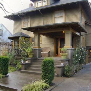
Exterior house color is the number one factor affecting your home’s curb appeal and therefore its value.
Learn how to choose paint colors which reflect your individual stye, the ambience you want to create and the decor you have.…
Continue reading...  Photo: Mike Baker
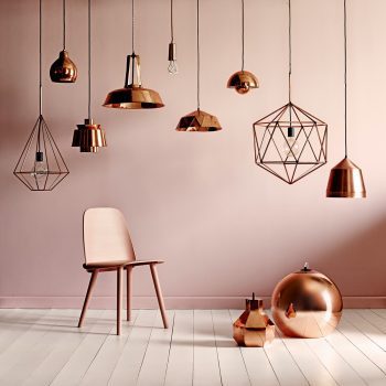
While it’s been a tumultuous year politically, design trends spotted in 2016 and even before, continue to manifest. Warm metals like copper and brass abound, pinks of all types continue to appear as sophisticated wall color choices and dark tones are showing up everywhere. Live edge wood used in everything from tabletops and shelving to bed frames continues to be featured in shelter magazines and homes alike. Here’s my take as an interior color specialist on what’s coming in interior design.
Purple
A deep jewel purple, Shadow is Benjamin Moore’s 2017 Color of the Year. Mid-toned violets like PPG’s Violet Verbena and Olympic’s Cloudberry made the top list as well.…
Continue reading...
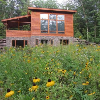
In 2001, a Bucks County, PA couple fell in love with Woodstock and began what was to become an annual ritual visiting the area. In 2008 they bought 3.5 acres. Drawn to area by the excellent hiking and the Woodstock Film Festival they decided to build their retirement home there. They started researching house styles and realized the perfect layout was one that they designed themselves.
The couple chose to work with Atlantic Custom Homes, independent dealers for Lindal Cedar Homes. The Lindal Homes are semi-custom and the house they designed is loosely based on the Elements line. Using a software program called Chief Architect, they made drawings of what they wanted, then bounced ideas back and forth with the Atlantic rep, eventually submitting drawings to the Lindal architects for the final plans. …
Continue reading...  Amy Krane Color
When you’re looking to add a design detail that’s a bit out of the ordinary, consider using color on a painted ceiling. It adds an element of fun and whimsy to a room. But designers really differ on the when and how-to.
Parameters when deciding to paint a ceiling with color.
If the ceilings are low, don’t do it. When the ceiling is painted differently than the rest of the room the eye will gravitate towards it. If the ceilings are low it will accentuate this problem. If the room is very colorful already either from wall color, decor or both, don’t do it.…
Continue reading...
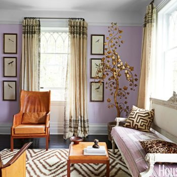
Summer is here and many of us are thinking about painting and redecorating. With 3500 Benjamin Moore colors alone the possibilities are endless. Often people find it difficult to know where to start. While any color on its lonesome might be a beauty, it’s really about how colors combine which create the finished effect. Looking for a sophisticated color palette which brings elegance or whimsy to your home? Think outside of the box and be adventurous with your combinations. The Living room above found in House Beautiful exemplifies this notion. Mixing a warm lavender (warm because the red in its makeup is palpable) with caramel and ecru creates a space which surprises.…
Continue reading...
Exterior House Colors
It’s Spring and everyone’s thoughts turn to painting their house exterior. But how do we choose exterior colors?
Painting your home is a major investment and it’s meant to last a decade. The things to consider when choosing exterior house colors include: the style of house, the color palette of the homes immediately surrounding it, the region of the country, home owner association rules, if applicable, the direction the house is facing and the colors of fixed elements like the roof, masonry and hardscape around the home. Those factors considered, there will still be a wide choice of different colors and design approaches to choose from to create great curb appeal.…
Continue reading...
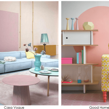
At the mention of pastels I think of those gorgeous candies, the nonpareil mint. The cool mint green, the blue-ish pink and the baby blue. I can imagine biting into the hard, sweet candy shell with the hint of mint below and the rich chocolate center. As an interior color consultant I just don’t think about pastels in home decor.
But pastel interiors have become a trend, certainly around Spring time. They seem to be everywhere and they are more often than not, poorly executed. When people create a pastel room palette they often employ too many pastels and the space becomes a mishmash of baby colors.…
Continue reading...  Nikolas Koenig
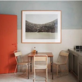
Two toned painted walls add color to a room without adding chaos. When the walls are divided horizontally, a graphic element is added to the design of the space. Painting walls with two colors creates a dynamism where the final affect is much more than the sum of the parts. When a client is open to it I’m happy to suggest this approach when I’m interior paint color consulting.
We’re accustomed to seeing two colors with wainscoting, of course. Wainscoting is a traditional room treatment which adds millwork to the lower portion of the walls. Wainscoting is often painted white while the sheetrock above is painted another color.…
Continue reading... 
