Our blog offers a fresh voice on the design scene, with ideas, inspiration and paint color advice focused on color for the built world. Updated regularly, discover current paint color trends and tried and true proven approaches to color design for your home, your business or your brand. It's all about the human response to color. Learn how to choose and apply color in a way that supports well-being and adds beauty and function to any environment. Whether interior or exterior, residential or commercial, smart color design makes the difference between a space that's hardly noticeable and one that makes you feel alive!
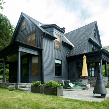
Unless you’ve been driving around with blinders on you’ve had to have noticed the prevalence of very dark homes by now. Exterior paint color trends for 2020 practically starts and ends with black, charcoal, navy and other very dark hues. I’ve been writing about this trend for years as they started showing up in about 2014 or 2015 but dark houses seem to be moving more and more into the mainstream. Chances are you’ll see more dark homes in cities and the countryside. The trend is lagging in the suburbs for obvious reasons. And while they seem most appropriate for very modern homes you’ll note dark hues on historic homes like the Victorian above as well as colonials and other architectural styles, much to the delight of some and horror of others.… Continue reading...
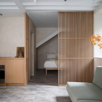
It’s that time of year that I forecast color and interior design trends for residences and I’m getting a jump on it this year. I am proud to say design pundits and shelter mags have consistently lagged behind identifying these concepts, reporting much later than I about new trends for the coming year. Like most years, some trends remain strong and carry on for longer than 12 months. This year those include, the use of pink, deep saturated wall color in hues like blue, green and teal, the use of caning in seating and case goods, dark green kitchen cabinets and the on-going love affair with light neutral spaces.… Continue reading...
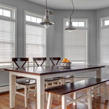
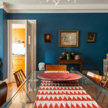
The kids are back in school, the fall season with its apple picking and pumpkin carving is here so inevitably the holidays are upon us. Even if you weren’t thinking about redecorating your home you are cognizant that the least used room is about to get a workout. Are you panicking? Don’t! Jazz up your dining room by choosing the perfect dining room paint color.
Here’s how to choose dining room color.
My philosophy about dining room color is to let the architectural style and decor direction
of the whole home guide you. Homes which employ one overall theme should continue this theme into the dining room.… Continue reading...
Popular “wisdom” says paint colors to sell your house should be warm neutrals. This has been the direction many paint color experts and Realtors alike have purported for years. They say don’t choose personal, idiosyncratic, boisterous colors and don’t paint it white. “Builder’s beige” had been a go-to for landlords and builders forever with colors like Benjamin Moore’s Linen White being used for rentals or new construction for decades. As a color consultant as well as a Realtor I say, “not so fast.” The choices are not so limited or rigid.
Paint colors that sell says Zillow
Zillow’s statistics regarding paint colors to sell your house which garnered more money for their homeowners in 2018 include a black or charcoal front door, navy or black kitchen islands with white cabinets, light blue bathrooms and light taupe living rooms.… Continue reading...
You’ve researched the best neutral paint colors. You’ve spent weeks on Pinterest and Houzz finding inspiration and ideas. You pay extra attention when Joanna Gaines talks about wall color (but she never talks specifics!). You’ve been led to the likes of White Dove and Revere Pewter ad infinitum. But you’re looking for the ultimate “best of” list, not tired old suggestions. Here it is! You don’t need to go to new paint brands like Clare and Backdrop to get a curated list of the most attractive, versatile neutral paint colors. Just keep reading.
What are neutral paint colors?
The most commonly understood meaning of a neutral paint color is one which goes with everything.… Continue reading...
Updated for 2022. Link here.
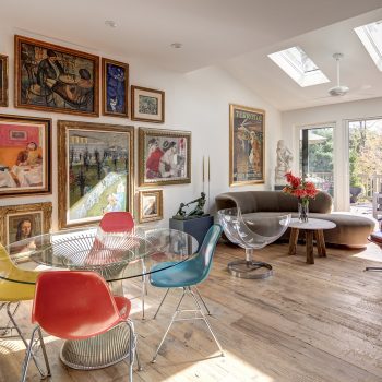
As an interior color consultant this is my favorite time of year to blog about color and design. It’s a great opportunity to sort through my year of tags, dog eared magazines and photos saved online, gleaning trends from what seems utterly random. Here are 11 interior design trends for 2019. The collection is a combination of ideas that have been percolating for a while with others that are genuinely new.
1. White walls with strong pops of color
White walls never go out of style but how such rooms are dressed really determines the ambience.… Continue reading...
How to use the world’s favorite color.
There are many shades and tones of this exquisite color. Ultramarine, Egyptian, Prussian, cerulean, periwinkle, indigo, turquoise; the list goes on. When mixing paint there are 3 primary colors: blue, red and yellow. Indivisible by no other color, blue is a foundational hue. It is considered by most people to be calming though some unlucky souls find the color melancholy. Here’s how to use blue.
Across nations and cultures blue remains the world’s favorite color. It wasn’t always so though. It was not until the twelfth century that it began to be associated with the divine and would start to be used in stained glass windows, depictions of the Virgin Mary and coats of arms.… Continue reading...
Of all of the paint colors available, white paint seems to be the trickiest color for people to choose. Neutrals are the backbone of paint companies’ color lines so filling out the choices with whites, grays and beiges is smart business for them. There are buckets of them, making the choice difficult. It’s a great time to call in a paint color consultant if you’re stuck. You can also tune into my podcast on this topic using this link here.
Why choose white in the first place?
People choose white paint for many reasons. The poorest reasons are lack of a better idea or afraid to make a mistake.… Continue reading...