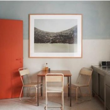
Pastels in Home Decor
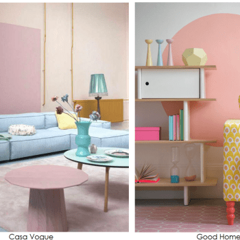
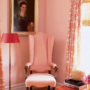
At the mention of pastels I think of those gorgeous candies, the nonpareil mint. The cool mint green, the blue-ish pink and the baby blue. I can imagine biting into the hard, sweet candy shell with the hint of mint below and the rich chocolate center. As an interior color consultant I just don’t think about pastels in home decor.
But pastel interiors have become a trend, certainly around Spring time. They seem to be everywhere and they are more often than not, poorly executed. When people create a pastel room palette they often employ too many pastels and the space becomes a mishmash of baby colors.… Continue reading...