The 4 Complex Shades Redefining Architectural Interiors
Let’s be honest: declaring that cool gray is dead isn’t news. Cool, blue-toned grays or even neutral grays peaked years ago, and the initial wave of warm beige and mushroom greige that replaced them has now become the standard modern neutral. When every new construct and renovation defaults to the same safe, warm taupe, it stops feeling like a design choice and starts feeling like builder-grade default. So where is architectural color actually heading?
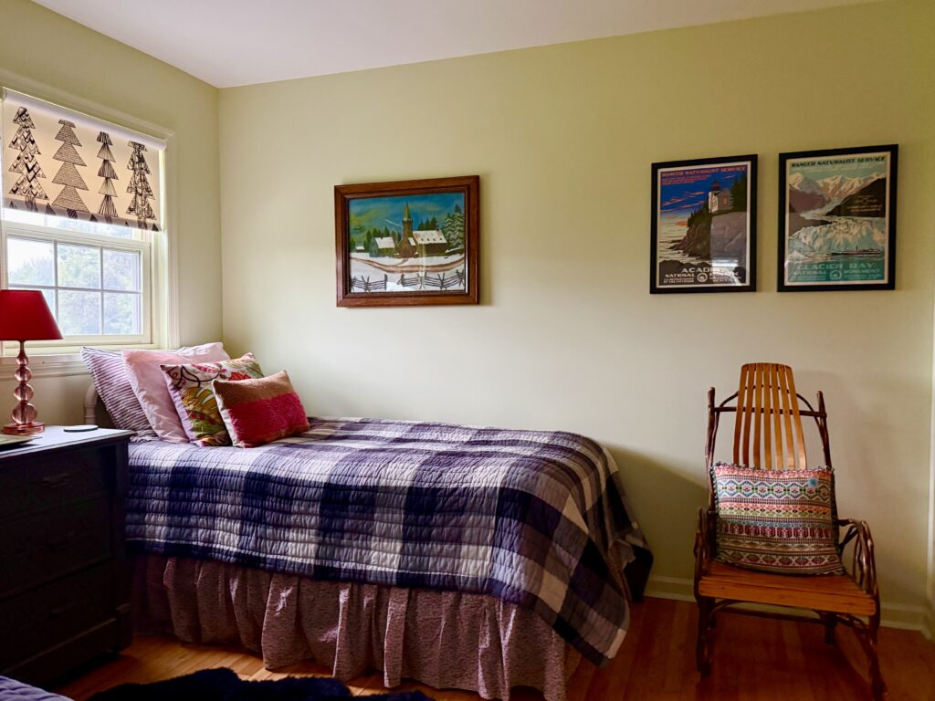
Amy Krane Color
Designers are moving away from safe, single-note neutrals toward complex, nuanced shades—colors that feel deeply historic, with a muted desaturation and subtle warmth. These hues bring sophisticated personality and narrative to a room.
1. Muted Mauve & Faded Lilac
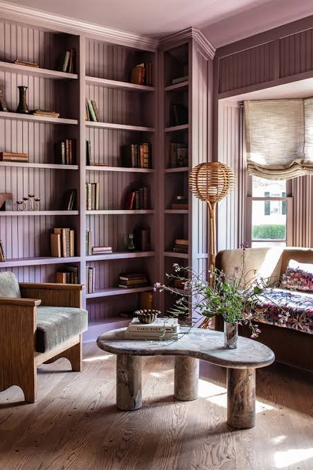
Heidi Caillier
Forget bright, sweet pastels. Today’s violet spectrum is heavily muted with gray and umber, transforming purple tones into sophisticated, earthy colors. These desaturated hues read almost like warm stone or plum-infused taupe depending on the time of day. Think of Benjamin Moore’s 2025 Color of the Year- Cinnamon Slate.
Why designers love it: It introduces subtle warmth and complexity without reading as overly decorative, pairing effortlessly with natural oak, polished brass, and white marble.
Where to specify: Anywhere! Try living room walls, study millwork, and full color-drenched powder rooms.
2. Celery & Olive-Infused Yellow-Greens
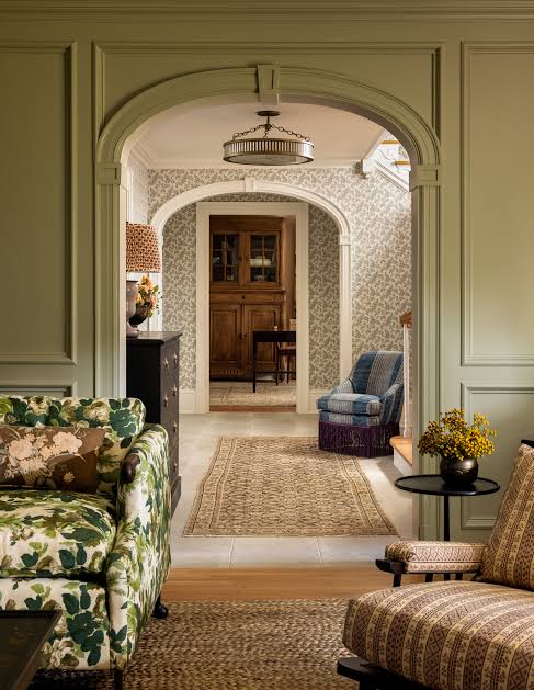
Heidi Caillier
The standard sage green trend has plateaued. Replacing it are complex nuanced shades ~ yellow-cast botanicals—shades like celery, chartreuse, and muted olive. These colors carry a distinctive, organic energy while remaining anchored in natural foliage tones. Sherwin-Williams just announced the 2027 Color of the Year is Celery. How on-trend!
Why designers love it: Yellow-greens act as a bridge between warm sunlight and cool architectural foliage, bringing luminous warmth to spaces that lack strong natural light.
Where to specify: Kitchen cabinetry, breakfast nooks, bedrooms and mudroom built-ins. I even have it in my office.
3. Muted Mustard & Dusty Apricot
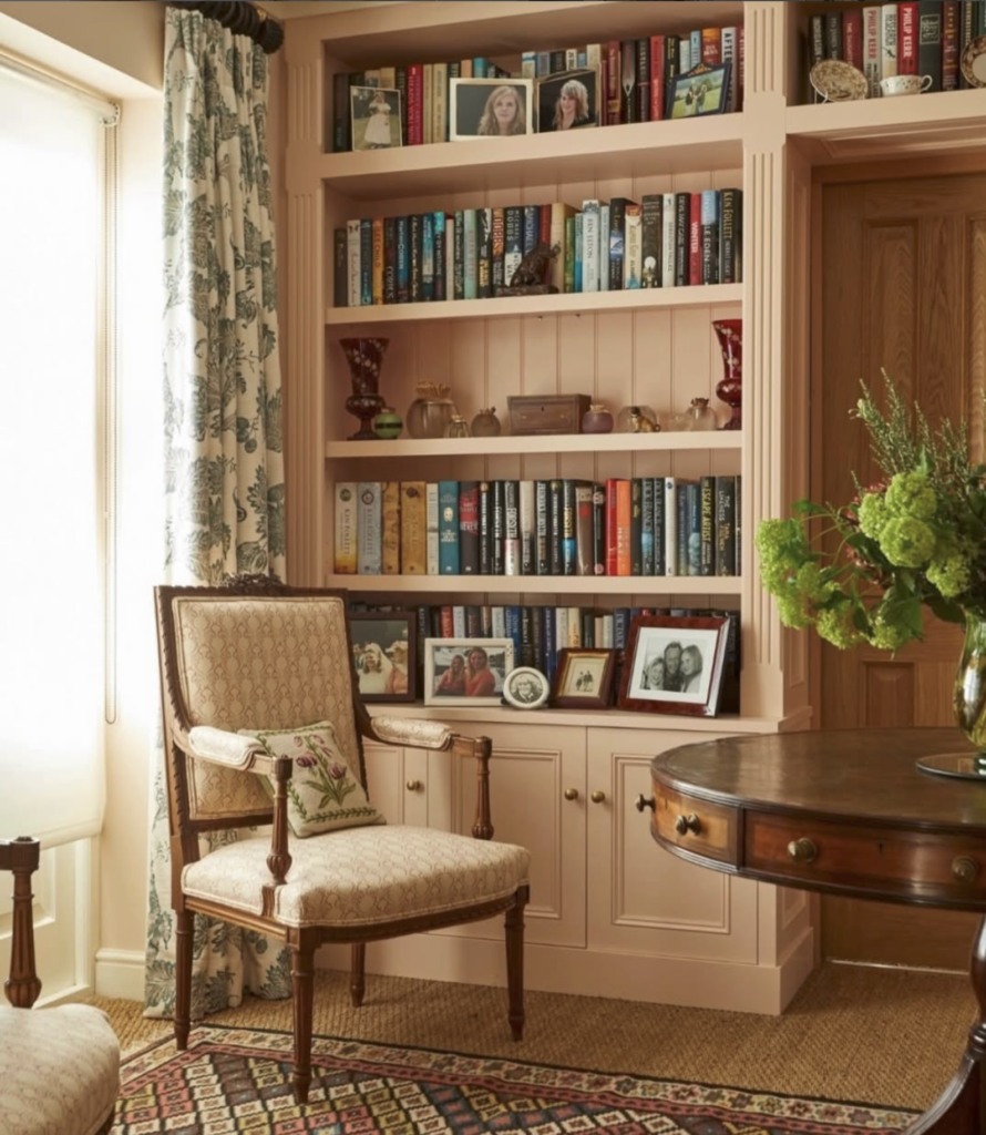
Compton Smith Interiors
It is ochre! Designers are specifying deep, sun-faded browned yellows and dusty apricots. These shades feel aged, weathered, and historic rather than primary or bright.
Why designers love it: They provide an exceptional backdrop for rich wood tones—like walnut or stained mahogany—and contrast beautifully against cool slate or charcoal stone accents.
Where to specify: Formal dining rooms, entryways, and exterior trim or front doors.
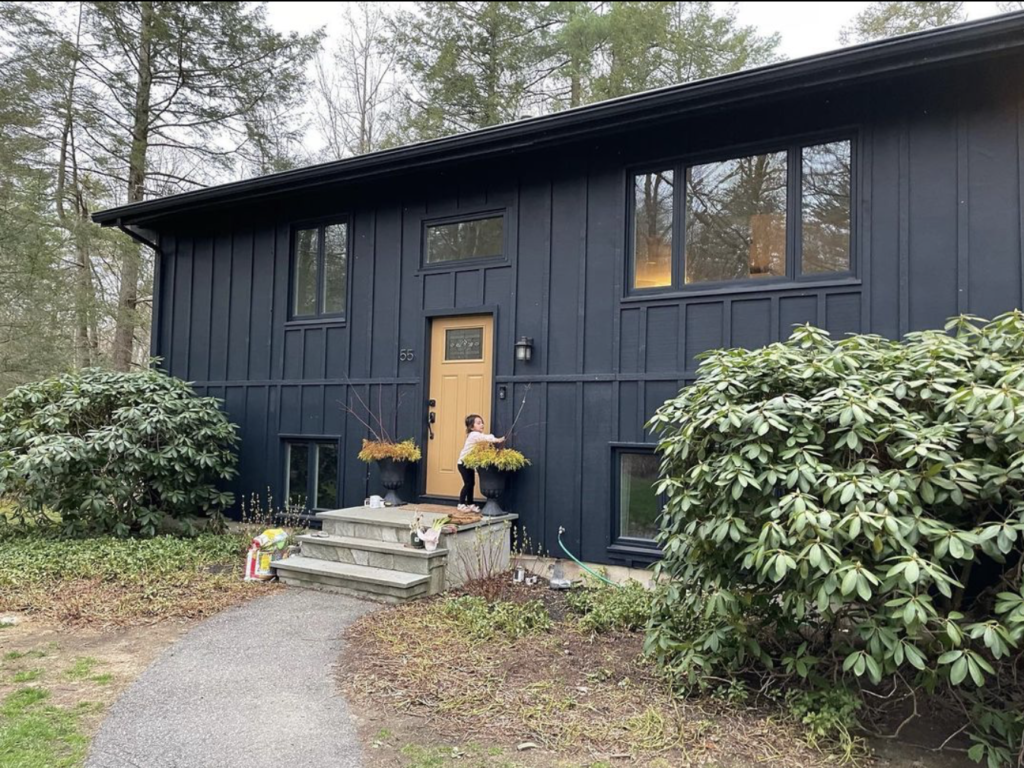
Amy Krane Color
4. Deep Espresso-Charcoal & Near-Blacks
Pure black and cool charcoal can feel harsh and abrasive in residential settings. The new wave of deep accent shades blends dark charcoal leaning towards rich espresso brown or deep burgundy, creating a velvety, soft-focused darkness.
Why designers love it: It grounds a space dramatically without creating the clinical, high-contrast shock of stark black.
Where to specify: Interior doors, architectural millwork, home office, dining room or cozy dens.
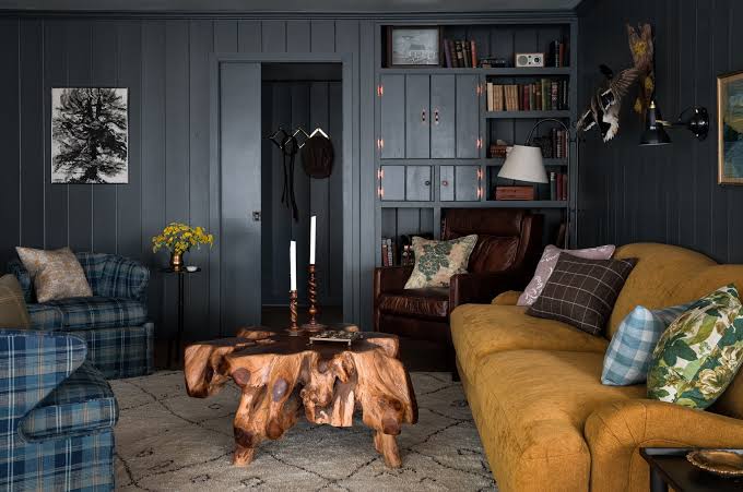
Heidi Caillier
EXECUTION STRATEGY: WORKING WITH COMPLEX TONES
Focus on Metamerism : Complex, desaturated colors shift dramatically under different light sources. A muted mauve that looks warm and inviting under 3000K LED lighting may reveal a cool, chalky tone under direct northern light. Always test large swatches against existing architectural materials—flooring, stone, and wood trim—before finalizing specifications.
Pairing with Architectural Woods: Rich Brown hues naturally complement raw timber, white oak,and vintage walnut. Avoid pairing these complex, historical shades with stark, cool white trim—opt instead for soft, warm architectural off-whites if you must go light to maintain a unified flow. But better yet match your trim to your wall color for an all-over uniform look which will cocoon your room in color.