 White paint is often treated as the ultimate safe, neutral choice for modern interiors and historic renovations. Yet, it is one of the most complex, unforgiving colors in a designer’s toolkit.
Nothing undermines a carefully curated home faster than a white wall that suddenly appears dingy, murky, or yellowed under certain light. If you’re asking yourself, “Why does my white paint look dirty?”—the issue isn’t the paint itself, but rather a disconnect between pigmentation, light exposure, and surrounding reflections.
Here is an architectural breakdown of why white paint turns dingy, along with how to curate the perfect white palette for your space.
The Light Exposure Breakdown: Why Light Changes Everything
White paint acts like a mirror—it reflects the light that hits it. A white shade that looks luminous and fresh in a design showroom can quickly flatten into a muted gray or muddy cream depending on the orientation of your windows.
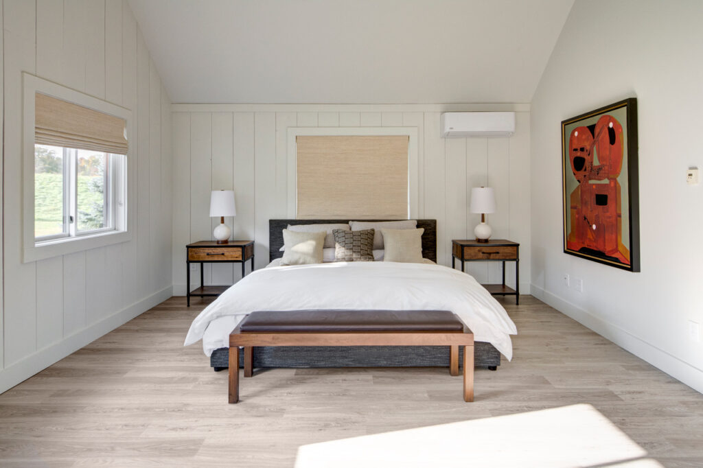
North-Facing Rooms (Cool, Blue Light)
North-facing light is indirect, consistent, and inherently cool-toned.
-
The “Dirty” Culprit: Stark, cool whites (whites from the blue hue family -blue undertone – or with gray in its make up) will look cold, shadowy, and decidedly gray-dingy in northern light.
-
The Solution: Choose a nuanced, warm off-white with subtle peach or creamy-yellow in its composition to counteract the cool, blue shadow cast by northern exposure. Try Benjamin Moore Swiss Coffee, Simply White, Acadia White or Capitol White
South-Facing Rooms (Warm, Golden Light)
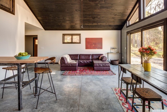
South-facing rooms receive intense, direct sunlight throughout the day.
-
The “Dirty” Culprit: Whites from the yellow hue family (undertone) will become overly amplified by intense afternoon sun and could make the walls look aged or yellowed.
-
The Solution: Soft, neutral whites with tiny hits of black/gray pigment ground the space and absorb excess glare without washing out. Try Farrow & Ball All White.
East & West Exposures (Shifting Light)
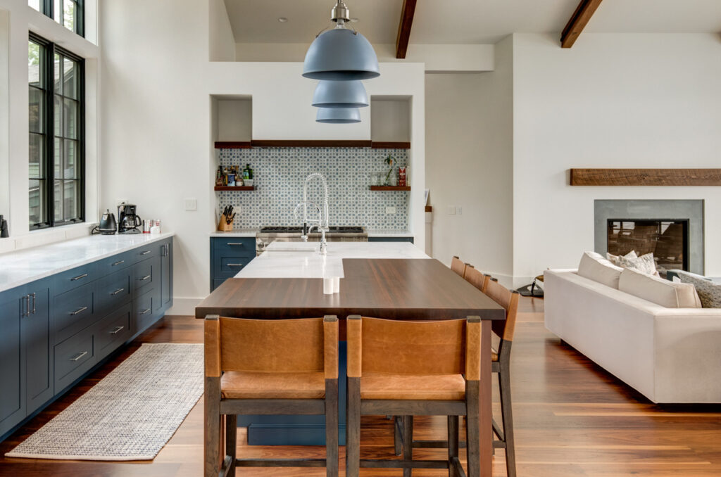 East light starts warm and ends cool; West light starts cool and turns golden-orange later.
-
The Solution: Whites used here must balance subtle warmth and neutrality to prevent shadowy corners as the sun moves across the horizon. Try Benjamin Moore White Dove.
Paint Pigment
“Pure White” straight out of a can with zero additional colorants added wouldn’t work on a large architectural scale—it would feel sterile, cold, and harsh, like an art gallery before the art is hung (and the paint companies don’t make it!)
To give white depth, paint manufacturers add additional colorants:
| Paint Base | Common Issue When Misplaced | Architectural Application |
| Green / Umber | Looks muddy, drab, or olive in low light | Ideal for grounding historic homes surrounded by lush tree canopies |
| Yellow / Ochre | Looks aged or stained under warm artificial lighting | Perfect for traditional homes needing historic warmth |
| Gray / Blue | Looks sterile, concrete-like, or dingy in northern exposure | Excellent for stark, modern, minimalist spaces with high south-facing glass |
When white paint looks dirty, it is almost always because the pigments added are in conflict with the light or adjacent materials.
Reflectance and Surroundings (LRV & Context)
Paint does not exist in a vacuum. It interacts constantly with fixed elements in your architecture:
The Impact of Light Reflectance Value (LRV)
Light Reflectance Value (LRV) measures the percentage of light a color reflects. A pure white has an LRV near 100, while black is 0.
-
White paint colors typically fall between 80 and 92.
-
If you pick a white with an LRV above 88 for a room with minimal natural light, there isn’t enough ambient light for the paint to reflect. Instead of looking bright, the paint collapses into a flat, murky haze.
Reflective Color Casts
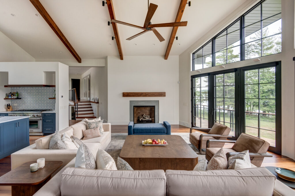
If your windows overlook a lush lawn, a red-brick patio, or a neighboring exterior wall, your white walls will act as a canvas reflecting those colors back into the room. Green grass reflecting onto a yellow-based white paint creates a distinctly dingy, olive-gray cast.
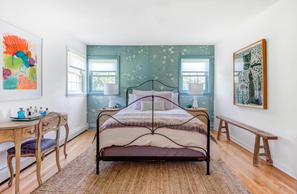
Trim, ceiling and millwork can conflict
A white wall only looks clean in relation to what sits next to it.
If your wall paint has a warm, creamy undertone, but your trim is painted in an ultra-crisp, bright white, the contrast will make your walls look aged and yellow by comparison.
Professional White Combinations That Work:
-
Tonal Warmth: Pair a rich off-white wall (e.g., Farrow & Ball School House White) with a slightly deeper, richer trim in the same color family for an intentional, architectural feel.
-
Color Drench – Monochromatic: Use the exact same white shade on both walls and trim, but vary the finish (e.g., matte on walls, satin on custom millwork and trim). This creates depth without risk of undertone clashing.
Transform Your Home’s Lighting Palette
Selecting the right white requires an architectural lens—evaluating geographic orientation, window placement, surrounding landscapes, and fixed materials like flooring and stone.
Stop guessing with endless paint swatches. Schedule a Remote Architectural Color Consultation with Amy Krane Color to curate a bespoke palette tailored specifically to your home’s unique lighting and architecture.