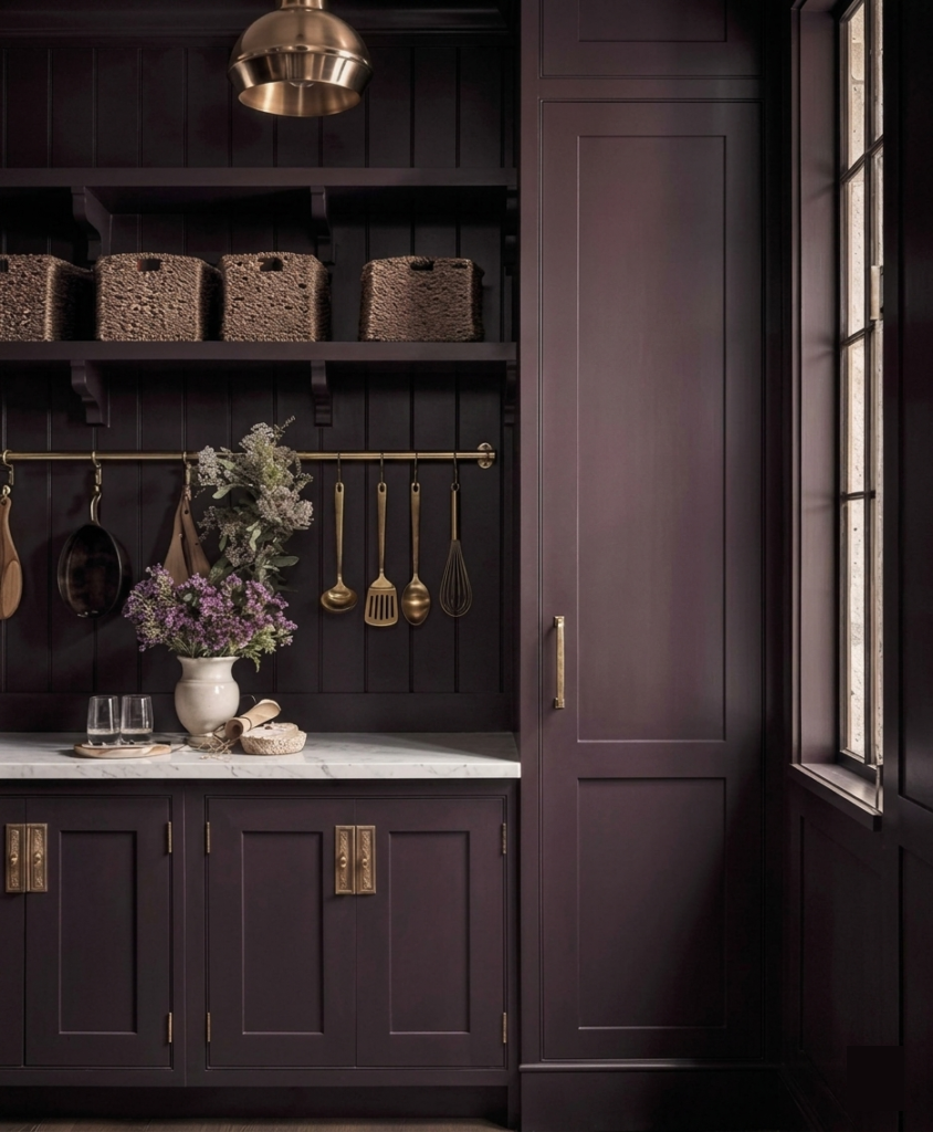
For the better part of a decade, “safe” was the reigning strategy in whole-home color: greige everywhere, one accent wall if you were feeling brave, resale value treated as the highest design authority. That era is ending. Pinterest’s 2026 color forecast — built from actual search and save behavior across 600 million users, names Plum Noir and Jade among the year’s fastest-rising interior color searches. Little Greene named a plum aubergine its Colour of the Year. Behr chose a smoky jade. The data and the industry are saying the same thing: saturated, moody color is no longer a risk. It’s a request.
How to use plum and jade
But there’s a real gap between a trending color and a well-designed room. Plum walls can read as boutique-hotel sophisticated or as a dated 2013 accent wall, depending entirely on what surrounds them. That difference is the job at hand. Here’s how to bring moody, saturated color into a home the way a professional would — so it reads as considered architecture, not a passing trend.
Be Mindful of Balance
Deep or bold color works because of contrast as well as the hue choice. A whole-home palette built around Plum or Jade should have a couple of public rooms — a powder room, a library, a kitchen island, a dining room – to show off the deeper color. One room that’s dark upsets the flow and balance in the house. Have two and spread them out. Other rooms can be mid-tone and light or include wallpaper. They can be a combination of neutrals and more colorful hues but tame ones. This is what separates a considered palette from a Pinterest board: restraint is what reads as luxury.
Build the Neutral Scaffolding First
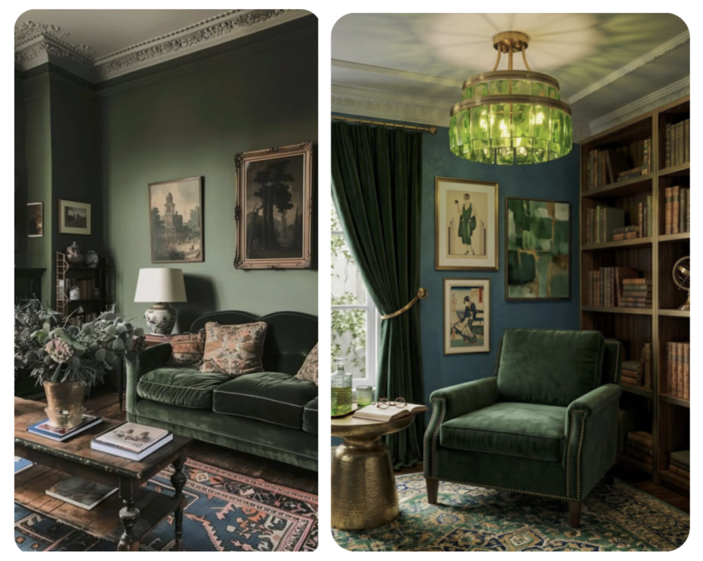
Before you choose the saturated anchor(s), choose the neutrals it will live beside — consider the ceiling, adjacent rooms, hallway sightlines. Warm, soft neutrals (not stark white) is what lets a moody accent room feel intentional rather than isolated. This is also what protects the investment: neutrals date slowly, so the architecture of the palette stays timeless even as the accent room’s furnishings evolve.
Plum and Jade Paint ideas
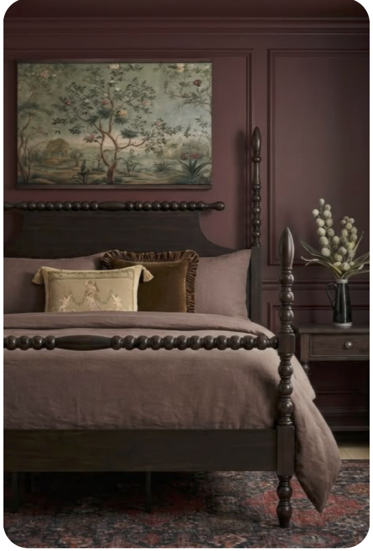
Try Benjamin Moore Caponata – AF-650, Bordeaux Red 1365, Bewitched CSP-450 for rich plum colors and Farrow & Ball Green Smoke and Benjamin Moore Webster Green HC-130 for jade.
Let Materials Do What Paint Can’t
Plum and jade both read as luxury when they’re paired with warm metals — aged brass, bronze, warm gold — and natural stone or wood with visible grain. Walnut looks great. Cool chrome or stark white marble against a saturated jewel tone can tip the room cold and flat. The goal is a room that feels layered and tactile, not a single loud color statement.
Test at Full Scale, Not on a Swatch
This is where saturated color most often goes wrong. Plum and Jade shift dramatically with light — a 2-inch chip and a full wall under your home’s actual north- or south-facing light can look like two different colors. A proper whole-home palette accounts for how the anchor color reads at 8am and at 8pm, and how it transitions into the neutral rooms around it.
The Takeaway
Moody, saturated color isn’t a trend to chase room by room — it’s a considered architectural decision made in relation to the whole home. Done well, it’s the difference between a house that looks decorated and one that looks designed.
If you want that palette built for your own home rather than approximated from a paint chip, that’s exactly the kind of whole-home color mapping I do for clients — and it’s also the thinking behind two of my ready-made palettes, Sun and Shadow and Vintage European Revival, which each contain either jade or plum – available now in my Etsy shop.